
Last Seen Blogs

jompii
Untitled
aldegger
Iorveth's hideout
reninova
wanderer

beelzeblogsposts
hell of a good time
weplay
We Play UAE
Text
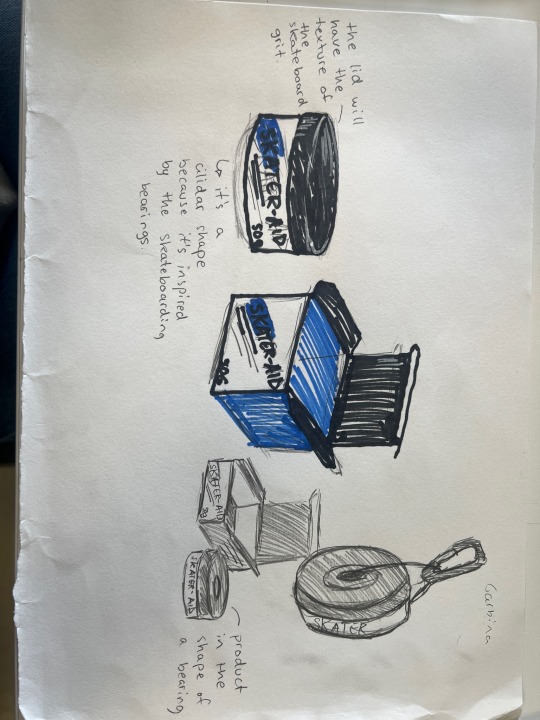
Thinking of product packaging and what the product will look like. Inspiring off the bearing of a skateboard. I thought it would be useful to have it attached with a carabiner because the other day skateboarding everyone just left their valuable stuff on the side. Because some baggy jeans don’t have pockets or sometimes you just don’t carry a bag. I think it’s also tapping into the street fashion that skateboarding culture inspires off.
0 notes
Text
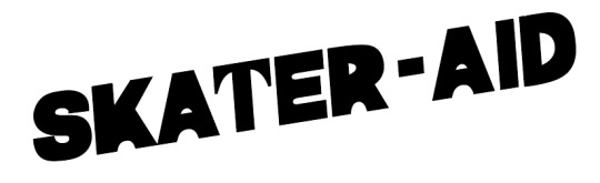

I smoothened out the paint so it looks more like a cream now. I also tilted the font because I think it looks better than having it straight. I created a colour difference in photoshop to have a transition in my logo.
0 notes
Text

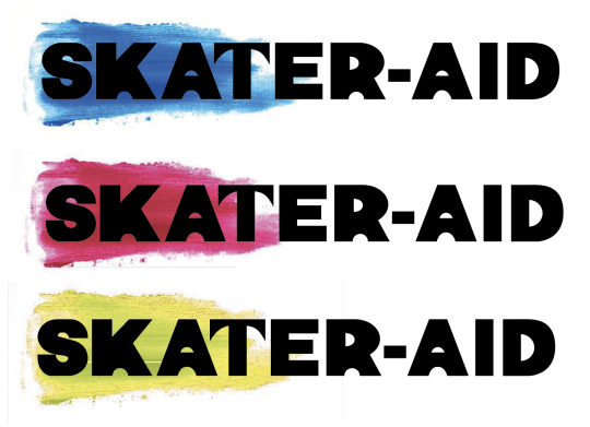
I have combined my two experiments and created a logo with the colour swoosh that represents the product and the brand itself. I think I would like it more if the paint looked more smooth. So that’s what I am going to do next.
0 notes
Text

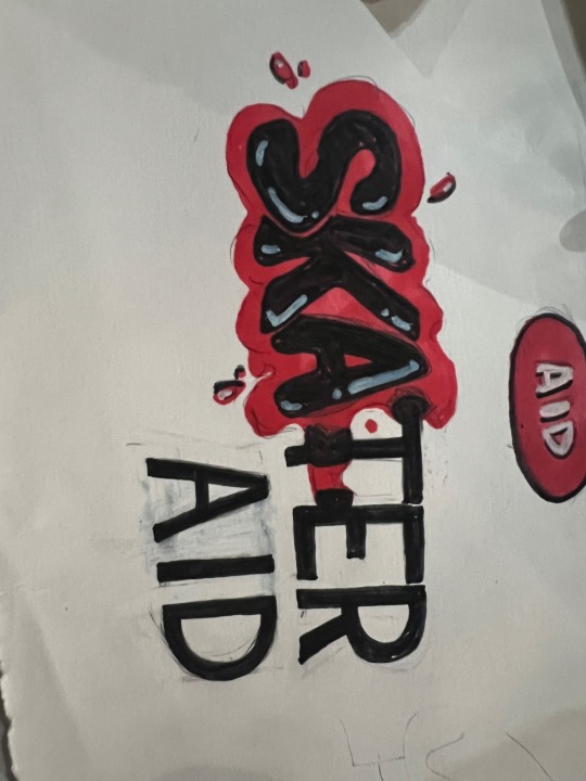
Paint experimentation.
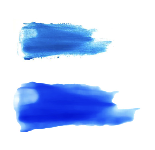
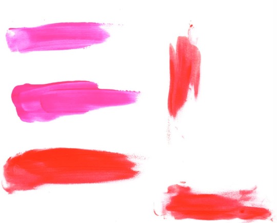
For my logo I wanted to visually display the cream used within the font. I looked into neon colours because skaters have a lot of pride and bruises and scars often have stories. I thought that if you visibly show people you have a scar or a bruise you can spark conversation every time you skate.
I mostly enjoy the blue and red and the most dominant colours. I think using neon colour on black and white background could be a good way to experiment. After I scanned them in I have realised how detailed the pain was and that it didn’t my come across as a cream and looked more like paint. I think trying to manipulate this in photoshop could help solve that issue and make it look more organic and like a cream.
0 notes
Text

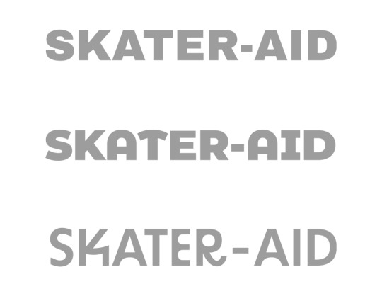

I have played around with type. I took three fonts that I felt fitted best for my target audience and changed their opacity slightly so that I can print them and alter them in black pen. I used the shapes I have conducted from my primary research of the ramps and obstacles from the skate park. This has helped me develop a very unique font that sits within the visual identity I want to evoke. I have asked a few people and including myself I think the first one is most cohesive choice.
0 notes
Text

A few sketches. I like the graffiti to Sam serif because it portrays the regular image of street skating with the Olympics visual aesthetic.
0 notes
Text


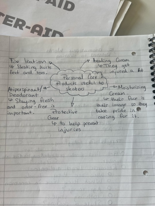
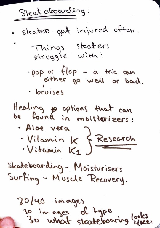
Those are initial ideas of what the product could be and of names. I have put a list of what sort of things skaters might struggle with.
0 notes
Text

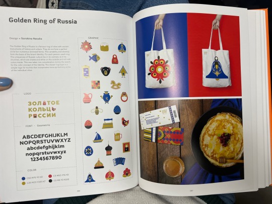


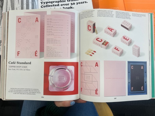
I looked at branding books in the library to help me develop a deeper understanding of brand identity and how to showcase my final pieces at a professional level.
0 notes
Text
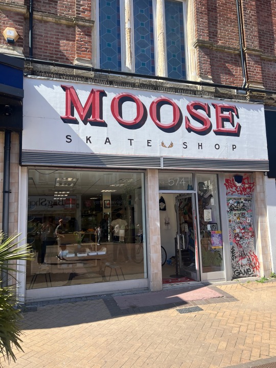


Moose skate shop in Boscombe.
Took a trip to analyse the skate shop in boscombe. I found that they sell a lot of popular brands like Bones Reds, Supreme wheels, spitfire, etc. the most dominant color was red and the store again had a floor like the skating ramps and actually had a big ramp build into the floor which was really cool. I believe it’s only for display and not to be used but I enjoyed the idea. This has helped me form a color decision as I think red is most dominant in the skating community and would be speaking to my target audience the most.
0 notes
Text

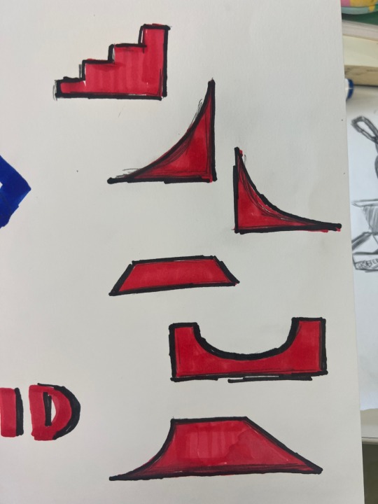
Experiment:
I went to a skate park and recorded my readers h through shapes. Analysing the ramps and using the geometry to potentially help develop a font that is inspired by the skate park obstacles. This could be a good representation of my brand as I want to target to street skaters that love tricks and obstacles.
0 notes

Text

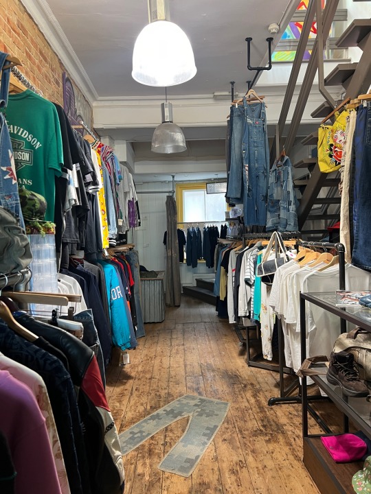

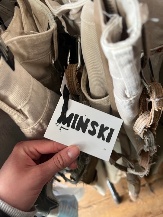


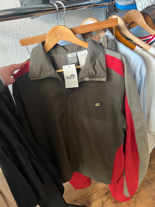
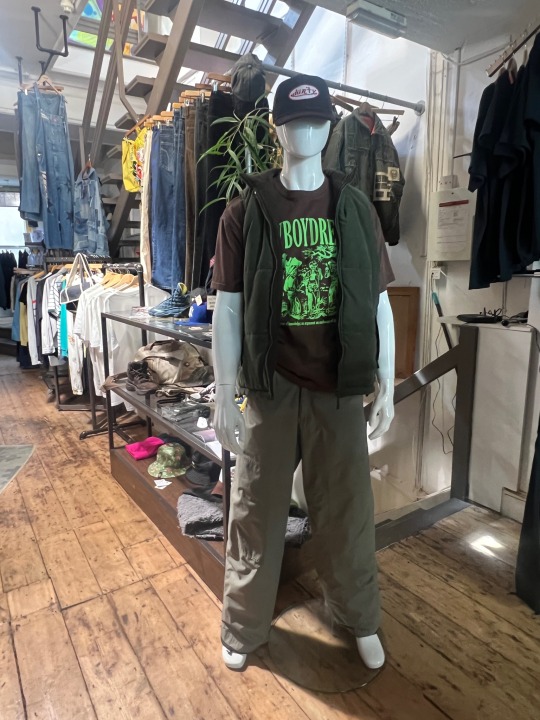
Understanding my target audience by looking into their sense of fashion.street skaters usually wear baggy clothes, Nikes and especially vintage. I went to a few vintage stores in Bournemouth town center and have noticed that there is a lot of oversized clothes, jackets and shoes. In one of them the floor was made of a material that it was used for ramps which interested me. The illustrations are very pop art.
0 notes
Text
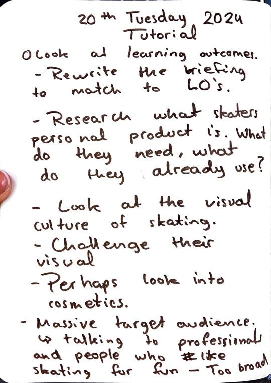

Learning outcome tutorial and project so far.
Showcasing my initial ideas. Going forward I will look into brands. By narrowing down my target audience I think going back to my research and sticking to street skaters as my main target audience will make things a bit easier and help me make clear design choices.
0 notes
Text

Decided to take an image of my skateboard. Analysing the tracks and wheels and bearings and board. Could potentially help me come up with names.
0 notes
Text

Plan of what I need to do. Each week I have been ticking off.
0 notes
Text
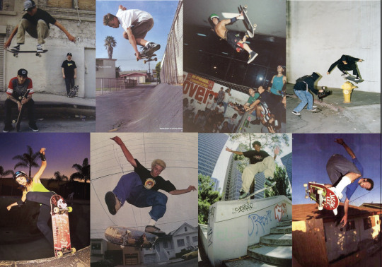
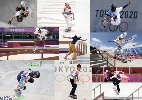
Showing the two different styles. We have steer skateboarding on the left outside of the Olympics and skateboarding on the right that looks more clean and bright and professional.
0 notes
Text
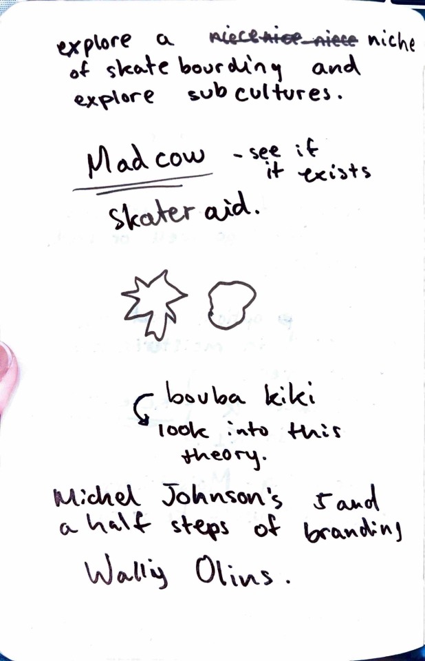
Spoke to Ciaran about my project and here are some notes I have taken.
0 notes