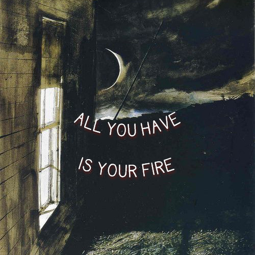
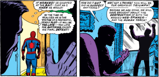
#the shooting diptych
Text
The shooting diptych
Part of the red string of fate series
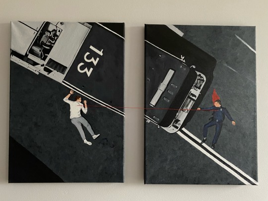
#it’s finished and I love how it’s turned out#the shooting scene#the shooting diptych#red string of fate series#the red string of fate#911 abc#911 on abc#911 art#911 fanart#painted by me#kym paints things#my art#buddie#evan 'buck' buckley#eddie diaz
455 notes
·
View notes
Text
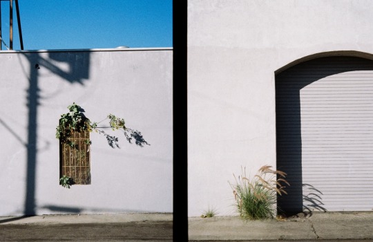
#psychogeography#urban landscape#street photography#urbanphotography#walkingphotography#new topographics#urbandecay#new topographers#psychogeographic#diptych#halfframe#film photograhers#35mm film#kodak#point and shoot#compact#social landscape#los angeles#la#alteredlandscape
37 notes
·
View notes
Text
“Shattered”
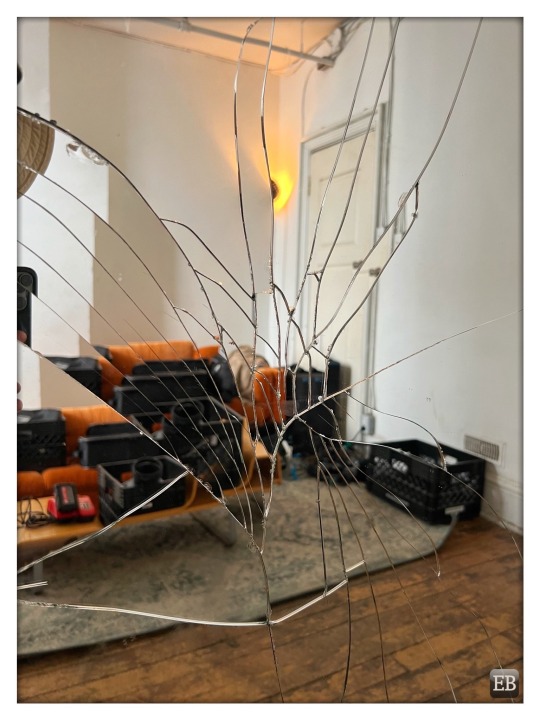
View On WordPress
#bad luck#broken#broken mirror#cracked#cracks#Diptych Studios#mirror#orange#photo shoot#setlife#seven years bad luck#shattered
4 notes
·
View notes
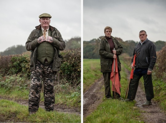
Text
Beaters & Pickers, Pheasant Shoot, Surrey, UK. Images ©Jason Florio
Portraits of Beaters and Pickers at a Surrey pheasant shoot, Surrey UK.
Pickers often work in tandem with gun dogs or retrieving dogs to aid in the efficient recovery of shot game. They may direct or assist the dogs in locating and retrieving birds, enhancing the overall efficiency of the process.
Beaters aim to create a controlled movement of game birds, ensuring they fly in a predictable…
View On WordPress
0 notes
Photo

CROSSROADS DEVILS DIPTYCH:
two folky concept playlists about literal demons and having a complicated relationship with your parents (listen in order!!)
my daddy said shoot,
or: it’s the 50s somewhere in appalachia. you’re gay and repressed, your mother’s long-dead, and your father’s a bastard who’s never really forgiven you for this. you want to run away with the love of your life, but can’t seem to shake this town and your father’s influence. so, you make a deal with a crossroads devil to take care of him. unfortunately the devil leaves you high and dry, which leaves you with no choice but to kill him yourself.
(17 songs; 1 hr, 11 mins)
all you have is your fire,
or: you’re the 11-year-old semi-feral child of monster-hunters who were mysteriously killed on a job. with no family left, no fear of consequence, and no idea what else to do, you strike a midnight bargain with a demon to get your parents back from the dead, but the cost is so much higher than you could ever anticipate...
(17 songs; 1 hr, 7 minutes)
#playlist#concept playlist#sometimes i make stuff#okay i fully admit that the first playlist is 1) better 2) more thought-out 3) way more cinematic you can blame anais mitchell for that#i heard young man in america and it tore something open inside of me!! if i knew how screenwriting worked i'd write a script but i don't#not to be all oc do not steal in 2021 but OC DO *NOT* STEAL I DO WANT TO TRY AND MAKE SOMETHING OUT OF AT LEAST ONE OF THESE#however if you do want to know how each track would play out in a movie you can ask that because i have everything Very Planned Out#the two genders....killing the representation of the devil and killing the actual devil
55 notes
·
View notes
Text
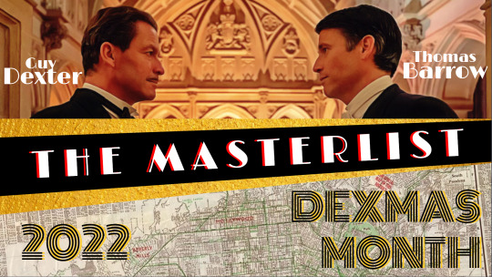
FABULOUS FLUFF:
Guy Dexter (2846 words) by ama
Part 1 of The Many Roles of Quentin Sidebotham
when held (462 words) by toastandjammies
desk head (593 words) by toastandjammies
Apple Picking (712 words) by angryessays
Part 1 of Thomas and Guy's Outdoorsy Outings
Shooting (2041 words) by angryessays
Part 2 of Thomas and Guy's Outdoorsy Outings
I suggest you kiss (2165 words) by Immovable_McLennon
Moments (4414 words) by Immovable_McLennon
bright eyes and gentle ways (3771 words) by Orszula
Art: Floral Diptych by @plxcxhxldxr
Art: MISSING SCENES by @academia4me
AMAZING ANGST:
Are we safe here? (1299 words) by Immovable_McLennon
Reginald Danvers, Esq (5620 words) by ama
Part 2 of The Many Roles of Quentin Sidebotham
Midlife Crisis (1850 words) by angryessays
Same Sad You (4384 words) by angryessays
Art: Comfort by @academia4me
SMOULDERING SMUT:
Insincerely Yours (2079 words) by angryessays
Wine Tasting (1437 words) by angryessays
Part 3 of Thomas and Guy's Outdoorsy Outings
baby got back (680 words) by toastandjammies
Hippolyta (7576 words) by ama
Part 3 of The Many Roles of Quentin Sidebotham
Art: The ending we all wanted...
AUDACIOUS AUs:
I want to tell you (6029 words) by Immovable_McLennon
History in the Back of the Attic (15781 words) by ama
Subverting Expectations (5633 words) by angryessays
A King for a Knight (5504 words) by angryessays
Home for Halloween (19818 words) by angryessays
We’ll Never Be The Same Again, Will We? (7260 words) by Nialuna
Collage: Brits in Hollywood, Modern AU by @just-barrow
Collage: Office Mates by @academia4me
Collage: When Thomasina met Gaia by @academia4me
HAUNTED HALLOWEEN:
I Want to Be a Witch (3970 words) by angryessays
The Dress 2: Electric Boogaloo (3114 words) by angryessays
Mr. Barrow’s Gentleman Friend (7478 words) by ama
Part 4 of The Many Roles of Quentin Sidebotham
Collage: Hollywood Vampires by @academia4me
JUST DEXMAS:
Adventures in Prohibition Alcohol Procurement (285 words) by angryessays
Collage: At home with Guy Dexter: interiors of the rich and famous by @academia4me
HOLLYWOOD HUSBANDS PROMPT POTLUCK LOVELY LIST
#Dexmas Month 2022#Thomas Barrow#Guy Dexter#Dexmas#Hollywood Husbands#Hollywood Husbands Fanwork Fest#THE MASTERLIST
20 notes
·
View notes
Note
I woke up with a meg mental image the other day, so a redemption-era thought for you, with the hope that it brings joy: eliot wakes up the second someone's about to take a picture of him (it's a sixth sense, some off-shoot of hypervigilance that never quite goes away) so parker DOES have photos of him glaring muzzily at her that she sends on to hardison, but when she really wants to capture the comfort and peace of eliot curled up a little on his side and meg sprawled beside him on the bed with her head on his arm (drooling generously on his sleeve), she sketches them.
hardison buys a good picture frame for it (a diptych, the other side is a photo of the three of them splitting an ice cream sundae about a year after sophie and nate's wedding) and keeps it by his computer wherever he's currently set up. there's a space for it in his laptop bag if he ever needs to grab the important things and run.
(wishing you all the best etc <3)
ohhh this is so good. it is so so good. it has taken me so long to answer it because i come to my inbox and just stare at it for a while, A+ thank you for everything. (i also believe, for really desperate escapes, hardison has a place for the picture frame sewed into the breast of his jacket, right next to his heart)
23 notes
·
View notes
Text
Spider-Man: Comics Recommendations (The Sixties)
MASTERPOST
So I just finished reading The Amazing Spider-Man comics from the Sixties (aside from about 20-30 issues in the Ditko era). Want to know what's worth a read? Probably everything, in a way, but here are my recommendations in chronological order under the cut, and if you can't be bothered, here's a quick summary:
ASM #1, Ann #6, ASM #39-40, ASM #47, #50-52, #53-61, SSM #2, Ann #4, ASM #67, #68-70, #75, #78-79.
(In bold: what I particularly loved.)
Issue #1. It's a classic. Amazing Fantasy #15 isn't so interesting. It features a few different stories so it's already a meaty part. Please be aware that this era is very verbose and the art is... what it is. Read a few issues from that era here and there, maybe read issues 31-33 ("If This Be My Destiny...!") but you quickly get the idea.

2. Annual 1: Dozens of cameos, Doc Ock uses Bluetooth, plot twists, it feels like a greatest hits issue.

3. The Green Goblin diptych: Issues #39-40 AND/OR Spectacular Spider-Man #2 (which partly retells it, and adds to it). For the first, it's the start of Romita Sr. taking over Ditko as the main artist (although he tries to keep the same visual style for his first few issues). The Green Goblin discovers Spider-Man's identity and reveals his own... and in SSM#2, this is retold with better art, as well as more story.


The difference in style is striking and SSM2 is definitely one of my favorites. If you hesitate, pick SSM2.
Maybe you can read issue #42 to see Mary Jane's iconic and long-awaited first appearance, but the issue itself isn't that good.
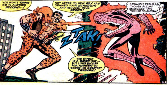
4. Issue 47: Kraven shoots lasers with his titties, and Peter and Harry become roommates. Enough said. If you enjoyed it, you can read the next two issues as well since they continue the storyline, but they're less fun.
5. Spider-Man No More (Issues 50 to 52): Another iconic storyline. The mob plot would be a bore if not for a specific character, but Peter has had enough of being Spider-Man and the art is gorgeous. #52 in particular is great. The original comics have different coloring from the scanned, cleaner version, just FYI.
6. Annual 4: Spidey and the Human Torch team-up against two mysterious villains... The two heroes often pair-up, and I really enjoyed this one so here you go! Plus, you get to see Peter and Harry's apartment in details in a double-spread, as well as the cast in the iconic coffee shop.
7. What a Tangled Web We Weave (Issues 53 to 61): So here's an extract from my read-through:
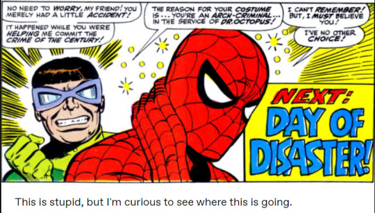
In this batch, we have Dr. Octopus drinking tea with Aunt May, and Spidey getting amnesiac, which influences his hero life and his soap opera daily life.
I was very invested in the storyline, so that's why I'm recommending all of it. If you're a soap fan, read it! And you can add Marvel Super-Heroes 14 as a treat. It's a weird issue, but imo it's a worthwhile read.
8. Issue 67: By this point, the stories are pretty much consistently entertaining, but this issue has a very nice fight with Mysterio. It's a visual treat. Maybe read the previous one if you want context.
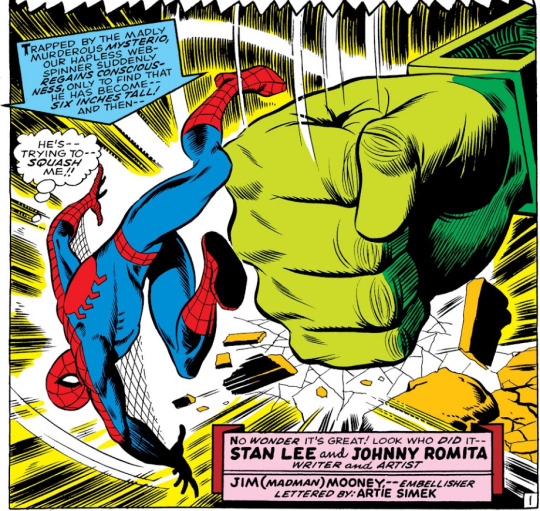
9. The Clay Tablet Arc but specifically #68-70 & 75. Peter gets involved in politics, Civil Rights are discussed, Jameson gets his due, Harry gets a moustache inspired by Fu-Manchu. However, the villains aren't compelling and the mystery of the tablet only gets interesting as it is resolved, hence why you can skip a bunch of issues. Ideally, you'd read everything, but hey, I'm only putting the best out there.

10. The Night of the Prowler (Issues #78-79): One of the more interesting characters introduced this decade! Aside from that, the balance of soap and action is perfect. The art is awesome too. #80 is also fun.

gosh he's so pretty
#spider-man#peter parker#comics#recommendation#guide#green goblin#the amazing spider-man#Stan lee#steve ditko#john romita sr#The Prowler
4 notes
·
View notes
Photo
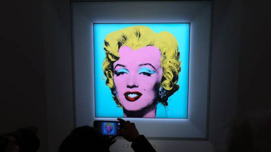


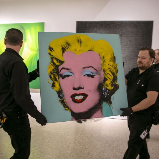
Andy Warhol's 1964 Portrait of Marilyn Monroe Sells a $195 Million
One of Andy Warhol's iconic Marilyn Monroe portraits has become the most expensive 20th-century artwork ever to go under the hammer.
The 40-square-inch "Shot Sage Blue Marilyn," one of dozens of images the artist made of Monroe in the 1960s, sold for a record $195 million at Christie's in New York Monday evening.
Prior to the sale, Christie's had described "Shot Sage Blue Marilyn" as "one of the rarest and most transcendent images in existence." It has previously been shown at galleries including the Guggenheim Museum in New York, the Centre Pompidou in Paris and London's Tate Modern.
The auction house had initially said it was expecting bids "in the region of" $200 million.
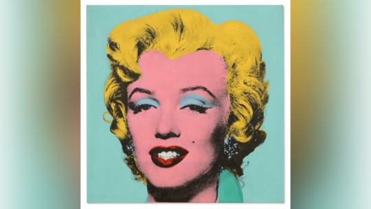
Warhol's colorful reproductions of Monroe's photo portrait -- originally a publicity still from her 1953 movie "Niagara" -- are among his most recognizable works, alongside his signature paintings of Campbell's soup cans.
Using a technique called silkscreen printing, which duplicates images on paper or canvas using a layer of fine-mesh silk like a stencil, he began creating them in 1962, shortly after Monroe's death. As with his depictions of other famous figures, including Elvis Presley and Chinese leader Mao Zedong, the Pop artist created numerous versions of Monroe's portrait in various different colors and configurations.
Among the best-known is "Marilyn Diptych," owned by British gallery group Tate, which saw Warhol print a grid of 50 portraits across two canvases. Elsewhere, the Museum of Modern Art's "Gold Marilyn Monroe" features a single image printed against a gold background, while "Shot Marilyns" saw the artist shooting portraits of the star through the head with bullets.
In 1964, he developed a "more refined and time-intensive" new process that was "antithetical to the mass production he was best known for," according to Christie's. That year, he used it to create a limited number of portraits -- a rare group of works to which "Shot Sage Blue Marilyn" belongs -- before abandoning the technique.
While a handful of paintings are thought to have attracted price tags in excess of $200 million in private sales (including works by the Abstract Expressionist painters Willem de Kooning and Jackson Pollock), the feat has only once been achieved at auction -- by Leonardo da Vinci's "Salvator Mundi," which in 2017 sold for over $450 million. The previous auction record for a 20th-century painting was the $179.4 million paid for Pablo Picasso's "Les Femmes d'Alger (Version O)" in 2015.
The auction record for a Warhol work was previously held by "Silver Car Crash (Double Disaster)," which depicts the mangled aftermath of a road collision and sold for more than $105 million almost a decade ago. Several of the artist's other Marilyn images have also attracted huge sum at auction in recent years, with 1962's "White Marilyn" selling for $41 million in New York in 2014.
"Shot Sage Blue Marilyn," meanwhile, was owned by a succession of high-profile gallerists and collectors before being purchased by the late Swiss art dealer Thomas Ammann. The portrait was offered for auction by the Thomas and Doris Ammann Foundation Zurich, the charitable organization set up in his (and his sister's) name, which will use the proceeds to fund health and education programs for children worldwide, according to a press release.
n a press statement prior to the sale, Christie's chairman of 20th and 21st century art, Alex Rotter, described the work as "the absolute pinnacle of American Pop" and "the most significant 20th century painting to come to auction in a generation."
"Standing alongside Botticelli's 'Birth of Venus,' Da Vinci's 'Mona Lisa' and Picasso's 'Les Demoiselles d'Avignon,' Warhol's 'Marilyn' is categorically one of the greatest paintings of all time," he added.
The artwork was one of four Warhols in the Ammanns' collection on sale at Monday evening's auction. One of his famous "Flowers" silkscreen paintings went for $15.8 million, and "GE/Skull," which he created in collaboration with the late Jean-Michel Basquiat, fetched over $4.6 million. Warhol's sculpture "Heinz Tomato Ketchup Box" meanwhile sold for more than $478,000.
Elsewhere, works by Robert Ryman, Alberto Giacometti and Lucian Freud also went under the hammer. Two of the biggest sellers were paintings by American artist Cy Twombly, "Untitled" and "Venere Sopra Gaeta," which fetched $21 million and almost $17 million respectively.
#Andy Warhol's 1964 Portrait of Marilyn Monroe Sells a $195 Million#Shot Sage Blue Marilyn#American artist film director and producer#art#artist#art work#art news#luxury#luxury goods#luxury living#luxury lifestyle#billionaire#billionaire lifestyle#Christie's#painting#auction#marilyn monroe
28 notes
·
View notes
Text
Movie Review | Miami Vice: Calderone's Return (Glaser & Colla, 1985)
This series has been defined in part by its maddening roster of guest stars, with the likes of Bruce Willis, Pam Grier and Dennis Farina in memorable turns, to name a few. I'm into the second season now*, but I wanted to come back to this one, as one guest star in particular has lingered in my memory: Jim Zubiena, who plays the assassin hired by Calderone to a number of his enemies, including Crockett. Zubiena, a professional shooter initially hired to teach Don Johnson and Philip Michael Thomas proper weapons handling**, was pushed into the role by Michael Mann, and his non-actor background plays a big part in his effectiveness in the role. Those other guest stars bring to their roles their presence, bringing their personalities and star qualities to the material. One of the reasons Willis is so memorable in his episode is that his formidable charisma is applied to a character so unheroic. (A weapons dealer who sells to terrorists and beats his wife. Just a bad guy in all respects.)
Zubiena does not have the same star qualities, so instead he brings a certain absence, of charisma, of distinguishing features, leaving only an eerie blankness. No humanity, all killer instinct and craft, a pure instrument of death. His appearance, curly hair, shooting glasses and a slight smile, causes any facial features to recede into the nondescript. His lack of allegiances, having worked every side of every conflict, give him a sense of total amorality. Even his weapons handling (the deployment of the Mozambique drill, heretofore unseen on television, and holding guns overhand to control the recoil) is simultaneously unusual and practical, operating on a hidden logic not spelled out to the audience, like the imminence of death in an Italian horror movie. Even when he's not on screen, he haunts the proceedings, a spectral presence with an unsettling void at his centre.
Unlike Brother's Keeper, this aired in two parts, with an interesting diptych structure, both halves being punctuated by off-kilter, unceromonious violence and ending with songs featuring soaring vocals (Russ Ballard's "Voices" in the first part, Tina Turner's "What's Love Got to Do With It?" in the second). There is plenty to enjoy in both, but as Zubiena only appears in the first, and the second depends on a relationship between Tubbs and Calderone's daughter that can't be fully fleshed out in the runtime, I can't help but prefer the earlier half.
*I've found the series almost uniformly excellent, with only two subpar episodes so far. "Made for Each Other", which makes the mistake of foregrounding the comic relief characters of Switek and Zito and as such plays with little tension, although it does provide the scene where Noogie's stripper girlfriend grabs him by the ears and shouts in his face "I wanna see Mickey Mouse!" And "Nobody Lives Forever", in which Crockett (re)learns the age old lesson of putting one's bros before their hoes, and which has the misfortune of coming after "The Home Invaders", which features more unpredictable and sadistic villains (and shows Castillo crack a case in real time), and before "Evan", which explores Crockett's vulnerability much more interestingly and tackling the subject of homophobia with unexpected sensitivity.
**Apparently Johnson took to it better than Thomas, and this was a motivation behind the latter's weapons of choice. You can hear Zubiena talk about the experience here.
2 notes
·
View notes
Text
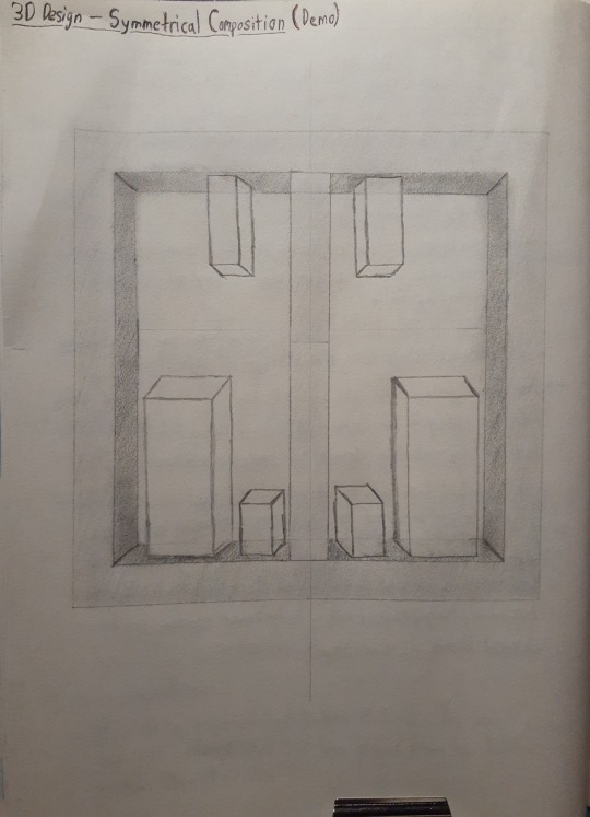
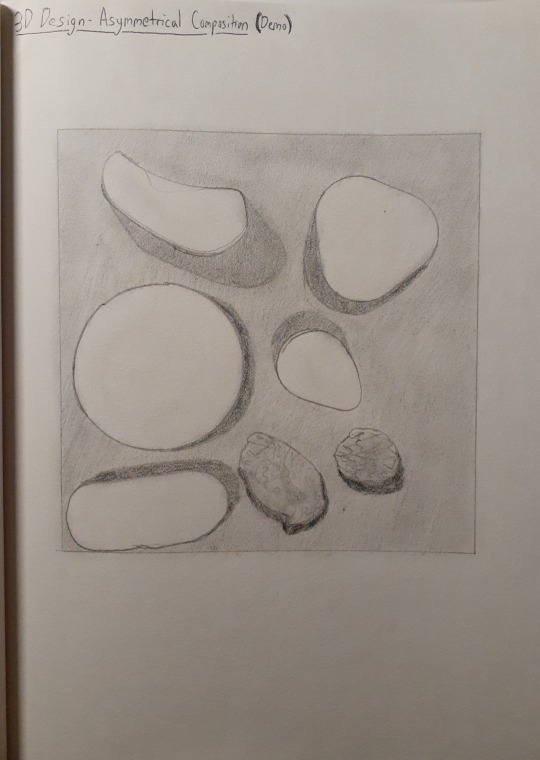
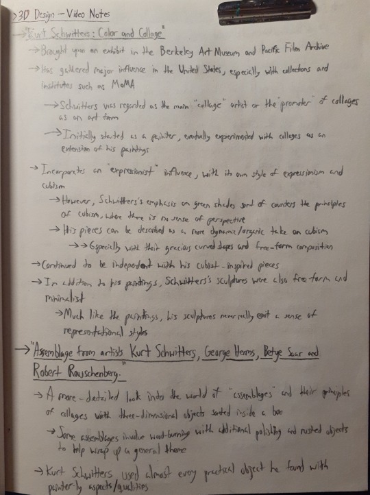
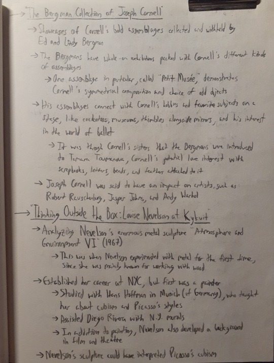
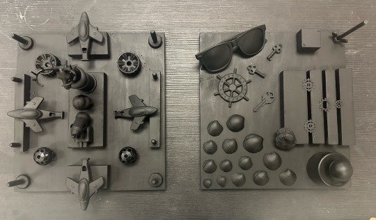
04/11/24 - 3D Design - FINAL CURATED PORTFOLIO
1. Video notes and sketched ideas for symmetrical and asymmetrical composition:
2. Process photos for the assemblages:
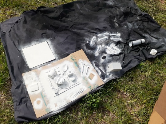
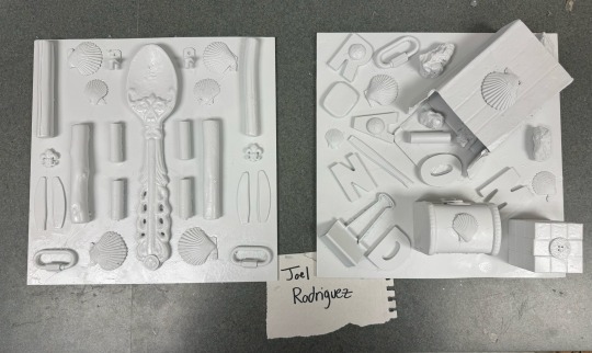
3. Side-by-side symmetrical and asymmetrical assemblages: “Home” & “Random Nature”:
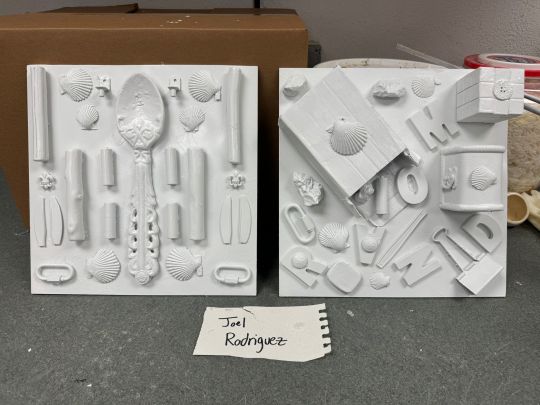
For this diptych, I was tasked to explore different ideas with symmetrical and asymmetrical composition. Both pieces were made over the span of two weeks from last Tuesday up to today.
I wanted to take a more spacious approach with my symmetrical piece on the left. The piece is called “Home” and contains assortments of plastic cutlery (from knives to spoons), sea shells, wooden branches, buttons, batteries, and items of nature and office environments. I’ve assembled these items to portray a feeling of being inside your home, where there is always just a mixture of items for working, decoration, and collecting. I’ve made the giant rustic spoon be the main hook of the piece because it symbolizes how antique models of silverware (mostly wooden) would be used to decorate the kitchen. The other hook would be the branches and sea shells, because it reminds you of the child-like feeling of playing outside in the backyard and beach. The chain-links and batteries symbolize your environment slowly turning into an office space in terms of professionalism.
As for the piece on the right, “Random Nature” is all about embracing sudden changes in settings for the items being used. Every single item here comes from a different background and as seen here, they all clash together in different spots. This piece represents the idea of randomness and truly embraces it by simply scattering all of the items around and leaving only little negative space in the composition. In addition, it does this by bringing over a select few of the same items used in “Home” but also inserting new objects found in backyards and other grassy areas. From the box being knocked over implying that there were items being left over inside it to the letters hidden in the piece spelling “Random” fittingly enough, “Random Nature” develops a sense of having scattered ideas while also allowing space to formulate between them.
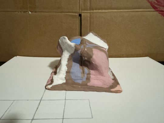
4. Process photos for soap structure:
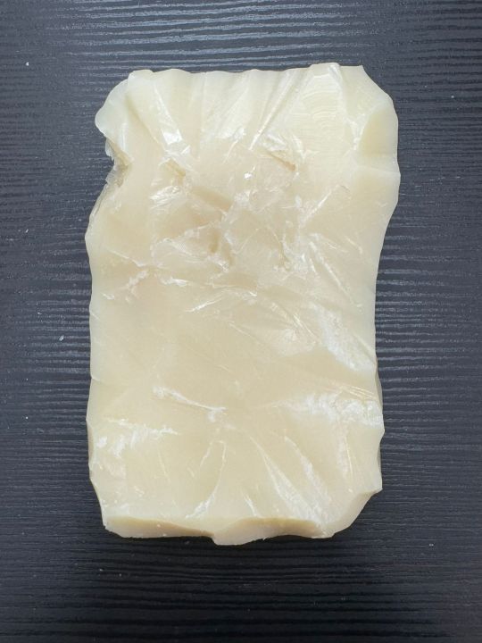
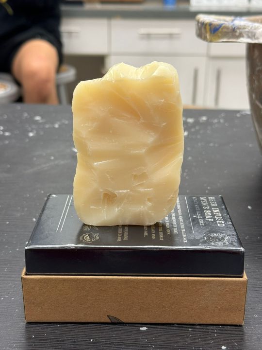
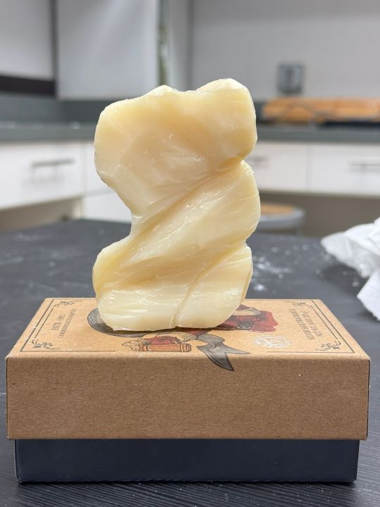
5. Photo shoot of soap sculpture: "Daze":
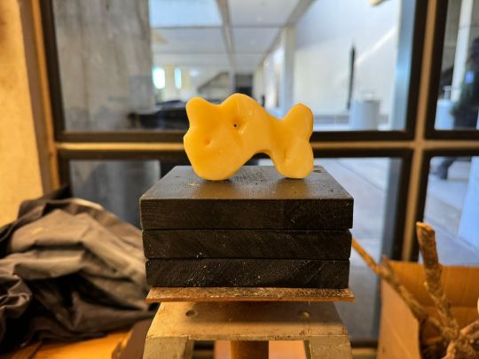
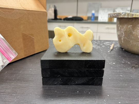
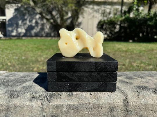
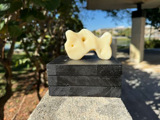
For the last two weeks, I was tasked with turning a beige bar of scented soap into an abstract sculpture. The piece was designed to have three openings that surround the soap through different wedges and inclines. The tool used to carve the soap was a smooth carving knife and the black wooden base serving as a platform is comprised of three wooden blocks glued and pasted on top of each other and spray-painted with matte black.
The process of carving the soap was starting with removing the sharp edges of the rectangular soap and curving them more prevalently, with a large lump on the right side in addition to more jagged curves on the left side. With disjointed lumps on the top of the front side and the bottom of the back side, the piece is carved smooth with the exception of a few rough surfaces in order to describe the feelings of smoothness and roughness countering each other. With the three openings placed around the piece, they are not placed in the same spot through both sides. Instead, they are carved in different places to imply that the inside of the soap is an indirect labyrinth of passages instead of just raw oils.
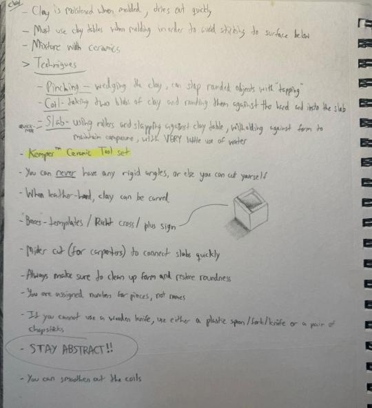
6. Process photos of ephemeral art:
(Missing)
This will be replaced with my notes for techniques with sculpting clay that I’ve took in class:
7. Photo shoot of ephemeral Art: "Sail":
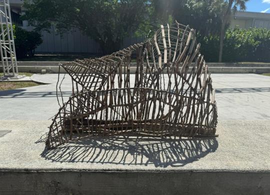
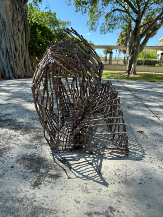
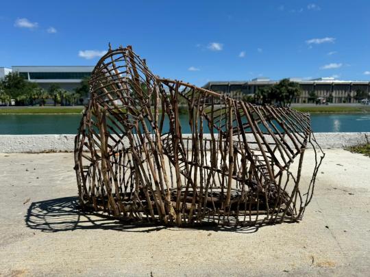
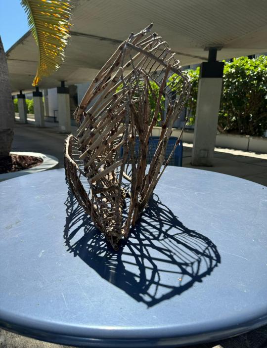
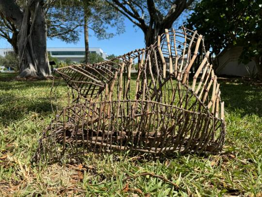
For the ephemeral wood structure, over the course of a few weeks, we were tasked with creating abstract works that "last for a short while." As the term "ephemeral" would suggest, our sculptures suggest that the piece is slowly disappearing as time goes on, whether that would be through the rough angles or the connected branches that somewhat overlap each other almost like the structure is rounded. The pieces were all assembled with sticks gathered around the grassy areas near our studio and hot glue. For my piece, I wanted to look for different ways to make the piece cross itself out by overlapping itself in different directions. I have struggled a bit with not making my piece seem triangular from any viewpoint because whilst constructing the base, I was trying to make the individual sticks connect to each other on different ends and accidentally formed objective sections from those ends of the piece, which I have rearranged in order to make the piece more abstract (and seem less "grounded"). It was quite fun coming up with different ways to make the piece more angled and stretched out in order to make the piece imply that it is slowly stretching itself out so that it could be close to becoming more transparent (which almost fits the purpose of making something that is ephemeral).
8. Ceramic sculpture - photos of process:
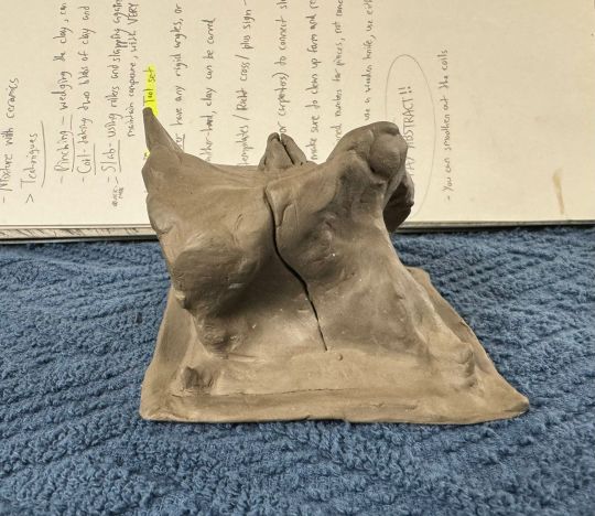
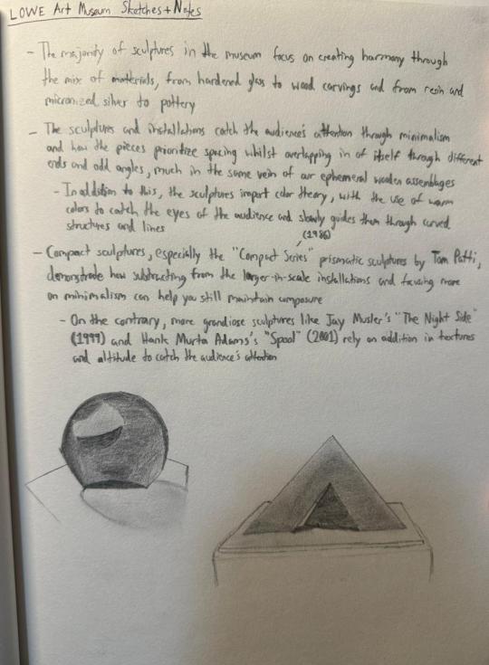
9. Museum sketches and studies:
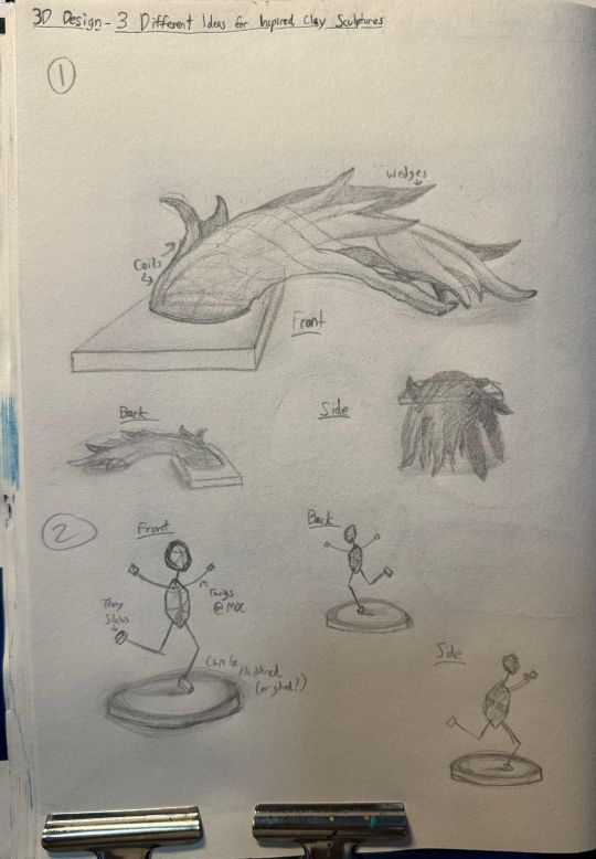
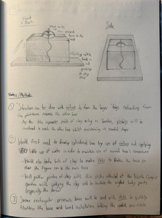
10. A few pages from my sketchbook throughout the semester:
Final Artist's Statement:
Throughout the semester, I've experimented with different techniques in developing my three-dimensional assemblages and sculptures in addition to working with different processes in constructing them. For example, I have used the "additive" process, which is a process in which you carefully add different spots of composition whilst paying attention to spacing and how it affects the harmony of the piece. In addition to the additive process, I have also used the "subtractive" process which involves minimalizing the composure of the piece whilst being mindful of negative space. Moreover, the "constructive" and "critical thinking" processes include coming up with relative significance for the use of invisible composition and harmony to create eye-catching pieces.
My favorite process would have to be the constructive process because it would help me control just how much realism I can put into a piece's meaning whilst arranging the pieces around so that it would be more leaning towards an abstract meaning. I would personally recommend this course because it enables you to be creative with making three-dimensional sculptures and installations with different techniques whilst also giving you the tools to experiment with said techniques!
Missing:
- 6. Process photos of Ephemeral art:
The reason why I haven’t taken any photos of my ephemeral art “Sail” was because I forgot to take photos of my progress throughout the weeks I was working on them. This will be substituted with my notes for techniques with using clay.
0 notes
Text

#psychogeography#urban landscape#street photography#urbanphotography#walkingphotography#urbandecay#new topographics#new topographers#southern california#psychogeographic#halfframe#diptych#half frame#canon#point and shoot#film photograhers#35mm film#analog photography#analog#alteredlandscape#los angeles#cityscape
19 notes
·
View notes
Text
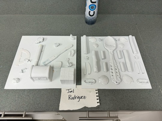
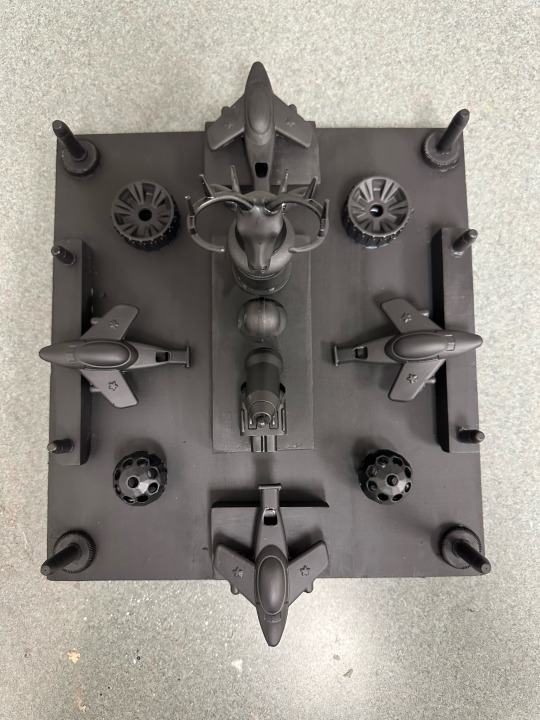
3D Art
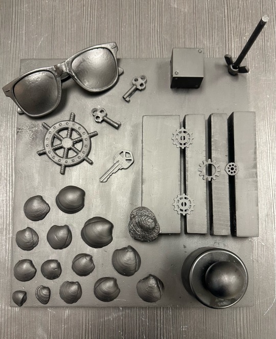
The Symmetrical and Asymmetrical Assemblage Diptych assignment, inspired by Betye Saar was an amazing opportunity to explore working with different materials and techniques I had not used before. I initially began collecting whatever objects I could find in my house such as scraps of wood, bottle caps, perfume caps, collected seashells, toy airplanes, toy balls and wheels, bullets, keys, and even sunglasses. Eventually, once I had enough items, the combination of multiple ones helped create some type of story or theme. Things such as the planes, deer head cap and bullets emulate what many American men enjoy, hunting, shooting, and the ability to travel. More relaxed figures like the seashells, glasses, keys, and boat steering wheel represented the beach or the ocean. In my pieces it is very apparent which is the symmetrical one vs which is the asymmetrical one. For the symmetrical assemblage, I tried using objects that were evenly shaped that I had at least one or two of or multiples in even numbers as well as alighting my objects evenly. For the asymmetrical one, I used objects that were more uneven and abstract like the seashells and pieces that I had in odd numbers. The main reason as to why I used black spray paint for both of my pieces is because It looked more clean and sleek as well as the fact that even though they’re supposed to be opposites in terms of symmetry, they are both meant to cohesively work together and tell their own stories. I believe that my assignments were completed successfully because I followed the instructions but found a way to have fun with it. Creating these two pieces was very enjoyable because I got to experience using materials I hadn’t experimented with before. Spray paint, although more difficult to use than I thought it would be, was so fun! The process of placing, rearranging, and hot gluing the items onto the base was very enjoyable because it was a new way to articulate ideas while narrating a story or message. Overall it was a good experience that taught me many new things as an artist.
Symmetrical and Asymmetrical:
0 notes
Text

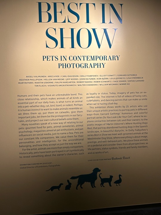
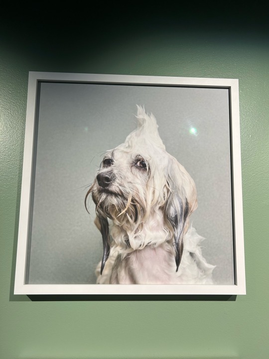


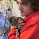
In Fotografiska there are multiple exhibitions based on the art and professionalism behind photography. On floor 5 there is an exhibition of the name “Best in Show” where photos are captured of various animals posed, natural, or documented. With 25 artists each wall displays their work meticulously where over 100 pieces are visible. The exhibit focuses on both 2-dimensional and 3-dimensional photography. This installation focuses on portraying pets in a substantial ways where they are friends, nature, apart of the household, respect and art in one beautiful conglomeration. Each of the artists have a motive behind what they shoot and use different techniques, angles, colors, perspectives. Each creation is unique and memorable explaining further why it was chosen for this experience. For example, Sophie Gamand in the series Wet Dog embarks a journey on understanding the layers of bath time with dogs, such as reactions, domestication and humanity’s relationship with vulnerability in bath time. She photographs in portrait mode using the dogs head-shots for her production in 2013-2014. The lens she uses is a Nikon 24-70mm f/2.8 lens.
During the visit at Fotografiska it is apparent each photograph represented to visitors was carefully selected because of the features and message behind every photo. Each photograph is different to the next but the two photographs chosen are specifically interesting since the context of each one. Both of these photos use normal lens with a fast shutter speed. Gerrard Gethings and Walter Chandoha are two incredible pet photographers who focus on capturing the authentic essence of life. Walter Chandoha is notorious for his cat photographs totaling up to thousands of them with him portraying cats iconicity in the photography industry with the nickname the “Godfather of feline photography”. Like the rest of the exhibit, the photo is fascinating, perfectly timed, shows character and tone, the photo chosen is a great summary of the exhibit. (Walter Chandoha’s “Paula and her kitty”) Multiple photos were taken on film in black and white. Observing the black and white photographs it can be noted the texture and exposure of light additionally the attention to detail is astonishing. The way the light reflects on the little girl’s hair with her cat is an example of a quality choice of deciding monochromez “Paula and her kitty” is a happy photo that evokes a smile simply. Similarly, Gethings composed photos generating smiles except with the concept of comparing household dogs and cats to their owners. This photo is a portrait too that utilizes color to catch the eye with the uncanny resemblance and is a posed photo. Chandoha is candid.
Interacting with all the photographs of the exhibit, I realized there is a staying power to each one that makes them unique to other animal photography. In Chandoha’s “Paula and her kitty”, the viewer is drawn to the photo through the authenticity of the photo itself, while Gethings diptychs are equally as fascinating. I enjoyed this exhibition because of how practical yet complex it was, every wall encompassed a great story and keen composition. Animals are a part of everyday life to some humans, we as humans are also animals so understanding the concepts of this field of photography and context helped me bond further with my pets.
0 notes
Text
A Virtual Gallery: In Appreciation of Diptychs.
Recently diptychs came to mind. Was considering a film camera to suggest my son use during a Father/Son galavanting session. The Kodak Ektar H35 (Link to my review and first post to 35mmc.) came to mind. No focusing or other controls so no planning required. Enjoy the moment. Point and shoot. This led me to search Flickr for diptychs and this brought a couple of surprises.
I had created a…
View On WordPress
0 notes
Text
LIA - Work in Progress Part I
"Everyday People, Places and Things"
I will be making diptychs that will portray the daily lives of individual members of my family (mom, dad, sister and me). I will be focusing on our routine and will be capturing the important part/s.
I am yet to decide of how I will creatively and uniquely show these in photographs. One of my ideas is shooting in the point of view of our dog.
Here are two examples of works that I will be using as an example.
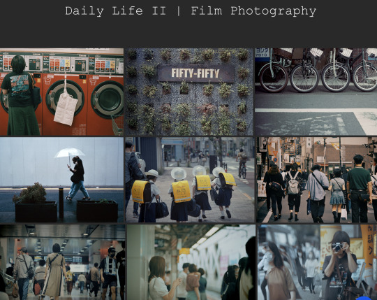
Hiroki Terashima's "Daily Life II"
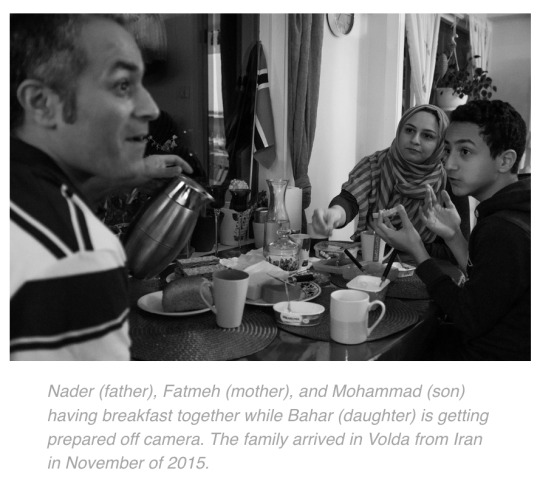
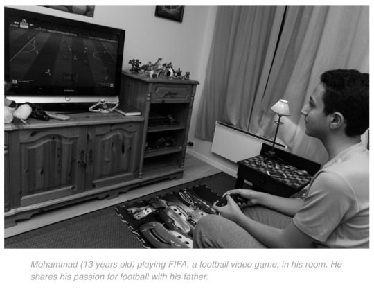
2. Lore Thouvenin's "Portrait : An Iranian family in Norway"


0 notes
Last Seen Blogs

arutai
Strange Array

bluurbed
Special Ed
karenfordonte
Caring For Donte
aidengrimes
Aiden Grimes
omgsims4isdabest
Sims4Brenawynn