#textstyles
Text
✨ Want to add a touch of style to your text on iPhone? Let's italicize! ✨
Here’s how you can do it:
Messages App: Highlight the text you want to italicize, tap "B/I/U" in the pop-up menu, and select "Italic."
Notes App: Similar to Messages, highlight the text, tap "B/I/U," and choose "Italic."
Mail App: Highlight the text, tap the "Aa" icon, then select "Italic."
📱 Tip: This works for most Apple apps that support text formatting!
Have you used this feature? Share your favorite tips below! 👇
#iPhoneTips#TextStyling#AppleHacks#MobileTech#iOSFeatures#SmartphoneTips#TextFormatting#TechTricks#ProductivityHacks#TechSavvy
0 notes
Video
youtube
How to create doted text outline in Adobe illustrator | KavuCreative
Dive into the world of creative design with my latest tutorial on Kavu Creative! Today, I'll guide you through the process of creating a stylish "Doted Text" outline in Adobe Illustrator. Follow these simple steps: select the Type Tool, write your chosen word (I'm using 'DOTED'), customize the font style and size, play with colors, and align to perfection. I'll show you how to transform it into a sleek outline with a dash of flair. Ready to master this design trick? Watch now, and let your creativity flow! 🚀💡 #AdobeIllustrator #TextEffects #DesignTutorial #CreativeDesign #IllustratorMagic #DotedText #DesignTips
#youtube#kavucreative#logodesign#doted#dotedtext#3dtext#textstyle#logomaker#logomaster#adobe#illustrator
1 note
·
View note
Text
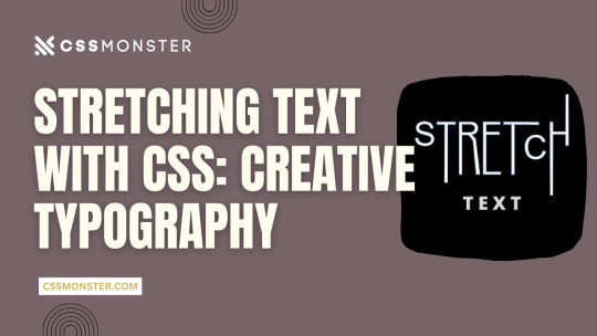
Stretching Text with CSS: Creative Typography
1. Introduction
Typography is a critical element in web design, influencing user experience, readability, and aesthetics. With the power of CSS (Cascading Style Sheets), web designers can enhance their text's visual impact, making it more engaging and expressive. In this blog post, we'll explore various techniques for stretching and warping text with CSS, allowing you to create captivating and unique typography on your website. Let's dive into the world of creative typography through CSS.
2. Understanding CSS Typography
Before we delve into the creative possibilities of text stretching and warping, it's essential to have a solid grasp of CSS typography fundamentals. Understanding these basic concepts will provide a strong foundation for the exciting techniques we'll explore later.
Key CSS Typography Properties
CSS offers several properties for controlling the appearance of text, allowing you to fine-tune the typography of your web content. Here are some key CSS typography properties:
- Font Properties: CSS enables you to set font family, size, style, and weight to define how text appears.
- Text Alignment: You can control the alignment of text within its container using properties like 'text-align.'
- Line Spacing: 'line-height' determines the vertical spacing between lines of text, affecting readability and aesthetics.
Font Stacks and Fallbacks
When specifying fonts, it's essential to provide a font stack. A font stack lists multiple fonts in order of preference. For example:
CSS
font-family: 'Arial', 'Helvetica', sans-serif;
If the user's device doesn't have the first font (Arial), it will fall back to the second font (Helvetica), and so on, until a suitable font is found or the generic 'sans-serif' font is used.
Responsive Typography
Consider implementing responsive typography by using relative units like 'em' or 'rem' for font sizes. This ensures that text adapts well to different screen sizes, making your website more user-friendly.
Web Fonts and @font-face
For unique and custom typography, web fonts are a game-changer. You can use the '@font-face' rule to load custom fonts on your website. There are numerous web font services available that provide a wide range of fonts for use in web design.
Typography Best Practices
Effective typography should prioritize readability and accessibility. Choose fonts that are easy to read and provide enough contrast between text and background. Maintain consistent typography across your website for a professional and cohesive look.
Using CSS for Typography
CSS plays a crucial role in controlling the appearance of text. We'll now explore how you can use CSS to stretch and warp text creatively, allowing you to design unique and visually striking typography for your web projects.
3. Stretching Text Horizontally
Stretching text horizontally is a creative way to modify the appearance of your typography. This technique can be particularly useful for creating eye-catching headings or stylized text elements. Let's explore some CSS properties and methods to achieve this effect.
Using 'letter-spacing'
The 'letter-spacing' property allows you to control the space between characters in a text element. By increasing the value of 'letter-spacing,' you can make the characters spread out, effectively stretching the text horizontally. For example:
CSS
h1 {
letter-spacing: 5px;
}
This CSS rule increases the letter spacing for all h1 headings, resulting in stretched text. You can adjust the pixel value to achieve the desired effect.
Applying 'text-transform'
The 'text-transform' property is another tool in your arsenal. While its primary purpose is to control the capitalization of text, it can be creatively used to stretch text. For example, by applying 'text-transform: uppercase;' to a text element, you can make all characters in the text appear in uppercase, effectively stretching them horizontally.
Combining Techniques
To create more complex effects, consider combining 'letter-spacing' and 'text-transform.' By adjusting both properties, you can achieve unique typographic results. For example, you can increase 'letter-spacing' while applying 'text-transform: uppercase;' to make text both wider and in uppercase letters.
Responsive Considerations
Keep in mind that while stretching text horizontally can be visually appealing, it may impact text legibility. Be cautious when using extreme values for 'letter-spacing,' as it can cause text to become less readable, especially on smaller screens. Always test and optimize your typography for different devices and screen sizes to ensure a positive user experience.
Examples
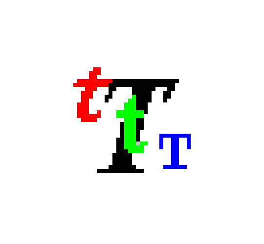
Let's take a look at a couple of examples to see the impact of stretching text horizontally using CSS:
Original TextStretched TextCreativeC r e a t i v eTypographyT y p o g r a p h y
In the table above, you can see how the 'letter-spacing' property can be used to stretch text horizontally.
Stretching text horizontally with CSS is just one of the many techniques available for creative typography. In the next sections, we'll explore more ways to manipulate text and achieve unique typographic effects.
4. Stretching Text Vertically
Stretching text vertically is another intriguing way to manipulate your typography creatively. While this technique is less common than horizontal stretching, it can add a unique and eye-catching touch to your web design. Let's explore how to stretch text vertically using CSS.
Using 'line-height'
The primary property for stretching text vertically is 'line-height.' The 'line-height' property determines the height of each line of text. By increasing the 'line-height' value, you can stretch the text vertically. For example:
CSS
h1 {
line-height: 2.0;
}
This CSS rule doubles the line height for all h1 headings, effectively stretching the text vertically. Adjust the 'line-height' value as needed to achieve your desired effect.
Using Pseudo-Elements
Another approach to stretching text vertically is by using pseudo-elements, such as '::before' and '::after.' By adding extra vertical space above or below the text, you can create a vertical stretching effect. Here's an example:
CSS
h2::before {
content: "";
display: block;
height: 20px;
}
This CSS rule adds 20 pixels of empty space above every h2 heading, stretching the text vertically.
Combining Techniques
As with horizontal stretching, you can combine techniques to create more complex effects. For instance, you can adjust both 'line-height' and use pseudo-elements to achieve a visually appealing vertical stretch.
Responsive Considerations
Keep in mind that stretching text vertically can affect text legibility and line spacing. Use this technique sparingly and consider its impact on different screen sizes. Ensure that the text remains readable and aesthetically pleasing across various devices.
Examples
Let's take a look at a couple of examples to see the impact of stretching text vertically using CSS:
Original TextStretched TextCreativeCreativeTypographyTypography
In the table above, you can see how the 'line-height' property can be used to stretch text vertically. The examples illustrate the impact on specific words.
Stretching text vertically offers a unique way to enhance your web typography, and it can be particularly effective for headings, titles, and other prominent text elements. In the following sections, we'll continue exploring more creative text manipulation techniques with CSS.
5. Skewed Text Effects
Skewing text is a fascinating way to create dynamic and visually striking typography. CSS provides the 'transform' property to achieve skewing effects, adding a sense of motion and depth to your text. Let's dive into how you can apply skewed text effects with CSS.
Using 'transform: skew()'
The 'transform' property in CSS allows you to apply various transformations to elements, including skewing. The 'skew()' function within the 'transform' property lets you specify both horizontal and vertical angles for skewing. Here's an example:
CSS
h1 {
transform: skew(20deg, 10deg);
}
This CSS rule skews the text within all h1 headings by 20 degrees horizontally and 10 degrees vertically. Adjust the angle values to create different skewing effects.
Skewing Elements on Hover
To create interactive and engaging text effects, you can apply skewing on hover. This way, text elements skew when users place their cursor over them. Here's an example:
CSS
h2:hover {
transform: skew(10deg, 5deg);
}
In this CSS rule, h2 headings will skew when hovered over, providing a dynamic and playful user experience.
Combining Skew with Other CSS Properties
Skewed text can be even more exciting when combined with other CSS properties like color, background, and transitions. You can create eye-catching text effects by incorporating skewing with these elements.
Responsive Considerations
Keep in mind that skewed text can impact text legibility, so it's important to use this technique thoughtfully. Ensure that your text remains readable on different screen sizes and devices. Consider fallback styles for unsupported browsers that don't handle CSS transformations.
Examples
Let's take a look at a couple of examples to see the impact of skewing text using CSS:
Original TextSkewed TextCreativeCreativeTypographyTypography
In the table above, you can see how the 'transform: skew()' property can be used to create skewed text effects. The examples illustrate the impact on specific words.
Skewing text adds a dynamic and visually captivating dimension to your typography. When used effectively, it can make your web design stand out and engage users. In the following sections, we'll continue exploring more techniques for creative text manipulation with CSS.
6. Warping Text with CSS
Warping text is a creative and eye-catching way to make your typography truly unique. CSS offers several properties and techniques to bend and distort text, providing a playful and dynamic aspect to your web design. Let's explore how you can warp text using CSS.
Using 'transform: perspective()'
The 'transform' property in CSS includes the 'perspective()' function, which allows you to apply a 3D perspective effect to text. This can give the illusion of text being bent or wrapped around a virtual surface. Here's an example:
CSS
h1 {
transform: perspective(500px) rotateX(20deg);
}
This CSS rule applies a perspective to all h1 headings, making them appear as if they are bent along the X-axis. You can adjust the 'perspective()' value and the 'rotateX()' angle to achieve different warping effects.
Using 'transform: warp()'
CSS introduces a 'warp()' function within the 'transform' property that allows you to warp text. This function enables you to specify the curvature, or 'warp' of the text, creating the appearance of text being bent along a curve. Here's an example:
CSS
h2 {
transform: warp(bulge 10% 50%);
}
This CSS rule warps all h2 headings in a bulge pattern, with a 10% curvature and a 50% offset, resulting in a text that appears to follow a curved path. You can experiment with different warp patterns and values to achieve various warping effects.
Combining Warping with Other Properties
Warping text can become even more exciting when combined with other CSS properties like colors, backgrounds, and animations. This allows you to create captivating and dynamic text effects that engage your users.
Responsive Considerations
Warping text can be a visually compelling technique, but it's essential to consider its impact on text legibility. Test and optimize your warped text to ensure it remains readable on different screen sizes and devices. Additionally, consider fallback styles for browsers that don't support CSS transformations.
Examples
Let's take a look at a couple of examples to see the impact of warping text using CSS:
Original TextWarped TextCreativeCreativeTypographyTypography
In the table above, you can see how the 'transform: warp()' property can be used to create warped text effects. The examples illustrate the impact on specific words.
Warping text adds a dynamic and playful dimension to your typography, making it visually appealing and engaging. When used creatively, it can enhance the overall design of your web content. In the following sections, we'll continue exploring more techniques for text manipulation with CSS.
7. Overlapping Text
Overlapping text is a creative technique that allows you to add depth and dimension to your typography, creating visually engaging designs. By layering text elements over one another, you can achieve various effects that draw the viewer's attention. Let's explore how to overlap text using CSS.
Using 'position' and 'z-index'
CSS provides the 'position' property, which allows you to control the positioning of text elements within their containers. By using 'position: absolute;' and 'z-index' values, you can stack text elements on top of each other. Here's an example:
CSS
h1 {
position: absolute;
z-index: 2;
}
h2 {
position: absolute;
z-index: 1;
}
In this example, the 'h1' and 'h2' headings are positioned absolutely, and 'z-index' values determine their stacking order. The heading with a higher 'z-index' appears on top of the other, creating the overlap effect.
Creating Text Shadows
Another approach to overlap text is by using text shadows. By applying a subtle text shadow to text elements, you can give the impression of depth and overlapping. Here's an example:
CSS
h3 {
text-shadow: 2px 2px 4px rgba(0, 0, 0, 0.5);
}
This CSS rule adds a text shadow to the 'h3' heading, making it appear as if it is overlapping the content below. You can adjust the shadow's offset, blur, and color for different effects.
Combining Overlapping Techniques
To create more intricate and dynamic overlapping text effects, you can combine different techniques. For example, you can use both 'position' and text shadows to make text elements overlap and cast shadows simultaneously.
Responsive Considerations
When implementing overlapping text, it's crucial to consider its impact on readability. Overlapping text can reduce legibility, especially when overlaid on top of each other. Use this technique selectively and test its effects on various screen sizes. Ensure that your text remains clear and accessible.
Examples
Let's take a look at a couple of examples to see the impact of overlapping text using CSS:
Original TextOverlapped TextCreative
C
r
e
a
t
i
v
e
Typography
Typography
In the table above, you can see how the 'position' property and text shadows can be used to create overlapping text effects. The examples illustrate the impact on specific words.
Overlapping text is a creative way to add depth and dimension to your typography, making it more visually engaging. When used thoughtfully, it can contribute to a unique and memorable design. In the following sections, we'll continue exploring additional techniques for creative text manipulation with CSS.
8. Combining Techniques
Combining various text manipulation techniques in CSS can lead to even more exciting and dynamic typography. By layering, skewing, stretching, and warping text elements, you can create visually stunning and unconventional text effects. Let's explore how to combine these techniques for truly unique typography.
Layering and Skewing
Combining layering and skewing effects can produce intriguing results. For example, you can position two text elements on top of each other using 'position' and 'z-index' and then apply a 'skew()' transformation to one of them. This creates a dynamic and 3D-like appearance, with one text element appearing to bend while overlapping the other.
Stretching and Warping
Stretching and warping text elements can be combined to create even more unconventional typography. For instance, you can stretch text horizontally with 'letter-spacing' and then apply a 'warp()' transformation to bend the text. This combination can lead to text that appears to be pulled and twisted, adding depth and movement to your design.
Interactive Hover Effects
You can take your typography to the next level by adding interactivity. Apply hover effects to your text elements to make them respond to user interactions. For example, when a user hovers over a text element, you can simultaneously apply skewing, stretching, or warping transformations, creating an engaging and playful experience.
Layering with Shadows
Combine layering with text shadows to create a shadowed depth effect. By positioning text elements with 'position' and 'z-index' and then applying text shadows, you can make text appear as if it's floating above or below the surface. Adjust the shadow's blur and color for different shadowed effects.
Responsive Design
While combining techniques can yield exciting results, it's essential to consider responsive design. Test the combined effects on various screen sizes and devices to ensure that your typography remains clear and legible.
Read the full article
0 notes
Text
Microsoft Publisher 97 - TEXTSTYLES
76 notes
·
View notes
Text
Gamma matrices - Wikipedia
NFT
Pauli's equation is derived by requiring minimal coupling, which provides a g-factor g=2. Most elementary particles have anomalous g-factors, different from 2. In the domain of relativistic quantum field theory, one defines a non-minimal coupling, sometimes called Pauli coupling, in order to add an anomalous factor
Candice Kim solution technology management system AI
�
�
�
�
→
�
�
�
�
−
�
�
�
�
�
+
�
�
�
�
�
�
�{\displaystyle \gamma ^{\mu }p_{\mu }\to \gamma ^{\mu }p_{\mu }-q\gamma ^{\mu }A_{\mu }+a\sigma _{\mu \nu }F^{\mu \nu }}
where
�
�p_\mu is the four-momentum operator,
�
�A_{\mu } is the electromagnetic four-potential,
�
a is proportional to the anomalous magnetic dipole moment,
�
�
�
=
∂
�
�
�
−
∂
�
�
�{\displaystyle F^{\mu \nu }=\partial ^{\mu }A^{\nu }-\partial ^{\nu }A^{\mu }} is the electromagnetic tensor, and
�
�
�
=
�
2
[
�
�
,
�
�
]
{\textstyle \sigma _{\mu \nu }={\frac {i}{2}}[\gamma _{\mu },\gamma _{\nu }]} are the Lorentzian spin matrices and the commutator of the gamma matrices
�
�\gamma ^{\mu }.[4][5] In the context of non-relativistic quantum mechanics, instead of working with the Schrödinger equation, Pauli coupling is equivalent to using the Pauli equation (or postulating Zeeman energy) for an arbitrary g-factor.
Euler hub equations to functions
So ranged your ranges
What's up? Sky gas temp freezing problem
2 notes
·
View notes
Text
receive_sharing_intentとは、Flutterで他のアプリから共有されたテキストや画像、URLなどを受け取るためのプラグインです。このプラグインを使うと、Flutterアプリがシェアメニューに表示され、選択するとアプリが起動して共有されたデータを取得できます。iOSではShare Extension、AndroidではIntentという仕組みを利用しています。このプラグインの使い方は、以下のようになります。
- pubspec.yamlにreceive_sharing_intentを追加します。
- iOSとAndroidのプロジェクトに必要な設定を行います。詳細は[公式ドキュメント](^1^)を参照してください。
- Flutterのコードで、ReceiveSharingIntentクラスのメソッドやストリームを使って、共有されたデータを受け取ります。例えば、以下のようにテキストを受け取ることができます。
```dart
import 'package:flutter/material.dart';
import 'package:receive_sharing_intent/receive_sharing_intent.dart';
class ReceivePage extends StatefulWidget {
@override
_ReceivePageState createState() => _ReceivePageState();
}
class _ReceivePageState extends State<ReceivePage> {
String? _sharedText;
@override
void initState() {
super.initState();
// アプリが起動しているときにテキストを受け取る
ReceiveSharingIntent.getTextStream().listen((String value) {
setState(() {
_sharedText = value;
});
}, onError: (err) {
print("エラー: $err");
});
// アプリが起動していないときにテキストを受け取る
ReceiveSharingIntent.getInitialText().then((String? value) {
setState(() {
_sharedText = value;
});
});
}
@override
Widget build(BuildContext context) {
return Scaffold(
appBar: AppBar(
title: Text('Receive Example'),
),
body: Center(
child: Text(
_sharedText ?? 'テキストがありません',
style: TextStyle(fontSize: 24),
),
),
);
}
}
```
このプラグインについてもっと知りたい場合は、[公式ドキュメント](^1^)や[参考記事](^2^) ³をご覧ください。
ソース: Bing との会話 2024/2/22
(1) Flutterでブラウザなどからシェアでアプリに情報を渡す - Zenn. https://zenn.dev/kentaroh/articles/8ec2962a5fadfe.
(2) Flutterでブラウザなどからシェアでアプリに情報を渡す - Zenn. https://zenn.dev/kentaroh/articles/8ec2962a5fadfe.
(3) 【Flutter 3.16】Share Extensionの画面をFlutterで作り .... https://zenn.dev/sora382/articles/cdeee519f3c7f7.
(4) 【Flutter】テキストファイルを共有で受け取れなかった話 - Qiita. https://qiita.com/mimi_sss/items/9cb3de98004d557291b4.
(5) undefined. http://www.apple.com/DTDs/PropertyList-1.0.dtd.
1 note
·
View note
Text
How to Design Custom Flutter Buttons

Flutter provides a flexible and powerful framework for designing user interfaces, including buttons. While Flutter offers a variety of built-in button widgets, you may want to create custom buttons that match your app's unique design. In this blog post, we will walk through the steps to design custom Flutter buttons.
Step 1: Define the Button Design
The first step in designing a custom Flutter button is to define its visual appearance. Consider the following aspects:
Button Shape: Decide whether you want a rectangular, circular, or any other shape for your button.
Button Size: Determine the dimensions of your button, such as width and height.
Button Colors: Choose the background color, text color, and any other colors you want to use for your button.
Button Typography: Select the font style, size, and weight for the button text.
Step 2: Create a Custom Button Widget
Once you have defined the design of your custom button, you can create a custom widget to encapsulate its functionality and appearance. Here's an example of how you can create a custom button widget:
import 'package:flutter/material.dart';
class CustomButton extends StatelessWidget {
final String text;
final VoidCallback onPressed;
const CustomButton({required this.text, required this.onPressed});
@override
Widget build(BuildContext context) {
return ElevatedButton(
onPressed: onPressed,
child: Text(
text,
style: TextStyle(
fontSize: 16,
fontWeight: FontWeight.bold,
),
),
style: ElevatedButton.styleFrom(
primary: Colors.blue, // Set the background color of the button
onPrimary: Colors.white, // Set the text color of the button
shape: RoundedRectangleBorder(
borderRadius: BorderRadius.circular(8), // Set the button shape
),
),
);
}
}
In this example, we create a CustomButton widget that extends the StatelessWidget class. The widget takes two required parameters: text for the button label and onPressed for the button's callback function.
Step 3: Implement the Custom Button
To use the custom button in your Flutter app, follow these steps:
Import the custom button widget into your Dart file.
Add an instance of the CustomButton widget to your app's widget tree.
Provide the necessary parameters, such as the button text and the callback function.
Here's an example of how you can implement the custom button in your app:
import 'package:flutter/material.dart';
void main() {
runApp(MyApp());
}
class MyApp extends StatelessWidget {
@override
Widget build(BuildContext context) {
return MaterialApp(
home: Scaffold(
appBar: AppBar(
title: Text('Custom Button Example'),
),
body: Center(
child: CustomButton(
text: 'Click Me',
onPressed: () {
// Add your button's functionality here
print('Button clicked!');
},
),
),
),
);
}
}
In this example, we create a simple Flutter app with a custom button. When the button is clicked, it prints a message to the console.
Conclusion
Designing custom Flutter buttons allows you to create buttons that align with your app's unique design requirements. By following the steps outlined in this blog post, you can easily create and implement custom buttons in your Flutter app.
I hope this blog post helps you in designing custom Flutter buttons. Happy coding!
0 notes
Text
How to Display a Circular Timer in Flutter?
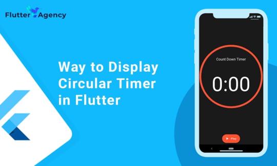
You can make stunning, native-looking apps for Android and iOS using the popular cross-platform Flutter mobile app programming framework. Circular timer creation is just one of the numerous things you can accomplish with Flutter. A countdown clock or a stopwatch are two examples of circular timers that are excellent for displaying the amount of time left on a job.
In Flutter, there are some different methods to build a circular timer. This article will teach you how to design a circular clock in Flutter. In addition, you will know how to change the timer’s look. You can learn more about displaying a circular timer in Flutter by reading the tutorial below. Also you can read this blog from our official website Circular Timer in Flutter.
Developing a Custom Circular Timer in Flutter
There are several methods in Flutter for displaying a circular timer outside the circular_countdown_timer package. As an illustration, you might make a circular progress bar using the RadialGauge widget. The circular_countdown_timer box, on the other hand, is a more specialized widget made just for showing countdown timers. You may make a customized circular timer by following the instructions in this article after installing Flutter:
import 'package:flutter/material.dart';
import 'package:circular_countdown_timer/circular_countdown_timer.dart';
void main() {
runApp(const MyApp());
}
class MyApp extends StatelessWidget {
const MyApp({super.key});
@override
Widget build(BuildContext context) {
return MaterialApp(
title: 'Flutter Demo',
theme: ThemeData(
primarySwatch: Colors.blue,
),
home: const HomePage(),
debugShowCheckedModeBanner: false,
);
}
}
class HomePage extends StatefulWidget {
const HomePage({super.key});
@override
State<homepage> createState() => _HomePageState();
}
class _HomePageState extends State<homepage> {
final int _duration = 10;
final CountDownController _controller = CountDownController();
@override
Widget build(BuildContext context) {
return Scaffold(
appBar: AppBar(
title: const Text("Circular Counter with countdown timer"),
),
body: Center(
child: CircularCountDownTimer(
// Countdown duration in Seconds.
duration: _duration,
// Countdown initial elapsed Duration in Seconds.
initialDuration: 0,
// Controls (i.e., Start, Pause, Resume, Restart) the Countdown Timer.
controller: _controller,
// Width of the Countdown Widget.
width: MediaQuery.of(context).size.width / 2,
// Height of the Countdown Widget.
height: MediaQuery.of(context).size.height / 2,
// Ring Color for Countdown Widget.
ringColor: Colors.blue,
// Ring Gradient for Countdown Widget.
ringGradient: null,
// Filling Color for Countdown Widget.
fillColor: Colors.red,
// Filling Gradient for Countdown Widget.
fillGradient: null,
// Background Color for Countdown Widget.
backgroundColor: Colors.amber,
// Background Gradient for Countdown Widget.
backgroundGradient: null,
// Border Thickness of the Countdown Ring.
strokeWidth: 20.0,
// Begin and end contours with a flat edge and no extension.
strokeCap: StrokeCap.round,
// Text Style for Countdown Text.
textStyle: const TextStyle(
fontSize: 33.0,
color: Colors.black,
fontWeight: FontWeight.bold,
),
// Format for the Countdown Text.
textFormat: CountdownTextFormat.S,
// Handles Countdown Timer (true for Reverse Countdown (max to 0), false for Forward Countdown (0 to max)).
isReverse: true,
// Handles Animation Direction (true for Reverse Animation, false for Forward Animation).
isReverseAnimation: true,
// Handles visibility of the Countdown Text.
isTimerTextShown: true,
// Handles the timer start.
autoStart: true,
// This Callback will execute when the Countdown Starts.
onStart: () {
// Here, do whatever you want
debugPrint('Started Countdown');
},
// This Callback will execute when the Countdown Ends.
onComplete: () {
// Here, do whatever you want
debugPrint('Ended Countdown');
},
// This Callback will execute when the Countdown Changes.
onChange: (String timeStamp) {
// Here, do whatever you want
debugPrint('Changed Countdown $timeStamp');
},
),
),
);
}
}
</homepage></homepage>
Function to format the text.
Allows you to format the current duration to any String.
It also provides the default function in case you want to format specific moments as in reverse when reaching ‘0’ show ‘GO,’ and for the rest of the instances, follow the default behavior.
Inside the CircularCountDownTimer we have to add these below lines:
timeFormatterFunction: (defaultFormatterFunction, duration) {
if (duration.inSeconds == 0) {
// only format for '0'
return "Start";
} else {
// other durations by it's default format
return Function.apply(defaultFormatterFunction, [duration]);
}
},
Add inside the scaffold widget to control the counter
floatingActionButton: Row(
mainAxisAlignment: MainAxisAlignment.center,
children: [
const SizedBox(
width: 30,
),
_button(
title: "Start",
onPressed: () => _controller.start(),
),
const SizedBox(
width: 10,
),
_button(
title: "Pause",
onPressed: () => _controller.pause(),
),
const SizedBox(
width: 10,
),
_button(
title: "Resume",
onPressed: () => _controller.resume(),
),
const SizedBox(
width: 10,
),
_button(
title: "Restart",
onPressed: () => _controller.restart(duration: _duration),
),
],
),
Function return button
Widget _button({required String title, VoidCallback? onPressed}) {
return Expanded(
child: ElevatedButton(
style: ButtonStyle(
backgroundColor: MaterialStateProperty.all(Colors.purple),
),
onPressed: onPressed,
child: Text(
title,
style: const TextStyle(color: Colors.white),
),
),
);
}
Example
import 'package:flutter/material.dart';
import 'package:circular_countdown_timer/circular_countdown_timer.dart';
void main() {
runApp(const MyApp());
}
class MyApp extends StatelessWidget {
const MyApp({super.key});
@override
Widget build(BuildContext context) {
return MaterialApp(
title: 'Flutter Demo',
theme: ThemeData(
primarySwatch: Colors.blue,
),
home: const HomePage(),
debugShowCheckedModeBanner: false,
);
}
}
class HomePage extends StatefulWidget {
const HomePage({super.key});
@override
State<homepage> createState() => _HomePageState();
}
class _HomePageState extends State<homepage> {
final int _duration = 10;
final CountDownController _controller = CountDownController();
@override
Widget build(BuildContext context) {
return Scaffold(
appBar: AppBar(
title: const Text("Circular Counter with countdown timer"),
),
body: Center(
child: CircularCountDownTimer(
timeFormatterFunction: (defaultFormatterFunction, duration) {
if (duration.inSeconds == 0) {
// only format for '0'
return "Start";
} else {
// other durations by it's default format
return Function.apply(defaultFormatterFunction, [duration]);
}
},
// Countdown duration in Seconds.
duration: _duration,
// Countdown initial elapsed Duration in Seconds.
initialDuration: 0,
// Controls (i.e., Start, Pause, Resume, Restart) the Countdown Timer.
controller: _controller,
// Width of the Countdown Widget.
width: MediaQuery.of(context).size.width / 2,
// Height of the Countdown Widget.
height: MediaQuery.of(context).size.height / 2,
// Ring Color for Countdown Widget.
ringColor: Colors.blue,
// Ring Gradient for Countdown Widget.
ringGradient: null,
// Filling Color for Countdown Widget.
fillColor: Colors.red,
// Filling Gradient for Countdown Widget.
fillGradient: null,
// Background Color for Countdown Widget.
backgroundColor: Colors.amber,
// Background Gradient for Countdown Widget.
backgroundGradient: null,
// Border Thickness of the Countdown Ring.
strokeWidth: 20.0,
// Begin and end contours with a flat edge and no extension.
strokeCap: StrokeCap.round,
// Text Style for Countdown Text.
textStyle: const TextStyle(
fontSize: 33.0,
color: Colors.black,
fontWeight: FontWeight.bold,
),
// Format for the Countdown Text.
textFormat: CountdownTextFormat.S,
// Handles Countdown Timer (true for Reverse Countdown (max to 0), false for Forward Countdown (0 to max)).
isReverse: true,
// Handles Animation Direction (true for Reverse Animation, false for Forward Animation).
isReverseAnimation: true,
// Handles visibility of the Countdown Text.
isTimerTextShown: true,
// Handles the timer start.
autoStart: true,
// This Callback will execute when the Countdown Starts.
onStart: () {
// Here, do whatever you want
debugPrint('Started Countdown');
},
// This Callback will execute when the Countdown Ends.
onComplete: () {
// Here, do whatever you want
debugPrint('Ended Countdown');
},
// This Callback will execute when the Countdown Changes.
onChange: (String timeStamp) {
// Here, do whatever you want
debugPrint('Changed Countdown $timeStamp');
},
),
),
floatingActionButton: Row(
mainAxisAlignment: MainAxisAlignment.center,
children: [
const SizedBox(
width: 30,
),
_button(
title: "Start",
onPressed: () => _controller.start(),
),
const SizedBox(
width: 10,
),
_button(
title: "Pause",
onPressed: () => _controller.pause(),
),
const SizedBox(
width: 10,
),
_button(
title: "Resume",
onPressed: () => _controller.resume(),
),
const SizedBox(
width: 10,
),
_button(
title: "Restart",
onPressed: () => _controller.restart(duration: _duration),
),
],
),
);
}
Widget _button({required String title, VoidCallback? onPressed}) {
return Expanded(
child: ElevatedButton(
style: ButtonStyle(
backgroundColor: MaterialStateProperty.all(Colors.purple),
),
onPressed: onPressed,
child: Text(
title,
style: const TextStyle(color: Colors.white),
),
),
);
}
}
</homepage></homepage>
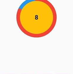
Output
Why Should You Display a Circular Timer in Flutter?
You can choose to show a circular timer in Flutter for various reasons. Here are some of the most typical causes:
1. To start the countdown to an upcoming event. The most typical application for circular timers is this. They help count down to the beginning of a presentation, the end of a timer, or any other event you wish to keep track of.
2. To provide user feedback. The user can receive feedback about the passing of time through circular timers. This is advantageous when performing duties like preparing meals or watching for a bus.
2. For a visual component for your app. Circular timers may provide an optical element to your app that will increase its aesthetic appeal and make it more engaging.
Hire Flutter developer to create a circular timer. It is an excellent alternative if you are searching for a way to show the passing of time in your Flutter project. They are versatile, easy to use, and serve several functions.
Conclusion
The article has shown how to display a circular timer in Flutter. First, you will set up the widget to show a circular countdown timer from the circular_countdown_timer package. It can also utilize the widget to exhibit a ten-second countdown timer by creating a simple example. By defining the colors, border width, and text style, the article also provided information on how to alter the timer’s visual look.
Connect with the top Flutter app development company for your project if you want to create mobile apps with the circular timer for your business. But if you’re still unclear and want more information about the Flutter framework, browse our blogs!
Frequently Asked Questions (FAQs)
1. How is a dart timer used?
The timer starts at the given duration and counts down to 0. The given callback function is called when the timer approaches zero. To repeatedly count down the same interval, use a periodic timer. The same rules apply to negative durations as to durations of 0.
2. How can I create a widget with a countdown timer?
Press the addition (+) sign in the top left corner to add a widget. A Countdown widget can be selected. Click Add Widget. Please tap on the widget once it shows on your Home Screen.
3. What does Flutter’s circle indicator mean?
The CircularProgressIndicator widget uses a circle to represent progress. It can be used as a progress indicator for determined and indeterminate work. The value attribute must be left empty or unspecified to create an indeterminate progress indicator in Flutter.
#flutter app development#flutter#hire flutter developers#flutter agency#hire flutter developer#flutter developers#flutter app developers#FlutterTips#FlutterTimer#CircularTimer
0 notes
Text
Styling and Theming in Flutter: A Comprehensive Guide

Styling and theming are essential aspects of creating visually appealing and cohesive user interfaces in your Flutter app. By applying styles and defining themes, you can customize the look and feel of your app to create a consistent and engaging user experience. This comprehensive guide will walk you through the process of styling and theming in Flutter, providing you with the knowledge and tools to design stunning app interfaces.
Prerequisites
Before we dive into styling and theming, make sure you have the following prerequisites in place:
- Flutter SDK installed on your machine. If you haven't installed Flutter yet, refer to the official Flutter installation guide for your operating system.
- A Flutter project set up and ready for development.

Applying Styles to Widgets
Flutter offers a flexible and powerful styling system that allows you to customize the appearance of individual widgets. You can apply styles using properties such as color, fontFamily, fontSize, fontWeight, and more. Let's see an example of styling a Text widget:
In this example, we apply a specific color, font size, and font weight to the Text widget using the TextStyle class.
Creating and Applying Themes
Themes provide a way to define a consistent visual style across your entire app. Flutter allows you to create and apply themes to customize the overall look and feel. Let's see how to create and apply a theme:
In this example, we define a theme using the ThemeData class and set properties such as primaryColor, accentColor, and fontFamily. The theme is then applied to the MaterialApp widget, which serves as the root of our app.
Customizing the Theme
Flutter allows you to customize the theme further by overriding specific properties. For example, if you want to change the primary color of a specific widget, you can wrap it with a Theme widget and define the desired property. Here's an example:
In this example, we wrap the RaisedButton widget with a Theme widget and customize the primaryColor property to Colors.red. Additionally, we apply the theme color to the button's background, set the text color to white, and define a rounded border for the button.
Styling Buttons with ElevatedButton and TextButton
Flutter provides specialized button widgets, such as ElevatedButton and TextButton, that come with predefined styles for different button types. Here's an example of styling an ElevatedButton and a TextButton:
In these examples, we use the style property along with the styleFrom method to customize the button's appearance. We can define properties like primary for the background color, onPrimary for the text color, padding for button padding, and shape for the button's shape.
Conclusion
Styling and theming are crucial for creating visually appealing and cohesive Flutter apps. By applying styles to widgets, defining themes, and leveraging specialized button widgets, you can customize the look and feel of your app to create stunning user interfaces. Experiment with different styles, explore theme customization options, and master advanced button styling techniques to build beautiful app interfaces with Flutter. Happy coding and designing captivating app experiences!
Read the full article
1 note
·
View note
Note
i wonder if you and harry ever met and when you tell him your name if he’ll think of paige ruffles LMFAOOOOOO ok sorry paigey love you
UR SICKFVBHIJDKOL
Anonymous asked: where's the post harry?😤
PLEASE HARRY
Anonymous asked: Her bellybutton looks like a pussy
gooDBYE
Anonymous asked: not dead and yes i read the ghost smut 🫡
kmNBFHHUIJDKOLP;
Anonymous asked: I just got a random charge on my card with the detail “TEXTSTYLES” and I’m wondering if anyone else has gotten that if it’s related to harry styles. I paused my card cause the bank is closed till tomorrow but I just wanted to check all my boxes before I called the bank tomorrow
Ive never seen that on mine before and I just checked and theres nothing recent I hope it gets resolved!
Anonymous asked: NOT LOUD NICOLE TOO😭😑 I WAS ROOTING FOR YOU
NO FUCKING WAY.......NOOOOOOOOO
Anonymous asked: agree that outies are scary especially with pregnancy belly it looks like your tummy will explode any minute or that there’s something coming out
RIGHT
Anonymous asked: I lost my tv remote, god fucking dammit.
Anonymous asked: sorry I have no idea why I shared that, just upset over the remote. fuck those stupid button controllers
0 notes
Text
Responsive Design Using Flutter
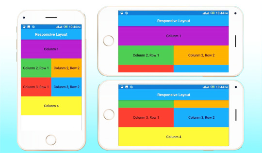
A responsive app supports devices with widely varying screen sizes. This is essential when the same app can run on a variety of devices, e.g., a phone, laptop, desktop computer, or tablet. Implementing responsive UIs in real life is not that easy. Using Flutter, let's make it simple. Everything in Flutter is a widget. Here we'll go through different widgets using which we can build responsive applications with Flutter. Three important things to consider while building an app with responsive design are the size, orientation, and device type. A change in any of these can change the app UI.
Responsive Design From a Business Perspective
Responsive design is a design and development technique that permits an application, website, or system to adjust to the size of a user’s screen. It will optimize a user’s browsing experience by providing a responsive Web page/application or application for the specific device.
Why is responsive design important in Flutter?
Some advantages come with having a Flutter application developed with a responsive design. Consistency in your application across variable screen sizes ensures that you have a wider range of users. Tablets and smaller mobile devices can provide the best-tailored user experience
In addition, the retention rate in your application is likely to be higher once you have developed an advanced responsive design. Since Flutter is the best choice for web and mobile apps, A responsive design guarantees that the appeal of your application is consistent and provides users with a seamless experience no matter the size of the device in use. It goes without saying that if you factor responsiveness into your application, it also shuts out negative ratings. There are more than 2 million applications on the App Store and more than 3 million more on the Google Play store. Most users form opinions about which applications to download based on reviews.
The concept of responsive design lies in utilizing one set of code that adapts to variable layout changes corresponding to various devices (smartphones, tablets, and desktop computers).
Important Factors in Flutter Designing
One of the important things we must consider while designing is the way of using widgets. The majority use hard-coded values with widgets, which results in apps that are poorly designed. Instead, a media query can be used to get the real-time size of the window.
To get Screen width: MediaQuery.of(context).size.width
To get Screen height:MediaQuery.of(context).size.height
Most of the responsive designs can be built using the following widgets:
Flexible and Expanded
These two widgets can be used to give flexibility to their children or to expand to fill the available space. The main difference between them is that the expanded widget needs the child to fill the available space, while the flexible widget does not. A flex value is given after wrapping a widget in expanded or flexible widgets.
Even if the extra property like flex is not given, the expanded widget will take the remaining space equally. The expanded child will use the free space. If more than one child is expanded, the space is equally shared. The default flex value is 1.
A flex factor is used if you want to specify a scale for the free space. A flex factor is a property of an expanded widget that specifies the sharing of the free space between child widgets and also its uses. A property called "fit" is used to specify how strict its size should be in the flexible widget. It can be either loose or tight. You can mix and match flexible ones with fixed-size widgets. eg:Flexible( child: Container( color: Colors.red, child: Text( "Flexible", ), ), ); eg:Expanded( child: Container( child: Center( child: Text( 'Expaned widget', style: TextStyle( color: Colors.blue, ), ), ), color: Colors.white, width: 200, ), );
FittedBox
Scale and position its child within itself according to fit and alignment. The BoxFit property describes how it should make its child fit, and it will scale or clip its child automatically. You can use different types of BoxFit:
BoxFit.none
BoxFit.contain
BoxFit.fill
BoxFit.cover
BoxFit.fitWidth
BoxFit.fitHeight
BoxFit.scaleDown
eg:Container( decoration: BoxDecoration( border: Border.all(width: 3, color: Colors.black), ), child: FittedBox(fit: BoxFit.contain, child: Text('This is fitted box') ), width: 100, height: 30,
LayoutBuilder
Orientation Builder
To determine the orientation of a widget, The orientation builder is somewhat similar to the layout builder. You'll get the Orientation object from its builder property. As an example, the number of columns in a grid view can be changed using orientation. OrientationBuilder ( builder : (context,orientation){ return GridView.count( crossAxisCount : orientation==Orientation.portrait ? 2 : 3, ), ); }, );
Fractionally Sized Box
It is mostly useful when used inside expanded or flexible widgets. The widget helps to size its children to a fraction of the total available space. Wrap the child you want to be sized with FractionallySizedBox.You can give a height factor and a width factor. Alignment is used to control the alignment of a fractionally sized widget.Expanded ( child: FractionallySizedBox( alignment: Alignment.centerLeft, widthFactor: widthFactor, child: Container( decoration: BoxDecoration( color: Colors.amber, border: Border.all(color: Colors.white), ), child: Padding( padding: const EdgeInsets.all(16.0), child: Text( 'width', style: TextStyle(color: Colors.blue, fontSize: 24), ), ), ), ), );
Aspect Ratio
The size of the child is according to a specific aspect ratio. It's often written as a fraction, like 3/2, as in three parts of width to two parts of height.AspectRatio( aspectRatio: 3/2, child: Container( child: Padding( padding: const EdgeInsets.all(6.0), child: Center( child: Text( 'AspectRatio', style: TextStyle(color: Colors.blue, fontSize: 20), ), ), ), ), );
In addition to these widgets, several other widgets and flutter packages are also available to make the app responsive. One among these is responsive_framework.MaterialApp( builder: (context, child) => ResponsiveWrapper.builder( child, maxWidth: 1200, minWidth: 480, defaultScale: true, breakpoints: [ ResponsiveBreakpoint.resize(480, name: MOBILE), ResponsiveBreakpoint.autoScale(800, name: TABLET), ResponsiveBreakpoint.resize(1000, name: DESKTOP), ], background: Container(color: Color(0xFFF5F5F5))), initialRoute: "/", );
Moreover, while working with complex designs such as grid views, we find difficulty in specifying the grid size. Most of you use a child aspect ratio to specify the size of grids. However, an easy way of giving a size for grids is the use of the package dynamic_height_grid_view.DynamicHeightGridView( itemCount: 120, crossAxisCount: 3, crossAxisSpacing: 10, mainAxisSpacing: 10, builder: (ctx, index) { /// return your widget here. } );
I hope you understand how flutter can build responsive web applications. Sanesquare is a web application development company laser-focused on delivering top-quality services. If you need assistance with web application development, feel free to get in touch with us.
0 notes
Text
Compute the number of two pair hands in poker
Odds Of Getting Full House In Poker - GetMega.
Math of Poker - Basics | Brilliant Math & Science Wiki.
Which Poker Hand Wins Calculator - PokerListings.
5-Card Poker Hands - Simon Fraser University.
Poker Hand Combinations – Explained.
Poker calculating odds.
Function to determine whether a poker hand is a straight?.
Poker Odds - Know Your Math and Vital Calculations for 2022.
Possible Poker Hands in 52-Card Deck - Chemical Ecology.
How many possible hands are there in a five card poker game?.
5 card poker hands.
Poker Hand Combinations: The Critical Skill Required For Hand Reading.
How many combinations with 25 characters.
3.4.3 Two Pair Poker Hands: Video - YouTube.
Odds Of Getting Full House In Poker - GetMega.
The Probability of a Two Pair (fraction) constant defines the probability of being dealt two pair and the probability is represented as a fraction. 1. For a five-card hand, first choose the two ranks that you want for your two pair. There are 13 x 12 / 2 = 78 ways to do this. Then, for each pair, choose the two suits: 6 each. Then pick the other card that's neither of the pair ranks: 44 choices (11 ranks x 4 suits). This gives 78 x 36 x 44 = 123,552 two-pair hands.
Math of Poker - Basics | Brilliant Math & Science Wiki.
In poker, the probability of each type of 5-card hand can be computed by calculating the proportion of hands of that type among all possible hands. Frequency of 5-card poker hands The following enumerates the (absolute) frequency of each hand, given all combinations of 5 cards randomly drawn from a full deck of 52 without replacement. Here are the number of ways to draw each hand and the probability of drawing for each... Thus the number of ways to arrange a three of a kind is 13 * 4 * 66 * 4 2 = 54,912. Two Pair. There are (13:2) = 78 ways to arrange the two ranks represented.... Here is a good site that also explains how to calculate poker probabilities. Five Card Draw. Frequency is the number of ways to draw the hand, including the same card values in different suits. The Probability of drawing a given hand is calculated by dividing the number of ways of drawing the hand ( Frequency) by the total number of 5-card hands (the sample space; ( 52 5 ) = 2 , 598 , 960 (\textstyle (52 \choose 5)=2,598,960).
Which Poker Hand Wins Calculator - PokerListings.
So, Full house = 13C2 * 2C1 * 4C3 * 4C2 = 78 * 2 * 4 * 6 = 3,744. Now, there are 2,598,960 unique hands in poker out of which 3744 are examples of a full house so to calculate what are the odds of getting a full house, just divide the above values: 3744/2,598,960 = 0.014%. Therefore, the odds of getting a full house in poker come down to 0.14%. 5 card poker hands. A "poker hand" consists of 5 unordered cards from a standard deck of 52. There are 52 5 = 2,598,9604 possible poker hands. Below, we calculate the probability of each of the standard kinds of poker hands. Royal Flush. This hand consists of values 10,J,Q,K,A, all of the same suit. Since the values are fixed, we only need to choose the suit.
5-Card Poker Hands - Simon Fraser University.
For this example, we can compute our equity as follows: Against the higher pairs, we have 0.18 (18%) equity. The higher pairs make up 18 / 34 of the villain's presumed range. So our equity for. Poker rankings hands.
Poker Hand Combinations – Explained.
1,098,240 possible one pair hands. High Card There are two ways to derive the number of high-card hands. One is by realizing that the set of high-card hands is the complement to the set of all other hands. That means the number of high card hands is 2598960 - 40 - 624 - 3744 - 5108 - 10200 - 54912 - 123552 - 1098240 = 1,302,540. It will find two cards of the same value, the 6C, and 6H, and return true. Since both calls to CardMatchUtils.DoCardsHaveSameValue returned true, this hand does indeed contain two pairs. If you have any questions, contact me by using the contact form here, or you can e-mail me directly at. In Hold’em, a Two Pair hand is one of the most common winning hands. The expression “Two Pair” should immediately have you thinking about pairs of cards in the same denomination or rank. Simply put, it's two pairs of equally ranked cards. So, if you hold 10 ♥ 10♣ and the board is 5 ♦ 5♣3♠ then you would have Two Pair, Tens and Fives.
Poker calculating odds.
Calculate number of hands where there are atleast two cards with the same number and atleast two cards with different number. The fifth card can be anything, even same as one of the pair numbers. For example these two would be valid hands: 5 ♡ 5 ♣ 9 ♠ 9 ♢ 2 ♡, J ♡ J ♣ 4 ♠ 4 ♢ 4 ♡.
Function to determine whether a poker hand is a straight?.
If those are equal, compare the values of the final card (the “ kickers ” ) in each hand. Finally, if the kicker does not breaks the tie, then both hands are equal. Let’s have a look at an example. Hand 1. Hand 2. In hand 1, the value of its higher pair is five, and hand 2’s is six. So, hand 2 is the winner. How to Count Your Outs. In those cases where you are putting your money in bad, the idea is that you are able to make a hand on a later street that is better than your opponent's. The cards that give you that winning hand are known as "outs." An example: You have. A♣.
Poker Odds - Know Your Math and Vital Calculations for 2022.
There is only 1 combo of 44 left in the deck, 2 combos of A9s , 3 Combos of 55 , 3 Combos of 99 , 2 Combos of 45s - some of these hands may also be bet on the flop when facing a check. So to recap we have: 1 Combo A5s , 2 Combos of A9s , 3 Combos of 55 (With one 5 on board, the number of combinations of 55 are cut in half from 6 combos to 3.
Possible Poker Hands in 52-Card Deck - Chemical Ecology.
How many combinations with 25 characters.
How many possible hands are there in a five card poker game?.
Poker Hand Probabilities: One Pair October 31, 2020. Calculating the probability of a full house is shown in chapter 1 of Harvard's Stat 110 (Probability) course, and is pretty straightforward.First, get the number of ways to choose three of a kind, multiply it by the number of ways to choose a pair from the remaining cards, and divide that product by the total number of possible hands. For two-pair, V1 will have two bits set and V2 will equal zero. For a three-of-a-kind, V1 will have a single bit set, and V2 will equal V1. For a straight, V0 will either be 0x1000055 or else a power-of-two multiple of 0x155. For a flush, V2 will have precisely one bit set. For a full house, V1 will have two bits set, and V2 will be non-zero.
5 card poker hands.
4. Well for one, your array should probably only have 5 elements, not 6 if you want it to be a true poker hand. As for determining if there is a pair or not, I would simply check each card against every other card to its right. This will run in O (n^2), but this is acceptable as long as the hand size stays at around 5. Poker Hands: counting. Assume that each of Poker hands are equally likely. The total number of hands is. In all cases, we mean exactly the hand stated. For example, four of a kind does not count as 2 pairs. This entry was posted in Cards and tagged JCM_math230_HW4_S13, JCM_math230_HW4_S15, JCM_math340_HW3_F13. Bookmark the permalink. A two pair is the seventh-best possible poker hand and is formed with two cards of the same value.... probability of being dealt a royal flush can be calculated based on the number of royal flushes divided by the total number of poker hands. It can be formed four ways (one way for each suit), meaning odds of around 1 in 30,940 overall - or.
Poker Hand Combinations: The Critical Skill Required For Hand Reading.
Sometimes in a game of poker, there arises a possibility of a tie with regards to the 5-card combination that players have at the showdown. In such a situation, a procedure is followed to decide the winning hand between the 2 two pair hands. Firstly, when this happens the highest pair is picked to determine the winner. Now, in a rare situation where both the players. 4. Four of a kind. 5. Two distinct matching pairs (but not a full house). 6. Exactly one matching pair (but no three of a kind). 7. At least one card from each suit. At least one card from each suit, but no two values matching. 8. Three cards of one suit, and the other two of another suit, like three hearts and two spades.
How many combinations with 25 characters.
All 5 cards are from the same suit and they form a straight (they may also be a royal flush). The number of such hands is 4*10, and the probability is 0.0000153908. IF YOU MEAN TO EXCLUDE ROYAL FLUSHES, SUBTRACT 4 (SEE THE NEXT TYPE OF HAND): the number of hands would then be 4*10-4 = 36, with probability approximately 0.0000138517. How to work out the total number of hand combinations for an paired hand like AA, JJ, or 44. Method: Multiply the number of available cards by the number of available cards minus 1, then divide by two. Word equation: ( (available cards) x (available cards - 1)) / 2 = total combinations. This hand has a number of possibilities, which is why they are commonly seen. In a regular 52 card deck, there are an astounding 123,552 Two Pair poker combinations and 858 distinct ranks. 3. Rankings. Not all pairs are of the same rank like in other hands each two pair hand has a rank of its own, some are higher than others. They are first ranked by the highest Pair and.
3.4.3 Two Pair Poker Hands: Video - YouTube.
In a game of poker, the hand rankings work as follows: a pair beats a high card; a two pair beats a one pair; a three-of-a-kind beats a two pair; a straight beats a three-of-a-kind; a flush beats. Therefore, the number of possible poker hands is (52 5) = 2, 598, 960. \binom(52)(5)=2,598,960.\ _\square (5 5 2 ) = 2, 5 9 8, 9 6 0. Poker hands are put into classifications so that players can know how much their hand is worth. The following is a list of poker hand classifications, listed from the least valuable to the most valuable.
Other content:
Supertech Racing Pro Slot Track Set Up Trouble Shooting
Bordertown Casino
Big Top Casino
Gta Diamond Casino Heist Who Is The Girl
1 note
·
View note
Text
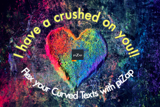
Design Trend Alert! Curved Text. 📷 #piZapTrend
Sometimes your design needs a little movement. Transform your text into beautiful curves for an aesthetically pleasing design look that will pop off the page!
Show us your curved text designs!
We'd love to see them. :)
#pizap#photoeditor#collage#borders#stickers#photoediting#photography#filters#fonts#effects#curved#curvedtexts#textstyles
0 notes
Text
D'Alembert's principle - Wikipedia
Euler's to Kim to Kim time no mass think hi
Lagrangian mechanics is a formulation of classical mechanics founded on the stationary-action principle (also known as the principle of least action). It was introduced by the Italian-French mathematician and astronomer Joseph-Louis Lagrange in his 1788 work, Mécanique analytique.[1]
Joseph-Louis Lagrange (1736–1813)
Lagrangian mechanics describes a mechanical system as a pair
(
�
,
�
)
{\textstyle (M,L)} consisting of a configuration space
�
{\textstyle M} and a smooth function
�
{\textstyle L} within that space called a Lagrangian. For many systems,
�
=
�
−
�
,
{\textstyle L=T-V,} where
�
{\textstyle T} and
�
V are the kinetic and potential energy of the system, respectively.[2]
The stationary action principle requires that the action functional of the system derived from
�
{\textstyle L} must remain at a stationary point (a maximum, minimum, or saddle) throughout the time evolution of the system. This constraint allows the calculation of the equations of motion of the system using Lagrange's equations.[3]
NFT application for zeta to Maxwell equations.
1 note
·
View note
Photo

https://youtu.be/M4-b3UAPTqQb If You Want To Know How To Change Whatsapp Font Style, Then Watch This Video Till END #fontstyle #whatsapptextstyle #textstyles #fontstyles #font #fonts #androidfont #ArsalTech #Arsaltechs #ArsalanKhan https://www.instagram.com/p/B9pKR1cADce/?igshid=1qa2qvbcei6u2
#fontstyle#whatsapptextstyle#textstyles#fontstyles#font#fonts#androidfont#arsaltech#arsaltechs#arsalankhan
0 notes
Text
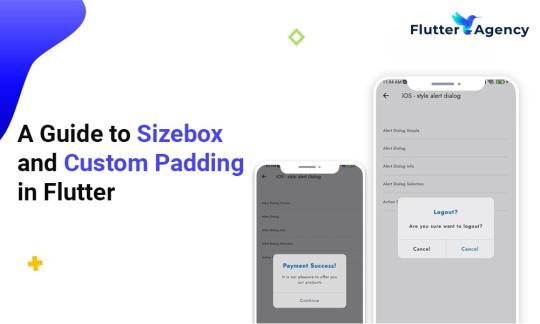
Sizebox and Custom Padding in Flutter
Flutter widgets play an essential role in building the perfect user interface for the app. Flutter is an open-source platform for many experts to develop web or mobile apps.
By implementing custom padding and sizebox in your project you can get best UI that gives a pleasant look to your app. The objective of the coders is to stack up widgets to create beautiful and functional UI.
You can look at essential widgets that perform the same job in the Flutter framework. Custom padding and size box are reliable widgets in Flutter. As the Flutter programmer you must understand more about these two things and start working on the project. Also you can read this blog from our official website��Sizebox and Custom Padding in Flutter.
Widget is almost everything in Flutter.
While you create a widget, you must build the layout correctly.
In the app, developers can add different widgets in column widgets to make a stunning layout.
If you include more widgets, the Flutter app layout becomes very complex.
Some widgets are visible, and others are not visible. Visible widget showcases elements are like images or texts that is displayed to users. However, widget composition decides how users act together with the app. Thus, coders follow best practices to apply ideal widgets when laying out apps.
Custom padding
A padding widget is the most popular one in Flutter and includes empty or padding space in the widget or a bunch of widgets. Applying padding to roughly any widget by putting it as a padding widget child.
Child widget size inside padding can hinder by how much space stays after placing empty space around. Padding is a great widget to add empty space around the widget with the help of an abstract.
import 'package:flutter/material.dart';void main() { runApp(//App widget tree starts from here MaterialApp( home: Scaffold( appBar: AppBar( title: const Text('FlutterAgency'), centerTitle: true, backgroundColor: Colors.greenAccent[400], ), //AppBar body: Center( child: Row( children: <widget>[ Container( width: 200, height: 200, color: Colors.red, ), //Container // Padding widget Padding( padding: const EdgeInsets.fromLTRB(20, 0, 20, 0), child: Container( padding: const EdgeInsets.all(0.0), color: Colors.green, width: 80.0, height: 80.0, ), //Container ), //Padding Container( width: 100, height: 100, color: Colors.red, ) //Container ], //<widget>[] ), //Row ), //Column ), //Scaffold ), //MaterialApp );}</widget></widget>
Properties of Custom Padding
Widget manages excellent properties and also add widgets easily without any hassle.
1. Padding
The property embraces edgeinsets geometry class as an object to insert empty space around the widget.
2. Child
When it comes to child property, Flutter app development team use widgets as objects to show padding widgets on the screen.
Sizebox
When creating an app and including different widgets inside rows and columns, you can identify no space attached between widgets. In that scenario, you can add some space between children to make the app design look marvelous. You can pay attention to possible ways to add space between widgets in the Flutter project.
Sizebox is a reliable widget in Flutter to develop an empty box with a specific height and width. Flutter experts must specify the height property when using the Sizebox widget in the column. Apart from that, they also specify the width property when utilizing the Sizebox widget in the row widget.
import 'package:flutter/material.dart';void main() { runApp( //Our app widget tree starts from here MaterialApp( home: Scaffold( appBar: AppBar( title: const Text('FlutterAgency'), centerTitle: true, backgroundColor: Colors.greenAccent[400], ), //AppBar body: const Center( //SizedBox Widget child: SizedBox( width: 200.0, height: 100.0, child: Card( color: Colors.green, child: Center( child: Text( 'FlutterAgency', style: TextStyle(color: Colors.white), ), //Text ), //Center ), //Card ), //SizedBox ), //Center ), //Scaffold ), //MaterialApp );}
Properties of Sizebox
1. Height
Property denotes Sizebox height in pixel and double value as an object.
2. Width
The property keeps in double value as the object and brings width to Sizebox.
3. Child
The property uses a child widget as an object to display Sizebox in the widget tree and inside Sizebox on the screen.
Sizebox is an in-built widget and comes with a specified size. It is the best way to set size constraints for the child widgets. Developers use an empty Sizebox between two widgets and get space in between.
Conclusion
The sizebox and custom padding in Flutter development are explained in this article. But with just a few lines of code, you can use this functionality to make excellent apps with features! I’m hoping you all understand what sizebox and custom padding are. You can hire Flutter app experts who will help you integrate this functionality into your application so that it has cutting-edge and the newest features.Let’s begin by discussing the details of your project with all of us.
Frequently Asked Questions (FAQs)
1. Why is SizedBox used in Flutter?
A built-in widget in the Flutter SDK is called SizedBox. It is a simple box with a given size. It can be used to add constraints on size to the child widget, create a space between the two widgets by inserting an empty SizedBox, or for other purposes.
2. What distinguishes a padded box from a sized box?
Padding inserts its child (additionally leaves space around the child’s edges without extending the child). SizedBox creates a fixed-size box, and its child will grow to the set width and height.
3. In Flutter, how do I add padding to a column?
You could use any widget for padding; nevertheless, this is only an illustration and could be used everywhere. Suppose you want to apply padding to each child inside a column or row of icons. Constant Icons (home_outlined, size: 60.0), Constant Icons (Icons).
0 notes
Last Seen Blogs

notagoonerlol
Untitled

uhohjellio
Jellio

l0u-cur4s
The crazy, they make me feel sane.
macroons
HONEYBEE