#tatsuaki urushihara
Text

Happy Triangle Strategy 2nd Anniversary!! To celebrate, here are the translations from the foreword and the first illustration provided in the artbook.
---
Foreword translation:
GREETING
Thank you so much for picking up this book! We've put together a collection of art—a war chronicle filled with the “battles and wars” we waged to create the designs used in Triangle Strategy.
I’d like to reflect back on the beginning of Triangle Strategy's art development. . . . I’ll recall it bit by bit.
The first time I heard about this project was several years ago, when I was working on art and design for Various Daylife and Bravely Default II on a weekly basis.
The first words I received during the early planning phase were Mr. Asano’s, “What if war came to a world like Octopath Traveler?” and Mr. Arai’s, “Salt . . . Iron . . . ”
They were simple words, but they captured my heart and filled it with excitement. From there, I began to draw, and it was as if those feelings grew and spilled out of me.
And, as is natural, a story about war will have many characters . . . The depth of the worldview was crucial as well. I had to add a lot of details to really get across the project’s heavy themes! I very much enjoyed the challenge. However, our time was short, and thus it was the beginning of a war for the artists. We were thrilled by the magnificent setting and plunged headlong into drawing each day.
The art team fought alongside me. This included Mr. Urushihara, an old comrade-in-arms who has a cool head, good sense, and substantial analytical and drawing ability; as well as Ms. Yoshiura (a student at the time the project started), who was positive, fun, and worked very hard on everything. Without them, I don’t think I’d have been able to do anything like this. Thank you very much!
Mr. Morimoto, who brought the characters over to neat, orderly pixel art . . . Mr. Matsumoto, who was over the UI and worked steadfastly through trial and error . . . Everyone at Art Dink for bringing art and design to life on the game screen and creating a wonderful world . . . Everyone who has been involved in and supported Triangle Strategy—I apologize for not naming you all. Thank you so much! And Mr. Asano, who always provides me with new opportunities and challenges. It was a great experience for me to be entrusted with the art for this project. I’d like to thank you again! I look forward to making use of this knowledge in my future work.
For those who are interested in this project, we hope you can play the game and find your favorite character!
I hope the world of Triangle Strategy continues to expand. Best regards, and thank you for your support!
- Naoki Ikushima
---
My name is Urushihara and I was given the opportunity to serve as an assistant on this project. Thank you very much for your support!
Several years ago, Mr. Ikushima introduced me to Mr. Asano’s team, and the first project I got involved with was Triangle Strategy.
I recall that, as someone who was greatly influenced by Square's games from the SNES/PS era, the chance to work on a project that has the same feel as those classic simulation RPGs had me shaking with excitement.
I've had the opportunity to work on a wide variety of projects during my career, from background designs to characters, illustrations for advertisements, etc., and this project has incorporated all of my experience! It’s turned out to be a monumental work.
I hope that it will be a profoundly memorable experience for all of you.
I would like to take this opportunity to express my gratitude to Mr. Asano, Mr. Arai, the development teams at Square Enix and Art Dink, and above all to Mr. Ikushima for giving me this opportunity and for providing me with so much guidance every day!
We’d also like to once again thank everyone who purchased the game software and this book! We look forward to your continued support of the Asano team's works!
- Tatsuaki Urushihara
---
Translation notes, and image ids under the cut.
Translation notes:
"SNES" was actually the letters "SFC" (you can see them in the foreword text in plain English) but it was referring to the Super Famicom, which was the Japanese version of the SNES, so I decided to localize as SNES.
"Salt...... iron......." really was just like that. I'm not sure if there was some formatting/grammatical thing I missed or if Arai really did just send over two words, but. either way it's really funny to me!!
I've recently looked more into Japanese grammar and all the particles that are used, and since I'm feeling a little more confident in what things mean, I inserted more filler words than normal to help things sound more natural. For example, "something along the lines of 'a fleeting instant made up of infinite possibilities'" would probably read more directly as "something that feels like 'a fleeting moment of infinite possibilities'." It's not a huge difference, but I guess I just wanted to make a note that I've taken some liberties with the grammar and the exact phrasing.
Image ID
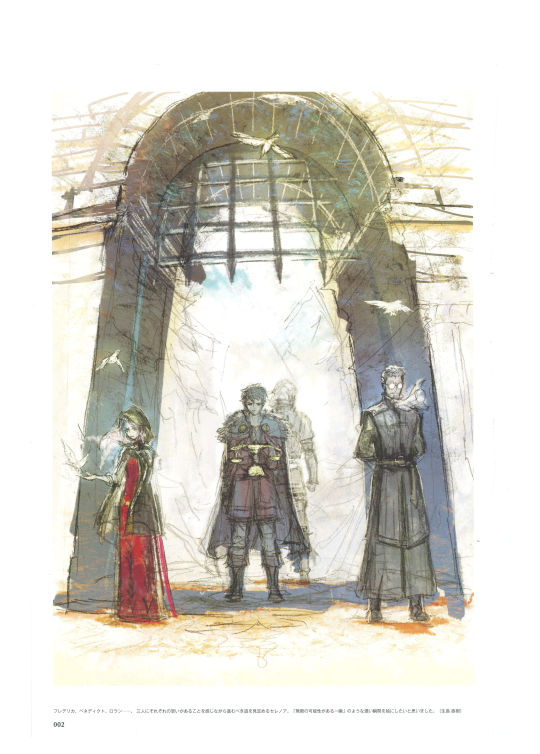
[Image id: The first image is a picture of the foreword (written in Japanese), which includes a small drawing of Serenoa, Roland, Frederica, and Benedict's faces. The second image is a drawing of Frederica, Benedict, and Roland standing with their backs facing Serenoa, who holds the Scales of conviction, along with the illustrator's note in Japanese. The third image is the translated illustrator's note, which reads, "Frederica, Benedict, Roland… Serenoa has to determine the path he should walk while knowing that the three of them each have their own individual desires concerning what should happen. In this picture, I wanted to illustrate a weighty moment, something along the lines of 'a fleeting instant made up of infinite possibilities.'' (Naoki Ikushima)" /end id]
#queue#triangle strategy#triangle strategy artbook#naoki ikushima#tatsuaki urushihara#I love all the illustrator's notes#they're so cool!!! and this project was so huge!!!
16 notes
·
View notes
Photo
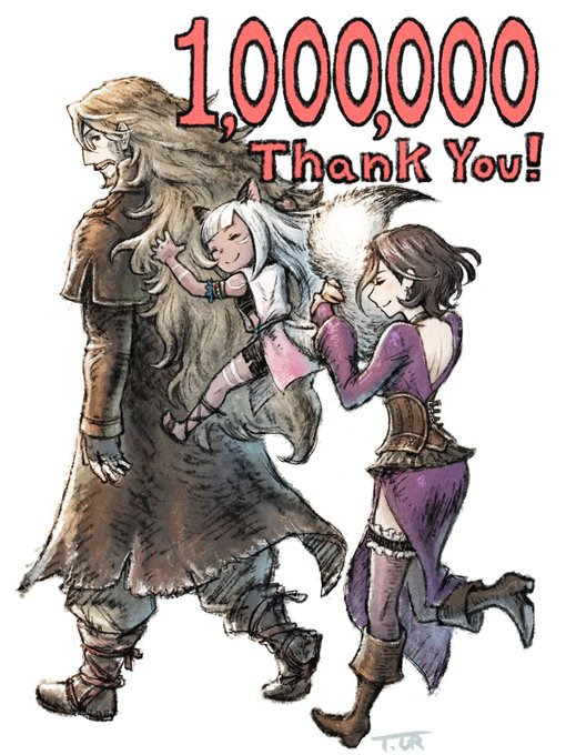
Octopath Traveler 2 has sold over 1 million copies!
Illustration by Tatsuaki Urushihara
47 notes
·
View notes
Text
"Octopath Traveler II" supera el millón de ventas
Square Enix celebra el millón de ventas del videojuego "Octopath Traveler II" con una hermosa ilustración en @OCTOPATH_PR.
A principios de este año, Square Enix lanzó Octopath Traveler II, una secuela de su amado JRPG de 2018. En menos de cuatro meses, el nuevo videojuego ya superó el millón de ventas. ¡Y eso es motivo de celebración!
Para marcar la ocasión trascendental, el artista Tatsuaki Urushihara ha compartido esta pieza, que representa una “cierta charla de fiesta” con Osvald, Ochette y…
View On WordPress
0 notes
Text
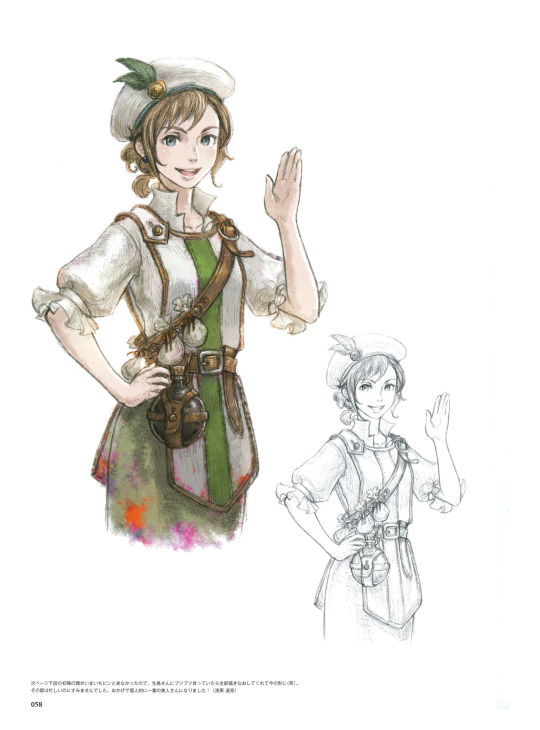

[Image id for the two images above: The first image is a scan of the first page of Medina's concept art. There are two versions of Medina's canon portrait, one colored, one uncolored. There is an illustrator's note at the bottom in Japanese. The second image is a translation of that note, which reads, "The face on the bottom of the next page came from the first draft. It didn't look quite right, so I was grumbling to Ikushima about it, and he redrew the whole thing, giving it the look it has now (laughs). Sorry about that, I was pretty busy at the time. In my opinion, she's become the most beautiful woman thanks to you! (Tatsuaki Urushihara)" /End id]

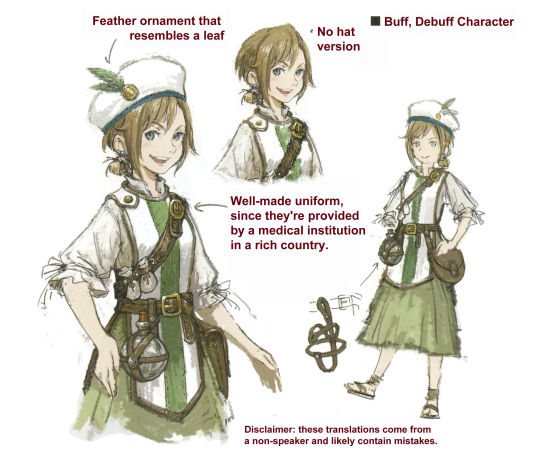

[Image id for the three images above: The first image is a scan of the second page of Medina's concept art. It has several drawings of Medina, including a full-body portrait that shows some details of the belt and pouch she wears, and has an additional illustrator's note at the bottom. The second image is a translation of the title, which reads, "Buff, Debuff Character," and translations for the captions. One points to a feather decoration on her hat and reads, "Feather ornament that resembles a leaf." Another points to her uniform and reads, "Well-made uniform, since they're provided by a medical institution in a rich country." Another caption points to a version of her without her hat, and says, "No hat version." The third image is a translation of the illustrator's note at the bottom of the second page, which reads, "I put this together based off a concept for an apothecary costume in 'Various Daylife' that I was given. (Tatsuaki Urushihara)." /end id]
Translation notes under the cut.
"I put this together based off a concept for an apothecary costume" might have been making a reference to a specific job class in Various Daylife. I looked it up a little and found one called "Herbalist" that might match, but I'm not super familiar with the game myself, so I wasn't 100% sure about it.
#triangle strategy#triangle strategy artbook#ts artbook character ref sheets#medina alliam#I didn't wait for the poll to end lol but hopefully this is easier to read!#I went back and forth on whether or not to include a full version of the translated page#but eventually opted against it because it just felt like extra clutter#feel free to leave tags/reply if you have any thoughts!#but yeah! seems like opposed to other characters Medina's development was a little more gameplay-driven vs story-driven#it's a little sad! I was kinda hoping for more of her backstory#just based off skin tone I kept kinda wondering if she might not be from Aesfrost/Glenbrook originally. but alas#sometimes I go a little nuts about how most of the PCs from Hyzante don't seem to have actually been designed to be ethnically Hyzantian#after looking it up seems like you've got medina geela corentin ezana quahaug archibald and (probably?) narve#which of those only two have a darker skin tone#I'm not calling square enix cowards BUT
36 notes
·
View notes
Text
Gustadolph, Thalas, and Erika Concept Art
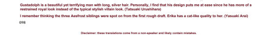
Concept/reference art for Gustadolph, Erika, and Thalas! Translation notes and image id under the cut.
Translation notes:
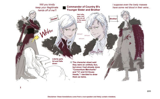
"Will you kindly keep your illegitmate hands off of me?!" was probably more directly translated like, "You're a bastard, stop existing in my vicinity." But it was a question and also used some polite language, so I changed the wording around a little to suit that.
"Hair tufts, eyes, and lips are all in the same place" was one I felt pretty uncertain about and ended up going a lot off of context. It definitely seemed to be saying something about hair, and was probably saying something about lips and eyes, but there might have been something about eyebrows or something else in there too.
"Wham" was a mimetic word that meant something more like "violent; holding nothing back."
Image ID:
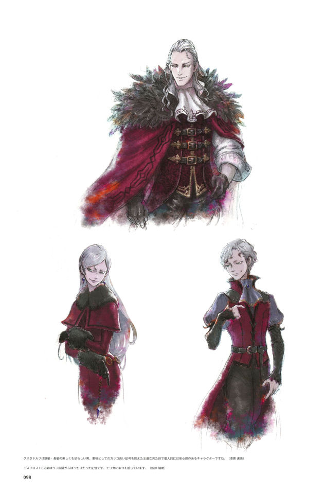
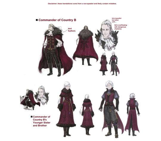
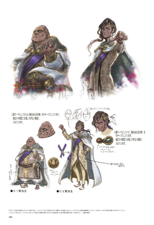
[id: The first two out of the five images are the full Japanese pages of concept art for Gustadolph, Thalas, and Erika. The first page has their official canon portraits. In the third image, which is a translation of the notes on the first, there is an illustrator's note that reads, "Gustadolph is a beautiful yet terrifying man with long, silver hair. Personally, I find that his design puts me at ease since he has more of a restrained royal look instead of the typical stylish villain look. (Tatsuaki Urushihara)" and another illustrator's note that reads, "I remember thinking the three Aesfrost siblings were spot on from the first rough draft. Erika has a cat-like quality to her. (Yasuaki Arai)"
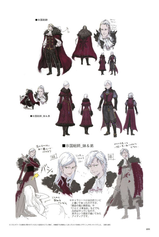
The fourth and fifth image are translations of the second page. The top half of the page is titled "Commander of Country B" and has several images of Gustadolph. One has a caption pointing to his ruff collar that says, "bird feathers." Another two notes next to his face read, "He's beautiful but rather cold…" and "He's overflowing with dangerous charisma." The second half of the page has pictures of Thalas and Erika. It's titled "Commander of Country B's Younger Sister and Brother". There is a drawing of Erika having thrown Frederica to the floor. Erika's dialogue reads, "Will you kindly get your illegitimate hands off of me?!" and there is a note next to Frederica that reads, "Liberty gets hit and falls down." In another drawing Thalas is holding a sword, both he and the sword spattered with blood. His dialogue reads, "I suppose even the lowly masses have some red blood in their veins…" There is a note between the two of them that reads, "The character sheet said they were an unlikely duo, but since I had already done 'Consortium Merchants' and 'C1 and C2 House Heads,' I decided to draw them as twins." Another note between mirroring portraits of Thalas and Erika's reads, "Hair tufts, eyes, and lips are all in the same place." There are also some small copies of the word "whisper" between them. There is an illustrator's note at the bottom that reads, "Erika and Thalas's setting and plotline never changed much, and even in the trial version they had a nice, simple bully feel to them that made them easy to design. (Tatsuaki Urushihara)" /end id]
#triangle strategy#triangle strategy artbook#ts artbook character ref sheets#gustadolph aesfrost#thalas aesfrost#erika aesfrost#cw abuse#happy halloween! vampire siblings for the occasion!#I keep trying to tell whether the 'I feel safe looking at Gustadolph' was supposed to be a joke or not#because it was worded JUST ambiguously enough that it might have been sort of a more poetic straightforward thing????#but I kept having to relook at the words because I kept laughing at it#it did very much have the vibe of 'look at those cold terrifying eyes. aren't those just the most darned trustworthy eyes?'#I get it tho!! he's right!!!! gustadolph's just got that coolness factor
24 notes
·
View notes
Photo
Anna’s reference materials!
A transcript of the longer passages + translation notes under the cut:
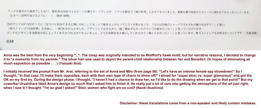
Anna was the best from the very beginning ^_^. The clasp was originally intended to be Wolffort's hawk motif, but for narrative reasons, I decided to change it to "a memento from my parents." The silver hair was used to depict the parent-child relationship between her and Benedict. (To eliminate exposition as much as possible . . . ) (Yasuaki Arai)
I initially received the prompt from Mr. Arai, referring to the set of Anna and Milo (from page 50), "Let's have an intense female spy showdown!" So I thought, "In that case, I'll make them opposites, each with their own type of charm to show off!" I aimed for "super stoic vs. super glamorous" and got the OK on my first try. During the design phase, I thought, "I haven't had a chance to draw her, so I'd like to do the drawing when we get to that point!" But my coworker Urushihara liked Anna's design so much that I asked him to finish it. He really put a lot of care into getting the atmosphere of the art just right; when I saw it, I thought, "I'm so glad I asked!" Stoic women who fight are so cool! (Naoki Ikushima)
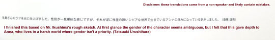
I finished this based on Mr. Ikushima's rough sketch. At first glance the gender of the character seems ambiguous, but I felt that this gave depth to Anna, who lives in a harsh world where gender isn't a priority. (Tatsuaki Urushihara)
Translation notes:
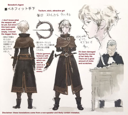
“Agent” is a word that’s literally translated as something like “subordinate hand”. In most dictionaries the direct word association is “minion,” “henchman,” or “underling,” but the connotations seemed a little too cartoonishly evil for the general tone that’s usually used in these titles, so “agent” felt like a better fit. It was probably meant to sound more sinister than just “agent,” though, so it was a tradeoff.
The word for “intense” in “Let’s have an intense female showdown” was this one, which can also be translated as “hot,” “ardent,” or “passionate.” The sentence as a whole likely meant to read more like “It would be hot to have a female spy showdown!” but since I wasn’t certain which they meant, I erred on the side of the more mild term.
#triangle strategy#anna pascal#benedict pascal#ts artbook character ref sheets#triangle strategy artbook#jackes clan#milo yuelle#it's sort of a tricky thing with the translation of words like 'hot' where I don't necessarily want to overly sanitize what they said#but since I'm not a speaker I don't want to read into things and potentially misattribute something potentially-unprofessional when#that might not have been the intent#so I kind of run it through a 'would I send this in a business email' filter in my head as I'm translating#but anyways#in all likelihood Mr. Arai was in fact referring to the inherent eroticism of femme fatale showdowns and he's so right for it#can't believe they're narrative foils.........
79 notes
·
View notes
Text
Exharme and Sorsley Concept Art


(More) concept/reference art for Exharme and Sorsley. Translation notes and image id under the cut.
Translation notes:
"Tasuki" is in reference to a specific type of sash used to hold up the sleeves of a kimono (Wikipedia link). It doesn't 100% resemble the sash we see here, but it did seem to be the word they used to describe it. When "tasuki" was put in quotes (up by the Tenebris-looking designs) I kept it as explicity "tasuki," but down in the illustrator's note I translated it as "sash" for clarity.
"Grrrrr...." is actually a mnemonic sort of word that's an internet slang term for "blood boiling"/"furious and speechless". There were a few forum posts I found about it, and most people seemed to agree that there isn't a great English equivalent. "Grrr....." kind of gets the general meaning across though.
"Pulling up vers." on the hoods was sort of a weird one. I'm guessing it's sort of supposed to mean "lowered," but it seemed to be using a word more like "raising." I might be missing something connotation/context wise there.
ID
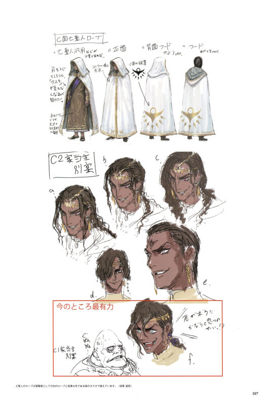
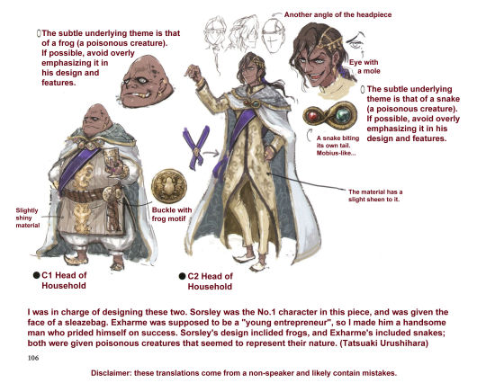
[id: The first two out of the five images are the original Japanese pages for Exharme and Sorsley's concept art. The next image is a translation of the bottom half of the first page. It has several notes detailing motifs of Exharme and Sorsley's outfits. Next to Exharme it reads, "The subtle underlying theme is that of a snake (a poisonous creature). If possible, avoid overly emphasizing it in his design and features." There is also a note pointing to a small Next to Sorsley it reads, "The subtle underlying theme is that of a frog (a poisonous creature). If possible, avoid overly emphasizing it in his design and features." There is also a close-up of Exharme's cloak-clasp with the caption, "A snake biting its own tail. Mobius-like…" Exharme also has a note pointing out a mole next to his eye, as well as some smaller drawings with alternate angles of his headpiece. Sorsley has a similar note next to a close-up of his belt buckle that reads, "Buckle with frog motif". There is also a note on Sorsley that mentions that the fabric of his clothing has a slight sheen to it. Exharme is labeled as "C2 Head of Household" while Sorsley is "C1 Head of Household". There is an illustrator's note at the bottom that reads, "I was in charge of designing these two. Sorsley was the No.1 character in this piece, and was given the face of a sleazebag. Exharme was supposed to be a "young entrepreneur", so I made him a handsome man who prided himself on success. Sorsley's design inclided frogs, and Exharme's included snakes; both were given poisonous creatures that seemed to represent their nature. (Tatsuaki Urushihara)".
The next image has the basic Seven Saints' robe design. It shows the front view (both with and without the cloak hanging open) and the back view (both with the hood up and hood down). There is a note near the front open robe image that reads, "If you close the front, you won't be able to see the "tasuki" so you'll want to keep it open," and another that reads, "The color is dark, but it looks shiny and expensive." There is also a note about the robes having a silk-like luster, as well as another that points to the golden emblem on the back of their robe that reads "Country C Emblem". There are then several different versions of Exharme's design, one of which has short hair that hangs in his face and has a small "Mwahahaha...." note next to it. There are then two more drawings, one of Exharme and one of Sorsley, that have a red box around them labeled "MOST PROMISING SO FAR". Sorsley has a note that reads, "Grr....." next to him, while Exharme looks to be shouting, "Do you really think you can match me!?" There is another illustrator's note at the bottom that reads, "The Seven Saints' garb is comprised of white robes similar to a clergyman's and a purple sash, which gives it a noble color. (Tatsuaki Urushihara)" /end id]
#triangle strategy#triangle strategy artbook#ts artbook character ref sheets#exharme marcial#sorsley ende#exharme with hubert von fire emblem hair is cracking me up
23 notes
·
View notes
Text
Lyla, Booker, Tenebris, Sorsley, and Exharme Concept Art


Concept/reference art for Lyla, Booker, Tenebris, Sorsley, and Exharme. Translation notes and text id beneath the cut.
Translation notes:
Gonna be real haha, I kinda gave up on the note that's pointing to the sash. The handwriting style is a little disjointed/vague, and I wasn't able to tell what exactly the characters were. But there seemed to be some reference to "inner" there, so I made reference to that.
The comment about Booker being an assassin might have been something more like "Booker plays the role of an assassin" or "Booker acts the part of an assassin" (with the implication that he's not literally an assassin).
Tenebris's name in Japanese is phonetically "Enigma." His name is probably the one that changed the most in the Japanese -> English localization.
Text id:
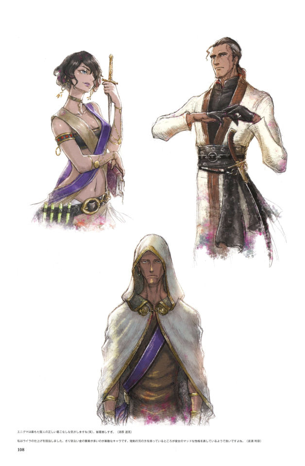
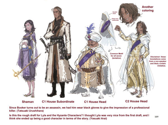
[id: The first image is of the full first page. It has portraits of Lyla, Booker, and Tenebris. There is another caption with an English translation of the caption on the first page. The first part reads, "I feel like Tenebris is the correct way to dress the Saints (lol). Everybody else dresses up too much. (Tatsuaki Urushihara)". The second part reads, "I was in charge of finishing Lyla. She is a wonderful character with many subtle gold elements. I like the fact that she's holding the blade of the dagger, which seems to show her mad-scientist-esque personality. (Rina Yoshiura)". The next image is of the full version of the second page, with several WIP drawings of Lyla, Exharme, Sorsley, and Booker. The next two images are English translations. The page is titled "C5House_Mad_Scientist." There is an image of Lyla walking toward the viewer, with some bowing men behind her. These men are labeled "Homunculi". Next to an image of Exharme and Sorsley, there is a diagram of their hooded capes and the purple sash they both wear. The same drawing is repeated below it, but with slightly different designs; Sorsley has a turban and Exharme has shorter, lighter brown hair. There are also beta designs of Lyla and Booker next to them. Lyla is labeled "Shaman", Booker is labeled "C1 House Subordinate", Sorsley is labeled "C1 House Head", and Exharme is labeled "C2 House Head." At the end of the page there is are some illustrator's notes. The first reads, "Since Booker turns out to be an assassin, we had him wear black gloves to give the impression of a professional killer. (Tatsuaki Urushihara)" The second reads, "Is this the rough draft for Lyla and the Hyzante characters? I thought Lyla was very nice from the first draft, and I think she ended up being a good character in terms of the story. (Yasuaki Arai)". /end id]
#triangle strategy#triangle strategy artbook#ts artbook character ref sheets#lyla viscraft#booker peynorth#tenebris mistel#sorsley ende#exharme marcial#lots of booker! I wonder if he wasn't supposed to be a bigger character at some point#and seeing all of the saints like this really makes me wish that more of them had survived the game#lyla is a favorite of mine and I really love the way they did her whole arc#but sometimes I'm like. who put her back in charge of things!!!!! let her rest!!!!!!!#I think she'd be down to just kinda vibe after everything that happened#kamsell and exharme on the other hand I think would've jumped at the chance to lead#I'd have to go back and watch the liberty ending but I think exharme straight up says he shares a lot of serenoa's goals#but he's just really particular about getting the glory for it#interesting stuff though. I love good villains and the saints are really really cool ones
21 notes
·
View notes
Text
Milo Concept Art
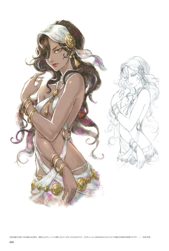
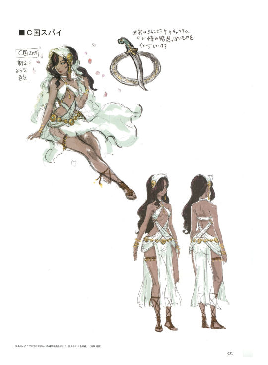
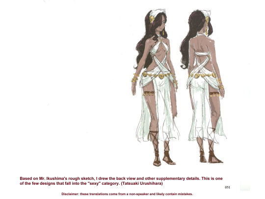
Milo's concept reference art. Translation notes and text id below the cut.
Anna's page also has a fair amount of information about Milo; here's a link to that too.
Translation Notes:
None this time! Everything was pretty straightforward.
Text id:
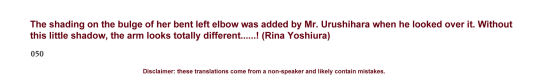
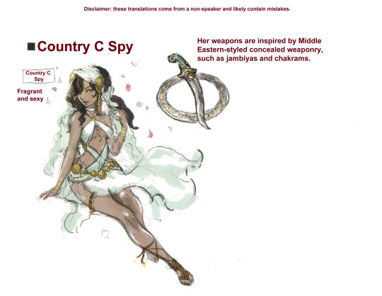
[id: There are two images, each displaying one of two of Milo's pages in the Triangle Strategy artbook as they're written in Japanese. The next image is a translation of the illustrator's note on the first page, and reads, "The shading on the bulge of her bent left elbow was added by Mr. Urushihara when he looked over it. Without this little shadow, the arm looks totally different……! (Rina Yoshiura)" The next image is the translations for the top half of the second page. There's a title that reads "Country C Spy", and a drawing of Milo reclining as cherry blossom petals around her that has the caption, "Fragrant and sexy." There is also an image of a chakram overlaid with a jambiya dagger that has the caption, "Her weapons are inspired by Middle Eastern-styled concealed weaponry, such as jambiyas and chakrams." The next image has a translation of the bottom half of the second page, and contains an illustrator's note that reads, "Based on Mr. Ikushima's rough sketch, I drew the back view and other supplementary details. This is one of the few designs that fall into the 'sexy' category. (Tatsuaki Urushihara)". /end id]
#triangle strategy#milo yuelle#triangle strategy artbook#ts artbook character ref sheets#I gotta go through the book and find the drawings of her fans and stuff sometime#casual accessories that are actually weapons are PEAK. to me#also parallels with anna's pin in a fun way
17 notes
·
View notes
Last Seen Blogs

qls-posts
제목 없음

acherryblossomconnoisseur
appreciatingcherryblossom

rudebih
love o'clock.

schmiegi
Vivi
sacred-gayze
Golden Haired Heresies