#region: south asia
Text
No. 41 - Air Astra
One of the reasons I take requests, other than 'it's fun' and 'so many airlines to choose from', is that sometimes people request teeny airlines that I've never heard of in my life (despite knowing about a lot, and I mean a lot, of airlines, both present and defunct). The most prominent example of this is, of course, Amakusa Airlines, but today's subject is another airline I hadn't heard of before - Bangladesh's newest airline, Air Astra.

I love this logo. It's sleek, aerodynamic, and looks like it could be the logo for a company in a science-fiction movie. The integration of the star in the letter A and the bright gold colour are both really nice choices. The kerning is a little bit strange, admittedly, but the nice connected letters more than make up for it.
Air Astra is one of only four passenger airlines with its air operator's certificate issued by Bangladesh. Its hub is at Shahjalal International Airport, and it flies to five destinations with two more on the way. It's privately owned, the first privately owned airline in the country to be founded since 2013, and it's a baby, having only started flights in 2022! Because of this pictures from certain angles are a bit hard to find, but I've done my best.

image: Md Shaifuzzaman Ayon
Their fleet is currently made up of three ATR 72-600s, with seven more on order at some point in the future. I've also heard rumours about them looking into Embraer regional jets and potential freight operations, but those are a bit vague and my inability to read Bengali is a limitation on my research. As it stands now, though, something I've never expressed out loud on this blog, I don't think, is that I'm a huge fan of regional turboprops. Operators in the US seem to be downright afraid of them and will use regional jets for even the tiniest of puddle-hops (maybe they think travelers are intimidated by them?) but they're a lot more efficient for low-altitude flights and cut down on things like fuel usage and noise. The larger ones, like the ATR 72, don't really feel that different from a jet when you're sitting in the cabin.
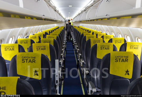
An Air Astra cabin interior, featuring bright yellow antimacassars with their logo and tagline. Not the absolute roomiest and a bit annoying for taller individuals but I've seen far worse.
And because the ATR 72 is such a big plane, it takes up a fair amount of space on the tarmac! Honestly, it's probably pretty hard to miss an Air Astra plane, especially in the light. Because wow is that a bright shade of yellow. I actually really like the specific hue they chose. One thing that makes me qualified to run this blog despite having no qualifications is the fact that I am apparently significantly better than average at telling apart colour on minuscule scales, so I do have to point out that this yellow isn't the most common shade. For example, it immediately stood out to me as being both darker and more orange than what, say, Spirit Airlines uses. And I think that's a pretty good choice. It's a lot more vibrant than other colours of a similar saturation. I love it.
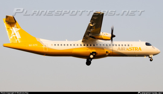
I always like when airlines put enough colour on the underside that you can clearly tell what airline the plane flies for from the ground. This is especially true for smaller planes that don't really have space for a logo on the belly. Air Astra goes for the same general shape both IndiGo and Azul have on their ATRs - again, my theory is that it's to contour around the ventral fairing, which is very pronounced on the type. I really like when airlines work with the shape of their plane rather than slapping the same livery on each model without considering the differences between them. The ATR is a curvy plane, and having a curvy livery on it really works. I also like the arc of yellow on the underside of the engine cowlings.
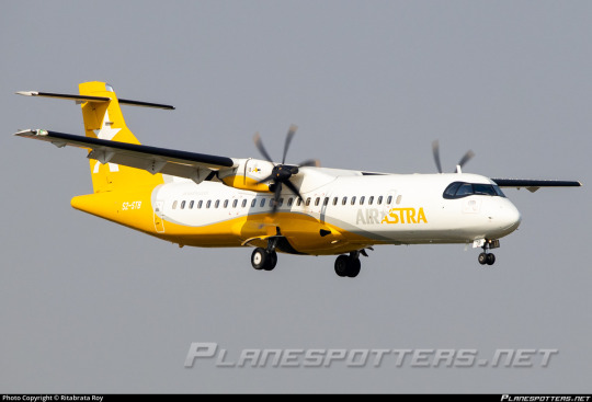
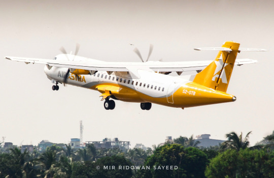
The shade of yellow they chose is incredible because it stays very consistent regardless of lighting somehow. That said, I do have some criticisms. The grey they chose really doesn't stand out enough from the white to make the trim or the first half of the wordmark legible, which is a real shame. They've also done something that many turboprop operators fall into - making the wordmark very tiny and below the windows. They're clearly not shy about showing off their identity, so it's a shame that it's hampered by this!
If it were up to me, I would have two ideas. The first and simpler one is to significantly darken the shade of grey used, which I think would take away a little from the gold-and-silver situation happening and also from the starry look of the shade they've chosen. My ideal solution would be painting the part of the plane which is left white in their chosen silver, and the parts that are currently silver in white. An alternative, perhaps even better, could be a black or deep grey replacement for the white so the grey could stand out - shine like a star. They could even add little specks for constellations. The star theme for an airplane is fantastic and I think they should lean into it!
You know what else would be fantastic? A shooting star theme. Just think about it. The logo already sort of puts me in mind of that, as does the elegant sweep of silver trim. I doubt it but I sincerely hope someone from Air Astra is reading this and taking notes.

I also think something could be done with the momentum that you get from the place the star intersects the letter A - a further sectioning of the fuselage along that line, maybe? I don't want to get carried away redesigning the Air Astra livery (even though livery redesigns are a thing I've considered doing, if I can get my hands on a graphics tablet) so for the moment I'll leave it at this final criticism: the centering of the logo on the tail is a little weird. I'm not sure how it could be improved without making it smaller, which would also be bad, but I also think the degree to which the star is wider than the A really makes it feel pushed back, which isn't my favorite. It's similar to the kerning on the wordmark where it doesn't ruin it or anything but I do notice it. (That said, the wordmark looks a lot better on the actual plane.)

image: Air Astra
I'm quite optimistic about Air Astra so far! At least, their livery. How they do as a company is obviously not something I have the knowledge or credentials to judge, though apparently they've been outperforming projections and have been reviewed positively for having service that meets expectations while their customer support exceeds them. They've only existed for under a year, and generally periods of expansion are what test airlines the most, so the fact that they've been handling themselves well so far is a good sign.
That said, I'm very happy with their livery. There's a lot about it that I think could be improved, because the start they have could easily be twisted into something A-worthy, but they have a great, memorable, clean logo, a great palette, and clearly a competent design team. Everything here is nice and well-executed, and I hope in the future they can elevate their livery to the same level as their logo, but what they've got already is a fantastic start. I hope things keep going well for them, because these planes would inject some much-needed vibrance to any airstrip.
Grade: C+
I did debate elevating that to a B-, but I settled on C+ because in the past that's where I've put other liveries that I think have a lot of room to grow. When I review a livery I'm not only rating it relative to other liveries but also relative to its own potential, which opportunities they've taken and which they've overlooked. Air Astra is good, but they could be great, and they're brand-new so they have plenty of time to get there.
Thank you to anon for the request! I really had a blast looking into this airline. It's incredible how it seems the larger an airline is the more determined it becomes to be boring, while smaller carriers without the massive design budgets are putting them to shame. One Air Astra plane would draw more attention than a dozen of Lufthansa's if they somehow ended up on the same tarmac, and clearly they stick with people enough that someone requested them. I think that's a massive victory.
#tarmac fashion week#grade: c+#era: 2020s#region: asia#region: south asia#region: bangladesh#air astra#requests
24 notes
·
View notes
Text

funny enough i've never drawn male nepal and sri lanka
#hws sri lanka#hws nepal#aph sri lanka#aph nepal#hetalia#hetalia oc#hws south asia#idk. ive been feeling uninspired about their designs for a year now#also yeah i recycled one of lebanon's old hairstyles for nepal lmao cause i still liked it but i thought it didn't fit the former#plus it was too similar to jordan#it works because this style is just basically a short hair ver of fem nepal's hair down#almost all of south asia has gotten a face lift these this past year and a half.....maldives and bhutan are next#i made south asia in like 2018 or 2019#isnt that crazy?#i think i'm particularly fond of my south asian designs despite starting with SEA because they basically grew up with me#as the 2nd region i designed
177 notes
·
View notes
Text
Nectar spotted

#Cave nectar bat#bats of asia#bats of the South East Asia Region#Bat of the day#daily bat#bat#bats#batposting#cute bat#cute bats#cute animals#Look at them go#!#Metal gear solid alert sound
178 notes
·
View notes
Text
I forgot how gigantic these boys are LIKE LOOK AT THEM STRUGGLING TO SIT INSIDE THE TUK TUK IN BANGKOK IM WHEEZING
#personal#joker out#im talking about mark's ig stories btw#LIKE JAN??? HAD TO BEND HIS LEG AND PUT HIS FEET ON A STEP#KRIS IS SQUEEZING NEXT TO JURE#yeah welcome to south east asia guys#they are giants in this region tbh
17 notes
·
View notes
Text
That's literally just racism???

Oh, and yes, of course this was from a "leftist". The fuck. That's what I get for going on Twitter, I fucking guess
#twitter#racism#racism against men is still racism????#hating men is not feminism???#oh and the comments mention a lot of other NONWHITE regions#like india and south asia#bravo#good on you progressives#you reinvented racism and packaged it as feminism#wanna guess the amount of terfs happily participating?
5 notes
·
View notes
Text
If you're dual citizens or parents are from different countries, please tag both. Include a cool fact about your country as well if you like. :)
(Tumblr only has ten options, so I've mostly divided the regions into Western/ non-Western.)
#usamericans are going to put their states instead of country in the tags and take years off all our lives‚ I know it#tumblr polls#tumblr culture#polls#world regions#cultures#diversity#knee of huss#asia#south asia#east asia#southeast asia#latin america#south america#central america#caribbean#oceania#aotearoa#australia#uk#europe#eastern europe#africa#middle east#north africa#west africa#east africa#central africa
17 notes
·
View notes
Note
hetalia artist for asian countries 🛐 as much as i love hetalia i don't think himaruya would really ever get to asian rep, it's only lucky that last year we get some asean official designs
bsbdjdjd yeah I’m kinda in the same boat with you on this one, but honestly I’m like. Very skeptical that his attempts to characterize the rest of Asia will go very well…
#remember when he just randomly dropped that white South Africa chibi head and never elaborated#yeah I honestly don’t really wanna see his interps of other regions HDHDJDJD#ask#anyways Asia beloved#I-crabbed-myself
18 notes
·
View notes
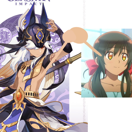
Text
i cant believe that hoyoverse named their characters stuff like kusanali, nilou, al-haitham and tighnari only for them to be the whitest most bland characters i've ever seen
#bland in terms of skin tone btw there's a little too much going on with tighnaris design for him to be called bland#but ykwim#it has the same energy as white american weebs naming themselves after anime characters#i just really hate what they're doing with sumeru#like the whole being pale thing is only One of the issues with the area that i have#for one#why are they taking like 8 different regions and blending them all together in a very weird way#like obviously it doesn't have to be Extremely Accurate because this is fiction and they're only drawing inspiration#but it's very clearly just the whole All Of South Asia Consists Of The Same People thing#idk man i just hate it and genshin has been pissing me off lately#genshin impact#zzz
28 notes
·
View notes
Text
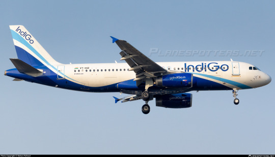
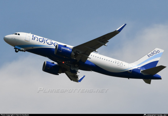
No. 9 - IndiGo
A very different type of bonus review - I'm here to stop talking about history and start talking about current events. Nobody has requested IndiGo, but IndiGo has requested that Airbus sell them a record-breaking 500 A320-family aircraft as an absolutely wild opening to this year's Paris Air Show. That is, to put it in context, the largest bulk order of jets by an airline ever, in history. While aircraft orders by companies are generally negotiated behind closed doors and thus I can't say how much money is actually changing hands, the approximate value of this deal is hypothetically 55 billion US dollars.
This will more than double IndiGo's existing 308-strong fleet, consisting of A320-family jets and ATR-72 turboprops. They are already the largest operator of the A320neo in the world, and have a truly stunning 999 aircraft on order.
Well. Assuming nothing changes, we will have a thousand more of these in the world by 2035. How do I feel about that?
Those living in the West might not be familiar with IndiGo (full name InterGlobe Aviation Ltd., not to be confused with defunct United States carrier Indigo Airlines; callsign "IFLY", not to be confused with Russian charter airline I-Fly) but even without this truly prodigious order they're pretty massive. In fact, they're the largest carrier in the world's most populous country. Currently headed by the former CEO of KLM, they are also the largest low-cost carrier in all of Asia.

It's interesting, but somehow this livery doesn't feel like it has much gravitas to it. That's fine for a low-cost carrier, it just feels a bit surreal that this is the current record-holder for largest bulk order of aircraft. Not the Delta-American-United triad, who already have 1,000+ aircraft fleets. Not Emirates and its massive A380 and 777 fleets. Not even a huge flag carrier looking to expand. They're not even a full-blown ULCC, and I could have imagined Ryanair making an order of this magnitude to try and rapidly expand way before I would have bought it from IndiGo. My guess would be that they're feeling a bit threatened by the two massive threats of the Lions Air and Airs Asia, but that's just speculation and also not what I'm here to talk about. I just cannot stop being astounded by this. I don't feel like any airline needs 500 aircraft total, but what would I know?

One neat little touch I'd like to point out is that this plane feels like it had a lot of thought put into how it's seen from the bottom. In particular, the little stick figure/airplane dot thing(?) IndiGo logo is on the bottom, and the little blue swooping line is made an active part of the design under the nose, rather than just trim, the same way as it is on the tail. The logo in particular is super recognizable. I will say, though, the way that it's just dots could probably make people mistake it for some sort of safety lighting rather than iconography, because it does resemble the sort of markers you'd see on the ground at a runway.

Seriously, what is that logo? Is that an airplane? I think it's supposed to be an airplane but it is so simplified it's no longer instantly recognizable.

The font used for the wordmark is ITC Bauhaus, which, sure, that's nice and big and striking, and its branding has not changed since 2006. The color...sure is indigo, though the actual livery on the airplanes pretty heavily skews towards general blue. (We're done with jetBlue, but blue jets will haunt me forever, it seems.) I wish it was a bit bolder on the actual fuselage, because it's a bit hard to read at times with how thin the letters are.
That said, I have to point it out: Indian carrier operating primarily domestic flights in India, which will mostly be flown on by Indian people, the majority of whom will speak Hindi (the fourth most spoken language on the planet), and yet has the airline's name and website in English but not Devanagari. (EDIT: I have been told by somebody who actually lives in India that English is probably the more broadly accessible choice for a lot of the country, so this is actually not an issue.)
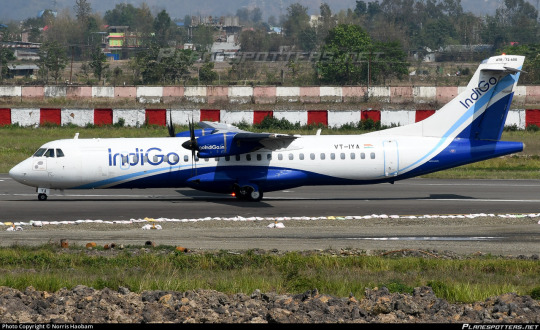
I kind of wonder if ATR operators are drawn to dark swooping curves on the bottom of their planes, because Azul had the same sort of basic shape around the belly fairing. I think it looks good on the type, don't get me wrong, I'm just curious now if that does factor into the thought process.
I think this livery is exactly as busy as it needs to be. It pinches in neatly under the nose, and I like how it travels up to cover the lower half of the tail. It feels uncommon to see that sort of tail-fuselage integration. It's nice how the light blue line alternately joins and diverges from the darker main body, creating a dynamic feeling, and I like how it's used as almost a rule for the placement of the logo on the tail. (I do wonder why the little plane logo couldn't go there instead, though. Or on the nacelles. Its absence everywhere except the belly seems weird. There actually is a small one on the nose under the windows, but if you can't see it from a distance I don't think it counts.)
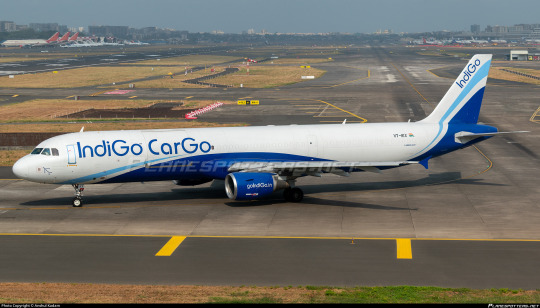
The airline operates a total of two freighters, but I just want to point out the commitment to the Go bit, which I like. It's a lot less of a common branding thing than you'd expect, honestly. Surprised more airlines haven't jumped on that.
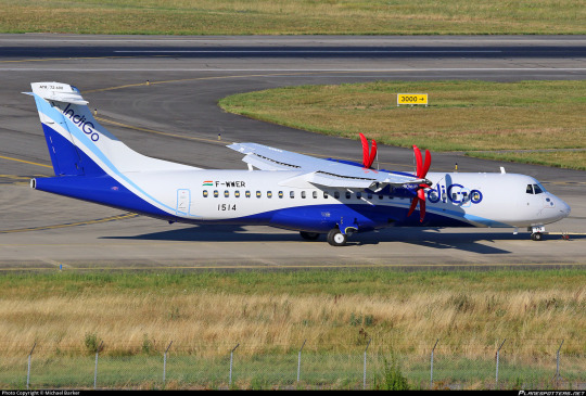
I really love seeing prop covers on planes. Those are her gloves.
I'm not sure how I feel about the fact that the blue fully retreats in that little center-back fuselage section. From a few angles you get just a sliver of it visible in a way that feels awkward, but in theory I do like it. A bit of white breaking up that line isn't a bad thing.
Grade: C+
As in, we will c +500 of these in the next twenty years.
Well, this has been just a fun little extra. It's a good thing I don't totally hate this, because 500 more of these are about to be flying to an airport near you! (More airports near more people, because I think 1,200 planes for just their current 101 destinations would be serious overkill). What an exciting start to the Paris Air Show, and I live in fear that I'll be forced to rush to my keyboard again when [throws dart] Binter Canarias announces that they [spins wheel] are going to start operating a fleet of secondhand A380s.
#tarmac fashion week#grade: c+#region: asia#region: south asia#region: india#era: 2000s#era: 2010s#era: 2020s#indigo#low cost carriers
34 notes
·
View notes
Text
tfw your oc/self-insert is from sumeru but you dont actually know which country's culture you want your oc to be based off of bc sumeru's a clusterfuck of multiple cultures
#they really just. mashed all of swana + south asia into one region huh#like should i go for arab culture?? or yemeni?? or iranian??#i have no idea#idk if im allowed to say this but im gonna say it anyway but#im not swana but my culture is somewhat influenced by swana#and i am muslim and swana culture is somewhat connected to muslim culture#so i guess that's why i feel sort of attached to sumeru despite not being swana lol#maybe i should go for iranian fashion bc my name IS iranian...#genshin impact#sumeru
11 notes
·
View notes
Text
bro my cousin just sent me these and I have...NO WORDS. NONE.

#genshin impact#genshin cw#comorianqiqirants.txt#negative#what the fuck???#hoyo thought they was cookin...#common genshit L#hetalia cw#sumeru#comorianqiqi.txt#you know something's not right when the WHITEWASHED HETALIA CHARACTER is darker than the three darkskinned mfs#from a SWANA/MENA/South Asia inspired region btw#common hoyoverse L#can't have shit in genshin#genshin more like genshit#hoyoverse being Ls
5 notes
·
View notes
Video
flickr
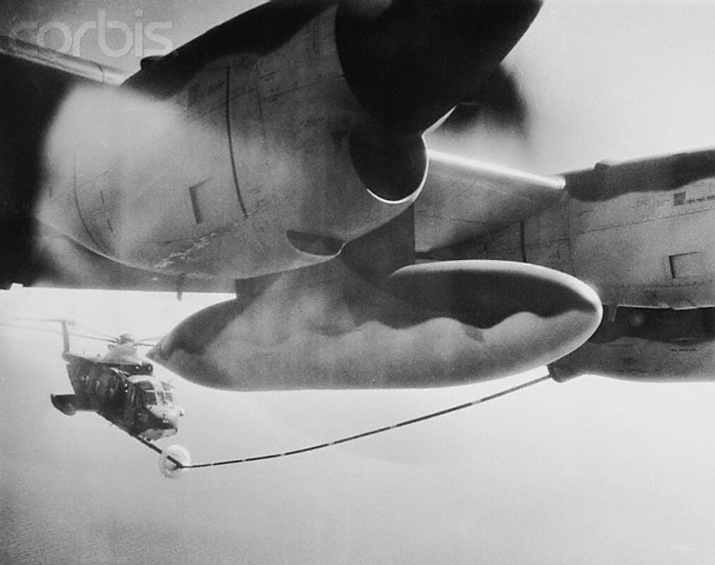
U1572829 by manhhai
Via Flickr:
01 Nov 1967, Saigon, South Vietnam --- Refueling. Saigon, South Vietnam: An HC-130P refuels a "Jolly Green Giant" rescue helicopter somewhere over the South China Seas. The , long the airlift workhorse in Southeast Asia, has been converted into an aerial tanker to extend the range of the rescue helicopters. These new aircraft are operated by the 39th Aerospace Rescue and Recovery Squadron at Toy Hoa Air Base. November 1, 1967. --- Image by © Bettmann/CORBIS
#Aircraft#Asia#Asian historical event#Battle#Connection#Contrasts#Historic event#Ho Chi Minh City#Nobody#North American historical event#Saigon#Size contrast#South Vietnam#Southeast Asia#Southeast Region#United States historical event#Vehicle#Vietnam#Vietnam War#1959-1975#Vietnamese historical event#War#flickr
3 notes
·
View notes
Link
They are finally getting rid of the confusing three different ages people would go by in Korea– an “international age,” a “Korean age” and a “calendar age.” and going to everyone going by international age.
1 note
·
View note
Note
bad news but the genshin boy has an arabic name cuz the latest genshin region is based on a mishmash of a myriad of different south asian & SWANA cultural influences
and yet still pale as fuck ☹️
2 notes
·
View notes
Text
SOUTH-EAST ASIA - Regional Data and Trends.
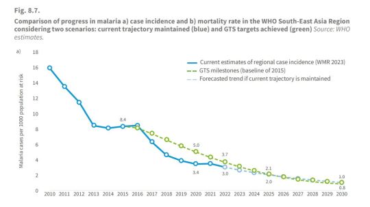
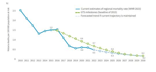
In 2022, nine countries in the South-East Asia Region contributed to about 2% of the burden of the malaria globally (5.2 million cases). Most malaria cases in the Region were concentrated in India (66%) and about 94% of deaths were in India and Indonesia (Fig. 3.5c). Since 2000, the Region has achieved excellent progress in reducing its malaria burden. Between 2000 and 2022:
case incidence (cases per 1000 population at risk) fell from
17.6 to 3.0 (Fig. 3.5a); total malaria cases dropped by 77%, from 22.8 million to 5.2 million; the mortality rate (deaths per 100 000 population at risk) fell from 2.7 to 0.5 (Fig. 3.5b); total malaria deaths declined by 77%, from 35 000 to 8000. However, substantial case increases have been observed in some countries in recent years, notably in Myanmar: Between 2019 and 2022, Myanmar saw a seven-fold increase in cases, from 78 000 to 584 000, fueled bypolitical and social instability.
The increase in malaria case burden in Myanmar since
2019 has impacted neighbouring Thailand, where cases
more than doubled between 2021 (2426 cases) and 2022
(6263 cases). Democratic Peopleʼs Republic of Korea India Indonesia Myanmar Bangladesh Thailand Nepal Bhutan Timor-Leste
In 2022, Timor-Leste reported zero malaria cases for the second consecutive year and Nepal reported zero indigenous malaria deaths for the first time.
Bhutan reported zero cases of malaria for the first time in
2022.
Sri Lanka was certified malaria free by WHO in 2016 and
has maintained this status.


#south east asia region#case incidence#zero human cases of malaria#malaria cases#world malaria report#world health organization (who)
0 notes
Text
My niece wanted to play Risk but her cousin and sister just wanted to play with their devices. So I played risk with her. This is my first time ever setting eyes on the risk map & to my horror and delight, i found that the south east asia map has only two regions -- siam for the main land ( vietnam, cambodia, peninsular malaysia, etc) & indonesia for the borneo islands.
#i didn't see the philippines at all#it's not like the other parts are named perfectly#but at least a whole region of multiple countries is not called a single country's old name#idk maybe call it borneo and south east asia
1 note
·
View note
Last Seen Blogs