#marc dubuisson
Text
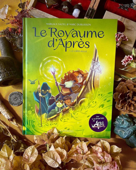
J-4 avant la sortie du premier tome !
Un petit post pour vous montrer mon process, un peu chaotique, je dois l’avouer, sur ce tome 1 !
Après avoir reçu le script de @unpied j’ai découpé toute l’histoire en petit thumbnails que j’ai scanné pour rajouter le texte et que cela soit plus lisible.
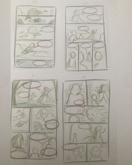

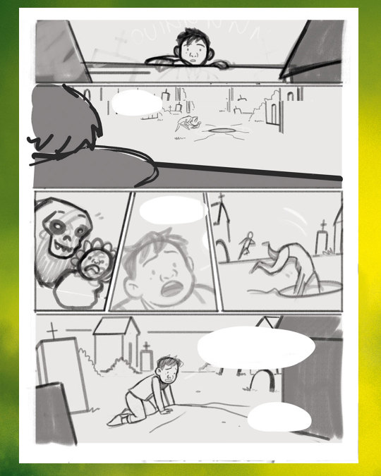
Une fois le découpage validé, je passe à l’étape du croquis. La page a beaucoup changé ici suite aux retours de Marc et de notre éditrice et aussi suite au changement de format du livre !
Ensuite « j’encre » la page pour bien préciser le dessin et que l’étape de la couleur soit plus simple pour moi.

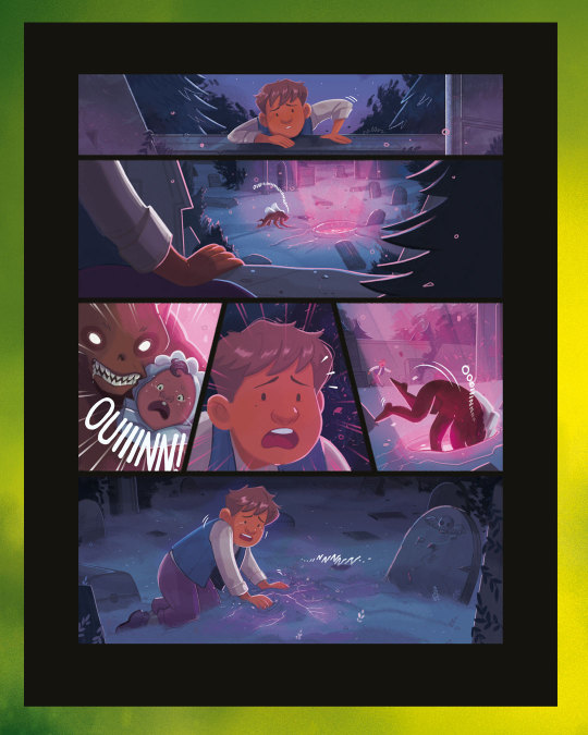
Et enfin la couleur ! L’étape la plus longue et la plus compliquée ! Je commence par les aplats et ensuite c’est les ombrages et détails pour bien marquer l’ambiance de la scène.

Heureusement, je commence le tome 2 avec un process un peu plus simple, que vous pouvez découvrir deux fois par semaine sur ma chaîne Twitch !
Plus que 4 jours avant la sortie ! 💜💜
Le Royaume d’Après,
Tome 1 Le Crépuscule
Sortie le 29/03/2024
@unpied / @m_saltel / @lelombard
@eliseharou

#supergna#margaux saltel#illustration#digital art#comic book#le royaume d'après#le crépuscule#marc dubuisson#le lombard#bd#bande dessinée#bandes dessinées#bd jeunesse#sorcière#royaume des morts#aventure#fantômes#ghosts#witch#cottage core#fantasy
4 notes
·
View notes
Text
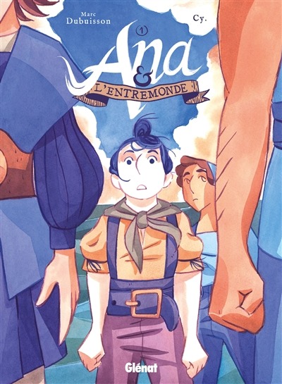
Ana et l'Entremonde T.1 : Par l'ouest, vers les Indes
Ana et l’Entremonde T.1
Alors qu’elle devait juste livrer des cargaisons sur un bateau avec son ami Domingo, Ana se retrouve bloquée dans la cale alors que celui-ci lève l’ancre. Hors de question pour l’équipage de faire machine arrière ! Les plans du señor Colomb pour rejoindre l’Inde par l’ouest sont bien trop importants ! Malheureusement, les détracteurs du projet avaient raison : la Terre…
View On WordPress
#ana et l&039;entremonde#Aventure#bande dessinée#coup de coeur#cy#fantasy#héroïne#héroïnes#marc dubuisson
1 note
·
View note
Text

Ana et l'Entremonde - tome 1, Marc Dubuisson, Cy, Glénat, (2022)
0 notes
Photo
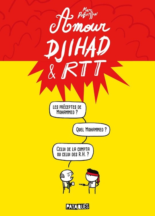

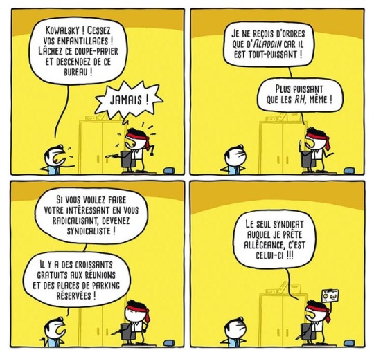

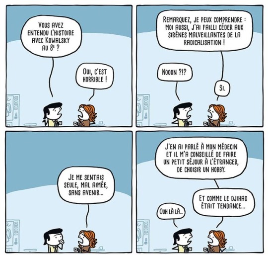

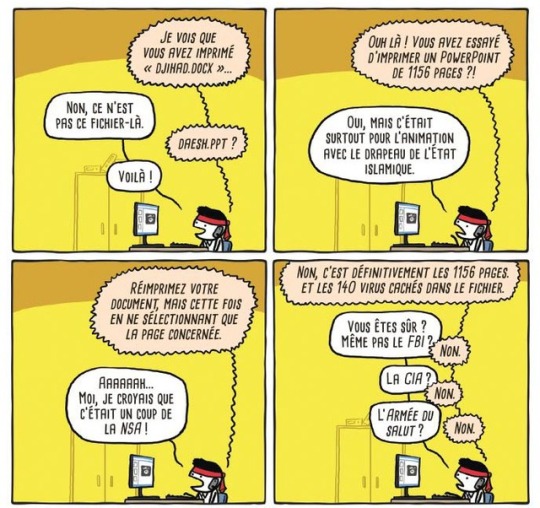

"L'auteur dédie ce livre aux victimes de l'intégrisme religieux et des réunions-lunch avec présentations PowerPoint".
Marc Dubuisson - Amour, Djihad & RTT (Delcourt/Pataquès)
0 notes
Photo
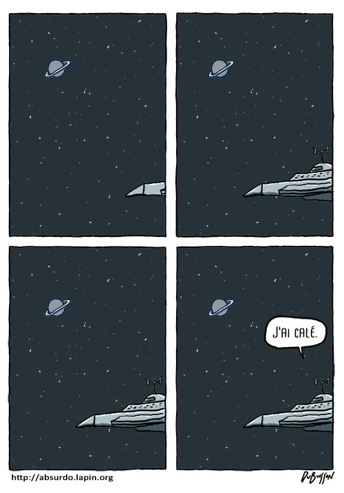
https://absurdo.lapin.org/
1 note
·
View note
Text
Voilà 😘

Marc Dubuisson
En Attendant La Fin Du Monde
2 notes
·
View notes

Link
0 notes
Text
Jean-Marc Nollet at the “Soir”: “No, Ecolo is not scary”
Jean-Marc Nollet at the “Soir”: “No, Ecolo is not scary”
[ad_1]
Posted on 3/01/2020 at 6:36 pm
Through Martine Dubuisson
, David Coppi
and D. Ci and Ma.D.
Jean-Marc Nollet, president and negotiator of Ecolo, comes out of his reserve on the eve of a potentially decisive week for federal negotiations. In the margins of an interview on federal negotiations, he confides in the image of Fathers Fouettard who sticks to the skin of the…
View On WordPress
0 notes
Text
Une modeste contribution sur l'écriture inclusive
Je trouve intéressante l’idée même de l’écriture inclusive (je suis persuadé comme Authueil qu’il ne s'agit pas là d'une simple mode), et j’aurais des choses à redire parce que je ne me vois pas encore l’adopter telle quelle (à l’exception notable de “celleux” et, par extension, “cellui”, qui fonctionnent bien comme raccourci de “celles et ceux” et “celle ou celui”, respectivement). Mais dans un esprit constructif je vais essayer de contribuer plutôt que de me contenter de râler sur les propositions actuelles.
Ma contribution porte sur le point médian. Certes, il ne faut pas se focaliser dessus: l’écriture inclusive ne se réduit pas à cela. Mais en même temps, il en fait partie intégrante (sinon pourquoi l’avoir inventé?), et en particulier il nécessite un apprentissage supplémentaire de la part du lecteur alors que la plupart du reste de l’écriture inclusive ne se remarque même pas pour un non-initié; il est donc légitime de se pencher dessus. Afin de repartir sur de bonnes bases, je pense que la meilleure introduction est celle de Romy (via Marc Dubuisson).
…
C’est lu? Vraiment? Vous êtes sûrs? Bon. Allons-y.
Nous remarquons d’emblée que le point médian sert dans des situations diverses comme « un·e artiste » ou « vous devez être épuisé·e·s », etc. Mais comment est-on censé le lire? Ce n’est pas une considération anecdotique: même si l’écriture ne se limite pas à la transcription de la parole, il est tout de même nécessaire de pouvoir lire sans hésitation ce qui est écrit. Sans compter que le point médian est censé marquer une abréviation: il doit pouvoir, à l’expression, correspondre une version non abrégée de celle-ci. Or dans le premier cas cela se lit: « un ou une artiste », mais dans le second: « vous devez être épuisées » (ou « vous devez être épuisés », à l’oral cela revient au même).
Le nœud du problème, pour moi, est là: la lecture du point médian est fondamentalement ambigüe. Il est possible de déterminer s’il faut énumérer les versions, ou juste le faire une fois parce qu’elles reviennent au même, mais cela n’est pas instantané et casse le rythme de lecture. Même si les plus gros problèmes disparaitront à l’apprentissage (ce que beaucoup de critiques de l’écriture inclusive négligent, se focalisant sur des problèmes qui ne sont que transitoires), il restera cette ambiguïté fondamentale dont les effets, je le crains, ne disparaitront pas vraiment.
Sans compter que cela ne fait que compresser à l’écrit un langage qui à l’oral ne bénéficie pas des mêmes outils inclusifs: il est évident qu’à force de répéter certaines expressions nécessaire au langage inclusif des compactions orales vont se révéler, et c’est peut-être celles-là qu’il faudra écrire, plutôt que d’employer le point médian, qui pour moi sépare trop la langue écrite et la langue parlée alors qu’elles sont liées.
Est-ce un défaut rédhibitoire? Je l’ignore. Mais cela suggère qu’il est possible de faire mieux, même si je suis bien incapable de dire comment… Désolé de ne pas avoir de meilleure conclusion.
1 note
·
View note
Text
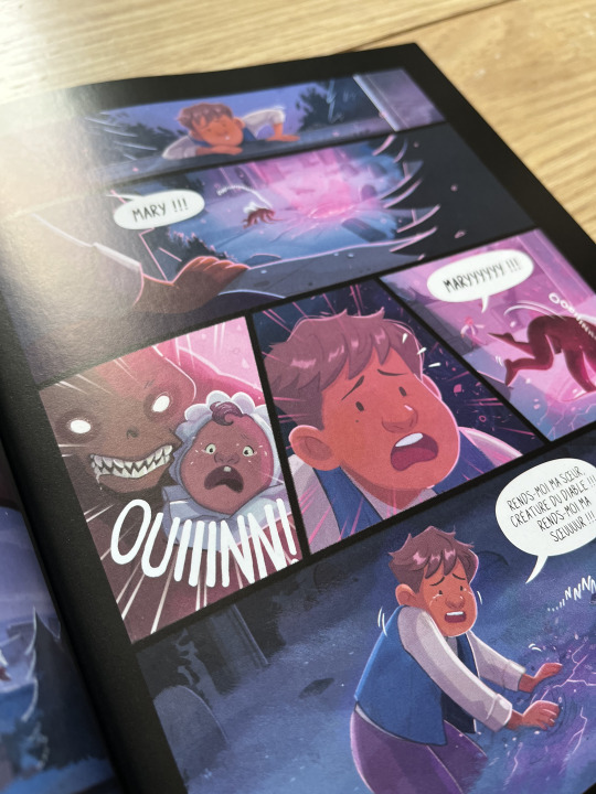
Ça sort aujourd’hui en librairie !
Avec le merveilleux Marc Dubuisson au scénario et moi au dessin, publié chez Le Lombard.
J’espère que vous ferez un bon voyage dans ce "Royaume d’Après" en compagnie de Christopher et Morrigan !
J’espère que cet album vous plaira autant qu’à moi ! 🦇🍁
#supergna#margaux saltel#illustration#digital art#comics#comic book#le royaume d'après#bd#bandes dessinées#bande dessinée#marc dubuisson#le lombard#bd jeunesse#witch#sorcière#supernaturel#fantastique#bd fantastique
2 notes
·
View notes

Text
Tweeted
"Poésie moderne", mon dessin d'hier pour 7sur7 https://t.co/T8vuGK6DBn
Vous pouvez retrouver mes recueils de strips en librairies ou via la boutique en ligne des éditions Lapin : https://t.co/Ok3jR9e7da pic.twitter.com/D0yK0ZHLdR
— Marc Dubuisson (@Unpied) February 15, 2020
0 notes
Photo

“En Attendant La Fin Du Monde”
Marc Dubuisson
https://dia.so/2JT
10 notes
·
View notes
Text
_GAP : La forme et le sens FAIRE DES OBJETS QUI PLAISENT.… Sophie Dubuisson Antoine Hennion
Intro :
What makes an object please? It becomes possible to treat the question practically, to tear it from the most abstract questions that it could also raise, by observing the work of the designers of a first agency, the GAP agency. It is a fashion agency, employing a dozen designers. In the middle, the agency has a strong brand image, its designers have the reputation of making a very "artistic" design, to be attentive to lines and shapes, to the beautiful object, to defend a design aesthetic that claims simultaneously, according to a fairly dominant view among French designers, as being sensitive to social symbolism, to the charge of meaning that design must give to objects: a mixture of Barthes and Baudrillard, who are indeed the leading figures of all the public works of the designers - so much so that it is not easy to decide for what part they inspired the design and for what part the design inspired them. The result is there, the work of the designers of GAP seems tailor-made to validate the theories of Baudrillard, unless it is these which rationalize the instructions of the social of the designers.
I selected and translated some interesting parts.
spaces and furniture, their uses in connection with the emergence of new activities. At this prospective stage, designers consider the function in its most global: the relationship between the user and the object that gives the latter its reason to be there. How are objects used? The report of the object to the user is then expanded, the "functional function" does not exhaust the dimensions that the designer of GAP would like to take into account when building a concept. If the object has a function, it is that of being able to bring something to the user, to be useful to him. But he does not reduce this utility to functionalism, the notions of "well-being", "happiness", "pleasure", according to the terms he uses, are also for him the forms of a certain utility or function of the object: "Function is not only the technical function, it is also the symbolic function, the function of reading" (Marc, the creative agency). What objects bring, say and transform are for the designer the most highly estimable effects: "What is important in the objects is to see what they tell us", "I like objects that me talk ". Users can find in objects a utility that is not limited to their proper functioning, but goes beyond: "It is an object that makes me happy", "people like objects that remind them of a past". The design goes further than the function, it exceeds it. In his speech the designer designates his work as what is "more" or "extra", which "goes beyond", which "exceeds" considerations that are only commercial, technical or functional.
By looking at how the designers of GAP characterize objects that have not passed into the hands of designers, we can see how they define the register of their intervention on objects. They often criticize these objects as having neither "sense" nor "concept", to "evoke" nothing. They know that all manufacturers do not use designers, that is to say that there are objects on the market that have not been treated in design, a situation they deplore. According to them, these objects go unnoticed - the design would therefore ensure that objects are seen. Their visibility appears to be the main condition of their existence, it is she who will make the object interesting. Through these notions, we have a delimitation of design work on industrial objects. Before his intervention, the material exists through its technical, commercial, functional performances, the designer wants to be able to hold all three in a "concept" that makes sense. Inspired by Baudrillard's literature in which objects are systems of signs arranged around us, designers charge objects of meaning, speech and meaning. But if, for Baudrillard, the objects lead us into the excess of a spiral of consumption that we can not control, for the designers of GAP, the objects are less lark mirrors or hollow boxes that markers that mark our environment, and concrete markers of our identity, in a rather vague, open sense, which moves away from the social recognition of a status or taste, referred to marketing, to aim at the shared evocation of a quality , rising with the contact of objects like memory with Proust's madeleine.
Objects are "signs", signifying elements. They "speak", "say something", "offer a reading", "evoke", "express", "carry a speech", "tell each other". The work of GAP designers becomes the incorporation of this discourse into the object. By putting meaning into these boxes which are at the beginning, for them, without soul and without identity, they make them objects "which say something" and "which carry meanings". Loaded with so much identity, the objects reveal themselves as carrying characters. They are "marked", "media" or "nerdy", "warm", "tender" or "maternal", or "masculine", "laborious" or "industrial". In this way, they are qualified by the designers as would be living beings with a personality and able to express themselves. Objects are no longer without soul. Their personality makes them symbols of values, reflecting at once their own characteristics and the discourses they want to be the messengers. They "endorse values of modernity" or are "references of power", they carry "signs of wealth" or "technology", or are themselves signs of "hygienism", " purity "," virginity "," cleanliness "," simplicity "or" wholesomeness ".
The meaning that GAP designers recognize to objects is partly inscribed in their own identity, it emerges from them, with their help. But this conception of meaning is quite far from the physical object, and can be very external to it. The meaning of an object can also be the faculty of opening a universe, of being a gateway to a world, like the forests, lakes or rivers of medieval mythology. The objects are taken as keys, they open paths and unfold the drape of our imaginations. If such an accessory for early childhood is "maternal", it is mainly because it evokes the warmth of love that a mother brings to her child. Referring to "the world of ironing", the iron designed by the agency must recall both the smell of freshly washed and ironed laundry, but also the efficiency at work of a woman concerned about his ironing. The world of ironing is all this world of objects, colors and smells that the action of ironing must evoke, but it is also, from these physical traits, this world of values and references to which adhere the housewife.
The design work on school-class furniture will make them the elements of another universe, that of the office. All of a sudden, they become more rewarding for the faculty, more motivating and better adapted for new school activities, because the designer reads in the market that the school universe of the blackboard and the professor's chair is exceeded we are now in the days of efficiency, work and value through work. The notions of universe or family used by designers reflect their will to act on objects but also on what surrounds them, beings, other objects, places and time. The designer wants to be able to connect different elements between them, to establish connections to build, like a geometry, worlds.
Objects make us dream, that is to say, they transport from one state to another, from one time to another or from one world to another. They can transform, and that's the "razor that makes it beautiful". They can "be vehicles of dreams" and take you into a "domestic universe", which will remind the house where it will always be good to take refuge because the values are reassuring. They can also force the memory, the memory of certain times or places where we like to be. Anne, who is mainly involved in thinking about concepts, and is involved in this very early in the design work, is part of the team responsible for thinking about the new organization of offices and their furniture. She thought of the need for a conference room that could break with the often noisy and stressful office environment. It is with reference to the mythical place of the National Library that she proposed to organize the space, because the room, endowed with the same characteristics, would become able to release a library atmosphere and would encourage a work of reflection: « we come to think, to be calm, to work. " Similarly, the reflection around the concept of the meeting room has led the designer to think of "a market" because in the same way that a market, a meeting brews ideas and men, produces exchanges and contacts . The work done by the designer is that of the mapping of places or objects, referencing seems to be the effect of an intellectual process that the designer does not theorize: "it reminds me of" explains he simply. An important part of his work is intellectualized but not formalized and consists of a connection between ideas or objects between them. The designer wants to be able to give the objects a power of mediation. Via the object, a dialogue could take place between the object, its user, the environment and the designer himself.
The "memory universes" and the "reference universes" are these whole worlds contained in the objects, they are neither material nor technical, they are the ones that the designers refer to when they speak of meaning, starting from they think about the "concept" of the object, which is the first production of the designer. Like these passages in the Grail stories, objects are primarily intended to "connote", to "refer to". Le Petit Robert tells us, following Goblot, to define the connotation: "Every name denotes subjects and connotes qualities belonging to these subjects". They are the ones the designer has to bring out, as they say. Thus taken up in the sense, the object "connotes order", "confers the idea", "means quality", "carries an atmosphere". It is not, objectively speaking, in the sense that it does not necessarily have the attributes that it puts forward, but it is what makes it possible to pass to, to think of. Before being a message or a speech, it is a passage, the meaning is behind it. The quality that the designer of GAP defines for its objects is related to the ability to allow these passages. The truth of objects lies in their availability to evocation.
It would be excessive to consider that GAP designers take objects for signs. They do not make any signs of it either: rather, they work with them to make them fit to make sense. Neither totally external to each other, nor solidarity, sense and object are made each other under the fingers of a skillful designer: we understand that in this conception of design, the technique and the function of the object are put aside and attributed to others, it is largely by shifting away from this too present materiality of the physical object that the designer opens another mode of existence, in a world where he becomes the vehicle of values and meaning.
This work of "concretization of signs", of making sense, goes through a particular means. For designers, it is first by the appearance of objects that it is possible to enter the worlds they open. From the subject matter and the content of the object, the designer of GAP retains above all that which is perceived, giving rise to an evocation, by association with another perception. Hence the constant link made in the agency between the meaning and the form, a little on the register of natural evidence - whereas, outside this precise conception of the meaning of objects, these two aspects could very well be oppose.
0 notes
Text
Favorite tweets
Je bosse donc sur mon prochain album "Startup Generation" et je me dis que cette bulle aurait aussi pu faire un bon titre. pic.twitter.com/MywdTcnAcg
— Marc Dubuisson (@Unpied) August 5, 2019
via http://twitter.com/Unpied
0 notes
Last Seen Blogs
renosounds-blog
Reno Premier Sounds DJ Services - Lake Tahoe Wedding DJ

shimkunaite
Believe in miracles

jonathanclareydigital-blog
Jonathan Clarey Digital

bijuice
ah, a kindred spirit

jinkalewajinkalak
Untitled