#idk its super cartoony and flat
Text
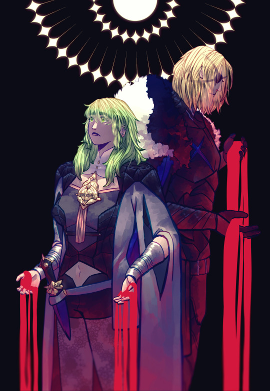
is destruction all we're worth, goddess?
#dimileth#fire emblem three houses#byleth eisner#dimitri alexandre blaiddyd#fe3h#fe:3h#byleth fire emblem#dimitri fire emblem#byleth x dimitri#blood for ts#idk its super cartoony and flat#guess whos properly playing 3h now.............
170 notes
·
View notes
Note
i am new here so I could be off, but looking through your art I'd say your main style features are simple (often cell-based) shading with otherwise an emphasis on the flat colours, A kinda simple cartoony (as in not super realistic) style that has hints of anime styles but otherwise doesn't belong strongly in any one art genre, and a slight leaning towards muted/earthy but still (in their pieces) bright colours!!
And well it's not a visual bit of style, when I looked at them all together + your year in review I could definitely see improvement and experimentation!! overall your art gives the vibes and style of someone trying new things and still learning /pos which is a good thing trust me, it's always good when you can see an artist's progress in their works, A good sign for the future <2
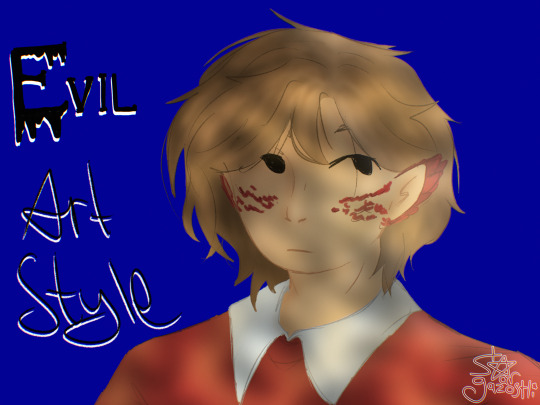
this, mayhaps?
idk man, like anon said, im still learning and trying stuff ans actually really like how this turned out
tho to be fair its not quite an evil art style, maybe instead a mildly devious art style
uhhh idk im just spouting words, ive had a long day lol
gonna post a silly doodle of Joel later also (and by later i mean in like 5 mins or less)
#evil art style challenge#grian#and yes there's definitely anime influence in my style. i taught to draw people well by tracing hetalia screenshots#my art#grian fanart
12 notes
·
View notes
Text
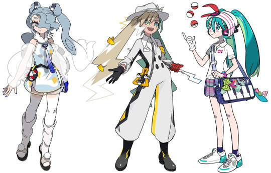
Reviewing and Ranking the Hatsune Miku x Pokemon Designs because I'm a procrastinator lol
(pictures from @hapuriainen)
Review:
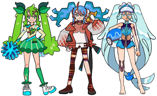
Grass: It seems like they were going for the Sword and Shield look with the jersey motif and I think it's smart to blend that with cheerleading. That being said, I wish it was... grassier? It feels a bit like wasted potential as the look is too focused on the region over the type. I like the elements of the design though.
Fire: I love the idea with the stockings but that's about it tbh. Her hair is supposed to look like fire but it doesn't come off that way and her bangs are disjointed from her pigtails. The colours are too muted and I feel like not enough effort was made to make her blue hair blend in with the rest of her colour pallet. The idea is there but it ended up being pretty underwhelming imo.
Water: definitely the best of the starter types! I love every part of the design and it all blends together perfectly! I especially love the design of the swimsuit! Simultaneously sporty and dainty!
Flying: absolutely gorgeous and I can definitely see Articuno in her design! I love the light and silvery colour pallet so I'm a bit thrown off by that strong blue tone in the tie and glove. I think those should've been the same grey as her hair or maybe the hair ties (which I find a bit too dark but is alright).
Electric: a really cool and new idea that doesn't follow the expectation of a Hatsune Miku design! I really like the cartoony elements of her design but it does come across as a bit simplistic. The hat also feels too big and doesn't really look like she's wearing it? It also looks too feminine for the rest of her appearance imo.
Trainer: she blends right into the world of pokemon while still being Hatsune Miku! I especially love the signature trainer hat with headphones and the colours of her skirt being her actual colour palette. It's not too plain or overdone, it's just perfect!

Poison: Obsessed! It diverges from Miku's typical design expectations and creates a character that I'd actually love to see in pokemon! Her design is just so cool and exotic and the colours are so bright and fun. Those shoes are sickening!!
Ground: the concept of this design is a bit weak imo and the whole thing feels pretty flat. The clothes feel very basic that it comes across as a half-assed, generalized idea of a nomad. The shoes especially ruin the look for me..
Ice: really cool design (pun not intended)! I like the geometric shapes and the androgynous business attire. I'm not too sure how I feel about the green accents though (although the red on the bag makes it better but it's also weird that it's the only place with red so idk if that actually fixes it) and I wish the long pigtail bits weren't there and it was just the short hair. The pants could have more details too but overall, a really interesting design!
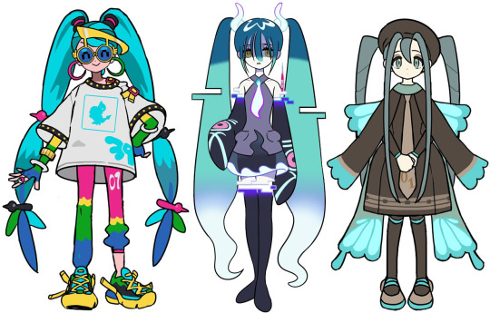
Normal: super cute, I especially love the glasses! It's a "normal" outfit which I assume was the intention so even though the saturated colours and simple outfit may keep it from being a favourite, I do think it's a strong design!
Ghost: it is a really cool design but to me, it doesn't give me "Pokemon". It feels like it's just a Hatsune Miku design that is ghosty and not enough innovation was put into actually merging the Pokemon aesthetics into this. Even as a stand alone Hatsune Miku design, there isn't actually a lot to it.
Bug: So precious! I love the simplicity and creativity put into this design. It's just perfect, head to toe!


Steel: love it! Every part of its execution is well done and I love the soft colours! It's simultaneously a cool and sweet design that I can just keep staring at!
Fairy: it's definitely cute and I like the idea of making her this gyaru school girl. It would've been cool to see something more extravagant for a fairy type look but it's still nice.
Rock: I love the princess design, she looks like she can be a gym leader or elite four member! It's so beautiful and the look is still great even without the dress and frills. I wouldn't understand how Miku can move with those things on her knees though lol. I also think the blue legging should've been black or have that blue present elsewhere in her outfit.

Dragon: I love a lot about the look but there are parts that also make it a bit disappointing. The shirt and pants in particular really wash out this look for me, they're so plain and bright (I hate that she's wearing a collared shirt). I feel like this should've gone all the way with its extravagance and medieval vibes, especially since it was the final revealed design and it's with a legendary Pokemon.
Dark: a stunning design that I didn't expect to be paired with Obstagoon! I love the slick shapes and the big fluffy hat and umbrella to contrast it (also the umbrella being a microphone is so clever)! The choker and shoulder straps make the look too modern but it's still overall really pleasant.
Fighting: Love the design and I'm obsessed with the colour palette! She looks so cool and I love the way sirfetch'd's leek was taken advantage of. My only nitpick is the shoes being a bit out of place from what's overall a slick design.
Ranking (lowest to highest):
18. Ground
17. Ghost
16. Dragon
15. Fire
14. Grass
13. Electric
12. Fairy
11. Flying
10. Ice
9. Rock
8. Fighting
7. Normal
6. Dark
5. Steel
4. Water
3. Bug
2. Poison
1. Trainer
15 notes
·
View notes
Text
something i love about art: all the beautiful and different styles
something i dfucking Hate: getting PUMPED and wanting to try everything u see in every art style that strikes a chord in u to the point it makes a giant list of Things and u struggle to pick between what to experiment with first and then ur reminded ur skills kinda suck and its testing ur GOD damnb PATIENCE
#me @ myself ur on fucking thin ice#art? more like All Ready Treally fucking mad#i love cartoony stuff with the Light Exaggeration#but i also like more uhh Realistic? stuff#not super realism but i mean kinda more down to earth with beautiful shading#speaking of fuckgin shading? i love just flat with no shading but also some? as well as the hardcore pro shading#im gonna clip thru the floor#I GOTTA SLOW DOWN BUT... theres so much Good Art#clock noises#WAIT ALSO#choosing between brushes man like#i LOVE texture stuff it gives a good brain feel#but smooth is nice too#tho i think i worry that ppl prefer smooth stuff since its 'clean' and textured stuff is messy as shit#my styles already messy as shit but like#man idk
4K notes
·
View notes
Note
after finishing the 3rd movie i wish it kind of came out later than it’s intended original movie release because i bet if it came out in theaters more people would talk about this movie :( it did get some talk when the trailers first hit and it was probably mostly the memes around keanu reeves but man i wish more people saw this movie i would say this is the least talked about sb movie in the trilogy so far
one complaint i really would say about the movie is the kamp koral stuff kind of felt forced? while it’s very cute and i acknowledge this movie is probably set in an alternate universe considering it ended with everyone getting snails and retconning how spongebob met others and their ages, kamp koral itself felt like it could be removed and only a few things would need tweaking around, but it isn’t terrible though or bad just felt like a force thing just to get the spin off started anyways
i love the animation so much! wish more people talked about it like at first i was hesitant of hearing it was going to be 3d i mainly worried about it either trying way to hard to have very detailed textures where you can see all of spongebob’s pores or just looking really flat and not interesting and while i still prefer spongebob to be in 2d the cgi they use was actually really great and managed to capture the spirit of spongebob, everything was nicely stylized and the movements didn’t feel inflated which i think a lot of cgi suffers from and it felt like a 3d cartoon with smear frames and exaggerated faces and those moments where it does seem like a lower frame count it doesn’t feel cheap and more like trying to tastefully capture limited hand drawn tv animation, the animation crew did a great job considering they were on a lower budget than other bigger studios like disney with their 100 million budgets compared to the movie’s 60 mil, i hope when the 4th movie is out they go with the same style and studio if they go with the cg route again (most likely), the animation itself i feel like is also pretty underrated considering talks now these days with animation studios going more stylized and cartoony than trying to be realistic i feel like the spongebob movie here should be talked about more when discussing stylized cg animation
omg so sorry i went off, i just have so many thoughts in the movie and i loved it! thanks for hearing me!
Yeah I wish it did too. The movie was so much fun to see in theatres! I should know because I saw it in theatres because there was a brief period where they played it in theatres in Canada. Let me tell you, it was STUNNING on the big screen. I think the movie wouldn't have had such a bad rap if it did come out in theatres (its the weakest of the 3 but idk the whole movie going experience enhances your feelings about a movie, or maybe that's just me)
But I get why they gave it a digital release. The movie was delayed so many times. I've been anticipating the 3rd spongebob movie since they announced it back in 2016. They said February of 2019, then spring of 2019, then summer of 2019. Then the spring of 2020. Then the pandemic hit.
They moved the release date how many times???? They couldn't hold it off any longer and honestly there isn't an end in sight for this pandemic anyways. Might as well drop it when people are at home and safe.
I agree that the kamp koral stuff was forced. That's what me and my friend thought when we went to see it. Some people thought it was really cute. I didn't care for it much. But back then I was more super iffy about if it disrespected Hillenburg or not. I was surprised how short the kamp koral stuff was. I feel like if you cut those scenes out then it wouldn't have changed the movie much.
I kinda wished they replaced the kamp koral scenes with actual reanimated scenes from the original show. I still feel like that would've been better. Too bad.
I know the movie suffered from a lot of corporate meddling hence why it feels like a weird mashup of different stuff and why the kamp koral bit feels so forced. Tbh the actual kamp koral mini series could've happened without the movie. As far as we do know. It doesn't necessarily change how Spongebob meets Gary.
By this weird spaghetti plot line. Spongebob met Gary at kamp koral but didn't adopt him. He was friendly to Gary but it wasn't years later where he was put in thr pet shop for spongebob to adopt. In the kamp koral show, Gary is a baby living in a snail colony that the other camp counselors can't stand. I'm assuming he probably got swept up by animal control and put in a pet shop later on. It's just a bunch of uncessary details but eh I don't care much about it now. They couldn't elaborate on all that in the movie so it just felt weird.
The animation for the movie was at least gorgeous. And from what I know, the cgi in the movie was a test to see how cgi would work for kamp koral. Hillenburg was hesitant about cgi but ended up liking how the movie looked. From what I know, kamp koral was meant to be traditionally animated. But tv animation is VERY different from movie animation. And comparing the movie to the tv show, the tv show doesn't look that good and is loaded with animation errors too😭
Its no surprised the movie achieved Hillenburg's expectations tho.
I LOVE 2D animation and I admit I was very hesitant about cgi. Its not bad but every movie wants to be cgi nowadays. And for spongebob, he's a difficult character to translate into cgi to begin with. Kudos to the crew for making it work, and not just work, but look better than a lot of the cg animated movies of today.
I know the 4th movie is a sandy movie. I wonder how the cgi will work? I think Sandy was the one who didn't look very good in sponge on the run. She looked kinda creepy. Her design in sponge out of water where she was cgi looked so much better. I hope they fix this issue before her movie comes out. She deserves to have a stunning movie look ya kno? Though some of the crew members are every protective of sandy so I can imagine they'll definitely fix it.
I don't mind your talk! It was a fun read and you made a lot of good points. The internet trashed sponge on the run so hard mostly because of misinformation. Its nice to see it gets some love. I reaaaally wish the animation was more noted for. It looked gorgeous but everyone was too focused on hating it to notice :(
#Ask#spongebob#spongebob squarepants#the spongebob connoisseur#sb#spongebon squarepants#spongebob meme#Spongebob movie#sponge on the run#kamp koral
2 notes
·
View notes
Photo
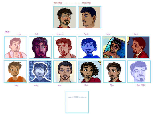
I know december isn’t over yet, but I decided i wanted to do one of the year of art things now. except a year of tony art specifically, bc we’d be here all night if it was all my art from this year.
and also since i didnt do one last year i threw in the beginning and end of 2016 art as well ^^
[ramblings under the readmore]
it was super hard making decisions for some months, jan 2016 and november 2017 in particular, as well as august ‘17, but i didn’t obsess over it like last time i made one of these - pushed myself to make quicker decisions, and not sort things into folders and subfolders and sub-sub folders :b i just used my blog’s archive to pick out a few options per month and then copied+pasted 1-4 of them into paint at a time and went from there! it was difficult figuring out what showed the month’s work off the best, what was unique, what worked alongside the other images in this and so on...
honestly my art didn’t change hugely this year, but lots of little shifts, things i’ve gotten better at, some of my favorite pieces i’ve done have been from this year, and i think as an artist i feel more...comfortable? idk. i do think between jan and july 2017 my ability to draw bodies improved, tho the images here are cropped ^^’ and looking thru the art showed me that sometimes i have really, really good art days and then a whole lot of crummy art days where nothing compares to that one piece i did...
so idk i guess that its really subjective, i have an unfinished piece from 2016 that is amazing, but then some pieces from like march or october of this year (as random examples, not specifically those months) that weren’t close to as good. also i have pieces that i like, that are more deliberately flat/cartoonish/illustrative rather than painterly, but because i included so many semi-realistic/painterly pieces, i chose not to include many of the more cartoony style pieces because they..can’t really be compared? but included some favorites anyway. idk.
#year in art#art summary#dksartz#tony stark#and this art summary itself is an example of my attempt at#focusing on the idea of good enough - removes a lot of stress and things are always better than just good enough anyway but it means i dont#end up perfectionisting myself into a hole and stressing myself out unduly#workin' on it
8 notes
·
View notes
Text
i started the penumbra podcast thinking “well its gay, ive read someone complaining about it being too catered to representation so im definitely goign to check it out” and came out with so much.. sooo much more. Im typing these lines and i still can’t process how good it is FOR FREE.... warning beforehand that ive unfortunately been told oftentimes that i’m ...good public... which maybe makes my opinion useless critically wise????? IDK im working on being less enthousiastic about everything (its hard and im not smart enough for clever meta i dont know a thing my guy. i jsut like people doing things)
the authors started wanting their project to be an anthology from what i’ve heard in a q&a but ended up sticking to a main storyline : the adventures of a depressed and bisexual juno steel, a private detective whose hobbies include good shooting and deduction skills and preparing one liners ahead to look cool when he uses them. The story follows his encounter with a colorful cast and a special mastermind thief he finds... distracting. It’s a detective noir parody... on mars.... and it’s queer. I can’t stress enough how thrilling it is to have several random background characters being gay, have a character with a high pitched feminine voice have everyone refer to him with masculine pronouns or have the very main character sometimes refer to himself as a guy and sometimes as a girl. All of it unquestionned or never bluntly stated for “look at us we’re diverse” points. By then i was sold and couldn’t expect more and BOY was i surprised...
The writing is particularly great... surprisingly so. Episods usually last 50 mins and trust me it doesn’t feel like it. The story flows so well and fast, between the character banters and the movie-like timed chains of events (if you listen to it theres an episod called juno steel and the train from nowhere pt1 and ive listened to it like 12 time these last 3 days. thats how good it is) ITS action packed. Like a really good action movie for your ears. the pacing is super entertaining
The voice acting is... stellar... i kid you not. Ive listened to some podcasts by now but the voice acting in the penumbra podcast is Really fun, despite having the same voice actors voice several characters. The most amusing thing is that I suspect the podcast to be heavily cartoon influenced, a vibe that translates really well in the characterizations of the characters and you can tell each characters quirks by the sound of their voices like you can tell the personality of an animated character from its design and posings. the range of some of the voice actors in this pod is mindblowing... like you have to stay after the credit to realize a voice actor played this one character bcause you clearly couldnt tell until it was stated. FOR REAL. In the same q&a they stated Ace attorney in their inspirations (LIKE HOW COOL IS THAT) and i think it really shows in the distinct, almost cartoony personnality of each character (read: cartoony as in exagerated, not flat)
It’s like roger rabbit meets blade runner meets kiss kiss bang bang. seriously. i definitely recommend it if u wanna have a good time.
(warning it has alot of loud noises.. literally the only downside to this podcast.. except maybe it being super tacky NOW HOLD ON HOWS THAT A DOWNSIDE)
god i love it so much you guys. I love it so so. sooo much... Ive been hyperactively working on my portfolio listening to it and now that animation school applications are over im working rly hard on the furyo/sukeban zine and all the things it necessitates (planning n drawing cover and all AHHHHHHH) its a terrible struggle because i really want to draw fanart of the podcast but I CANT PUSH THE FURYO ZINE ANY FURTHER AHND AHHHHFKHDHFD
#its just a long ass text about how much i love the penumbra podcast#ANYWAY. IVE BEEN LISTENIN TO A LOT OF PODCASTS AND ITS A GREAT MEDIUM I NEVER THOUGHT ITDBE SO POWERFUL-#-STORYTELLING WISE#IF U HAVE PODCAST RECOMMENTATION IM DEFINITELY TAKING EM#podcasts r fantastic if you have a short attention span but many responsibilities#hum. if u listen to the penumbra pod you better come to my inbox with every little thought about it Please im struggling and alone#(well lara is on my boat now#love u lara)
26 notes
·
View notes
Last Seen Blogs
supernatural-dean-sammy-cas-blog
Supernatural Overload

ilovefola
iLoveFOLA.com
dataglitch
Art of DarlsDraws / Robot Enjoyer

rubbersneakers
Rubber, sneakers & dirty socks
stiftung-brand
Stiftung Brand