#i've figured out csp i think
Text

did you guys know i can paint too
#this is based on / a parody of “man with a bowler hat” by rene magritte#i've figured out csp i think#round mixing brush held me in its loving arms and it said shhhh shhh its all gonna be ok#i haven't done a digital painting since i was eleven#definitely some stuff i can tweak#but otherwise... love it so much#tf2#team fortress 2#tf2 fanart#tf2 medic#tf2 mercs#tf2 archimedes#archimedes#medic tf2#team fortress medic#team fortress two#this was so fun help me
2K notes
·
View notes
Text
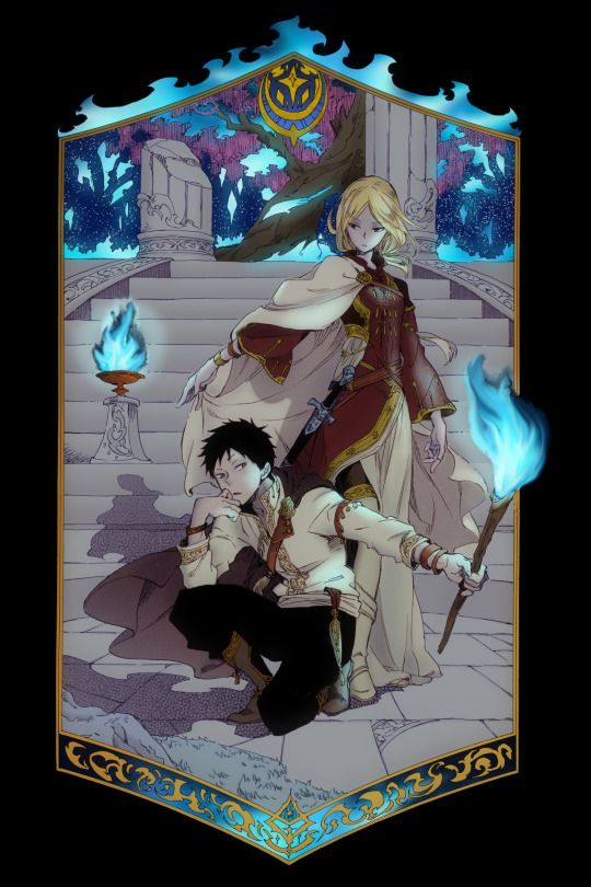
#snow white with the red hair#akagami no shirayuki-hime#akagami no shirayukihime#kiki seiran#obi#ok this one took forever#i don't like editing the original image much#but i had to so i could get the flames right for this one#i also used csp's new shading feature to figure out the flame shadows#okay what else#oh! so the tree in the background kind of looked like a WISTERIA to me#i think that's all the notes i have this time#another shout out to sabishi tomo for the suggestion on this one#i realised earlier that i've never coloured mistuhide so he'll probably be next#okay enjoy :)
195 notes
·
View notes
Text

just fucking around and finally figured out how to cel shade my animations, I'm gonna be unstoppable
#raveartts#kinda figured out keyframing too? it looks pretty bad on the bg here but that's what testing is for#AND i found a good method for copy pasting frames in csp#i kinda just got in the mood to animate#but figured i should fuckin...idk...LEARN THE PROGRAM FIRST????#still not even sure what i want to animate#just something small#but i need to like actually think of the movement#i could shade it though and that makes me so excited#and it'll be Not A Nightmare to do#i'll have to test this later but i wonder if i can do gradients easily?#i know there's a method for it but i totally forgot what video it was on#i wanna animate alex and i think it'd be neat if she could keep her hair gradient#though i may omit the stripes?#i've animated her before but just keeping the hair red
2 notes
·
View notes
Note
Hai I hope this isn't weird to say but your art is very comforting to me and when I feel down I look through your work esp Hospital Dirk not in a sadistic way but like because you depict him with so much heart and it really really resonates with me..... Hope you're doing good :]
it's not weird at all thank you! I'm glad my love for him is evident, I don't think i can overstate how much he occupies my daily thoughts because it's essentially... always... I love pondering the minutiae of his life and his reactions to everything around him. i AM doing good. I hope you're also doing good.

#lucy art#ask#hospital dirk#self harm#wip of some kind#I've been trying very hard to figure out a way to use csp that doesn't make me rage. because I got it recently#and I think I succeeded#so perhaps more nonpaint art in the future#the key is to use it like paint and ignore all the fancy features like layers and filters and only use one brush ever
62 notes
·
View notes
Photo

Fluffcember Day 22: Dancing
Some fancy noble dancin’ between noble horse bois.
#Fire Emblem Three Houses#Lorenz Hellman Gloucester#Ferdinand Von Aegir#Ferdlor#Fanart#Anvil Doodles#Fluffcember#Huh I think this is the first time I've ever actually drawn Ferdie#Also I apologize if I made the boys too skinny#I'm still figuring out and working with models in CSP so...
3 notes
·
View notes
Photo
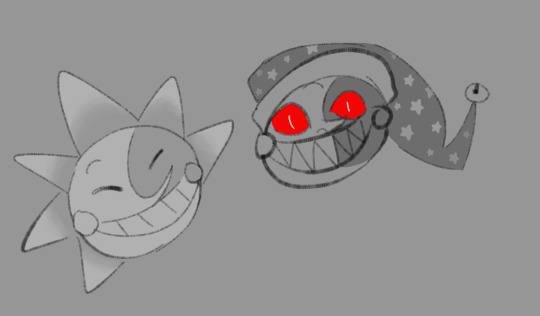
oh also full set of my icon
#mine#fnaf sb#fnaf sun#fnaf moon#fnaf sundrop#fnaf moondrop#gonna be honest; still figuring out what tagging system i want to use#scrunklies r also very good for me to get used to csp too#i dont think i've drawn any scrunklies art in my physical sketchbook#i just went right to digital n here we are
6 notes
·
View notes
Text
My Favorite Cheap Art Trick: Gradient Maps and Blending Modes
i get questions on occasion regarding my coloring process, so i thought i would do a bit of a write up on my "secret technique." i don't think it really is that much of a secret, but i hope it can be helpful to someone. to that end:

this is one of my favorite tags ive ever gotten on my art. i think of it often. the pieces in question are all monochrome - sort of.
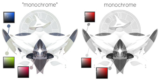
the left version is the final version, the right version is technically the original. in the final version, to me, the blues are pretty stark, while the greens and magentas are less so. there is some color theory thing going on here that i dont have a good cerebral understanding of and i wont pretend otherwise. i think i watched a youtube video on it once but it went in one ear and out the other. i just pick whatever colors look nicest based on whatever vibe im going for.

this one is more subtle, i think. can you tell the difference? there's nothing wrong with 100% greyscale art, but i like the depth that adding just a hint of color can bring.
i'll note that the examples i'll be using in this post all began as purely greyscale, but this is a process i use for just about every piece of art i make, including the full color ones. i'll use the recent mithrun art i made to demonstrate. additionally, i use clip studio paint, but the general concept should be transferable to other art programs.

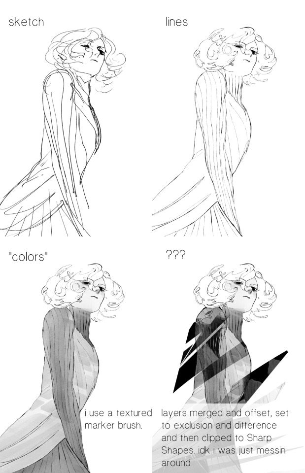
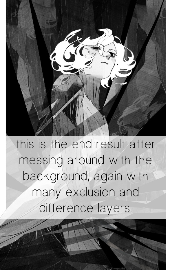
for fun let's just start with Making The Picture. i've been thinking of making this writeup for a while and had it in mind while drawing this piece. beyond that, i didn't really have much of a plan for this outside of "mithrun looks down and hair goes woosh." i also really like all of the vertical lines in the canary uniform so i wanted to include those too but like. gone a little hog wild. that is the extent of my "concept." i do not remember why i had the thought of integrating a shattered mirror type of theme. i think i wanted to distract a bit from the awkward pose and cover it up some LOL but anyway. this lack of planning or thought will come into play later.
note 1: the textured marker brush i specifically use is the "bordered light marker" from daub. it is one of my favorite brushes in the history of forever and the daub mega brush pack is one of the best purchases ive ever made. highly recommend!!!
note 2: "what do you mean by exclusion and difference?" they are layer blending modes and not important to the overall lesson of this post but for transparency i wanted to say how i got these "effects." anyway!
with the background figured out, this is the point at which i generally merge all of my layers, duplicate said merged layer, and Then i begin experimenting with gradient maps. what are gradient maps?
the basic gist is that gradient maps replace the colors of an image based on their value.

so, with this particular gradient map, black will be replaced with that orangey red tone, white will be replaced with the seafoamy green tone, etc. this particular gradient map i'm using as an example is very bright and saturated, but the colors can be literally anything.
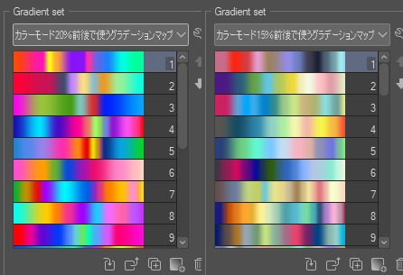
these two sets are the ones i use most. they can be downloaded for free here and here if you have csp. there are many gradient map sets out there. and you can make your own!
you can apply a gradient map directly onto a specific layer in csp by going to edit>tonal correction>gradient map. to apply one indirectly, you can use a correction layer through layer>new correction layer>gradient map. honestly, correction layers are probably the better way to go, because you can adjust your gradient map whenever you want after creating the layer, whereas if you directly apply a gradient map to a layer thats like. it. it's done. if you want to make changes to the applied gradient map, you have to undo it and then reapply it. i don't use correction layers because i am old and stuck in my ways, but it's good to know what your options are.

this is what a correction layer looks like. it sits on top and applies the gradient map to the layers underneath it, so you can also change the layers beneath however and whenever you want. you can adjust the gradient map by double clicking the layer. there are also correction layers for tone curves, brightness/contrast, etc. many such useful things in this program.
let's see how mithrun looks when we apply that first gradient map we looked at.

gadzooks. apologies for eyestrain. we have turned mithrun into a neon hellscape, which might work for some pieces, but not this one. we can fix that by changing the layer blending mode, aka this laundry list of words:

some of them are self explanatory, like darken and lighten, while some of them i genuinely don't understand how they are meant to work and couldn't explain them to you, even if i do use them. i'm sure someone out there has written out an explanation for each and every one of them, but i've learned primarily by clicking on them to see what they do.
for the topic of this post, the blending mode of interest is soft light. so let's take hotline miamithrun and change the layer blending mode to soft light.

here it is at 100% opacity. this is the point at which i'd like to explain why i like using textured brushes so much - it makes it very easy to get subtle color variation when i use this Secret Technique. look at the striation in the upper right background! so tasty. however, to me, these colors are still a bit "much." so let's lower the opacity.
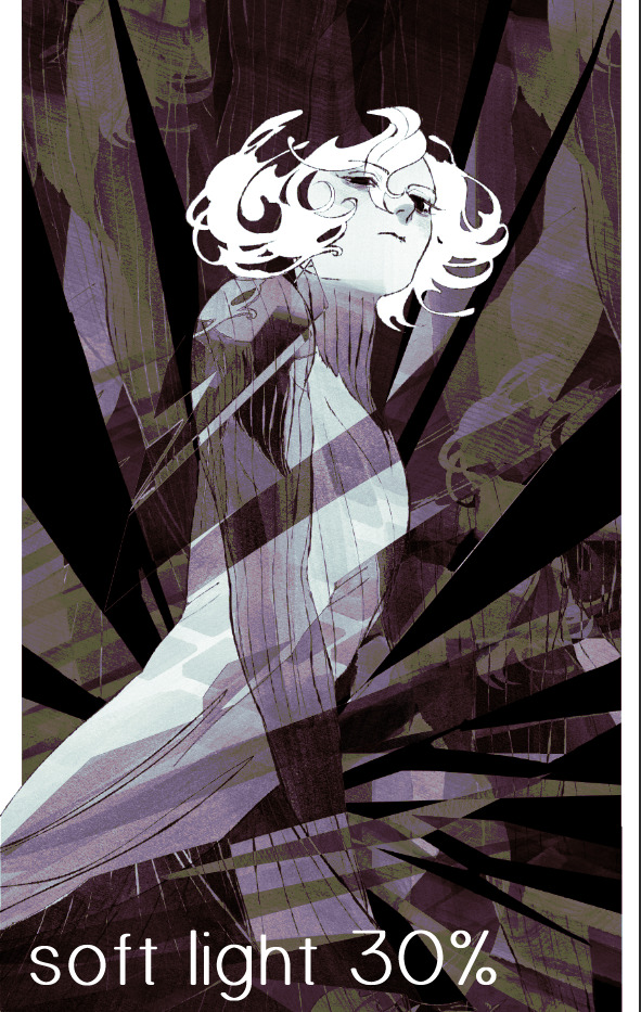
i think thats a lot nicer to look at, personally, but i dont really like these colors together. how about we try some other ones?
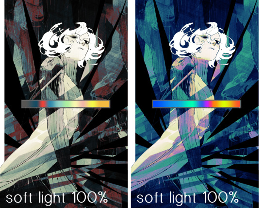
i like both of these a lot more. the palettes give the piece different vibes, at which point i have to ask myself: What Are The Vibes, Actually? well, to be honest i didn't really have a great answer because again, i didn't plan this out very much at all. however. i knew in my heart that there was too much color contrast going on and it was detracting from the two other contrasts in here: the light and dark values and the sharp and soft shapes. i wanted mithrun's head to be the main focal point. for a different illustration, colors like this might work great, but this is not that hypothetical illustration, so let's bring the opacity down again.
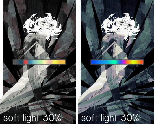
yippee!! that's getting closer to what my heart wants. for fun, let's see what this looks like if we change the blending mode to color.
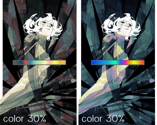
i do like how these look but in the end they do not align with my heart. oh well. fun to experiment with though! good to keep in mind for a different piece, maybe! i often change blending modes just to see what happens, and sometimes it works, sometimes it doesn't. i very much cannot stress enough that much of my artistic process is clicking buttons i only sort of understand. for fun.
i ended up choosing the gradient map on the right because i liked that it was close to the actual canary uniform colors (sorta). it's at an even lower opacity though because there was Still too much color for my dear heart.
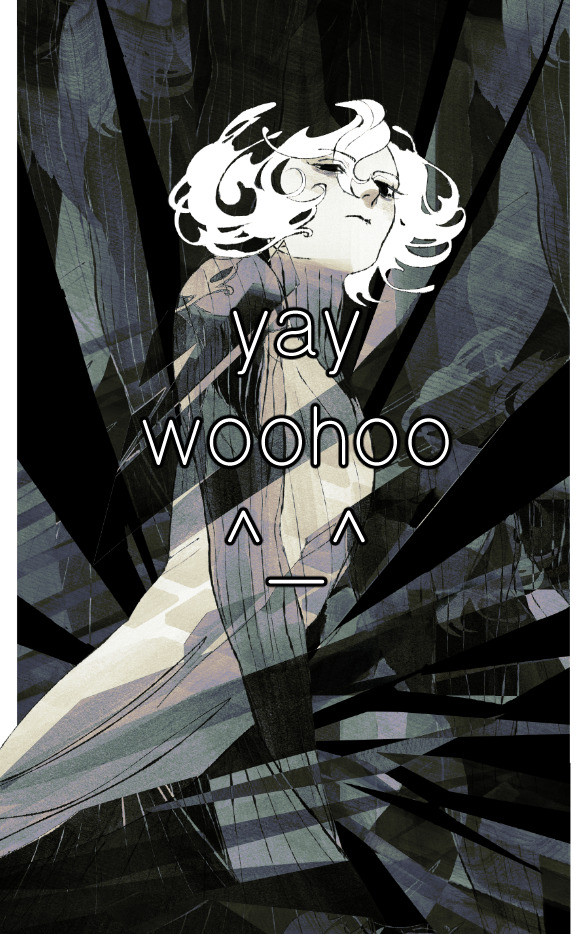
the actual process for this looks like me setting my merged layer to soft light at around 20% opacity and then clicking every single gradient map in my collection and seeing which one Works. sometimes i will do this multiple times and have multiple soft light and/or color layers combined.
typically at this point i merge everything again and do minor contrast adjustments using tone curves, which is another tool i find very fun to play around with. then for this piece in particular i did some finishing touches and decided that the white border was distracting so i cropped it. and then it's done!!! yay!!!!!
this process is a very simple and "fast" way to add more depth and visual interest to a piece without being overbearing. well, it's fast if you aren't indecisive like me, or if you are better at planning.

let's do another comparison. personally i feel that the hint of color on the left version makes mithrun look just a bit more unwell (this is a positive thing) and it makes the contrast on his arm a lot more pleasing to look at. someone who understands color theory better than i do might have more to say on the specifics, but that's honestly all i got.
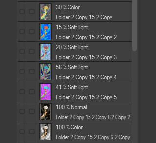
just dont look at my layers too hard. ok?
1K notes
·
View notes
Text

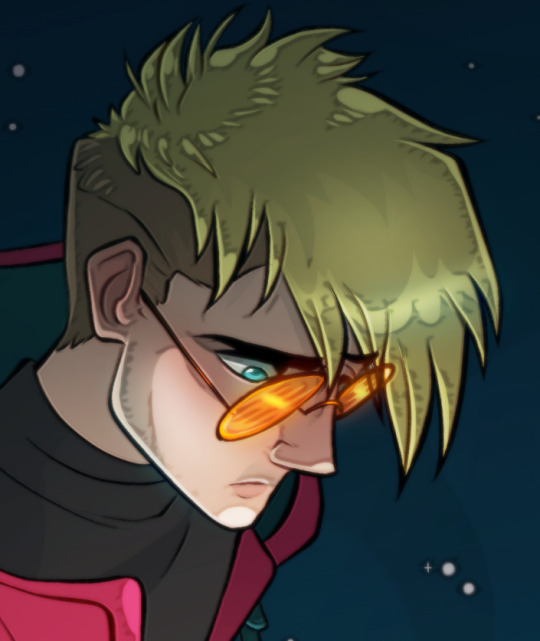
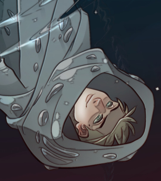
Idk if we've all heard but I have been hyperfixating on Trigun as of late & I really wanted to do a piece for it. Everything here is out of my comfort zone 🎉 growth!
I finally took the time to figure out how to use 3D models in CSP for posing. It was a little wonky but I don't think it's the program's fault I'm just getting my sea legs. The manga perspective slider is a massive help.
I also learned how to make a custom brush! I've never done that. I wasn't going to draw a million knives for Millions Knives millions of knives you know. So we have the knife tentacle brush. I uploaded it to the CSP asset store so go forth & use it if you want. For good or for evil idc!
Okay bye go watch Trigun Stampede! 💛
Process video on tinktonk
#fan art#digital art#art#digital drawing#digital painting#vash#vash the stampede#trigun#trigun stampede#anime#trigun anime#vash trigun#knives millions#trigun knives#millions knives#nai trigun
3K notes
·
View notes
Note
do you have any tips on how you color? your coloring style is similar to what i’m trying to achieve but i have no idea how you actually pull it off
Hi!
I'm gonna separate this question into rendering vs. coloring. I'm not sure which you mean so hopefully tackling both covers your question, although I'm not really the best at explaining things.
For rendering, I usually paint using some square/textured brush (kind of like the one pictured below and a low opacity circle brush (the standard in photoshop, and most painting software). Lately I like using brushsets from the digitalbrushes account here on tumblr.
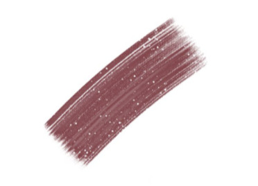
I sketch, and then paint underneath the sketch. after i paint for long enough I either delete the sketch layer or I merge the two. I like to add texture where the midtones are. I think a lot of my "rendering style" is probably owed to that.
I like adding texture around midtones. I also like adding limited random variation of color and value to large areas. Like below, you can see that I added a slightly different shade of red to the lit part of the apple in step 3. If you add variation or slight gradation to the large light shapes or shadow shapes you can create the impression of depth. At the very least it looks more fun.
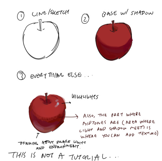
Also a disclaimer, but for the last two drawings I did I've kind of went off kilter. The process is the same but I used some oil paint brushes I downloaded and I pretty much added as much variation to every shape possible, which I would not recommend unless you're sure of what you're doing. But you can see here that even though I added variation (in color, brush stroke, etc) that the shapes are pretty readable and the light is very clearly separated from the shadow.


In terms of choosing color, I had a long stretch of time where nothing would look right to me. Things were colored really literally, with no regard for lighting or ambient color (background/environment surrounding characters). I would often fix things up using a gradient map and using color burn or multiply on 14%. Honestly, this is still a great way to make things look coherent, I really like these gradient maps on the CSP asset store if you want to look into them.
My colors improved a lot after I developed an eye for color/figured out what colors I like to put next to each other. I did this by saving and making a folder of any piece I saw that I liked specifically for color. By doing this I got a clearer sense of what kind of color schemes I tend to like. I suggest doing this as well so that you can figure out what kinds of color schemes and pairings you tend to enjoy most.
Hopefully this answers your question <: ] Apologies if this doesn't make sense, it's a bit of a long post.
#ask#I wish I could help out more anon ... I often feel like I have no style consistency so seeing this ask surprised me#i think unfortunately i do work partially intuitively so its a little hard putting this into words
89 notes
·
View notes
Note
What art program and brushes do you use? tips on lighting? your illustrations radiate warmth 🌻💛
Thank you!! 🌻💛
This post got a little long, but I've answered each question so if you're curious, it's under here!
Art program?
I use Clip Studio Paint EX and Procreate! I mostly use CSP for my animations and Procreate for my illustrations lately, but I've used CSP for a lot of my illustrations too.
Brushes?
For CSP: I mostly use variations of the default "Design Pencil", each tweaked to fit different needs. Sometimes I use brushes I made myself, but these three are my main ones.

For Procreate: I use the HB Pencil for my lines and Tinderbox for my colors (both are default brushes).

Lighting tips?
This is a pretty big question! I could spend hours talking about this, but I tried to put together some very basic tips.
Figuring out where shadows go:
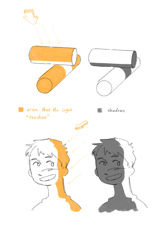
Light generally comes in a straight line from the light source, and everything it hits or touches is the illuminated area.
Everything it doesn't touch, either because it's an area at an angle it can't reach, or because something is in the way, is the shadows!
Thinking about where the light source is, and where it can't reach or what obstacles are in its way are helpful things to think about when figuring out shadows.
Reflected light:
This is a little more specific, but once you figured out basic lights and shadows, reflected light is another element that's useful to know.
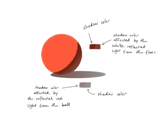
Every object reflects a bit of the light it receives, which affects the colors of the other surrounding objects. The reflected light is of the color of the object it's reflected from.
Rendering details in light and shadow:
You'd be surprised at how much you can get away with not rendering the details that are in the shadow, as long as you render the ones that are in the light.

In this Trigun fanart piece I've skipped most of the details that are hidden in the harsh shadows, but kept a lot of the details on Vash's boots for example.
Unless the focus of the piece is on something in the shadows specifically, you can simplify a lot of the stuff that's not in the light!
🌻
If all of this confuses you, that's alright! Learning takes time, and small steps are still steps forward!
Rules are also there to be broken depending on your goal for your art, so you don't even have to follow them if you don't need them. I break these all the time too.
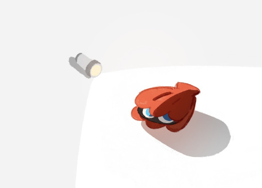
I hope these tips can be helpful in any way! Happy fun lighting!
18 notes
·
View notes
Note
hi Habs! :D i love your art and have seen ppl say they want to eat it and i would also like to partake lol. have you ever explained your methods of doing digital art? i love traditional but i would like to branch out into digital. i've tried different applications like krita, sketchbook, and sketch.io but i don't really vibe with them (if that makes sense). any tips?
Hello ! Haha thank you ! Totally get what you mean about vibes, I’ve used a few different programs, and I like paint tool sai and clip studio paint the most, and mostly use csp now !
Took me a long time to get into digital art, and the biggest breakthrough I had was that I didn’t have to do line art lol, now I only do it when necessary and 99% of my stuff is cleaned up sketches. Changing my process completely changed how I felt about my art for the better. It keeps my work dynamic, and also lessens feeling of the sketch looking better than the linework!
Generally my process is sketch, duplicate the layer and clean it (sometimes put the old layer on a low opacity so I can make sure I’m staying true to the sketch, so it’s like lineart with extra steps lol) then I block in one colour under the lines, either make a new layer with a clipping mask, or lock the opacity and colour on that layer.
For colouring, I usually use a single layer, I put down messy flats and shadows then clean it up and render it, add highlights and funky details and then I’m done. I’ve explained my colouring process here before, and I have a time lapse that shows my sketching/colouring process here.
I have shaky hands, so a lot of my brushes have stabilization turned up, usually I set it at 15 on csp brushes idk how that translates to other programs though.
For my sketches/clean up, I like using brushes that have little to no variation in brush size, and have varying density or opacity. Not for everyone but I like how it makes my work look and I end up liking my stuff a lot more like that. Usually I keep my sketches at the start really light and build up pressure as I clean
In general, I think the best thing to do is try a whole bunch of methods and figure out what works and what doesn’t! Lots of people have very different processes, so looking at how other artists work and trying out how they do stuff for yourself can be great for learning! Good luck with digital art!
95 notes
·
View notes
Note
hi tamelee!
I'm here to ask for a little bit of advice if that's okay (: about a month ago I bought a Wacom drawing pad so I could start experimenting with digital art. artists like you here on tumblr have really inspired me to start making art. but I feel kinda.. lost. I've been mostly drawing naruto manga caps and I'm getting better but I guess I don't know where to go from here. coloring and shading scares me lol. I'm using clip studio paint and it's just a little.. intimidating. I feel discouraged, like I won't be able to do it. how did you do it tamelee? did you watch a lot of tutorials, or did you experiment until you figured things out? any advice you'd have for a beginner artist I'd really appreciate.
thank you veryvery much for your time ^^
Hi Nonee! 🧡
Sure!
Oh I think that’s a very good place to start. As well as drawing subjects you like ^^!
Hmm, tbh I’ve just experimented a lot, but I don’t think my way of having done things was the most efficient. You might want to follow tutorials step by step? You can try coloring only with flat colors until you feel a bit more confident with that as well as cell-shading (toon-shading/non-realistic, like in anime) instead of rendering further as that can all be confusing at first. I personally never truly understood shading until I studied cell-shading and made my art a lot more readable. A lot of Anime uses this;
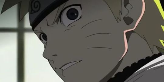
You see how there is a base color, a darker color for shadows and highlights? (Sometimes not even highlights.)
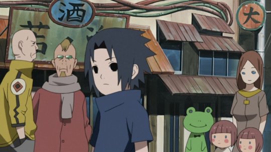
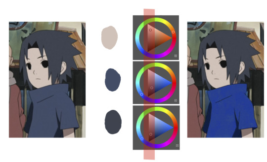
When you start to study it from existing work you’ll start to notice things like color always being in the same area of saturation and when you suddenly have a color that is way more saturated than the other it can look off. (See example.) But this is a guideline, not a rule. In your own art you can especially use saturation and brightness to help aid you to direct a viewer's focus and even tell a story.
I LOVE ‘How to train you dragon’ and ‘Kung Fu Panda’ for this because their coloring is so inspiring and if you truly want to learn from professionals... well those are the type of media to look for of course! I have an entire folder to inspire me just based on those.
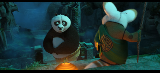
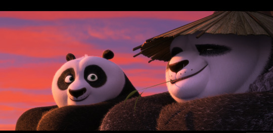
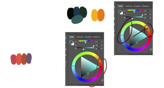
Do you see how calculated those color combo’s are?!?! Here you see both analogous and complementary schemes and it is actually through looking at the things I like that I learned it >< The orangey colors stand out and are bright which helps you to focus on that area whereas the complimentary scheme is used to bring characters together.
If drawing Manga-caps is something you love to do, then maybe for coloring you can study screen-caps from Anime or even other animated films. I’d recommend to take it step by step, though I haven’t really applied it myself, from the video’s I’ve seen and artists I’ve followed it is always advised to have an art-goal that you can work toward. Maybe you first want to focus on lineart and then laying down a base color where the colors are harmonious and next would be cell-shading maybe and then you can start adding another light-source etc- eventually you can decide to create more depth or practice with monochromatic coloring, maybe even greyscale to learn values. But right away that can all sound a bit intimidating doesn't it?
Find things that you like and then maybe you can open them in your program and just study. Find a brush you like, put on some music or a show on the background and for a moment play around with it without needing to create a finished piece. This is also how I learned how things like adjustment layers work or what all the different kinds of tools do. I have to agree with you, CSP is intimidating for me as well >< so this is kinda how I approach it as there are so many add-ons and additions within it but I try to only learn what I need for that moment so I don't overwhelm myself. I definitely try to find video’s that can help me with creating Manga though! ^^ There are plenty!
It'll get easier eventually, you'll learn the program and you start to recognize placements for shadows and you will get a feel for the coloring- no worries 💪 Learning something new will always stay intimidating, every time I open up a new document I feel it too. It's not easy at all, but you kinda have to allow yourself to experiment and even make mistakes because practice is never perfect.
I have some beginner tips written here- I hope any of this is somewhat helpful 🌷🫶
15 notes
·
View notes
Note
How do you go about formatting your comics? I’ve always wanted to make a comic but formatting it has always been a struggle..
Also don’t forget to drink water and care for urself
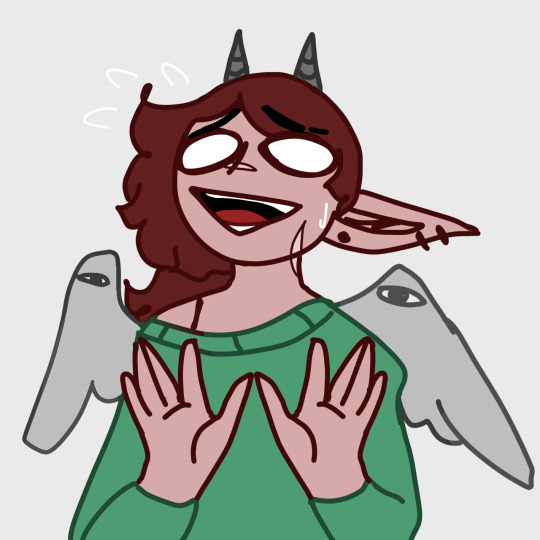
Drink has been acquired! Grab yourself one too, it's "Vane might ramble too much" hours!
Keep in mind that my formatting is what works for me, so it might not work for everyone. I also use Clip Studio Paint (EX), so some bits might work for other programs, while some might not. I also can't for the life of me remember the difference between CSP Debut, Pro, or EX so I'm sorry if I mention features you might not have.
I'm gonna cut the post here, so it doesn't take up too much space on the dash :D
Alrighty! I'm not completely sure what you mean by format, so I'll just do a quick rundown of my process!
Script
I usually start with a script. It can be as loose or detailed as you want it to be, but mine usually are something like this:
Character A: "Says a word!"
Description of scene or action
Character A: "Says more words!"
Character B: "And more words are said"
I use gaps in the text to signify a panel break. So this would be two panels! Keep in mind your workload, and don't put in too many if you're not ready for it.
Sketch
After I finalize, or at least have a general understanding of my script, I get a canvas around the size that I think it'll be. I usually start out with about 1800x8000, but you can adjust it based on your needs.
I like to try and sketch out a rough idea of how I want the comic to flow. Using my script, I sketch out the panels and toss in where I think the text bubbles will go. Here's the latest Wanderer update as an example! (Yes I usually use the first draft sketches for the final product, don't worry about it lmao)
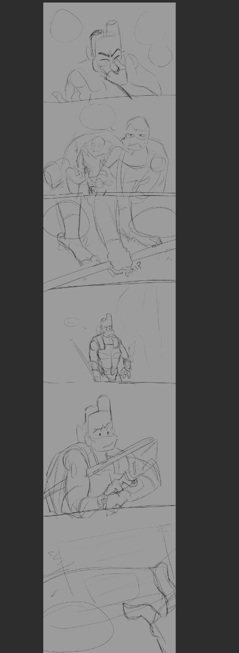
I do a sketch of the entire thing, which helps me resize as I need.
Panels
The panels were always the hardest part for me to figure out before I started working on Wanderer. Again, this is what works for me. It might not work for everyone, and this is also just how I set up this specific comic.
Let's get some boxes going. Go to the Frame Border option, and select rectangle frame.

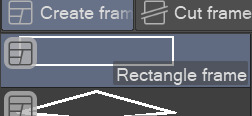
It needs to be on create frame!
Click and drag one giant box over your sketch. I'm using an excerpt from the above sketch for example! You can click the frame layer itself, hold ctrl down and adjust the width of the box.
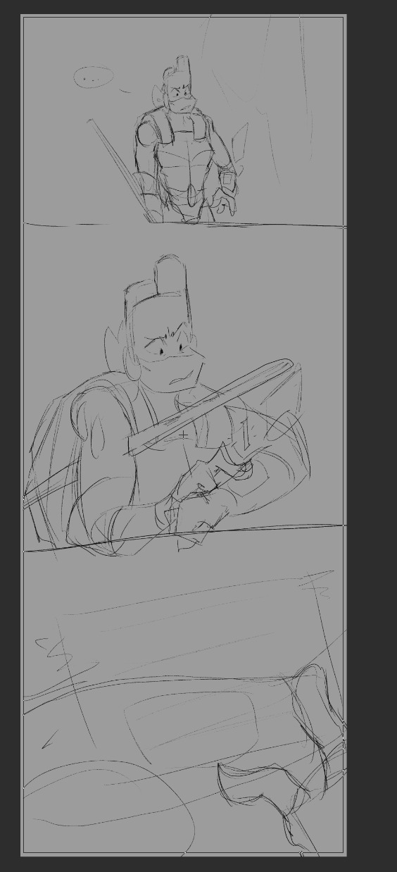
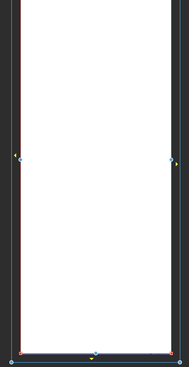
Delete this layer:

and move your sketch above the frame layer so you can see it!
Now we just split the panels up how you want them. Next to where you found the Create Frame option earlier, there should be a Cut Frame option. I personally use Divide Frame Folder, so everything is contained without bleeding through to other panels.
You can mess with these:
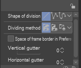
The "gutter" is just how much space is made between panels.
When making your panel splits, you can hold ctrl to snap to a 45° angle.
It might end up looking messy to the side, but each new frame folder will be like a new mini canvas for each panel. I find that color coding the layers helps me find which ones I need if I start getting too many.
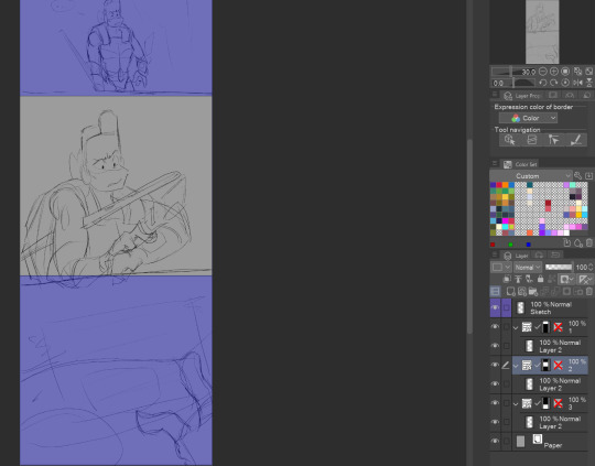
Here's a look at what it might look like based on what I've done for just this example.
And if we go to the actual file for the upload...
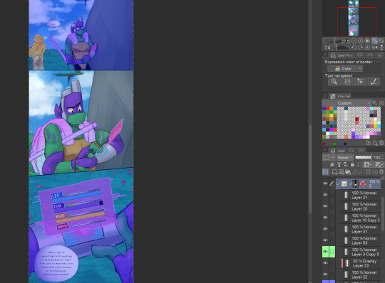
It keeps everything nice and organized, imo!
Okay, I thiiink that about covers it. Text boxes/bubbles and the such are easier to find tutorials for, so I'm not gonna cover those unless people specifically want those. But I'm more than willing to divulge... most... of my secrets haha.
As always if I need to clarify anything, just ask and I'll do my best to clear it up! Best of luck on your comic making adventures!
34 notes
·
View notes
Text

Here it is! I think it's the first alien animal I've managed to paint in colour and more or less integrate in a background.
The background is photobashing and the animal painted in CSP with some cuttlefish texture and velvet worm. Overall I think it's a good way to concept!
I have to see how to speed up the painting from greyscale to colour, because I still haven't figured it out.
11 notes
·
View notes
Note
2, 7, 10, 11, 19, 22, 25 for the art asks
HI HILARY!!!!!!!!!! LOVE U LOTS AND LOTS SO MUCH THANK U <3 :D yaaaay
2. What art-related sites have you ever signed up for?
as a little baby well i was playing on an ancient webbed site called sketchfu.... i've had deviantart after that then it was pretty much all tumblr twitter instagram.. these days i like using toyhouse
7. Show us at least one picture you drew or sketched recently that you did not put on a public site.
this question is painful for a guy who doesn't save any of his artwork... here is an oc i designed for a little thing i've been doing w friends

10. What do you like most about your art?
i answered this already but i will be positive today and think of a second thing! i think i draw really fast and this suits me well, bc i lose interest quickly and also i really like to draw from observation. a lot of moving subjects like people and animals
11. What do you like least about your art?
i feel like i can't draw faces well and they're really stiff or lopsided </3 i have a lot of fun drawing bodies but then the face will just ruin the picture for me and be the reason i don't share it... i'm trying to improve w this T_T
19. What medium/program do you use the most in your art?
i try to fill at least one sketchbook a month just w pencil drawings really doodly stuff but i mostly draw digitally. paint tool sai is my favourite art program but recently i got a refurbished ipad, i'm using both csp and procreate on there bc i haven't quite figured out what i prefer using over there yet
22. List at least one of your “artspirations.”
i rly love raymond briggs so much, ever since i was a kid and my nan had his fungus book at her house. i would go over and just stare at it for ages truly.. i got to see his work last yr with my friend at an exhibition it was really amazing like such vibrant colours?!?? amazing
25. Draw a picture!
my oc puddle ^_^

9 notes
·
View notes
Text


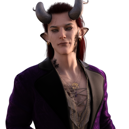

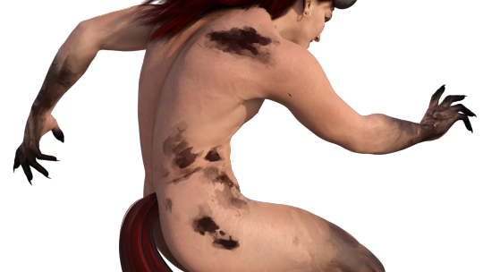
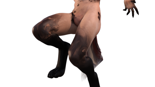
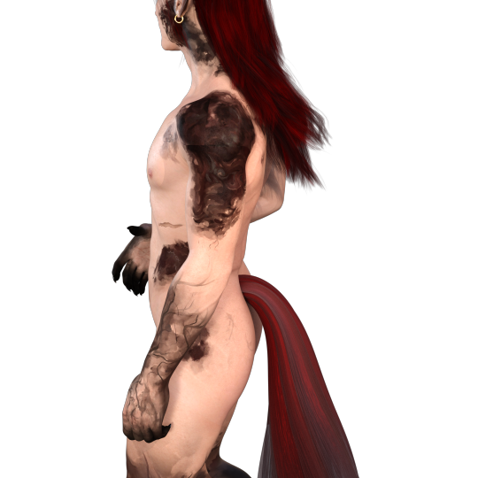
So, I've been dealing with burnout by messing around in Daz3D a lot, and made Valefar to the best of its ability, which turns out is pretty advanced. It's basically a glorified character creator with a moderate learning curve, and I had to do a lot of touching up in CSP since the clothing system is very hit or miss. The spots and scars I also added myself by editing the base textures and will probably see a revamp at some point since I'm not that happy with the one over his eye. Unfortunately, I'm not well versed enough in 3D programming wizardry to figure out how to seamlessly edit over... well, seams. Yet, anyway. And I tried a dozen different ways to do something more efficient and more accurate than my initial attempt, but turns out what I did actually *was* the simplest. lol
Other features I intend on doing myself, such as his branding tattoos, horns, tail, paws, and maybe hair if I'm feeling brave. Since his is technically longer and usually tied back with a ribbon. All of that sounds very simple but then you gotta remember that it must be done in Blender and I die a little inside. Because nothing is ever simple in Blender. Anyway.
The cool thing about Daz is that you can create scenes and such and the lighting system is very good and it's fairly easy to light a scene and take pictures decently well within a few minutes. I have yet to perfect the art so all I have to show are WIPs and "test" renders.
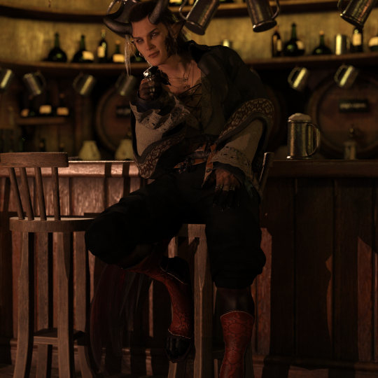


The first two here were from a much earlier version of him before I figured out how to bend the horns to my liking as well as the lower half of his face. The last one was also kind of an experiment. The clipping is an unfortunate feature that I don't think can be easily fixed from what I know. The clothing layering system is rather... unintuitive. But thankfully, I have the skills to just edit whatever most bugs me in CSP. lol
Also I like making his eyes do the thing.


He's about to get The Zoomies.
#haligren's ocs#my ocs#my oc valefar#sitra achra novel#dnd oc#daz3d studio#daz studio#3d art#my art#haligren's art
6 notes
·
View notes