#i'm very tired so this is just another quick pinterest study!
Text
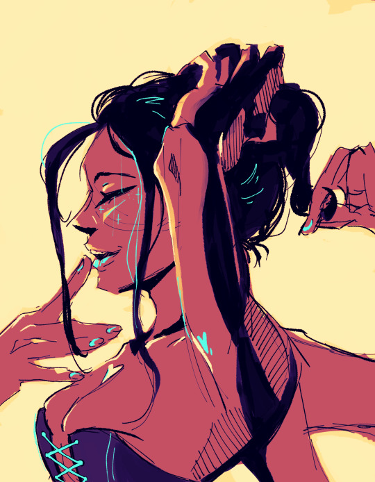
#one piece#nico robin#wtt art#daily wtt robin 2#day 8#i'm very tired so this is just another quick pinterest study!
505 notes
·
View notes
Note
So, how exactly are you good with shades, shadows, light sources in drawing? I've always had trouble with those sort of things so I was wondering if you could give me some advice other than "practice." Also, are you an animator or what exactly is your art profession? I'm an art student soon to be taking her Masters, but I still want to know.
i think some good advice is to grab some objects you have, and maybe a flashlight, and move the light around these things and see what parts cast shadows and which parts attract light. shadows and light sources all come from understanding that what you’re drawing is a 3 dimensional object. the more you start to understand the shapes that make up forms (like the human face, what cloth folding means, etc) the more you will start to see your art as an object that casts shadows instead of just a flat drawing. practice will only get you so far, a lot of art is thinking hard about what you’re drawing.
Here are some images that visually explain what I mean. I wouldn’t even draw these myself bc time is short and there is always so much I want to draw, BUT looking at them and studying them is a valid form of practice just as much as drawing is.
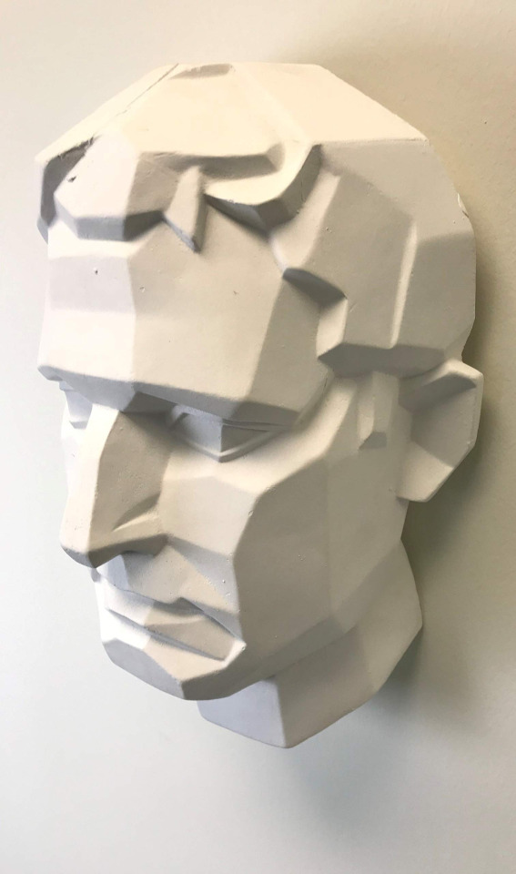
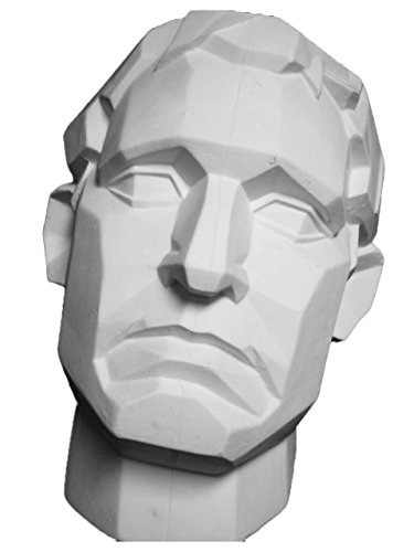

^^^^ this is the same head, shown at three different angles, but the head is made of the same basic shapes each time. In each photo can you identify the light source? if you can, great! now think, Why do you know where the light is coming from? Its because even though these are 2D photos, the object in the photo has a very clear 3D form. Apply that knowledge to your art! If you can’t tell where the light source is coming from, start to analyze which parts of the face are highlighted and which parts are in shadow. Reality tells us things that are brighter are closer to the light, things that are darker are obscured by some other form which is why shadows are cast. Shadows happen when the light is unable to reach part of the form because something opaque is obscuring the light from passing through!
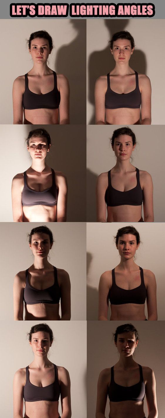
Here is another great image from RobynRose on deviantart that shows how light from different angles casts shadows on different parts of the face and body. This happens because we are 3 dimensional forms!
When it comes to finding visual refs to study from, another awesome resource is senshistock on deviantart. Its literally a god send for art refs. They do great poses, have amazing diversity with their models and are an overall great resource!). I also recommend pinterest boards that people have already made. its a really quick and easy way to find a large amount of tutorials and visual explanations on like any art topic you need help with! The only downside with pinterest is if you’re going to use any specific image as a direct reference for a piece, make sure you can hunt down the source creator for that tutorial if you plan on sharing it anywhere! Pinterest is often a helpful but creditless place lol.
So, you say you’re tired of being told to just practice. Well, thats super fair! But realize part of bettering your art is paying attention to the way things look all! the! time! Pay attention, detailed attention to everything around you when you’re not drawing. And by paying attention I mean like, walking into a room and identifying the light source, is there more than one light source, is there any kind of secondary light source, etc. Now, its not that I’m consciously doing these things 24/7 but it’s more of like, a mode of vision.
Art is just as much about understanding, thinking, and problem solving as it is making things look pretty and knowing which colors to pick. ESPECIALLY when it comes to shading and light sources, that stuff requires serious thought. So, when you are ready to practice some more I recommend using a reference photo to practice (being told using references is cheating or shameful is the biggest lie young artists are told. its so damaging) and when you have your reference photo, don’t just copy what you see, think about WHY it looks the way it does. Why is there a shadow there? whats blocking it? why does the clothes fold the way it does? what is it being pushed or pulled against? All these questions become clearer the more you start to visualize what youre seeing as something that is 3 dimensional instead of 2 dimensional.
Sorry that was so long, I really hope it helps not just you but others.
ALSO my degree is in animation but I rarely animate for fun / for work / in my own time. I consider myself to be a visual development artist for animation (character design, color scripting, and background art are some of my favorite things to do!) as well as a freelance illustrator.
427 notes
·
View notes
Text
Little late getting to these -- that's fully the fault of a class project I spent all of Monday/Tuesday and most of Wednesday working on -- but I finished my project and wrote up some long replies to these!
(Apologies for any funny formatting -- I'm trying out the beta for the new post editor!)

Absolutely not.
Nope! There are a few people who do know (other guides Andrew's met before, the Dryad, and I'd imagine the Witch Doctor knows something's up even if he doesn't know why), but none of them live in Purity Town proper, and the Dryad and Witch Doctor aren't the kind to participate in rumors or spread what isn't theirs to share. The old man is also aware just because he and Andrew have talked about their curses, but he's 1) not currently in town and 2) not going to share even if he were.
Most folks don't know much about Andrew in general; Becca probably knows the most out of the townsfolk, knowing a little bit about his family and where he's from (he has some pretty specific skills as a hunter that betray this, but he doesn't talk about his exact town of birth), but no specifics and certainly not time periods.
Andrew is good at keeping things quiet; he has to be.

I would actually appreciate if you didn't post to Pinterest -- usually I'm fine with people reposting with credit (several of the things I've posted to my DeviantArt have found their way to Instagram, for example) but Pinterest has something of a reputation for stolen art (things being reposted from another Pinterest post without credit this time, or credit being hard to view for users not logged in or just viewing through Google). So reposting elsewhere is fine (though if you repost to Reddit or Instagram, tag me at u/Ariibees or @Ariibees)! I'd just prefer my works stay off of Pinterest.
The terminology related to The Guide/Andrew/The Guardian/The World’s Core/The WoF is all confusing because on some level, they’re all the same being. Kind of like trying to talk about Jekyll and Hyde -- same guy, different looks/actions, haha.
For all intents and purposes, references to the WoF being the barrier/core/whatever behind or within which the spirits of light and dark are contained is equivalent to saying “these spirits are held trapped by the magic of the Guardian, who when summoned appears as the WoF.” I do break slightly from the official lore in how the WoF/Guardian/thing holding back these spirits works (mostly because I don’t really like the idea that the Hallow is a “temporary guardian” or whatever), but the basic concept of “these are trapped by [thing that makes up the WoF]” remains unchanged.
If “loony cultist” is a reference to something, I’m so sorry, but I’m lost on it. If you’re just talking about the lunatic cultist in a funny way, then yes, they’re in here as a very plot-significant character!

I had to google what meme you were talking about, but it did make me laugh.
Andrew’s most annoyed by the nickname because people do like to call him Guide, and for someone who’s dedicated his whole life to his role, it can get tiring. He doesn’t really *mind* being called Guide -- it’s fine, that’s what he is and as long as people are respectful of his job he’ll take what he can get -- but at the same time, he’d like for people to stop thinking “Aah! Monster!” or “Weird academic know-it-all” and just...treat him like a normal person sometimes. So he fights to be called Andrew. And...Malik comes along and gives him a nickname that he doesn’t like and doesn’t allow others to use, save for maybe a small group of people of which Malik is not a part. So, not cool, man!

People love to overcomplicate explaining shading/lighting, and if you wanted to you could certainly go on and on about reflections of light off the ground and shading colors and all sorts of things, but as I’m writing this at 1 AM I don’t really care to.
If you really want to get into shading, I see nice ones on DeviantArt or Tumblr from time to time, or you can always watch a YouTube video on it. Really, though, just keep at it, think about how the shadows should look and work, and you'll get better at it eventually and pick up new ideas on how it all works. (And this is coming from someone who is new to making comics and actually started as a painter.)
Purity Town’s shading comes down to this: simplicity. As much as I’d love to spend hours and hours redrawing the panels I don’t like and carefully shading every fold of fabric and painting detailed backgrounds, I’m a full-time college student and will be working full-time over the summer -- I don’t have the time. So, I cut corners: I reuse backgrounds or use brushes (see: bricks, trees, clouds) that make certain details easier, and I try not to obsess too much over panels I’m not fully happy with. Shadows go where they feel right, and light on the opposite side.
For shading, this comes down to making things quick and easy. For these last few pages, character shading/lighting has only been five layers. One hard light layer for the bluer soft shadows, one overlay layer for darker soft shadows, one linear burn layer for hard shadows, one soft light layer for soft lighting, and one overlay layer for hard lighting. I’ll often also make use of glow dodge layers for lighting, or change the color balance or add more hard/soft light layers if there’s a very heavy color filter on the scene (such as a celestial event, blood moon, or outdoors at night).
Using all the different layer types is essentially a cheat code to fancier lighting -- don’t want to use flat black? Boom, hard light or overlay or burn will give you colored shadows. Want to make your light brighter? Glow dodge will make it burn your retinas.
Sorry that this isn’t a very comprehensive guide, but in my mind, shading and lighting is really something that you pick up over time and it’s hard to sit down and write a guide for it without making it into a massive essay on art theory that I don't even know proper terminology for because I'm not an art student. Of course with some googling you’ll find *proper* guides for this sort of thing from art majors and the likes, and those can be super helpful and technical! But for Purity Town, I just sort of go with what feels right and what's easy to replicate.

Firstly, I’m happy to hear you’re liking the comic!
Secondly, those buttons are actually there due to the theme! (For those on mobile who can’t see it, I have the theme set to only display on desktop as I prefer the current mobile layout on phone.) I’m using the simple webcomic theme (a quick Google should tell you how to install it for yourself) -- except I’m not actually using it for the webcomic features; rather, it’s a case of “this is the most simple, nice-looking non-default theme I could find.”
The previous/next buttons are added by the theme with the intent that the blog is being used as a typical webcomic website, with nothing but comic pages being posted. However, I post asks and other art here too, and I do so with the intent that people looking at #Terraria or their dashboards in general will see it. So...I use html formatting to make the first/previous/next/last links, along with an index and chapter-by-chapter viewing (using /tagged/chapter##/chrono) so that no matter where you’re coming from, you can still navigate just the pages!
If you want to add just the previous/next buttons, I can’t really help you -- web development is not my area of study in the slightest. But you can check out the theme that they come from and if you want to install only them, you can surely find a tutorial on it somewhere!
(As a side note, the comments section is not from the theme, it’s from a site called Disqus. I don’t expect many people, if anyone, to leave comments, but since I link back to this site a lot and many folks don’t have Tumblr accounts, it’s an option I like to make available.)
Hiya! My hike was pretty nice; it was a short and easy one, but that was quite appreciated as the trail is unmaintained from November to April, and the trail was covered in fallen trees and quite rocky. Still had fun, though!
And for backgrounds, it depends! For indoors scenes (or outdoors scenes with buildings) I don’t tend to use references, outside of looking up things like “which side of a door is the handle on.” I will, however, integrate real-life textures (see: the quilt and rug in Guide’s house, the wood walls on the building in the background of this week’s page), and paint over paintings from the Terraria wiki.
For outdoors scenes, for simple backgrounds (such as foliage-heavy) ones, I typically don’t need references. I like the difference between detailed, lined indoor/man-made object scenes vs. painted, messy outdoor scenes. But for things like mountains, I do sometimes look up references to help with color choices and the likes.
The town’s layout is a bit strange in that depending on the scene, the background could be drastically different. One side of town faces more mountainside, one side faces the orchards/open hillside, and the other two sides face various degrees of open space and more mountainside/forest. References taken on top of mountains are helpful to get an idea of what degree of foliage I should include between the characters and the sky.
Though this is very specific to the town of Purity -- other towns/villages will have significantly different-looking backgrounds, even the foliage-heavy ones.
That said, what's even more helpful than looking at photos is looking at paintings. Spirit: Stallion of the Cimarron is really good for getting an idea of how to draw grasslands and distant mountains, plus Studio Ghibli movies in general!
15 notes
·
View notes
Last Seen Blogs