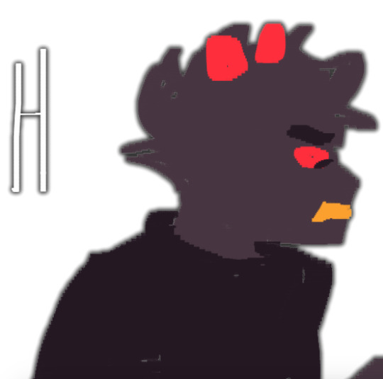
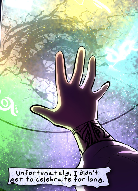
#i'm going with a more lineless style
Text
i have been distracted with an entirely separate piece of art
#i think it's gonna look bitchin if everything goes well too#although i'm considering a slightly meme-y version#'do you love the color of the sky'-esque#i'm going with a more lineless style#because i'm not comfortable enough going full painterly#but lines would just distract from it#and i can do lineless#he has spoken
0 notes
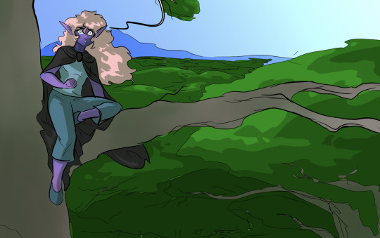
Text
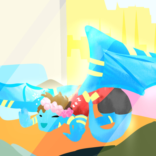
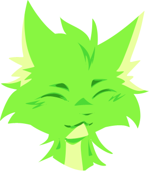
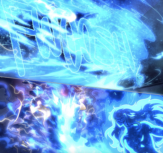
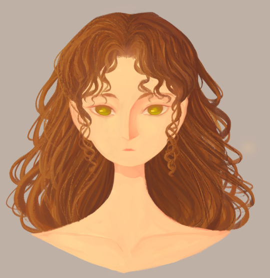
Reptiles have the right idea, the sun feels so nice
#I wanted to doodle this so badly#My new bedroom has a sun-facing window and I laid down in there earlier to sunbathe and oh my stars#i was so drowsy afterwords#I highly recommend it#Also I'm not terribly happy with this artwork but also my drawings don't have to be perfect :]#I just wanted to mess around with a lineless style again#I'm trying to draw more often because otherwise my old high school art teacher is going to bully me /joking#not a poll#qsmp#poll the egg
17 notes
·
View notes
Text
HERMIT A DAY MAY - DAY 10
Stressmonster x Cucumber Quest
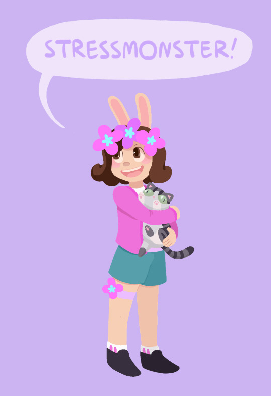
For Stressmonster I chose the wonderful webcomic Cucumber Quest!
I chose this design for her because I thought her colors and aesthetic would work wonderfully with the art style. I also think she would probably appreciate how cute the comic is if she were familiar with it.
This one was very difficult for me and I'm still not entirely satisfied with how it turned out. The rendering for this comic uses a very different style than what I'm used to, and I had some trouble reverse-engineering how the visuals are created, so it didn't turn out as on model as I would have liked. But, that being said, I think she looks adorable anyway.
I also totally made up how the kitty would look, since as far as I can remember there aren't any kitties in Cucumber Quest, so I came up with her design from scratch.
To learn more about Cucumber Quest and see my style references, adventure below the cut!
(The funds are still raising for Gamers Outreach!)
Cucumber Quest is sweet, beautiful webcomic by the artist Gigi D.G. It follows the adventures of a young rabbit boy named Cucumber and his sister, Almond, as they go on a quest to defeat the Nightmare Knight.
Unfortunately Cucumber Quest will not be finished as a comic, due to changing circumstances in the authors personal life, but the story will eventually be concluded as an illustrated script and every one of the over 800 pages of the comic is more than worth reading.
I cannot say enough good things about Cucumber Quest. It has a charming, engaging story, beautiful art, and fun, memorable characters. Please give it a read if you have the chance, you will not regret it.
Style references:
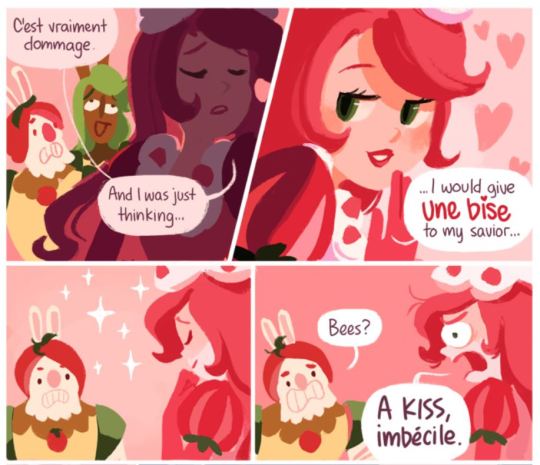
The comic uses a lineless style and soft color palettes. The shading changes drastically with the lighting, but I tried to mimic the style as it looks with flat lighting (such as in most panels of the above example).
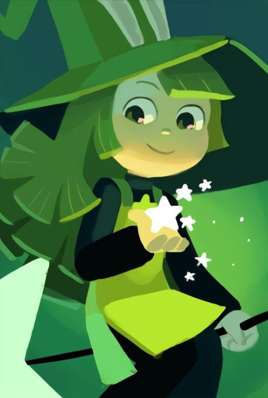
Here's an example of a character rendered with more dynamic lighting (this is Peridot, she is a witch)
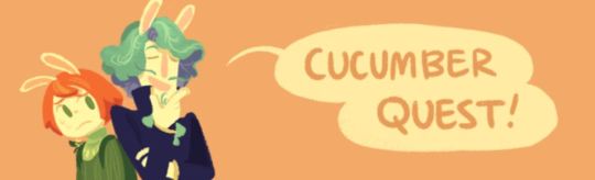
Cucumber Quest title banner
#I think one of the issues here is that I do not know the best brushes for this style#but I am still glad I attempted it since I love the art in this comic so much#I also think the original artist might block the characters in with shapes then add detail over top#which I am not very good at and do not have much experience in#since I am a big sketching and lineart guy lol#And yes the kitty is a Jellie cat#hermitaday#stressmonster#stressmonster101#hermitcraft
97 notes
·
View notes
Text
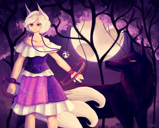
Ok the WIP I posted a little while ago is no loner a WIP yipeeeeeee I am so tired of looking at this drawing.
Artist's Notes:
THIS DRAWING IS FINALLY DONE YAAAAAAAAAAAAAAAAAAY!
Ok so this drawing was a WIP that I had had sitting around for a while, and so because I wanted to do a test run with the new face style I'm trying out, I decided to pick it back up again. Now you may notice that compared to the other version of the WIP, the shading is different, and that's because I had to change all of it to match the light source of the moon, which was.... not exactly fun (especially cuz I stayed up late at night to finish this which was tiring), but it was worth it because I am a lot happier with the shading now. Also, when I initially redid the shading on the white trim of her outfit, I ended up making them look like indiscreet white blobs that just looked... bad, so I had to fix that and I think it looks a lot better.
My favourite parts of this drawing have to be the face and the hair, though I'm not surprised about how much I like the hair since hair is my favourite thing to draw. Also the wolf, I really like how the wolf turned out, since I also love drawing animals from time to time. I also like how the background turned out.
Also, Enoko's design was a hit hard to get right, and I decided to add the white trim separating her shirt and skirt mainly because I didn't like how abruptly it changed in the original design. Also, for some reason her dress makes me think of 1800s-y southern/western clothes, which has given me the headcanon that Saki gave her these clothes when they first met. Makes me wanna draw the two of them together in very western styled clothes, I think it would be cute. I also changed up some of the colours on her original design to fit in more with the palette that I was going for with this piece. Also, I like how her tails turned out, mainly because when I was working on some of the sketch for this I tried to make them smaller, but they didn't look right so I just went "fuck it" and made them big and poofy. Also drawing her wolf ears was fun, I like drawing simplified wolf ears like that. Overall, I'd say I did a good job incorporating elements (like the bear trap hands, the tails, the gem) in a way that didn't feel like they were out of place in the piece (something I was concerned about with Enoko's design).
All in all, I wouldn't call this my best work, but I do like a lot of aspects of it. I've also noticed that I'm kinda getting a bit frustrated with certain parts of my style like the lighting (mainly the lighting), so I think I wanna try and branch back into that more painterly style that I started out with when I first started posting here while still mixing in some elements of my lineless style. Also, I need to get better with my colour values, mainly just for clarity since I kinda think that's where this drawing falls flat a little.
103 notes
·
View notes
Note
I've noticed your artwork sits on a border between semi-lineless and fully lined; some parts of a figure having an outline while others don't. It's a fascinating vibe that I really like, and I'm curious if there are any rules you have set in place for how this style comes out.
Yeah kinda! I actually don't do lineart at all- it's fully painted, but I simulate lineart in certain places. I basically use the same rules as line weight: areas with lots of connecting lines or bunches will have thicker/ more noticeable lines than straight planes. That's when I'll keep pure colour and no outline. Sometimes it's just eyeballing, but that's generally how I go about it!
83 notes
·
View notes
Text
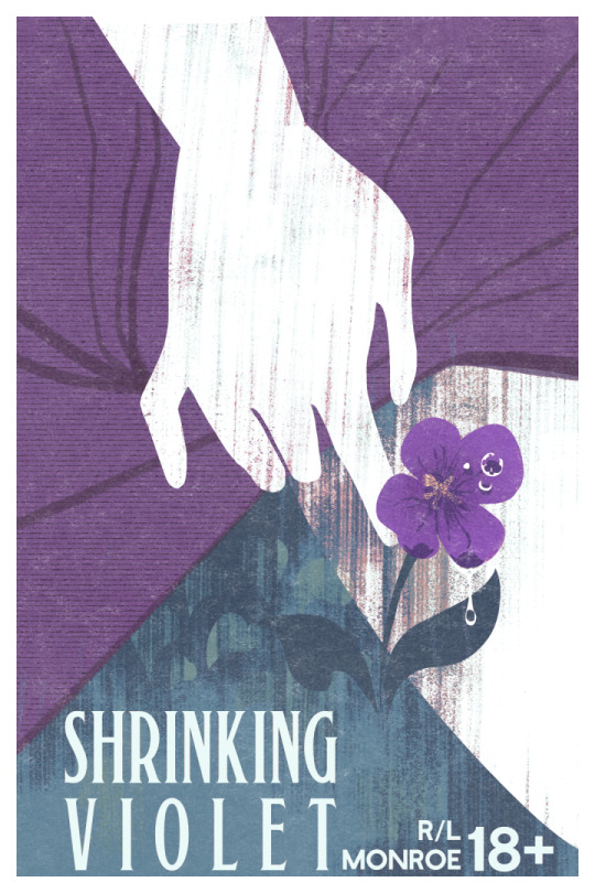
Shrinking Violet is out! another of @petitemortality R/L Monroe's wonderful erotic shorts, with another cover by yours truly >:) i've been saying it on nearly every promo post i make for this but if you're one of the people who has wanted me to write f/f, you're legally obligated to read this one. below is the sales copy, and then below that some discussion of the process for designing the cover!
Nobody at college knows that shy, nervous Maya had a 'bad boy' reputation in high school - and Maya is the only one who knows tough, rebellious Nasrin used to be a sweet-tempered teacher's pet. Mutual attraction is rekindled when their paths cross again, but the two find their old dynamics have been flipped on their head.
Maya finally knows what she wants, and Nasrin is bold enough to give it to her...that is, if she can bring herself to ask. Will their first time be perfect the second time around?
7k words, EPUB and PDF format.
This is the second in the Fuck Yourself Friday series of shorts. New stand-alone erotic stories are released on the last Friday of every month.
FYF 1: Go Fuck Yourself
These stories contain explicit sexual content, and are intended for 18+ audiences.
Contains:
-F/tF
-transfem sub
-outdoor sex
-praise kink
-soft penis stimulation
-non-penetrative sex
THUMBNAILS
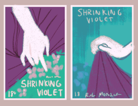
this one was very straightforward with the request: "the image I have in my mind for a cover is someone's fingers knotted in a skirt spread out against wildflowers. but more in the sort of gripping your own skirt gently kind of way, somewhere between anxious and excited if that makes sense. I'm thinking like you know the classic soft grunge tumblr aesthetic photo vibe. type of shit you'd post next to a closeup of a skinned knee in long socks"
very easy instructions to follow! so while i usually prefer to do 3 thumbnails, i only ended up with 2. there's only so many ways you can depict a hand on a skirt, after all. and we decided that we wanted to continue with the style i established with the first one, with silhouettes, lineless art, and bold textures. we liked the first one more, but wanted to get some leg in there.
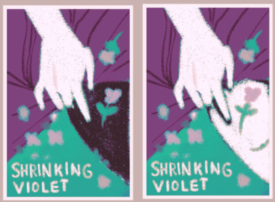
i proposed adding black pantyhose to the narrative to make it work on the cover (i have changed prose to match what i drew for illustrations Many times) but we went with bare leg in the end
FINISHING

so i didn't actually do a sketch for this one, just went straight to rendering. as we all know i use gradient maps a lot in my work, so i gave lee a choice between a bright, springy palette, and a wetter, darker palette. i also offered it with the border, or with the skirt going over it. personally i like the skirt going over it, but the border keeps it consistent and more book-cover-y, so we went with that. lee chose the darker palette, which suits the story much better
but the font didn't fit! too vintage for the story, which takes place in modern day.
fonts time :^)
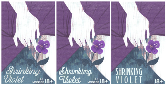
we went with the third option for the contrast. and also added a raindrop to the flower (which got moved to the right petal in the final draft). gently touching petals, wetness, This Is Yuri.
and the final result is as above!
anyway you should all read this story, it's incredibly sweet childhood-best-friends-to-lovers and in itself a love letter to trans femininity. i highly recommend it, and it's only $3!
go and get it!
67 notes
·
View notes
Text
Handy book of tips and tricks for using Krita (by a user thats used krita for a while)
HI! So i'm a krita user, and i figure since i know fellow artists that are moving to krita, i might as well make a handy guide to some of the tricks i use to snazzy up my art and basic howtos. This will be splitup into three sections: Tools, Layers, Filters. I'll also be interspersing how i used them in my art as examples!! Thisll be a two parter so hold on tight.
Shortcut keys:
P = colourpick
E = eraser
B = brush
Tools:
Obviously try using all of the brushes and seeing which ones you like. Krita has a myriad of handy and good brushes, and you can even make your own if you feel like it. I personally like to modify the rectangle eraser to a normal brush and using it, before i modified it a little more to be my own brush.
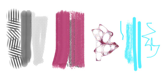
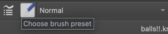
You can change the settings of the brush youre using on any layer by clicking this little dropdown menu in the top left of your screen. That little three dot button by the left side also goes into more detail about the brushes in case you want to fine tune a brush to your liking.
Personally, these are the custom brush edits ive used to make my art just that bit crunchier. As you can see, theres a lot more options you can tick and mess around with if you feel like it too.
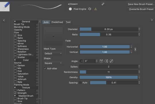
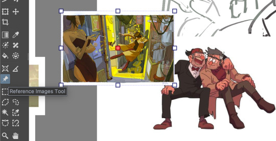
The pin button is the reference tool. If you copy paste an image into krita while the pin tool is selected, it will appear as its own image above all layers that can be moved around using the pin tool to use as a reference. Real handy so you dont waste layers on ref images.
Layer styles
Ok, you probably know the basics of how to change layers, (its this little dropdown menu here) but did you know that krita has a cool thing called LAYER PROPERTIES??

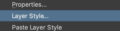
If you right click a layer and click this little button here..it should bring you to this handy menu with styles! These are really useful
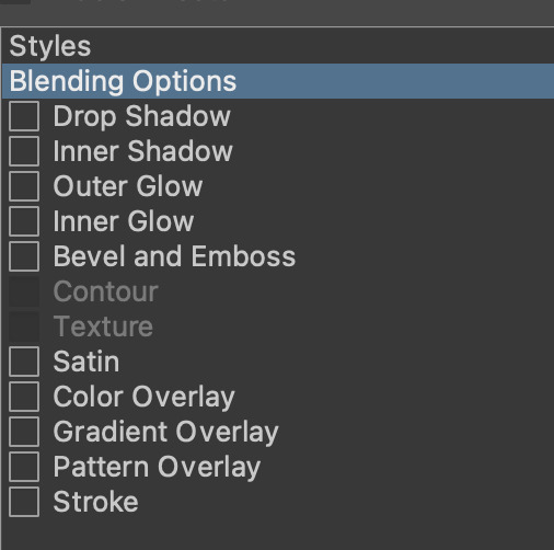
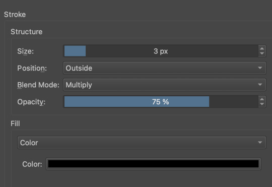
Now, i used to usually use outer glow set to these parameters to give the illusion of lines (and this is how anime artists usually line their very delicate pieces of hair and stuff), but i found an even better way!!
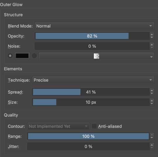
Its called stroke, and you can just modify it to be as thin or thick as you like. I recently used it for these two pieces, because its more precise, and used across multiple layers makes your work look cool and like you gave a damn about lineart. This is especially helpful if youre a stubborn son of a bitch that isnt going to to take the time to line your lineless work, or if you want to line really small items like string on shoelaces and not have it look messy (just set the colour to white and draw as usual.)
PART TWO
64 notes
·
View notes
Note
hey Olympea, did anyone ever call you - snrk - Green Bean? bc I can't help but think of this nickname when i look at you :D
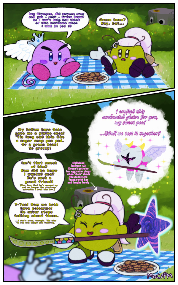
Featuring a picnic with Princess Chiffon! (I hope you don't mind me putting your words in her mouth.)
+2 Nicknames!
+1 Not-yet-tragic-due-to-time-shenanigans memory!
+1 Sneaky Cameo
For some reason Galacta Knight's step seems to lighten around her and he gains a somewhat shy, but more refined and graceful cheerfulness that's very different from the regular bombastic and powerful Aeon Hero persona he has to put up for the public. Olympea doesn't mind. She's just glad to see her good friend thriving and comfortable around her! Oh! And bonus! Unlike her girlfriends he loves chatting about weapons just as much as her. (Bless her. I don't think she's connected the dots yet, guys.) Maybe she never will, considering the tragic endpoint of the Heroes of Yore narrative. I am normal about them. Fufufu.
(Yeah, so, I said I was going to take it easy. That, uh, didn't happen. I feel like I unlocked some kind of well of creativity and I'm just along for the ride. I mean, look at this thing! What is happening?! Full backgrounds, lineless painterly style?! Recognisable bushes?! I toyed around with textures and somehow made Olympea look like felt. I even figured out a way to give the lineart that slight bleed to make it look hand-drawn.)
Take a proper gander at this propaganda @kirbyoctournament
Masterpost
#Olympea#Olympea's Quest#Olympea HoY#Chiffon kirby oc#maybeher0#Keigo the Pet Rock#Galacta Knight#Aeon Hero#Ibispaint#kirby oc#kirby oc tournament#my drawing#my art#my comic#ask box#ask and i shall answer
37 notes
·
View notes
Text
Am I a toy to you, my love?
I need a human's touch, but
You don't need me
I need a human's touch, but
I'm obsolete
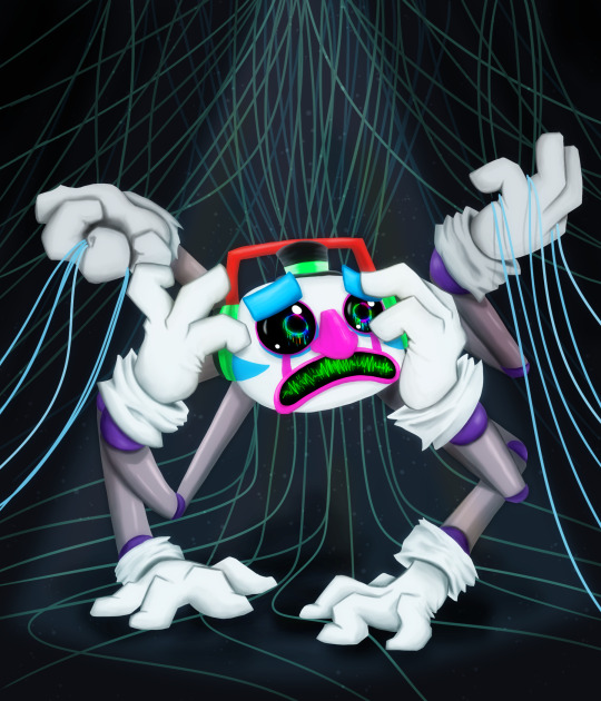
Beta DJMM inspired by this song.
Probably not going to do much other than this pic but I have ideas...The more fucked up of which is that his memories (possibly including memories of Y/N if we are to go that route) were uploaded into the new DJMM. Most people think the memories were TRANSFERRED, but they were actually copied. Meaning there are two versions of him now, one who got a new bod and gets to perform and this guy, who now sits semi abandoned in a forgotten part of the Pizzaplex. (They probably have those, if HW2 is any indication.)
Also I'm super fucking proud of this art, I've never done this "lineless" style before and it's probably some of the smoother shading I've managed to accomplish ever...
#fnaf#fnaf djmm#fnaf dj music man#dj music man#djmm#beta djmm#beta dj music man#fnaf sb#fnaf security breach#my art
44 notes
·
View notes
Text
Finally finished this piece with Marcille as a marvelous spatuletail hummingbird! I wanted to draw her as a fursona (? I'm not sure if you should use fursona to refer to a character that's not a artist avatar but I don't know what else you would use) and figured why not a bird to go with Falin. She's got a sort of nervous energy, and the colors of a spatuletail seemed like they would go with her outfit, so I ended up with this.
I think I could've made her birdier, maybe done away with the nose and mouth to give her a beak? I do know I'm getting steadily happier with my art, but I'm not quite satisfied with. I love lineless art styles, but I would like more texture, and maybe I'll dabble with a bit of lineart in the future? Idk, tell me what you think.
PS: Found out my png problem had to do with some sort of glitch where either mobile devices automatically turn transparent backgrounds white when uploaded to Tumblr or Tumblr does it, so I had to send it to my email and then upload to Tumblr from my computer. So if you don't see a drawing from me for more a week, I'm working on stuff, I just haven't had time to get to my computer and upload it. You win some you lose some ¯\_(ツ)_/¯.
Edit: Why does the png have a faint reflective halo when you click on it???? I give up😭.
#dungeon meshi#marcille donato#my art#furry#new artist#anthro#furry art#furry sfw#sfw furry#artists on tumblr#bird furry#lineless art#digital art
22 notes
·
View notes
Text
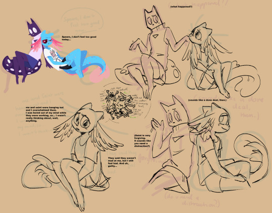
So we all agree Rivulet would have ADHD right? Well sometimes it's not all about being hyper, sometimes it just sucks </3
But with the right friends it's not that bad, maybe?
(From: your local ADHDer Espurr)
Also be afraid as you witness more Spearmaster as I was trying to figure out how hard it would be to do anthros in my lineless style.
Under the cut: Extra stuff from the first drawing :)
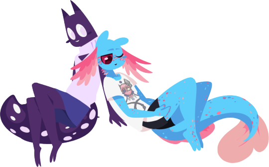
Here's the completed transparent drawing of Spearmaster & Rivulet hanging out!
And the design on Rivulet's shirt because I feel boring giving these guys completely plain clothes:
Is it questionable to have a shirt that just has a real-life god with turbo cancer on it? Maybe. But I'm not sure on that part of the lore in Anthro AU so maybe it's not too weird 😏
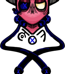
And here's a silly Saint headshot from when I was trying to involve them more in this comic but I actually can't figure out how to do their Anthro AU design in a way I like grrr
(also hope it's fine for everyone that I tagged this as Fishstick even though that's not the ship I fully intend to go for in my Anthro AU, I feel this comic could be interpreted romantically and I have no qualms w that :) I like Fishstick)
#rain world#rain world anthro#spearvulet#fishstick#spearmaster#rivulet#slugcat#rain world downpour#my art
308 notes
·
View notes
Note
So far, has there been any sort of art technique or process you've tried that made you go "that was surprisingly easier/harder than I expected"?
Oh man, yea. So many things. Doing this comic has been a learning experience and a half because of all the textures and effects I have to do, most of which I figure out on the fly because I've either never done them before or I've never done them that many times before.
The first "surprisingly easy" effect I'd never succeeded at before was the scales on the Storm Drake in the interlude after chapter 6:
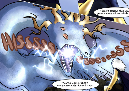
It's a Droplet particle brush used on two layers, one set to Multiply and the other to Screen. It produces a very easy texturing effect that works on everything from scales to sand to rock, making the surface look like it's catching the light in complicated ways. I used it again in Dainix's desert flashback in chapter 19 to make the sand look like it was catching the light.
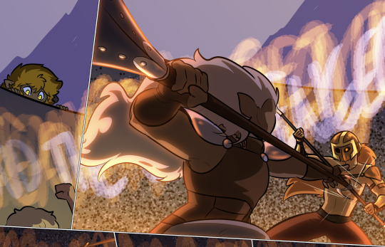
I actually used a similar method to draw the background in the arena fight in chapter 12 - using a rounder particle brush, but the same combo of Multiply and Screen to produce a chaotic pattern that gave the illusion of a massive background crowd without making me hand-draw ten thousand tiny people.
This one was an effect that didn't surprise me and that I sadly had very little cause to replicate, but I LOVED the multicolored highlighting effect in Erin's chapter 6 flashback in the heart of the Storm. It ended up being very simple to do and it just looked SO pretty.
Changing the highlighting colors to just the cool-tones for this page just made me like it more.

When we hit Falst's intro arc and I had to draw about a million forested backgrounds, I decided to refine the process I'd used in the first few chapters, because I wasn't happy with those results:
Starting in chapter 8 I tried a lineless style for forested backgrounds, and it worked out better than I'd hoped. Not only did it produce a feeling of depth and shadow, I didn't even need to plug in my drawing tablet to do it - I could literally do these backgrounds with my trackpad and mouse, which was a huge timesave. Combined with a little experimental sunbeam stuff and these forest backgrounds ended up both shockingly simple to make and VERY nice to look at.


I used a similar technique for the soulcrystal in The Collector's lair - stacked Multiply and Add layers with nested rough shading patterns similar to the ones I used for foliage, but with more overlap to produce the effect of chaotically scattering light.

This was another no-drawing-tablet one, and I liked this texture so much that I willingly redrew it for the stinger in chapter 18 rather than copying the texture from the earlier chapter.
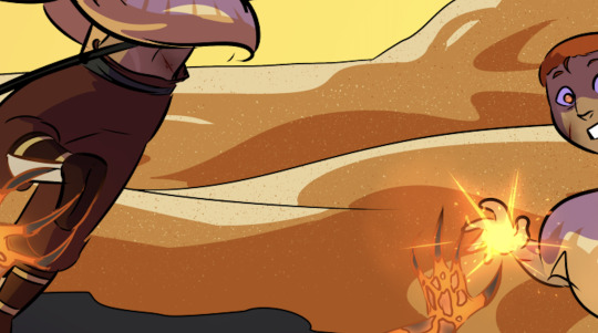
In terms of effects that took longer than I anticipated, Dainix's fully-realized Crucible form has been giving me trouble for literally as long as I've conceived of the comic. Drawing fire is already hard enough, but giving that fire a semi-solid, tangible form that was clearly readable as a humanoid figure was a HUGE pain in the ass. The head and arms were easy to design, but what to do with the bottom half was always a struggle, and beyond that I wasn't always sure how opaque to make him - real fire is a semi-translucent light source in constant motion with no clearly delineated edges, and if you draw it in a way that deviates from that too much it can make it feel less like fire. It took a while before I was happy with the color balance on him to make him suitably glowy without losing the internal detailing that made his expression readable.

Similarly time-consuming, working out how to do Vash's "nova mode" took some trial and error. I wanted to make it clearly visually distinct from Paladin light magic and regular fire magic, so I focused on trying to replicate the texture of the surface of a star, with sunspots and flares rather than licks of fire or sharp-edged lightsaber vibes. I'm happy with how it ended up, but if I recall correctly it took upwards of two days just getting all those glowy effects sorted out.
Then drawing the actual starfire blast was an even bigger pain, because again I didn't want it so glowy that it was completely unreadable. To be honest I'm still not sure if it worked.
This is a very recent one, but it took me a while to figure out an effect I was happy for to communicate "this place is really, really dark." I didn't settle on a blanket dusty purple desaturation layer until quite late, to sort of replicate what night vision supposedly looks like for animals that can see decently well in the dark. Lights and darks are preserved, but color isn't so much, and this way I wasn't way-overshadowing everything and making it impossible for US to see. And conveniently the actual effect is quite simple to do - it's just a universally gray layer at 50% opacity set to the "Saturation" combine mode, stacked with a universally dusty purple layer at 70% set to the "Color" combine mode. Very easy to add quickly and copy/paste across different pages.
There's probably more, but yea. Almost all of the "that was surprisingly difficult" effects either get easier with time or I figure out ways to simplify them and make them work in fewer layers. This is the really fun thing about a longform project like this - I keep finding new ways to challenge myself I'd never even thought of before.
225 notes
·
View notes
Text
Deltarune Animation - Concept Stuff
While I work on the animatic/boards for my planned deltarune animation, here's some concept art for a portion of it to come.
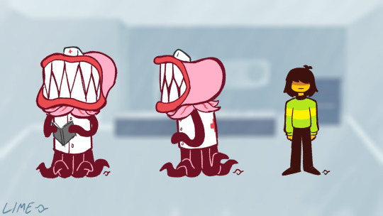
Since the nurse didn't have any full-body references available I took some inspiration from takes I've seen of their Undertale counterpart. I'm liking how these are coming along, though.
I kind of wish I could keep that style brush for the actual animation but Krita's animation setup is way too janky and CSP is EXPENSIVE if I want to do full animation work with it (I own the PRO version which only gives you 24 frames to work with at a time). So, I'm back to using Flash/Animate, and... the brushes adobe has suck.
MOVING ON-
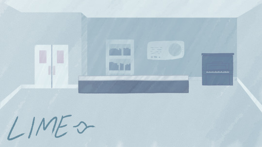
I think for the backgrounds themselves I want to go with those subtle lines and not totally lineless. I like the water color look, maybe with some subtle speckles here and there. Ever seen Scooby-Doo: Mystery Incorporated? Those backgrounds SLAP, they're so beautiful. But the lines give it a more playful vibe, I think. Well, maybe that isn't the right word to use- oh well.
I would be very open to having someone else work on the backgrounds for this animation. I don't know who, and I'm not nearly done with the animatic yet. And since this is sort of a passion project, I'm not making any money off of this. If it comes to it, I might commission someone to make the backgrounds, but I'd be extremely grateful to anyone who is interested in hopping on board here.
It's really nice being able to have *something* to show for now, at least. AHHH MAKING STUFF IS SO FUN!!
#lime's art stuff#lime's animation stuff#deltarune#deltarune fanart#kris deltarune#kris dreemurr#deltarune side character#art#digital art#animation#work in progress#concept art#character design#character concept#background art#background design#animation planning#tobyfox#toby fox#video games#taking my time#we're getting there
27 notes
·
View notes
Text
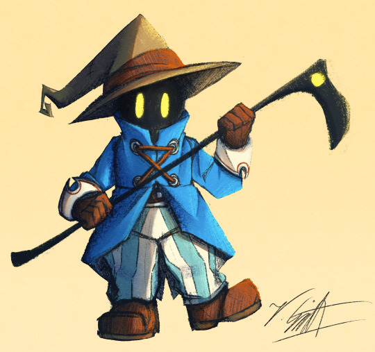
I've crawled out of my cave after playing Final Fantasy IX for a long ass time what have I missed?
Artist's Notes:
I'M BACK BABY! A while back I made a post with a new style experimentation thingy but I ended up deleting it because it was just kind of a boring face thing, I was planning on doing more art but then I started playing Final Fantasy IX and uhhhh yeah so that game has kind of taken of my brain for the past two weeks and I am 20 hours into the game because I love it so much. I wanted to draw Vivi because Vivi is just really fun to draw ok? I've kinda been feeling really burnt out with my lineless style, mainly because of how hard it was to do lighting. I'll show one of my initial art style tests on the bottom of this post. Again, used to have it be an individual post but it was just one face so it was kinda boring, so might as well include with this one on the subject of art styles. I wanted to kinda mix some aspects of my older style with the sketchy shading lines with a more painterly way of doing the lighting (mainly in the shadows). All in all, I think that's my favourite part about this drawing, it feels nice to finally be able to do some proper lighting again, and I want to experiment even more with my lighting and rendering in future pieces. Also, part of the pant shading got kinda lost in the sketchiness, so for next time I'll probably focus on the clarity of the more sketchy parts of the drawing, since I did go with my initial sketch for the final drawing. I also gave up on the background since I had no idea what to do for it, and I didn't put too much detail into the staff as I forgot which one I gave him in my current playthrough and I didn't want to risk spoiling myself via looking up references, but that's ok I like how the singular yellow circle on it matches Vivi's eyes. Also I was having a bit of trouble figuring out how to draw his body and how to pose him, but I like how the pose turned out a lot. It was inspired by his idle animation when in a battle in game where he does a little shimmy.
Ok I need to talk about Vivi's design because I love it so fucking much oh my god-
I absolutely love how his face is just in complete shadow and only his eyes stand out, it's so cool and unique and I love how they recontextualized the original black mage design from the classic Final Fantasy games. How they did it I won't say because I don't wanna spoil the game, but someone give this poor baby a therapist because he goes through a lot. Actually, same can be said for all of the FFIX cast, they all need therapy (again, I won't spoil anything, please go play the game for yourself).
While I do love almost all the characters in the game, even though Vivi is most fun to draw, my favourite character has to be Zidane (the main protagonist of the game). He's a really fun protagonist, and they could have easily written him as a misogynistic jerk who doesn't respect women but they didn't, and I really appreciate that. He's just an overall cool dude who's a really nice older brother figure to Vivi and also just has a cool character design (who I also want to draw eventually). Initially in the game I was planning on grinding levels for Vivi to make him the tactical nuke of the party, but then that title went to a different character (who was initially multiple levels behind the group since I grinded the party in the starting area way to much before they joined, but now they are two levels ahead of everyone and have pulled the team through a lot of tough battles, again I won't say who it is because it is kind of a spoiler and the way the gameplay actually ties into their character arc is just so good omfg). Once I eventually finish the game I'll probably write a full review on here, so no spoilers until then lol
Also, I've kinda been burning out a bit with making Touhou art, which also made me a bit burnt out with Touhou stuff in general (although I will continue keeping up with the manga) so getting into other things (i.e. Final Fantasy and even Fallout since I've watched the first season of the TV show which is a whole other post for another day) has helped me refresh and given me something new to think about. I've ended up in the exact place I feared ending up, where I would start drawing fanart for it not because I wanted to but because I felt like I had to, so I'm taking a bit of a break. When I do draw Touhou fanart again I'll try to draw for the sake of myself, and to all the other artists and fanartists on this platform (and on any social media for that matter), take care of yourself and don't forget to take breaks when you need to!
(Ok part of that last paragraph was definitley influenced by the good ol' "it's 9:00pm and I need sleeb, but the message at the end still holds up, always take care of yourself)
Oh yeah, and here is that one style experiment I did btw
Man I really fell down the "Yoshitaka Amano art enjoyer" to "Final Fantasy fan" pipe line didn't I?
14 notes
·
View notes
Text

[Image ID: A knee up pose of a fan design of Marvel character Max Dillon, done in a ‘lineless’ style. He is a pale man with short white hair with green accents, wearing silver lightning bolt shaped earrings, a green shirt that has two yellow lightning bolts going down the chest, yellow glove, and dark pants. His most prominent feature is his left eye, which is green, and has a lightning bolt like effect connected from it. This same lightning bolt effect is swirled around his left hand. The background is a very dark green colour, with a large lighter coloured circle that has a slightly darker green unfinished border that extends down to highlight random areas of his body behind his head, neck and shoulders- inside this circle is more circles around his head that descend in size and get darker in colour. A large portion of his figure and the background is obscured by various boxes of text from the article “Are you looking at me? Understanding and managing paranoid personality disorder” by Andrew Carroll, as well as various different coloured speech bubbles and thought boxes from comic book issues the character has appeared in. /End Image ID]
I don’t like. Really enjoy posting art on tumblr anymore, I'm not really looking to necessarily ‘Curate An Audience’ with the artwork I create, but this is a piece that is very personal to me that has been in development for way too long and which I am very proud of, especially for being the first time I've done this sort of like, ‘Collage Style’ for an art piece. IDFK, I just like it a lot.
TDLR: I spend too much time thinking about the mental states of various Spider-man characters, especially for the antagonists
(This will be reiterated in the tags as well, but FYI, if you are ableist about or on this post, I will block you.)
#max dillon#electro#spiderman#spider man#spider-man#marvel#marvel comics#dinu yells into the void#dinu yells in the void#dinu's sketchy art#abuse tw#abuse#speech discrimination#speech discrimination tw#implied suicide#schizo slur tw#schizo slur#okay i yhink thats all the tw tags I gotta tag#for the comic text boxes#if anyone wants I will hunt down the origins of all the comic text boxes#and I do plan on trying to eventually transcribe all of the text for id purposes#also genuinely. please dont be fucking weird about this.#like im serious. if you’re weird about this post i'm going to block and report you.#No one on tumblr needs my medical history but I am someone with a personality disorder.#so this topic means a lot to me#so just be fucking normal#please.
47 notes
·
View notes
Text
Broken phone p3
Did you miss this section? Today my sister Angel (@littleangelblogstuff) and I decided to draw together again. Today's topic suddenly became Mike (and we didn't discuss what we were going to draw in advance!). We drew within the New World!AU.
Jeremy picked out a dress for Puppet, but he's not sure if she'll like it. Mike thinks everything will be fine.
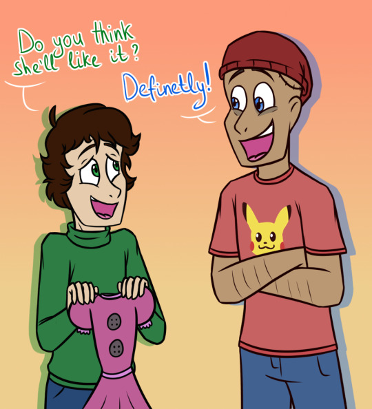
AI: 1boy, 1girl, :3, beanie, blue eyes, brown hair, crossed arms, crossover, dark-skinned male, dark skin, dress, english text, gradient, gradient background, green eyes, hat, jeans, open mouth, orange background, pants, pikachu, pokemon (creature), shirt, short hair, smile, turtleneck.
AI thinks Jeremy is a girl (does it knows something about the 2019 Rebornica's reboot??). Okay, I decided to stick to the “dress” and draw something from the past. I used the fan game "Five Nights of Flirting" as inspiration for Mike's childhood friend. I really liked Ellie, so I wanted to take her into my AU.
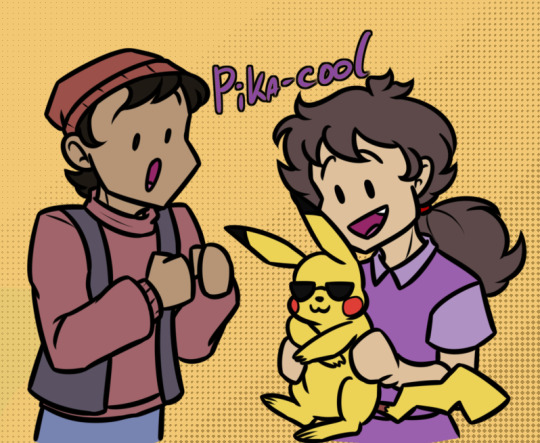
AI: 1boy, 1girl, :3, beanie, brown hair, fang, hat, holding, holding animal, holding pokemon, long hair, open mouth, pikachu, pokemon (creature), ponytail, purple shirt, shirt, smile, sunglasses, sweater, vest, yellow background.
Oh no, the sunglasses are missing! 😭 Okay, Ange decided to try the near-lineless style + Rebornica art style. Mike looks happy to have received the rare card.

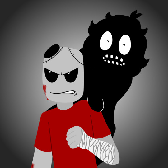
AI: 1boy, bandaged arm, bandages, blue background, blue shirt, cellphone, closed eyes, crown, gradient, gradient background, hand on hip, holding, holding phone, male focus, phone, pikachu, pokemon (creature), shirt, short sleeves, smartphone, smile, solo, upper body.
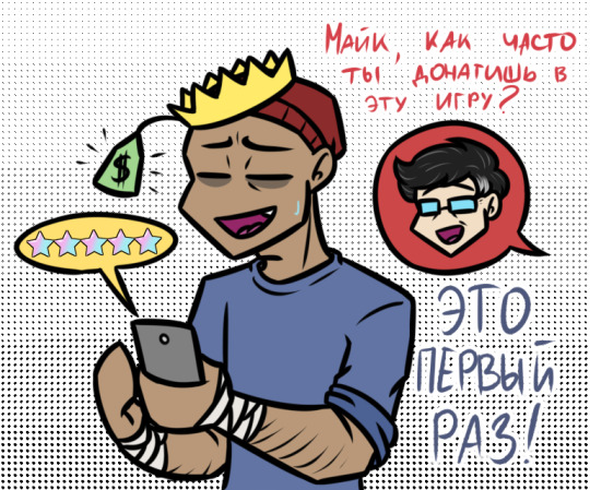
“Bandaged Hands” immediately transported me to the present. No, Mike doesn't harm himself (on purpose)! One of my drawings showed Mike playing a game on his phone. I wanted to expand on this topic. "Mike, how often do you donate to this game?", "This is the first time!"
That's where Angie's part ends. I definitely liked it~
I wanted to draw Mike with Ellie's ghost. Due to his head injury, Mike has frequent headaches, and Ellie's presence almost always makes things worse.
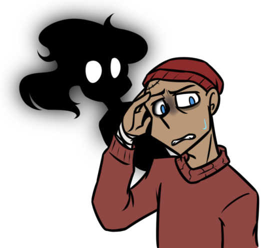
AI: 1boy, 1girl, beanie, blue eyes, dark skin, ghost, hat, silhouette, sweatdrop, sweater, transparent background.
I like that the AI was able to see the ghost in the picture. But what I like even more was how Ange was able to draw something completely new! And then there is Ellie in life too!
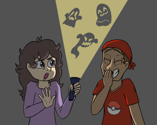
AI: 1boy, 1girl, bandana, brown hair, closed eyes, covering mouth, flashlight, grin, hand over own mouth, holding, long hair, long sleeves, open mouth, purple shirt, red shirt, shirt, short sleeves, smile, teeth.
I liked the experience of drawing Michael Afton, so I decided to draw something dark again. The 1999 incident, also known as "the bite of '99". Someone had reprogrammed an animatronic dog to attack a boy who stood in his way to perform a ritual (and no, it's not Vincent!). Mike miraculously survived, but Ellie…
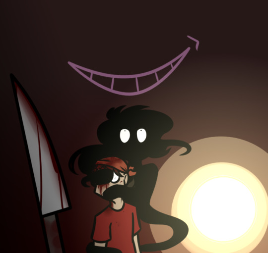
AI: 1boy, 1girl, bandana, blood, blood on face, brown hair, knife, red shirt, shirt, short hair, silhouette, weapon.
Back to the present, back to Ellie protecting Mike. She only does this in particularly stressful situations, because she understands that she is harming her friend.
Each time such drawing brings a new experience. I'm glad that so much attention was paid to Mike this time. This section doesn't end, and someday we will bring something more interesting!
(Also, I think it's worth leaving the FnoF tag just in case)
#fnaf#fnaf au#friendliesart#new world fnaf au#phone guy#rebornica#jeremy fitzgerald#mike schmidt#fnof#five nights of flirting
18 notes
·
View notes
Last Seen Blogs

stpaulschoolpalampur
St. Paul's Senior Secondary School
princesaltines
prince salty
totallycorrect-beetlejuice
Totally Correct Beetlejuice Quotes

darthzz-ploo-world
Darthzz's Stuff

cngamesfmp
CNGamesFMP