#i’m too lazy to go and fix it so it has uppercase letters
Text
jon’s got his hands up in surrender. he’s overwhelmed, jay can tell. he’s gotten better at handling the press, but sometimes, even for the most experienced, it can get overwhelming. he’s in the center of a crowd, floating a foot off the ground. he’s been trying to find a way out for the last five minutes, but it’s proven difficult to excuse himself. both fans and reporters are trying to get the closest. jay’s a few steps away.
“superman!” he calls out. he has jon’s attention in that same breath, and everyone else follows close. it’s a surprise to everyone around who the voice belongs to.
it’s been years. far too long since the last time they’ve seen each other in person. jay’s gone back to his natural hair color since then, and he’s gone to wearing more neutral colors while working. jon himself has let his curls loose as superman. they nearly cover his eyes, but not enough that jay doesn’t notice it: the confusion when he first spots jay changing into recognition.
a few other reporters seem to pick up on his identity as well. a few questions get thrown at him about him presence in metropolis.
“superman, can you tell us where the criminals are being taken?” jay asks, ignoring the shouting beside him. jon opens his mouth, then closes it. the man next to jay murmurs something jay doesn’t catch. instead, he continues. “there have been rumors recently about many criminals being apprehended by your fellow heroes that have gone missing. the public is beginning to suspect that the heroes have something to do with it. is there anything you can say to that?”
the crowd around him is silent for a moment.
criminals that have been locked up recently by any notable heroes have begun disappearing from their cells. most of the cells have been found with struggles of a fight, and traces of whichever hero had arrested that criminal. a few heroes have been taken in for questioning, and although they’ve all gone home innocent, people are not having it. there have been protests and riots against heroes all over the world since the second time.
it’s one thing for any other reporter to try to question jon on this topic. it’s another thing when it’s his ex questioning him. especially when superman has just been held for interrogation two days ago for supposedly kidnapping an inmate.
the crowd turns back to jon.
“we are looking into the situation. we will find whoever is kidnapping the inmates and justice will be served,” jon answers him. he looks bothered but jay can’t tell if it’s with him or the topic.
“can you confirm or deny if any of the heroes are actually guilty and are being let go due to their reputations?” jay presses. he takes a step forward.
“none of our—“
“what are you doing to try to prevent these kidnappings? how far along are you into the investigation? are the kidnappers simply taking inmates or how long will it be before innocent people begin to disappear?” jay can tell that the questioning is irritating jon, who’s doing an awful job at hiding it.
“we are taking this investigation very seriously. as we speak, there are people on the case, attempting to track down the people responsible. trust me, we are doing everything we can,” jon says firmly.
“have you considered that maybe what you’re doing isn’t enough? sure, they’re criminals but they should be in their cells, not wherever they’re being taken. god knows what’s happening to them now. how many more have to be taken before the people responsible are apprehended?”
that seems to do it. jon forces a smile, then. “sorry but i have to go. maybe we can continue this another time.”
they won’t. but it’s not like he can really say that. jay doesn’t have time to say anything because as soon as he’s done speaking, jon is up, up, and away. the crowd begins to disperse soon after, and jay is left frowning, staring up at the streak of red and blue that jon left behind.
——
technically, jay is in vacation. sure, he hunted down jon yesterday to try and get some answers for his story, but he is on vacation. he’s not in metropolis to get closure from jon, nor is he here for work. he’s here to visit the aerie and wink.
but neither of them are on vacation, which means jay is left to find ways to entertain himself. yesterday had been entertaining enough, and if he could, he’d do it again today. but he doesn’t think jon would listen if he tried.
maybe trying to interrogate jon the way he did wasn’t the best way to be seeing him again for the first time in years.
instead, jay spends his morning at the park. he walks along the path for a few laps until he decides to sit down at one of the benches near the playground. there aren’t many people around, just a few exercising and some others with kids not old enough to be in school yet.
he tries not to, but jay can’t help the way his eyes follow a mother with two kids. one is an infant that she’s pushing gently on the swing, and the other is running around the playground, showing off to his mother. it’s a nice scene, but it leaves jay feeling…well, almost like he’s missed out on something.
jay’s never quite liked the idea of marriage or having a family. sure, when he was younger, he used to dream of marrying whoever his crush was at the time. but as he grew older, especially after bendix, marriage had stopped sounding appealing. kids were never something he felt like he needed in his life. he never imagined kids whenever he thought about his future. but being with jon, loving him and planning for the years to come, well. those things always seemed a bit more appealing with jon in the picture.
but not everything lasts forever.
he still remembers how bitter he had felt those last few days together. how unhappy he had been and how he had begun to pack up his things before he and jon had even broken up. that within hours of officially breaking up, jay was already on his way to gamorra. he had believed there was no going back, then. he remembers how awful it felt to fold up the suit, leaving it on their— jon’s bed with the ring on top. he remembers how damian had texted him at least twice a week to check up on him until jay had asked him to stop. it was hard, ultimately, to try and leave behind the life he had in metropolis. especially when their break up had gone public. there are only so many months superman can go without being seen with his boyfriend before people start asking questions.
jay doesn’t know how long he’s lost in thought for until he feels a sudden rush of wind. he shakes off the thoughts, and looks around. beside him, jon sits on the bench in his suit. it’s a nice shade of blue, now.
“jon?” jay manages before jon leans forward.
“can we go someplace private to talk?” jon asks. he’s staring down at jay, mouth in a straight line. he’s not exactly frowning right now, but it’s very close.
“sure,” he says. he’s glances over to the playground, but the mother and her kids haven’t noticed jon yet, and no one else is close enough to say something.
he watches jon stand up, and he holds his hand out to jay. when jay takes it, jon pulls him up. there’s barely enough time for him to register the moment after because soon enough, jon’s letting him down on top of the daily planet’s globe. it’s nostalgic.
jay finds his balance, only needing to hold onto jon for a second before he’s fine on his own. it’s weird, though, to be standing someplace he shouldn’t be. it’s been too long and he doesn’t quite remember the last time he was up high like this. he turns to face jon, who hasn’t taken his eyes off jay.
“you had something to talk about?” he asks, shoving his hands into his jeans’ front pockets.
“what was that yesterday?” jon asks. there isn’t much of a bite to his words. if anything, he sounds hurt. “we break up and don’t see each other for years, and then you suddenly show up in metropolis, accusing me of kidnapping inmates?”
jay scoffs. “accusing you? i wasn’t accusing anyone. i was just doing my job. something is going on and the people need answers.”
“you humiliated me!”
“that wasn’t the first time someone’s done that to you and it’s definitely not going to be the last. get over yourself. i didn’t come to metropolis to point fingers, i’m not here for you at all. but i saw the chance to get the story and i took it.”
“why else would you be here?”
“i’m visiting the aerie and wink,” jay says. he pushes his glasses up. “you do realize that i lived in metropolis for years before we met, right? i have other friends here.”
jon doesn’t say anything to that, he simply sighs. he crosses his arms over his chest, fingers tapping against his biceps. and jay tries not to stare, but jon’s got a bit more muscle to him, and he can’t help the way his face heats up thinking about it.
“well…” jon starts. he lets his arms fall back down to his sides, and looks out to the city. “it’s…it’s good to see you. you look great.”
jay smiles. he thought if he was ever going to run into jon again, that it would be awkward and he wouldn’t know what to say. but the arguing had been like an ice breaker. the awkwardness didn’t last long and standing here, seeing jon worked up was hilarious. to stay the least. it feels nice.
“thank you,” jay says plainly. he knows he should say the same, but he doesn’t. mostly because he knew that the way jon would look at him, expecting the compliment to be returned would be funny. and it is, when jon huffs and goes to cross his arms again. but jay stops him. he grabs jon’s arms and wraps them around his waist before wrapping his own around jon’s shoulders. he lays his head on jon’s shoulder, looking out to the city as he says, “you’re not so bad yourself, superman.”
#i’m too lazy to go and fix it so it has uppercase letters#posting this before i have second thoughts#this is post canon. they break up bc things go south in their relationship. not bad but they’re unhappy#anyway i believe in jayjon lovers to exes to lovers pipeline#jayjon#jay nakamura#jon kent#superman#soke#dc#supertruth#pink kryptonite#txt
18 notes
·
View notes
Text
Learn Log #3 - GUI
This week I studied various elements of Graphical User Interfaces (GUI) including text, logos, buttons and cursors. For practice, I made a mock-up of a fantasy RPG menu which turned out alright. Apologies for the late post. I was a bit busy this past week. Hopefully this doesn’t cause a delay in next week’s post but we’ll have to wait and see!
Text and Font
To practice my font making skills, this week, I tried to make readable fonts in the smallest sizing possible. My reasoning behind this is letters might be read in large passages of text, so a smaller size will likely be required – especially for small menu spaces such as inventories.

Above was my first attempt which used 3x4 pixel letters. While many of the characters were recognisable, a good number were not. The ‘M’ and ‘W’ were utterly unreadable, and some of the characters were difficult to read, like ‘S’ and ‘X’. I decided to move up to a 4x5 size.
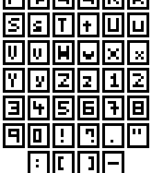
With this slightly larger size, I attempted to make both uppercase and lower case letters, most of which worked pretty well. While most characters such as the ‘S’, ‘E’, ‘3’, ‘Z’ and so forth benefited from the extra pixel in the Y-axis – characters were still needed an extra pixel along the X-axis. Characters such as ‘M’ and ‘W’ were still basically unreadable, and characters such as ‘T’ and ‘I’ were difficult to align along the even number of pixels. To fix this, I moved up to 5x5.
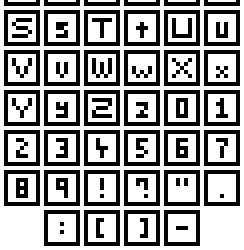
Finally! I have successful ‘M’s and ‘W’s! From this test, I really think that there are a few principals for creating nice fonts. 1) If you know or unsure about if the letters ‘M’ and ‘W’ are involved then make the canvas size for each letter at least 5 pixels wide. The same can go for characters like ‘S’ with regards to height. 2) Make the canvas size an odd number along the X-axis to better align specific letters.
With this last font set, I was also able to size the canvas for different types of characters differently. Capital letters occupied the full 5x5 canvas, lowercase letters occupied a 3x4 canvas (except for the ‘M’ and ‘W’ which had to be 5x4), and numbers and symbols filled a 3x5 canvas. I did this so readers could better distinguish between uppercase and lowercase letters, and similar characters like ‘O’ and ‘0’. I’ll have to see what it’s like an actual game later, but I think it’ll be a pretty useful trick.
I do think I will be able to make larger fonts than this and size them down in the Unity engine. Even if this is the case, I think this worked pretty well as practice within tricky boundaries.
Logos
I think logos and titles are pretty crucial to a game. They plaster the cover and main menu of the screen, and I’m sure we can all think of a few memorable logos we’ve seen in games. So, now that I’d practised making text I wanted to make a banner logo for my Itch.io page. The first thing I did was a little sketching on paper before converting it to a small pixel art concept, as shown below.
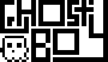
The recommended banner size for Itchi.io is about 900px wide. I was not going to start here, so I decided to do my rough draft at 45x26 and detail it as I scale up. I made this draft by implementing the concepts I really wanted first and building around that. I knew I wanted to include the ‘S’ wrapped around the ‘T’, so I started there and worked my way through the logo. I also wanted to include a little ghost, so I left a space for it in the bottom left corner. Next, I wanted to add some detail and hollow out the letters, so they were white with a black outline. This is useful as it means the letters are both white and black, allowing the logo to be read on dark and light backgrounds.
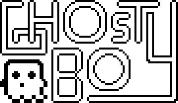
To add the detail, I scaled up the previous logo by 400%. This allowed me to round out the edges and create a nice ‘blocky-but-smooth’ look. I also adjusted the ‘G’, ‘T’ and ‘S’. The original ‘S’ and ‘T’ combo made the ‘S’ seem a little bit strange, but this new version was a lot better. With the hollowed out ‘G’ I made it seem like it was beneath the ‘H’ which I thought was a nice effect. I left one of the ends of the ‘Y’ very blocky to make it seem like it had been interrupted by the T. At this point the logo was 180x104, so I scaled it up by 500% to reach 900x520 before adding more detail.
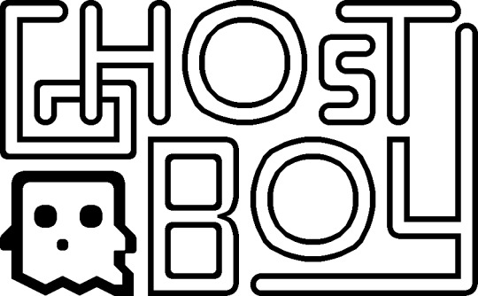
If someone were to ask me, ‘Hey, should I make a 900x520 pixel art logo dealing round edges and circles?’ I would slap them. In fact, I’ve slapped myself because I did precisely this, and it took ages. At smaller sizes, circles can easily be adjusted, viewed, or manipulated to trick the viewer into thinking they are looking at a round edge. When you need to make 4 circles, the largest being 220x220 this becomes insanely difficult. Looking back on this issue I definitely should have used anti-aliasing - I completely forgot about it if I’m honest. The ‘O’s didn’t even come out looking that great. They look quite boxy – definitely should have used anti-aliasing. I have regrets.
Luckily the other letters turned out much better. I did adjust the ‘Y’ also as previously the logo read ‘Ghosty Boy’ rather than ‘Ghost Boy’. This did make the canvas 840x520, but I don’t think it’ll be a noticeable change. I’m pretty happy with it, especially after all the time it took. I may revisit the logo at another time (especially to fix up those ‘O’s).
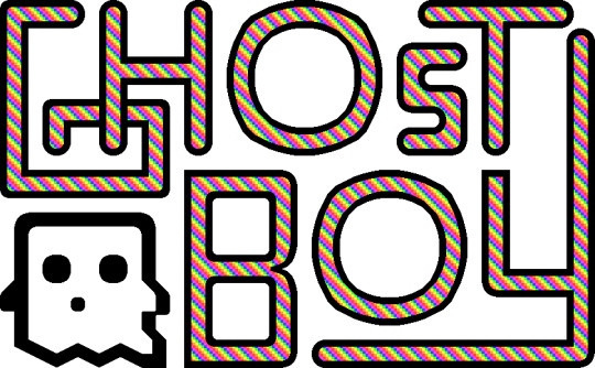
Above is the final logo, I added the pattern used in my profile picture (slightly desaturated to make it easy on the eyes) to the insides of the letters and called it a day (or 3 days. I hate the letter ‘O’).
Buttons
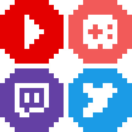
So, we’ve got our game’s font and title, what we need now are some buttons for interacting with the menus. To practice making button sprites, I decided to make link buttons for social media sites. I started by making the designs of the buttons, as shown below.
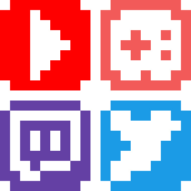
I started with small, white 9x9 designs of each social media sites’ logo on a background of their associated colour. I wanted the buttons to be small (to be put on the sidebar of a website) and completely circular. The Itch.io logo could not fit onto the small size, so I made a rough-looking videogame controller instead.
I then expanded these designs into a larger 13x13 circle which I would later turn into the button. Not much happened in this step but this.
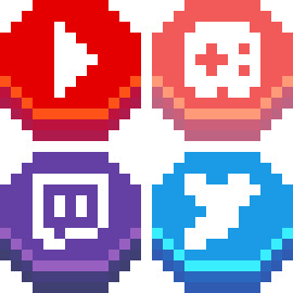
And the buttons were done! I shifted the logos of each button upwards before adding a shadow and highlight line on the bottom. Buttons require some sense of depth or separation from the background to show that they can be interacted with. This is really all that’s needed, but more detail can be added to make the button look more appealing.

I added a shadow around the back of the buttons to emphasise the edges of the buttons, separating them from background. I then added some more detail to the highlight to make the button seem shiny and draw attention to it. By alternating between highlights and normal tones, the button appears metallic. Finally, I changed the white logos to a light yellow so the white didn’t seem too bright.
Overall, I’m pretty happy with how the buttons look. The colours on the Itch.io button are a bit desaturated which conflicts with the metallic look. This is due to the colours of the actual logo being quite desaturated. If I were to return to it, I would change it to be pink or orange to capture a similar colour but make the button as bright and eye-catching as the others.
Cursors
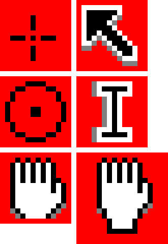
There’s not much to talk about in regards to cursors. The default cursors of PCs and Macs are pretty good, however, adding a custom cursor image to a game makes it look really cool I think – even if it’s just a simple adjustment. I tried my hand at making some cursors. The circular points make fitting cursors for shoot games as they’re reminiscent of a gun scope. The hand cursor is a little tricky to do in a small space and might not be worth it as cursors need to be small. Like I said regarding text - if Unity has an option to scale down cursors that will make things much easier. These are some simple ones, but I’m sure there could be more eccentric designs even within these cursor shapes.
Assessment
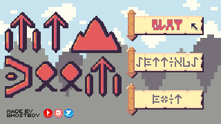
So, for this week’s learning assessment, I wanted to make a mock-up fantasy RPG menu based on the items I made last week. This was definitely not a lazy excuse to use the same colour palette and 100% a sincere artistic decision.
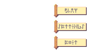
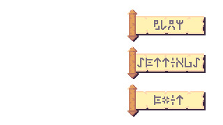
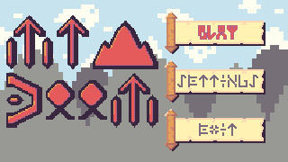
The first thing I started with was the buttons. It is crucial a menu’s buttons are clear and easy to read so they should dictate the size and presentation of the rest of the screen. I really liked the scroll item from last week, so I decided to make the buttons scrolls. This made the addition of depth more complicated, but I think I did an alright job by adding a shadow bottom right of the scroll.
For the text on the buttons, I wanted to delve into the fantasy aspect and use rune-like letters. I had to tread a fine line between clarity and the desired aesthetic of the letters which took a lot of trial and error, but I think I got there in the end.
I then scaled up the buttons to add some further detail to the scroll and the runes. I thought the plain white background looked pretty bland so I decided to make a background.
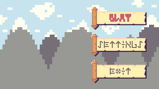
I made a mountain range as a background for the menu and changed the text of the ‘PLAY’ button to an outlined red. I kept the background quite simple as this week’s topic was interfaces, and I was concerned that a detailed background might distract from the interface elements. I turned the ‘PLAY’ red because I wanted to give the impression that the option was being selected. I had ample empty space to the left of the screen, so I decided to create a logo for the game to fill that space.
[photo]
After some more trial and error with different rune letters, I created this logo giving this fake game the title ‘Mt Doom’, inspired by the mountain range background. The rigid rune style really gave the title a more menacing feeling which was good. The ‘O’s used looked a bit weird as I had trouble turning them into a rigid rune style. I increased the size of the logo to add more detail and popped it into the menu screen.
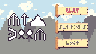
The extra detail made the runes look a bit nicer. The ‘O’s were still off but did fit the rest of the font a little better after adjustment. My biggest concern was how out of place the whole logo looked. This was quite clearly because of the pure white colour used for the letters. I could change this to the white within the colour palette; however, this colour was used in the background, so I decided to match the selected button and use the colour red for the logo.
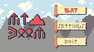
The red made the logo really pop while fitting in with the rest of the piece. Additionally, some light shading on each of the letters made letters stand out even more. I also moved the black outline of the text slightly to the right to make it feel more like a shadow rather than just an outline. Unfortunately, I didn’t feel like the logo had a grand enough presence for its purpose and menace to shine through. To fix this up, I digitally resized the logo by approximately 133.33%. Now, digital resizing really works well for stuff like 200%, 500%, 1000% and so on because it just adds pixels. However, a resize of 150% means you are resizing the image by 1 and a half-pixel which is not possible. This creates jagged, messy lines – but I decided to give it a shot because why not?
To my surprise, the sizing was perfect, and the messy lines actually worked somewhat with the aesthetic. The shading did get messed up a bit, and if I were to do this again I would go back and adjust the shading, but overall I actually think it improved the piece. Finally, I decided to add a cursor, a watermark and social media buttons into the piece, as shown below.
This watermark and the social media buttons do look a bit out of place in the piece, but I think that works in their favour. It draws attention to them and makes it clear that these are not part of the game or menu. This is particularly useful as those social media sites will open an external tab so showing they’re not part an internal part of the game is important.
Looking back on this piece, I do wish the background had more detail. Initially, I didn’t add it so the interface was clear and this may have worked. Still, the fact the background is very simple makes it aesthetically different and distracting. Also, while the scrolls were a nice concept, they could be designed to have more depth and a better select state. Overall, what I took from this practice is that this design process of ‘Buttons to Background to Logo’ is quite useful, but I do need to make adjustments as I go through each stage in the process.
Conclusion
That concludes week 3 of learning pixel art. In week 4, I will be diving into environments starting with grass, trees, bushes and some other features of nature. I’m really excited to build pixel art environments, and I think I’ll enjoy it more than this week as I got a bit sick of making letters over and over again.
My learning and this blog post wouldn’t have been made possible without these fantastic resources. Go check them out if you wanna learn some stuff about pixel art!
Creating A Pixel Art Font by TutsByKai
How to Make a Pixel Logo by TutsByKai
Pixel Art 101: Buttons by Pixel Pete
How to Animate a Button by TutsByKai
How to Make Pixel Art Cursors by TutsByKai
0 notes
Last Seen Blogs

villlaneve
brie larson marry me challenge (prev kazniankara)

ianation
ANDRIAN MAGNO

ivana0402
Ivana🤎

luxnbrgx
24 𓂀
magnetictapedatastorage
24 📚 ♀♀ 📚imminent city slicker