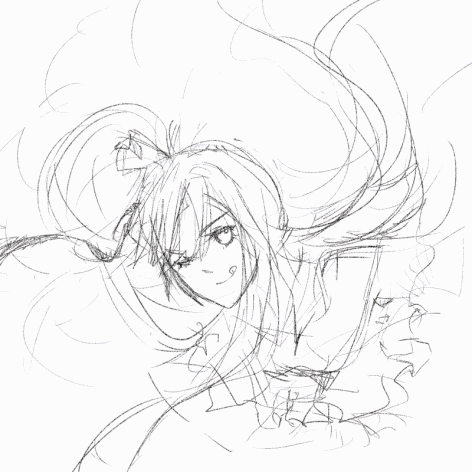
#i just like this one better idk. the lineart is my fav part and it looks nicer here
Text

ew04 mr.hc
#hypmic#hypnosis mic#samatoki aohitsugi#happy birthday yokohama bad boy or whatever. love u#i missed drawing him a lot actually. it's been a while#this is one of those drawings that i feel like i'm giving myself too much credit for but i rly am shocked how alright this turned out#that being said i continue to be frustrated by how shit i am at everything past solid coloring. shading is sooooo hardddddd#hence why i decided to post an un-rendered version here. the one with shading etc is on twt but i immediately regretted posting it lol#i just like this one better idk. the lineart is my fav part and it looks nicer here#but well... comparing this to my samatoki bday art from a year ago i'm relieved to see actual major improvement#i still want to draw more often and keep learning though. it's just been hard to find the time and mental capacity lately#7-7-cherry drawingz
22 notes
·
View notes
Note
Hey, quick question... how do you do lineart and shading? I suck and desperately need advice... also love ur art <3
hi!! ty so much :] i use 2 drawing apps when i draw dont ask me why ig i like different brushes but for my sketches i draw on ibis paint most of the time and use This brush right here
for my lineart i often use procreate and use the narinder brush in the sketching section (and also doodle with it) bc it looks rlly nice and ive been drawing with it for a while now surprisingly bc i always tend to change brushes 😭
for lines i turn the layer to multiply then add a layer on top and set that one to clipping mask then i color the lines inside w a shade of pink and bc the lineart layer is set as multiply the pink will look darker idk if this makes sense?? i do that for all my lineart so yea WOW I SAID LINEART AND LAYER A LOT i May be stupid
ALSO for lineart dont hesitate with ur lines, its gonna make everything harder and ur gonna struggle and spend way more time on it instead just warm up beforehand a good way to do so would be to just trace lines until you get more comfy and also draw using the force in ur wrist and not ur arm!! i rlly love doing lineart now it may be my one of my fav parts i am an Outcast
for shading it just came with experience i guess…? i was rlly bad at shading at first So a few tips i learned along the way was to never shade w black bc it doesnt look nice (except if ur goign for that kind of aesthetic where it works) so i always shade w purple or pink colors set on multiply and it blends nicely,, also!! trying out a lot of things can help id suggest making a pinterest board or smth with art U like/are inspired by and try out some of the aspects just to practice things u wanna get better at and it can also help ‘develop’ ur artstyle!!
also for clothing folds and stuff Which was hell to shade for me i just studied w a lot of pics and now i Think im better at it idk help but studying always helps a lot in everything like when i dont know how to draw smth i Always use a reference pic and its a very good warmup!! also try to keep in mind a light source bc otherwise the shadows may contradict themselves but thats still fine as long as ur learning And there is no right way to do art dont overwork urself if you cant do something first try its fine art is a journey :)
SORRY IF THIS WAS KINDA LONG i hope this helps in Some way even if im bad at explaining but i rlly love answering stuff abt my art in general so :}
11 notes
·
View notes
Text
A weird and long step by step
((this probably isn’t a good tutorial, no one asked for this, i just want to write something)) If you think too much words just read the bold ones. Program used is Clip Studio Paint Pro. I bought it in summer 2018 with 50% sale, really worth it if you ask me.
I start off with rough sketch, usually the draft was just stickman (i deleted the layer so there’s no such thing in the GIF) using Redjuice’s flatbrush, or I do this step traditionally using pencil and paper then took a photo of it
rough lineart, well I’m bad in lineart so this one particular lineart will be our final lineart, or maybe I would redraw this again just to make sure of the composition & detail. I’m using the default (rough?) pencil tool
blocking the figure. To save lives, make sure do this in new layer. Using default G-Pen tool in desaturated (or gray) colors. This step will help if you want to make background.
uhh rough colors?? I never prepared color palette beforehand so I just brush off colors to see how they work. Still with Redjuice’s flat brush with different pressure. I did this until I’m satisfied. Usually I use complementary colors in base color and highlight (eg if the basecolor blue, then the highlight will be yellow/red). For shadows just around saturated/desaturate colors. In this step defining values is important. This step is very necessary for me because I like colorful things, so sometimes just splashing colors into drawings and it ended up ugly.
make folder of all usable layers, then duplicate folder, then merge. I try to keep my layers in minimum due to my laptop’s low spec. I also have too much experience of wrong layer so in the end let’s just merge all of them. Usually I separate between background, figure (the one blocked before), and eyes cuz eyes are frickin hard for me. Maybe more if there are details.
Render pretty much self-explanatory, for this style I’m using this watercolor brush. Altough in 90% of my drawings I also use this brush. Start with the pic’s focal point I mean if you draw people usually the most important part is the face, then try to make it as best as you can. I will not move to the next part until I finished the face, especially.. eyEs.. Just pick colors by pressing alt then brush everything.
better explanation. skin: I used saturated color for the lines, then paler colors. nose: idk i usually make noses more saturated than the rest. eyes: dark top, then some highlight in the middle, and bright desaturated color in the bottom.. pretty much basic anime eyes. For all parts I start off by drawing lines (aka painting lineart)
Hair is my fav part, but also hardest aside from eyes. I just make some blob at first, then lines, then render by making triangle or rhombus of colors
Render the rest until u satisfied (I’m very sorry at this worthless effort of explaining), just follow the rough color created before
Make it fancy. I just airbrushed red/orange in overlay layer. Then some droplet from default brush. If necessary a color balance layer and curves can help too.
That’s all. Sorry for too much words lol. I just happen to have some rough weeks hahA. Anyway I’ve posted several drawings in this style before, my favorite is this one (top), and these posts also used similar style/technique: 1 2 3. If anyone want a better and more detailed tutorial just let me know, so I’m sure what I did can be useful for someone...Thanks if anyone read this.
#tutorial#i believe this post will not show up in tumblr's search result#step by step#art tutorial#...i guess? hope this inspired someone huhuehaha#long post
9 notes
·
View notes
Text
Colouring/ Shading/ Lighting for Digital art
HI! Hello~ I’m here and I have a teeny tiny tutorial for you today (courtesy of dear Melito who actually wants my help??? I’m??? Blessed??? I realise that there’s a lot of you who have no clue who the fuck this person I’m referring to is, oh well, not my problem — ur missing out on hella great cake.)
So I have a timelapse of everything (below, duh, in case you can’t scroll) and I’m also gonna make comments on it cus ya know, these vids are only a minute long and thirty fucking megabytes like Jesus Christ.
So without further ado-do!
Should I have added music? Probably??? Ehhh the deathly silence can comfort you. (Wow what a mood.)
The Run Down:
Is rundown one word or two??
When colouring, I break it up into three main steps: base, line and “Hiding All My Fuck Ups”
(First) Base
I’ve never made it to first base... or any base
When colouring, use a non translucent brush to colour in everything. As in, so it’s completely solid??? Where’s my English today?
For every different colour, put it on another layer! I tend to do the skin colour first. You can go over lines that will be covered with another colour... did that make sense?
That’s it, I just felt the need to have three steps at least.
Line
As in... line art.
What I do is I lock my layer — that means when I try to add colour, colour will only be applied to the area that’s been drawn on.
I usually colour pick the colour I used for the base, and the line looks very pale when done (I do this with a non translucent brush too)
I then adjust the layer with lineart so the colour looks darker and more saturated. For my program (Medibang) I go Filter > Hue > Max out the saturation and lower the brightness > save. Sometimes I may do it again if it’s not dark enough.
If you can’t edit the colour then there’s another way! Duplicate your lineart > select the layer on top > change blending/ layer type to “Multiply” (it multiples the colour... duh)
If THAT doesn’t work I have one last suggestion before I sadly admit idk — duplicate line art > select top layer > colour the entire think a dark colour or black > lower the opacity
Line art done! (This time I wanted six steps — 6 is my fav number)
“Hiding All My Fuck Ups”
I rely on this too much okay?
I can actually further split this into two; shading and “I’m Kidding Myself” — let’s begin!
Shading
To shade, I work from bottom layer up!
What you’re gonna do, is select your bottom colour, (or any really but ORDER HELPS) and lock the layer.
Why? That way it’s easier to colour without going over the lines! (Your building on the foundation you set essentially)
With a semi translucent brush (FYI, translucent brushes are thinks like “blur” or “smudge” that purely affect what’s there and do not add anything) I use the watercolour brush set at 15-20% opacity.
I’ll eyedrop the base colour that I’m shading, and with the colour wheel, tru and find a darker version of that. NOTE: when looking for a darker colour, I don’t go to the black, I try and find a more saturated colour OR a darker HUE — black is a curse, I don’t ever use pure black or pure white — give your work the colour it deserves UwU
With the watercolour brush, I literally run the darker colour over all lines that indicate a shade (imagine a light somewhere and what that light touches is what you mainly focus on)
For clothes, I follow the creases I’ve drawn
For hair, I tru to imagine the hair in three main shapes and run the colour over the perimeters of those
Then it’s time to blend! I usually just eye drop the base colour again for this, and trace (lightly, our tablets have pressure sensitivity — same going for steps 1-8) the line that divides the light from the dark, adding a middle ground since the watercolour brush is only semi transparent.
For adding blush to skin: create new layer above skin layer > set to multiply, again, if you can’t do this then you follow same steps as before with line art) > using an Airbrush like brush (soft, no sharp edges, kind blurred), colour the skin areas that need blush.
Skin areas that need blush; areas with LOTS of blood vessels (head... the OTHER head...) areas with thinner skin (elbows, knuckles, knees)
If your skin layer was on the bottom, your blush will only appear on top of the skin and not the other layers!
Just be careful about the areas outside the drawing — you may need to do some tiny erasing
Finally, merge all the colours together. Sometimes different layer types don’t like to merge together without screwing up your other layers, to avoid simply merge them one at a time from bottom up.
As in, second last one and last one merged together, then the one above that merged with the last one — merge everything with the last one... AM I MAKING SENSE?!
I’ll usually merge the lineart with the colour too — I just didn’t here for some reason
“I’m Kidding Myself”
Here we add stuff that hides flaws and merges the character with a background if you have one!
I use three types of layers for this, if your program doesn’t use these then see if they have similar functioning ones (I’m always experimenting so this isn’t set in stone) if your program has nothing then... this will be a little harder, you’re gonna have to do this by hand somehow.
I use these kinds of blending layers; Multiply, Overlay and Add
First I prevent getting the colour on anything BUT the character; magic wand tool > select the empty space > hold ctrl/shift and keep tapping to add or remove areas > invert if you need in order for the art piece to be selected
You can see this when my background when blue, I’m basically highlighting my art of Yuri
Colour this entire space on a new layer. The colour I use doesn’t change here on out (except in the video I do cus I lose the colour but that’s aside the point). When choosing a colour, consider the colour of light — I use human colours??? Colours you find on a person essentially.
As a general rule of thumb; for every new thing, new layer, it gets a little harder here. I also use a semi translucent (watercolour) brush again for everything!
Now we have a silhouette of Yuri — I set this to multiply, it’s essentially like a highlighter marker pen but darker?? This is so that I may adjust the entire colour to fit the lighting colour
New layer (NL), I set to Overlay. Overlay is like multiply except bright! Remember what I did when shading? Yep, rinse and repeat! Afterwards, adjust the layer’s opacity setting so that it fits better with the image.
I’ll also make the brush really tiny and go over hey areas to highlight such as the edge of the nose, chin and jaw — I’ll also add shine to the eyes.
NL, set to Add. I only ever use this layer if I want to achieve “blinding lights” sort of looks. So when the lighting is immense, I have a white background, or the background is incredibly bright.
I use add layer scarcely, to blemish any lines and make it look more refined. I’ll also adjust opacity if need be.
NL, I’ll use the airbrush set too REALLY BIG (1000 usually) and if I have a background, will try and add light to it by making this layer multiply too. I’ll add darkness in the side or corner of the background etc.
NL do the same thing with Add except also make a point for where the light is coming from.
NL, I’ll use a mix of Add and Overlay to add sparkles, fragments, light spots etc depending on image type of need be
Using a Fluffy pastel brush (it’s textured) I also use pure white. This is the only time I ever do.
I’ll add reflection to eyes, jaw and nose. For hair, I’ll pick out a few strands of hair where it’s darker and throw in some loose lines. Clothes are rarely outlined and only where light touch. I use this limitedly.
Ctrl + D ;) to deselect the lasso tool — I don’t usually merge the layers after this because it’s usually too messy and I’m done anyway so I save it, however you CAN put them all in a FOLDER if need be. (I have a few in my vid, the entire thing is in a folder tbh)
Voila! That’s it!
I hope this has been of some help or use! And that this makes SOME sense... I’m absolute shit at explaining everything...
This was incredibly fun to do tho and I spent two hours typing this all! Wow!
Okay thanks for reading! (Hope this helped Melitooooooo, don’t forget the wedding cake ~ v/ important part of marriage you know)
#art#digital art#yoi#yuri plisetsky#art tutorial#tutorial#colouring tutorial#how to colour#colour and shading#how to draw
47 notes
·
View notes
Last Seen Blogs

sharkl-e
shark🪼

susie-fogartaig
no name🖤
cursedmystic
cursed body.
third-cookie
Cookie

tomas459-blog
これもあれも見たい無料動画