#i have like 2 other variations of this artwork with the same colors just shaded differently but i think this one's my favorite
Text
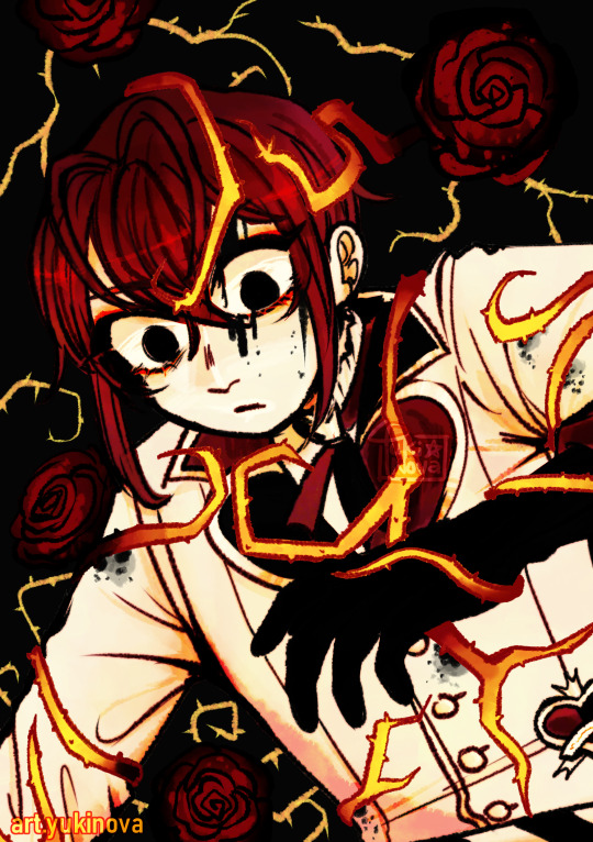
Listen to the roses, they only want what's good for you...
#riddle rosehearts#twst riddle#riddle rosehearts fanart#twisted wonderland#☆▪DEAL#this is a metaphor; except half of it was intentional and the other half just happened to work#i have like 2 other variations of this artwork with the same colors just shaded differently but i think this one's my favorite#the writing on the bottom is my instagram handle since it was posted there first and im too lazy to edit it#don't question my posting logic too much even i don't know how it works#riddle my guy you need a long good rest
682 notes
·
View notes
Text
Lamb
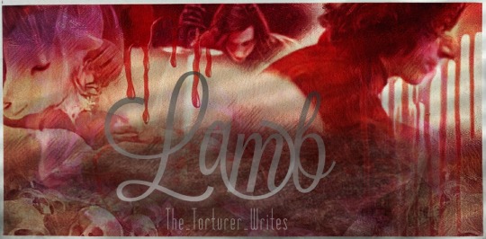
***This amazing artwork was gifted to me by @elmidol. Please do not re-use or re-post it without permission from them and/or myself. Don’t be a dickbag.
Summary: In the beginning, there was only Vader, the Sky Walker. He wandered the heavens, filling the void with the cosmos.
To combat his loneliness, Grandfather Sky Walker created two brothers, twins: one drawn to light and one drawn to dark.
Their bond created all life as we know it.
C/N: 18+ only; mythology AU; implied genocide; physical violence; self harm; bloody bloody blood
Word Count: 3.2k
A/N: Well, here I am again, and here we go again. Please take the content warnings seriously because I am not a nice girl; and herein, may lie not-nice-girl things.
This is my first foray into world building, and I welcome all feedback, critiques, and comments. :)
Special thanks to @kylorengarbagedump and @bexterbex for helping me develop this idea and get it ready for sharing.
***
In the beginning, there was only Vader, the Sky Walker. He wandered the heavens, filling the void with the cosmos.
To combat his loneliness, Grandfather Sky Walker created two brothers, twins: one drawn to light and one drawn to dark.
Their bond created all life as we know it.
You ran your fingers over the intricate gold leaf pattern on the book’s cover, remembering your lessons as a child. This Scripture, your grandmother’s most treasured possession, was the only part of your life you’d brought on this crusade. It was the only thing you couldn’t bear to abandon, even in the face of certain death.
You exhausted every avenue before taking on this last of your options. You demanded justice from the law only to be told you should keep your mouth shut. You went straight to the throne, but it shut to your caste, your people too low to deserve even an audience.
Selling every item of value, you had barely scraped up enough for the one-person craft, but it served its purpose. You were here. You landed the shuttle on one of Chandrila's famed rolling hills, overlooking The Demarcation. You exhaled, shallow and nervous, and looked out over the horizon. The pilgrimage to this place, this day, was long and harrowing, but the sacrament itself would be quick.
Your fingers quaked as you shucked everything identifiable about yourself: blue pants your mother bought for your birthday; green shirt that belonged to your brother, found in the rubble of what was your family home; jade hair clip handed down from mother to daughter for generations. None of it would serve you now, and it would only be in the way. Trading the vestiges of civilization for religion, you donned your grandmother’s ample amethyst robe, lacing the silk ties that held it together, and grabbed up the athame she’d bequeathed to you at your initiation.
She enveloped you, your grandmother, and you buried your nose into her sacred garment to inhale the lingering scent. They were your world, lovely and loving, ground to dust beneath the machine of a war none of you pledged to fight. The Resistance descended upon your planet like a plague, and they left a great nothing, a slate wiped forcefully clean in their wake.
It was for them you made this trek, that you abandoned all logic and reason for faith. They raised you to share their doctrine, but it never served a single purpose for you in life. Your grandmother and mother believed everything they’d ever taught you about the Twin Fathers. They wove the fabric of their lives, and yours, around it; and now, you clung to their prayers, your last hope in the face of something horrible and wholly dismissed by the universe.
There was no one to remember them, their faithfulness and devotion, but you.
Fathers, we pray. Bless this our food to the nourishment of our bodies that we may be strong in your service. Bless these our hands that we may share your great instruction with those in need. Bless our hearts that we may find the balance you have so righteously set for us.
Their prayers spilled over your dry lips, the only eulogy they would ever receive, and every holy word strengthened your resolve.
Clutching book and blade in one hand, you punched a series of numbers into the keypad nearest the bay door, extending the ramp. When it finished descending, you issued another command, the tiny keys lighting up with each pressed digit.
“Self-destruct sequence initiated.” The robotic voice vibrated the tiny craft’s walls. “Confirm.”
“Confirmation,” you cast one last look around the shuttle that had been your home for a month, “Bravo Echo 2-4.”
“Countdown 2 minutes.”
Sunlight, warm and inviting, welcomed you as you stepped off the ramp. Squinting into its brilliance, you recalled the way your brother would read to you on lazy afternoons and how your family would picnic on similar grassy knolls. The beeping over your shoulder grew faster with each passing second, and you lifted the cumbersome dress around your knees, wasting no further time jogging down the hill.
You were out on the flat land for just a second before the shuttle exploded into a fiery ball. You watched the blast shoot debris and columns of soot into the perfect sky. In another life, it would have scared you, shying you away from the destruction. Silent, stoic, you tracked plumes of grey smoke and the fall of ashes, comparing it to the devastation you found after the Resistance found your planet.
Days after the attack, you roamed fallen buildings and picked through still warm rubble. You had been too late, too far away. Knowing you could have done nothing to stop the strike was empty consolation.
You could have died with them. You would rather have died with them. Now, all you could do was die for them.
On bare feet, you crossed the flowery field, taking in the array of purples and yellows. You lingered on the blue-green grass, feeling the soft stick of it underfoot, and you basked in the wispy clouds overhead. This was life, teeming with vibrant colors, but it all felt hollow, dampened. You wondered if everyone who came here felt this way, grateful that this beauty would be one of their last memories but unable to fully appreciate what they saw.
Pressing your lips into a determined line, you steeled your will and turned to The Demarcation, The Great Divide.
Grandfather Sky Walker tasked the twins with creating and maintaining The Balance. One would usher life; one would usher death; both harbingers of fate.
It was striking, a sudden upheaval of vitality in deference to darkness. Tendrils of fog mingled with melancholy dusk, and you spent a long moment admiring the space between one and the other. This spot, this one impossible convergence, was balance. It was what every man strived to achieve, and no man could boast.
On the other side of the billowing veil, where you were coaching yourself to go, was The Ren’s territory. People far and wide spun countless tales about the land and its Master. It was a bottomless hole, they said, that would swallow you up steps past the boundary. It was an unending bog, and all who journeyed there were lost. All of its structures were built from the bones of the dead, and The Ren was the vicious king of an unforgiving wasteland.
Your grandmother, however, believed The Ren to be a merciful father, wise and misunderstood. He was the bringer of ends who did not differentiate between rich and poor. No creature was safe from his touch, and that made every creature equal in his eyes.
Whatever that land may be, whatever The Ren may be, there was nothing on the other side of that shroud that could compare to what you’d already endured. It was the way forward, your only way, and you bid yourself to go forth on deliberate steps.
Mirroring the track of your life, a balmy day gave way to a wintry gloom as you moved through the gauzy curtain, passing from one kingdom to another. The living world fell away, replaced by slender black trees that shot up to winking stars and stood adorned with wide, scarlet leaves. A ghostly breeze blew, shaking the leaves to delicately fall and blanket the spongy ground. You trod upon them carefully, uncertain what might lurk beneath the crimson carpet.
You took your time on the winding path, drinking in every otherworldly detail. Light pooled from a clandestine moon, and the very air shimmered under its grace. Midnight-colored blossoms dotted the road, mingling with swaying ferns. The stars shone so bright you could almost hear the twinkle, a delicate song tapped out to echo against the trees. Every inhale was laced with morning mist and rich earth.
The stories were wrong. This was no forlorn place. It was luminous, hallowed. Absent the touch of civilization, this land had bloomed unharmed, untainted.
This world felt more real to you, more easily understood. Colored with variations of shadow, it was peaceful in its ashen palette.
Reaching the altar, you stared, both reverent and curious. How many had come before you to lay their lives down for The Ren? How many had died as a sacrifice? Surely, its ruddy color came from generations of blood spilled in offering.
It was a chalice to which you would soon be adding.
The stone was cold and damp, raising gooseflesh on your nearly naked form. It curved down in the very center, a macabre cradle for all those laid here. A blending of emotion and chill cast your skin in shades of flush and set every digit to trembling. It was as though the thing waited for you impatiently, its very existence demanding an offering.
Your skepticism at your grandmother’s faith dwindled when confronted with an exact duplicate of the altar upon which you’d taken your initiation rites. It was larger, but the ridges were the same. The slab of your childhood did not bear such a florid hue, but the sacrifices it received had been sugar, water, bread.
This shrine’s very construction felt haunted, a cauldron of souls made solid.
Hoisting yourself up onto the behemoth, you arranged your tools in the very center. You set the athame at your right and spread the weighty purple velvet over the shrine, laying the fabric and yourself out as you would for a lover.
Your lips trembled. Your knees knocked together. The cloak barely covered your body, and the little satin bows lent an air of innocence you could hardly claim as truth. You hoped, swallowed a handful of prayers, that The Ren accepted sacrifices as the stories told. Today, confronted with the reality of this place, you believed it more.
Tenderly, longingly, you ran your fingers over the tome once more. You lifted it and pressed a gentle kiss to its cover. It would lie beneath your head during this last of your chores and for however long your body would remain here.
Closing your eyes, you conjured memories of your grandmother bearing witness to so many dead over the years and how you, filled with doubt and agony and hate, had failed to do the same for your family, your friends, your people. It had been too great of a thing, too much sorrow to compact into a single prayer.
The words came easily now, having been swirling and growing in your chest for weeks.
Into thy hands, Great Fathers, do we commend this soul, departed from the body, in payment for the souls still yet to come. We pray that you welcome her, keep her, and enter her into the great Balance so we may again feel the light of her love.
Swallowing your grief, you gripped the wicked blade tight. You had no more tears to cry. You brimmed with an awful energy, this ceaseless anguish bubbling up from your very marrow.
“Dark Father,” you brushed fabric away from your right leg and sliced a deep gash into the supple thigh before you could change your mind. “Hear my prayer.”
You hissed at the burn but smoothed your features into a stolid mask. You would do this for your family and people, who received no warning, no choice to convert or flee. You would make your entreaty to The Ren; or, you would die here and reunite with them. Whatever the outcome, this was your end.
“I commit my body to your hands. As your brother has given it to me, I give it now to you to use as you will. Grant me the grace of your ear that I may plead my case.”
Your breath stuttered, and you fought back the roaring in your ears so you could concentrate and carry on. Fixing your eyes upon the trickle of blood, you watched it turn to a pool and hurried to match it with another slash at your left forearm. Benumbed, you tracked the redness as it crested and spilled in every direction.
The callous cold seeped into your very bones, and you fell back against the altar with a gasp, fingers grasping for the book’s corner. You blinked, heavy lidded, as your face fell to one side, staring into the great forest beyond.
In your delirium, you thought you could see them, smiling and holding each other. Tears you thought you no longer had rushed forth, and you shook. Weakness or acceptance broke open the gate on your heartbreak, releasing a torrent of sobs and screams. There was no one to hear, to care, to chastise you for its futility.
You heard her voice, your grandmother’s tone the same that had been soothing your fears since you could remember, rubbing over you like a comforting balm.
More than yesterday, beloved. Less than tomorrow. Find me in the Balance.
“Nona, I’m coming.”
Your fit rode your wounds and bled away to faint sniffles and glassy eyes. You stared up at what you felt had to be an eternally night sky and pushed your fingers through the growing sticky puddles.
This was death, and you welcomed it. You would slip away into a dreamless sleep here in such a place as you never knew existed. Fatigued, breathing slow, your face fell to one side, eyes unfocused but still dancing from beauteous flower to leaf to timber.
He was a charcoal smudge, nothing more. His movement was so subtle your addled brain took him for a tree, black clad and too tall to be a man. He stepped through the maze, and what little tenacity you had left drained away.
He came to sit upon the side of the altar where you lay dying, tilting his head to look at you. You stared, bewildered and confronted with the most beautiful man you’d ever seen when you had been expecting The Ren, the great storied monster. He passed his hand over your face, and the sting of your wounds abated. The heaviness of your limbs lessened, and the burden of your body eased.
Feeling and consciousness and awareness flooded back into your senses, and you bolted upright. Understanding dawned, and you gaped at him, struck dumb by every mesmerizing feature. Ebony tresses crowned him brilliantly, and he looked back at you with deep, glittering eyes. His fair skin was sprinkled with twilight constellations, and his lips were full, lush, slightly pink.
This was The Ren.
Troubled by the absence of death, you surveyed your situation, shaking both tense hands into fists. The ritual robe clung to the altar more than it did to you, swirling lurid with your blood. Blood that still flowed, you realized. Wide-eyed and amazed, you studied this unnatural phenomenon. The wounds at your thigh and wrist still wept; they should have killed you, but there was now a sanguine loop wrapping each injury around to feed into itself.
“Why have you called me here?” His voice was gravelly, as though he hadn’t used it in millennia.
“Am I dead?” It was a staggeringly stupid question, but it was the only clear thought in your head as you stared at the vermilion ouroboros around your wrist.
“If you intend to answer every question with a question,” his enormous hand shot out to capture the flesh just above your forearm laceration, “you will be soon.”
He squeezed the wounded limb until you shrieked and tried to tug away. Deciding that he would not let you go until you appeased him, you licked dry lips and worked your mouth into a measure of moisture.
“Why did you come?” Your query shocked even you, and you snapped your mouth shut hard enough to hear the clap of your jaws.
True to his word, The Ren’s hand connected with your throat so fast you couldn’t say for sure he’d moved. In one moment, idiotic inquiries filled your muddled mind; and in the next, you were choking at the end of his arm.
“Your howling,” his fingers tightened at your throat, thumb rubbing into the pulse almost delicately. “The next question will be your last. Why are you here?”
Licking your suddenly too-dry lips, you studied him, wrapping both of your small hands around his wrist. This man, this deity, was walking death, and that he sat here with his hands upon you changed the very foundation of everything you believed to be true.
“I-I came to ask your favor, Dark Father.”
He shoved you away and stood from his perch. Death’s gravity pulled you down again, and you whimpered, reaching for him as though it would prolong the inevitable. Your mouth worked on a plea, but none came.
“You’ve wasted your time. And mine.” He turned away and spat the rest over his shoulder. “Sparing virgins their lives or the lives of their lovers lost its allure long ago.”
Glancing back, he must have seen something, perhaps the abject apology in your face and on your outstretched fingers, because he snatched you from oblivion in a blink. You broke into wretched sobs, each lung-full of air quaking and painful.
“I came here so you’d come for me.” You dug bloodstained fingertips into your eyes to staunch the tears. “And to ask for your help.”
He was ethereal, his presence just a step out of sync with the rest of the universe, and it was difficult to look upon. You turned your face to one side and tried to compose yourself. You were battling the significance of your loss against the staggering truth that The Ren was real and here.
“You come to ask favors but cannot even look upon the beast?” He closed the gap in a blur, and you shrieked, leaning away. “How do you plan to beg if you will not even open your eyes?”
Crowding in aggressively, he leaned over and braced himself with both sturdy hands on either side of your head, an effective cage. His gaze traced over every curve of your face, and you couldn’t move under the oppression of his scrutiny.
“You think you will make demands of me?” His voice changed, dropping to a malicious whisper as he brushed a lock of hair from your forehead, tracing it to its origin in your hairline.
He would eat you; you were sure of it. Razor-sharp teeth hid just behind those beautiful lips, and he would tear you to pieces. Bolstering yourself, you drew in a shuddering breath and looked up into the galaxy-filled eyes. You had to say the words. You had to tell him what brought you here, but you weren’t sure you could do it.
“The dying lamb has no value to the shepherd.” His suddenly gentle tone belied his impatience and interminable power. “Tell me why you are here; or, I will leave you to die.”
You stared at him for what felt like an eternity, losing yourself in his resplendent gaze. It was like staring straight into the sun, and every part of you felt branded by him.
Your reasons for coming here meant little to him, you were certain. You pictured your family again and the horror inflicted on them.
The tension in your body loosened as purpose flowed through your veins once more. Your trembling lips blew out a steadying breath, which seemed to please him. He traced your lower lip with the very end of his thumb, waiting for you to speak.
“Retribution.”
148 notes
·
View notes
Photo
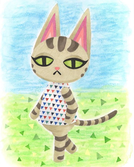
Ziggy Crossing
Still not quite sure I'm 100% back into the swing of things (posting regularly and being more present) yet, but time will tell. For now I'm testing the waters.
Anyway. In the time I've been away, I ended up talking to some friends about (to the surprise of absolutely no one) Animal Crossing, and in that conversation, the idea of drawing my cat, Ziggy, as an Animal Crossing villager came up. I'd toyed with it before after seeing some other people draw their pets as villagers, and that conversation more or less sealed the deal for me to at least try it, even if my attempt didn't pan out and see the light of day.
Obviously, things went pretty well because here I am posting this.
The first step, as it is 90% of the time for me, was to come up with a sketch and go from there. I primarily used Olivia and Lolly [pre-existing Animal Crossing cat villagers] as my references--Olivia for the pose and eyes, Lolly for the stripes and some details regarding the ears and face--but I also checked certain things across the various cat villager models so that details could be consistent where they needed to be.
I think if I missed the mark anywhere, it's probably in the proportions. Namely the size of the head and length of the body. But I think it's close enough that unless you compare it directly to Olivia's model that I referenced for the pose, the proportions aren't so off that it's distracting or off-putting. I did originally have trouble figuring out what pattern to put on her shirt though because the real Ziggy doesn't really have anything I could pull a pattern from. These days she does wear a white and silver collar, but that's not a whole lot to work with. So I left that alone while I pondered how I wanted to go about coloring the whole thing.
My plan at the beginning was to use this sketch as a test piece for some acrylic paint markers I recently acquired (which you will be seeing me talk about in the future), but once the sketch was finished and I went back to check the colors I had (you know me; gotta have a swatch chart for everything), it was pretty obvious that if I want this to be my dear Ziggy and not just a random tabby cat, I needed to figure out a different coloring method.
I could have just done regular acrylic paint, but that sounded like a chore and thus I was not interested. Same with gouache. Colored pencils were on the table, but the main problem I have with those is that they can be pretty slow and personally I think their texture really lends them better to replicating the 3DS/Animal Crossing: New Leaf style, as opposed to the look of New Horizons, and that's not what I was going for here.
That left me with two main options: Watercolor, which was a hard pass for this kind of art (at least for Ziggy herself), and alcohol markers, which I did use quite a bit on the last Animal Crossing artwork I made, and they had worked out fairly well.
Alcohol markers it was!
Of course, even after that decision was made, there was the issue of how to handle the lines of the drawing. When I was planning on using the paint pens/acrylic markers/whatever, that seemed a lot simpler because, in theory, I could just use the same pen I wanted to color with to do the outlines and then fill them in. And because that would be using mostly opaque paint, if I needed to I could just cover up any overlap with relative ease. Alcohol markers don't play by the same rules though, so I had to re-think all that.
In the end, I pulled out a pale warm gray Polychromos pencil close to the main color of alcohol marker that I had picked out that I figured would also be light enough to blend in everywhere else. That way I could have the defining lines that I needed without having to worry too much about them being visible in the final product. [For clarification: I picked a Polychromos because once sharpened they tend to hold a point longer and better than the other colored pencils at my disposal and I really needed to keep a sharp point as long as possible to do the lines here.]
In retrospect, I do think it might have been to my benefit to pick out a pink for doing the inner ear lines, but the end result there isn't so awful that it single-handedly (paw-ed-ly?) ruins the drawing for me. It's just something to take note of for next time if there is a "next time."
Once I had my lines (including doing the eyelashes and mouth with one of my usual black fineliners), the next challenge was the actual coloring. Mostly because I had to be very careful around the edges so that the marker ink didn't feather out too far (as alcohol markers do on any paper that isn't marketed as "bleed proof" because that's what bleed proof in paper actually means--not that it won't bleed through to the other side, though that is less common with that kind of paper, but that it won't "bleed" across the page), and I also had to be a little careful and choosy about how I did any blending or shading.
Again, my blending and shading plan was going to be different had I used the acrylic markers. The main thing I ended up doing here was trying to find areas that needed to be layered so that the one-color shading could act as a line/barrier between sections. Best example: Where the ears meet the head, I shaded the bottom portion of the ears. You can also see this a little bit where Ziggy's tail meets her body and where the legs intersect at a few different points. By no means did this turn out perfectly, considering that I really wanted to stick to use as few colors as possible (which means pretty much all the shading is just layers of one color to darken it) which means there isn't as much distinction or variation as there could be.
And I feel it necessary to note here that I was worried when I first finished the lines that the eyes looked wonky, but after coloring pretty much everything else in that concern dissolved because 1. It's harder to tell and 2. Even if they aren't exactly the same, it makes visual sense because it looks like her head is slightly turned, meaning the eyes wouldn't be identical anyway. Never underestimate the power of coloring your work in!
Speaking of which, you might be wondering about her shirt by now. Well, after toying around with some ideas I got it in my head that a good way to tackle that problem might be with washi tape, as I've used it in this manner before and worked out pretty nicely.
Even though it wasn't a lot to work with, I did like the idea of the base color for her top being white like the real Ziggy's collar, and that narrowed down my tape options considerably. Of the options I had that I thought would be suitable, I ended up having a choice between one with small rainbow-colored polka dots and the decidedly less vibrant small triangles that you see here. The polka dots seemed a little too peppy for Ziggy, so I went with the triangles. And this, I must say, is one of those artistic decisions that I feel even better about the longer that I see the end product.
The main issue I have with using washi tape, and thus why I don't use it in this way that often, is because cutting the washi tape to fit a specific shape is a process that doesn't get much easier even with practice. And even if it did, that wouldn't eliminate the very real possibility of cutting or indenting the paper underneath while you're cutting the tape. Of which, I have not yet figured out how to totally avoid short of forming the washi tape on a separate piece of paper, cutting it there, and then moving it to the final piece. But that method comes with its own problems too, so...
Still, I made the decision to go through with it here and just accept the rough edges/lack of precision and all that.
Before I put the tape down though, I did do a little shading with some light gray markers that I was counting on showing through the tape to give it a little more dimension. Seeing it now, I do think I could've stood to go a little darker, but again this isn't something that totally ruins the end result for me. Just something worth noting.
After all of the above, I was left with one lingering problem: The background. Which I've noticed seems to normally be a "problem" area for me in that I don't always have a solid idea for what to do with it.
I did consider what exactly I wanted to do earlier on in the process, before I started on Ziggy on the final paper, even. Briefly, I thought I might cut her out and put her on a separate background as is sort of a go-to background method for me. Something just didn't feel right about doing that here though and it feels like I've done that a lot lately (you know, when I've not been drowning in mandalas for NaPoWriMo...). So it was at this early stage that I locked in the idea of adding in the background in later, probably doing something kind of loose to give a general idea that hopefully wouldn't take too much time or effort.
We've already established that I wasn't super keen on the idea of using acrylic paints or gouache for this drawing, and that remained true for the background too. Although, I don't really like using alcohol markers for backgrounds either because it can be tricky to keep things smooth and consistent. That left me with colored pencils and watercolor. Colored pencils are usually hard pass for backgrounds for me for a number of reasons. So! Watercolor, hmm...
I drew Ziggy here on my darling Strathmore 400 series mixed media paper because I love how it handles markers and it has enough weight and texture to it that it handles a lot of my other go-to options with little fuss. Watercolor is really the only thing I have trouble using on it, the main problem being that sometimes (not always) the paint doesn't like to blend out super smoothly and certain watercolor techniques don't work the same on it. This doesn't mean it's useless for watercolor (at least not for me), that just means I have to be more careful about how I choose to work with watercolor on it.
In this case, the blending issues lined up with the idea I had of letting the background have more texture since Ziggy came out a lot smoother by the very nature of alcohol markers.
Somewhere in all this, the idea struck me to use my Gelatos to leave behind some crayon-like texture. That idea seemed fitting to me since Animal Crossing is a fairly light-hearted and child-friendly game, themes that crayons go along with.
The gelatos are water-soluble but not every color dissolves completely when activated with water. This should be pretty evident here because I didn't try to hide it. I wanted quick and easy, and without a doubt just letting the texture do whatever it wants is the quick n' easiest method to use with the gelatos.
Once I'd done a bit of back and forth with two greens and two blues to give me the solid suggestions of a sky and ground, it still felt like it was missing something.
Ultimately, it seemed like a good idea to me to try and mimic the triangle pattern/texture that New Horizons features. (In past games you could get squares or circles for a grass pattern at random.) And while I as per usual I had to think on how to go about this, in the end, the best solution I could come up with turned out to be drawing the triangles in with alcohol markers. Truly, I'm surprised to be reporting this because I fully expected the creamy nature of the gelatos to make using alcohol markers on top feel disguising and unproductive. But not so! At least not with the limited gelato use here. The creamier areas do soften the color of the marker, but I think that worked to my advantage.
Although, I did end up using a little bit of my yellow Moonlight gel pen because I felt like I needed some yellow triangles for balance and I knew transparent yellow markers wouldn't do what I wanted.
But that brings us to the final product. I'm happy with it. And I do really like how the grass ties in with Ziggy's green eyes. It's just a nice little touch of visual cohesion in my book.
As I always say, I'm sure it's not perfect and there are some missteps here and there or things that could be improved. Nevertheless, it was a fun experiment and serves as good encouragement for me to continue playing with the lineless look, among other things.
I do have to note though that it feels super weird to just leave the eyes like this with no indication of shine on them! I made the choice not to since it's not a common trait with the official character models (at least not for eyes in this same style) but part of me still feels like it's incomplete.
As I've said before recently and I'll probably say again, I can't promise I'll be getting back to a regular upload schedule now, but it's on my mind. I want to get to that point soon. I do have the acrylic markers I mentioned to talk about and another supply in the mail, and some other art in my backlog. So if you can be patient with me a while longer, there will be more from me to look forward to.
In the meantime, please be kind to yourself and others.
____
Artwork © me, MysticSparkleWings
____
Where to find me & my artwork:
My Website | Commission Info + Prices | Ko-Fi | dA Print Shop | RedBubble | Twitter | Tumblr | Instagram
2 notes
·
View notes
Text
TIPS ON PHOTOGRAPHY
Hey guys, back once again over the weekend I had another photography assignment and I’m glad to share with you all.
I was supposed to watch some YouTube videos and make notes of all I learnt.
As I made notes, I was to cast my mind to my surrounding and begin to see how objects will look beside others as in size, colour, feelings, etc. and describe how I understand seeing especially in the artistic sense
I was also to describe the various elements of art and use my camera to make images that will be interesting and worthy of an exhibition. I was asked to make 2 interesting images per
element and organize the images under their respective headings and describe how I made it.
Let’s dive straight in!
Photography is not just a technical exercise, but an art, application and practice of creating durable images by recording light. Owning a camera doesn’t make you a good photographer and at the end of the day, it still narrows down to being an art. Dorothea Lange said that a “camera is a tool for learning to see without a camera”. Having the camera doesn’t necessarily mean you automatically get to see great subjects and shoot “OMG’ (oh my god) pictures. It requires perfection through a lot of practical work or knowledge, personal skills and creativity-which is best described as a combination of inventiveness, imagination, inspiration and perception. Bryan Peterson also explained that to advance your personal vision, you must really practice.
We have to learn to see what is around us so we can express it in artistic ways. We’ve to train our minds to see something new and different even at places we’ve been before or things we’ve seen before. As Ernst Haas said- “I am not interested in shooting new things, I am interested in to see things new”. This short statement makes a lot of sense. We’ve to be interested in training our minds to see things in a way that people think is abnormal, in a way that even when we are paired with people in the same geographical area, we take “fire” pictures that will make or partners wonder; wow, how come I didn’t think of that or see that?
Recognizing good light is all photography is about. Hence the meaning of photography being light writing. Sometimes we just have to recognize how a particular light, either natural or artificial, controlled or spontaneous falls on a building or hits city to be able to get a good shot. We can’t get good images by riding with the bus every day or requesting an Uber everywhere we go, sometimes we need to take the risk and walk, even if not with the mindset of getting a few things photographed but just to interact with nature, and we’ll be surprised that we’ll end up taking much more photographs than we planned on doing.
Photography is not about the content of the photograph or picture, but about the compositional arrangement. Composition can be described as the arrangements of elements used. It means paying attention to what will be photographed, how it is placed in relationship to other objects in the image and how well the subject matter is expressed.
Elements of design should be your foundation for how to learn to see. They include;
· Line
· Colour
· Value
· Shape
· Form and
· Texture.
SEEING ESPECIALLY IN ARTISTIC SENSE.
Seeing in artistic sense means a lot to me. Seeing artistically, to me means that when I look at something, I don’t just simply look at it, I don’t just look, I look and ‘see’. I try to make a connection between stuff and elements that look or seem unconnected. It is how I look beyond ordinary objects and just using what I already know to create something new. More like using a ‘third’ eye. Seeing artistically to me means that going somewhere people will think is abnormal just to create new photographs or trying out new things people might see to be weird.
ELEMENTS OF ART
As mentioned earlier, the elements of art should be the foundation on how to see. It is simply referred to as the building blocks of art. They include line, shape, form, texture, colour and value.
· Line: a line is referred to as a mark with length ad direction. There are various types of lines and they have been listed and explained below.
--Line variation: this means using a variety of thin and thick lines or varying the weight of a single line to create interest.
--Contour lines: contour lines are lines that follow the outer edges of an object, like an outline.
--Blind contour: drawing contour lines without looking at the paper and even though they may look kind of humorous or funny, the drawings actually turn out to be someway somewhat artistically interesting.
· Value: this refers to the relative lightness or darkness of an object.
· Color: we all know that light source is needed to see colour. Basically, colour is seen by reflecting light on an object.
--Hue: hue refers to the name of a colour; red, yellow, green, black, etc.
--Intensity: the brightness or dullness of a colour is referred to as intensity.
· Space: the area around, above or inside an object is referred to as space. There are two types of space
--space that involves depth.
--space that involves the shape of area.
Shallow space
This is space that feels cringed, feels flat. There is not much depth in the artwork. Objects are close together without much room to move around.
Deep space
With deep space, there is a lot of depth in the artwork. Objects tend to disappear far in the distance.
Positive space
This refers to the areas of focus or the most important parts of an artwork.
Negative space
This is the space around areas of focus-usually the background of an artwork.
· Shape and Form:
--Shapes are two dimensional, having height and width.
-- Forms are three dimensional or have three dimensions, height, width and depth.
Geometric shapes
These are mathematical lines or shapes or forma often with hard, sharp edges. Circles and spheres are exceptions.
Organic shapes
These are natural or free form shapes, lines or forms often with curvy, soft edges.
· Texture: the texture of something or texture refers to how the object appears to feel. There are two types of textures;
--Actual texture: this refers to texture you can actually feel. With this type of texture, If the object looks rough, it feels rough too.
--Visual texture: this kind of texture refers to texture you can see but not feel. It I also known as implied texture. With this type of texture, the object might appear rough but smooth to touch.
PICTURES DEPICTING THE VARIOUS FORMS OF ELEMENTS OF ART
LINE
Figure 1
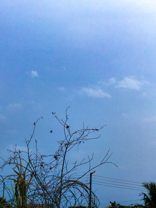
I find this picture depicting or showing lines because of the various kinds of lines that can be identified in it. The tree or bush has some kind of thin and thick lines in there, we can also see spiral lines from the razor wire that has gotten entangled with the bush. This is a picture I took on my way to buy porridge on Friday morning at around 6:30 am with my iPhone 6s back camera, 4.15mm with a shutter speed of 1/340 sec, aperture, f/2.2 and ISO 25. I edited this picture using Lightroom.
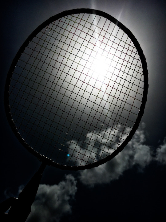
FIGURE 2
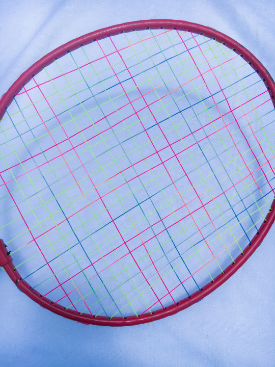
This is also another photograph that depicts line. There are horizontal and vertical lines that can be seen in the above photograph and these are forms of lines. I found this old racket in the store room at home and decided to take a picture of it with my iPhone 6s back camera, with a shutter speed of 1/3700sec, aperture being, f/2.2 and ISO 25. I edited the picture with Lightroom.
COLOUR
FIGURE 3
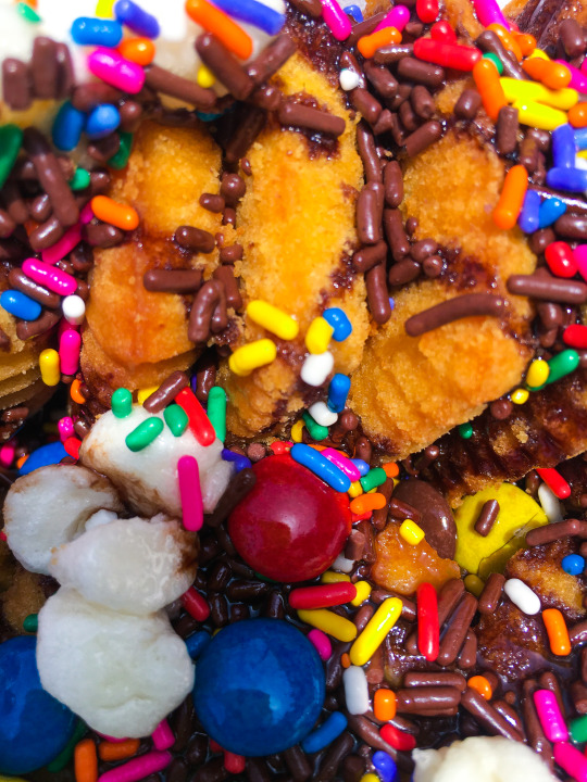
I ordered these mini cakes from Chafty Catering and decided to take this picture, not for any reasonable purpose but just because of how the colours looked so vibrant and appetizing.
The above picture is ideal to depict colour because so many different colours can be identified from the above picture. We’ve the colour of the mini cakes being brown, the marshmallows white, the skittles which come in different colours like red, blue etc. captured this image with my very own IPhone 6s back camera, with shutter speed being 1/300 sec, aperture, f/2.2 and ISO 25, also edited with lightroom.
FIGURE 4
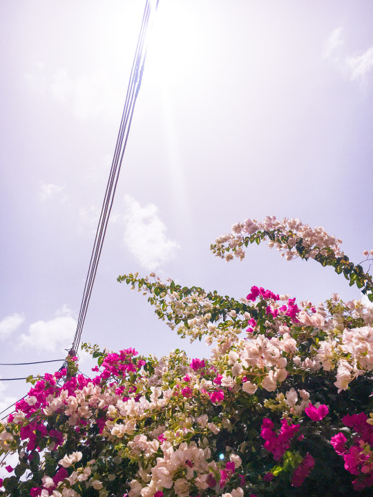
This is a picture of a tree right opposite my house, as to say my neighbor’s house. I took this picture because personally I love nature, and I also was in love with how the sun hit the tree for it to bring out its colours. The way the rays passes through the ple wires is another besuty to behold, but that is just a plus, not where the attention actually is. This picture depicts colour in the sense that, we’ve the colours of the flowers being a shade of pink which is known as ‘fuchsia’ and we’ve some kind of off-white or creamy colour and we also have green, for the leaves of the plant! We’ve the pole wires to be black, and the blue skies, we’ve the clouds being white too. In all, we have about 6 colours in the photograph. This also was captured with my iPhone 6s camera, with shutter speed 1/190000sec, aperture being f/2.2 and ISO 25 and edited with Lightroom.
VALUE
FIGURE 5
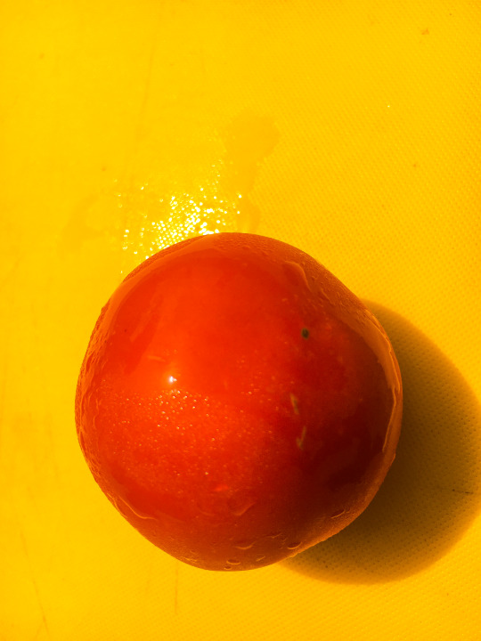
This is a picture of a tomato I took straight out of the refrigerator and put on a yellow chopping board directly under the sun. I chose to use this photograph for the depiction of value because we all know the definition of value to be how bright or dark an object is. Again, we all know red and yellow to be very bright and loud colours, hence, using it to depict value makes a lot of sense. This picture too was captured by my IPhone 6s back camera with a shutter speed of 1/13500 sec, aperture being f/2.2 and ISO 25, edited with Lightroom.
FIGURE 6
This is a picture of the same racket I found in my store room, but this time held towards the sun. I chose to use this picture to depict value because a part of the image depicts a bright side, thus, the sun and another side depicts a darker side. Per the explanation of the element of art; value, this picture is ideal. This picture was also taken with my IPhone 6s camera, with shutter speed being 1/26000 sec, aperture, f/2.2 and ISO 25, also edited with lightroom.
TEXTURE
FIGURE 7
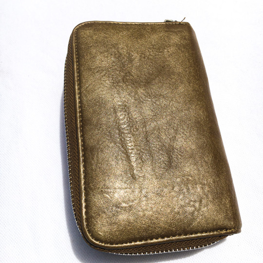
I decided to take a picture of my old purse and use it to depict texture. Texture refers to how an object appears to feel, and there are two types; actual and visual. This old purse can be used to depict visual because it appears to be rough when looked at but smooth when felt. This was also captured with my iPhone 6s, with a shutter speed of 1/4500 sec, aperture being f/2.2 and ISO 25. This was also edited using Lightroom.
FIGURE 8
This is a picture of a terrazzo wall in my house. I took this picture to depict actual texture because my terrazzo wall looks rough from afar, and is rough when felt too. Captured this with my iPhone 6s. With aperture being 1/1100 sec, aperture, f/2.2 and ISO 25. I edited this with Lightroom.
SPACE
FIGURE 9

This is an image I captured on my first visit to new town with my mum, to buy some fresh fish. Accra New Town is a town in the Metropolitan district, a district of the Greater Accra region in Ghana. I took this picture with no motive but only because that was my first time visiting the place. I had never seen so many canoes in my life too, and that was another minor reason why I took the picture. I decided to use this picture I captured to depicted space (deep space) because the picture has a lot of depth and the objects, i.e. (the canoes, the fishermen and fishmongers) tend to disappear into the horizon. Same IPhone 6s for the picture, with shutter speed of 1/200 sec, aperture, f/2.2 and ISO 25 and edited using Lightroom.
FIGURE 10

This picture is a composition of a glass and an orange. This composition is intentional, I had the mindset of making or creating something that could depict shallow space. And I think it works. Shallow space refers to space that feels cringed or flat. If an artwork is shallow, it means there isn’t much space to move around, hence, objects are close together. In this composition, there isn’t much space to move around since the view ends right where the orange is. Any means of trying to look farther than the orange is not possible. This was taken with my iphone 6s. with shutter speed of 1/290 sec, aperture f/2.2 and ISO 25, also edited with Lightroom.
SHAPE AND FORM
FIGURE 11
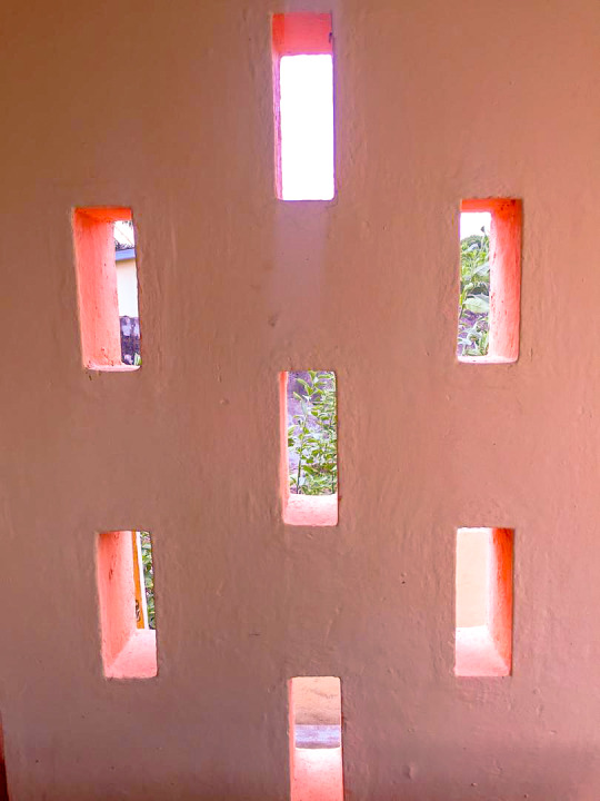
These pigeon holes depict shape. Picking one of these pigeon holes, they are rectangular in shape and putting all of them together or picking them randomly, the still kind of form a shape. Taken with my iPhone 6s, with shutter speed being 1/2500 sec, aperture, f/2.2 and ISO 25. Edited using lightroom.
FIGURE 12
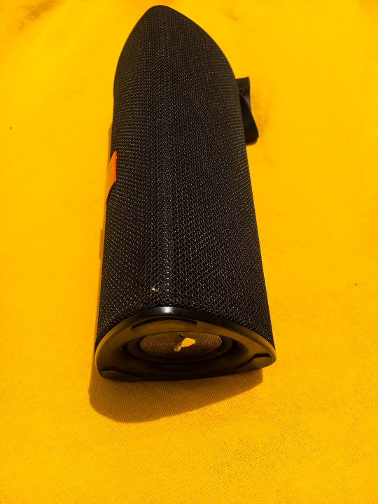
This is a picture of my portable Bluetooth speaker I use in school. I’m a music lover so I guess it makes a little bit of sense. Well, I photographed this mini speaker because I thought It would be ideal for a form, since forms are three dimensional; height, width and depth. I captured this image with my iPhone 6s again, with a shutter speed of 1/2100 sec, aperture, f /2.2 and ISO 25 and edited using Lightroom.
DOREEN AKWORKOR WORBIE
PHOTOGRAPHY II
1 note
·
View note
Text
How to Purchase an Oriental Rug
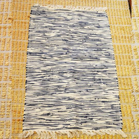
Exactly what is an Oriental rug?
This is constantly a good area to start if one is considering a purchase as simply these details alone will certainly offer one clarification and insight right into what one is seeking. As the nations in the East have constantly been thought about the Orient, a handwoven rug, made from woolen, silk or cotton, from this part of the world is the real write-up. A little further delineation could be made if one also added in Western Europe, Northern Africa, and also Russia. I have seen lovely handmade rugs from Romania, Uzbekistan, and Egypt along with the Caucasus region in between the Black Sea and the Caspian Sea above Iran. One of the most well-known rug weaving countries is Iran, Afghanistan, China, Pakistan, India, and Turkey. This is a tradition that goes back hundreds of years. you may also interesting in large quality rugs www.xlargerugs.co.uk
You will certainly discover it depicted in front of nearly any rug book in living color. The rug scholars are still saying as to where it was woven however the very same weaving methods are still in usage today.
Oriental rugs are not made in the United States although we do create numerous industrial copies. These would certainly be identified as "Oriental layout" rugs.
An ordinary 9 x 12 handwoven rug takes a minimum of 3000 hours of weaving, to say nothing of the moment spent on the design, color preparation, spinning of the woolen and the establishing of the impending.
A Persian rug is an Oriental rug but specifically woven in the nation of Iran or if an antique (100 years old or a lot more) woven in the former Persian Realm.
All Persian rugs ARE Oriental rugs but not all Oriental rugs are Persian rugs. Possibly the factor for this category is the reality that the Persian weavers of the past were constantly leaders in design and quality.
Allow us to speak about the basics. All Oriental rugs are woven on a loom by hand. If made in a small town the impend is normally created of timber and not perfectly straight yet if made in an expert workshop the impend would certainly most likely be metal and more specifically designed.
The impend is strung with upright threads, which would certainly be the beginning point of any rug. These threads are called warps as well as can be of cotton, wool or silk. Tying loops around a pair of the warps develop the design of the rug. Each knot is linked and also separately cut by hand. One at a time, variously colored hairs of woolen are made use of to develop the layout, one row each time. After one row of knots has been finished, the weft is then placed in between the just-completed row as well as the following one to be done. The wefts work to protect the knots in position as well as hold the rug together. Some weavers place just one row of wefts in between the rows of knots, others 2, 3, 4 and also more.
A lot of weavers are shown to weave at a very early age by a member of the family as well as the selection of the number of wefts or what kind of knot to tie is influenced generally by the heritage and place of the weavers. Many of the previous nomadic (pastoral) weavers now reside in villages their rugs are extra frequently than not a reflection of patterns woven for several generations in their location, each design motif is dedicated to memory.
In rug workshops, the weaving is very carefully monitored by a master weaver that is responsible for every impend under his careful eye. Tribal or village rugs are usually woven in the residence with several of the style elements committed to memory. Tribal rugs commonly are woven on a woolen or cotton structure.
The age wonderfully works sympathetically together as well as the indigo dye, which creates all the arrays of blue, also protects the wool. Normally with vegetable dyes, one will see a slight or not so minor (depending on the ability of the dyer) variant in the color itself.
Handspun woolen, being much less flawlessly rotated will accept the colors of the dyes at various depths of the very same color and also will certainly show more variant in color than machine-spun woolen. Deeply saturated wool will also reveal much less color variation which will only appear after the rug begins to age.
Extra lately, brand-new production utilizing vegetable dyes as well as hand-spun wool has started to show up in various areas. Started in Turkey in the 1980s by a government-sponsored program, Iran quickly adhered to and also now there are several locations where these fantastic dyes, excellent quality hand-spun wool, and traditional layouts are being used to produce brand-new rugs or even more specifically, brand-new artworks!
These rugs can easily be the "vintages" of tomorrow as the weaver's creative thinking and also ability is wonderfully brought to fruition.
Also, there is an additional weaving strategy, which is similar to a Navajo rug called a kelim. This rug is virtually all warps and wefts as there is no heap. This also is an Oriental rug yet not as time-consuming to weave. The patterns on kelims are normally geometric based layouts using big locations of shade. These rugs work rather well in contemporary insides and also are commonly utilized as wall surface hangings. Numerous are unique and also lovely although not as hard wearing as a knotted rug. In the past, most of these kelims were woven for the weaver's use as well as have only recently become extra common in the industry.
What is important in evaluating an Oriental Rug? One of the most important aspects of a rug is the shades used and also their mixes. Does the rug enhance as one looks at it?
Rugs woven with this kind of woolen do not put on well and are often sold for following to absolutely nothing which is exactly what they are worth. A rug woven with exceptional wool can quickly make it through 50 years or even more with extremely little wear if cared for properly.
Top-quality woolen will certainly improve the extra it is walked on and also will certainly create antique aging or sheen that is very searched for by rug collectors. The moral of the tale is to touch the wool, rub the palm of your hand across the face of the rugs. Compare it to one more rug. It ought to not feel extremely completely dry or rigid. Choose the rug up by the edge and see how much it weighs! A hard-wearing rug will have some "body" to it. This, of course, would certainly not relate to silk as the weight of a silk rug is much lighter. Silk will certainly feel cool to the touch and also will have a distinct luster! Check out the rug very carefully by walking it and seeing it from every possible angle.
Glossy wool usually mirrors light and often on rugs woven with handspun wool you will certainly have a dark and a light side. If the rug is old, one would certainly look for any kind of signs of moth damage where the heap has been consumed away.
On older rugs, one would additionally try to find indicators of fixings, such as a patch sewn in to change a worn location or holes. Also, inspect the rug in the very best feasible light to ensure the stack is complete as some careless conservators simply paint in the shade on used locations as well as the rug will have little life left in it. If the rug is a large amount, as well as these realities, have been indicated ahead of time, then great, yet if found by your examination as well as not indicated, simply pass on the purchase.
3 notes
·
View notes
Text
February 12th-February 18th, 2020 Reader Favorites Archive
The archive for the Reader Favorites chat that occurred from February 12th, 2020 to February 18th, 2020. The chat focused on the following question:
When applicable, what about a creator’s art might convince you to check out their comic?
carcarchu
I like a wide range of art styles so it's hard to pinpoint specifics but if an artist is able to draw very attractive looking characters (recognizable character designs, outfits that don't look like they came out of 2004 gap catalogue, characters that can still be recognized even when they change their hair style) then i find that very appealing. beyond that how well an artist can integrate the characters with the actual space they exist in is something i find very important as well. a bunch of floating heads can only carry a series so far. if the artist can make the characters feel like they properly exist in the space i think it can really elevate the series although in practice this is something very difficult to do.
Deo101 [Millennium]
For me, honestly some art styles are very inspiring to me and that will sometimes get me to read just because I want to see the art more and learn from it. Things like textures, colors, character design... It can draw me in just by exciting me as a learning opportunity
chalcara
For me art‘s the hook and story the line. Come for the art, stay for the story, you know?
Funnily I‘m looking less for pretty art and more for good visual story telling. I want the art to show whats going on without having to rely on dialogue.
Cronaj (Whispers of the Past)
I'm honestly very picky about art styles when it comes to comics, and that's a personal issue It has some to do with art styles being attractive to me, but honestly, the most important aspects of a creator's style to me are (1) consistency of style and anatomy, (2) level of completion, and (3) clear communication of what's happening. When it comes to whether or not I check out the comic initially, the main things that come into play with the promotional materials, covers, and/or thumbnails are contrast of the image and cleanness of the rendering. Of course, obviously, my personal tastes play into it. (I tend to like semi-realistic styles, sort of anime-ish but with a twist, or painted styles that may resemble concept art.) But honestly, probably more important than grabbing me initially to begin reading is readership retention. And that's where the 3 qualities I look for come into play: (1) Consistency of style and anatomy: This is probably the most important part for me as a reader. If I can't tell who is who because the characters change appearance from panel to panel, I'm ducking out, because that affects the clarity of storytelling. I also cringe everytime I see a particularly egregious anatomy error. I know what people look like. I see them every day. If I feel pain from looking at an artist's work, I'm not sticking around. (To be fair, everyone makes some kind of anatomy mistakes, but really it's if the anatomy mistakes are really awful to me and aren't as a result of a deliberate style CHOICE. Keyword, C H O I C E.) (2) Level of completion: This really just means that if it looks like the artist rushed through the panels or they were being lazy, I feel like their comic isn't worth my time. I mean, if an artist themselves doesn't care about their work, why should I?(edited)
. (3) Clear communication of what's happening: Once again clarity of storytelling is absolutely essential. If the composition of a large portion of the panels don't clearly show the actions of the characters, I can't follow the story. Aaaaaand as a bonus: Please, please, for the love of all powers that be, please, make your fonts legible. If I can't read the comic without squinting because your text is too tiny or hard to read, I'm not going to try. I have bad eyesight as it is. Take pity on your readers. I'm not going to suffer for your work. I have dropped far too many comics to count because the creator didn't care enough to make sure that the font was legible. And this applies to both desktop view, mobile view, scrolling format, and page to page format. Just.... Make your fonts big and clear.(edited)
sssfrs (JOE IS DEAD)
That's interesting to think about how recognizable characters are when their hair style changes. I might try to use that as a character building exercise
Deo101 [Millennium]
Solid excercise: can you tell them all apart when they're bald and naked?
Cronaj (Whispers of the Past)
OoooooooOOOOOOOOOOHHHH
I
Might partake that challenge
Deo101 [Millennium]
Also it's really fun to draw characters in all sorts of hair and clothes so idk what id do if I couldn't tell them apart when doing that!!! That's like 40% of my art!
Cronaj (Whispers of the Past)
This just convinces me more and more to do AU art
Deo101 [Millennium]
Yeah aus are another 20% of what i draw LOL
Look im drawing the comic most of the time so I wish to partake in non canon things the rest
carcarchu
@sssfrs (JOE IS DEAD) i've read series before where the character gets a hair cut / dyes it and i'm like WHO ARE YOU? IS THIS A NEW CHARACTER?
Deo101 [Millennium]
Oh another good excercise is drawing your Characters in many different styles and seeing if they remain unique when not in yours.
Cronaj (Whispers of the Past)
I want to do all of this
This is stuff I hardly ever have time for
So I am extra attracted to it
Also, there IS a time later in the comic where a certain character's hair gets partially burned off
And then he cuts it pretty short to get rid of the singed edges
And I feel like his hair is like 80% of his character design
So I'm just a little scared about that
Deo101 [Millennium]
Also, @Cronaj (Whispers of the Past) , I am unsure what you mean by "readership retention" with something that makes you interested in a comic, could you explain?(edited)
Cronaj (Whispers of the Past)
By readership retention, I mean aspects of the art that decide whether I'll continue reading past the first few pages
(obviously story comes into play as well, but I won't pretend that the art in the first few pages of a comic don't contribute)
Deo101 [Millennium]
Oh okay, I thought you meant like how many readers have unfollowed or something
Cronaj (Whispers of the Past)
Nah
More like, "oh cool! Your cover and blurb seem interesting. Lemme check out the comic!"
And then after reading the first few pages/chapter:
"ah... Not for me." Or "Nice, I'll keep reading!"
Deo101 [Millennium]
Gotcha
Capitania do Azar
Ohh I don't feel like dissing particular artsyle choices, but I know a few aren't for me. I'm no big fan of ultra realistic, hyper detailed stuff you usually see in super hero comics (other genres pick that style too sometimes and I still don't really appreciate). I particularly like artstyles that are distinct and recognizable, I have a hard time with stuff from different authors that just looks... Like a carbon copy (sometimes, the style being referenced is waaay too obvious and that is always a big no for me) Good use of color is key. Give me some good values too. I want colors to make sense and I am very tired of pink. I also appreciate consistency. If you give me artwork with a more paintery style but then the comic is cellshaded, that might tip me off. But not necessarily (tho I appreciate inner consistency inside the comic itself). Rushed stuff, like mentioned above, is also not a good look, but only insofar as it distracts me from what's happening in the story. Consistency is a very important word here, because I love seeing a common line that is able to take in all the differences that are necessary in character design and backgrounds, but also make me believe that they all could live in the same world.
Oh! And also: if the artstyle involves using lineart, I am really fond of sharp, clear lines with weight variation
sagaholmgaard
I'm curious about what you guys mean with consistency- do you guys not like if an artist's art style changes over the several years it might take to make a finished webcomic? Is it that it peeves you when the backgrounds are done in, say, a painterly style while the characters are done with lineart? Is it when the artists makes ordinary illustration work in a completely different style from their comic pages? (This is genuine curiosity I hope no one's feeling attacked rn ^^)
carcarchu
i personally really like seeing an artist's skills improve and evolve over the many years it takes to draw a series
even at the expense of a more "consistent" final product
sagaholmgaard
Yeah me too, it's one thing i really like about webcomics
chalcara
Can‘t talk about the others, but I get thrown off when one page is sprite comic, the next painterly, third cell-shaded without having a in-story-reasons for those style changes, like flashbacks or pov-changes. But more commonly, the issue’s the classic „comic‘s usually coloured, but oops, this time you only get the pencils because I had no time to update“. If that happens too often and/or doesn‘t get fixed for the archive I just lose investment in the comic.
Art evolution is natural, both in webcomic and published work with a dedicated artist.
Ah, that‘s another source of inconsistency - people switching colourists or even artists around. Once in a while is fine, but if it happens every month or so, I tend to get annoyed by it. It‘s actually why I killed my first webcomic twenty years ago; it was a collaberation and life kept getting in the way forcing me to switch colourists every five pages or so.
carcarchu
oh actually i have read a webcomic where they changed artist's 18 chapters in. i really fell in love with the magical and dark tone of the original artist and was engrossed in the world that they set up. they had a painterly style and it really set the atmosphere of the entire series but then the new artist had a super clean and cutesy art style and the sudden tonal shift really threw me off. in the long run the new artist was actually extremely consistent and better at actually releasing long chapters and very good quality chapters and the writing actually improved too because of it but it was never able to recapture what it was that i really loved about the original art style. also the new artist changed the character designs a little so the heroine was no longer even recognizable as the same person
since it was relatively early in the series i definitely would have preferred if they just got the new artist to actually redraw the first 18 chapters in the new style just so the change wouldnt be so incredibly jarring
chalcara
Any harsh breaks like that will cause some people to break away from the comic, I found. I dumped one of my favourite-for-years comic because the creator got bored by their main character and completely sidelined her in favour of a group of minor characters I had absolutely no interest in.
Didn‘t mean the comic got worse - by all accounts its still beloved by quite a sizable audience - it just wasn‘t for me anymore.
sagaholmgaard
Ahh that I can relate to. I get super attached to the main character and usually have a hard time getting into any spinoffs with the rest of the cast, even if I want to (and im a hypocrite because i also want to make spinoffs for ever side character in my own comic LOL) i guess if the style changed a LOT from page to page that would throw me off too. that feels like the artist is trying to experiment, maybe making sort comedic comic strips would be more acceptable then? Every style would at least be contained to one strip at least
DanitheCarutor
That's... actually a really good question. I don't really go for a specific aesthetic. Sometimes what's going on in the thumbnail attracts me, or it could be the use of color, the style, a character design. I'll check out a comic with just about any art style. I guess maybe if I have an idea of what the creator is going for with their art? Like, the art may have a lot of kinks, but maybe being able to tell what style they're trying to go for makes me want to check out their work? Honestly, I don't have a really strong art bias, as long as the comic is readable I'll go for almost anything. Maybe I won't check something out if the style looks extremely uninspired... like if it were the most generic, based off Japanese cartoons, style ever then I might give it a pass. But even then I do sometimes check it out anyway, so I really don't know! This question is surprisingly hard to answer! To give my last quip about last week's topic, since I don't want to derail the current one. I feel the creator's personal life is no one's business. I understand if they're a legit bad person, but digging into a creator's life to see if they qualify to be supported is... I dunno. This mindset makes me feel that if someone who liked my work ever tried to get to know me, they would be doing it solely to see if I'm good enough for them, which feels really invasive and predatory. I fully understand most people can't just enjoy something, that's how the world is, it just kinda sucks sometimes. The world kind sucks sometimes. Alright! I'm doing with giving my final thoughts on that subject.(edited)
Deo101 [Millennium]
The question is specifically about what draws you to art, rather than what turns you away so if you don't want to rag on any art styles that's not what it was asking for I think! Though yes it's very closely related (and it's not bad to say what you don't like)
Eilidh (Lady Changeling)
I definitely am more likely to read a comic that has a distinctive style - no particular style preferences, really. Interesting use of colour/value is definitely a bonus. But as long as it's engaging and the composition is good/readable, I don't really mind whether the art is "good" or not.
DanitheCarutor
@Deo101 [Millennium] I wasn't trying to rag on anything. I couldn't specify what about someone's art would draw me to their comic, it was easier to the one thing that might not, but I still said that I may be drawn in regardless. Sorry if I came off like a douchebag, totally not my intention. <_<'
Deo101 [Millennium]
No I know, someone earlier said "I don't feel like dissi g particular styles" I'll be honest I was typing my post as you were and so I didn't even read yours til after I said something(edited)
Just kind of a general thing! Feels like it went to what turns us away instead of what draws us in so just kinda a reminder of the op
sagaholmgaard
Readability is definitely important for me to want to continue following a comic, but what about the art that makes me want to read something...? I definitely have a preference toward cartoony styles overall. A solid character design will make me wanna check out a comic. If the main character has a recognizable silhouette and interesting shape language. I also love really bold lineart, especially if it's used to create shadow and contrast. Interesting color schemes too. I think how the background is drawn can really make me want to read something as well. I know BGs aren't people's favorite thing to draw but to me if the setting looks very well though out and designed, that definitely motivates me to check something out. And awe-inspiring sceneries are always hella cool! I read a lot of things outside of my artistic preferences though, but I think these are the things that might make me pick something up based only on the art itself.
keii4ii
I think I tend to find more appeal in certain compositions, which is a more subtle aspect of style. I am a major sucker for evocative use of backshots/ not-showing-the-(whole)-face, for one thing. Compositions that make full use of the three dimensional space around the figure(s) is another (this doesn't necessarily mean putting a lot of stuff around the character; you can have a mostly empty space and still make it feel very 3D).
(I hope both of those things show in my own works... I just love those things soooo much )
Deo101 [Millennium]
Oh I LOVE when a panel like... Cuts a face. Something about it makes me lose my mind every time
DanitheCarutor
@Deo101 [Millennium] Ooh! Lol sorry about that! I was so caught up with off computer stuff that I didn't notice anything else typing while I was. I haven't read the whole conversation yet, but I can see how it would turn to that. "What draws you in" is a hard topic to stay on. At least I imagine it would be since it's hard for me to talk about.
Ah! I admit I really like shots focused on scale, specifically ones were you can feel how tiny the MC is compared to what the camera is focused on. Does that make sense? Like the panel shows this ginormous thing, and it has the MC in it to show how massive it really is. That's awesome when done right.
Deo101 [Millennium]
Tiny little person. Yes. Very good
DanitheCarutor
Tiny people in giant worlds are the best!
keii4ii
I love those too!
DanitheCarutor
Oh, also this isn't a webcomic, but I've been interested in reading Vinland Saga after seeing this page on Twitter.(edited)
Something about extremely hideous expressions on semi-realistic faces jives with me.
FeatherNotes(Krispy)
What draws me in easiest is the design aspect of characters, environment and the webcomic title! It's a bit of a turn off when the title doesn't look polished. That's one of the main draws for me is an intriguingly designed logo with a catchy name that follows through their chosen aesthetic. I've seen many comics that stand apart from the title image they chose and it's a bit jarring to see! Great examples of wonderful execution of these aesthetics are BlackOut City, O'Sarilho, Sink Your HookTeeth and Shadrunners(obvs there are many more) I have to agree with @sagaholmgaard about backgrounds! There are quite a few creators who avoid them and stick to simple colours and gradients that just dont keep me in the comic- though my fave genres include a lot of world building, so BGs in a romance may not be emphasized as much. Lastly, dynamic character design!! I love a wonderfully crafted cast that allows me to read the characters easily no matter what setting or outfit they're in. Also it's really random but i do love an artist who can draw really good shoes?? That is always a draw in for me (edited)
Capitania do Azar
Oh I meant it in the way that if you spend a lot of time experimenting with different styles and techniques, you'll never be good at any of them. Style and approach changing over time is, imo, inevitable and good :) @sagaholmgaard(edited)
@@FeatherNotes(Krispy) I constantly think my logo looks like crap next to other webcomics', so thank you (edited)
DanitheCarutor
Oh god, @FeatherNotes(Krispy). Titles and logos are legit my weakest point, that part of the comic creation process is the worst! I have this cosmic-horror/fantasy comic I've been developing since 2005, and it took me till just last year to come up with a decent title. It'll probably take another 14 years to come up with a passable logo. Lmao!
FeatherNotes(Krispy)
It is really hard! Because that image/logo and name represents the body of work so firmly, its also got to stand strong with what it's representing and stand up to other titles too! Basically, i like to think of something that will help generate top results when i search on google for the title, which to me helps it stand on its own on the web, and sound catchy enough for pitches in person! I don't want to steer the convo away too much from the prompt, but there is definitely more to discuss about titles and their chosen aesthetics
varethane
@DanitheCarutor have you read Golden Kamuy? If you love hilariously hideous expressions in manga, it seems like it may be your jam lol
(it's also set in a specific historical period and contains a lot of really interesting material about the time/place it takes place in)
Also I feel like I have never, even one time in my life, come up with a good title for anything-- both Chirault and Wychwood are placeholder titles that I used just to kinda name the story for myself, which I initially intended to change when something better came along, and then nothing ever did
LadyLazuli (Phantomarine)
I know I'm generally drawn into a comic if it's just... generally a visual feast? And it doesn't even have to be a beautiful feast - just... a feast! A super intriguing artstyle, beautiful or not, is something for my brain to pick apart and enjoy. Detailed backgrounds, intricate costumes, fascinating presentation/layout... all the way to crazy expressions and fun asides, and even some gory or scary bits to make me go EEK. Basically, if I'm reading it, and my hand is twitching with the prospect of drawing fan art, then I'm in for good.
DanitheCarutor
@FeatherNotes(Krispy) Urg that is such a nightmare! And there are only so many different styles you can do for a logo, and so many variations of words, it's like how there aren't any truly original stories anymore. I got lucky with the title for my current comic, it's the most generic thing ever, but fits in a tongue-in-cheek way. @varethane I've never heard of it, but the face compilations I'm seeing are intriguing! Man, I love stupid facial expressions.
Capitania do Azar
@varethane golden kamuy, I see you are a fellow of taste as well
varethane
(I love it so much)
Capitania do Azar
@DanitheCarutor oh idk about the "only so many things you can do with logos", I've seen amazing things in this world, if there's a limit I'm not seeing it
varethane
(I can always tell exactly when I was binging it because there's a big chunk of my phone's photo gallery that's all screencaps of Asirpa making dumb faces)
Capitania do Azar
@varethane guys shooting each other in the woods? I'm always in for that
DanitheCarutor
@Capitania do Azar Lol I guess? I can't see how you can have an infinite number of designs for writing, while still trying to keep it vaguely readable. But I really don't like lettering, so my imagination is hardcore lacking in that department.
Capitania do Azar
Lettering and logo design are their own fields of expertise, it's ok
meek
Hmm I'm similar to a lot of previous responses where I can't pinpoint a specific style or trend of art work that draws me in because the styles of comics I read differ incredibly. That being said, there are some things that I do look for to keep me coming back: 1) Consistency of style/anatomy: unless there's a specific reason for the general art style to change (not including semi-deformed or chibi versions of characters), I appreciate characters staying proportionate or just otherwise consistent throughout the comic. And art evolution isn't something that's at odds with consistency, it can actually help that by making characters more distinct and easier to distinguish from each other. 2) Potential for art evolution: Almost the opposite of the previous point lmao but if I find a new comic and I see the latest page is of a much higher skill level than the first page, I'm immediately hooked. I want to see the journey. And I want to see how far that journey goes, even past the point where the art "gets good". There's at least one comic that I can think of where once it hit the style that it wanted to, the art has stayed consistent for the past several years but so much so it's almost plateaued and become stagnant. It's still good art, by all means! But I want to see it grow and evolve more. 3) Good panel/speech layout: Okay it's not quite art in the same sense but someone else mentioned this above and I think it's important too? There are so many comics I can think of that I couldn't read or I dropped off at a point because reading was a chore, either because of giant or unsightly speech bubbles, tiny or ill-fitting font, a combination of the two, etc. Sure, graphic design and layout is a skillset completely different from pure illustration, but it's one worth knowing because otherwise you could do a disservice to your art and your story.
Cronaj (Whispers of the Past)
@meek Seriously, the text is so important to me, and I consider it a large part of page layout and design
meek
Agreed!! It's something that bothers me with printed comics all the time. I've tried to read so many "classic" graphic novels and I just.. I can't get past the giant text boxes with small font with miniscule kerning and ESPECIALLY if they then add color to it. Please, keep in mind your readers with reading difficulties But to turn this into a positive One of my favorite things that also helps make a comic feel more personal is when the creator turns their handwriting into a font or otherwise have FUN with the speech bubbles
Cronaj (Whispers of the Past)
YES. As someone with bad eyesight, typography is one of my favorite aspects of finishing a comic page.
Deo101 [Millennium]
It also is super important for me with ADHD, reading is hard enough as is! so bubble layout and clarity can really bring the whole thing together and elevate a comic
Eightfish (Puppeteer)
I tried that but got the feedback that my text is hard to read and the way i format my speech bubbles is distracting (: But some people have said they really like it so ¯\_(ツ)_/¯ Though I do think I could have done better with the font. I have good eyesight and bad handwriting do I think i have a much easier time reading weird text than many. Since you guys care so much about text, would you mind taking a quick glance at my comic and telling me how readable it is? It'd be nice getting feedback from random people as opposed to only my readers who felt strongly enough to leave a comment unprompted
meek
Oh man I have this specific panel in mind from some early 2006 Avengers comic of like.. what not to do Basically it was a bright yellow text box with this white/light blue font. It was just. It was a nightmare to read Oh sure!! Definitely send me a link
Cronaj (Whispers of the Past)
Yep! Send me a link too! I'd love to help you out
I also have a good typography book to recommend if you're interested. I can drop it into #art_resources(edited)
Eightfish (Puppeteer)
Here is link: https://www.webtoons.comen/challenge/puppeteer/list?title_no=290620
Thanks for taking the time to give me critique!
Cronaj (Whispers of the Past)
The link's not working, but I can probably find it on Webtoon
Eightfish (Puppeteer)
And I think i dould find a typography book interesting, so yes please do send the link
Sorry, i think the link is missing a slash
Did we both delete the link
Deo101 [Millennium]
did we both delete a
yah
i got it
Eightfish (Puppeteer)
Lol
Deo101 [Millennium]
https://www.webtoons.com/en/challenge/puppeteer/list?title_no=290620
Eightfish (Puppeteer)
Thanks
Cronaj (Whispers of the Past)
I found it
(The font is a bit small on mobile, but the font is fine?)
Eightfish (Puppeteer)
Wait can we move to shop talk?
FeatherNotes(Krispy)
(maybe we can have this discussion on shop talk channel? )
Cronaj (Whispers of the Past)
Sure
FeatherNotes(Krispy)
OH LOL
DanitheCarutor
@Capitania do Azar Oh god, they so are! I envy anyone who enjoys that craft, I'm a lot better than I was, but lettering is still so hard. ;v; At least the fancy stuff is hard, regular speechbubble lettering is easy as long as my hand cooperates.
Cronaj (Whispers of the Past)
There's a book I had to read for a web design course I took, and it is seriously a life saver
It put text in a whole new perspective
DanitheCarutor
I do all my lettering traditionally, but maybe that book would be helpful, I legit hate doing it no matter what medium I use. (sorry for continuing to derail the channel.)
Capitania do Azar
@DanitheCarutor i used a website that converts handwriting to fonts + font forge for tweaks to get personalised fonts
DanitheCarutor
I used to type bubbles out, and I've thought about it for my current comic but I mix up words and letters really bad, and I forget to add words entirely while typing. It wouldn't be so bad if my brain saw the mistakes while rereading everything, although sometimes it takes a couple days or another set of eyes for me to actually see them. When I write the bubbles in with a pen I make a lot less mistakes since it takes more effort to write out each letter, also my brain can keep better track of the ones I do make. I feel like that's an excuse that makes no sense.
Deo101 [Millennium]
no it totally makes sense
snuffysam (Super Galaxy Knights)
I can't say I'm ever especially drawn in by art? Besides the sense of "it looks like a lighthearted action story and I like lighthearted action stories", not much catches my eye. Though, I will drop a comic if I'm put off by the art. Like I can forgive if some things look janky at the start of the comic, but if that jankiness doesn't improve over time, I'll drop the comic. I'll also drop the comic if the character designs are bad (i.e. indistinguishable from each other, or in rare cases just too gross to look at). But again, I can't exactly say "good character designs draw me into the comic" because a lot of comic banners/thumbnails don't really show off full character designs.
chalcara
Varied bodytypes are catnip for me. And I like comics with expressive characters over comics that limit expressiveness to keep the characters pretty.
Eightfish (Puppeteer)
Oh, definitely agree with that second part. Comics where it looks like everyone has had a ton of Botox is a huge pet peeve of mine
Like, eyebrows are not the only part of the face that can move.
Do more
renieplayerone
Yeah i agree with the janky art thought. I think it helps me follow through the jank if i see that the later pages, the artist has shown growth, and i dont want to force anyone into a "gotta redraw it" loop if thats not something they want (of course everyone has their reasons and theyre also valid af) Ill tend to be more forgiving about the jank if i know its someones first webcomic or first comic in general, because you cant learn how to make comics without actually sitting down and making the dang thing. So yeah, the jank can be a double edged sword(edited)
What super draws me in is comics with a great sense of color. While i love anything vibrant, if the softer watercolors are done well, they're chefs kiss. Prime example of that is Stand Still Stay Silent
mariah (rainy day dreams)
I've been thinking about this question all week and I think I finally boiled my answer down to something short, sweet, and to the point. It's gotta be some kind of spooky and some kind of cute I have a pretty broad range of art styles I like and I definitely also read stuff that doesn't fall under those categories, but I think my favorite stories or artists are some blend of those two things. I don't really have a preference between color and greyscale. Like I definitely love a good color feast comic, but if you know how to use your grey tones or even just black and white well it's just as good for me. Maybe that's also just me trying to justify being mostly a greyscale artist to myself TuT
FeatherNotes(Krispy)
@mariah (rainy day dreams) devils candy would def be up your alley then!
mariah (rainy day dreams)
Devil's candy v good
renieplayerone
Devils Candy is amazing
mariah (rainy day dreams)
I love to combination of cute monsters and action also.
DanitheCarutor
@renieplayerone I'm not sure if it fits totally with your preference, but if you're looking for watercolor Lost Honey is gorgeous! https://www.losthoney.com/
mariah (rainy day dreams)
Lost Honey is another great comic great to look at, really interesting world
DanitheCarutor
It's one of my faves! ;v; There is another comic that was half watercolor half digital that I used to love reading (if I remember right pages set in the current time were digital, and backstory stuff was in watercolor.), but it has been discontinued for years now. It was called Toilet Genie/D00R, a comic about a genie who was locked in a public toilet and was awakened by a pug that got thrown out by her owners. It was so pretty, with such an interesting style!
mariah (rainy day dreams)
Oh wow I haven't thought about that comic in 5 years! X'D I didn't read much of it, because I don't think there was much of it available at the time, but yeah, that one was also very pretty (edited)
renieplayerone
Oh those colors are really pretty!!
DanitheCarutor
Right? Lost Honey is total eye candy. @mariah (rainy day dreams) Yeah, it's sad the creator never got to finish it. I think about it every so often since it's one of the extremely rare (semi)watercolor webcomics out there.
Also I'm extra attached to traditional mediums since I work in a traditional medium myself.
mariah (rainy day dreams)
Same. Got that ink wash/watercolor bias.
Eilidh (Lady Changeling)
My current comic is marker shaded but I so want to do something with ink wash after this one...
DanitheCarutor
Yeah, right now I'm working with color pencils since they're cheap but I want to give gouache or acrylic a try for my next project, depending on which story I do.
Kabocha
Hm, the question is... a lil' challenging to answer. I think in a lot of cases, the art isn't necessarily what gets me, but when it does -- Sometimes it's when someone uses a resource I like/made and I can go "OOOH! I know that thing you used!" Screentones are another one that gets my attention pretty quick. Sparkles... And probably effective spot color use. As much as I enjoy many full color webcomics, there are many that get tiring to try to read for one reason or another (usually it's either a font or a saturation issue - too many similarly saturated colors near one another gets tiring to read). Also, soft coloring. Oooh, just... when the art feels like it ought to be printed on those soft-touch covers... Yeah, that gets my attention. ...and watercolor/inkwash, too. ... okay that's a lot of things that grab my attention, but tl;dr: oh hey look at all that cool stuff that people can do!
mariah (rainy day dreams)
That was part of what was so hard for me thinking about this question cuz really, a lot of things get my attention X') and the more I thought about it the more I was like "I like when a comic is like X, but oh also Y is great and I do really enjoy Z as well!" I just ... like so many things. But I think that's better than being really picky. I've meet some folks that are super picky about art and basically only like one style and I'm just like... you're missing out on so many amazing things!
Kabocha
Right? And heck, even in some comics where the style would normally be unappealing (to me), there's just something about the art and the aesthetic that clicks to make it all work together for that project.(edited)
I do think, though, that there's always going to be a special place in my heart for greyscale or screentoned comics. There's just something about art that knows how to effectively make use of shading and contrast to make their work... well, work for me.
kayotics
Art is probably the first thing that draws me in to read a comic. The top, top tier thing that gets me to pay attention to a comic is really strong inks. I love inking, and unusual inking styles. To those who know me, that's probably incredibly unsurprising. I also love really angular styles. Some other stuff I gravitate towards: cartoony styles, expressive faces, and kind of ugly characters. I enjoy seeing characters that might be described as plain or are drawn in a bit of an ugly way. The last thing that draws me in? Hands. If an art style pays attention to hands, then I'm all for it.
mariah (rainy day dreams)
Does a comic have characters with big, crooked, toothy grins? I'm down for the count X'D https://media.tenor.com/images/618576ebcc4f6d2a12438624be77c54f/tenor.gif
varethane
oh hey, did someone mention webcomics done in ink wash/marker?
Chirault was that!
1367 pages of..... ink with greyscale marker..........
FeatherNotes(Krispy)
honestly blows me away that you toned it traditionally like, all of GJS is inked trad, but to ink AND tone in marker is just.....damn
sssfrs (JOE IS DEAD)
I love ugly characters
RebelVampire
When it comes to art, I'd say there are about four factors that will draw me in.
First, readability. Can I visually follow wtf is going on in the comic? I have no interest in the visuals if I can't understand what action characters are taking. So the first point is always for if that is true.
Second, character distinguishability. Can I tell one character from another? I am notoriously bad even in real life at being able to tell people apart, so when reading for fun, it's super important to me that I don't have to put a lot of effort into telling characters apart (exceptions for identical twins, of course). Third, personal appeal. Do I think the art is pretty or cute? Like, obviously this is subjective so I can't really put into words why I'd find one style appealing and the other not. But ya know, I like stuff I think is pretty to look at. Fourth, backgrounds. If a creator puts a lot of effort into their background scenery, I'm very sold on it. I love beautiful backgrounds, and the effort put into them give me an overall better impression of the comic as a whole. Since it takes some real passion to take care with backgrounds. All this being said, I'm not much of a stickler for art. If a comic is well-written enough, they can fail all these points and I'll still read it. This is just a list of what aspects have to be in the art for it to draw me in.
Eightfish (Puppeteer)
My points are pretty much the same as Rebel's, with the addition of a few things: I adore comics with dramatic facial expressions and consistently excellent anatomy. Also, if the art style is unique? If I feel like I've never seen someone draw that way before? That's ++. So good. I've read comics where I thought the art was good but the story was mediocre, but I've never read a comic where the art met all my points (and Rebel's), where it made me go, "holy fuck," audibly, and then had the story disappoint. Comics where the art made me go "holy fuck" audibly: Excecutioner's Academy: The art is so pointy and colorful and detailed and weird. It's full of personality and life and so are the characters. Warning: hiatus comic ): https://tapas.io/series/Ex-Ac Ava's Demon: You guys know about Ava's Demon, right? With original music and animations ending every chapter, this might be the most effortful comic I've ever seen. https://www.avasdemon.com/pages.php#2611 Sfeer Theory: Everyone looks so different from each other, it's fantastic. Some characters are not conventionally beautiful, yet they're still so appealing. And backgrounds! And a thought-out and unique magic system! https://sfeertheory.com/comic/01-00/ Electric Bones: Backgrounds! Banter! http://electricbonescomic.com/index.php/comic/page-001/ I also loved Prague Race, but unfortunately it was cancelled ):
If anyone else has recommendations for comics with amazing art, I'd love to hear them!
Cap’n Lee (Flowerlark Studios)
For me, it just has to be an art style I like to attract my attention. I generally like realistic art, stylised art, or pretty much any style that hasn’t been done to death (like generic anime art; much as I love manga, I’m really tired of the over-saturation of bland and soulless anime-inspired art). Pretty much anything unique and well executed will grab my attention. I especially like greyscale and limited palettes.(edited)
And just to clarify, I do like anime-style art when it has expression and/or skill behind it; just not when it looks generic and manufactured. Overall, though, it’s the writing that’s ultimately the most important thing to me in a comic, so I’ll enjoy comics for their writing even if I’m not a fan of the art.
#ctparchive#comics#webcomics#indie comics#comic chat#comic discussion#comic tea party#ctp#reader favorites
1 note
·
View note
Text
Artist’s 3D Calligraphy Makes Your Words Jump Off the Page
Want to add depth, dimension, and color to your writing but don’t have the time or money to take advanced English courses at your local university? Believe it or not, a Turkish electrical engineer has discovered an easy way to make your writing really stand out, and you can do it inexpensively in the comfort of your own home.
Turkey’s Tolga Girgin, an electrical engineer who also dabbles in graphic design, has found a way to create amazing 3D calligraphy pieces with perspective and shading, giving a whole new meaning to the phrase “Use your words.”
“My wife, Zeynep, encouraged me to start calligraphy,” Girgin told CalligraphyMasters.com. “She likes my handwriting and wanted me to share them on the web.” Although Girgin has been drawing sketches since childhood, he just took up calligraphy seriously about a year ago.
As for the tools of his trade, he says, “I started with parallel pens. Then I met with the steel nibs. Writing with steel nibs is difficult, but my favourite instruments for calligraphy are the steel nibs … because I can make many variations with them. Flexible nibs give my letters dynamism and sharpness.”
We can see this wonderful word work being ideal for place cards at a dinner party, greeting cards, gift wrapping, and even various holiday decorations. They’re also perfect for shadow boxes and retail displays of your other creative efforts.
And according to Girgin, 3D calligraphy not only looks beautiful, but it has health benefits as well: “To be honest, I love calligraphy more than engineering,” he says. “Calligraphy makes me relax.”
Sort of along the same lines as coloring books, we imagine.
More from Yahoo Makers:
15 Clever Candy-Free Valentines Your Kids Will Love
2 Kissy Valentine’s Day Crafts
Valentine’s Day Is Totally Different if You’re a 20-Something Today
Let Yahoo Makers inspire you every day. Join us on Facebook, Twitter, Instagram, and Pinterest.
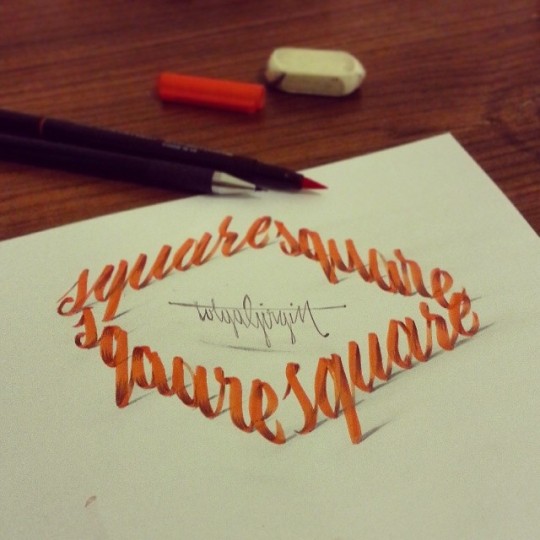
A new way to use your words
Turkey’s Tolga Girgin, an electrical engineer who also dabbles in graphic design, has found a way to create amazing 3D calligraphy pieces with perspective and shading.
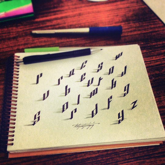
Inspired by his wife
“My wife, Zeynep, encouraged me to start calligraphy,” Girgin told CalligraphyMasters.com. “She likes my handwriting and wanted me to share them on the web.”

A new talent
Although Girgin has been drawing sketches since childhood, he took up calligraphy seriously about a year ago.
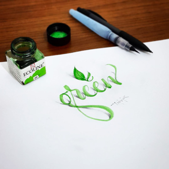
Tools of the trade
Girgin says he “started with parallel pens. Then I met with the steel nibs. Writing with steel nibs is difficult, but my favourite instruments for calligraphy are the steel nibs … because I can make many variations with them. Flexible nibs give my letters dynamism and sharpness.”
3D calligraphy: Original greeting cards
Making a one-of-a-kind greeting card of this nature can be a gift in and of itself.
Make your writing take flight
3D calligraphy can add dimension and color to the simplest words. This, too, would make a stunning greeting card.
An eye-catching branding tool
Girgin thinks that 3D calligraphy could have many commercial uses as well.
Pop-up promotion
3D calligraphy would certainly be an elegant and heretofore unseen way to promote just about anything.

Obvious yet elegant
What better way to promote a line of pens than with 3D calligraphy?
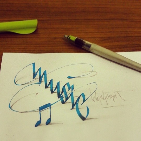
Melodious writing
You can almost hear a symphony when you see this 3D calligraphy rendering of the word “music.”
For the kids
3D calligraphy is also fun for children’s projects — of course, you’ll want to put it on a very high shelf when it’s done.
Hot idea
The sky’s the limit when you’re working in 3D. Using the lighter as a letter creates some provocative artwork.
Co-opting the coloring-book craze
Pictures that you’ve colored, as well as calligraphy that you’ve drawn, could combine perfectly in a 3D creation.
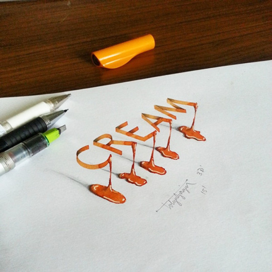
3D calligraphy: Rich with benefits
According to Girgin, 3D calligraphy not only looks beautiful, but it has health benefits as well: “To be honest, I love calligraphy more than engineering,” he says. “Calligraphy makes me relax.”
0 notes
Text
Soulworker Hack
Soulworker Hack Download - Game-Hack.best
Greetings Mobile Gamers, APROGEN GAMES has actually started taking the pre-registration of its own new Greatly Multiplayer Online Parlor Game (MMORPG) SoulWorker: Zero. Soulworker is an anime activity MMORPG which occurs in the Cloudrealm, a currently unused urban area which only nurtures the psychics as well as a horde of beasts. I delight in to ultimately accommodate the needs of gamers in The United States and also Europe with SoulWorker. SoulWorker calls for a minimum of a GeForce 7600 GS to pass the minimal specs.
However, if you are actually looking for a brand new MMORPG to sink your teeth in to we may find you delighting in SoulWorker. SoulWorker, the eye-catching story and also anime-inspired motion picture gameplay experiences most up-to-date Soulworker Hack Tool upgrade offers Jin Seipatsu, the Fistfighter course one of the SoulWorkers-- a group of soldiers along with emotional states therefore tough that they're able to reveal them into powerful items.
Instantly evaluate your computer system against SoulWorker - Cartoons Activity MMO body criteria. If you locate the video game SoulWorker affected your daily life, study, or job, satisfy give up this ready a while till you handle your existing job. By definition, if you have actually played any type of-- and our experts mean any sort of-- MMORPG in the past, you'll recognize what to anticipate in SoulWorker.
SoulWorker - Anime Action MMO body needs mention that you are going to need to have a minimum of 2 GIGABYTES of RAM. Heart Laborer ZERO is the mobile phone variation of the COMPUTER MMORPG activity Soulworker. Head to the soulworker submits wherever you selected to install all of them. Soulworker ZERO includes the exact same tale and all various other benefits that the COMPUTER variation possess, while integrating the auto mechanics available on cellphones.
Those who really love anime themed video games and just as enjoy activity adapted MMORPGs are going to experience straight in the house while participating in SoulWorker. No release time has actually been actually declared, yet Gameforge is delivering SoulWorker to the States and also, Europe. Visually, the video game is actually a 3D model of the cartoons it is encouraged through. SoulWorker is actually slated for release eventually this year-- although a specific date hasn't been actually introduced however.
SoulWorker_DE is actually a less active brand name when it concerns marking down as well as providing promo codes SoulWorker_DE has a mix of evaluations amongst customers on Knoji, with 30 scores and also a common rating of 3.0 superstars. SoulWorker is actually a free-to-play cartoons MMORPG with an activity fight device, featuring Soulworker Hack advanced capability combos. From Cougar Gamings, SoulWorker is a third-person activity MMORPG along with an Anime style for Personal Computer. In a post-apocalyptic situation, using key-board and computer mouse or controller, players take on the duty of a Spirit Laborer, decided on as humanity's rescuers.
Soulworker Hack - Heart Worker Game Reviews.
Downloadable by means of Steam as well as the Gameforge portal, today's SoulWorker upgrade takes the fight versus the unholy mob to brand new heights. Soulworker includes cell-shaded 3D graphics with an anime-inspired artwork and wonderful graphic as well as audio impacts. SoulWorker is actually right now accessible using Heavy steam as a free-to-play title. SoulWorker has the transfer to impress along with quick fight, true cartoons emotion and 4 unique personalities available in the beta and for full launch.
Sizable PvE information along with over one hundred dungeons as well as the brand new PvP Arena, which was first launched in SoulWorker's western release. SoulWorker attract a lot of younger players, they would like to wedge their wallets in Spirit Laborer Dzenai rather than delaying in the video game. To better recognize the path your world wide web website traffic needs to get from your gadget to the Soulworker hosting server, you'll would like to utilize a traceroute.
Our company additionally discovered 2 silhouetted character slots indicating SoulWorker may get 2 brand-new personalities in potential updates. Wtfast maximizes your relationship by minimizing the variety Soulworker Cheat of hops between you and the Soulworker activity web server. SoulWorker Gameplay. Push "Ready To Play!" on "Soulworker Patcher" along with "Login utilizing the Patcher" disabled or even don't if you recognize Oriental.
SoulWorkers release the exceptional graphics along with estethical maintain cartoons parts, which will certainly delight all the otaku followers with its own magnificent and also colorful animations of the matches, magic spells as well as other activities that are highly exceptional, not overlooking to mention the splendid characters, foes as well as the environment.
#soulworker hack#Soulworker Hack Download#soulworker#Soulworker Cheat#Soulworker Cheat Engine#Soulworker Cheat Download
0 notes
Text
My First Trip to Africa: Sierra Leone, Freetown - Kono
AFRICA
I constantly desired to go to Africa. Like most Afro-Americans, I grew up in an surroundings idolizing the whole lot, Africa. Once I got there, I comprehend I Knew nothing approximately Africa. My maternal grandmother made it clear that everything Africa is excellent. Granny did not, however, spend time disparaging the accomplishments of different cultures.
Growing up in Nicaragua's Latino and black cultures. And for me, there is no differentiating among these two ethnicities. Latinos are blacks, and black are Latinos. But this is not so for each person who finds choose with one group.
In Africa, these differences will amplify. Creating a surreal world in which an elite minority will treat different with detached. Sometimes stereotype can give an explanation for things If it turned into easy as black and white. However, things are seldom black or white.
STEREOTYPES
The standard stereotype can not explain Africa's ethnic variations; maximum people's look darkish to me, however they are variations; differences that go again for centuries. The Sierra Leoneans requested me regularly, "are you Nigerian," "American" or "Hausa," those usually got here up. Chief Morsay described Biko and me as "white." He told us that we're foreigners much like human beings with white skin. His index finger became rubbing the pinnacle of his hand for emphasis. When Afro-Americans do this in a conversation, we recognise that it's an impediment similar to "Whites Only." "You're not Africans," he stated. In Africa, it topics where you come from, or from what aspect of the river; within the case of the Congo's Bushong and the Lele ethnic group; what aspect of the river makes a distinction socially politically and financially.

But none of that changed into on my mind. I became excited to visit Africa. Relating to my grandmother's Afrocentric ideals; I wanted to look for myself the grandeur of the continent that launched civilization and the entirety that makes us stunning: The melanin, the curves, rhythm, the meals Loose Diamonds. A list of defense mechanism, my vanity used to combat the regular influx of American racist propaganda, where the whole lot is ready colour, and black is the colour that faints all hues.
RACISM
Consequently, racism is the lens thru which most Afro-Americans view the sector. It's not a distorting lens; for the most component, the lens is accurate; despite the fact that limiting. Focusing most effective on the only view. In a international where people find myriad of ways to segregate each other, racism makes this division feasible.
It is obvious that the Belgians of King Leopold II acted inside the maximum racist, inhuman way in the direction of the humans of the Congo. But in the long run Mobutu Sese Seko of the Ngbandi ethnic group arrested Patrice Lumumba of the Tetela ethnic group. I do not think that ethnicity become the cause for Mobutu Sese Seko transgression in the direction of Lumumba. Thomas Sankara and Blaise Compaoré, each are from the Mossi ethnic organization of Burkina Faso. But similar to King Leopold II, greed become the cause for Mobutu's treachery in the direction of Patrice Lumumba and the destruction of infinite Congolese lives. Compaoré did the same in Burkina Faso securing privileges for a ruling minority; keeping strength on the rate of Thomas Sankara and the humans of Burkina Faso. Using corruption, expropriation even overseas assistance to preserve electricity. With no country to answer to, these guys have been no one of a kind than King Leopold II inside the inhumane remedy in their countrymen.
In Sierra Leone, the (RUF) will put in force the equal, cutting off limbs and ad systematic rape and homicide; dispersing lots and enslaving the population to extract diamonds for his or her non-public wealth.
POVERTY
But poverty is a relative factor. Having grown up in the Caribbean and Latin America. I changed into conversant in 1/3 world fact. But none of this organized me for Africa.
THE TRIP
The extent on conversations goes up the nearer you get to the African departure living room. Things are direct. Laughter reinforced; the sucking of the teeth is loud, the grins big.
The plane landed in Lungi International airport to a remarkable chorus of cheers and applauses. Like a Hollywood emancipation scene, Africans are satisfied and thankful to be domestic. You can experience their excitement. I too turned into excited, to greet the African air. Stepping out of the aircraft, I located the humidity familiar. What turned into different, was to check out a crowd and seeing one coloration of black humans. I attempted now not to appearance surprised; I pretend I've been here before. The Africans looked at me like if I've been here earlier than too.
The tarmac and runway are big, like any airports. But at Lungi you don't see the buses, vehicles or the on foot tunnel protecting you from inclement weather. Everything is open and huge as the sky. I did not see industrial airplanes or business aircraft; simply empty tarmac with a much far away blue-green woodland horizon with out a homes in sight.
Walking into the slight immigration constructing become a marvel, no crowds! I notion this unusual for an worldwide airport. Somehow, I notion they might be connecting flights to the other part of Africa. Only the folks that could be boarding at the identical aircraft in course to Liberia. Right away as you enter the constructing, you notice a few old style booths with modern fingerprint popularity machines. Immigration officers had been smooth and short. They ask for passport and yellow vaccination card. Welcome to Sierra Leone!
The people of Sierra Leone are friendly; they may be beneficiant with their consolation quarter. They greet you, touch you lightly with a common custom.
Waiting for our luggage, I became attracted to 2 large, very wonderful, status wooden sculptures. Two action figures carved from a unmarried tree trunk. No one paid those any thoughts. They stroll via them like nuisance African memento. I constantly preferred the eye to detail of African artwork; there's a consideration for the viewer, the wearer, and dealing with of artifacts. This affiliation of welcoming artistically with dance, texture, food and shades became for me African arts functionality.
Although very outstanding, I did no longer understand at the time; the ones wooden sculptures will constitute the fruits of my African artistic affect.
Leaving the airport, we see a signal with our names. Our host Chernor, we call him Cherry, set up to have Lamin greet us and arrange the bus tickets so that it will take us to the seashore and the ferry to Freetown. Lamin works for a organisation that assists travelers to Sierra Leonne. Having someone at the floor that speaks, Krio become calming. Krio is a higher bargaining language; exchanging money is aggressive, some notes have preferences. So there may be room for saving if you can good buy in Krio.
Outside, they are younger guys promoting bus tickets along side Sim Cards. They're aggressive, but now not pushy. There's plenty of coins in sight constantly changing arms. We look ahead to the air circumstance mini buses to fill with passengers. The ferry isn't far away, approximately a mile. But it takes about ten minutes power to get there. The street is incorrect; I idea that this being the manner to the airport it is probably in higher care, however no. It become just the begging of the many examples of forget and corruption that the people of Sierra Leone live with each day.
The seaside is huge and smooth; I note this due to the fact anywhere else seems to be litter with debris. I see some modest swiftly constructed shanties. I changed into looking for colorful fishing boats but did no longer see any. They're small children, gambling with torn and dirty western clothes. They paid us no thoughts. At this time the little wharf was full of the passenger from the plane, awaiting the ferry; bags and people below a timber hut, with an armed protect. We waited for several hours. It could be sunset before they referred to as our numbered tickets, the small ferry made several journeys transporting us appropriately to Freetown.
The boat trip takes less than an hour to pass the ocean estuary arriving in Freetown at night time. The view turned into dark with out a identifying capabilities to look. Inside, our host Cherry and his driver Mohamed are there waiting. They picked us out of the group right away before absolutely everyone offers to assist. Lamin had despatched images. Cherry made certain that Mohamed receives our bags. Cherry greeted us with a big smile, glowing eyes, on a vibrant spherical friendly face. He right now asked us approximately the flight and are we hungry. He said he has cook dinner meals home, "it is probably too highly spiced for us," he stated. So if we adore, we will go out to get some meals. We opt for the spicy food; it became very late for our jetlag bodies to go out. The streets in Freetown, at nighttime, are jammed full of vendors selling everything. None of it looks appealing to me. Freetown just does not appearance easy. And this is a wonder. A Big marvel!
We left the wharf on a two-lane paved road lit with occasional street lamps. Mohamed is focused on his challenge even as Cherry does the speaking. I'm satisfied he is. The road maintains getting crowded the closer you get to town. They're lots of small children out selling stuff, anything. I see plenty of bake excellent and fruits. Everything seems lease. Things experience extraordinary, anachronistic, a chunk out of area, like if I've traveled lower back in time. The people don't appear concerned approximately the traffic. The avenue is abuzz with African track. And the human beings are simply moving with purpose in what looks like a chaotic order.
GODRICH
We tour on paved roads all the manner up to College Road in Godrich. Then we turn proper. And Mohamed slows to a move slowly; the street now unpaved becomes a series of hills and gullies slowly main up to the subsequent turns, like the bus ride from Lungi to the seashore. There will be extra moments like this. Mohamed is trying not to have the lowest of the car drag on a hill, patiently he turns. Like if he has executed this lots of time.
CHERNOR'S HOME
The vehicle got here to a prevent at a big metallic door, about 10 ft high. Surrounded by means of fencing simply as high with damaged bottles cemented at the pinnacle. We're three turns off the main avenue, some of the houses have this barrier. A lot do not; a few houses are simply packing containers of corrugated scraps steel wooden and cardboard prepare. There is a feel that Freetown turned into now not always like this. These dwellings bare the scars and the remains of political corruption and a vicious, inhumane civil battle.
At Cherries domestic, he introduces us to his uncle Mohamed, his sister Mimona and his "House Boys." Cherry has "House Boys" and a "House Girl." At first, I concept he turned into speaking approximately his kids, however no, that's what they call the servants or assist. Although they may be extra than servants, they need to be endorsed by way of a member of the family. They call you "Sa" like yessa. Like I said, It appears like you're lower back in time.
Mimona placed a big bowl of "krain krain," at the desk. Cassava leaf pounded and shredded with warm peppers introduced to the pot of fish and boiled Jazmine rice at the side. It become hot; they had a great snicker looking our faces get shiny. Although very highly spiced, it turned into scrumptious. The rice become helpful calming the krain krain's warmth. We needed something to drink. Small luggage muddle Sierra Leone. This night time while eating hot Krain Krain we have brought these ubiquitous waterbags. According to the water task "Infections and parasites, maximum located in contaminated water, cause the largest motive of dying in Sierra Leone."
After a completely long adventure, the mellow dance of Mosquito Smoke Coils, I changed into feeling tired. I wished a bathtub. Reacquainting myself with these norms of the Caribbean and Latin America: The open shower and cold water. Making certain now not to drink the water from the pipes all through my bathe. I went to sleep in Africa.
The next day I noticed lots of children a few in uniform. The faculties are out early for the infants. Education in Sierra Leone is legally required. But a scarcity of faculties and instructors has made implementation impossible the by-product of corrupt institutions plaguing this kingdom. I saw a collection of three taking walks on the street with a basket on their heads. They appearance five or six, too small to be on foot in a hectic metropolis by themselves.
0 notes
Text
Virtual Sketchbook 2
1. Unity and Variety: In art, as in life, unity is about oneness and variety is about diversity. We see this very much in our lives everyday since our country is one filled with many different cultures, religions, and races. An artist will most times use a combination of both unity and variety by repeating similar shapes, lines and colors throughout the work in varied ways. A perfect example of this is pictured below in Allan McCollum’s work “Perfect Vehicles.”
Balance: Balance is about finding equilibrium. A work of art with out balance, makes us uneasy because we crave balance in our own lives. Artist achieve balance in two ways, symmetrically and asymmetrically. A work is symmetrical when both sides are the same, such as it is with most architecture. Balancing a work of art asymmetrically is much more complicated. Instead of making both sides of the work the same, as in symmetry, they need to create a sense of balance by positioning the objects by size or by their use of colors and empty spaces. A very popular example of asymmetrical balance is Vincent Van Gogh’s “Starry Night.” The largest structure in the foreground of the painting is balanced by the moon in the upper right corner.
Emphasis and Subordination: These two principles deal with parts of the artwork the artist wants the viewer to focus on. An artist will use different means such as contrast, size and color intensity to emphasize a certain part of their work. Similarly, they will use subordination to keep our attention from less important aspects of the work so as not to detract from the area they are emphasizing. This is shown below in the painting by Francisco Goya “Executions of the Third of May.” The figure in the left center is emphasized by his upraised arms and brightly colored shirt and pants. The other figures have been painted with more muted colors and appear to be in the dark while light surrounds the emphasized figure.
Directional Forces: Directional force is used to guide the viewers eye around the painting using actual or implied lines. An implied line may use the shape of an object or the direction a figure is looking to guide our eye’s to another aspect of the artwork. In the painting below, “Annunciation” by Botticelli, you can see that he uses the gaze and outstretched arms of Mary and the angel to direct our eyes to those two central figures.
Repetition and Rhythm: Repetition is a recurring pattern throughout a work of art. It can be shapes, colors or any other element that is used to give the work unity or emphasis the element that is being repeated. Rhythm is more of a feeling in the art work and is most often times represented through repetition of an element with similar variations. Pictured below is a very famous example of repetition and rhythm used by Andy Warhol in his painting “Marilyn Monroe.” He repeats her image over and over but each one is slightly different than the others.
Scale and Proportion: Scale is used to emphasize one objects size, in comparison to another. Proportion is the comparison of parts to a whole or to each other. In Michelangelo’s “Pieta” sculpture, he had to increase Mary’s scale in comparison to Jesus so that the two would look proportional. If she were made in her actual proportional size to Jesus, she would be dwarfed by him and the sculpture would look unbalanced and awkward.
2. Madonna and Child with the Chancellor Rolin by Jan van Eyck (figure 7.9, page 122) contains implied lines and depth, atmospheric perspective, bold colors (especially Mary’s deep red robe which appears to make her the focal point of the painting, along with baby Jesus), implied motion of the angel above Mary’s head, repetition of shaped and patterns in the floor tiles and achieves balance by having each of the largest objects (Mary and the Chancellor) on each side of the painting.
3.

If I had to pick a “color scheme” for my life it would definitely be the various values of turquoise. This is my favorite color and I have purchased/received just about anything you can think of in this color; from clothing and purses to Tupperware and luggage. I even had the walls of my bedroom painted a very dark shade of turquoise for a time, thinking a darker shade would be more soothing than something that was very bright. That most certainly was NOT the case! After weeks of sleepless nights, I had to concede that even though I loved the color it was not conducive to restful sleep and it must go. I instead settled on a nice, soft gray that went beautifully with all of my teal accents and have been much happier since.
4. I chose to do a painting of one of my tattoos that has a lot of meaning to me. On my left forearm (see last photo below), I have a tattoo in memory of my father that passed away ten years ago. The tattoo is of his guitar that I have many memories of him playing throughout my life and how wonderful it was to hear him sing (he sounded surprisingly like Elvis). I chose to do my painting with acrylic paint on canvas. If it’s not obvious, I have never painted before. At first, I admit, I was upset to have to actually create art when I signed up for art appreciation but this exercise has really given me some perspective on what it takes to create something beautiful. I can honestly say that I now have a deeper appreciation for the work an artist puts into their paintings. All in all, a very fun project!
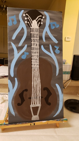
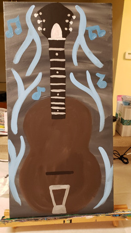
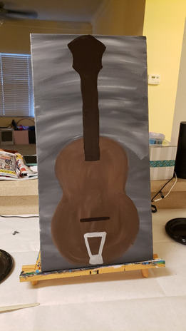
5.
This black and white photo by Russian photographer Mikhail Potapov is absolutely perfect as a black and white photograph. You can clearly see the woman's determination but also, it appears she has some uncertainty. The darkness of her dress and of the horse are a beautiful contrast to the lighter sky and I think it emphasized their deep interaction. If the photo were in color, I don't believe it would hold the same weight for the viewer as it does presently.

I don't have any information on the artist that took this photograph, I found it in a Google search and it caught my eye immediately. The colors in this photo are so vibrant, you can practically smell the salt water, feel the sand and hear the waves. I can't imagine that this photo taken in black and white would give us the same feelings as seeing it in vivid colors.

0 notes
Text
21 Brand Style Guide Examples for Visual Inspiration
When it comes to building a memorable brand, it’s all about consistency.
When you’re shopping for your favorite cereal or coffee at the grocery store, you want to be able to spot it from a mile away.
The best brands stick in our brains because their presence is defined by the repetition of the same logo, fonts, colors, and images.
Once we see them enough, they become instantly recognizable, bringing us a clear sense of reliability and security.
Developing a consistent brand starts with creating a brand style guide. These branding rule books help graphic designers, marketers, web developers, community managers, and even product packaging departments all stay on the same page, and present a unified vision of the brand to the public.
We’ve compiled a list of some awesome brand style guides to use as inspiration for your next branding project or website redesign. Check them out below.
What are brand guidelines?
Brand guidelines, also known as a brand style guide, govern the composition, design, and general look-and-feel of a company’s branding. Brand guidelines can dictate the content of a logo, blog, website, advertisement, and similar marketing collateral.
Picture the most recognizable brands you can think of. Chances are, you’ve learned to recognize them because of the consistency across the messaging — written or visual — these brands broadcast. The same brand colors are reflected across them. The language sounds familiar. It’s all very organized and, while not rigid, it’s cohesive.
Here are a few types of guidelines you’d find in a brand style guide and which parts of a brand they can influence.
Mission Statement
By reputation, you might think a mission statement is in its own category of importance to a business. And it is. But your business’s mission statement is also compass for your brand style guide. A mission statement ensures every piece of content you create for your brand is working toward the same goal — and, ideally, strives to solve the same problem for your customer.
Your mission statement can guide your:
Blog content.
Paid/sponsored content
Ad copy.
Visual media.
Slogan or tagline.
Buyer Persona
By definition, a buyer persona is a fictional representation of your ideal customer. It can include details related to your customer’s age, gender, job title, and professional challenges. For this reason, your buyer persona should also appear in your brand style guide. Your buyer persona is your target audience, and therefore stipulates for whom your brand publishes content.
Your buyer persona can guide your:
Blog content.
Ad copy.
Visual media.
Color Palette
A color palette is a group of colors a company uses to design its brand, and it guides every piece of visual content the brand creates. Your color palette can be as simple or as elaborate as you want, so long as your brand doesn’t deviate from the colors you choose to include.
Color palettes that feature multiple colors often dedicate specific colors to specific types of marketing content. While the first two colors of your color palette might govern your logo, for example, the next two colors might support your website and blog design. Another two or three colors might be the basis for all your printed branding material.
No matter what colors you use for your color palette, make sure you identify their HEX or RGB color codes. These codes consist of numbers and letters to help you recall the exact shade, brightness, contrast, and hue you want associated with your brand, so your colors don’t gradually drift in appearance as you create new content. You can find color codes using most photo-editing or design software that comes standard on your computer. Learn more about finding and committing to color codes in this blog post.
Your color palette can guide your:
Logo.
Website design.
Printed advertisings.
Event collateral.
Editorial Style Guide
Nowadays, an editorial style guide is the bread and butter of an authoritative brand. This component of your brand style guide can have strong implications for your PR team, as well as the people who write articles, scripts, blog posts, and website copy for your company.
An editorial style guide’s main job is to commit to an editorial stylebook (such as Associated Press or Chicago), how to phrase certain products, topics the brand can and cannot write about, and even other companies the brand can and cannot mention. However, a brand’s editorial style guide can also go into much deeper detail about your buyer persona: what they like to read about, where they read it, their general reading level, etc.
Your editorial style guide can guide your:
Blog content.
Video scripts.
Website copy.
Landing page copy.
Public relations talking points.
A knowledge base supported by your customer service team.
Paid/sponsored content.
Typography
Typography is another visual element of your brand style guide, but it isn’t just the font you use in your company logo. Typographic guidelines can support your blog design — which font you publish articles in — the links and copy on your website, and even a tagline to go with your company logo.
As you can see, the purpose of the brand style guide is to form and maintain all of the various elements of a company that, when combined, spell out the entire brand as it’s recognized.
Intrigued? Check out 21 of the best ones we could find.
Style Guide Examples
Medium
Wolf Circus Jewelry
Ollo
Skype
Barre & Soul
Spotify
Jamie Oliver
Herban Kitchen
Urban Outfitters
Love to Ride
Barbican
I Love New York
Cisco
University of the Arts Helsinki
NJORD
Espacio Cultural
Alienware
Netflix
Scrimshaw Coffee
NASA
New York City Transit Authority
1. Medium
Medium emphasizes both typography and color in its brand style guide. Its guide also include details related to the company’s “Purpose” and “Product Principles.”
See the full brand guide here.
Source: Behance
2. Wolf Circus Jewelry
Wolf Circus Jewelry’s product is all about appearance. Naturally, the company’s style guide is too. The brand’s style guide includes the company’s mission statement, product details, typeface, logo variations, a color palette, and a separate set of guidelines just for advertisements.
See the full brand guide here.
Source: Issuu
3. Ollo
Ollo is so into color and typography, it turned its style guide into a game. Click the link below to see how much you can manipulate the brand. It’s the perfect way to show content creators how creative they can get but also still adhere to Ollo’s specific typeface and color codes.
See the full brand guide here.
Source: Bibliothèque Design
4. Skype
Everyone’s favorite video chat platform also has a squeaky-clean style guide for its brand. Skype, now owned by Microsoft, focuses primarily on its product phrasing and logo placement.
See the full brand guide here.
Source: Microsoft
5. Barre & Soul
Barre & Soul’s brand style guide includes variations of its logo, logo spacing, secondary logos, supporting imagery, and a five-color color palette.
See the full brand guide here.
Source: Issuu
6. Spotify
Spotify’s style guide might appear simple and green, but there’s more to the brand than just a lime green circle. Spotify’s color palette includes three color codes, while the rest of the company’s branding guidelines focus heavily on logo variation and album artwork. The style guide even allows you to download an icon version of its logo, making it easier to represent the company without manually recreating it.
See the full brand guide here.
Source: Spotify
7. Jamie Oliver
Jamie Oliver has an extremely thorough brand style guide, covering logo placement across all of its kitchenware products. The company also includes a large color palette with each color sorted by the product it should be shown on.
See the full brand guide here.
Source: Issuu
8. Herban Kitchen
Herban Kitchen has both a color and texture palette in its style guide. These guidelines help to show not just how the brand’s logo will appear, but how the company’s various storefronts will look from the outside to potential customers.
See the full brand guide here.
Source: Issuu
9. Urban Outfitters
Photography, color, and even tone of voice appear in Urban Outfitters’ California-inspired brand guidelines. However, the company isn’t shy to include information about its ideal consumer and what the brand believes in, as well.
See the full brand guide here.
Source: Issuu
10. Love to Ride
Love to Ride, a cycling company, is all about color variety in its visually pleasing style guide. The company’s brand guidelines include nine color codes and tons of detail about its secondary logos and imagery.
See the full brand guide here.
Source: Issuu
11. Barbican
Barbican, an art and learning center in the United Kingdom, sports a loud yet simple style guide focusing heavily on its logo and supporting typefaces.
See the full brand guide here.
Source: Issuu
12. I Love New York
Despite its famously simple t-shirts, I Love New York has a brand style guide. The company begins its guidelines with a thorough explanation of its mission, vision, story, target audience, and tone of voice. Only then does the style guide delve into its logo positioning on various merchandise.
See the full brand guide here.
Source: Issuu
13. Cisco
Cisco’s style guide isn’t just a guide — it’s an interactive brand book. The company takes website visitors page by page through its brand’s vision, mission, strategy, and even its promise before showing users their logo and allowing them to actually type using their proprietary typeface, “CiscoSans.” Where’s Cisco’s color palette, you ask? The business has a separate webpage for just that.
See the full brand guide here.
Source: Cisco
14. University of the Arts Helsinki
The style guide of the University of the Arts Helsinki is more of a creative branding album than a traditional marketing guide. It shows you dozens of contexts in which you’d see this school’s provocative logo, including animations.
See the full brand guide here.
Source: Behance
15. NJORD
NJORD’s minimalist style guide gives you everything you’d need to know to design using the brand’s logo and color palette for both web and print.
See the full brand guide here.
Source: Behance
16. Espacio Cultural
This cultural center in Argentina has a color palette that’s as elaborate as the artistic workshops it hosts. Nonetheless, the brand does a fantastic job of breaking down every last color code and logo placement you can find — from the building itself to the advertisements promoting it.
See the full brand guide here.
Source: Behance
17. Alienware
Video gamers know Alienware from its game-friendly computers, but the rest of the world knows it by the brand’s sleek aesthetic. The company organizes its brand style guide into four basic parts: voice, design, photography, and partner. The latter describes (and shows) how the brand interacts with partner brands, such as Star Wars.
See the full brand guide here.
Source: Issuu
18. Netflix
As far as its public brand assets are concerned, Netflix is focused primarily on the treatment of its logo. The company offers a simple set of rules governing the size, spacing, and placement of its famous capitalized typeface, as well as a single color code for its classic red logo.
See the full brand guide here.
Source: Netflix
19. Scrimshaw Coffee
Featuring a five-code color palette, this “laid back,” “friendly,” and “modern” brand has a number of secondary logos it embraces in various situations.
See the full brand guide here.
Source: Issuu
20. NASA
NASA’s “Graphics Standards Manual” is as official and complex as you think it is. At 220 pages, the guide describes countless logo placements, color uses, and supporting designs. And yes, NASA’s space shuttles have their own branding rules.
See the full brand guide here.
Source: Standards Manual
21. New York City Transit Authority
Like NASA, the NYCTA has its own Graphics Standards Manual, and it includes some fascinating typography rules for the numbers, arrows, and public transit symbols the average commuter takes for granted every day.
See the full brand guide here.
Source: Standards Manual
Want more? Read How to Create a Writing Style Guide Built for the Web [Free Template].
Source link
source https://www.kadobeclothing.store/21-brand-style-guide-examples-for-visual-inspiration/
0 notes
Photo
Sparkle By the Sea
Pardon me as I just barely squeeze a MerMay piece of art in.
I'll be honest with you guys, I've been pretty lacking in artistic motivation since NaPoWriMo ended. Although if you've noticed my lack of uploads, you probably could've already guessed that. This isn't abnormal for the aftermath of a month-long challenge for me, especially with a brand-new video game calling my name at every moment of the day, but even so I feel like this particular motivation drought was a bit different.
Part of it definitely had to do with the changes to DeviantArt that I'm sure I don't need to remind everyone of, but that's been more of me dreading seeing what the state of the community is than anything else. (However, I have noticed I'm not a fan of the new tag system over the old category one, as confusing as the category system could be sometimes.) Rather, I think this lake of motivation has more to do with the fact that being largely absent from all social media during NaPo reminded me...well, that I hate social media.
This is really a bigger discussion for a journal or something, but suffice to say it did not feel good to realize just how many literal hours I had previously been spending trying to desperately to scrape up just a little bit of support on other social media platforms (namely Twitter), versus the more natural growth I see here on dA that also feels a lot more genuine and less forced/obligatory.
I can't really explain it, but that reminder/realization really helped my brain slip back into a place where I felt like creating again. And with that, I'll transition into talking about the art and save the social media talk for, as I said, a journal or something later on.
Naturally, I've been seeing a lot of mermaid art this month and every year I feel the urge to get in on the fun, though I know better than to try actually doing the MerMay Challenge (especially not this year after having just done NaPo), so I usually either do a one-off drawing or if I'm too busy with other projects I just skip it. But I was starting to feel that need to make art in my brain again and I've had a specific set of stickers from the dollar store sitting in my stash for quite a while now that more or less sealed the deal for me.
How do these stickers fit into the mix? Well, I originally fell in love with/picked them up because they are mermaid-themed and absolutely adorable--See for yourself! And I thought they would make for nice decals in a book project since they're wall stickers and therefore repositionable with minimal adhesive-yuck. And at first, I thought maybe I'd end up making them into said hypothetical book project in time for MerMay...except that felt a little cheap in combination with my lack of uploads. Did I really want to come back with a book project featuring mermaids I didn't even draw? And for MerMay of all things?
So I sat on the idea and left the stickers out where I could see them, and eventually I sat down and took a closer look at them. The art style, upon further inspection, actually didn't look like it would be too far outside my usual art-making realms...Most of the coloring looks a lot like watercolor, except for the skin which I thought was flat and smooth like alcohol marker and the glitter accents which from my perspective pretty much had to be digital, but could potentially be replicated with glittery/metallic supplies...
And that was the moment the idea hatched. I decided I'd try drawing a mermaid myself in the same style. This would work for MerMay, have something to do with the stickers, and based on my plans would work well for me as a mixed-media project, which as I'm sure I've said before is where I think my artistic talent shines best.
I thought the scariest part was going to be replicating the looser and less strict line style, and to a point it was, but it wasn't nearly as bad as I thought it was going to be. I find it's usually kind of tricky to explain this, but really what this part of the process boils down to for me (if I'm replicating an existing style and not using my own), is really just studying the original artwork(s) and looking for patterns, then trying to stick to those patterns. For example, the style here features fairly large & rounded faces, and the hands are more like hand-shaped mittens (which was great news by the way because hands are always a pain in the butt for me), so I did my best to emulate those features.
As per usual, I did start with a sketch, but I tried to keep it looser than usual, and then when I did the inking I started with my 0.2 Micron, again trying to keep things loose and no be too fussy if I could help it. Then I went back with a brush tip liner from Prismacolor to get more natural variation in the lines and to force myself to not have quite so much control over the line weight.
I was also very careful with my choice of liners because I knew pretty much everything except the skin was going to see a lot of watercolors, which meant the lines had to be waterproof. And of course, I went with watercolor paper (my nice 100% cotton stuff this time) to make sure I didn't have any issues with blending or layering.
Now, at this stage, I didn't know what I was going to do for the background, though I was leaning towards the idea of making one separately and placing the mermaid on top afterward, as sort of a nod to the original mermaids being stickers. But I wasn't totally sure yet.
What I was sure of was how scared I was to just dive into coloring. The sketching and inking and gone so well I was thinking I was in for a rude awakening at any moment. So, just in case, I scanned my uncolored lines as a fall-back if I royally screwed up. With my paranoid mind set at ease (for the most part), I could begin with color application.
I started with the skin since it was the easiest; Just one good layer of alcohol marker, leaving a little white space here and there like the artwork I was emulating. Although 1. The marker color turned out a bit darker than I was expecting and later blended too well with her tail, so I had to lighten it in Photoshop, and 2. because watercolor paper really soaks up the ink, I ended up with less white space than I thought I would. But beyond that, this step went off without a hitch.
So then came the second-scariest part: The watercolor. I used a mixture of my Master's Touch watercolors and Mermaid Markers (yes, that was a very conscious supply choice ) and tried to take my time and be mindful of the color balance I was looking for.
I'd decided ahead of time that I wanted to try and stick with a soft-ish palette like the original art, but I still wanted my choices to be different. Since yellow/gold is featured in the original but not used for a tail color, that's what I went with, and I opted for the blue-y-purple hair since a soft blue and purple are also prominent in the original and based on color-theory would be a nice contrast to the gold-orange tail. Though I did also try to get some pink in both the tail and the hair for a bit of unity and calling back to the pink in the original art.
The trickiest part with the coloring was actually the tiny lips and blush spots. I ended up using a fluorescent pink for that turned out as more of a red originally and had to be touched-up via Photoshop because of that and also because of the lightening I did to the skin. It's more that it was a bit of a challenge to get the shapes of these much smaller areas right and in the correct place, since I had to use very minimal pencil markings, lest I end up with nasty graphite marks mixed into the paint.
Getting the hair to be dark enough without being extreme compared to the rest of the drawing was also a great test of patience, but it ultimately worked out, I think.
I also had a hard time deciding what color the piece of coral in her hair should be, which is why it ended up as this vague dusky-orange color. And I got more pink on the sand dollar next to it than I intended, but neither of those things is a huge deal.
While I waited for all that to dry though, I had to decide how I was going to go about tackling all that extreme sparkle the original art had. I could have just added it in digitally and not even attempted it traditionally, but everything else had gone so smoothly that I decided to push my luck this time.
Originally, I started with just glittery gel pens, but I found pretty quickly that they were sinking back into the colors underneath them too much and thus just weren't doing what I wanted. I wanted high-impact sparkle. After some brief consideration, I turned to the metallic watercolor sets I have made by Art Philosophy, which are very high-impact metallic and pretty opaque, which would work well over my failed gel pen and would work wonders for the areas where I wanted that high-impact over an opposing color. (I.E. Where I wanted the blue sparkle over a very orange-yellow area, which would normally make brown mud if the color on top wasn't opaque.)
The funny part about that is that I originally used a different shade of purple and gold for those areas of sparkle that I ended up completely covering with different shades (the purple needed to be lighter and the gold needed to be darker/more gold and less yellow). And her eye shadow cover saw all three colors before I settled; The purple just seemed wrong, and the gold blended too well with her skin. I thought the blue wouldn't work so close to her blue hair, but it actually ended up looking the best out of the three.
Although, I do have to make a full disclosure that the high-impact sparkle you see here is in fact where I went in and re-did it digitally once I scanned the artwork in. Unfortunately, glitter and metallic supplies just don't scan very well and usually end up looking too dark, dull, or flat by comparison. The metallic paints work just fine in person since you can move the art and see how they reflect the light, but it just doesn't work in a still image that's been captured by having a bright light uniformly shined over it.
Still, re-tooling the sparkle digitally ended up being an interesting challenge, especially since it's been a fairly long time since I was messing with digital textures like this.
Also worth noting is that I had to re-paint some of the metallic areas because they weirdly lifted off onto the plastic cover I used to protect the art when I pressed it onto the background to make the glue stick. I'm not sure if it's because those were the extra-layered areas and they hadn't fully dried all the way down to the paper, or if that particularly plastic just picks up this metallic paint really easily or what.
And speaking of that background...
Like I said earlier, I wasn't really sure what I wanted to do for a background for a while, but after reviewing my mermaid-centric Pinterest board I decided a simple rock seat and something to vaguely suggest the ocean/water without getting too detailed would suffice just fine. Based on that, I felt like using gouache would work nicely (and I just really felt like using the gouache since I don't find a lot of opportunities to use it) and that a color scheme that flipped her hair and tail colors would be best for the effect I wanted.
I've found I really like the Strathmore 400 series mixed media paper for gouache because of how smooth it is, so I cut a piece down to size and got busy.
For the most part, I just kind of went in with the colors doing whatever felt right, and trying to use some gouache I'd already mixed from past projects (since gouache can be reactivated and I've found this kind, in particular, seems to reactivate really nicely) either on their own or to mix the colors I felt like I needed. And I also tried to do a lot of blending straight on the paper to get more variations in color and make things a bit more lively.
Oddly enough, this ended up being a good example of gouache's covering power because I accidentally started applying the colors upside down--using more greens and blues on top and more pinky-purple on the bottom--and not only had to flip the paper around but also had to do a fair amount of covering the colors I'd already put down with colors you don't really want to mix with them because they don't make very pretty results. But it worked out just fine, so yay!
I also added some clouds for a little extra ambiance, which I think looks quite nice.
Believe it or not, the most difficult thing about the background was the rocks. I spent far longer than I care to admit (or bothered to document, for that matter) trying and in many ways failing to mix the proper shades of gray I wanted, and the end result didn't turn out quite as clean and graphic as I had hoped, but by the time I put the mermaid on top, you really can't tell because you can only see a fraction of what's actually there. And I mean, the end result isn't terrible, it's just not quite what I was picturing in my mind's eye is all.
Personally, I know it's kind of an odd choice, but I really like how there's no defining line between the water and the sky, and yet you still get a clear idea that they're separate and the rocks aren't just floating in space. I'm not sure how, but I think I'd like to work with this kind of ambiguity more often. It's like a step between abstract and more structured art.
Anyway. With the background done, the next step was to attach the mermaid, which I felt like doing in a more 3D and less flat manner, so I chopped up a cardboard box that previously held a chocolate bunny I had on hand and glued some pieces together to boost the mermaid up a bit. This where those deep shadows between her and the background are coming from.
Here I feel the need to insert a comment about how difficult it was to get my tacky glue to dispense the glue for me, though there's a chance this is because I need to poke the opening in the tip to be a bit wider. (You have to poke it open yourself and I always felt like I never did get it open quite enough...unless you like strenuous hand exercises...)
Of course, once all the above was done then I had to scan the art in, which I was admittedly a bit nervous about after the incident with the plastic cover peeling off the metallic paint (though fortunately, the scanner glass didn't have the same effect), and then all that was left wad the digital retouches.
Overall, I'm really happy with how this turned out. It doesn't blend in as well as I originally wanted it to with the original art, but in the end, that doesn't really bother me. It's just a nice piece of art on its own that is also unique from what I normally do...except it's still got a lot of similar elements to how I normally make art. It feels a lot like the days when all I made was fanart. The key difference here is that I know myself better as an artist now and thus can use that knowledge to my advantage.
I can't promise this a return to regular posting for me, though I do hope it's a gateway to me posting more frequently at least, but I can say I do intend on getting back to working on art more often and therefore being more present online again. At the very least, I can happily tell you guys that I have a couple of new art supplies en route to me that I've been wanting for a while and am excited to share with you once they arrive. If nothing else, we at least have that to look forward to!
____
Artwork © me, MysticSparkleWings
____
Where to find me & my artwork:
My Website | Commission Info + Prices | Ko-Fi | dA Print Shop | RedBubble | Twitter | Tumblr | Instagram
1 note
·
View note
Text
21 Brand Style Guide Examples for Visual Inspiration
When it comes to building a memorable brand, it's all about consistency.
When you're shopping for your favorite cereal or coffee at the grocery store, you want to be able to spot it from a mile away.
The best brands stick in our brains because their presence is defined by the repetition of the same logo, fonts, colors, and images. Once we see them enough, they become instantly recognizable, bringing us a clear sense of reliability and security.
Developing a consistent brand starts with creating a brand style guide. These branding rule books help graphic designers, marketers, web developers, community managers, and even product packaging departments all stay on the same page, and present a unified vision of the brand to the public.
We've compiled a list of some awesome brand style guides to use as inspiration for your next branding project or website redesign. Check them out below.
What are brand guidelines?
Brand guidelines, often contained in a brand style guide, govern the composition, design, and general look-and-feel of a company's branding. Brand guidelines can dictate the content of a logo, blog, website, advertisement, and similar marketing collateral.
Picture the most recognizable brands you can think of. Chances are, you've learned to recognize it because of the consistency across of the messaging -- written or visual -- that brand broadcasts. The same brand colors are reflected across them. The language sounds familiar. It's all very organized and, while not rigid, it's cohesive.
Here are a few types of guidelines you'd find in a brand style guide and which parts of a brand they can influence.
Mission Statement
By reputation, you might think a mission statement is in its own category of importance to a business. And it is. But your business's mission statement is also compass for your brand style guide. A mission statement ensures every piece of content you create for your brand is working toward the same goal -- and, ideally, strives to solve the same problem for your customer.
Your mission statement can guide your:
Blog content.
Paid/sponsored content
Ad copy.
Visual media.
Slogan or tagline.
Buyer Persona
By definition, a buyer persona is a fictional representation of your ideal customer. It can include details related to your customer's age, gender, job title, and professional challenges. For this reason, your buyer persona should also appear in your brand style guide. Your buyer persona is your target audience, and therefore stipulates for whom your brand publishes content.
Your buyer persona can guide your:
Blog content.
Ad copy.
Visual media.
Color Palette
A color palette, you'll correctly assume, will guide every piece of visual content you create on behalf of your brand. Your color palette can be as simple or as elaborate as you want, so long as your brand doesn't deviate from the colors you choose to include.
Color palettes that feature multiple colors often dedicate specific colors to specific types of marketing content. While the first two colors of your color palette might govern your logo, for example, the next two colors might support your website and blog design. Another two or three colors might be the basis for all your printed branding material.
No matter what colors you use for your color palette, make sure you identify their HEX or RGB color codes. These codes consist of numbers and letters to help you recall the exact shade, brightness, contrast, and hue you want associated with your brand, so your colors don't gradually drift in appearance as you create new content. You can find color codes using most photo-editing or design software that comes standard on your computer. Learn more about finding and committing to color codes in this blog post.
Your color palette can guide your:
Logo.
Website design.
Printed advertisings.
Event collateral.
Editorial Style Guide
Nowadays, an editorial style guide is the bread and butter of an authoritative brand. This component of your brand style guide can have strong implications for your PR team, as well as the people who write articles, scripts, blog posts, and website copy for your company.
An editorial style guide's main job is to commit to an editorial stylebook (such as Associated Press or Chicago), how to phrase certain products, topics the brand can and cannot write about, and even other companies the brand can and cannot mention. However, a brand's editorial style guide can also go into much deeper detail about your buyer persona: what they like to read about, where they read it, their general reading level, etc.
Your editorial style guide can guide your:
Blog content.
Video scripts.
Website copy.
Landing page copy.
Public relations talking points.
A knowledge base supported by your customer service team.
Paid/sponsored content.
Typography
Typography is another visual element of your brand style guide, but it isn't just the font you use in your company logo. Typographic guidelines can support your blog design -- which font you publish articles in -- the links and copy on your website, and even a tagline to go with your company logo.
As you can see, the purpose of the brand style guide is to form and maintain all of the various elements of a company that, when combined, spell out the entire brand as it's recognized.
Intrigued? Check out 21 of the best ones we could find.
Style Guide Examples
Medium
Wolf Circus Jewelry
Ollo
Skype
Barre & Soul
Spotify
Jamie Oliver
Herban Kitchen
Urban Outfitters
Love to Ride
Barbican
I Love New York
Cisco
University of the Arts Helsinki
NJORD
Espacio Cultural
Alienware
Netflix
Scrimshaw Coffee
NASA
New York City Transit Authority
1. Medium
Medium emphasizes both typography and color in its brand style guide. Its guide also include details related to the company's "Purpose" and "Product Principles."
See the full brand guide here.
Source: Behance
2. Wolf Circus Jewelry
Wolf Circus Jewelry's product is all about appearance. Naturally, the company's style guide is too. The brand's style guide includes the company's mission statement, product details, typeface, logo variations, a color palette, and a separate set of guidelines just for advertisements.
See the full brand guide here.
Source: Issuu
3. Ollo
Ollo is so into color and typography, it turned its style guide into a game. Click the link below to see how much you can manipulate the brand. It's the perfect way to show content creators how creative they can get but also still adhere to Ollo's specific typeface and color codes.
See the full brand guide here.
Source: Bibliothèque Design
4. Skype
Everyone's favorite video chat platform also has a squeaky-clean style guide for its brand. Skype, now owned by Microsoft, focuses primarily on its product phrasing and logo placement.
See the full brand guide here.
Source: Microsoft
5. Barre & Soul
Barre & Soul's brand style guide includes variations of its logo, logo spacing, secondary logos, supporting imagery, and a five-color color palette.
See the full brand guide here.
Source: Issuu
6. Spotify
Spotify's style guide might appear simple and green, but there's more to the brand than just a lime green circle. Spotify's color palette includes three color codes, while the rest of the company's branding guidelines focus heavily on logo variation and album artwork. The style guide even allows you to download an icon version of its logo, making it easier to represent the company without manually recreating it.
See the full brand guide here.
Source: Spotify
7. Jamie Oliver
Jamie Oliver has an extremely thorough brand style guide, covering logo placement across all of its kitchenware products. The company also includes a large color palette with each color sorted by the product it should be shown on.
See the full brand guide here.
Source: Issuu
8. Herban Kitchen
Herban Kitchen has both a color and texture palette in its style guide. These guidelines help to show not just how the brand's logo will appear, but how the company's various storefronts will look from the outside to potential customers.
See the full brand guide here.
Source: Issuu
9. Urban Outfitters
Photography, color, and even tone of voice appear in Urban Outfitters' California-inspired brand guidelines. However, the company isn't shy to include information about its ideal consumer and what the brand believes in, as well.
See the full brand guide here.
Source: Issuu
10. Love to Ride
Love to Ride, a cycling company, is all about color variety in its visually pleasing style guide. The company's brand guidelines include nine color codes and tons of detail about its secondary logos and imagery.
See the full brand guide here.
Source: Issuu
11. Barbican
Barbican, an art and learning center in the United Kingdom, sports a loud yet simple style guide focusing heavily on its logo and supporting typefaces.
See the full brand guide here.
Source: Issuu
12. I Love New York
Despite its famously simple t-shirts, I Love New York has a brand style guide. The company begins its guidelines with a thorough explanation of its mission, vision, story, target audience, and tone of voice. Only then does the style guide delve into its logo positioning on various merchandise.
See the full brand guide here.
Source: Issuu
13. Cisco
Cisco's style guide isn't just a guide -- it's an interactive brand book. The company takes website visitors page by page through its brand's vision, mission, strategy, and even its promise before showing users their logo and allowing them to actually type using their proprietary typeface, "CiscoSans." Where's Cisco's color palette, you ask? The business has a separate webpage for just that.
See the full brand guide here.
Source: Cisco
14. University of the Arts Helsinki
The style guide of the University of the Arts Helsinki is more of a creative branding album than a traditional marketing guide. It shows you dozens of contexts in which you'd see this school's provocative logo, including animations.
See the full brand guide here.
Source: Behance
15. NJORD
NJORD's minimalist style guide gives you everything you'd need to know to design using the brand's logo and color palette for both web and print.
See the full brand guide here.
Source: Behance
16. Espacio Cultural
This cultural center in Argentina has a color palette that's as elaborate as the artistic workshops it hosts. Nonetheless, the brand does a fantastic job of breaking down every last color code and logo placement you can find -- from the building itself to the advertisements promoting it.
See the full brand guide here.
Source: Behance
17. Alienware
Video gamers know Alienware from its game-friendly computers, but the rest of the world knows it by the brand's sleek aesthetic. The company organizes its brand style guide into four basic parts: voice, design, photography, and partner. The latter describes (and shows) how the brand interacts with partner brands, such as Star Wars.
See the full brand guide here.
Source: Issuu
18. Netflix
As far as its public brand assets are concerned, Netflix is focused primarily on the treatment of its logo. The company offers a simple set of rules governing the size, spacing, and placement of its famous capitalized typeface, as well as a single color code for its classic red logo.
See the full brand guide here.
Source: Netflix
19. Scrimshaw Coffee
Featuring a five-code color palette, this "laid back," "friendly," and "modern" brand has a number of secondary logos it embraces in various situations.
See the full brand guide here.
Source: Issuu
20. NASA
NASA's "Graphics Standards Manual" is as official and complex as you think it is. At 220 pages, the guide describes countless logo placements, color uses, and supporting designs. And yes, NASA's space shuttles have their own branding rules.
See the full brand guide here.
Source: Standards Manual
21. New York City Transit Authority
Like NASA, the NYCTA has its own Graphics Standards Manual, and it includes some fascinating typography rules for the numbers, arrows, and public transit symbols the average commuter takes for granted every day.
See the full brand guide here.
Source: Standards Manual
Want more? Read How to Create a Writing Style Guide Built for the Web [Free Template].
0 notes
Text
21 Brand Style Guide Examples for Visual Inspiration
New Post has been published on https://britishdigitalmarketingnews.com/21-brand-style-guide-examples-for-visual-inspiration/
21 Brand Style Guide Examples for Visual Inspiration
When it comes to building a memorable brand, it’s all about consistency.
When you’re shopping for your favorite cereal or coffee at the grocery store, you want to be able to spot it from a mile away.
The best brands stick in our brains because their presence is defined by the repetition of the same logo, fonts, colors, and images. Once we see them enough, they become instantly recognizable, bringing us a clear sense of reliability and security.
Developing a consistent brand starts with creating a brand style guide. These branding rule books help graphic designers, marketers, web developers, community managers, and even product packaging departments all stay on the same page, and present a unified vision of the brand to the public.
We’ve compiled a list of some awesome brand style guides to use as inspiration for your next branding project or website redesign. Check them out below.
What are brand guidelines?
Brand guidelines, often contained in a brand style guide, govern the composition, design, and general look-and-feel of a company’s branding. Brand guidelines can dictate the content of a logo, blog, website, advertisement, and similar marketing collateral.
Picture the most recognizable brands you can think of. Chances are, you’ve learned to recognize it because of the consistency across of the messaging — written or visual — that brand broadcasts. The same brand colors are reflected across them. The language sounds familiar. It’s all very organized and, while not rigid, it’s cohesive.
Here are a few types of guidelines you’d find in a brand style guide and which parts of a brand they can influence.
Mission Statement
By reputation, you might think a mission statement is in its own category of importance to a business. And it is. But your business’s mission statement is also compass for your brand style guide. A mission statement ensures every piece of content you create for your brand is working toward the same goal — and, ideally, strives to solve the same problem for your customer.
Your mission statement can guide your:
Blog content.
Paid/sponsored content
Ad copy.
Visual media.
Slogan or tagline.
Buyer Persona
By definition, a buyer persona is a fictional representation of your ideal customer. It can include details related to your customer’s age, gender, job title, and professional challenges. For this reason, your buyer persona should also appear in your brand style guide. Your buyer persona is your target audience, and therefore stipulates for whom your brand publishes content.
Your buyer persona can guide your:
Blog content.
Ad copy.
Visual media.
Color Palette
A color palette, you’ll correctly assume, will guide every piece of visual content you create on behalf of your brand. Your color palette can be as simple or as elaborate as you want, so long as your brand doesn’t deviate from the colors you choose to include.
Color palettes that feature multiple colors often dedicate specific colors to specific types of marketing content. While the first two colors of your color palette might govern your logo, for example, the next two colors might support your website and blog design. Another two or three colors might be the basis for all your printed branding material.
No matter what colors you use for your color palette, make sure you identify their HEX or RGB color codes. These codes consist of numbers and letters to help you recall the exact shade, brightness, contrast, and hue you want associated with your brand, so your colors don’t gradually drift in appearance as you create new content. You can find color codes using most photo-editing or design software that comes standard on your computer. Learn more about finding and committing to color codes in this blog post.
Your color palette can guide your:
Logo.
Website design.
Printed advertisings.
Event collateral.
Editorial Style Guide
Nowadays, an editorial style guide is the bread and butter of an authoritative brand. This component of your brand style guide can have strong implications for your PR team, as well as the people who write articles, scripts, blog posts, and website copy for your company.
An editorial style guide’s main job is to commit to an editorial stylebook (such as Associated Press or Chicago), how to phrase certain products, topics the brand can and cannot write about, and even other companies the brand can and cannot mention. However, a brand’s editorial style guide can also go into much deeper detail about your buyer persona: what they like to read about, where they read it, their general reading level, etc.
Your editorial style guide can guide your:
Blog content.
Video scripts.
Website copy.
Landing page copy.
Public relations talking points.
A knowledge base supported by your customer service team.
Paid/sponsored content.
Typography
Typography is another visual element of your brand style guide, but it isn’t just the font you use in your company logo. Typographic guidelines can support your blog design — which font you publish articles in — the links and copy on your website, and even a tagline to go with your company logo.
As you can see, the purpose of the brand style guide is to form and maintain all of the various elements of a company that, when combined, spell out the entire brand as it’s recognized.
Intrigued? Check out 21 of the best ones we could find.
Style Guide Examples
Medium
Wolf Circus Jewelry
Ollo
Skype
Barre & Soul
Spotify
Jamie Oliver
Herban Kitchen
Urban Outfitters
Love to Ride
Barbican
I Love New York
Cisco
University of the Arts Helsinki
NJORD
Espacio Cultural
Alienware
Netflix
Scrimshaw Coffee
NASA
New York City Transit Authority
1. Medium
Medium emphasizes both typography and color in its brand style guide. Its guide also include details related to the company’s “Purpose” and “Product Principles.”
See the full brand guide here.
Source: Behance
2. Wolf Circus Jewelry
Wolf Circus Jewelry’s product is all about appearance. Naturally, the company’s style guide is too. The brand’s style guide includes the company’s mission statement, product details, typeface, logo variations, a color palette, and a separate set of guidelines just for advertisements.
See the full brand guide here.
Source: Issuu
3. Ollo
Ollo is so into color and typography, it turned its style guide into a game. Click the link below to see how much you can manipulate the brand. It’s the perfect way to show content creators how creative they can get but also still adhere to Ollo’s specific typeface and color codes.
See the full brand guide here.
Source: Bibliothèque Design
4. Skype
Everyone’s favorite video chat platform also has a squeaky-clean style guide for its brand. Skype, now owned by Microsoft, focuses primarily on its product phrasing and logo placement.
See the full brand guide here.
Source: Microsoft
5. Barre & Soul
Barre & Soul’s brand style guide includes variations of its logo, logo spacing, secondary logos, supporting imagery, and a five-color color palette.
See the full brand guide here.
Source: Issuu
6. Spotify
Spotify’s style guide might appear simple and green, but there’s more to the brand than just a lime green circle. Spotify’s color palette includes three color codes, while the rest of the company’s branding guidelines focus heavily on logo variation and album artwork. The style guide even allows you to download an icon version of its logo, making it easier to represent the company without manually recreating it.
See the full brand guide here.
Source: Spotify
7. Jamie Oliver
Jamie Oliver has an extremely thorough brand style guide, covering logo placement across all of its kitchenware products. The company also includes a large color palette with each color sorted by the product it should be shown on.
See the full brand guide here.
Source: Issuu
8. Herban Kitchen
Herban Kitchen has both a color and texture palette in its style guide. These guidelines help to show not just how the brand’s logo will appear, but how the company’s various storefronts will look from the outside to potential customers.
See the full brand guide here.
Source: Issuu
9. Urban Outfitters
Photography, color, and even tone of voice appear in Urban Outfitters’ California-inspired brand guidelines. However, the company isn’t shy to include information about its ideal consumer and what the brand believes in, as well.
See the full brand guide here.
Source: Issuu
10. Love to Ride
Love to Ride, a cycling company, is all about color variety in its visually pleasing style guide. The company’s brand guidelines include nine color codes and tons of detail about its secondary logos and imagery.
See the full brand guide here.
Source: Issuu
11. Barbican
Barbican, an art and learning center in the United Kingdom, sports a loud yet simple style guide focusing heavily on its logo and supporting typefaces.
See the full brand guide here.
Source: Issuu
12. I Love New York
Despite its famously simple t-shirts, I Love New York has a brand style guide. The company begins its guidelines with a thorough explanation of its mission, vision, story, target audience, and tone of voice. Only then does the style guide delve into its logo positioning on various merchandise.
See the full brand guide here.
Source: Issuu
13. Cisco
Cisco’s style guide isn’t just a guide — it’s an interactive brand book. The company takes website visitors page by page through its brand’s vision, mission, strategy, and even its promise before showing users their logo and allowing them to actually type using their proprietary typeface, “CiscoSans.” Where’s Cisco’s color palette, you ask? The business has a separate webpage for just that.
See the full brand guide here.
Source: Cisco
14. University of the Arts Helsinki
The style guide of the University of the Arts Helsinki is more of a creative branding album than a traditional marketing guide. It shows you dozens of contexts in which you’d see this school’s provocative logo, including animations.
See the full brand guide here.
Source: Behance
15. NJORD
NJORD’s minimalist style guide gives you everything you’d need to know to design using the brand’s logo and color palette for both web and print.
See the full brand guide here.
Source: Behance
16. Espacio Cultural
This cultural center in Argentina has a color palette that’s as elaborate as the artistic workshops it hosts. Nonetheless, the brand does a fantastic job of breaking down every last color code and logo placement you can find — from the building itself to the advertisements promoting it.
See the full brand guide here.
Source: Behance
17. Alienware
Video gamers know Alienware from its game-friendly computers, but the rest of the world knows it by the brand’s sleek aesthetic. The company organizes its brand style guide into four basic parts: voice, design, photography, and partner. The latter describes (and shows) how the brand interacts with partner brands, such as Star Wars.
See the full brand guide here.
Source: Issuu
18. Netflix
As far as its public brand assets are concerned, Netflix is focused primarily on the treatment of its logo. The company offers a simple set of rules governing the size, spacing, and placement of its famous capitalized typeface, as well as a single color code for its classic red logo.
See the full brand guide here.
Source: Netflix
19. Scrimshaw Coffee
Featuring a five-code color palette, this “laid back,” “friendly,” and “modern” brand has a number of secondary logos it embraces in various situations.
See the full brand guide here.
Source: Issuu
20. NASA
NASA’s “Graphics Standards Manual” is as official and complex as you think it is. At 220 pages, the guide describes countless logo placements, color uses, and supporting designs. And yes, NASA’s space shuttles have their own branding rules.
See the full brand guide here.
Source: Standards Manual
21. New York City Transit Authority
Like NASA, the NYCTA has its own Graphics Standards Manual, and it includes some fascinating typography rules for the numbers, arrows, and public transit symbols the average commuter takes for granted every day.
See the full brand guide here.
Source: Standards Manual
Want more? Read How to Create a Writing Style Guide Built for the Web [Free Template].
Source: https://blog.hubspot.com/marketing/examples-brand-style-guides
0 notes
Text
How to Choose The Perfect Accent Chair
When I think about what the most important aspect of design is (in my humble opinion) I would say that cohesion is a huge part of my decision making. Now, that doesn’t mean that every item in the house looks exactly the same, but it means that everything should compliment each other in a way where nothing seems out of place or odd in light of all the other design choices you have made. This post is sponsored by Amazon Home, which has so many great options for furniture and decor pieces. I was recently deciding on what accent chair I should get for our front room sitting area (such a Southern house thing for sure!) and I went through a little checklist of questions in my brain to help me find the perfect piece for our space, and so I thought I’d share the tips with you as well!
I ended up choosing this amazingly pretty Rivet pink and gold armchair and it’s perfect for our space! I love that you can find private label brands on Amazon (like Rivet) and use the ease of the internet to scroll through tons of options from the comfort of home. The Rivet brand was a good choice for us since they have affordable mid-century inspired options (perfect for our ’60s home) and a 30-day return policy in case the item doesn’t perfectly fit your space. OK, here are my tips to find your perfect chair for your space!
Consider your color scheme!
This may be the first thing you think of when deciding on adding an accent chair—the color! I know for me I specifically wanted a pink chair to compliment the pops of pink that were already throughout the room and I also knew the pink would set it apart from the grey couch next to it. Think about your room and decide if you’d rather have a color that blends in to the existing color scheme (if so, choose a neutral shade or a color that appears a lot in the room) or have one that stands out as a focal piece (if so, choose a color that appears less often in the room if at all). If you really want a stand out color in a room, just make sure that the color (or a similar shade) appears at least 1-2 other places in the space, even if it’s somewhere small like on a pillow or in a piece of artwork, so the chair doesn’t feel like a total anomaly. And I like to match hardware color throughout the house as much as I can for continuity, so I’ll choose gold legs over silver/chrome, etc., but if you have a mix of all metal types, feel free to continue that (just maybe don’t do one giant gold chair if nothing else in the house is gold). Since I like to play up the gold aspect, I added in a pretty gold pouf and this mid-century gold lamp to compliment the legs of the chair and continue that gold theme we already had going. Also, sometimes an item would work if you just moved something else to a different room that would otherwise clash a bit. We had a multi-colored rug in this space that didn’t go well with the more rose pink of the chair so we switched it for a pretty but more neutral rug option by Rivet and it made a huge difference!
Is your aesthetic eclectic, consistent, or a mix?
Do you have a strictly defined personal style that runs throughout the entire house or is your home a cute hodge-podge of lots of different styles and eras (or somewhere in between)? I personally have a pretty particular palate when it comes to home decor (California mid-century modern pastels with a twist!) and I can quickly sort through items to see what would fit and what wouldn’t, so I like to stay within those design choices to make items feel cohesive in the overall space. If you are more eclectic, then you don’t need to worry as much about if the chair is from the right era of design (or even which part of the world the design is inspired by), so you would choose the item more based on color scheme and proportions that fit your space. If you are somewhere in between, I would suggest having the larger pieces in the room, like chairs, tables, and couches, follow a particular theme and then do decor variations with the accent items in the room. Sometimes even small touches can help add cohesion, like using furry fabrics in different areas of the room similar to the soft fluffy pillow I chose for the chair.
To match or not to match? That is the question …
Some people are super into the matching set idea where you get a couch and then choose the chair that matches the couch in color and style. This is basically a preference thing so you need to ask yourself if the idea of matching items makes your brain super happy that the items are alike, or do you feel bored with too much of the same look in one area? I used to go for the matching set idea because I wanted everything to “go together,” but the past few years I’ve swung over to the non-matching side. I think it gives the space more variation to have different shapes and textures than having just one look (especially if the couch and chair are very large), but I think the matching set can work too when done well.
Do you have any additional considerations?
In other words … do you have pets, kids, or any other specific situational needs that you need to take into account? If you have pets, you may want to steer away from non-friendly pet hair fabrics (like wool!) and choose a chair color that would hide pet fur easier (especially if they like to curl up on chairs for naps). Fabrics that are super hard to clean (and light in color) might be a bad choice for a house with small children (leather is a great option with kids since you can wipe it down easily), but if the chair is in a room where the kids don’t spend as much time or eat in very often like our front room, you may be fine. It’s also good to think about what activity you’ll use the chair for and adjust your chair comfortability score accordingly. If it’s going to be your main reading/TV watching chair, you’ll want a more comfortable option, but if it’s an accent chair for a space that’s used less often, you can get away with more form-over-function in that scenario.
Don’t forget to measure!
This is kind of a big one, but easy to forget about! So you’ve found what you think is the perfect chair for your space, but before you pull the trigger and buy it, look at the dimensions and make sure that it will fit in the spot you have for it comfortably with plenty of room for a walkway around it if needed and any other accents you want nearby (like a side table or ottoman). It can be super disappointing to realize that an item isn’t the right size for your space, but it’s better to find out before you buy and avoid an overstuffed room that makes you feel like the space is smaller than it actually is. It can be hard sometimes to picture the 3D measurements in the space, so I’ve actually made full scale cardboard versions of furniture before I bought an item to make sure it would fit in the room—sounds crazy but it’s SO helpful.
So there you have it! If you consider each one of these components when selecting an accent chair, you can be a lot more confident that you’ll love what you get and it will be something that will keep you happy for years to come. Hope this is helpful for you next time you need to snag a cute chair for your home sweet home! xo. Laura
Credits // Author and Photography: Laura Gummerman. Photos edited with A Color Story Desktop.
Credits // Author and Photography: Laura Gummerman. Photos edited with A Color Story Desktop.Credits // Author and Photography: Laura Gummerman. Photos edited with A Color Story Desktop.Credits // Author and Photography: Laura Gummerman. Photos edited with A Color Story Desktop.Photography
from RSSMix.com Mix ID 8265713 https://ift.tt/2wU40bN
via IFTTT
0 notes
Text
Theory of Writing: Final
Literacy Practices:
1. How has history shaped our literacy practices?
History has created the foundation for change and growth within our literacy practices. Below are the steps of how I created a painting, and each caption reflects how history has established today’s literacy
in the beginning literacy started with a blank page: no pencil marks, no lines, nothing. Then came a sketch, and with that the beginning of everything. I think in term of literacy the sketch began with oral literacy. Throughout cultures people began composing words with their tongues. With those words the image of literacy began; different lines representing the formation of different sentences. As the understanding of sentences and ways to articulate oneself grew, the image began to take form. shading representing the deeper meanings that were formulated through words: stories, speeches, songs.
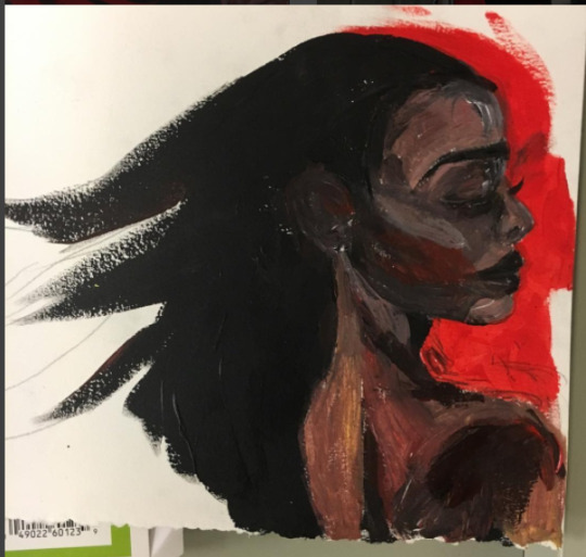
The sketch that was oral literacy created a foundation where colors to take over. It began with base colors reflecting the general tones of the various parts of the painting (or in this case literacy). The words that once exited people’s mouth were now stamped onto a page, and this created another dimension to literacy just like the paint added another dimension to the image. The painting looks like something altogether different from the sketch--and there is no going back. Just like one can’t erase all the paint from a page, one cannot recreate the realm of oral literacy. Adding a writing component to literacy altered the sketch that it began from forever. One could never hear a word without seeing it, and the stories that were once told everywhere were stamped to pages and made immortal. You can’t erase paint like you can erase pencil.
But what can you do with paint? You can paint over. Although the base layer of paint takes a lot to completely omit, you can hide it from view with another layer of paint. The base layer guided the further layers to come, and those layer were cleaner, more detailed, and truer to the image I was trying to create. The dark muddled browns of the base layer guided me to add highlights with pink and purple hues. The foundations of literacy guided the top layers of paint. The sketch demonstrated where I should paint what, but the base layer of paint allowed me to dive deeper and create a more complex and beautiful piece. So the beginning of writing helped guide further literacies. It wasn’t as obvious as adding a whole new layer of paint to the page, but the change was pretty apparent. The words that were only allowed for scholars spread to the middle class and even the poor in many places. Like paint spreading across a page literacy spread as well with more intricacies than ever before: different genres, different topics, different authors. The world of words that was once only open to the elite created a foundation for everyone and an expansion for what literacy is.
People probably thought that was as far as it could go. The canvas was covered in paint and the image was finished; what more was their to add? But there was another dimension that people had never imagined. Both my painting and literacy expanded beyond paper. I created images that sprouted from the page, and the world of literacy gained technology. Another dimension. Another medium. Another world.
With technology the entire realm of literacy changed. My painting is no longer just a painting and literacy is no longer what it once was. The introduction of typing, texting, making videos, and taking pictures created a whole new depth to literacy. It was another layer that was entirely connected (like the paper to my painting) and entirely separate, but the world of literacy today would not exist with the other layers--oral literacy, the beginning of writing, and the the expansion of writing.
And the thing with both my art and with literacy? Neither will ever be completely finished. I can always paint over or add another layer to my piece. I have no idea what else literacy can do, but I know there’s more. There’s always more.
2. Definition of 21st Century Literacies
The definition of 21st century literacy practice is that people are demonstrating power and change through the utilization of technology and globalization. Literacy is just like painting, you always paint over and continue to recreate.
Today’s literacy practices are a lot more complex due to the globalization of the world and the access to technology. However, today’s literacy practices stem from the same sources that literacy practices have always stemmed from: power and change.
Those that hold power create the literacy practice of society, all the way back to Ancient Sumerians. Today’s literacy practices just spread power so that literacy practices are stronger on an individual basis. Everyone’s voice (which is one’s power in many ways) can be displayed throughout literacy practices with technology and media. The president of the United States and “that girl in your writing class” both post their opinions on Twitter with the same limiting character amount. Yes, the popularity and visibility of their posts are very different–but their very power to share their opinion is the same. It goes back to what we read with Steven King in On Writing: writing is telepathy. It is the power to broadcast one’s thought from mind to mind, and technology has enabled that practice more than ever before.
Literacy practice has always been a demonstration of change, but with the rapid growth and innovation in today’s age; literacy practices are a symbol of change more than ever before. Walter Ong debated that people have lost oral literacy as a result of the rise of writing and reading in society. I argue that perhaps oral literacy is being transformed more than being lost. Instead of telling a story and getting replies face to face people are responding to each other comment to comment. The speed of that conversation is not being lost; it’s just morphed onto the screen. Tone of voice is not gone it is just being accessed through emojis and memes. Technology gives people the means to invoke and create change while being a metaphor of change through it’s existence.
Theory of Writing:
Every writing stems from another piece of literacy. There is no literacy without another literacy. This goes back to the history of literacy and how it was created, and to depict my theory of writing I created a painting that sprouted from my other painting. The steps of creating this painting reflect my theory and its’ outcome.
The next section of painting stemmed from the first. In this case I scanned my painting in and actually printed out a copy of it, but in the world of literacy it’s a lot less clean and simple (unless you plagiarize). Sometimes it’s very clearly that you’re using one piece of writing to create another piece of writing, like a summary or research paper when you actually ingrain source. I think it’s a lot more complex than that though. I think every subject you have a class on and every book you read has a role in what you write and what you say. Sometimes you consciously are aware of that, but a lot of times I don’t think you are. Ideas stick in people’s heads and they have a way of coming out in unique ways (especially in my head, I make the weirdest connections).
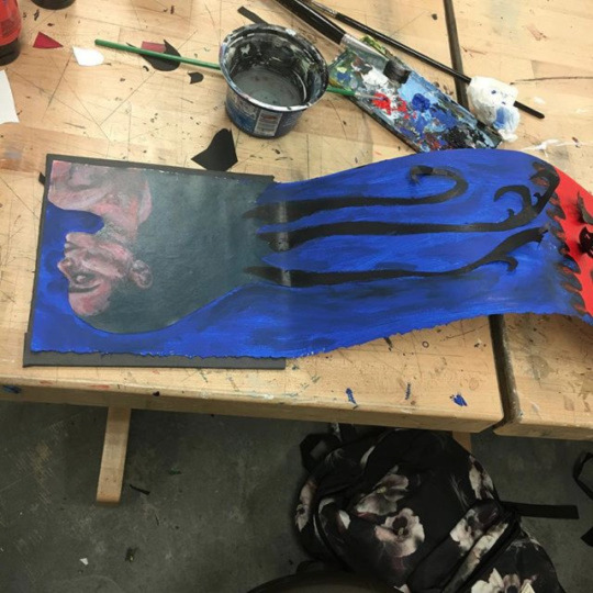
So sometimes the connection between one piece of literacy and another is clear like copy and pasting an image or quoting in a research paper, but sometimes something entirely different sprouts out from that connection. In the half of the artwork I created my original knowledge from the first half of the piece guided me in creating the second half. Based on what happened when I painted and glued on the first girls tendrils I had an idea of what to do for the second girl’s hair. I used the knowledge I already had to create something different--the connection was clear here (although a lot of the time it is not), but the outcome was different. From knowledge sprouts knowledge and literacy is pretty much a representation of knowledge. Take for example what you’ve learned in economics, my theory is that knowledge comes up in what you are writing in english class. That sounds weird and off, but I think your mind will apply what you just learned about supply and demand in regards to your topic of Shakespeare (obviously it doesn’t have to be those specific topics, but you know what I’m saying).
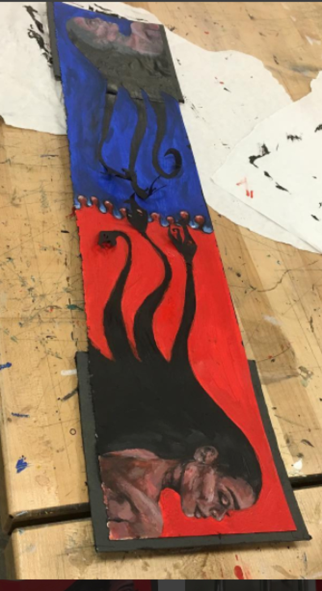
And just like I created art from art, literacy is created from literacy (art is a form of literacy, so I basically just said the same thing twice). Every topic, every reading, every movie, and every conversation will be a part of your literacy. It will be in what you say. it will be in what yo write. Maybe that’s just how the mind works, but literacy stems from the mind so there you have it.
2. How has your prior knowledge impacted your theory of writing? Has it helped it develop? Has it been a roadblock?
I think my prior knowledge has mostly been a benefit in creating my theory of writing. College has made me more and more aware of how one class effects another and how all of my knowledge is connected, like with my theory of writing. I would sometimes be dumbfounded at how much my very different classes connected. For example, I connected what I was learning about ancient Egypt in Art History to concept of pastoral in literary inquiry and business ideas I was learning in my information and analytics class. I never quite understood how connected all my knowledge was until this year. This class forced me finally understood these big ideas in an analytical way. I have concluded that the connections of my knowledge are just my literacy expanding, morphing, and connecting. That’s because everything I am learning is literacy, and I think the variation of literacy that I have been exposed to--art, math, people--has helped guide me in my understand of literacy and create my theory.
0 notes
Last Seen Blogs

annamariestasny-blog
Untitled
reiplebe
rei plebe

yeosferatu
The kindest vampire ever

chararts
Doodle Craze
reiplebe
rei plebe