#i had to let the cartoonyness free & took it out on them
Text
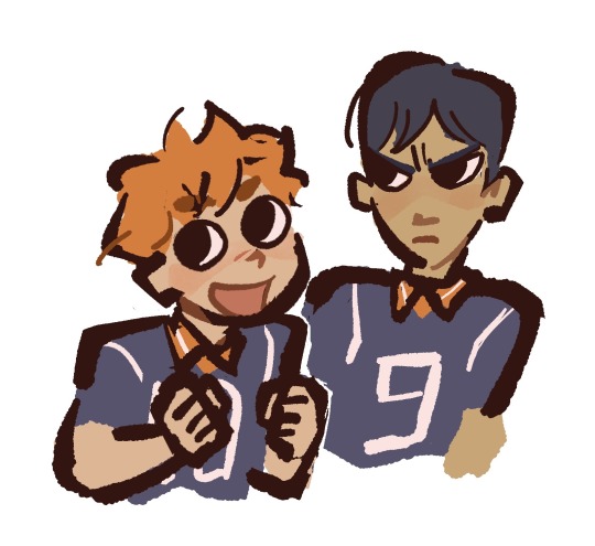
This is what bobas made of. Yeah think twice before you have it again
#i had to let the cartoonyness free & took it out on them#my rart#kageyama tobio#hinata shoyuo#kagehina#haikyuu!!
566 notes
·
View notes
Text
Art Analysis: Gorillaz, and How an Art Style can Lose its Edge.
Ah, Jamie Hewlett. My hero, and ultimate inspiration. I hear y’all praising Damon all the time, but I never would have gotten into Gorillaz if it weren’t for Jamie’s artstyle....at least, it was amazing. What happened though? How does Gorillaz in 2018 compare to Gorillaz in 2001? Well, lets take a look back through the history of Gorillaz.
Welcome to the first Art Analysis. I’ve wanted to do this for a while because, frankly, I haven’t seen many other people do it. Today, I’ll be talking about the art style of Gorillaz, not actually Jamie Hewlett specifically (bummer, right?) We’re going to analyze what made it great, and why, I feel, it has lost its magic. Remember, this is all my opinion. Even though your wrong, feel free to tell me your thoughts as well.
Phase 1:

(Early Gorillaz Concept Art)
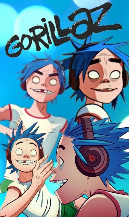
The Gorillaz was born when Damon Albarn and Jamie Hewlett expressed dissatisfaction with the modern state of mTV. The idea of having cartoon characters replace real musicians lent itself to be a vessel for great social commentary, but in order for this to work, the characters had to be distinctive. Gorillaz in phase 1 feel very at home in the early 2000s. Powerpuff Girls, Dexter’s Laboratory, and Johny Bravo all rocked the specific, thick-lined, angular, flat shaded style, and the Gorillaz followed suit. Many have pointed out how this style feels like a throwback to 50s UPA animation, and the Gorillaz use similar animation methods as well.
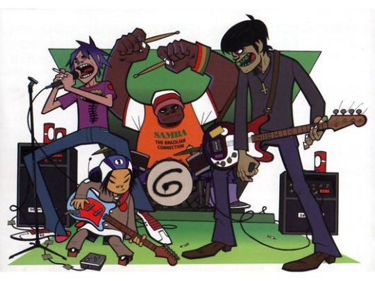
Let me just say that this is, in my view, the BEST cartoon style. Phase 1 Gorillaz art and animation felt more lively and slick. They had an over-emphasized cartoonyness that not only carried their message well but also contrasted beautifully with the dark nature of the characters. Jamie Hewlett’s work in Gorillaz phase 1 was his best work to date, outside of maybe Get the Freebies.

The Gorillaz in phase 1 also remind me a lot of urban vinyls, like those of KidRobot. This may be due to the smooth, flat colors and shading. It suits the more urban feel of their first album quite well. The Gorillaz fan artist Irina Bolshakova has mastered this style and deserves a mention because I think she is the greatest Gorillaz fan artist of all time. I often reference her work more than Jamie even!
Phase 2:
The most significant change in direction in terms of the Gorillaz artstyle, atleast until recently, was with the beginning of phase 2. Demon Days, as an album, have significantly different themes than the band’s previous outing. It was a post-911 world now, and gone were the innocent, chill vibes of Self Titled. The world just got a whole lot drearier and more paranoid. The cartoon network inspired style wouldn’t work for this, and changes needed to be made.

For starters, the characters became more gritty and detailed. They often looked worn out and ghoulish, like zombies, which was especially fitting. The thick lines, unfortunately, were diminished significantly, replaced with what almost resembles pencil lines, and shading began to use a gradient. It was often darker as well, making the eyes of the characters look sunken in and vampiric. Limbs showed more of a natural curve, and were less geometric, and muscles were more toned. The characters often felt stiff and spidery in phase 1, legs jutting out at exaggerated angles. They were often posed more naturally in phase 2. The colors in this art are often muddled and dull as well. To me, I describe the style of phase 2 as akin to walking into an old, dusty antique store.
While this style works very well for Demon Days, I feel like it was overall a downgrade. The characters feel less distinctive and eye catching. That may be why they are often seen wearing outlandish costumes in this phase, but I digress. The gothic feel of the album should be right up my ally, and, well, it is. I love this album so much, as well as D Sides. And I love the artstyle, don’t get me wrong. I just feel it changed too much and lost what made Gorillaz art so appealing to me in the first place.

Much like Irina is the best phase 1 Gorillaz fanartist, Lora Zombie gets the award for the best phase 2 Gorillaz fanartist.
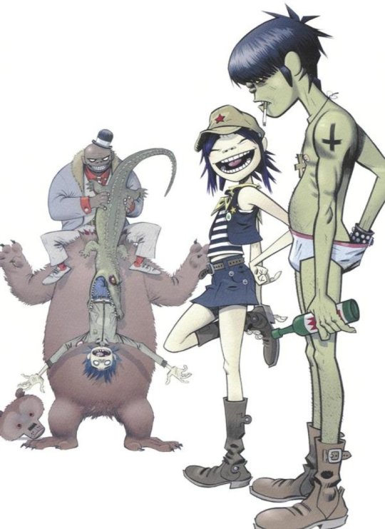
Phase 3:

Phase 3 marks the beginning of a downward trend in the artstyle’s evolution. Plastic Beach is a bit of an odd-ball album from them, and a hit or miss for many people. The style of the album was dramatically different then previous outings, transitioning from demons and self destruction to a “Gorillaz at Sea” carnival attraction. At least that’s how I would describe it.

With only 1 2D animated music video for this album, and considerably less promotional imagery than past outings, there isn’t as much to go off of. The first thing I noticed was that the pencil lines in Demon Days are significantly more pronounced, making much of the art look unfinished at points(ironic, considering Rhinestone Eyes). This clashes with the more dynamic shading , leading to a bit of a strange look. Perhaps this would look good with darker colors, but since this album is much more pop-y and upbeat, the colors are actually much brighter than past incarnations. It is also here that Jamie appears to loose a sense of consistence with his character designs. Most notably is Murdoc, who appears to have gotten some sort of jaw reduction surgery (something we’ll see more of in phase 4), and at some points looks like a racoon, as the dark circles around his eyes are often extremely exaggerated. Murdoc particularly looks distinctly different at different parts of the album. 2D’s issue in phase 3 has to do with magically reducing his age. In some art, he has very visible wrinkles and a receding hairline, but other times, he looks just as old as he was in phase 1.
Phase 3 is a dramatic drop in quality, and it feels fitting that this album led to a falling out between Jamie and Damon due to his art feeling underutilized.
Phase 4:

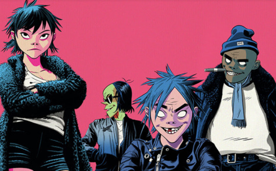
7 years after Plastic Beach, the Gorillaz make an admittedly lack-luster comeback. Not only was the music of Humanz pretty dull, but the phase 4 artwork in general was Jamie Hewlett at his worst. The first change was the abandonment of any sort of consistent outlining on the characters. I hate when cartoons do this; thick outlines are amazing! Why tf would you get rid of them? The characters in this album are designed to look very human like, with very human proportions and less exaggerated features.
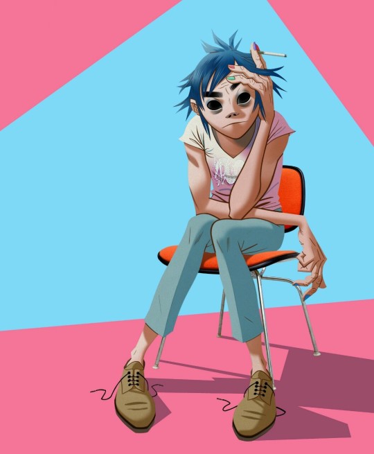
The style is unrecognizable. Eyes are smaller and less circular. Limbs are lankier and hands grosser. The classic “ape nose” seen in the past three phases and an iconic part of their design was shrunken and narrowed. Shading is more 3 dimensional, adding to the comparably realistic character designs. 2D and Noodle also joined Murdoc in getting jaw reduction surgery. 2D also grew back one of his front teeth apparently. And with this album, any consistency in character design is gone completely. I wouldn’t believe you if you told me that this:

and this:

Were the same character. What the hell? Phase 5 was a dark time for Gorillaz, and it shows, as not only the music itself, but the art also felt jumbled and inconsistent.
I feel like I should add, though, that while this is my least favorite Gorillaz artstyle, it is by no means a bad artstyle in general.
Phase 5:
It was with phase 5 that the Gorillaz started to look more like the Gorillaz again. It was also with phase 5 that Russel finally joined the jaw reduction club, but that’s besides the point. The Now Now was one of the best albums to come out of the Gorillaz, and that says a lot. It’s somber vibes were the score to my summer vacation, and were a breath of fresh air after the hot mess that was Humanz. The new art with this album took a different turn, feeling yet again like a throwback, not to UPA unfortunately, but to old fashioned comicbooks.

This style is marked by harsh shadows and flat, two-toned shading. Yes! Its about time you brought that back. Just like the album itself, the art gives a 70s vibe, particularly with the choice of color and tacky clothing. But a few things in this style don’t work.The body proportions of the characters are identical to real humans, and the hands and ears are considerably more realistic. This really bothers me, but at this point I’ve excepted that the Gorillaz aren’t just cartoon characters anymore. For the most part, this art is more consistent and stylish, and is a welcome change to the previous incarnation.
Having a damn good style for the Now Now is great and all, but I certainly miss what we had back in 2001. The Gorillaz are less underground now, and feel more consumerized, especially seeing as Noodle has an instagram, and I feel that the art has gone a similar route. I hope to see a bit more of that classic Gorillaz in the future, and I sure hope that the television show takes pointers from the OG Gorillaz. Until then, here are the artstyles of each phase ranked:
5. Phase 4
4. Phase 3
3. Phase 5
2. Phase 2
1. Phase 1
I hope to do more of these Art Analysis. This was really fun to put together.
80 notes
·
View notes
Last Seen Blogs

renaisnce
tragedy;

food-millions
All Recipes🍽
sofhtie
captain of everything she had ever wanted
notsethrollins-blog
burn it down