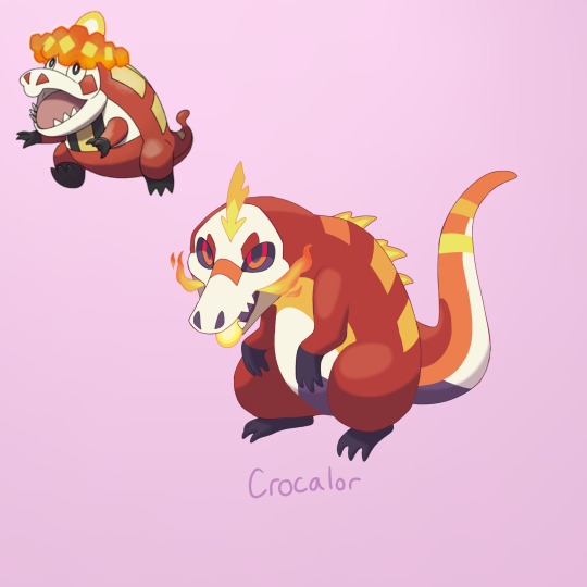
#crocalor redesign
Text
Ok so Fuecoco is perfection and Skeledirge is pretty badass, but Crocalor bothers me way too much. So I redesigned him to how I woulda if I was part of Gamefreak!

Lil guy…… Click for Quality!
#crocalor#fuecoco#skeledirge#pokémon scarlet#pokémon violet#pokémon scvi#pokémon scarvio#pokémon starters#pokémon redesign#fire type pokemon#crocalor redesign#aria draws#digital art#fanart#digital drawing#character design#Pokémon#fakemon
42 notes
·
View notes
Photo

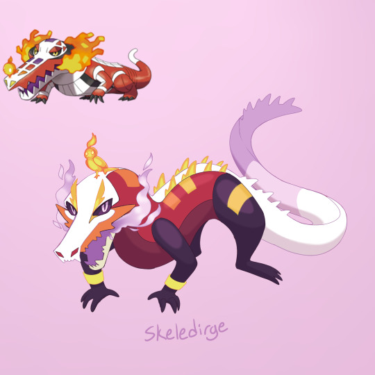
Pokemon Redesign #909-910-911 - Fuecoco, Crocalor, Skeledirge
2K notes
·
View notes
Note
did you see that Skeledirge's face markings are meant to look like a concert hall layout, with the bird being the lead singer
yes i did i found this out way late which lowkey upset me bc i couldnt tell until someone brought up all the possible design inspo. like i can see what they were trying to do but it completely went over my head which could totally just be me as i am known to miss the obvious but alot of paldeas pokemon are 'i understand the concept but the execution could be better' i wish it was more obviously a singer cause i only got that from the dex entry and when i got my ass BEAT by torch song like 3x over
#i didnt know the name was referencing a funeral song that one is on me i didnt know that word#thinking abt ginjaninjaowos crocalor redesign with its lil suit top... i want that for skeledirge#the concert hall layout and microphone bird is so fucking creative i wish id got it the first time round#asks#anon
49 notes
·
View notes
Text

Redesigned the Fuecoco line cause I will admit, I don't like it. The concepts are cool, but it seemed kinda lose and crowded, like too many ideas crammed into one design? So yeah, redrew it to fit my personal tastes and leaned a little more into the partial ghost typing on skeledirge cause why not
33 notes
·
View notes
Text

fuecoco line redesign scribbles,
i made skeledirge like an opera singer who holds the bird in a hamlet skull kinda way
#pokemon#pokemon scarlet and violet#fuecoco#crocalor#skeledirge#drawing#pencil#art#traditional art#hamlet#to be or not to be#pokemon redesign
30 notes
·
View notes
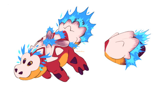
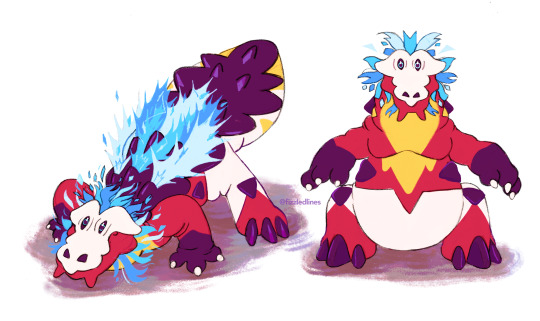
Text

redesigned crocalor grabbing some grub
155 notes
·
View notes
Note
Since it's been a while, could we have your thoughts on the other evos for the Paldean starters?
We'll go with the last two stages of the Quaxly line, as those are the only starters I haven't done yet:

Quaxwell isn't quite as unique of a middle evo as Floragato or Crocalor, as it doesn't have a distinctive visual element that's entirely its own (like Floragato's yo-yo or Crocalor's sombrero). With that said, it still avoids being nothing but a transitional stage due to its anatomy (not as humanoid as Quaquaval but not as duck-like as Quaxly) and its colors, which keep Quaxly's white and aqua but add a predominant darker blue into the mix.
Visually, I like the way the hand feathers are designed, and how the shape and patterning on them is mimicked by both the chest and the tail. I also like the simple limited color palette, with the light blue drawing attention to the face/eyes and a bit more on the chest and tail to draw the color through.
The one thing that bugs me about the design is the "hat" on top. It feels weirdly bulbous compared to either its evo or pre-evo due to how high up it goes, and the hard highlight makes it look bizarrely plastic-y. Something about the blue on the feet also bugs me, probably just because it feels rather arbitrary. Aside from that, it's solid enough and makes the direction the line is going in clear.

Thankfully, Quaquaval is a carnival dancer and not some kind of conquistador, as was my original fear when trying to guess what direction Quaxly would go in. It's also a peacock, something more obvious when its "aqua feathers" are spread out:

I like what they were going for overall here. The dancer theme is clear enough but not overly on-the-nose, and combining a peacock with the festive costumes worn during carnival makes sense. There's also a fairly clear through line with it and its pre-evos.
With that said, though, I do have two major issues with this design. First, the anatomy is pretty wonky. You have fairly humanoid legs that lead up into a duck pelvis, which then abruptly joins with a more humanoid torso at a 90 degree angle, almost like a centaur. It's bizarre to say the least, and really makes it look stranger than it should. Here are two fan redesigns that give it proper bird legs that I'm rather fond of:
The colors also bug me a bit. The red feels extraneous, especially on the coot feet, where it only serves to draw more attention to the toes of all things. The dark blue also feels a bit too dark—I would've preferred something closer to Quaxwell's palette— and it's strange to have white only in the neck area and nowhere else. I'm also not fond of the wing-hands, which look a bit broken compared to Quaxwell's, and I feel like the string of tail feathers at the side aren't needed.
Overall, the line has the right idea and some interesting concepts, but unfortunately some funky anatomy really holds it back from being fantastic.
Also, shoutout to its running animation. They didn't need to make it that funny, but they did and I respect that.
66 notes
·
View notes
Text
hello darlings, funny how this is my first post and it's just about me talking about being on the grind for redesigning the disappointment of the starter evolution line —
i understand that the pokemon the designers put a lot of effort into many of the designs but come on, crocalor and skeledirge could've been so much more unique, why must they do my son fuecoco like that.
#character design is one of my biggest hobbies so seeing the potential some of these designs could've had is a bit disappointing#pokemon#pokemon scarlet and violet
2 notes
·
View notes
Text
fuecoco is SOOO cute i really wanted to try my hand at redesigning its evolutions for funsies :)
Crocalor has fire blasters in the spikes on its bone-like shell that help it move at a terrifying speed in the water. Crocalor can control which blasters it sets off, allowing it to use death spin on its prey (you know, like crocodiles do). The fire tarnishes the bone shell and by the time it evolves into skeledirge the shell has turned black from the soot.
176 notes
·
View notes
Last Seen Blogs

anaaremereblog-blog
Ana Are Mere Blog

stewupdate
stewupdate

anomalous-photographer-blog
I told you not to trust me.

neozcovr
Taecovr

waitnoimdying
never never never