#but I redesigned them to fit Simon better and to fit it my style
Text
Tattoo flash sheet inspired by Simon "Ghost" Riley (2022) because I hate the ones they gave him in the game 😇

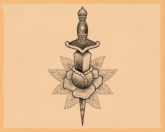
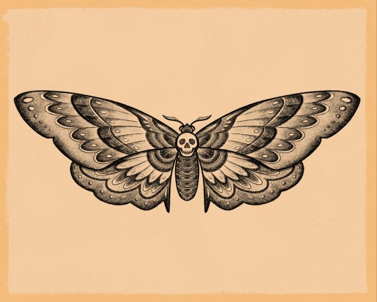
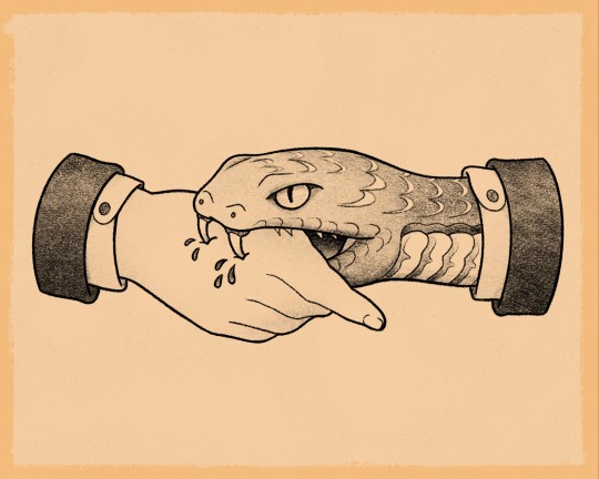
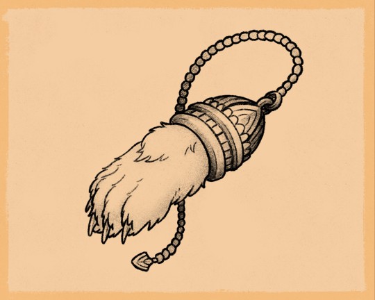


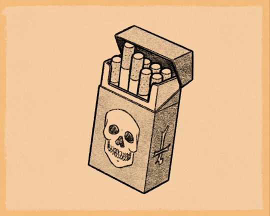

#the little flower in the spiderweb is a drawing by Joseph#simon riley#ghost#simon ghost riley#art#mienne#cod mw2#modern warefare ii#tattoo#tattoos#flash sheet#flash tattoo#if you want to use these designs to be tattooed on you than that's fine BUT please tell me and show me the pic!!!#also#ask me beforehand and I'll be able to get you a high res image withou the background so your artist has an easier time stencilling it#the designs aren't all very creative#a lot were inspired by existing tattoos#but I redesigned them to fit Simon better and to fit it my style#ghoap#ghostsoap
1K notes
·
View notes
Text
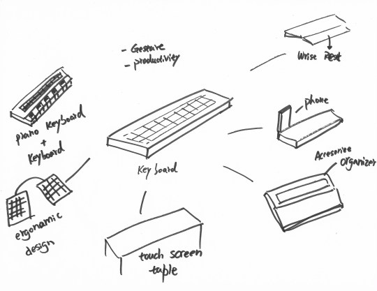
PD3 Blog WK1
Short Answers
In the video “How Great Leaders Inspire Action”, Simon Sinek pointed that great leaders in different areas have a common way of thinking, which is the golden circle theory. The theory claims that inspiring leaders think the way follows by Why, how, and what order, not what, how, and why.
My initial “why” starts with problems that we have encountered in our civilian daily life. We are not living in a perfect world where there is nothing to be fixed. The world has been developed very fast, and everyday we have new technologies invented, fixing tons of problems. However, new things bring new problems, we are always, and will be always dealing with different problems. But why am I focusing on civilians? Of course I’m not saying that a super rock star, or a president of a country is not as important. My point is that civilians are the majority of the people. By helping them fix problems, I help the majorities, i fix the majority problems. And even people like super rock stars or a president would have to eat, drink, and sleep. So they also have a side of civilian life style. On the other hand, by designing for the civilians, I mean I will not design weapons, firearm, or anything that will threaten any other’s life.
By fixing problems, I believe that good designs can help people improve their lives. I choose my topic because I believe that:
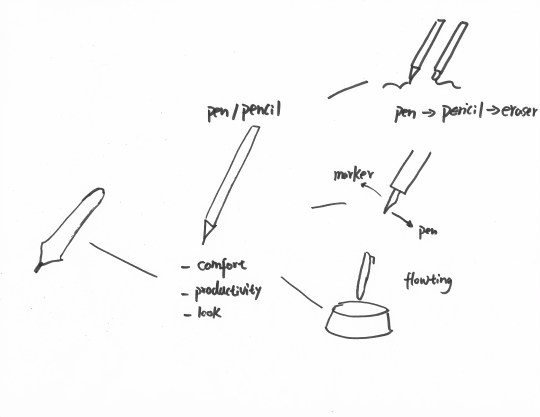
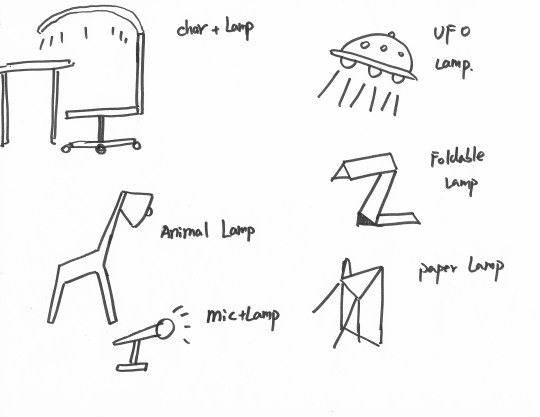
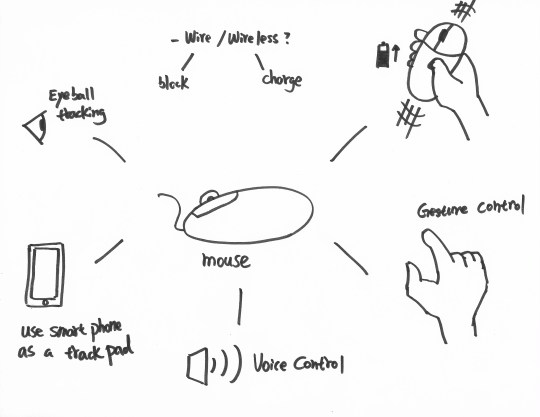
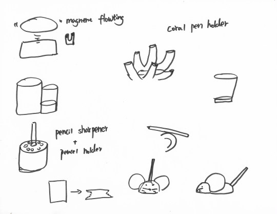
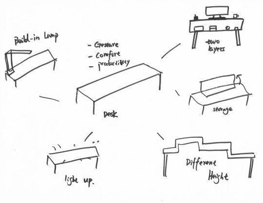
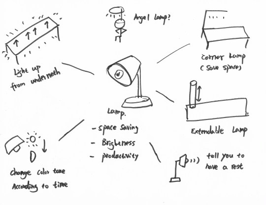
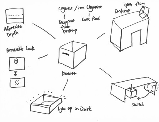
1) the working space for office, especially the desk space is limited. What if I can design something that organize the desk space better? If the space is saved, can people working in the office improve their productivity?
2) some of the office equipments or accessories are not well designed. Is there any possibility for me to redesign them better? So the productivity of my users could increase?
In the readings about the new HP printer, I really like the sentence “A printer is no longer just a printer, but also representative of a lifestyle and identity.” Actually, not only printer, a lot of products have no longer play only functional roles in modern time. Due to commercial competition and technology development, “This product works” becomes the very bottom line of a product now days. Customers are seeking for something that works, feels, and looks right to them.
In this article, Ken Musgrave also mentions that as a designer, it needs the ability to picture yourself in somebody else’s life. I totally agree with that. Designers are suppose to designer something for someone or some groups. Maybe it is not possible to have a designer to become one of the target users at once, but it is possible to at least try to imagine what kind of life they are living in. This is a designer's primary job.
Competitive Products And Targeting Design Aesthetic
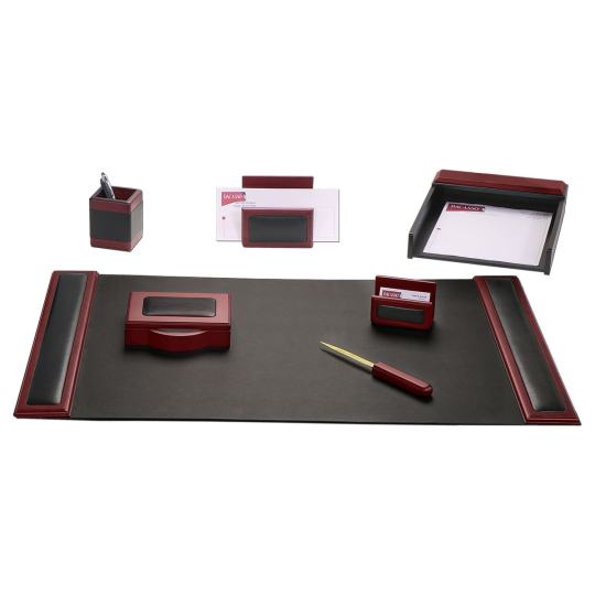
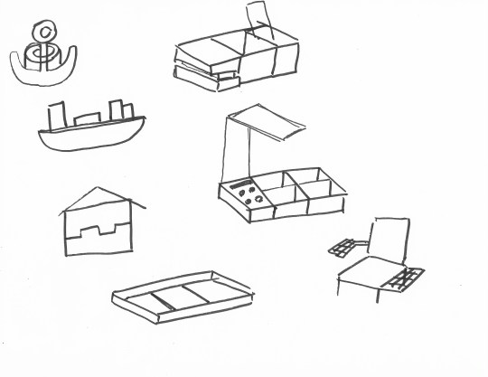
A set of office accessory organizers. Good Aesthetic but too many of them. Maybe we can make less them and more compact.

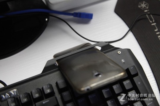

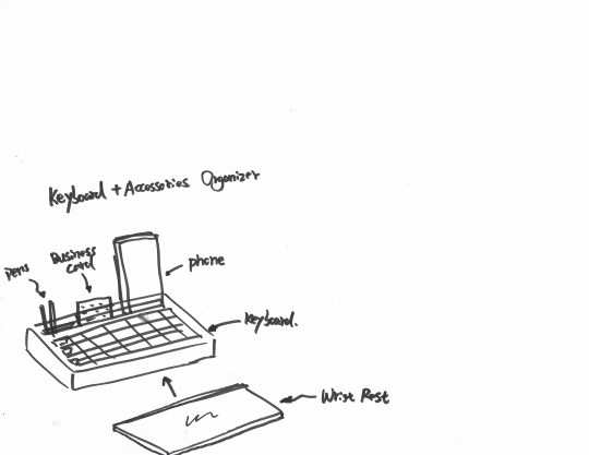
A keyboard designed with phone holder build-in, but the size doesn’t fit. Maybe it’s only designed for one certain brand of cell phone. However, this problem is fixed by a simple solution by the user, insert the phone in between the keys.
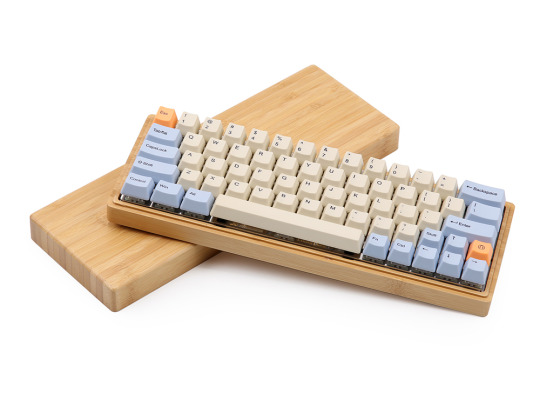
A keyboard made with bamboo. Simple and light design. It fits in office very well.
List of retail spaces I could visit or research:
Office depot
Best buy
staples
Initial user exploration
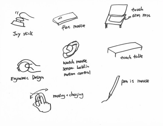
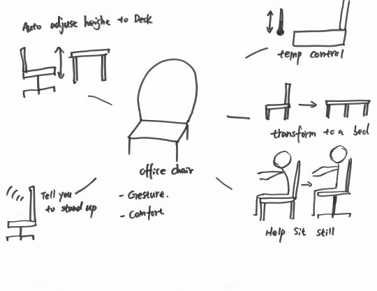
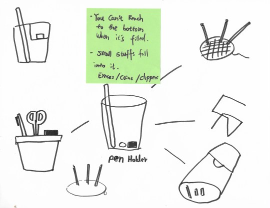
My user group perhaps is the office workers who mainly spend their most working time in the office, on the desks. Because these group of people spend basically all work time on a office desk, I’m going to solve some problems on the desk, design something on the desk. The users under this category are hugely relied on computers, tablets, pens, and papers on the desktop. The biggest problem might be desktop space management, brightness of the working environment, sitting gestures of sitting for a long time.
List of potential users
1. Auditing, Accounting, Consulting, Insurance agent, Financial Analyst, Banker.
2. Designer
3. Customer Service, Sale Representative
4. Engineer
5. Office Administrative Assistant
6. Medical Office Worker
7. Movie, Audio Editor
Design Sketches

1 note
·
View note
Text
Eco Wedding Tips - Save Money, The Environment and Look and Be Beautiful
Eco-Friendly Sustainable Wedding Resources - Save Money, The Environment, Beautifully!
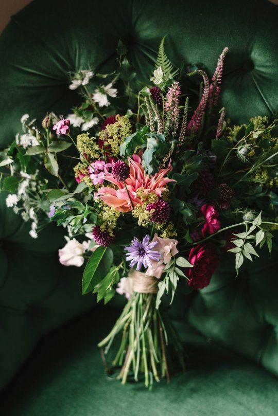
Looking for eco-friendly wedding ideas? Planning a green wedding doesn’t have to be hard. Reduce wedding waste, find second-hand wedding dresses, and look for other easy ways to have a sustainable wedding. The environmental impact of weddings is huge and we should all do our part to help. Here are a few ethical, eco-friendly, zero waste ways to say ‘I do’. Consider this as a guide to spend less, giving more and getting more in the end. Don’t get sucked into the idea that ‘bigger is better’. The cost of your wedding does not do anything to make your marriage last longer. But it CAN destroy your budget and have a huge carbon footprint.
The Rising cost of weddings
Did you know that the average cost of a wedding has risen to almost $30,000 in the United States? Considering the pressure many couples are under to throw an elaborate wedding, many people are left wondering how they can afford to tie the knot. However, there are many ways you can save money and still have a beautiful, luxurious wedding. I've been to a few weddings that went "all-out". Those weddings were actually less beautiful and the experience less appealing than weddings that were mindful. I much rather have a tree planted in my name than a bag of chocolate-covered almonds initialed in gold lettering.

Check Out Our Favorites Ways Below!
You don’t have to be a hardcore Greenie to appreciate the allure of a wedding in the midst of rolling meadows, botanical gardens or forested hillsides. You can double your venue's green quotient by selecting a site managed by a non-profit organization that protects the land—or sea! In Florida, Tampa Bay Watch is doing invaluable work through their restoration of wildlife habitats, education programs, and cleanup efforts. Your rental fee goes directly towards ensuring they can continue to preserve and protect these waters for future generations.
Eco-Friendly Wedding Tips
Planning an eco-friendly wedding can be fun and leave you with a feeling of satisfaction for your minimal impact living. It won’t be quite as easy as calling your local wedding planner, unfortunately. Here are a few tips to get you started on your road to your low carbon footprint married life!
Purchase Eco-friendly Wedding Rings
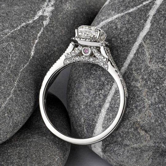
The amount of money and human labor that goes into supporting the precious metals and diamond industries is immense. Many diamond-mining organizations have come under fire for the mistreatment of their workers. Natural resources are slowly becoming depleted as more people want to own precious stones.
Promote sustainability and the proper treatment of workers by purchasing wedding jewelry made from recycled materials. This jewelry is often more affordable than other diamonds and wedding bands. Check out the sustainable wedding bands from AU-Rate. They use only 100% recycled gold and all pearls and gems are purchased only from ethical sources. From family-run pearl farms to strict working conditions in gem mines, they focus on producing beautiful jewelry with strong ethics.
Another sustainable jewelry idea is to upcycle an old family heirloom. Have an old piece of jewelry that has been passed down your family for generations? Reuse parts of old heirlooms, including gems, diamonds, and metals, to create a piece of jewelry with a unique family history.
Resources:
Taylor & Hart
Aurate
Noemie
James Allen
Catbird
Fair Trade Jewelry
Plan a Recycled Wedding
Thanks to many eco-conscious and economical brides, there has been a recent boom in websites that allow brides to “recycle” parts, or all of their wedding. Brides who have just recently said ‘I do’ often sell their gently used decorations, wedding invitations, and even their wedding dresses. Second-hand clothing is the cornerstone of eco-friendly fashion!
Browse through the offerings on places like eBay and Craigslist and find huge savings on everything you need for your wedding. Thanks to the internet, you can incorporate beautiful secondhand pieces into your own wedding. This saves you money and prevents these good-as-new items from simply becoming trash. Check out Bride2Bride.com for second-hand wedding dresses!
Eco-Friendly Wedding Planners:
Greater Good Events
Green Wedding Professionals
Eco Cult Directory
Select an Eco-friendly Wedding Venue
An eco-friendly wedding venue saves you a great deal of money. It also drastically reduces the carbon footprint of your wedding. Many large venues, including hotels, banquet halls, and reception areas, require a large amount of electricity. All the lighting, sound systems, heating, and cooling are not a great choice for the environment. Host your reception outdoors to reduce the need for constant lighting and energy usage.
You can also host your ceremony and reception at the same venue. This way, guests don’t have to waste gas traveling from one location to another. This is not only on my list of green wedding tips but also on my list of ‘make everyone’s life easier’ tips!
If you must host the ceremony and reception in two different places, consider renting a shuttle or other form of eco-friendly transportation to take people between the venues. This will mean fewer vehicles on the road and a decrease in harmful emissions.
Eco-friendly Wedding Venue Resources:
Eco-Friendly Venues
Sustainable Wedding Venues
Green Building Information Gateway
Ceremony and Reception Sites
Consider Registering for Donations
Simplest of all the eco-friendly wedding tips I want to share is to ask for money for a green cause! Committed to making a difference in the environment? Have guests make donations in your name, instead of purchasing gifts for you through a registry. Many charities offer donation cards that you can fill out and send to wedding guests, which indicates that you would like them to make a donation in lieu of giving a gift.
There are plenty of great eco-friendly charities that focus on protecting the environment and the earth’s species. Some of my favorites are the World Wildlife Foundation, Rain Forest Action Network, Conservation Fund, American Forests, and Greenpeace.
Donate Leftover Wedding Food
When it comes to weddings, the mentality is often that it is better to have too much food than too little. With hors d’oeuvres, cocktails, appetizers, entrees and desserts, there is often a large quantity of food leftover after the reception. Choose local food and donate leftovers instead of simply wasting it.
As food decomposes it releases methane gas, a toxin that is 20 percent more harmful than carbon dioxide. Help cut down on methane release by donating food to organizations such as America’s Second Harvest Food Bank, City Harvest or other local food kitchens. Food waste is a huge problem in this country, however, there are many ways to reduce your garbage output and prevent your wedding from contributing to it.
5 Things You Need for a Green Wedding
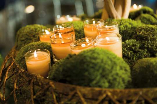
Many green wedding supplies will be bought second hand or borrowed from friends and family. There are, however, a few items that you might want to buy new. Choosing eco-friendly wedding items will seriously reduce your carbon footprint. Here are a few of my favorite suggestions:
Biodegradable confetti. Don’t throw things on the ground that won't biodegrade, even if you ARE getting married!
Paper straws are a great alternative to plastic for your beverages. No straw is great too, but, some people really do love those things!
Eco-friendly paper lanterns. You can find ones that are 100% biodegradable which I think is totally cool.
Disposable Wedding Plates made from sustainable materials. Find compostable tableware free of dyes, bleaches, or other harsh additives. A great alternative to single-use plastic.
Eco-Friendly Wedding Dress Ideas to Consider
If an earth-conscious wedding dress brings to mind an ill-fitting hemp garment, you couldn't be more wrong. Whether vintage, or made of organic materials, eco-friendly dresses take on many styles and couldn't be more beautiful. And in an increasingly green environment, there certainly isn't a shortage of options. Where to start? Consider the following:
1. Re-wear a gown, such as your mother's — even better because it has sentimental value. If you're not a fan of her '80s-style sleeves, take it to a seamstress to redesign the look. Or, you can buy or rent a pre-worn gown.
2. Take re-wearing a gown to a new level and go vintage. Check out consignment shops or vintage boutiques. You might get lucky and find something one-of-a-kind.
3. Look for a dress made of organic fabrics, such as organic cotton, organic silk, or peace silk. A dress made out of recyclable materials can also do the trick.
4. Choose a designer that creates sustainable gowns, whether it's by hand-making the dress or supporting women in developing countries. Need some options? Try any of these designers...
Organic Wedding Dress Designer Resources:
Daughter of Simone
Indie Bride
Leila Hafzi
Deborah Lindquist
The Cotton Bride
Sustainable Wedding Shopper-Stylist Resources
Sustainable Brides
Ethical Weddings
Green Wedding Designs
Is a Green Wedding Right for You?
Plan a green wedding to save money and the environment. You can promote sustainability by finding innovative ways to reduce the carbon footprint of your big event. It is easy to incorporate eco-friendly elements into your wedding. That way, you and your soulmate can start off on an eco-friendly life together. I hope these eco-friendly wedding tips will help you in planning your own special day! Check out Bridal Guide for more wedding planning tips! Have any other green wedding tips to share?
0 notes
Text
Game 333: Waxworks (1992)
The box CamelCases the second “W” but the title screen doesn’t. There’s a similar issue with whether the company is called HorrorSoft or Horror Soft.
Waxworks
United Kingdom
HorrorSoft (developer); Accolade (publisher)
Released in 1992 for Amiga and DOS
Date Started: 11 June 2019
Waxworks is the fourth major title from HorrorSoft, after . . . A Personal Nightmare (1989), Elvira: Mistress of the Dark (1990), and Elvira II: The Jaws of Cerberus (1991). (It is also the last; the company would re-brand itself AdventureSoft in 1993 and from then on publish essentially nothing but Simon the Sorcerer entries. That annoys me a little bit. I mean, “AdventureSoft” is too generic a name to be taken up by a company that just publishes one series. They should have called themselves “SimonSoft” and left “AdventureSoft” for a developer with a more diverse catalog.) I think I could make a case for the game not really being an RPG, but part of me is curious to see how the developer does without Elvira as the game’s centerpiece. I never really cared for the character, which I’m sure dragged down my enjoyment of the two previous titles.
Like the Elvira games, Waxworks is fundamentally an adventure game that does offer RPG-style character development, combat, and inventory. The interface is slightly redesigned from Elvira II. (The engine is called AGOS, a graphical version of an open-source engine designed for MUDs called AberMUD.) The system of health to individual body parts has been dropped, as has the useless beating heart. The compass is moved from the lower-right to the left, and character stats are on the bottom rather than between the two main windows. A control panel of icons in the upper-left lets you check inventory, manipulate objects, ready weapon, and attack.
I bought the GOG version and was confused for a while until I looked it up and discovered that the game came with two manuals, one of which GOG doesn’t offer. The second, The Curse of the Twins, explains the backstory in 13 pages of text by Richard Moran, who also wrote the manual to Star Control II.
The backstory casts the unnamed protagonist as a twin whose brother Alex disappeared when they were teenagers. They had been exploring an old mine. The siblings lived in the seaside town of Vista Forge, where their rich, eccentric Uncle Boris built a wax museum in his creepy mansion. Now an adult, the main character has returned to Vista Forge to attend Boris’s funeral. All kinds of mysterious signs, portends, and disasters accompany the trip, including the collapse of Boris’s grave, and disappearance of his coffin when a sinkhole opens beneath the cemetery. During the chaos of this event, the protagonist thinks he briefly sees Alex in the mine tunnels that run under the cemetery.
The hallways of Uncle Boris’s waxworks.
The protagonist remembers a tale that Uncle Boris once told, about a family ancestor who caught a witch named Ixona stealing one of his chickens. In retaliation, he chopped off her hand, for which Ixona cursed the family: “In every generation in which your family bears twins, one shall belong to Beelzebub.” The curse nearly immediately came true, when one twin son of the family became Vlad IV of Walachia, or Vlad the Impaler, who lived up to his name by tracking down and impaling the witch. Generations later, other twins in the family included Torquemada, the Marquis de Sade, and a female witch burned at the stake in Salem. [Having lived in Salem, I am obliged to point out with indignation that no accused witches were burned in Salem; they were all hung, except for one who was crushed under rocks. Also, they were all innocent.] It was these very individuals that Uncle Boris chose to populate his waxworks. Determined to lift the curse, Boris also funded a dig at Vlad’s castle in Walachia and recovered a crystal ball from the impaled corpse of Ixona.
The character enters the tunnels and returns to the location where Alex disappeared, finding evidence that someone has been living in the tunnels, eating bats and fish. The next day, at the reading of the will, the character inherits Boris’s estate. A letter left by Boris indicates that Boris knew Alex was still alive, and possessed by evil, and that the character can save him by using the waxworks to travel back in time and undo the curse.
Uncle Boris’s creepy, disembodied head speaks to me from beyond the grave.
The game begins at the door to the mansion, with Boris’s butler inviting the character in. The butler gives the protagonist (whom I guess I’ll describe in the first person from now on) a crystal ball in which I see Boris’s face. He tells me that I must use the waxworks exhibits to enter the worlds of the previous twins kill them, “destroying the power that feeds the curse.” I then find myself in front of an Egyptian exhibit. The Egyptian siblings technically predate the curse, but one of them was evil, which gave Ixona the idea in the first place.
Death is only the beginning.
I move throughout the mansion. Given the backstory, I expect to find exhibits depicting the Spanish Inquisition, the Salem Witch Trials, Dracula, and perhaps even the persecution and assassination of Jean-Paul Marat as performed by the inmates of the asylum of Charenton under the direction of the Marquis de Sade. But I guess those were just examples. What I see instead are:
A mine being overrun by a mutant plant
Did that happen in this town? If so, the authorities sure hushed it up.
Jack the Ripper approaching one of his victims with a knife
You’re not even stabbed yet, woman! Don’t swoon–run!
A bunch of zombies lumbering through a graveyard
I’m not sure this event was “historical.”
There are other closed curtains throughout the museum. I’m not sure if they’ll later be opened and reveal other exhibits.
I wonder if I’m supposed to take these on in a particular order, but the game has me covered there. I turns out I can talk to Boris by clicking on the crystal ball. He tells me that no, it doesn’t matter what order I choose–all of the scenes need to be “cleansed.” I realize later that talking to him has cost me “psy” points, so I’d better save it for when I’m really stuck.
. . . except that I’ll be Level 1 for the first one and like Level 20 when I go to the last one.
I decide to go in chronological order, although I’m not entirely sure where the graveyard fits into it. My best guess is that the order is Egypt – Graveyard – Jack the Ripper – Mine. Thus, I head back to the Egyptian exhibit and choose “Enter.”
A couple of flashes of light later, and I’m in a pyramid. A nearby room shows someone labeled “pyramid designer” stabbed in the back, his body hunched over a table. A piece of papyrus underneath the corpse has an image of Anubis and a set of nine hieroglyphics.
Some kind of puzzle already.
The room is full of baskets, jugs, pitchers, and other objects, and it turns out that, just as in Elvira II, you can pick up just about everything. Unlike Elvira II, there’s no spell system here that’s going to make use of all these items, so there’s probably no point in loading up my inventory. I do it anyway, mostly because I want to see if the 16 items the window holds are all I get, or whether it scrolls. It turns out that it scrolls. At this point, I realize that I can’t figure out how to drop things. Clicking and dragging them back to the environment doesn’t help. The manual says that “Drop” is supposed to be an object action when I click on an object, but it never appears. I hope there’s no limit to my inventory, then. I walk out of the room with a scarab beetle brooch (found in a chest), a dagger, a lamp, a bowl, a beaker, a stylus and ink block, two pieces of papyrus, three baskets, six jugs, a jar of oil, and a mat.
The scene in the first room. Most of this stuff will end up in my inventory.
Returning to the hallways, I start wondering if I’m going to have to map. I decide to try following the right corridor first, and if I get lost or confused, then I’ll map.
I turn a corner and meet a pyramid guard with a sword. Combat hasn’t really changed since Elvira II, either. You hit the sword icon to activate your readied weapon, then click in the screen itself to indicate what part of the enemy you want to target. The guard defeats me three times in a row.
And here’s where we learn that Horror Soft did not skimp on its customary gruesome death screens.
Finally, on the fourth time, I manage to kill him–with no hit points lost. That suggests that luck is going to play a big role in combat. From this one battle, my level increases to 2. I also get the guard’s sword.
As I walk, I realize I’m getting 1 experience point for every square I’ve never stepped in before. I soon go to Level 3. This is accompanied by an increase in maximum hit points.
Continuing down the hall, I meet another guard, who also slays me two times in a row. I finally kill him on my third try. I hit him about five times for every time he hits me, and I do hundreds of points of damage to him. These guys are tanks. I begin to wonder if I was really supposed to level up in one of the easier scenarios first.
At this moment, let’s pause to note that the graphics are quite nice. Many are animated, which isn’t coming through in these static shots. But the only sound effects I’ve experienced in the game are the swishes and thuds of weapons connecting in combat. There’s music, but it’s loud and relentless and I turned it off.
This guy was a little easier. He looks easier.
After picking up some piles of sand, I meet a new enemy: a priest with a dagger. He dies a lot easier than the guards. At the end of a corridor, at a statue, I find a tuning fork in a pot. But it isn’t long before yet another guard kills me. I reload, kill him, step a few paces past him, and find a little pond. There, a crocodile kills me while I’m trying to fill a jug with water. Man, this game is rough.
Reloading, I walk a few paces past the crocodile, then meet an Egyptian guy with a spear:
The problem is that hit points don’t seem to regenerate automatically as you move. It occurs to me that Uncle Boris might be able to help. I contact him and, sure enough, using the bits of papyrus and pen that I picked up, creates three healing scrolls. Each one seems to heal 10 hit points. They don’t really help: the spear guy destroys me in two stabs.
I start paying attention to the statistics, and when I finally kill the bastard, I’m convinced the game is just making things up. When you strike someone, the box in the lower-left corner tells how many hit points of damage you’ve done. There were times that I hit the guy for over 200 points in multiple blows and he didn’t die. When I did finally kill him, it was after maybe 80 points of damage.
I come to a treasure room! Too bad that’s not why I’m here. Five pots, a weight, two cat statues, a golden calf statue, and a tile all join my overflowing inventory.
In a real RPG, there would be lots of cool stuff in a room like this.
I soon come up against a thick glass panel. Nothing will smash it. This sounds like a job for the tuning fork! After 15 minutes of rummaging through my stuff, I find it–somehow I accidentally put it into a basket. I use it and the glass shatters and collapses.
A few paces on, two blades come out of the ceiling and kill me.
Okay, it turns out that the blades are the result of a trap, indicated by the presence of a very thin piece of string stretching across the corridor. I’ll have to watch for those in the future.
I finally make it to a set of stairs upward, where I’m confronted by a puzzle: a pentagram with the number 0 at each point, plus four numbers (1, 3, 4, 6, 7) at each intersection of lines. Clicking on any of the 0s causes them to cycle through numbers 1 through 9, but it also starts an hourglass timer at the bottom. If I run out of time, as I did the first attempt (before I realized the hourglass was even running):
The mechanism by which this happened is unclear to me.
My guess is that it’s like a magic square: each line has to add up to the same number, with no number being used more than once, including the ones in the middle. That means I have to make do with 2, 5, 8, 9, and 0 at the points of the pentagram. It doesn’t take me long, though, to realize that isn’t going to work. The best I can do with no repeating numbers is make the totals come out to 16, 17, 18, 19, and 20.
So I focus on just getting them to add up to the same thing period. I spend some time messing with it in Excel and I finally come up with the answer, but I’m unsatisfied with my method. I know there’s a way to do it algebraically, and I just couldn’t figure it out. Solving math puzzles via trial-and-error never seems right. Anyway, I go up to Level 6.
Caught it just as the door was opening.
A few steps down the corridor and:
How did I end up barefoot, exactly?
I think I’ll leave it there. So far, it seems like a brisk game, but much like Elvira II, the RPG elements are unsatisfying. The deaths are kind of funny, but I wouldn’t be laughing if I prized myself on low reload count.
Time so far: 3 hours
source http://reposts.ciathyza.com/game-333-waxworks-1992/
0 notes
Text
20 Best New Portfolio Sites, June 2017
Welcome readers, it’s June, and the Brutalism bug is back. No, really. After disappearing into the phenomenon I called “post-minimalism”, plain old Brutalism seems to be making a comeback.
Oh, it’s had a few refinements; good designers would never let their brutalist sites actually look bad. But the underpinnings of the style are definitely there, and present in more than a few of this month’s entries. Beyond that, it’s a fairly varied assortment of portfolios for you all to dig into. Enjoy.
UI Viking
Our first entry this month is actually from a designer we’ve featured before, only he’s gone and redesigned his portfolio. The inimitable UI Viking brings us a star-studded design that’s just plain loaded with color, personality, and illustrations of a badass viking. In space. In true commitment to the joke, things like “continue reading” buttons on the blog say “Kill This Post” instead. The contact form says, “ODIN OWNS YOU ALL! I’ll respond you ASAP… between robberies and lootings.”
Overall, it’s a great-looking site that—despite the inherent simplicity of the layout—is just overflowing with personality. You’ll never mistake it for being anyone else’s work.
Nick Jones
This is the first time I’ve ever seen a website designed around a golden spiral. Nick Jones’ portfolio is exactly that, and it feels ingenious. Hit the down arrow on your keyboard (or click any of the content cards), and you’ll spiral right on into his site, giving the experience a weird feeling of depth.
It’s playful too. Go to the site and hold the up arrow. Just try it out. The whole site is pretty, though the text might be a bit small. It also loses points for not letting me use my scroll wheel to move into the site. I mean, it’s the one kind of site where I might forgive scroll wheel hijacking.
On the other hand, it gets massive points for having a more accessible version that is linked to right at the start.
Senthil
Senthil’s portfolio just about makes me nostalgic for the days when everyone wanted their site to look like Apple’s. Oh, this is by no means a rip-off, but the influences are certainly there. It actually reminded me of the beautiful things inherent in this kind of minimalism: the perfectly distributed white space, the type, the focused use of imagery…it’s all there, and it all still works.
Rick Waalders
Longtime readers of this series will know how I feel about the over-use of animation, and how that can affect accessibility. On the other hand, there’s something to be said for just going all in like Rick Waalders.
The site looks good, with solid type, plenty of contrast for the dark layout, nice color palette… oh, and the huge spinning 3D thing that stays with you throughout the whole site. Every element is pretty much animated out the wazoo. In a weird way, it works. I guess if you’re going to create an experience like this, you may as well commit.
Doberman
Doberman is a design firm that likes to mix things up, apparently. Their use of collage-style layout, color, and typography combined leave me feeling like the site is a mix of post-minimalism and brutalism. It’s not often you see a designer successfully tie two bandwagons together and charge ahead at full speed, but that seems to be what happened here. The clash of styles is surprisingly effective.
Leszek Juraszczyk
Leszek Juraszczyk’s portfolio is almost aggressively post-minimalist. From the monospaced type to the bare-bones layout, to the near monochrome palette, it hits all the right notes. It also looks refined, and elegant even, with some of the imagery overlapping other elements to give a sense of depth. This is everything ’90s print designers dreamed of when they started designing websites too.
Roger Burkhard
Roger Burkhard has opted for a horizontal layout to showcase his projects in a somewhat brutalist—but still good-looking—design. As this style permeates the rest of his work, it seems appropriate.
Mario Hugo
People involved in the arts seem to adore masonry layouts and serif-laden type. Mario Hugo is no exception. It’s a fairly simple site whose only concession to flashiness is the fact that the gallery thumbnails rotate when you hover over them. For all that, it’s well-made and just plain pleasant to look at. Part of that is the organization. Part of it is the focus on putting the art front and center.
Chris Biron
Chris Biron’s portfolio believes in keeping it simple. no really, it says that on the home page. The rest of the design lives up to the promise, with a simple, minimalist layout. The site is stylistically separated from others by skewed text, and slight ripple effect when you hover over images. All in all, it’s well done, if occasionally reminiscent of WordArt.
dn&co.
dn&co. puts the work front-and center, with just the slightest hint of brutalism hiding around the literal edges of the design. And between the images in the case study. Well, it’s either brutalism or post-minimalism, and I’m having a hard time telling the difference at this point.
Cole Townsend
Cole Townsend’s portfolio reads a lot more like a resume, and studiously avoids using images. Always a bold choice, as you have to rely on the user’s willingness to click through links. That said, the text is very beautifully laid out, so I enjoyed this one nonetheless.
Kennard Lilly
This is certainly one of the more colorful portfolio entries this month. The use of a painting as the background gives the site an unforgettable style, even if it sometimes makes the text hard to read. This is toned down when you click on a portfolio piece, but you still get the sense that “vibrant artsy stuff is going down” all throughout the site.
Julia Chistiakova
Julia Chistiakova’s site is every bit as colorful as her illustration and web design work. It also uses simple gallery that makes use of modal windows to present each case study. Despite its simplicity, it’s highly stylized, and just plain oozing with personality.
Jack Morgan
Jack Morgan has definitely worked for Google.You can tell the moment you land on his site, because if I didn’t know better, it could be a Google product. It has the same minimalism. It feels a bit like Material design. All the text is set in Roboto. Every div has about ten classes.
Yeah, this guy works for Google. His site is a master class in Google-branded design.
viget
viget marries the familiar portfolio trends we’ve come to know with a distinctly corporate feel. With clients like ESPN, the World Wildlife Foundation, NBC, and more, that makes sense. Corporate is what you want. It never fails to impress me when I find designers who can take designs that seem fairly traditional—and all-purpose and tailor—them to their audience through attention to detail.
Clement Simon
Want a break from all of the flashy new trends? Have a look at Clement Simon’s portfolio. It’s a simple site with a masonry layout, solid imagery, and elegant typography. And by “elegant typography” I mean the text is a bit too small. That said, scrolling through this site is almost like Zen meditation in comparison to others.
Nik Papic
Nick Papic clearly wants to stick with clients who like reading. Aside from the logos of client’s he’s worked with, there’s nary an image to be found. That said, you probably don’t need an image gallery when you have a resume that reads as well as Nik’s. And I mean that both in terms of typography and content.
Bukwild
Bukwild uses a lot, and I do mean a lot of background video. However, instead of letting the background video and imagery do all the talking, each has been carefully chosen and edited to fit the theme of the site, which is no surprise, as Bukwild bill themselves as experts in branding.
The branding is really what stands out about this site. Every element feels like it was very carefully made to fit together, beyond the normal efforts of designers. It takes a fairly normal site (for professional designers), and turns it into something recognizably theirs, even if it’s a bit hipster-ish.
Nicole Saidy
In a world of minimalist sites that are so often monochrome, and super-colorful sites that blind the eyes, it’s nice to see a compromise. Nicole Saidy accomplishes this through using a rainbow of accent colors in very small decorative elements, combined with a sort of pastel gradient for buttons and other larger UI elements. Combined with a design that’s just plain solid overall, and you get a minimalist site that still stands out.
Andrej Cibík
Andrej Cibík’s portfolio is minimalist, and does that thing where a designer forgets to turn off his grid view when he launches the site. I kid. The grid is there for style reasons. Beyond that, the typography on this site stands out as excellent, as do the eye-catching-yet-understated animations, which I love.
He also stands out for having a section in his “About” Page that details all of the thing’s he’s bad at. That certainly helps set realistic expectations for the client.
Beauty Mockup Scene Generator (500+ Items) – only $24!
Source
from Webdesigner Depot http://ift.tt/2rRz22T
from Blogger http://ift.tt/2rmmLjk
0 notes
Text
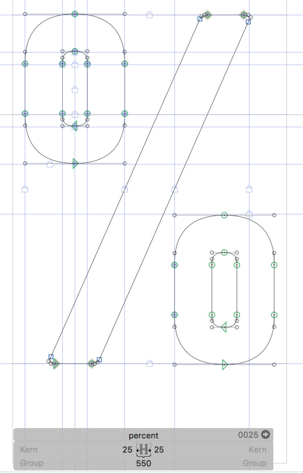
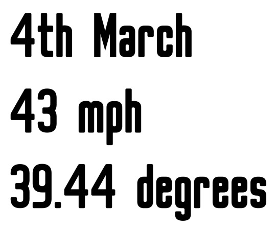
30th April 2017 - Number Fixing
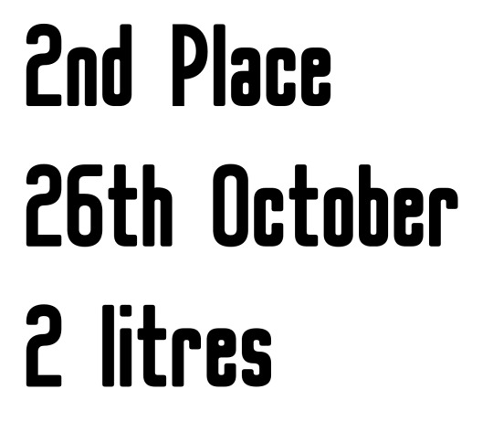
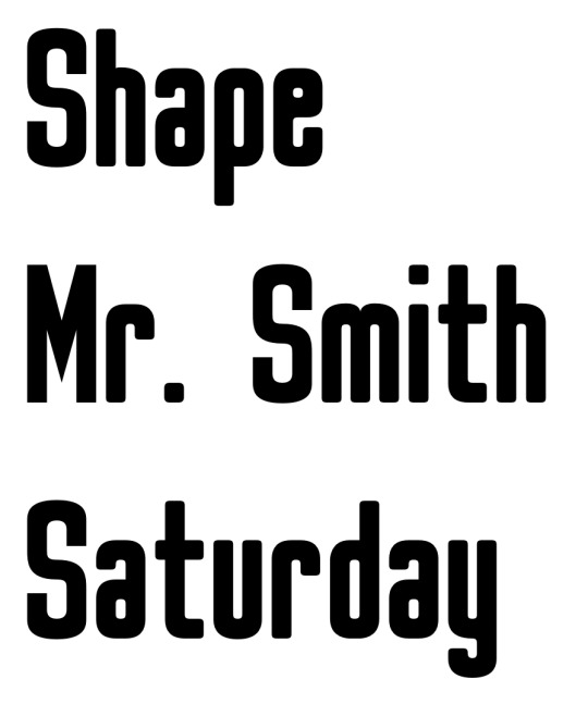
The state of the numbers was bugging me, and along with a few other glyphs, they needed some desperate attention. In an attempt to get them all fixed up and looking perfect, I decided to dedicate my entire day to fixing all of the numbers and a few other glyphs.
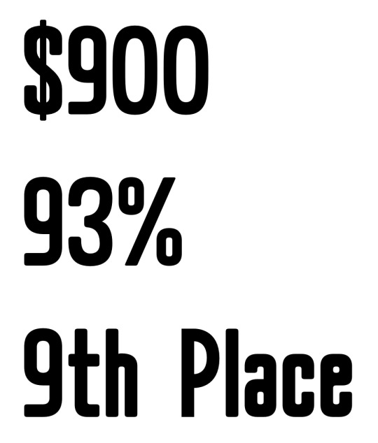
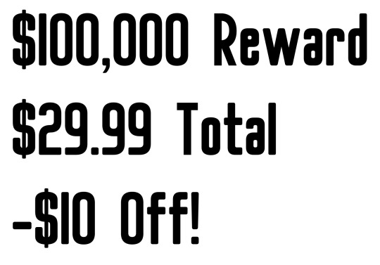
I started my day off by working on the percent symbol. I deleted the perfect circle shapes and completely remade them using guidelines for curvature and stroke weight. The small circles now have a stroke weight of 75 ems, making them optically even with the stroke weight of the slanted stroke. I placed the top of the left circle 2 ems above the cap-line, and the bottom of the right circle 2 ems below the baseline, to make them appear optically even with the bottoms of other glyphs; I have a feeling I may need to adjust this again though. The symbol’s width is now 500 ems, and the whole symbol fits in with the style of my font much better; there’s a much better harmony between the symbol and other glyphs. I may adjusted the spacing and width in the future, but for now I’m going to leave it as it is. I’ll be aiming to seek feedback on this symbol from Jake and Simon after the bank holiday on Tuesday. Below is a screenshot of the percent symbol by itself, as well as a screenshot showing it in practice.

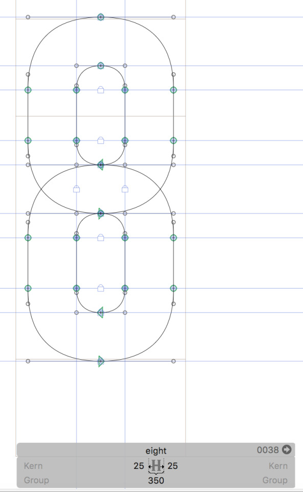
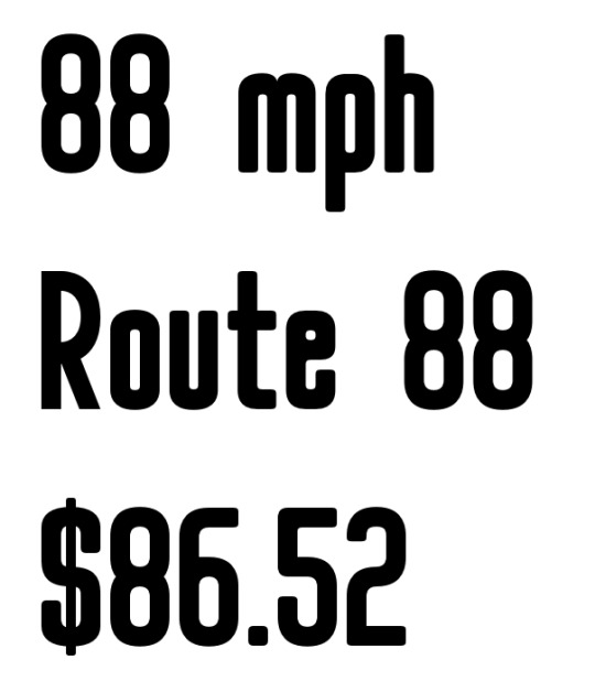
The first number I started refining today was the number 8. Jake pointed out to me that this glyph looked out of place, and so today I’ve decided to completely redesign the glyph, remaking it in a fashion similar to that of my other glyphs. To construct the number, I used guidelines for stroke weight and curvature; the stroke weight of the number is 100 ems, and the new width is 300 ems. The number fits in much better now with the overall style of the font, and works really well in practice. I’ll be sure to seek feedback from my tutors to see if they think any further changes need to be made. Below are a couple of screenshots of the num 8 by itself, as well as in practice.
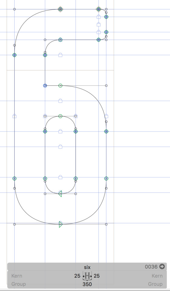
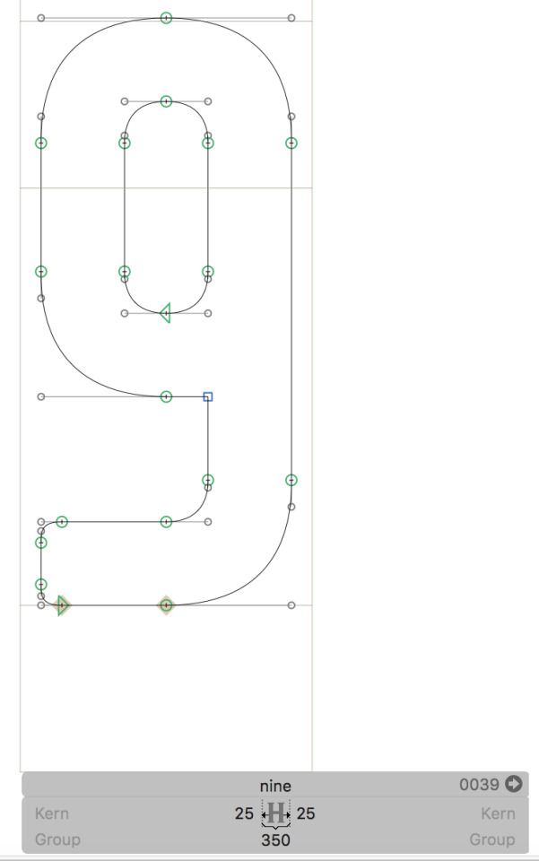
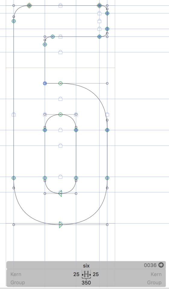
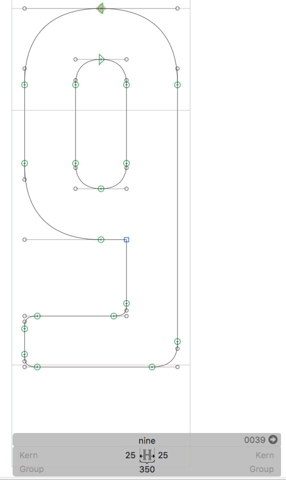
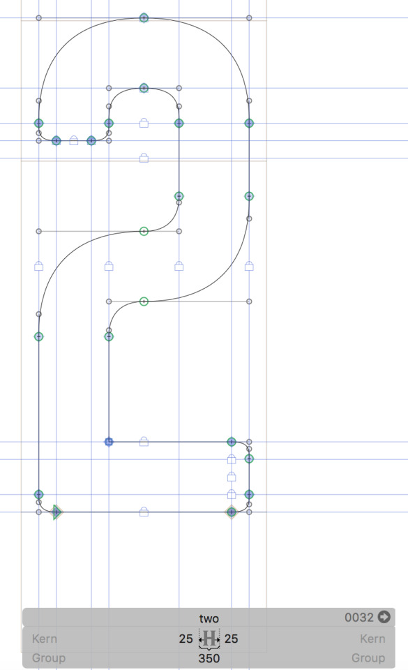
Next up was the number 6 and the number 9. I’ve had a lot of trouble trying to get the number 6 and number 9 looking and feeling right, so I figure a complete redesign of both glyphs wouldn’t hurt. I remade the number 6 by using guidelines for stroke weight and curves. This time, whilst creating the 6, I stuck to creating the curves in the same way I did for other glyphs in the font. To remake the number 9, I simply deleted the old one, duplicated the refined number 6 and rotated it to the correct orientation. Both the number 6 and 9 have a stroke weight of 100 ems, and are now 300 ems wide. Both of these numbers now fit in much better with the overall style of the font, and they both work really well in practice. I’ll be seeking feedback from Jake and Simon on both of these numbers to see what they think. Below are a few screenshots of the number 6 and 9 by themselves, as well as some screenshots showing them in practice.
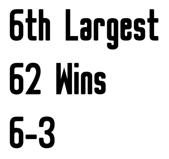
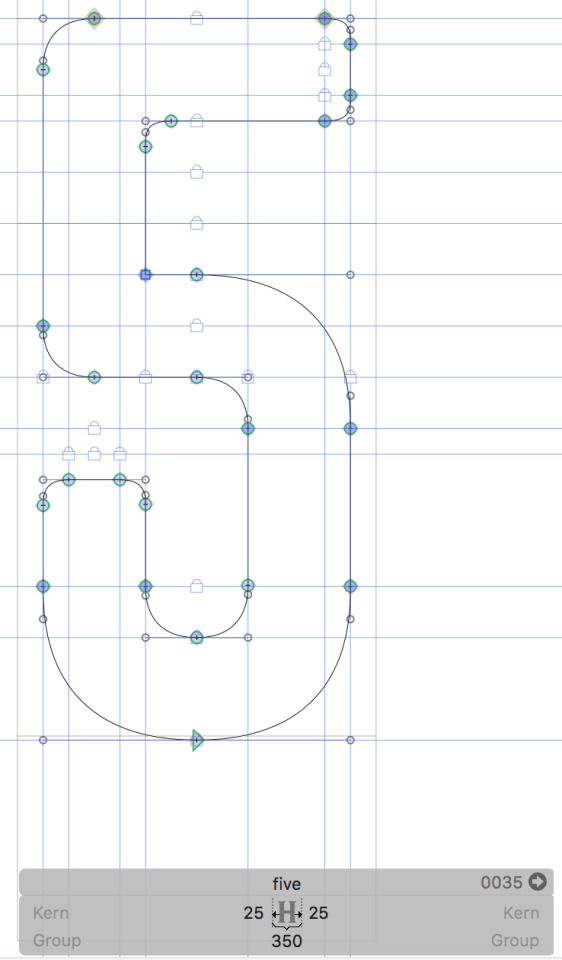
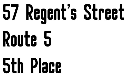
I then moved on to adjusting the number 5. I also completely remade this number, using my newly refined number 6 as a rough guide for the shape, and using guidelines for stroke weight and curvature. The shape is pretty similar to the number 6 except for the two top left corners are much sharper in the number 5, to help make the glyph recognisable as a 5. I don’t mind that the two look similar, as it creates consistency in aesthetic between the numbers. The refined 5 has a stroke weight of 100 ems throughout, and a new width of 300 ems. Below is a screenshot of the number 5 by itself, along with a screenshot showing the number 5 in practice.
Whilst making the number 5, I had the idea of using the number 5′s sharper top-left corners in the number 6 and 9. I don’t really think they’re any better than the number 6 and 9 that feature the softer curve, but it was worth a try anyway. Below are screenshots of the experimental 6 and 9.
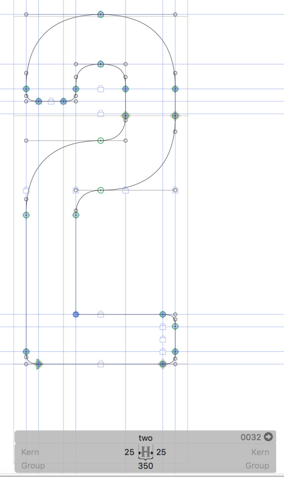
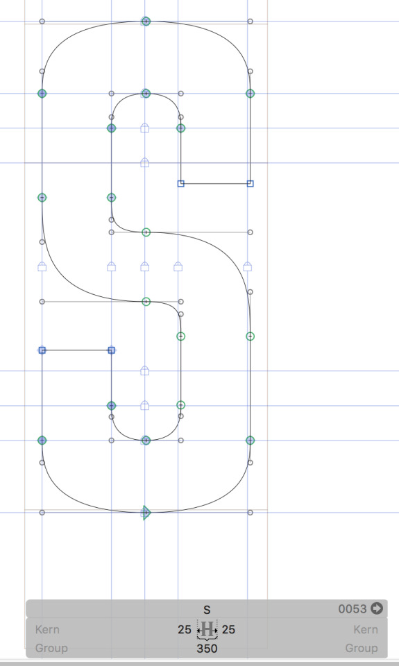
Next up, I worked on refining the number 2. I completely remade this number too, constructing it in the proper MERZ style so it fits in with the other glyphs better. It took me quite a while to work out how to construct the middle curve, but after referring to the shapes of other glyphs, I eventually settled on the middle curve I have now. I may adjust it’s height in the future as it seems a little bit high, but for now I’ll leave it as it’s height matches up with other glyphs pretty well. I used guidelines for stroke weight and curvature to make the number 2, which has a stroke weight of 100 ems and a width of 300 ems. I want to try placing this new middle curve shape into the cap S and dollar symbol too, to see if they’re any better than what I have now. Below is a screenshot of the number 2 by itself, and a screenshot of the number 2 in practice.
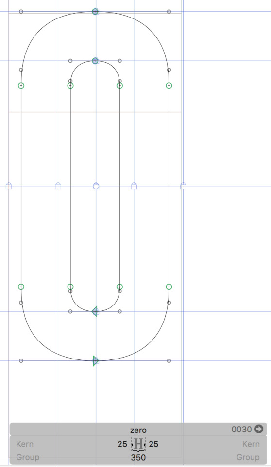
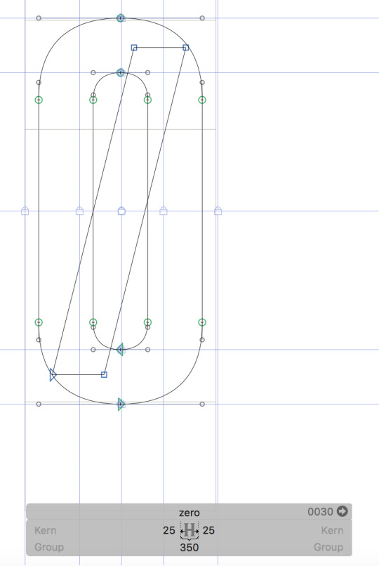
I then adjusted the shape of the number 0 to be more consistent with other glyphs. I completely remade the shape of the number 0 with a stroke weight of 100 ems and a width of 300 ems. The refined 0 fits in much better with the style of the font now, but it does look almost identical to the cap O. To remedy this problem, I created a version of the number 0 that has a diagonal stroke that strikes through the number, but I’m not sure if it really works all that well. I’ll be sure to seek feedback from Jake and Simon before going any further with this number. Below is a screenshot of both of the refined variants of the number 0, as well as a screenshot showing the strike-less 0 in practice.
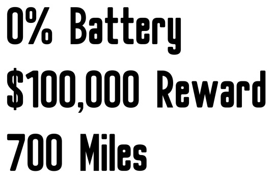
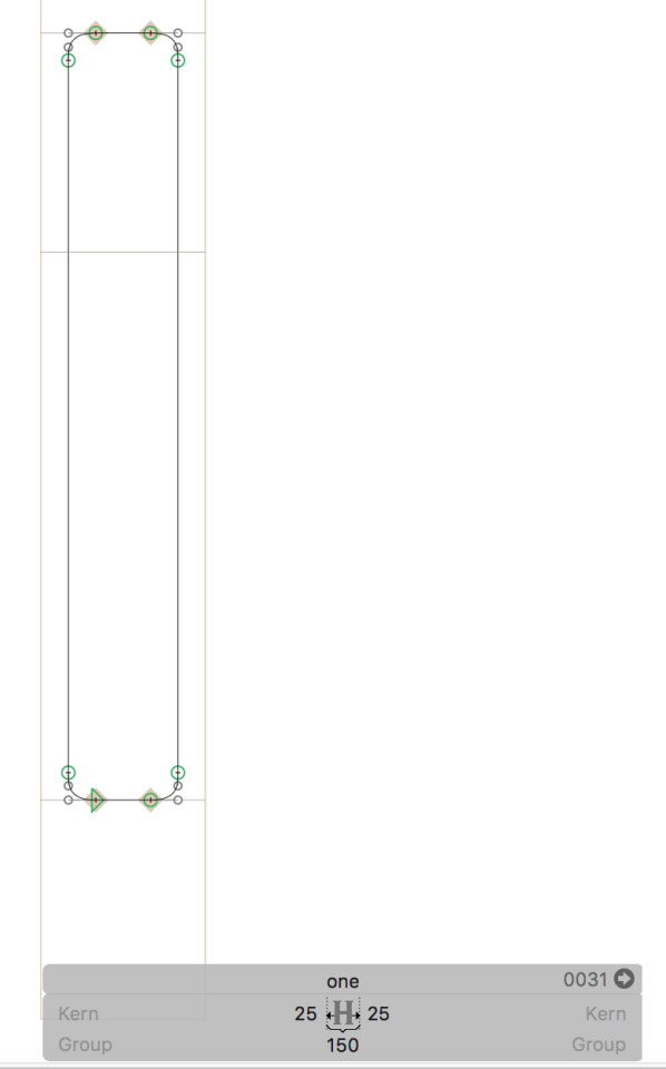
I felt that the number 1 also needed some changes, but I wasn’t quite sure what to do with it. I decided to create a simplified version of the number that is simply a vertical stroke of 100 em stroke weight, with rounded corners. I’m not really sure that I want to use this simplified version though, as it looks almost identical to the lower-case l; I do think it works really well with the other numbers though. I’ll be sure to seek Jake and Simon’s advice on the matter. Below is a screenshot of the simplified 1 by itself, as well as a screenshot showing the number in practice.
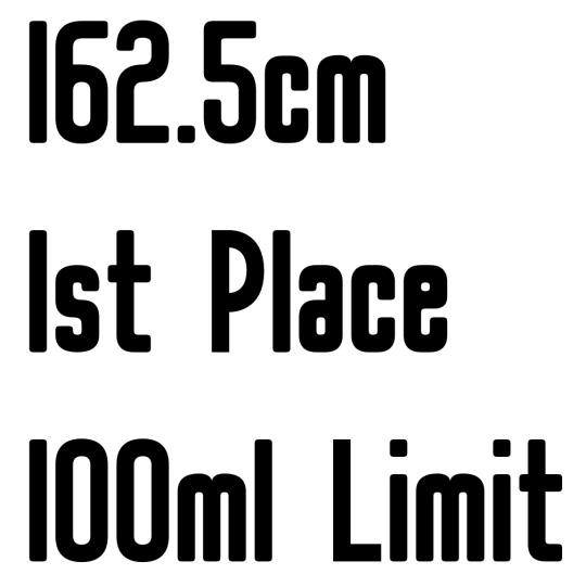
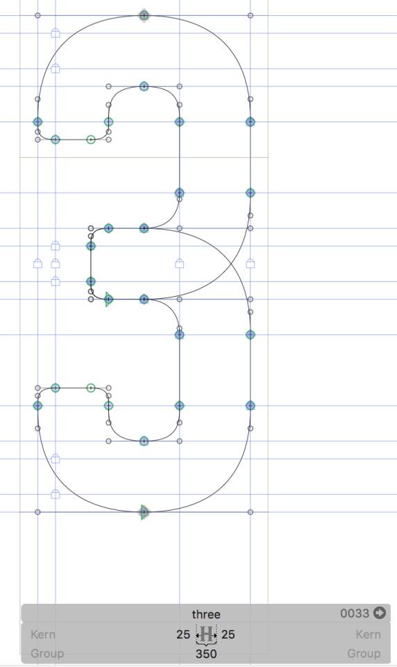
Next up, I refined the number 3, completely remaking the number with a width of 300 ems and a stroke weight of 100 ems. I built the number using guidelines for stroke weight and curves, which are now the same as the other numbers, making the number 3 now fit in better with the general aesthetic of the font. I’ll be asking Jake and Simon what other changes I can make to this number. Below is a screenshot of the number 3 by itself, along with a screenshot showing the number in practice.
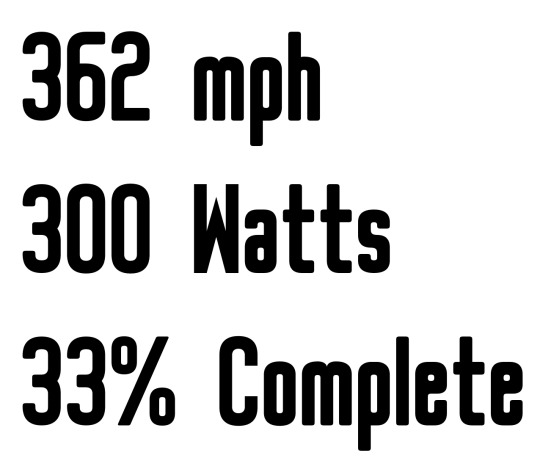
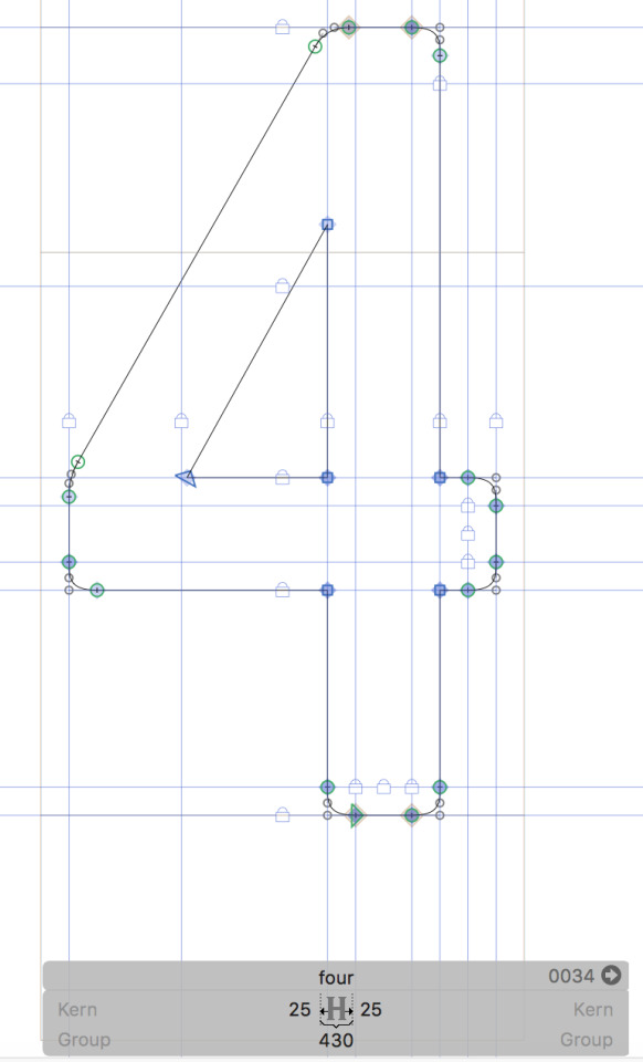
I then moved on to refining the number 4. This one was tricky, but eventually I managed to remake it to a standard I was happy with. I remade the number with a width of 380 ems and a stroke weight of 100 ems. The shape itself is similar to the previous 4 I was using, except this time I’ve adjusted a few of the curves, and the bottom of the slanted stroke now ends when it hits the top of the horizontal stroke, rather than going straight into the corner as with the previous 4. I’m really happy with the new shape, and when put into practice it works brilliantly. Below is a screenshot of the refined 4 by itself and a screenshot of the number in practice.
Before I completely finished up with the numbers, I went back to the number 2 to bring down the middle curve by 50 ems, making the letter optically even on the top and bottom. Below is a screenshot of the adjusted 2.
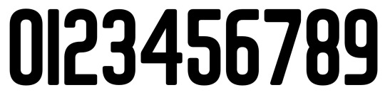
Below is a screenshot of the complete number set post-refinement.
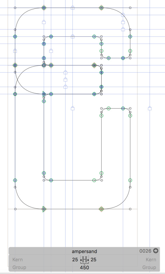
I couldn’t help myself but to revisit the ampersand. I had an idea for a variation of the ampersand based off of the one I ended up with yesterday. I think this second variation better fits the font theme but I’m not sure that it’s very functional when put into practice, or if it’s even recognisable as an ampersand. I saved it anyway, and will be seeking feedback from Jake and Simon on the matter. Below is a screenshot of this second ampersand variation, as well as a screenshot showing the symbol in practice.
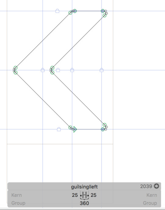
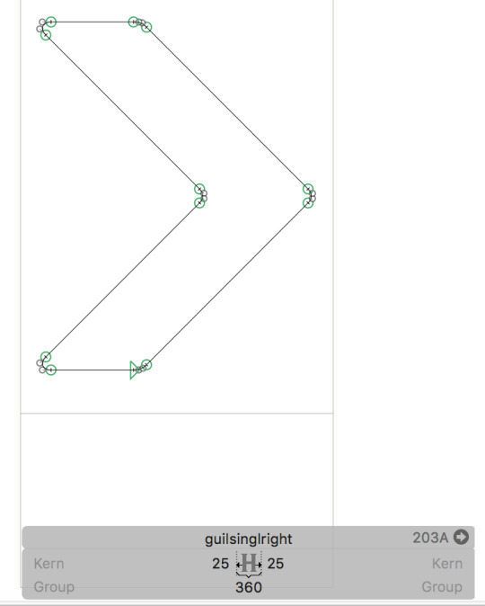
I then made some small adjustments to the left and right guillemets, specifically, increasing the stroke weight from 75 ems to 100 ems. This increased stroke weight makes the symbols fit much better with other glyphs in the font. Below is a screenshot of both the left and right adjusted guillemets.
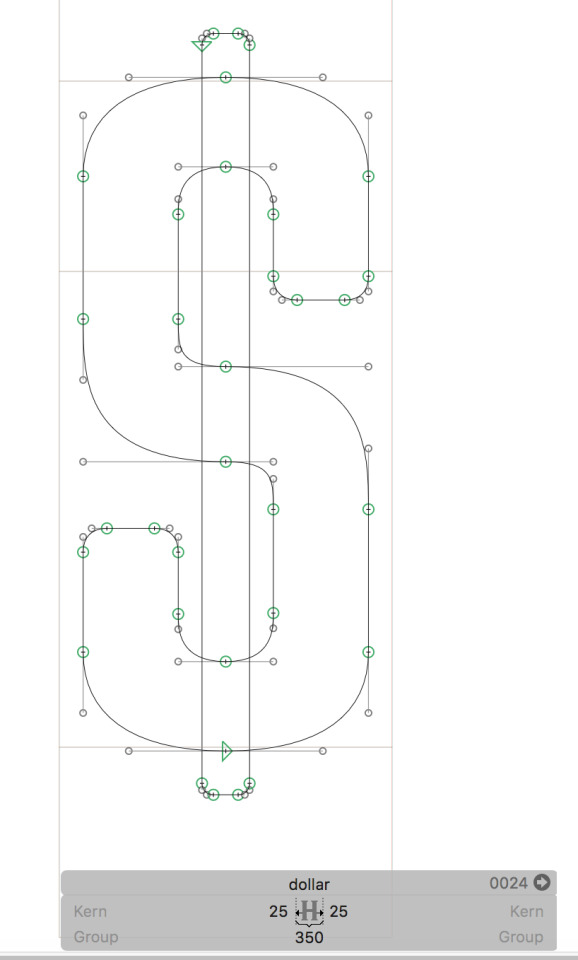
To finish the day off, I decided to adjust the cap S and the dollar symbol to feature the middle curve that I made for the number 2. I think this style of curve better suits these glyphs, and also suits the overall theme of the font much better. When put into practice, the glyphs still work brilliantly, and are just as recognisable for what they are. I’ll be sure to seek feedback from Jake and Simon on this new style of curve to see what they think. Below are screenshots of the refined cap S and dollar symbol by themselves, as well as screenshots of both glyphs in practice.
0 notes
Last Seen Blogs

yumichika
witness me

vieclamtaidanangnet-blog
Vieclamtaidanangnet

brokerco1n
THE BROKER

astoryofcornerblr-blog
제목 없음

skulldustmoss
gay