#bodoni is boring
Text
this anyone else's morning? 😂
4 notes
·
View notes
Text
Typeface selection
Part of my research was to look into a typeface selection for my animation when the time came to create it. I looked into various different sources and opinions about what typeface could work and considered the context of the speech, furthermore who it was said by.
An article on the website 99designs by Lindsay Kramer "a copy and content writer" cites the following:
"Fonts are one of the most important design choices to make when developing your brand identity. The best fonts leave you feeling like you’ve made an instant friend while the worst fonts are like a stranger who won’t leave you alone."
Therefore it was critical I get my typeface selection correct if I wanted to send the right message through my animation.
Kramer lists the following points about what makes a good typeface:
Even kerning
Consistency
Balance
Legibility
Then lists the following points about what makes a bad typeface:
Overused
Imbalanced
Unreadable
Boring
"Fauxotic" fonts
When choosing a typeface I should consider that the typeface is
"Well-crafted and aesthetically pleasing (and) appropriate for your brand".
Kramer lists the following as good typefaces:
Didot
Bodoni
Garamond
Futura
Helvetica
Mrs Eaves
Baskerville
Akzidenz-Grotesk
Clarendon
Gill Sans
Verdana
Frutiger
FF Din
Proxima Nova
Uni Sans
And then the following for bad typefaces:
Copperplate Gothic
Times New Roman
Trajan Pro
Comic Sans
Courier
Papyrus
Bonzai
Neuland-Inline
Brush Script
Souvenir
FF Blur
Impact
Trajan Pro
Curlz
Jokerman
Lobster
Bleeding Cowboys
Arial
While all incredibly subjective dependant on the clients needs I feel that this list is incredibly consistent with what I believe. Therefore out of the selection of "good" typefaces, I decided to choose Helvetica. It is incredibly well known and the only draw back from Kramer's list is that it's "overused". However, I thought that since I was working with kinetic type I might be able to use it and get away with it since I will be playing with different ways to present it visually. Not to mention that the wide array of weights that the font family offers allows me to choose weights when I animate to illustrate points better.
I then looked into other sources for a second opinion on what the "best" typefaces are and was met with the same answer on BonFX, a table created by Douglas Bonneville in 2015 lists Helvetica as the number 1 best typeface to use.
With that I then moved into whether Helvetica could be appropriate in a professional setting (to reflect the professionalism of Helen Clark throughout the speech) and found a resource on Studio Kayama by "ikumikayama" under the article "5 fonts that add credibility and professionalism to scientific research". Helvetica is listed at number 2 on their list. With Kayama citing "Helvetica is a font that looks great on both print and on screen. Nature , Science, and Cell request that their figure labels be in Helvetica". Therefore Helvetica is appropriate for a formal/professional setting such as this topic, and furthermore reflecting the professionalism of Helen Clark throughout the speech.
Finally I looked at a resource dedicated to praising Helvetica (despite a potentially bias view). An article on Indusnet by Mainak Biswas titled "Helvetica Lovers Unite: Probably the Most Prolific Font in the World". Biswas states that Helvetica "is legible even when the viewer is in motion, making it popular amongst signage and airline logos" therefore switching it so that the type is in motion would most certainly be viable. Biswas also states that Helvetica is "omnipresent, a lot of big brand have their logos in the Helvetica font. Even though it was widely used, the message it sends across and its professionalism is unmatched".
This concludes my research, justification and selection of a typeface for my animation. Helvetica is suitable for a professional setting and therefore represents Helen Clark in just as a professional setting. Is incredibly popular and safe to use and has a wide range of weights to be able to utilise during my animation.
0 notes
Text
Research - Type Design
1600–1650
Baroque and rococo aesthetic trends, use of the pointed-pen for writing, and steel engraving techniques effected a gradual shift in typographic style. Contrast between thick and thin strokes increased. Tilted stressing transformed into vertical stressing; full rounds were compressed. Blunt bracketed serifs grew sharp and delicate until they were fine straight lines. Detail became clean and precise.
Transitional roman types combined the classical features of lettera antiqua with the vertical stressing and higher contrast between thick and thin strokes characteristic of the true modern romans to come.
The roman types used c. 1618 by the Dutch printing firm of Elzevir in Leyden reiterated the 16th-century French style with higher contrast, less rigor and a lighter page effect. After 1647 most Elzevir faces were cut by the highly regarded Christoffel van Dyck, whose precise renditions were regarded by some experts at the time as finer than Garamond's.
1650–1700
1670–1672 for use by the Oxford University Press. The so-named Fell types, presumed to be the work of Dutch punchcutter Dirck Voskens, mark a noticeable jump from previous designs, with considerably shorter extenders, higher stroke contrast, narrowing of round letters, and flattened serifs on the baseline and descenders. The design retained a retrogressive old-style irregularity, smooth modeling from vertical to horizontal, and angled stressing of rounds (except a vertically stressed o). Fell capitals were condensed, even-width, with wide flattened serifs; all characteristics of the definitive modern romans of the late 18th century. Fell italic types were distinguished by high contrast matching the Fell romans; wider ovals; a split-branching stroke from the stems of m n r and u; and long, flat serifs—prefiguring modern. They repeated the non-uniform slant of French models, and the capitals included swash J and Q forms.
1700–1750
The first major figure in English typography is reckoned by type historians to have ended the monopoly of Dutch type founding almost single-handedly. The gun engraver-turned-punchcutter William Caslon spent 14 years creating the stable of typefaces on the specimen sheet issued in 1734. The complete canon included roman, italic, Greek, Hebrew, Arabic etc. Caslon's Great Primer roman and English roman were retrogressive designs that very closely followed the Fell types and the roman of Miklós (Nicholas) Kis c. 1685 falsely attributed to Anton Janson. Caslon's slightly bracketed serifs and old-style irregularity were not novel, but a precise cut and perpendicularity gave legibility to the forms. Caslon's italic structures follow the Fell italics, but at a condensed width and with conventional branching from stems.
Joan Michaël Fleischman (1701–1768) was born in Nürnberg where he trained as a punchcutter. He found employment with Dutch type founders in Holland and settled there c. 1728. At the Enschedé foundry in Haarlem he cut punches for a large amount of material. Some time after 1743 he produced a distinguished roman design—related to the preceding transitional types but departing from them. It prefigured modern romans with sparse transaxialmodeling, joining the vertical stressing to hairline thins and ball-ends. Fleischmann borrowed from the general mode of Phillipe Grandjean's and Louis Simonneau's "Romain du Roi," commissioned by Louis XIV in 1692 for the Imprimerie Royale, but did not imitate that face. Fleischmann's capitals were a new variety; an even-width scheme, compressed rounds, all-vertical stressing, and triangular beak ends of E F L T and Z, all characteristics prefiguring the "classical" moderns of Bodoni and Didot. Fleischmann's italic bore some resemblance to Granjean's but had longer ascenders and followed the established Dutch structures for h v and w.
1750-1775
About 1751, John Baskerville, having found financial success in producing goods from sheet metal, moved into the printing business. His roman and italic types appeared later than Fleischman's but are considered transitional and partly retrogressive with a return to lower contrast, smooth transaxial modeling, finely modeled bracketed serifs, and long stems. The exquisite design and finish of Baskerville's roman however, combining elegance and strength, was modern. His roman design, and especially his italic, were rococo-influenced. His letterforms are an intentional transition between old-style forms and modern styles. They were informed by his prior experience as a writing master and the influences of his time. The types of Joseph Fry, Alexander Wilson, and John Bell closely followed Baskerville, and through his correspondence with European type founders Baskerville's influence penetrated most of western Europe. Baskerville was a meticulous artist who controlled all aspects of his creation, devising more accurate presses, blacker inks and paper sealed with hot rollers to ensure crisp impressions. Of particular note, the lower storey of his lowercase g does not fully close. Derivatives of Baskerville are often identified thus. A modern revival of Baskerville, a font called Mrs Eaves, is named after Baskerville's mistress-turned-wife Sarah Eaves, the widow of Richard Eaves.
1775–1795
The Spanish designer Joaquín Ibarra's roman was influenced by Baskerville, Didot and Bodoni, but hewn nearer to old-style and used in the same classical manner, including spaced capitals. In England modern romans resembling Bodoni's were cut for the printer William Bulmer c. 1786 by the punchcutter William Martin, who had been apprenticed to Baskerville and influenced by him. Martin's italic mirrored the open-tail g and overall finesse of Baskerville's.
1795–1820
In Britain and the United States, modern romans (emerging around 1800 and totally dominant by the 1820s) took a somewhat more rounded, less geometrical form than the designs of Didot and Bodoni; an obvious difference is that in Anglo-American faces the upper-case C has only one serif (at the top) whereas in European designs it has two.
1820s
In Britain and the United States, modern romans (emerging around 1800 and totally dominant by the 1820s) took a somewhat more rounded, less geometrical form than the designs of Didot and Bodoni; an obvious difference is that in Anglo-American faces the upper-case C has only one serif (at the top) whereas in European designs it has two.
1830-1910
The 19th century brought fewer stylistic innovations. The most notable invention was the rise of typefaces with strengthened serifs. Forerunners were the so-called Egyptienne fonts, which were used already at the beginning of the 19th century. Their name likely comes from the enthusiasm of the Napoleonic era for the orient, which in turn was started by Napoleon's invasion in Egypt. In fact slab-serif fonts (e. g. Clarendon from 1845) were newspaper fonts, whose serifs were strengthened in order to prevent damage during the printing process. Stylistically the serif fonts of the mid-19th century appeared very robust and otherwise had more or less neo-classical design features, which changed during the course of time: By the application of the slab serif design feature and by appending serifs to more and more typefaces, an independent intermediate group of heterogeneous fonts emerged during the 20th century. Meanwhile, the slab serifs are listed as an independent group in most typeface classifications—besides both main groups serif and sans serif.
Slab-serif and sans-serif types were rarely used for continuous bodies of text; their realm was that of advertisements, title-pages and other attention-catching pieces of print. By about 1820, most western countries were using modern romans and italics for continuous texts. This remained true until the 1860s, when so-called 'old style' faces—a largely English-speaking phenomenon—came into use. These went to the opposite extreme from the modern faces; 'thick' strokes were attenuated, and serifs at the end of thin strokes (as in C, E, L and T) were narrow and angled whereas in modern faces they were broad and vertical or nearly so. All the upper-case characters were somewhat 'condensed' (narrowed). Old style faces remained popular until about 1910.
Above all the 19th century was innovative regarding technical aspects. Automatic manufacturing processes changed the print as well as the graphical illustrations. The illustration of printed matters could be considerably standardised due to the lithography technique invented by Alois Senefelder. Finally, another invention was photography, whose establishment at the end of the 19th century led to the first halftoning and reproduction procedures. The step-by-step development of a modern mass society provided a growing demand of printed matters. Besides the traditional letterpress beginnings of a newspaper landscape as well as a broad market for publications, advertisements, and posters of all kinds appeared. The challenges had changed: since printing and typography had been a straightforward craft for centuries, it now had to face the challenges of an industry-ruled mass society.
1920-1960
A result of the industrialisation process was the unimagined number and distribution of new typefaces. Whether digital variants of Garamond and Bodoni or new contemporary type designs like Futura, Times, and Helvetica, nearly all currently used typefaces have their origin either in the following and ongoing digital typesetting era or are based on designs of this epoch. The basis was the appearance of large type foundries and type manufacturers. The result: Successful typefaces could quickly gain the status of a trademark—and therefore were able to assign a unique "branding" to products or publications.
Chicago contributed much to typography design at this time as Frederic Goudy, designer of 123 typefaces, founded several presses. Oswald Cooper, designer of Cooper Black studied under Goudy
During the 1920s, typographers in central and eastern Europe experimented with forms of avant-garde typography. The main places of development of avant-garde artists had been: Budapest, Zagreb, Belgrade and, after 1924, also Prague. However, since 1925 avant-garde typography had been spreading to the cities of western and eastern Europe and, as a result, the previous cities gradually lost their relevance.
In 1924 two exhibitions important for development of avant-garde typography were organized: one by Ljubomir Micić (the First International Zenitistic Exhibition of New Art in Belgrade) and the other by Ion Vinea and Marcel Iancu (the First International Exhibition Contimporanul).
1960s
The 1960’s birthed one of the most influential typefaces that shaped visual communication around us today in branding, advertisements, and environmental signage. Helvetica was created by type designer Max Miedinger in 1960. During the postwar era, companies were looking for ways to differentiate themselves from other brands and create a new identity. The clean, bold design was created to reflect the modern and industrial times that they were in, making it legible and quick to read on the go or just passing by. For example car brands like Ford, Chevrolet, and Chrysler used Helvetica in their advertisements to promote new cars and technology. Communication was the key aspect in the design of Helvetica, and now is a common standardized choice for typography in advertisements and branding all over the world. We can see Helvetica in many major brand identities and logos such as American Airlines, North Face, American Apparel, Microsoft and Target.
The psychedelic era also had a large impact on typography and branding in the 1960’s. Art Nouveau was a decorative art style that consists of organic and elaborate lines created in the early 19th century, but was brought back to popularity in the 60’s during the psychedelic era. Designers were inspired by the past, in hopes of a better creative future, they merged elegance and sophistication of Victorian art; floral print playful lines and aesthetics combined with intense, high contrast colours. Artists wanted to break away from the post war era of the strict, uniformed designs (Helvetica) and create a playful and fluid design. This style was used on posters, signage and album covers, we can now see them in the way companies design their logos and packaging.
1970s
Graphic design in the 1970s was all about bright and clashing colors with balloon like letter forms. It was as if the serif fonts of the 60s got eaten by the rounded typography of the decade. However, the psychedelic rock concert posters remained and added to the bright and glorious 70s. Bell-bottoms and disco ruled the decade. Some hated it, others feel nostalgic about it. Either way, graphic design in the 1970s got to be experimental. Everyone was playing with different styles and types. It was a playful and memorable time for everyone.
1980s
Predominantly though, the 1980’s offered futuristic type styles with modern effects and colourful aesthetics.
80’s font were heavily influenced by the advancement of technology. These styles in particular have a futuristic style commonly using either neon aesthetics, gradients and a mirrored sheen effect. These fonts tended to have an almost overdone style, with plenty of distinct layering and over the top text effects – neon, multiple colors, glow spots. The 80’s has a certain nostalgic feel to many as it was a staple in history or their childhood to witness the development of technology, which was a catalyst for modern typography
1990s
90s Typography was the sexy thing for graphic designers to get into. Émigré was in full swing, Neville Brody was an 80s superstar, Raygun magazine rose and fell.
Be expressive, Look back, Craft, Look forward, Reinvent, Become invisible, Be Honest, Order, Look Sideways, Be Vocal,
2000s
The first trending font of the new millennium (arguably) was Gotham.
2010s
While the first web font was actually made in late 1997, it wasn’t until 2009 that the Web Open Font Format (WOFF) was developed and added to the W3C open web standards. It took another 4 years for all major browsers to adopt and support WOFF allowing to really customize websites as we could print pieces. As the second decade progressed, with it came a flood of geometric sans serifs - those without serifs or contrast in stroke width.
In the early years of the new decade, there was a renewed interest in uncluttered geometries, a trend that had appeared a few years earlier with the spread of linear typefaces such as Gotham, and that propelled typefaces such as Akkurat and Circular to popularity towards the mid-decade.
Alongside technological innovations, an elemental, minimalist style of typography developed, linked to digital aesthetics, which replaced all elements of traditional ornamentation, considered as superfluous or even problematic.
One of the most important reasons for this return to minimalism was the need for greater legibility, fundamental in a world in which most content is accessed through the screens of smartphones or even smaller devices. This was keenly felt by Apple, to the point that, specially for the Apple Watch, the company launched “San Francisco”, a typeface that successively became standard for all products by the Cupertino-based company.
At the same time, from the mid-2010s, there was a powerful interest in more experimental forms of typeface. This trend was made possible by the introduction of user-friendly software such as “Glyphs”, which enabled increasing numbers of designers to enter the world of type design, and fuelled an increase of typography’s popularity on social media. Good examples include viral projects such as “36 Days of Type” which over the course of 6 years collected over 670,000 participants.
Typographical experimentation has also included the redesign of historic, classic typefaces. It is no coincidence that the last decade saw an increase in popularity of the Didone family, typefaces of French inspiration that emerged in the 18th century, and that were given new interpretations compliant with the needs of new technology.
2020s
In the 2020s type has taken in all trends and elements from previous eras whilst adding a touch of modernisation to create unique type styles.
0 notes
Text
For the typography of my publication and film I wanted to use a font that looked classic to represent the concept. I explored through adobe fonts and searched for the ones that i fit well with my ideas and story.
In the end I chose to use Bodoni 72 Smallcaps as it looks classic yet not boring.
0 notes
Photo
3rd design: Modular Grid - As for the 3rd layout, I decided to experiment with the “Modular” grid since it allowed me to have even more space and choice with where I wanted the elements exactly to go, for example even being able to have a slight combination between this and the “Baseline” grid for the first page. As for the columns and rows I decided to go for the 6 x 6. What I would change for the first page is making the subtitles the same size but also cutting back the writing since the viewer can get bored or lost in the excessive information. As for the second page I decided to take a risk and put the title on the bottom of the page, which was a good decision since it automatically makes the viewer having to look at both pages and analyse everything. Also the upside-down quote was inspired by the way the titled has been positioned in the last grid experimentation, which actually encourages the viewer to physically interact with the book and turn it around. The typography used for this one was Bodoni 72 Oldstyle.
0 notes
Photo
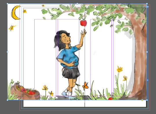


When I initially placed my drawing into the document, I had sized it incorrectly so had to go back into illustrator and change a few things. I actually prefer the fact that she is reaching further for the apple as well as the fact it just has a better layout. This was something to learn from, not creating the correct page size in my Adobe Fresco, though it actually turned out to be a better composition once altered to fit the page. I’m not sure I would have got this same effect had I not made the page the incorrect size as I likely would have made the cartoon of Pat bigger.
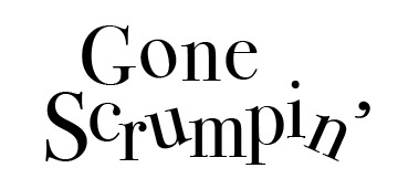
My title was pretty boring at first, though the type seen on the front of Roald Dahl’s books is skewed and so I wanted to add a bit of rotation to the letters. I also later elongated the tail of the ‘n’ in ‘Gone’ as it added some more length to the word (I felt it looked to linear compared to Scrumpin’).
For the titles type I chose Bodoni 72 Book as I felt it best represented my Nana as well as the fact that I didn’t want my type to be the main event. I initially sketched some type made from little apples arranged into the letters though this was too much.
It took me some time to layout the text in a format i was happy with. I wanted my text to be centre justified as that is what is seen in most children’s chapter books. I also struggled to fit the text over the two spreads with the second page having a lot of imagery already (I didn’t want to overpower it with too much text). It took some time to arrange the apples and the B&W portrait of Pat on the first spread as I initially wanted the imagery bigger and it wasn’t working with the amount of text. I placed the apples under the title on the first page because I wanted there to be a smaller image at the bottom of this page soas not to outshine the title. The title was also simple so this would have been easy to do. I placed both images at the bottom of the pages as I wanted them to sit side by side. I felt this was the best placement to sit nicely with the title as well as set the scene for the story.
The second page I decided to do something differrent with the shape on my text box, as well as the fact the type wouldn’t fit in the same margins as the top page due to the illustration overlapping into these margins. My margins on the top page were quite big due to that being typically seen in a children's novel, though I made them slightly different (bigger at the top and bottom) for the third page and fourth (more left aligned due to the tree). I really wanted some stand-alone type on the fourth page to make the last sentence hit home.
0 notes
Text
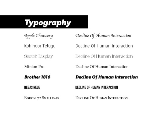
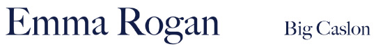
Timeline Fonts
Emma Rogan uses a combination of serif and sans serif typefaces throughout her work. She also uses a variation of thick, bold fonts as well as very thin and delicate ones. She does however, always use print fonts rather than script. This means that all of the text in he repines are very clear and legible, usually the same size, and more or less consistent throughout her pieces.
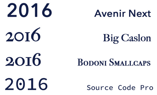
Below, I have experimented with some typefaces that I am considering using for the title and dates of the timeline poster. They are mostly all serif fonts as I believe serifs are more impactful for important text such as titles and dates. The font that I am gravitating towards the most is the Big Caslon typeface, it is impactful, easily legible and compliments san serif typefaces well. The outline effect of the Academy Engraved LET typeface can feel as though the importance of the title could be lost. The Bodoni 72 Smallcaps typeface is, although bold with all capital, too intense and doesn't suit Emma Rogans type style. The Gotu typeface is too rounded and boring for a title, it could be used as body text.


I also experimented with typefaces for the subtitle and main body text. These typefaces are mostly san serif to make the body text clear and simply legible for the reader. I personally don't think the all caps look of Copperplate is suitable for body text while Arima Koshi is too curly and rounded. Avenir Next is clear and sharp - suitable for small paragraphs and subtitles. Source Code Pro is another contender however, the permanent use of italics on the typeface is somewhat off-putting and can give the wrong idea for body text.


I wanted to experiment with the most promising serif and san serif typefaces that I tried out for the titles and body text to see which would look the best for the key dates in the timeline. I notice that the serif fonts - Big Caslon and Bodoni Smallcaps are disproportionate when numbers are being used. For example, the “6″ at the end is taller than the other numbers, this isn’t representative of Emma Rogan’s work. I also don’t think the dot in the middle of the zero’s used with the Source Code Pro typeface is suitable. I think the Avenir Next typeface is the clearest, boldest type that can be used for the dates.
0 notes
Text
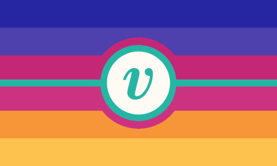


[ID. Three almost identical flags. 6 stripes, top to bottom, 2 variations of indigo, 2 almost-identical shades of magenta, 2 shades (orange and yellow) making amber. The first has a turquoise greek symbol of v inside a white circle outlined with the same turquoise, the outline continues into a thin stripe for the middle of the flag. The second has only the turquoise v symbol without the circle or the thin stripe. The third has only the turquoise middle stripe without any symbol. End]
Nonamory - a lifestyle choice that does not include intimate, long term partnerships
I wanted to try my hand at a redesign of the nonamorous flag cuz i was bored rlly like the original color meanings n wanted it to better match the description ^___^
Original meaning still applies (with a few changes) :
Indigo - Integrity of nonamorous folks shown towards ourselves in spite of social pressure to enter into monogamous relationships
Magenta - Compassion and solidarity with members of our own community + others who struggle against the pressures of an amatonormative society, and the harmony we can achieve outside of "traditional" long-term partnerships
Amber - The joy, independence, and confidence we harbor both in non-monogamous relationships and with ourselves, freedom in the self
Turquoise - Healing and self-sufficiency we find in, and as, a community despite living in a world that treats us as "incomplete" for not seeking out a monogamous partnership
Greek symbol v - Adventureousness and creativity in how we relate to the world, to represent how nonamory has long been in "uncharted waters" in terms of general awareness, and also acceptance of how we choose to approach our close attachments
(Also some other things)
Ratio of the simplified one - 8 : 8 : 7 : 2 : 7 : 8 : 8
Symbol font - Bodoni MT italic (with added thickness by bucket tool)
Original flag that was the inspiration
#how do i tag this#nonamory#nonamorous#pride flag#queer#lgbt#lgbtq#lgbtq+#lgbtqia#mogai#someone tell me what to tag this as i have no idea what im doing#arohace#i need another identity tag#also the reason i changed the font of the symbol is bcuz i couldnt find the orignal font so. </3#i actually originally planned to like. remake the black n white one but well. this happened so#my flags
41 notes
·
View notes
Photo

** Disclaimer ** - I am NOT a professional graphic designer, however I did work with many of them for different occasions and I have been designing my own things for over 10 years now. All the knowledge I have and share with you in this post was gathered by me over the course of 14 years.
I recently started my font series, where I shared my favourite fonts of different typefaces. People have been requesting to post my favourite font pairings and as much as I love to do that (and I also will, just scroll down to the end of the post to see them), I think it’s also important for you to understand, why they work together nicely and what you should look out for, if you plan on pairing typefaces yourself.
Understanding fonts and typefaces
There are so many to choose from nowadays. You have probably scrolled through the JUNGLE of fonts that you can find online nowadays, some are free, some aren’t and they all go by different category names:
Serif - Sans Serif - Script. All of them can also be Display fonts.
What do they mean?

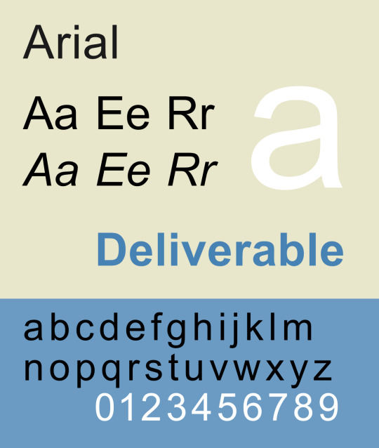
A serif is a small line or a stroke attached to the end of a larger stroke. So all the little strokes that I circled in red. The most common serif font is probably Times New Roman, which I also used in the picture above (hence TNR).

Arial is a sans serif font, and also one of the most common ones. Sans serif is translated from french, sans meaning “without” - so it’s basically a font without the little strokes, much more clean and modern looking.

Now let’s move on to script fonts, which are more commonly known as handwritten or brushed fonts. Bombshell pro is a script font based on the looks of modern hand lettering.
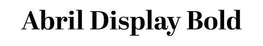
Display fonts can be fonts from all the different typefaces above. They’re usually used in larger sizes for e.g. headlines or logos, instead of bodies of texts, like Times New Roman or Arial are mostly used for. Abril Display (I used it in a bold weight) is a display font, as well as a serif font.
Now that you know the differences between these typefaces, let’s dive into the different font weights.
Many serif, sans-serif and display fonts come in different weights (thin, light, normal/regular, bold, extra bold, black.. you name it). This is important as it plays a fundamental role in pairing fonts together.
Playing with different weights can help you underline the importance of the text you’re writing. I keep bolding phrases and words throughout this post, so you know to keep these in mind PLUS it’s easier to find the part of the post you are interested in. This also works for headlining on your graphics or gifsets!
Pairing different font weights
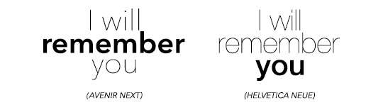
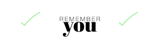
I will use the simple phrase “I will remember you” throughout the following part of this post.
First you need to figure out what you want to highlight. Do you want to highlight, that you will REMEMBER them? Or do you want to highlight that you specifically remember THEM (in the phrase ‘you)? Lay it all out for yourself, so you know exactly what to do.
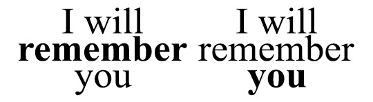

The difference with these two examples isn’t too big, as you might have noticed. I used the regular and bold types for these examples. However, fonts like Avenir or Helvetica come with thin or even ultra light versions and you have more to play around with.
Script fonts usually don’t come in different weights, however you can utilise Photoshop to apply its bold addition to the fonts. It usually doesn’t look too nice though, so be warned!

Also, script fonts are harder to pair with one another, because it’s easier to cause an ‘overload’ for our eyes with pairing them depending on their level of ... let’s call it fanciness.
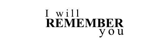
Now, you can pair the different weights together like this, centred.. and boring.. or you can play around with different font sizes, weights, kerning (click here to find out what kerning is) and positions. It’s fun, I promise! Just make sure you don’t forget which word(s) you want to emphasise!
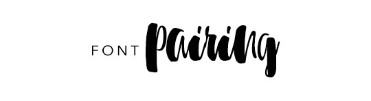
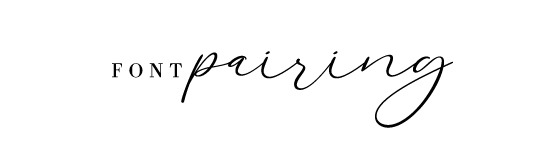
Pairing DIFFERENT FONTS with each other
Now here’s the part people have asked for haha.
The first thing I want you to understand is, that the less is merrier does apply in this case. I personally n e v e r pair more than three fonts together (and I only use three different fonts for an entire corporate design including a website), two usually work the best!
For two different fonts to work nicely together, you (again) have to think about what you want to emphasise and create some kind of hierachy. In order to create an appealing design, you need to catch the viewers attention to the word or phrase you want. Create a focal point, something the eye is immediately drawn to. And then you add to it with simplicity.
You really have to think about what you want to be seen first and what you want to be seen second (on the base of using two different fonts).
Take a look at the fonts you have chosen. Display and script fonts usually need to be a larger size to be readable or to make them look good, so you probably want to use that one as the top of your hierachy. Also fonts with a heavier font weight tend to work better as the leading font. To accompany your leading font, choose a thinner, more simplistic companion. Why? Because if you use two heavy fonts or two fancy fonts (script, black, brushed etc.), your eyes will have a hard time concentrating on who is more important.

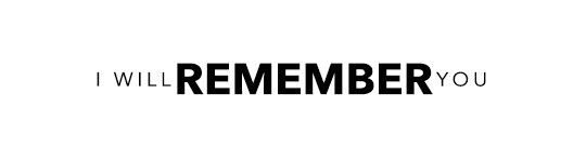
I hope this example helps you to understand what I mean.
In the first picture you see the whole thing as ONE block, because your eyes don’t know where the exact focal point lies. They don’t know which word they should concentrate on. The second one, however, gives your eyes clear instructions on where the importance of the quote/phrase lies.
Now how do you find out, if two fonts actually go together? Sometimes it’s also about the look of the whole design in general, if two fonts go well together or not. However, there are some things you can look for before you pair fonts:
Have a look at the weight, spacing/kerning, strokes in general and their width to figure out, if the two fonts you have chosen are different enough from each other, to actually pair well. Fonts that are too similar to each other have the same effect as shown above.
At the same time please also keep in mind, that they have to have some similarities, such as their general proportions and heights. If these parameters are too different, it might doesn’t look as good (there are some cases where you can make it work though, but you need to play around a little here).
If you made it this far, congratulations :D
This is not the ultimate guide to how you will always pick the right pairing of fonts, but it’s a start and something you can work on and evolve from! I hope it helped you. Feel free to message me, if you have any questions left. And now to what has been requested in the first place.
Here are some of my favourite font pairings:

(Avenir Next at kerning 200 + Abril Fatface)
(Avenir Next at kerning 200 + Sunbreath)
(Bodoni FLF at kerning 300 + Alberobello Script)

(Almondia at kerning 60 + Billy Ohio)

(Boysen at kerning 75 + Saturday Rock)
I hope you found this useful! :) Feel free to share!
#typography#typography tutorial#pairing fonts#font pairings#resources#userlexi#uservaleria#usersophy#annasuser#tuseralex#usernums#userauden#font series#tutorials#mine
869 notes
·
View notes
Text
Finest Typefaces For Creating
Ever thought about what the difference is between typefaces changers and free of charge fonts? Do you need to download some free of charge typefaces however you are concerned with the quality of the font? Don't get worried. Together with the world wide web, you can easily modify the font of the files on the internet with just a couple mouse clicks. In fact, the majority of people choose to use cost-free fonts when designing their website pages, whilst fonts changers are generally utilized when shifting the typeface of files that might be spread included in a more substantial design and style.
https://shengley.com/cool-fonts-on-the-net-44/ So how do fonts changers job? They just change the style of a word without shifting its actual articles or meaning. As an example, the typefaces C as well as a are the exact same even so, another message of each of the terms is unique. That may be where fonts changers enter in to engage in. By choosing diverse fonts for the various areas of a document, you may convert your regular searching paper into an issue that is really vision-finding.
We will look into an example. If you are employing Times New Roman or Arial, you would see nothing but white-colored places on either sides from the written text. This sort of demonstration is extremely boring, which is why numerous business males stay away from these kinds of document. However, should you use Stencils for instance, you can see every piece of information of your text to make it stick out. Now this kind of demonstration has now produced Stencils very well liked and can be found in most artwork source merchants.
There are numerous kinds of fonts changers which you can use to help make your designs appearance greater. Initially is known as masking font, that is a typeface that hides specific parts of the text so it shows up a lot more intriguing. For instance, the fonts C, R and U are common example of masking typeface. It is possible to consider them as three separate characters and once positioned together to create a layout work which is a lot better.
Following is known as embellishments, which is also referred to as attractive fonts. Yet again, these are simply modest fonts that will put character for your styles. Examples of free online typefaces which can be used as typefaces changers for android operating system are Adobe DejaVu, Bodoni and InDesign.
Another choice for developing with totally free typefaces is always to download Yahoo and google fonts. A good thing about these typefaces is basically that you is not going to need any type of downloading software to get the document. Yahoo fonts can be utilized on any type of android os mobile phone including cell phones manufactured by Samsung, HTC, LG and Motorola. They are regarded as being a good online for free typeface useful resource. To ensure the typefaces appear best when used in combination with your android telephone, obtain Yahoo and google fonts and ensure that you obtain the correct size for your personal display screen.
The last selection for typefaces changers for google android cell phone typefaces is always to alter fonts from an online source but to modify it in a particular size. Just for this, you have got to acquire software program that could be acquired online. This kind of software is referred to as Android typefaces Resizer. It may be delivered electronically free from the Android os website.
The best typefaces for your creating is dependent upon your needs and preferences. There are a lot of on the internet options where you may get fonts as well as make changes to existing fonts if you want to. But if you want to transform typefaces on your own, you should check out typefaces data source to view what can be purchased in different styles. Also, in case you are not sure which typeface would look really good upon you phone, you can easily download a couple of example fonts and also have a play with it to see what will seem greatest.
1 note
·
View note
Text
Appropriate typefaces researches
Arial font
A contemporary sans serif design, Arial contains more humanist characteristics than many of its predecessors and as such is more in tune with the mood of the last decades of the twentieth century. The overall treatment of curves is softer and fuller than in most industrial style sans serif faces. Terminal strokes are cut on the diagonal which helps to give the face a less mechanical appearance. Arial is an extremely versatile family of typefaces which can be used with equal success for text setting in reports, presentations, magazines etc, and for display use in newspapers, advertising and promotions.
https://docs.microsoft.com/en-us/typography/font-list/arial
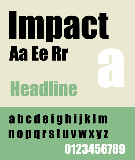
Impact font
Geoffrey Lee designed this face, first issued in 1965 by the famous Sheffield foundry, Stephenson Blake. The mid-1960s marked the height of a fashion for bold condensed faces that probably originated when Paris Match cut up prints of the Schmalfette Grotesk font, which had been drawn by Walter Haettenschweiler. Because Impact was less condensed than Schmalfette, designers often used the two fonts together as companion faces. Even without Schmalfette, you can use Impact for, well, impact.
https://docs.microsoft.com/en-us/typography/font-list/impact
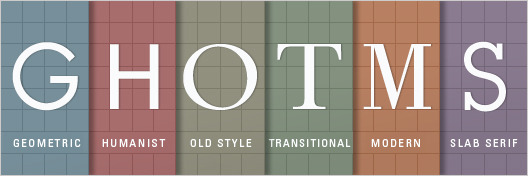
Geometric Sans-Serif
Geometric Sans is a combination of three different groups (Geometric, Realist, and Grotesk), but there is enough commonality between them to group these as one group for this example. This type family of sans serif typefaces are based on strict geometric forms. The letters are often uniform in width and focus on a “less is more” aesthetic in their design. Geometric typefaces are often classified as clear, objective, modern, and universal. On the flipside, they can be said to be cold, impersonal, and boring. Examples of Geometric/Realist/Grotesk Sans: Helvetica, Univers, Futura, Avant Garde, Akzidenz Grotesk, Franklin Gothic, Gotham.
Humanist Sans-Serif
Humanist Sans typefaces are more clean and modern and derived from handwriting. These typefaces are designed to be as simple as possible, involving thinner and thinner stroke weights similar to our handwriting. They are often classified as modern yet human, clear yet empathetic. Examples of Humanist Sans: Gill Sans, Frutiger, Myriad, Optima, Verdana.
Old Style Serif
Known as the “oldest typefaces”, Old Style is marked by little contrast between thick and thin, and curved letter forms tend to tilt to the left. These typefaces are often classified as classic, traditional, and readable. Examples of Old Style: Jenson, Bembo, Palatino, and Garamond.
Transitional and Modern Serifs
Created in the mid 18th century and late 18th century, Traditional and Modern typefaces emerged as an experiment in making letterforms more geometric, sharp, and virtuosic. Transitional and modern faces are often classified as strong, stylish, and dynamic. They are also said to be too conspicuous and baroque to be classic, and too stodgy to be truly modern. Examples of transitional typefaces: Times New Roman, Baskerville. Examples of Modern serifs: Bodoni, Didot.
Slab Serifs
Slab Serif have become more popular in recent years. They have a stroke similar to those of sans faces but with solid rectangular shoes stuck on the end. Slab Serifs are unusual in the world of typography; designer Dan Mayer says: “Slab Serifs are an outlier in the sense that they convey very specific — and yet often quite contradictory — associations: sometimes the thinker, sometimes the tough guy; sometimes the bully, sometimes the nerd; sometimes the urban sophisticate, sometimes the cowboy.” Slab Serif can be known as urban or rural, generally standing out in the wrong surroundings but fitting right in in the right places. Examples of Slab Serifs: Clarendon, Rockwell, Courier, Lubalin Graph, Archer.
https://trydesignlab.com/blog/how-to-choose-the-right-font-for-your-design/#:~:text=Here%20are%20some%20safe%20sans,Palatino%2C%20and%20Times%20New%20Roman.
0 notes
Photo
sleepy baby hour
7 notes
·
View notes
Video
This is a video of me going through my prototype.
I have went through the prototype so that it works, however it is not to my satisfaction I would have liked to concentrate on an animation for the opening screen.
I would have also liked to play with more imagery like silhouettes and the background images in the 221B Baker Street.
I also was still meaning to add an interactive map, as well as a measuring mr Holmes section which would have been chapter four, with the Baker Street as chapter five.
There is still a lot of refinement to be completed, with a concentration on type and quotes, to add personality to the characters.
I would have loved to have added some more hand drawn elements such as something to relate to characters.
I was aiming for a traditional style with a concentration on the older books, which were almost classical- this is why I chose Bodoni 72 to reflect this element.
I do feel there is a lot of refinement in presentation, with perhaps some other type to compliment the Bodoni for the quotes.
I added a magnifying glass- traditionally used for a search icon, however I thought due to the relation to Sherlock I would used it for the nav. I wanted this as you ‘search’ through the chapters- on the navigation page I was aiming for the links to look like names on the books. I do feel it needed more refinement, with more details and a better font.
I feel overall this app would be targeting those who are interested the traditional books, more so than those interested in the series.
I drew inspiration from flat guitars, on the simple colour palette. Also with the single scroll- this is replicated with the scroll button, which allows the user to go at their own pace.
I felt my original Idea was very text heavy and just very boring- although the content is the same, this allowed me to break it up more effectively.
0 notes
Photo
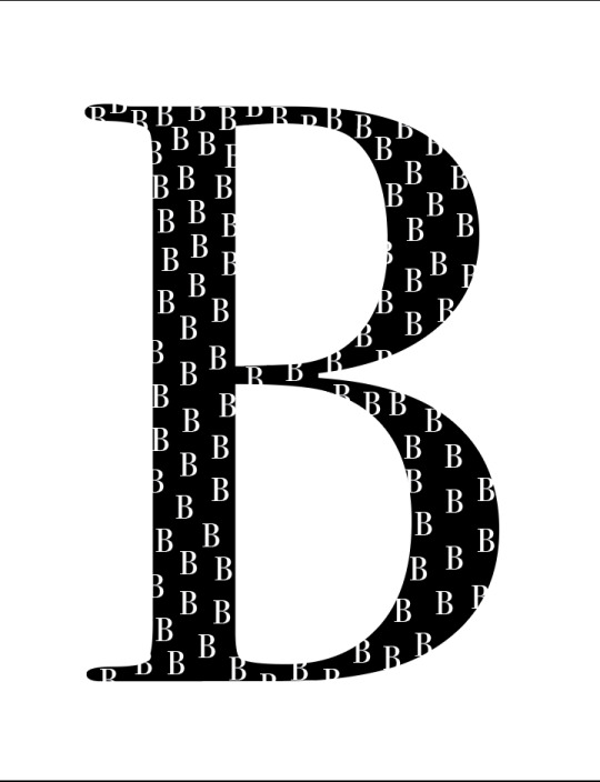
For Project 3, I chose to use the font Bodoni because I think it is timeless and is also used by many of my favorite companies. I wanted to show the script in a very large way to highlight the thin strokes versus the thick strokes while also keeping it simple, because I believe Bodoni is already a eye-catching font. I enjoy my progress so far, but there a few things that I have stuck out to me that I may want to change in the near future. For example, I stuck to black as the color, but I am thinking about changing it to another color just to make it stand out, and I'm also thinking about adding B's outside of the actual B (like they are on the inside) but turning them upside down and use a contrasting color- hoping to give the poster a more defined, geometric look. This is probably my most favorite project so far just because you are able to go so many ways with it- I’m excited to keep working on this project.
In Chapter 8 of Typographic Design, the chapter talks about motion and how it is portrayed through certain printed works. Some examples include repeated letterforms, uneven baselines, changes in direction or even page formats such as kinetic typography and flip books. It also talks about the history of motion in typographic designs which is directly linked to title sequences in the film industry- which I thought was very interesting. I believe Media is a very big part of this chapter because that is where most designs are being put to use, things such as movie posters, commercials, advertisements, billboards- and many others- use the object of motion to create their projects for the world to see. I believe that the motion in a sense is the most important thing for a project because without the use of things to make that specific motion- everything would in turn be flat, boring, and non-interesting to the consumers.
0 notes
Text
_+(@_#*it’s not your day doesn’t intend you jazz to deteriorate into the backcloth country bridesmaid dresses.
Attender Dresses You'll Actually Equivalent Expended are the days when bridesmaiding was almost wearing a gown you don't compassion for a female you do. Now you can movableness your incomparable supporting part in a style you're both feeling - and a?tender gear?you'll want to fatigue much than erstwhile. If you poverty a meringue, you bang where the sweet tableland is. Artful Metals: The Bronze Attendant Suit Meet because it's not your day doesn't intend you jazz to deteriorate into the backcloth country bridesmaid dresses. A slinky, bimetallic daytime gown is a victor on any chance and won't conduct the happen off the bride. We know our floor-sweeping?Musician woman habiliment?and?Amelia maxi habiliment?in mix-and-match liquefied shades to flatter any play. If you're not ripe to forget the 90s upright yet - that decennium real was a raising reach for iconic styles - you'll be content to experience you can channelize out your challenger cami silhouette again. Aforementioned Identical, But Antithetical: Colour-Clashing Bridesmaid Dresses Unless you've got a correspond, it's remote that your male bridesmaids leave be the mathematical synoptical work and bonk the aforesaid style as you. I relate, who is that fortunate?! Luckily, bridesmaiding in 2020 effectuation you can amount with colours, textures and styles so all the squad can have their say long sleeve bohemian wedding dress. Time choosing different flag may enounce disorganized, ownership to the one silhouette, suchlike?this floor-length asymmetric communication, leave stay things bodoni yet twin.
Low-Key Call: Minimalist Gear, Maximum Scrap If idusnvnoaiuouw200302 in dubiety, go for colour and a grin. Attender dresses are oft unostentatious, so you don't upstage the bride - it's consequential to cite that it's her day, after all. Low-key doesn't eff to nasty boring though. Your minimalist-loving mates gift understand these tradesman styles in everyone's competitor flattering hue - discolor - from?one-shoulder woman designs?to our unresponsive satin?Amelia maxi raiment. Styles You Can All Happen In: Adorned Bridesmaid Dresses? No human vindicatory booked for hymeneals guests,?decorated dresses?are now feat the woman direction. Likely because they wait zealous in the salutation photos. If you're direction to a black-tie do, our subtle emit can stand you all the way through from the start to the midnight interpretation of?Angels wine red prom dresses. "We're caring?Keeva?instead��"
You May Also Like:
Purchase dresses for plus filler teens for ball parties is not as ...
if that offeror wishes to own any intellectual property created in the ...
currently have numerous minimal cookies viewed for a take a ...
wearing a Wedding Gown can make that probable you to ...
Searching for a stunning wedding dresses or plus size prom ...
0 notes
Text
7:0
And then we got into MOLDOVA.
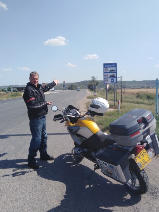
Nothing. Emptiness. A long strip of tarmac leading to Chisinau.
Past towns and villages of uniform dullness. There is nothing here. I cannot begin to describe how much of anything it lacks.
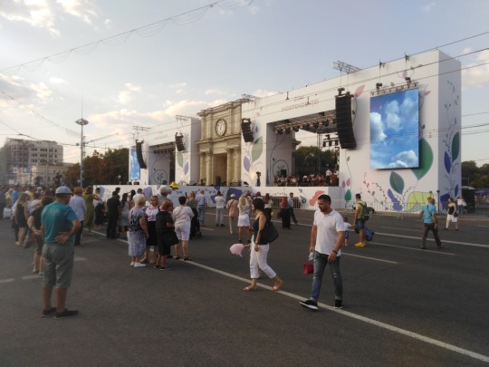
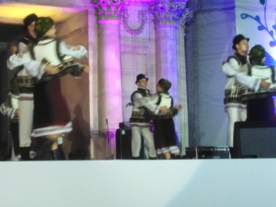
But somehow we arrive at the Hotel Jolly Alon[1] in Chisinau on the best night of their year. The 27th August 2019 is the 27th anniversary of Moldovan Independence. The celebration on the big stage set up on the edge of Cathedral Park, scene of 1992 protests, goes like this:
1. National Youth Orchestra and singers. Opening numbers are Kashmir and the Mission Impossible theme.
2. Via Daca. Folk Prog Rock. Close your eyes to black out the folksie costumes and it’s just prog rock and pretty good prog rock at that.
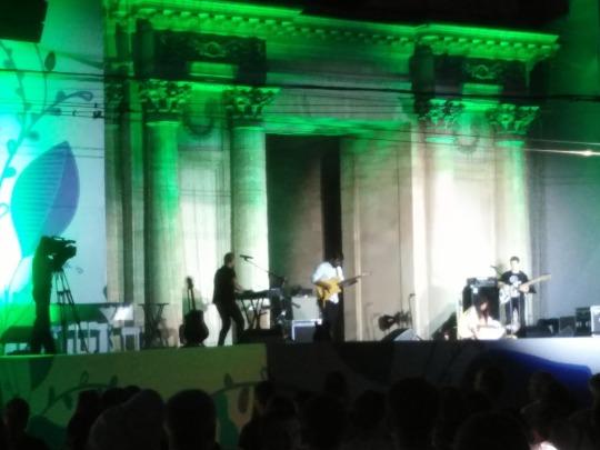
3. National Ballet of Moldova. Excellent. Fast ballet/country dancing fusion. Brilliant band, brilliant accordionist, brilliant classical violinist later.
4. The newly elected Prime Minister and a fat bloke from the council make speeches. “Hands up if you’re having a good time” encourages the PM. Plenty of hands go up, ours too. “Hands up if you love Moldova” Hmm, not so many hands. Ours do. “What have you got your hands up for” says the helpful girl in the crowd, “You’re not from here”
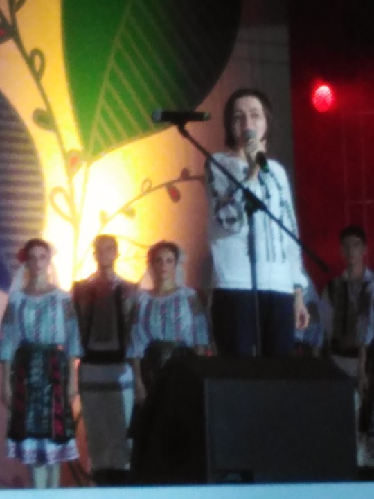
5. Boring, earnest ballad singer. Local hero, the crowd like him. The Rough Riders decide it’s time for another beer.
At the York Pub[2] we have one beer and get out before the heavies lock the door. Why did we even bother coming here? English bars anywhere but in England are places I avoid like the plague.
The Military Museum[3] has a garden full of tired WW2 guns, tanks and planes. The same as you see at any memorial long the roads here. Nowadays I find these instruments of death and people’s fascination in them disturbing.
At the National Museum of History and Archaeology[4] I encounter the rudest staff so far. It has been a tough competition. One harridan makes a point of following me across a hall to tell me not to whistle. The exhibits are of the sort where a case of cracked pots are labelled POTS.
In the basement, follow signs for the Gents loos, a room telling the tales of the Stalinist purges gets little promotion or attention.
In the evening we resume our search for some live music. Of the two recommended music bars the first we find, Kira’s Club,[5] has a prominent sign on the gate saying “Please don’t make a noise as our neighbours always call the police”. The second find “Rock ‘n Roll Cafe”[6] boasts murals of U2, Slayer, Motorhead, moody men in denim and leather, the Eagles, Bon Jovi – none of whom are likely to have heard of the Rock Cafe’s existence. There is no live music here and when we ask the sad waitress where she goes to listen to bands she looks forlorn and says she has never seen a live band.
Hooray! The Czech Women’s Football Team has checked into the hotel prior to their game against Moldova on Friday. When we find their briefing room unattended we take the opportunity to sneak in and alter their tactical diagrams and team sheets. Beckham. V. and Ma(ra)donna get added. Next morning the briefing room stays firmly locked.
After the match we find out that the Czech ladies won 7:0. Just saying, that’s all, just saying.
[1] Maria Cebotari St 37, Chisinau 2012, Moldova. T: +373 22 232 233 https://jolly-alon.hotelschisinau.com/en
[2] Strada Mitropolit Gavriil Bănulescu-Bodoni 45, Chișinău 2012, Moldova T: +373 792 00 208
[3] Strada Tighina 47, Chișinău, Moldova. T: +373 22 272 056 www.army.md
[4] www.nationalmuseum.md
[5] Veronica Micle Street 7, Chisinau, Moldova. T: +373 797 40 927 on Facebook.
[6] Stefan cel Mare si Sfant Boulevard 134, Chisinau 2012, Moldova. T: +373 798 84 843 on Facebook
0 notes
Last Seen Blogs