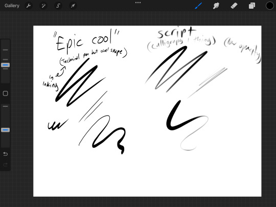
#bc you can make it a really light color and do a sketch
Text

ranked pretty much all of my finished art on my computer and a couple sketches. can you tell i like hunter x hunter
#ben jumpscare in there#raey draws#not a real art but i AM drawing godbless#raey spam#more elaboration on some: the killua & leorio one is Fine i guess i just don't like it#also stopped liking making it about halfway through & you can kinda tell#the blue killua piece has 2 different rankings bc i didn't understand lighting but the actual drawing was pretty good#look ok the group picture w omori is in special tier cuz it would be so good if it weren't for sunnys goddamn neck#i really have to fix that one of these days lol#but aside from that i really like it#the mari picnic one i liked the sketch way more#mari herself looks good but the background and the picnic basketand the literally everything else....#i do like the gon being beat up drawing BUT there are like 2 pixels that weren't colored in and it annoys the hell out of me#was kinda debating whether or not to put a couple of the pieces in draw that i like in special tier#technically the haircut aubrey piece is supposed to be in special tier cause it fits the requirements#(draw that i show people who haven't seen my drawings before)#but ehhhh#i like the alluka one better ig#also if you're curious about the purple eyed abomination on the bottom thats a Really old art#was supposed to be a cross between phil tpn and yashiro nene (i did not choose these characters)#looks like trash rubbish horrible. its so funny
6 notes
·
View notes
Text
Gold Tutorial
hiiiii i got asked for how i color gold. tbh most of the time i just blob shapes in but i can try to explain my process too <:v
(i was trying to write more b4 giving up bc my handwriting is a mess)
here is an elf ear to start with! i just paint on top of my sketch for gold but feel free to line art or do whatever is your normal process
we need to keep in mind gold is reflective! so while picking a light source keep in mind there will be light bouncing back. typically i do this by not coloring the shadows all the way to the edge, but if there are multiple sources be ready for some bounce light action too

heres some colors! the second lightest shade is the base color we'll be working with. feel free to make the gold cool or warm toned, i just usually make my gold warm toned. in theory this also works with rose gold and silver, so feel free to play around with colors!
we're gonna keep in mind the light source, which i will be using the same as the example photo roughly. again i'm really messy with gold i just slap it on on top and it usually works okay but refine the shapes if you wanna!
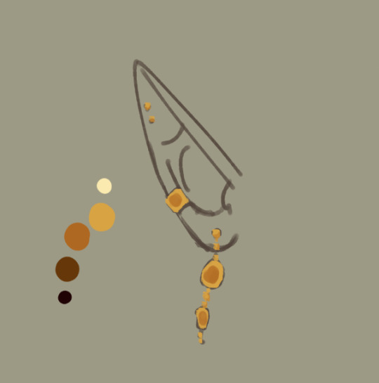
first shadows! i keep these towards the middle to build shape. playing with different shapes of shadows will give different form to the metal but tbh.... i build most of my form in the highlights

second shadows: i focus these usually closer to the light source, but you can also do darker near the rebound light. again, try not to color directly to the edge to keep it looking very shiny

darkest shadows! like before, but smaller. here you can also add in different colors blobbed in the shadows if you want. i find its easiest to see reflections in the 'shadowed' parts of metal. add in your character's hair color, clothing color, or even the bg color if you want!

example with my nerevar picture of the reflections: you can see the blueish-grey of his collar in the gold to give it more dimension! even if you're working with abstract shapes it can help sell the illusion with more detail.
next up is highlights which i use a blending mode for (actually every highlight in anything i draw uses it but i feel for metal it REALLY helps): Add (glow)
or at least, it's called that in CSP. in other programs it might have a different name.

first highlights i like to draw rays of light from the light source and blend the parts furthest from the light. you can curve these according to shape but tbh most of the time i just do this. or you can softly add it in very blended like the nerevar picture above for a brighter look

second highlights: i add them in around the top and bottom. keep it organic really if im being honest.
ANDDDDD UR DONE! it should hopefully look like metal. tbh i have no idea what im doing <:v
i hope this helped a lil!
148 notes
·
View notes
Note
hi, correct me if i'm wrong but i seem to remember you saying that you're majoring in illustration! i'm currently in the process of applying to colleges and i plan on majoring in illustration as well, so i was wondering if you had any advice for portfolios. I could really use some tips on the presentation aspect specifically, bc I'm a little lost when it comes to stuff like the arrangement/organization of pieces, how I should crop my pictures, etc. any advice you can give me is greatly appreciated!!
hi yes i can totally help you out with this! i like to think my college portfolio was pretty good bc i got accepted to every school i sent it to lol :) the main pieces of advice that i was given when building it were this:
studies and pieces that show off your technical skill are great, but limit them to around a third of your portfolio at most. art schools DO want to see that you're technically skilled and can like, draw a charcoal still life or a self-portrait, because those ARE important skills to have, but ESPECIALLY if you're applying to a school that's more known for contemporary fields like animation or illustration, it's much more likely that they want to see your creative mind at work. the single best thing you can put in your portfolio is a BODY OF WORK, and specifically a body of work that shows off your own ideas and your own take on whatever you're producing. this means 3+ pieces that are interconnected or related to the same central theme. my portfoilo, for example, consisted of 2 or 3ish traditional, technical pieces which showed that I had a certain level of technical skill, and the ENTIRE rest of it was devoted to a series of original interconnected narrative comics I'd written and drawn. Every reviewer I met with told me that this was what made my portfolio stand out to them--it showed that I was not only technically skilled, but that i had something i wanted to DO with that skill, that I had direction and drive with my art and was able to produce work that reflected that. If you're maybe (definitely) not quite as ambitious as me, something like a series of 3-5 interconnected illustrations or a short comic if you're into that might do the same thing.
as a side note, if you DO have a body of work as the central focus of your portfolio, a lot of colleges will be interested in your process as well! for example with my comic portfolio, i used one slot to demonstrate my process, because I penciled every page traditionally before digitalizing it and i had extensive character and worldbuilding sketches. I wouldn't devote more than one slot to it, but if you have a body of work where the process is important to you it could be worth throwing in!
arrangement is tricky, but the advice I generally heard was "put your best stuff first." whatever you're most excited about, whatever is going to grab someone's attention the fastest, that's what you want to have in your first slot. (I actually don't think I followed this advice on my applications LOL but it's what i was TOLD to do and i think it's solid advice.)
in terms of editing, assuming we're talking about traditional pieces being photographed, you want to make sure your pieces are 1. well-lit, (DO NOT TAKE YOUR PHOTOS WITH OVERHEAD LIGHTING. wait for an overcast day and take them outside trust me) 2. legible, (no weird shadows obscuring parts of the piece, high-quality enough that no details are lost due to digital pixelation, etc) and 3. as color-accurate to real life as you can make them. most of this is just about getting a decent-quality camera (a newer iphone should be fine) and a good location. (outside and overcast, as previously mentioned) you may want to throw your pics into photoshop and play with the balance slightly, but I wouldn't do anything too drastic, try to get the most accurate photo possible without any editing. (if your pieces are small and flat, scanning them in may work better. most public and school libraries have scanners you can use for free.)
finally, cropping. the general rule that I was taught is to crop the piece, not the photograph. if you've got a piece on paper and you're not sure you like how the actual drawing is oriented on the paper, crop the PAPER down to size, and THEN photograph it. your photos should aim to show the ENTIRE piece from edge to edge (unless it's a detail shot obv) and I even like to include a little bit of extra "breathing room" around the piece so that it's clear exactly where the dimensions of it end. here's a piece I used for my college portfolios for reference:

i lowkey do not like this piece now but that's not the point. this is what i mean by breathing room--a few extra inches of space around the actual canvas so it's clear that this isn't a closeup and you can see where the canvas actually ends. the same is true for digital pieces. if it's a full bleed illustration (something with full color all the way to the edges of the canvas) just make sure you like the composition cropped the way it is and submit the full piece as-is. if it's a floating spot or something similar without hard edges, leave a bit of white or transparent breathing room around the edge of your image.
hope this helps! if you have any more specific questions lmk :)
#asks#^ guy who is terrified at the prospect of having to build a portfolio for fucking JOB INTERVIEWS now lmfao
88 notes
·
View notes
Note
Something about my drawing feels off , i only got into digital drawing few weeks ago and I'm stuck at the same point and lost .. any advice?
mmm okay first of all this is really good- first impressions-wise, the proportions and anatomy look very solid so there are no major glaring issues so to speak
if you were to ask me, what i think this artwork needs is that sort of 'volume' or depth that most beginner digital artoworks lack. You can achieve this sort of volume in two ways depending on the style you are going for: either by improving the lineart, or by treating the lines just as part of the sketch and painting over them for a more.. ''painterly/rendered'' look
if you want to keep the lineart in, what i suggest is adding some "line weight" so that the artwork doesn't look so flat. What i mean by this is to thicken the lines where body parts would naturally overlap (like the neck and shoulder, the nostrils area, the corners of the mouth as well as the tip of the lips etc) and where shadows would normally be for the illusion of volume. After that, i'd also add more shadows and color variation in the colouring layer so that the skin looks more lively and again, for that volume. You can do it with some dark blue or orange on a multiply or an overlay layer, just experiment a bit with colors and blending modes.
If you want a more messy/painterly look (which is more down my alley or in line with my artstyle), what i'd personally do is i'd create a new layer on top of everything and just paint over the lines with broader strokes and a darker color in an attempt to add some volume to the shapes and to make the artwork look more cohesive and less "digital" because at the moment, i can tell that it is made up of a Lineart layer, then a Colouring Layer below, that very religiously follows the lineart layer and then maybe a layer on top of that for the other colors and the hair. This is a very common digital art process and a good one to keep in mind but a little secret i can give out that i've noticed in 80% of the artists who have this sort of drawing process is that they will always, always merge everything in one layer at the end and adjust things as they go. They will not keep the layers separated and just never revisit them in the process, despite what it may look like. There will always be something that needs fixing and they will fix it as they go so i suggest doing the same and being a bit more "freeform" with your layers
Anywayss, besides that, I'd also introduce some color variation like in the previous method. As a general tip, try to move the color slider around and don't just shade with a darker variation of the base color. I like how the hair is painted and the shine and everything, it looks very good and everything is pretty much set in place, i'd just render it even more, make it More voluminous. It's just missing a little pop a color: i'd add some blueish gray hues in the brown hair and for the purple hair i'd make it more rich by adding some deep dark blue hues and some faint yellow highlights (bc purple and yellow are complementary colors blabla) As for the shape, think of the hair as chunks of volume that reflect light and that are also affected by gravity.. or as spaghetti if u like flat hair like me bsjsjd
That's all i could think of; Again, it's very good and promising considering you started just a few weeks ago, so keep going at it! I hope it was at least somewhat helpful and that i wasn't being too technical with the wording (and that it made sense)
#i hope it didn't come across as mean or something#i have a bad habit of being pretty blunt with my words#and upseting people#the artwork is really nice and pretty but i was asked for critique so i pointed out some parts that could be improved#you don't even want to know what my art looked like a few weeks into digital art lmfao#this is 10x better#keep at it op!#and again hopefully i didn't offend with anything don't take it to heart you don't have to listen to me do what u want#ask iztea#if there are any typos no there aren't
51 notes
·
View notes
Note
I love your art!! I really admire your work and I love your deltarune fanart, especially how you draw noelle :) whenever I look at your art I always feel like you have such a firm grasp on anatomy and all your drawings feel like they really exist in 3d space, and i love how the characters in your drawings are shaped :0 do you have any tips for a learning artist?
well gosh, after you buttering me up like that, how can i refuse? (jk but in all serious, thank you so much this is SO sweet) anyway, let's see, tips..... (this ended up turning into a whole tutorial lmao)
so one thing you'll hear a lot of artists say is to start with a warm up first, but not a lot about what "warming up" actually means. some people take that to mean they have to start with a whole other drawing, personally i find that takes away too much energy and i end up spending way more time on it than i want to. i like doodling little cubes and cylinders, but if i have something to color sometimes i just do that to warm up. whatever works for you best, just anything to get your hand used to the motion of drawing.

for starting the actual drawing it really is important to begin with a line of action. think of it as a basic guideline for how you want to pose a character. it will help the pose flow better, trust me. (im going to draw noelle bc obviously im pretty used to that)
some artists start with just the line, i like to do the guide for the head first and then the line, whatever
you dont absolutely have to follow the line for your pose btw its just good to have an idea of what youre doing before you do it
after that is when you start worrying about shapes, usually. an important thing to remember when drawing is that absolutely everything is made of shapes, first and foremost. humans, animals, objects, drawing anything starts with shapes. circles squares and triangles. this goes for drawing from life too! it's why you want to start with a light pencil or a sketch layer cuz this is the stuff youre gonna erase later, but it's essentially the skeleton of your drawing
btw, i give noelle a very basic "average thin teenage girl" figure but it's good to practice other body types too and learn what shapes work best for drawing those

you mightve heard the advice to "draw the person nude first and then draw the clothes on top of them" and that's only partially true- it's good to know what the shape of the body is before you dive in with the clothes but you dont have to do like, a whole nude model first. you just need enough to understand how the fabric is going to fall on the body
also, and this is sort of off-topic, but when it comes to clothes its good to understand how different fabric works and how it's going to react to a body underneath it. some fabric clings, some is very loose, some is thin and some is thick. basically what im saying is that you dont have to shrink-wrap the clothing to the body, especially when it comes to a character with breasts or anything else that sticks out. thats a mistake a lot of beginner artists make. in this case, noelle's robe is very loose but i still want it to conform to her body a little bit so the pose isn't totally lost

aaaaand there ya go! after all that is when im ready to actually draw the dang thing. you can tell if you look close that i didnt totally follow the guidelines i made for myself, and that's okay. for example i tend to almost always draw the head too small and then have to enlarge it afterwards. one of the perks of being a digital artist is i can make mistakes and not have to re-do the whole drawing to fix them.
one other thing as to how to get better at actually drawing the body right in the first place- FIGURE DRAWING! as cliche as it might sound it really helps. it's best to draw from life, but if you can't get into a class for it there are plenty of websites out there with good photography of nude models. i also reference a lot of my poses from those websites, or sometimes from videos of figure skating or ballet if i think the situation calls for it.
this is a good website for figure drawing practice- it lets you set a timer so you can practice getting a pose down quickly or spend a lot of time on one model, your choice
also, yknow, always make sure you're having fun and dont stress out too much about whether what youre drawing looks good. the more you draw, the better, and don't think you have to post everything to social media if you dont want to. draw for yourself first and foremost and observe from life and artists you admire what you WANT to draw and want to get better at, and what looks like fun. that's the most important part
#(im doing this to avoid having to write something else dont tell anyone)#i have no idea if this is a good tutorial or not or if its all stuff you already know#im basically parroting what i was taught in art school. so you dont have to go to art school
563 notes
·
View notes
Text
Nagito Color Study | Please do not repost, reblogs are welcome though! Brushes & Techniques & a progress pic below the cut
Uhhhh okay, how to explain this one. I was rereading “Logically Lucky” by PinkSweetSmoke and some of the visuals in the earlier chapters really struck me. The way that they write this relationship is pretty dynamic, and I wanted to see if I could use colors to talk about how Hajime and Nagito feel for each other and what they’re going through emotionally? So this is fanart for that fic, directly inspired by that fic based on the established vista(s) and also the style of writing their relationship, but it doesn’t really make sense unless I say all of that lol? But it wouldn’t exist if not for that fic, so I’d feel weird not mentioning it.
Brushes used (Clip Studio, Free):
Main: “ラフペン” from gyuukotu’s “Fill Set (塗りセット)”, content ID 1695210
Fill: Default India Ink brush pen - the rough pen is a little unpredictable, so I used this to flat the image and make sure that there were no gaps
Cloud Flat: "荒筆" from gyuutoku's “Fill Set (塗りセット)”, content ID 1695210
Cloud Blender: I downloaded it from the internet instead of the app 2 years ago and cannot find, with certainty, where it came from, since I get rid of everything on my hard drive that's not art every year :( there are lots of good cloud blending brushes out there for free, though, and I typically use the gouache blender
Misc. Techniques:
Screen Distortion: I used CSP's free cloth texture clipped above the "blue" layers and then liquified it in places for the screen distortion effect
Gradient Mapping: I cannot overstate how helpful gradient maps were for minor color corrections, you guys PLEASE try them on a finished piece of your own if you haven't used them yet. Click Layers > New Correction Layer > Gradient Map and then choose from the premade gradients before adding your own so you can see how they worked. I used a few different ones clipped to specific areas w/ lowered opacity & hard/soft light settings where I felt like the color was falling flat and it was SO helpful at giving it just that little bit more depth.
Hearts: I've discovered that you can cheat at hair and clothing rendering by just making hearts. Try and see how many you can find lol
Color Theory in General: The whole point of this piece, after it stopped being fanart (lol rip), was to be a color study focusing on the contrast between shadow and light and what I could do within the blues & the yellows to make them appear as if they're actually different colors. In the blue section, everything is p much blue, nothing is any other color. In the sunny section, a lot of the stuff is warmer variations of the standard colors, since I wanted it to be more vibrant and didn't feel like I could achieve that if everything was shades of yellow and orange. That being said, I stuck as closely to that as possible. But ANYWAY, juxtaposing the two starkly different color profiles also helps the blues in the blue side read as colors that they aren't, which was part of why I did this study.
Sneaky sneaky: I just modified the diner a bit in order to get the colors I wanted, i.e closing the blinds bc I can. As an artist it's important to remember that YOU have full control over every single part of the piece, you just should ideally have a reason to create inaccuracies/ break rules or else it can end up being a bit messy and disorganized & details/ your vision can get lost.
Aaaand finally, the sketch from TWO AND A HALF MONTHS AGO:
#trusttheprocess 😭😭😭
#nagito komaeda#sdr2#color study#super danganronpa 2#nagito fanart#my art#october 2023#jesus I started in july#but I also like let it sit for a good 2 months after the mockup#so shhhh#fav#komaeda nagito#character study#fanart
70 notes
·
View notes
Note
if I’ve already sent this ask before I’m so sorry, I’ve got adhd, but how did you find your art? (I’m in my questioning phase)
hihi!!! no problem! i think i have some kind of glitch with asks bc when i go look for them it says i have 3, but when i check it, there isn’t any so im sorry if any of u have ever sent asks and i havent answered them it’s probably bc of that😭
but anyways lets get on it!
finding you art style is not smth simple at ALL. ive been drawing my entire life!!! and ive had a bunch of different styles until now, they kinda used to change every few months or so, i was always happy with them but it never really lasted??? and i always had at least one part of the process of it to dread doing, for example, coloring.
it wasn’t until recently i FINALLLYYY found a style im 100% comfortable in.
it really takes experimenting and finding what elements of creating art you love and enjoy the most. for me, i used to mostly do traditional art, just pencil or ink sketching and i would OCCASIONALLY color them. so i really used to enjoy kinda the messiness of the pencil on trad mediums and stuff? and i never rlly found a way to translate that element to digital art which is the one i enjoy the most now.
brushes are very important! it depends on the look you like. since i like that pencil feel, i use a pencil looking brush! (softy from esbenlash’s procreate brush set) and i also got a paper feel screen protector for my ipad to enhance the experience🔥
i found i mostly enjoyed doing lineart and didnt rlly look forward to coloring, i didnt find my past styles enjoyable bc they kind of felt restricting in that area? since i didnt find a way to make it more abt the lineart and less abt coloring that i liked (ofc theres plenty! i just didnt find one for me)
so tbh i think what mostly influenced the style i enjoy the most now is film, and baroque art!
i had recently seen:
Crimson Peak (2015)

The Shape of Water (2017)
and ofc


Stranger Things DUHHHHH
and i fell in love with the way the lightning was, heavy dark shadows and moody lights, and tried to match my style to it and found that it highlighted all the things i enjoy doing the most while drawing! so thats where i am now
special mention to the one movie im obsessed with currently


The Crow (1994)
also has the similar style
all that + experimenting, studying other’s art i liked and finding elements to integrate to my art, ANDDD music also played a huge part in it. so as you can see for me its about kind of combining aspects of every single piece of media i like 😭
its not gonna be the same for everyone, but its always good to have a guide so i hope this was useful for you and anyone else! im always willing answer any art questions :)
don’t worry too much about speeding up finding your style, it’ll come to you eventually, so focus on enjoying the moment and learning, take mental notes of what you like and don’t like!
sorry this is kinda long as hell… but i like rambling
#perfect opportunity to show off these shots from my fav movies teehee#art truly is all one!#i love getting inspired from multiple medias and combining it into drawing#ari answers asks
18 notes
·
View notes
Note
Ur strength is definitely color and line work. Something I would say needs some work is definitely your full body drawings and poses. Your poses are always static and rigid and (especially when in motion) it takes me a moment to figure out what the character is supposed to be doing. Your anatomy is fine, its the stiffness of the over all pose thats the issue. It makes your pieces lack energy and any real umph. Your beautiful use of color and line usually covers for this but for me (someone who also struggles with this) it pops out like a sore thumb.
To practice, id suggest doing gesture drawings (1 minute sketches of action poses) to really understand how the body moves fluidly and to practice capturing that energy. Id also suggest doing 5-10 minute studies of full body figures in which you specifically observe how the pose affects the distribution of weight. How the torso curves in relation to the pose (your torsos are often very vertical and stiff) and how their muscles, fat, and clothing stretch, bulge, or fold depending on the pose.
Try to keep things loose during these studies and focus on capturing the energy of the pose over perfect anatomy. Focusing on anatomy can often be a distraction and can actually detract from capturing the fluid movement of a pose when you are first learning. You dont want to be thinking about anatomy during a 1 or 5 or 10 minute study if that is not what you are trying to learn.
While doing gesture drawings, its important that you move fast and dont get hung up on details. Get the line of action in there and the general shapes of the figure. Focus more on the movement of the figure over anatomy or details. Feel the rhythm in the pose and do your best to capture it. Id suggest doing 10 or 20 of these at a time. Sites like Line of Action are great for studies like this.
For 5-10 minute studies you want to build on the rhythm you developed during the 1 minute studies. Again, you want to focus on the movement of the pose over the details. Keep shapes simplified and force yourself to think in the abstract. A vibe i get from looking at ur art is that you get focused on the small details while losing sight of the big picture (might be wrong bout this but its something i also struggle with lolol) so during studies its important to keep ur mind on the bigger picture. Focusing in on small details adds to the stiffness of a piece as instead of one singular piece, it’s made of many smaller pieces. Idk if that makes sense lololol. Id do 1 hour of these 5-10 minute studies.
But yea id say this is really the main thing holding you back right now. Once you figure out how to capture the rhythm and energy in a pose id say ur golden lololol good luck! I hope this helps XD
oh gods yeah I need to whip some referencing for poses and specially dynamism, I tend to make things a bit too stiff. I think I cornered myself into making very static poses since I do a lot of character ref oriented work, and showing the design and outfits is a priority over the dynamism, and like, I need to get working on that.
It sucks to realize how I've let social media performance guide a bit on what I draw and I practice. People like their fullbody character designs with a grey background, and I've let a lot of What Isn't That fall apart, and it's bad! I gotta get better!
I need to find a way to maybe get a way to do these practices and still post it, bc even when I've done them, they stay in a folder and never get to see the light of the day. (Also, I saw the other ask and I'm gonna check that one soon! I struggle so much finding good refs for that!)
13 notes
·
View notes
Text
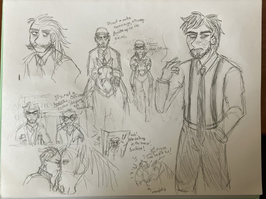
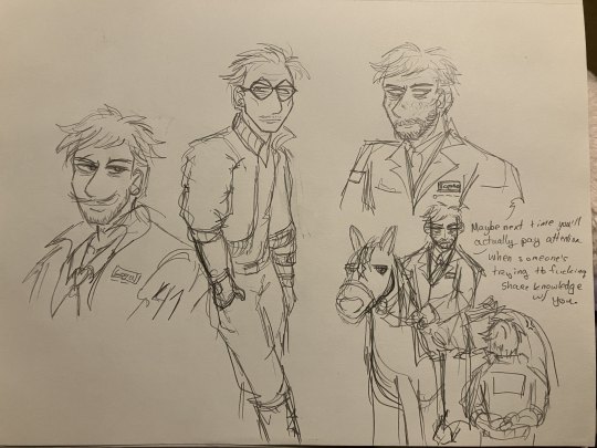

it's time for jean himages (horse images). i want to trace and color some of these digitally but itll take three years so here's what i have for now. so im posting on this blog for the headcanons and bc they're not full art pieces yet
anyways these r just sketchbook doodles so theyre not the greatest anatomywise (bc i fix them in post (ie digitally)) but you know what i stare at them so much so here
jean rides his horse in the french style which involves Lightness (a way of like. communicating with your horse and making sure the horse's needs are met, i think) so he's. really gentle with his horse. he braids the horse's hair in dressage style so button braids on top and then plaited tail. it's a big black horse with a white blaze and white socks (yeah im a horsegirl too) (in my digitally lined version of that third image, i spent like an hour making sure all the tack was accurate to the riding style. this is just the initial sketch so it's not accurate here, so you're just going to have to pretend)
harry rides horse a mixture of western and english bc he always does everything his own way, and kim (and judit not pictured) rides english bc that's the standard rcm procedure for horse. also as part of the mounted cop uniform, they have to have riding helmets lol
i think harry's horse is a small chestnut mare with a blaze and stockings, and kim's is a little bigger dark bay. they're quarter horses / thoroughbreds mostly. tho tbh they're probably elysium / insulinde specific horsebreeds that i don't know about
kim hates doing horse bc the horse never listens to him. he's used to kineema! so he's too tight on the reins. but then he ends up liking the horse anyways
obviously a lot of these r not too canon to my headcanons bc there's a few ooc phrasings and some things aren't solidified to events that i want to write about but that's ok. i'm working on writing some kinda' post-Martinaise dynamics bw Jean, memory-loss Harry, and Kim as well as the others at the 41st, and I want a lot of 'Jean has to teach Kim how to ride horse' in there. coz i think it would be fun to write kim 'wow jean is competent??? and i have to take orders from him even though i fucking hate his guts???' kitsuragi lol. making kim not good at something for once and he hates it so much how tf do you stay professional when the horse keeps misbehaving and you can't control her
also im headcanoning that all the motor carriages in insulinde at least are the british way: driver on the right, passenger on the left. carriages / horses on the road on the left (bc the rcm patch is on your right shoulder, so when you pass people on the left they can see it (if you're doing it the "normal" way ie driving/walking on the right, people can't see your patch when you pass them (i know this from experience bc i put white tape on my trenchcoat rcm-style)))
transcript for my handwriting under cut
First Image:
jean on horse in the top middle: It's not a motor carriage, Kitsuragi. Loosen up on the reins.
kim on horse in the top middle: I know that, Officer.
kim in the car middle left: It's not a horse, Officer. You're driving too carefully.
jean in the doorway bottom middle: Hah! You're talking to the horse! Sucker!
kim with the horse bottom middle: I was just putting on her bridle Vic!
Second Image:
Jean to Kim bottom right: Maybe next time you'll actually pay attention when someone's trying to fucking share knowledge with you.
Third Image:
Jean on left: Hurry it up back there Lieutenant, we don't have all fucking day.
Harry in middle: He's got this, Jean!
Jean: Don't Jean me.
Harry: He'll be fine!
Kim on right: If you had let me keep the Kineema, we'd be there by now.
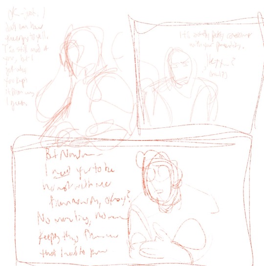
#these doodles are just a trick for y'all to read my hella' long as fuck texposts#bc i have SO MANY GODDAMNED THOUGHTS ABOUT EVERYTHING#about the Characters and the Worldbuilding and the Dynamics and the Plot#literally so fixated on this media it's incredible#doodles#my art#jean vicquemare#harry du bois#kim kitsuragi#jean horsegirl vicquemare#disco elysium#horses#de#also eyes is there in the second image but dw about him thats a bad drawing of him
16 notes
·
View notes
Note
if it's okay, would you mind sharing your art process? your style is SO gorgeous dude. keep it up spardacest nation!!!
Thank you so much anon, and of course!
I kinda posted about it on twitter a while ago, but for anyone not also on there, here's a paraphrasing of what I said there!
(under a cut bc it's gonna get a bit long)
(speedpaint video from procreate mostly bc like I also said in that post, it's one of the few pieces I've done entirely on procreate and thus entirely recorded kdfjhdk I usually don't do the sketching + painting parts on there but every now and then I get lazy and want to get it all done quick in one program lol! It's not as good as it would look if I were using krita to render (which is what I normally use) but it gets the idea across decently of what it is that I do)
The short version of my process is:
sketch, clean up sketch for lineart, then flat colors, then paint over the flats (i make the flats my shadows and paint on the light), then a multiply layer for skin details (like lips, eyebags, etc), then an overlay layer for skin transparency details (red over the ears/nose/fingertips etc), then i do hair over the lineart, then a multiply layer with the contact shadows in a light beige/grey/neutral tone on top of everything else, and then i unify layers, paint over the details, and color correct the HELL out of it
The longer version is:
SO, first of all, I will say, my entire process for a finished/fully redered piece is pretty scattered and uses a lot of different apps, because after many years of trying out different drawing apps I found that I just worked better when I could incorporate the parts I liked best from each individual one rather than having to adapt to another app entirely!
In total, what I use is: autodesk sketchbook and procreate for the first half I do on my ipad, then krita and photoshop on my computer when I'm actually rendering (but any photo editing app instead of ps will do, I'm just used to photoshop bc that's what I learned as my first drawing app WAAAY back in the day lol), and then meitu on my phone for color filters (also any phone editing app with filters in it will do), AND also optional just for references: blender and daz3d on computer + magicposer on my phone
The actual step by step of what I do:
First of all, if I want to do a detailed, well rendered piece I will start by getting my references ready. That means either just grabbing a screenshot from the game if it's like, a simple portrait, or a photo reference, taking a picture of myself in the right pose/lighting, and if it's something more complex I will recreate the scene in Daz3D to simulate a realistic lighting, OR even just blender (i have the game models for the dmc characters downloaded, so I can just pop them in, pose them and change the lighting to get a realistic idea of what shadows their faces will cast in that specific angle/lighting.)
Note: references are pretty essential to me, and there's nothing to be ashamed about for using them! Personally I don't struggle a lot with the drawing/sketching part of art, but my tiny little pea brain cannot fathom how to make an object 3D in my mind, and how to visualize shadows realistically... thus the reliance on 3D programs to do that for me, and then all I have to do is draw what I'm seeing lol. My art improved significantly ever since I started making 3D refs so I could get /exactly/ what I needed - there's still a lot of leeway you need to learn though, because as realistic as the lighting will be in a rendering program, you'll never really get a fully natural looking image, as far as stuff like the body stretching/squishing/pulling when it's in movement, facial expressions, folds in clothing/fabric, etc... so really it's more a guide than something meant to be followed 1:1.
Then, once I'm confident I know exactly what I'm gonna draw/have the idea in my head, I start sketching it in sketchbook. Not really getting very in depth, just blocking out rough shapes - I like sketchbook and to be on my ipad for that because it feels very reminiscent of traditional sketching on paper to me, which while I'm not super confident on my traditional art abilities, I do get the most natural/fluid/non-stiff figures out that way.
Then when I think I have the general idea ready, I export the sketch layer as a png and import it into procreate - which is where I kinda start picking at the sketch and polishing it like i'm carving it out haha. Lots of liquify tool, flipping the canvas to check if it's even, blending out some of the lineart to help out with the rendering later, and then polishing up what was once the sketch into serviceable lineart. I usually reimport it back into sketchbook at this stage - while I like procreate for drawing I don't love the brushes I can use for lineart there, and so I usually only draw the "base" naked figure in there - when I'm in sketchbook I use a hard pencil to refine the details, then on a separate layer add all the things "on top" like hair, clothing, etc - usually I can get it pretty easily in one go, and once I'm satisfied I erase the naked body under the clothes and unify the lineart layers.
Then I will just do the flats with a hard brush, turning the lineart layer into an overlay layer and coloring things in with the shadow colors.
At this point, I export the file as a psd and import it on my computer - I give it a once over in photoshop first to see if there needs to be any adjusting (like whether any layer that has an effect needs to have a different effect, if all the colors look right since the ipad screen isn't the most faithful, if i wanna change the background color, etc), and once I think it's ready enough, I open it up in krita, where I do the actual bulk of the painting/rendering (as to why specifically krita: it's because I've gotten very comfortable with the brush/painting brush dynamics there and cannot seem to get as good results anywhere else, it's just the goldilocks spot of a brush for me haha.)
If anyone's curious, here's the brushes I usually use for painting:
The one in the middle is my go to painting brush, left one for tinier/more refined details, right one for blending out soft shadows (though I learned the hard way to not overuse it, or it will look like I went ham with an airbrush tool lol).
(I don't change any of the settings on these brushes, so if you wanna try out the exact ones I use! Just fresh off how they come out the app haha)
I paint on the lights on top of the shadows, and just focus on that for the time being - once I'm done with the basic painting, I'll make a separate multiply layer for details like lip color, eye waterlines, makeup if there is any, eyebags, etc, and then adjust the opacity until it feels right - then I'll make an overlay layer with skin translucency details (like, when you hold your hands in front of a light and see the tips of your fingers become bright orange - many parts of your body are always a bit translucent to the blood underneath, specifically parts where the skin is thin like noses, cheeks, joints, knuckles, etc, and I found it makes the character look a lot more alive to add that subtle coloring in) - then usually I do hair on a separate layer on top of the lineart (because that way I can add small flyaways, more details, etc, and just use the lineart as a guide)
After that, I'll usually make a multiply layer on top of everything where I'll add contact shadows in a neutral color (usually pretty pale, it'll be darker anyway since it's multiply), and once I feel like I've rendered everything out properly, I save the psd and re-open it on photoshop.
In photoshop, I'll mess around with the layers a little bit more (changing hue/saturation, opacity, etc), fuck around with the background to make it look pleasing, and once I'm happy with it, I'll unify the layers and start color correcting - usually by duplicating the unified layer and messing with the curve/hsl of the image and then changing the opacity of that edited layer until it's as strong or muted as I want it to be - then I also edit the RGB curves individually and adjust the opacity of that also (because I just really like how it ends up looking if I give a bit of a red/warm tint to the shadows lol), and at that point often I will reimport the finished image into procreate for some finalizing touches! Like, blending out shadows that came out too harshly, painting over anything that came out not the way I wanted it, redefining the lineart if it got messy during painting, and adding any extra small detail that might have gotten lost like catchlights, hair shines, hair flyaways, tears, etc. I also do one last round of flipping the canvas and liquify if needed!
At this point, I export the finished image both to my computer and my phone - on my phone I open it up on the photo editing app, and add a bunch of different color filters - I don't hesitate from going completely balls to the walls here, and just kinda applying as many filters as will make an image look pleasing to my eye.
Once I think it looks good, I'll export the edited image to my computer - and then open both the version without filters and the one with them on photoshop, and use the filtered version as an opacity layer, and adjust it until it doesn't look as crazy anymore lol.
One last step I recently started incorporating was also changing the image to grayscale after I'm done, and doing one last round of curves in greyscale to make sure the values look right, and nothing is getting too lost because the values are too similar (because i know i get a bit swept up in getting repulsed by harsh contrasting lighting and can end up washing out all of rendering if I don't check myself kjdfgk)
AND that's it!
Yes it's a pretty long and chaotic process, but it's coming from years of trial and error and realizing I can just let myself fo whatever makes me happier with the results, and I don't have to stay constrained to one program if I don't like every tool it has to offer/don't have to accept the final image fresh off the painting app as the "finished" image with no adjustments allowed after, lol. I don't find it takes a lot more time than if I didn't do it this way, but YMMV.
Hope this was helpful and sorry for taking so long to explain! I just wanted to give a thorough explanation dfhdkhkx
#asks#sorry i know its a bit chaos hfdgd#but i hope its helpful anon! thanks for asking#also for anyone wondering#no i am not paying for ps lmao#fuck adobe#it is always morally correct to pirate adobe products people#if you have an alternative photo editing app you like best youre welcome to use it#but if youre too used to photoshop. everything is free on the internet if you know where to look#i also wouldnt recommend meitu bc it feels like a pretty sketchy app all things considered#im just too lazy to care to change my go to app but i would look for a different phone app#p sure theres billions that let you add funky color filters instead#actually i think you could use photoshop camera raw filters for that too#its just way too intensive of a process for my tiny potato computer and it feels a lot faster + seamless on phone
11 notes
·
View notes
Note
Listen, can you tell me more about your art process? Because honestly everything from your sketches to the final product is amazing and I'm really curious to know how you go about it.
i am finally neither drunk nor hungover so i can reply to this properly! honestly, never expected an ask like this bc this is like. for the good (tm) artists. i started drawing in february, as well as this blog, and i'm still finding and changing things!
either way, what i strongly advise to think about first is a good idea and a good composition: first more important than last, but a drawing can just be hard to look at if it's not well-organized. for some reason, i like to do triangles with a detail in the center to which attention will be naturally drawn.
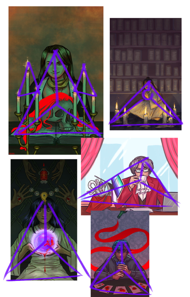
once i figure out what i want, i start doing multiple sketches: a very rough one with no reference and very thin repetitive lines, then a better one with references and corrections, and then a finer one, with thick strokes. here, you see the final sketch (still not lineart, though), and this is also where i put a base in the background: i find working with a white bg to be inconvenient, and it does add somewhat of an undertone.

then i do the lineart in thinner and better strokes! i'm still playing with the brushes and customizing them, but here are the ones i use rn in ibis paint:


i later go a layer below lineart and fill in the simple colors. even if i plan on making the light green later or using some interesting shadow colors, right now i imagine the lighting is simple and white. i put on the basic shadows by using the multiply layer and some dull pinks.
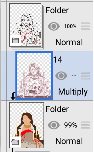
as you can see, i also color the lineart later with a clipping tool. frankly, by this point, the drawing looks bad. that's where i use the multiply layer again:
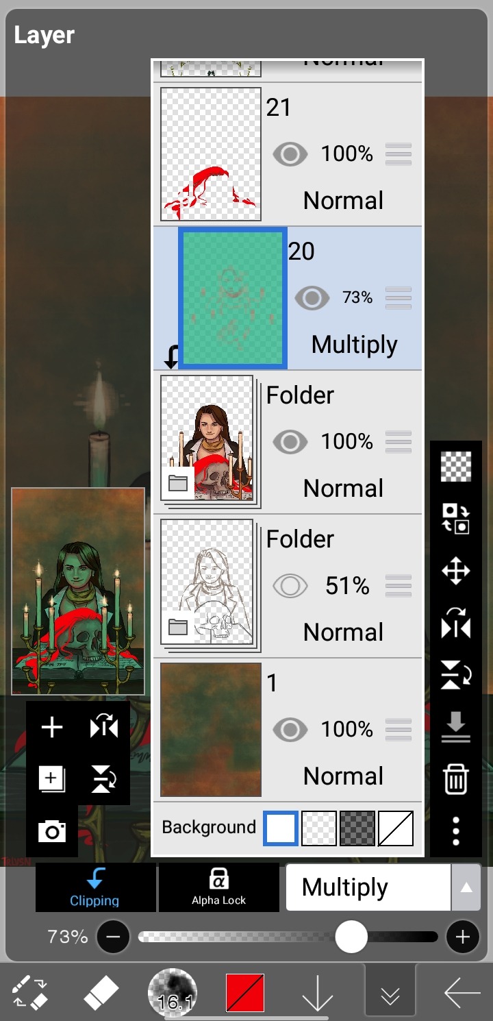
in this case, i added light by coloring some parts of the layer with a lighter contrasting color, but sometimes i just erase parts for really bright lighting in an otherwise dark setting, like in the beanix, kristoph and maya drawings in the first picture.
i add light with a normal layer by color-picking, and sometimes just go over the whole thing with a normal layer as well to correct small imperfections. i only use stuff like blurring and hard light layers for the candles, as i like to keep a certain roughness to the drawing.
uhh, what else is there? i do love doing a spot-the-symbolism moment like, everywhere, especially in the fey clan pieces... but i feel the most important part is painting not an image, but a character. this is why I'm so fond of painting from a live model: you don't capture a singular moment, you compile millions of images into one, this capturing the essence of the person, locking time with paint. that's, of course, not the case here, i just like to talk.
either way, just have fun with it!! duplicate your drawings to experiment, use clipping tools, learn some composition and color / shading basics, make things stand out!!
and thank you so much for the compliment:)
30 notes
·
View notes
Note
Hey bean!!!! I love your art so so much and your comics fill me with joy!! Would you mind sharing what's your process to make them?
Helllooooooo ty!! Of course!! Tbh it’s pretty loosey goosey and procreate isn’t the greatest program for comic building, but I manage lol. I usually start with the dialogue (my favorite thing to write!) which may initially be written blearily in bed at 3am in my notes app or directly onto the canvas. I usually build scenes based on the dialogue, which I’m sure is obvious in hindsight since most of my comics are just long drawn out arguments LOL. From there, I do a very rough sketch/storyboard to get the idea of the page down and how I want the panels to look, expressions, movement, etc. I’ll use a piece from queening the pawn act 2 part 2 as a simple example:

I primarily use the 6b pencil for these two stages. Very rough!! Then I turn the opacity wayyy down and do a cleaner sketch over the top, nailing down more details and expressions. This is also where I will use pose references if needed and warp the lines if I need to make something bigger/smaller (bc I don’t have vector layers and they will get blurry once I resize lol). I also usually add the dialogue text at this stage so I can refer to it without having to open up and squint at the barely-there storyboard layer lol. (More under cut, I am not known for my brevity)
Now I can do the lineart (studio pen!) and draw the panel boxes (by hand like a loser using the monoline calligraphy brush). I do the panels after the lineart so I know exactly how to size them for the characters and what I might be cutting off. I do the background lineart after so I don’t end up drawing more than I need to outside the boxes.
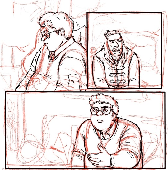
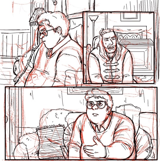
You can see at this point I decided to change Guillermo’s position in the first panel, having his arms down rather than up and removing his glasses - the angle of his left hand ended up being very finicky and I decided I wanted to see his expression (and not worry about his glasses immediately reappearing in the next panel lol). I can now add the background, which I either erase around the characters or use a masking layer on (if I have room for more layers lol) Then I start coloring, primarily using a very plain no-pressure paint brush (custom, for to save my wrist) for base colors and then build on patterns from there, changing layers as needed. I add my cheek color at 50% multiply, pop on the dialogue bubbles, and that’s pretty much it!
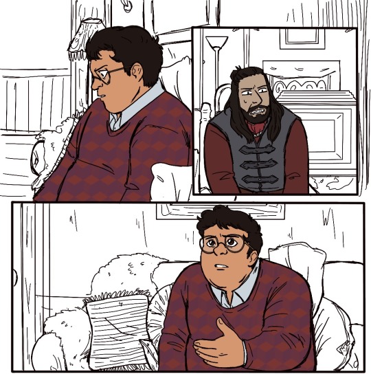
Very simple shot-reverse-shot scene, but my process is pretty much the same even for more complex stuff like
I’ll play around a lot with effects and background and lighting if I feel like it or if I feel the scene demands it (like the glasses panel - the Tarantino eyes and the glasses flash add to the dra~ma lol), and one thing I know I need to work on is flow! My instinct is often to expect your eyes to go left to right, down, and left to right again, but it’s really pleasing to have something to follow with your eye -like dialogue boxes. In the above you can see how I warped the panels and the angles of Guillermo’s attack to try to make it more exciting to look at and have a smoother flow. Def better than just two rectangular panels on top of each other, but I could have gone way harder on the angle of impact. Always learning and growing!! I just run out of room so often bc I hate using different canvasses for multiple pages, I feel like I lose the flow if I can’t see them on top of each other lol.
ANYWAY. Long fucking post. If you want to start drawing comics my advice is to Just Do It. The more you do them, the better you’ll get and the more fun you’ll have making them!! I never ever thought I would be the kind of person who does longform fan comics (we love you reapersun), but here I am having a blast lmao. Hope this answers your inquiry even a little bit, I’m afraid I am both long winded and extremely undisciplined!! ❤️❤️
48 notes
·
View notes
Note
Hey, I’m new here, and I looked through some of the art, looks really good btw, but how long does it normally take, I know art takes a long time, normally 1-2 hours for me
Hi! Welcome in!
My drawings kinda vary depending in how much effort I’m going to put into it. If it’s just line art sketches maybe 1-2 hours. Base colors and basic shading I wanna say 3-5? Adding backgrounds and light sources can take WAAAAAYYYYY longer.
I’m not 100% sure bc I’m bad at telling time and I usually don’t do it all in one go bc of IRL things. Usually I’ll have to stop for a period time for work, helping my family, or something. I try my best to get what I can done.
But I’ve gotten faster at making drawings. If you look at some of my earlier drawings from last year those took me up to, like, 50 hours 😭
Thanks goodness I’m quicker at it bc with my work schedule that would not fly!
Thanks so much for the ask!
#midnight talks#digital art#I can’t tell time#adhd man#it sucks#time perception#is WEIRD#I appreciate the ask tho!#welcome to the blog!#asks <3#asks and replies#keep the asks coming#thanks for the ask!
16 notes
·
View notes
Text
the Main 6 with a MC with tattoos
🔮Asra🔮
he thinks they're so freaking cool and tbh kinda hot
will trace your tattoos with their fingers at any given moment, especially when you're cuddling
you often catch him observing your tattoos with a smile on his face
thinks about getting a tattoo himself (or more than one), and might have them be magic, like they light up or move around his skin
they think your skin is an artistic masterpiece
if your tattoos have backstories he probably already knows them all, but will sometimes ask you to tell him about them just to hear you speak
faust loves to explore your tattoos, especially if they're magic bc she loves to chase the tattoos across your skin
If you let him he'll make illusions from your tattoos, either bringing them alive on your skin or lifting them from your skin like a patronus or smth
🌹Julian🌹
good lord help this poor man he's simping HARD
Julian.exe has stopped working
he thinks you look hot as fuck. if you appear shirtless in front of him with your tattoos showing, he's absolutely done for
he loooooves stroking his fingers through your tattoos and tracing them when you're cuddling, it relaxes him
when he can't sleep he'll ask for you to tell him about one of your tattoos, lying on you and falling asleep to the sound of your voice and your heartbeat
like any good masochist, he also loves the pain that comes with a tattoo so he'll probably get some for himself. suggests getting tattoos together. might get a hideous tattoo of some dumb shit on impulse if he's drunk
will 100% help you take care of your new tattoos, mantain the older ones and make sure nothing gets infected
Kisses on tattoos kisses on tattoos kisses on tattoos
👑Nadia👑
she thinks your skin looks like art, and it makes you look even more stunning
gets you perfectly tailored clothes that complement and highlight your tattoos
probably won't get one herself but will help you with everything you need to mantain yours
gets you the best tattoo artists there are and stays with you as you get tattooed if you want
probably wakes up before you, so she takes her time to admire your tattoos and trace them softly (I am toUCH STARVed sue me)
When doing the spicy, she likes to stroke your tattoos gently with her nails to send shivers down your spine. She also likes to kiss the tattoos where her nails stroked
🌲Muriel🌲
doesn't get it at first and tbh he's a little worried. doesn't it hurt a lot? why would you inject ink into your skin? isn't it dangerous? only after you explain everything to him he calms down
he does think your tattoos look beautiful tho, you'll often catch him staring at your skin. he gets hella red when he realizes you saw him
when you're sleeping he very delicately traces your tattoos, making sure to not wake you up
very worried about infections and proper care of tattoos, will not even let you slip up on it
inanna licks your tattoos in approval
🌻Portia🌻
• "CAN I COLOR YOUR TATTOOS PLEASE" at least 4 days a week
• I like to think she has an artistic touch so she'll sketch tattoo ideas for fun. If you see her drawings and decide get a tattoo of one of them, she'll combust
• when cuddling she'll trace your tattoos while humming a slow sea shanty (tbh I'm actually imagining Valka and Stoic's song from HTTYD2), also walks her fingers down the ones in your arm to hold your hand
• definitely suggests getting matching tattoos and for the both of you to design them together
• will probably get tattoos for herself after seeing how cool you look, probably some flowers, plants and mushrooms, definitely a Pepi one. Can't really imagine her with a sleeve so it'd be in a patchwork kind of style imo
• Will make homemade balms to take care of your new tattoos and insist on applying them herself
• she likes to count your tattoos while kissing each one as she counts
💪Lucio💪
• freaking LOVES your tattoos, definitely wants some for himself
• If he already has tattoos, he likes to show them off to you by flexing his muscles
• lets you use his cold metal hand to soothe the pain of a fresh new tattoo (idk if this works I've never gotten a tattoo... yet)
• Makes sure you are only tattooed by the best tattoo artist that exists and even threatens them to not screw the tattoo up
• If you have arm tattoos and wear sleveless arms (bonus points for beefy arms) he can't stop staring and blushing
• will probably suggest you get a tattoo of his face, and you're not 100% sure if he's joking or not
#the arcana#the arcana fluff#portia devorak#julian devorak#nadia satrinava#muriel of the kokhuri#asra alnazar#lucio morgasson
94 notes
·
View notes
Text
ok uhhhh how i draw ig idk 😭 I’m really bad at this idk why I’m doing this but anyways
^
I use either of these to sketch, usually in a brighter color. I generally gravitate towards blues but it honestly depends on who I’m drawing.

Then I um um uh sketch idk how to like. Talk about it it just comes really naturally uhhh. I always start with the head. First you draw a circle. Y’know. And then the body underneath with like a. A line. For the shoulders and turn that into the body and like a box I guess idk. I added the red box line this just to make the anatomy clearer or something idk I usually just draw it and then move on. So I lower the sketch opacity and move on to lineart. I use a downloaded brush for it which uhhhhh I forget where I got it :( but uh it’s max stabilization because I can’t make non shaky lines lmao

I um got a little fancy here sowwy :( so um um um um uhhh um idk 😭 lineweight ig I love lineweight!!!! 😍 I just uhhh put it where I think it should or just. Do it accidentally idk sowwy 😓
So uh I don’t actually add color before I do colors but like since she has black sclera and color eyes I was just like eh why not yknow so uh
next I add.. colors. Idk how I shade like. Changes so sometimes I do flats and sometimes I’ll just do one color and shade it and do the next color and shade so uhhh idk I’ll do flats first here

So uh. Flats. Idk not much to say here. I just color picked from her ref. And chose colors when I needed to bc that’s not her usual outfit


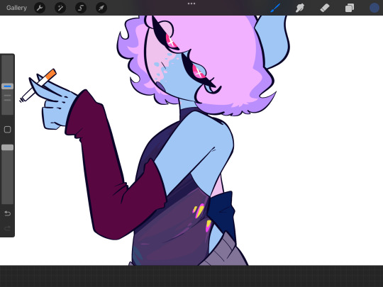
So then I just. Idk. Hue shifting 😍 I just add stuff where it feels right tbh sorry :(
I don’t actually use a light source for most things unless it’s like really dramatic I probably should. Do that…..
and then I like. Idk just. Repeat. For. The other colors. Sorry this is NOT helpful I’m sorry 😭 I usually like. So for the edge of the shadow I add a darker color shifted to the left or right, and towards the … uhhh opposite side of the edge I add a slightly lighter color also shifted. Bounce light or something idk. Then like highlights if I want idk 😭
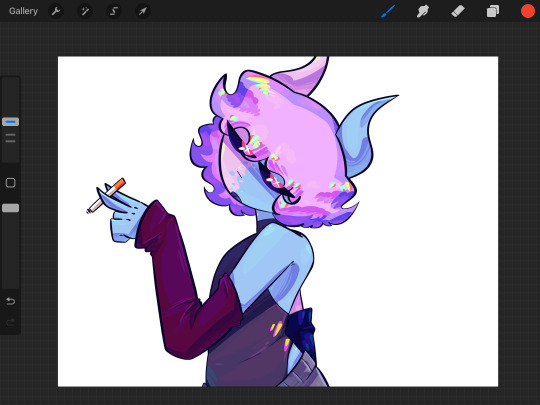
So um I went too far oopsies but uhhh yeah look at her go we aren’t done yet though so uhhh um uh i honestly don’t know from here I just. Add stuff until it looks cool enough. I gotta edit the cigarette smoke (WHICH BY THE WAY, NOT TRYING TO MAKE IT LOOK COOL. SMOKING GIVES YOU CANCER SO UM. PROBABLY DONT) and uhhhh yeah idk I’ve said all I can basically 😭😭😭😭😭 I kinda lose myself in the process and like. Don’t think at all? I kinda forget I or anything else exists. Why I like drawing: 🤭 but ummmmm um um yeah see you on the other side ig 😞

Yea. Um. Um. Yea. If you have questions pLEASE ask I like. I didn’t this very badly 😓 but anyways yeah that’s my. Crappy art tutorial featuring my OC Luna
#Luna Andromeda (oc)#Myart#my art#mossy’s ocs#Multidimensional#demon oc#art tutorial#i GUESS#😞#sowwy :(
10 notes
·
View notes
Note
hi! dunno if this has been answered before or if youre in the mood to get interviewed, but im sososo in love with your art - im esp fascinated by the different textures n how you color. everything about your art scratches my brain just right!! im rlly interested in your process. are you more intuitive with a piece, or do you usually map out a pretty clear outline/palette beforehand? what's your fav/least fav part of your process? would you ever post timelapses or maybe no bc of ai?
heyo anon, thanks a bunch !! <33
I have talked about my process here and there but I'm generally all over the place about it KFHDSJGJDJSD
I used to plan out my color palettes back in 2020 since I wasn't that great at coloring (it was pretty painful for me..!! lots of my work looked bland bc of it) and I didn't really know how to draw backgrounds either so they were always an afterthought.
I blabbed a bit about how I learned how to jump over that hurdle in another ask!
Usually I have a hard time visualizing what I want to draw in my head, so unless I have a clear picture in mind, my sketches are definitely where I begin forming my ideas.
At this point in my art journey, I plan both the background and the character together so the finished piece looks more cohesive. Most of my coloring process by now is pretty intuitive since I can generally feel what colors work together and what doesn't, and I also edit my pieces with tone curve,gradient maps, and color balance if needed.
this was from an ask I got on twitter, but I think it's super relevant and the best explanation I was able to put into words, so I want to reshare here⤵️
"Generally when in the early stages of a piece, I start off with some limited and often very light pastel-like colors. I also keep shapes simple, just for the sake of planning my composition's direction.
As I render in details, I gradually bring in my more darker + saturated colors. I like to check the piece in black and white often to make sure there's a full range of values. This also helps to verify if the composition itself is clear and understandable even without the help of colors. Usually this is why many artists start in black and white and then bring in their colors, since it saves time in that area."
My least favorite part of my process??? I'd say the sketch 😭😭😭😭😭 sometimes its fun though,,,,?
The feeling of knowing what you want to draw but not being able to put it down on paper is so... RAGHHH. OR that moment where the sketch looks better than the finished product.
Actually I noticed this more while doing commissions, since I become more hyper aware to meet the client's request.
I have posted timelapses before!!! Ta daaa
I haven't recorded more because clip studio used to lag a lot with the timelapse feature on, but I recently got more ram so maybe I'll give it another shot eventually?
15 notes
·
View notes
Last Seen Blogs
thesweetreaper
Mochi-mochi ^3^

sublatus
O TEMPORA! O MORES!
snickerdoodle-0
SnickerDoodle-0

xa4duc
02NINE
maxxammopro
Ammo PRO