#and one of the options there is you can pin your gender on a gradient that goes hypermasculine -> androgynous -> hyperfeminine
Text
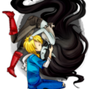
hmm gender thoughts
#the people who made pronouns page have another website right#and one of the options there is you can pin your gender on a gradient that goes hypermasculine -> androgynous -> hyperfeminine#and it's like a linear gradient and i hate that SO MUCH. this is hostile architecture for Me Specifically#[disclaimer that if you find that type of thing helpful that's completely fine]#but anyway my gender is like. im a guy but not in a trans guy way#and im a girl but NOT in a cis girl way and i call myself girl in my head a lot but i am a bit Sensitive about how other people use it?#and im always thinking too hard about ''are they acknowledging my 5D chess gender or subconsciously saying it because of my appearance''#if someone called me androgynous or whatever im stabbing them though. idk that just feels so... gender neutral? and im not gender neutral#do ya feel me.#i feel a bit silly typing all this but ah this is the transgender website i think u all would understand me#im a guy like. you know the weird guy who shows up overdressed to casual events but he looks nice so its fine really#and also like. guy who always wears black and looks cool [the cool might just be in my head but thats fine]#and. i might have to think harder abt how i feel regarding Girl ™. i dont want to discard it because i do love doing my own thing with it#but also like being perceived as a cis girl (intentionally or unintentionally) makes me want to jump out of my body. lol. anyway#this is all so sucks honestly my favourite gender is just creature.#you see a thing so weird you just go '' oh god what is that'' and not gender. although i do like the flavour of it/its that is so niceys...#oh jesus uhh#long post#<- for the tags
11 notes
·
View notes
Text
Avatar of Envy (Leviathan)
Monsterlover!MC is gender neutral.
[Part 1 (intro) ; Part 2 (Lucifer) ; Part 3 (Mammon) ]
Please note this is an 18+ blog; do not follow if you’re younger than 18.
Surprisingly, your seeing Levi’s truest form was planned by the both of you. And in part, thanks to Lord Diavolo and his stunning private beach.
The opportunity first came about thanks to a video game boss you couldn’t defeat. No matter how many times you approached the battle in various ways with different equipped skillsets, weapons, and healing items, you were always taken down with just a few hits.
Feeling the tell-tale throbbing of a migraine, you hit the pause button on your portable Sintendo console and flopped onto your bed. You just had to go and take on the Dark Souls franchise, despite knowing it was literally christened “You Died: The Series” by its fanbase. You cursed your undeniable curiosity (and partial masochism).
At least there was one person you could go to for help, even if you knew he’d decry you as a normie for not being able to defeat one of the lower-level bosses. The name-calling would be preferable to throwing your system across the room.
So you saved your progress, got up, and left the comfort of your room. Down the hallways, bare feet falling against the plush carpeting, to stop before a familiar door.
You gave it a series of complex knocks that sounded more like Morse Code than an announcement.
Instead of the usual TSL-related passcode, you heard the door’s lock click. Not one to miss an opportunity, you hurried inside, closing the door softly and relocking it.
As usual, Levi sat before his multi-monitor systems with his headphones on, his eyes flickering across the main screen. Disturbing him wasn’t an option you were willing to take (especially after he nearly sicced Lotan on Asmo for interrupting a rare, one-time raid). So you settled beside his bathtub and leaned against it.
Eventually, the massive boss on the massive screen died in a blaze of glory. Once Levi’s PC collected the fallen rewards, he paused the game and turned his swiveling chair to look at you.
“What’s up?”
You held up your Sintendo and gave him a sheepish grin.
“A little help, please?” You honestly needed a lot at that point, but you didn’t need to tell Levi that.
Taking the system from you, he studied the boss on screen then lifted a brow at you.
“Really? The Hellkite Dragon is giving you problems?”
You were quick to open your mouth, a retort at the ready—
“You know it’s a skippable boss, right? You won’t be able to get to the bonfire or join the Warriors of Sunlight, but you can bypass it altogether.”
—until your mouth clicked shut with a soft snick. You honestly didn’t know, which made the smug look on Levi’s face all the more irksome.
“I guess I could help you out...”
“I’ll buy you an extra large bufo egg tea milk in return,” you said.
His gradient eyes lighting up, Levi continued the game from where you left off. And unsurprisingly, he deftly avoided the dragon’s attacks while landing critical hits. Your eyes are glued to the screen from a slight distance.
At least, until something else caught your attention.
It was a familiar habit of Levi’s that made you remember the fact he wasn’t really human. He poked out the tip of his forked, long tongue while concentrating intensely.
You can’t help but think back to the time he raged against you for knowing more about TSL. Hell, if he wasn’t so angry and you weren’t in danger, you would’ve happily admired his partial-true form. With you two now on better terms, you wondered if you could see what he really looked like close up...
“Done.”
You blinked down at the flickering pixels on your Sintendo screen. Your PC was sitting before the bonfire as if it didn’t just go through a major boss fight.
“Thank you!” you chimed, taking back your handheld. His chest puffed out just a bit from the praise. And since he was in a good mood... “By the way, can I see what you really look like?”
Sputtering, Levi looks at you with wide disbelieving eyes, a blush lighting up his face.
“Wha? But why would you—”
“Because I think you’re really cool so obviously your real form is also really cool and I want to see it. So why not?”
And now, there were two dummies staring at each other with heated cheeks. Whatever courage you mustered up began fading fast and you were close to taking back your words.
“Alright.”
You almost couldn’t believe the mutter you heard.
“B-but not here. Not enough space...”
That small admittance fanned your burning curiosity even more. But you agreed, promising to wait until the right time. Instead of tackling him into a hug, you settled on giving him a wide grin. Best to not make him blue screen so suddenly.
So, while doing your best to keep your excitement contained, you waited. Attended your usual classes, hung out with the boys at Purgatory Hall, laughed at the sudden shenanigans involving the brothers.
When Lucifer informs his brothers and you about Diavolo’s two-day invitation to his private beach, you still. It takes all of your self-control to not look at Levi with a hopeful smile.
But your excitement must’ve been palpable at the time. As you finished packing for the vacation, you received a text message from Levi later that day.
Come out to the shoreline on the first night. I’ll meet you there.
Once you all arrived, you did have fun with the other brothers on the first day, rather amused at how each one did what they could to spend some personal time with you. Seeing them in their swimwear was a nice bonus, too.
But once the sun set and night fell, you couldn’t hold back your eagerness anymore. Mainly as Levi had yet to return from the beach. The moment you caught Lucifer scanning the main room for Levi, you jumped to your feet.
“I’ll see if I can find him; be right back!”
Ignoring the shouts of surprise from behind, you rush out onto the sand barefoot.
Your eyes scan the open shoreline, looking for any sign of him. But there isn’t any sign of his purple locks anywhere.
However, you do notice the glowing lights just beneath the water’s surface. Bright dots of citrine, deep purple, blues undulate back and forth. Dark shapes, reminiscent of massive branches breech the surface, appearing familiar to you. You soon realize they’re heading towards a stretch of flat, high rocks a stone’s throw to the east.
Your rush after the shapes, struggling somewhat due to the soft sand underfoot. You ignore the sting of the rocks’ jagged edges digging into your soles as you scrabble up to the tallest stone. The pain is worth the sight you meet.
A massive serpentine creature rises up from the water, its glowing citrine eyes pinning you in place. The dots along its scaled, black body, bioluminescence, grow and dim with each of its breaths through its parted fanged mouth.
Its needle-like teeth and slitted pupils would put you on edge. But the familiar, coral-like horns and the soft, feathery protrusions on the side of its head put your fears to rest.
“Levi?”
The beast lowered its head, edging its round, smooth snout closer to you. It huffed out a hot puff of air at you in reply with a soft growl. You brought up your hands, entranced at how he truly looked, but paused. As if reading your thoughts, Levi gently bridged the little space between his scales and your hand. You rested your forehead against his scales with a bright grin.
“You,” you said softly as if sharing a secret, “look amazing.”
In his current form, all Levi could do is rumble in reply, which you were more than glad for. It made denying your honest words undoable.
But when he turns back into his more humanoid form, if he has any lingering doubts about how you see him, you’ll be there to sooth them. As his Player Two.
#demon#demons#exophilia#obey me#obey me shall we date#obey me one master to rule them all#obey me leviathan#I basically see Levi as a more complex-looking axolotl#'cause they're ridiculously cute
279 notes
·
View notes
Text
Week 10: Individual App design research- Prototyping Questions
What elements do you like?
Rebecca’s App design:
Willow & Pauline:
Colour- simple- one colour didn’t take too much away from info- easy to navigate- nothing missing- location things are distracting, grey colour, or less opacity
Phatt:
A very realistic app. FAQ has too much info. I like the keypad screen instead of it linking straight to dialling the company. Make actions more cohesive i.e some pages animate across/ left and some slide up. No back button on ‘Pay with’ page. Match review colours with meaning as it’s quite confusing. What do the red/ green/ orange colours stand for in the review? Green colour means low price however there might be less parking available, doesn’t understand what the colour stands for. If arrow points left, screen should flow/ slide left too. Everything else like the colour and font work well together!
Tammy:
I like the grey arrow tab. I prefer the pages to slide left/right rather than up/ down because it’s how apps normally work so we’re used to it. It can be a bit too much. I really like the home page design because the layout looks good however colour can be improved.
Natalie: I like the colour and how it’s simple. I like the icons with the pin/ car and it’s the same throughout all the pages and makes it cohesive. Really good overall but not sure if I like the green since it usually goes with environmental and money/ cash related so not suitable for a parking app.
G:
No back button- on timer. Add notification- for topping up time- don’t want to think about it- organization is good- buttons are too big
Likes the colour-coded aspect of the reviews
Debbie’s App design:
Natalie:
Colour, cute, font is really cute
Have an option for saved park (bookmark option maybe)
Phatt:
Contrast colours work well together. Make the background for homescreen teal to tie in with the rest of the app more.
For ‘add new card’ screen, have another option. No question mark- change to confirm
Like the rounded font, easy to read
For hamburger option, don’t make it go back to the home screen but keep it in the side menu
Cute icons, but needs more
Understandable and easy to use
Tammy:
Like the two colours in title screen.
Like the font
Cute design. Like the colour combination. Add new icon for successful screen
The colour combination, easy to understand layout
Willow & Pauline:
Similar to Michelle’s just diff colour.
Map - showed up the different prices and places and could click - simple and clean layout but preferred the other colours more as looked like taxi
G:
Nice to have a visual to see how much time is leftover
Needs to have a date enter for the Booking Function
Text size for ‘Save Location’ is not easy to read, maybe make it bigger
Michelle’s App design:
Phatt:
Colours, icons, everything, the gradient, it’s so cute, the flow is good, understandable, easy to use, i like how the colour is clear, font is cute and easy to read, simple and it suits the colour and i love it!
Tammy:
I love the colours from the first look. I like the rounded font, apps normally use typical fonts like arial etc so it’s boring however with the rounded look it’s more friendly. Love the gradient circles combined with the icons. I especially like the icons because it’s colourful and detailed yet simple. 10/10!
Natalie:
It’s so cute and pretty. I like your icons! (the car icon, it’s not too much and simple) I like the history tab. I like how the font is really easy to read. Easy to use. Add a bookmark/ saved/ favourite locations for facilities that they find for the future.
Willow & Pauline:
colour, pleasing- book a carpark- plus of minus- auto calculate easy as. Illustrations were nice.
G:
I like how I can go back. Like having a choice to move around. Reviews text is a bit small. per/hr. I like the circle/ timer, nice visual. Type in end time.
Delete account button/ log out?
In general of our apps:
1) Favourite colour choices and fonts?
Willow & Pauline:
Pauline is Bias to blue but likes the blue or greeny blue as it is one colour, white and one colour worked really well and kept it clear and simple. Could maybe use the blue used as detail colour accent.
Tammy:
Blue/ purple with the pink accent because it stands out the most. It’s very calming especially when combined with the gradient. It might appear very colourful however when using it on the phone it’s not and it’s simple and clean. For the font I prefer Rebecca’s font when she uses the bold with the normal typeface style in the title ‘ParkPal’.
Natalie:
Favourite colour choice is Michelle’s because it’s the easiest to see (dark background with white font). Along with the font since it’s bubbly and cute. Debbie’s light font is really nice as well as Futura.
Phatt:
I didn’t have a favourite however it would look nice with Debbie’s yellow and Michelle’s blue! Because it’s a good colour combo for both genders. Michelle’s pink might be aimed for female audience. Rebecca’s green is a bit harsh and green usually means ‘go’ like in traffic lights but your app is for parking. Blue represents calming and when you park your car it’s parked and still, not moving. Font choice favourite is Debbie’s, I prefer the rounded font more rather than Arial. Arial font is too typical and simple as you see it everywhere.
2) Overall favourite and why?
Willow & Pauline:
Both think we need to combine the different aspects and incorporate it into one app.
Tammy:
I like all of them! You should combine Michelle’s colours with some of Rebecca’s designs and Debbie’s icons as well as Michelle’s icons.
Natalie:
I like all of them. Each parts of each of our designs should be combined. I like Michelle’s colours and Debbie’s font as well as how simple Rebecca’s one is.
Phatt:
My overall favourite is Rebecca’s because it looks more realistic. More general for everyone to use because car parking, most people are adults so keeping it simple might be better. However for the icons I like Michelle’s because it’s easy to understand.
3) What stood out to you the most?
Willow & Pauline:
How it automatically calculated prices- easy and quick- in a rush for parking seemed speed up process. Showed prices for each parking worked well
Tammy:
The designs and functionality works well i.e the map $ where you can tap to see prices. Colours stood out to me the most especially Michelle’s. Also the icons (particularly the vector line art with the sparkles)
Natalie:
Michelle’s stood out to me the most because of her icons. I don’t like reading and when there’s a lot of pictures it’s easy to understand. It’s really nice when you book/ pay and the icons pop up because it relates to what it says so it’s just nice.
Phatt:
The design and functions. I didn’t like how there’s too much blank/ negative space on certain pages. I liked how in Michelle’s one her layout is clean and also stands out with the box + shadow along with the gradient circle. I prefer having the book, find, pay on the top than bottom. I prefer Debbie’s review design with a solid colour contrasting against the white. I like Rebecca’s side menu with the profile photo and her realistic keypad screenshot. Also having the main logo flow across all the pages (if you have space).
G:
Consider open navigation and user needs as they’ll want to be able to easily change out or decide that they want to cancel bookings. Maybe have a calendar pop-up to select booking dates.
4) What mood/ style did you like the most?
Willow & Pauline:
Green and blue- one colour and white or black. Two colours need to go together really well otherwise distracting, that’s why I liked the green as it was striking and blue seemed to work well too.
Tammy:
Simplistic style, clean and minimalistic. Rebecca’s one was good but she could add colour to the background instead of having a plain white background. I like the teal colour!
Natalie:
I like Debbie’s mood the most personally but I’m not sure if others would prefer it since it might remind them of ASB. Michelle’s style was my favourite because of the icon drawings and lowkey kawaii, i love it.
Phatt:
Debbie’s font and colour is quite friendly and playful. It’s simple and minimal which I like. Michelle’s I like her icon’s the most and the gradient circles also the blue colour is calming and good colour to view since it’s cool toned. Rebecca’s I liked her flow and information throughout her pages.
1 note
·
View note
Last Seen Blogs

transnezumi
❤️HOMO-SEX-YOU-WALL❤️
samuel-sadi
Samtatic Things
mstarrc32-blog
شركه تنظيف خزانات بالمدينه المنوره

espeneldritch
STUPIT
prismaticuniverses
esoterically far out!