#Seyhan Argun
Text
Books On Books Collection - ABC of Typography
View On WordPress
#Alexandre Clérisse#Anne Simon#Aseyn#bande dessinée#Chiavelli#David Rault#Delphine Panique#François Ayroles#Hervé Bourhis#Hervé Di Rosa#Jake Raynal#Jean-Christophe Menu#Keith Haring#Libon#Maximilien Vox#Nanette Wylde#Olivier Deloye#Seyhan Argun#Singeon#Stéphane Mallarmé#Virgile Legrand
1 note
·
View note
Text
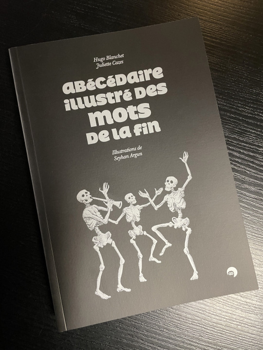
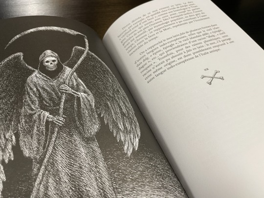
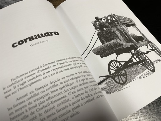
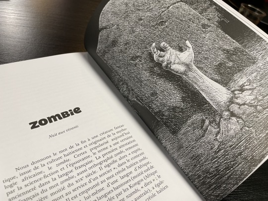
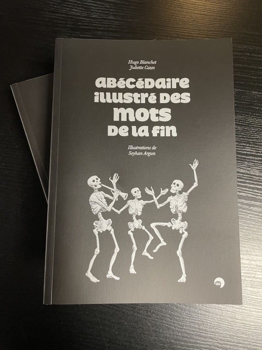
Abécédaire illustré des mots de la fin.
d'Hugo Blanchet, Juliette Cazes et Argun Seyhan.
© Atelier Perrousseaux, 2024
1 note
·
View note
Text
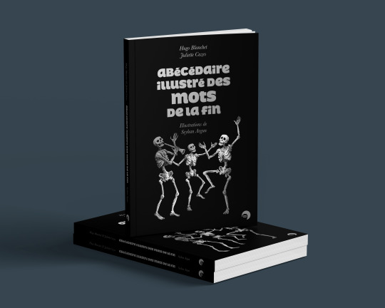
Abécédaire des mots de la fin, le nouveau livre de Hugo Blanchet et de Juliette Cazes, illustré par Seyhan Argun, paraîtra le 13 mars 2024 aux éditions Perrousseaux ; j'en ai signé la mise en pages.
1 note
·
View note
Text
ABC Of Typography: The Story Behind The Fonts You Use Everyday
ABC Of Typography: The Story Behind The Fonts You Use Everyday
Thanks to word processing programs like Microsoft Word there’s probably been a few occasions where you’ve had to decide what typeface to use. What font will make my resume stand out? How can I play with this spacing so that it looks like I wrote more than I wrote? Recently I ordered some business cards that looked fine on the computer, but in-person were too hard to read because the weight of the…
View On WordPress
#Alexandre Clérisse#Anne Simon#Aseyn#David Rault#Delphine Panique#François Ayroles#Hervé Bourhis#Jake Raynal#Libon#Olivier Deloye#SelfMadeHero#Seyhan Argun#Singeon#The ABCs of Typography
0 notes
Text
Sevil de Sevme! pdf indir
“Yalnız olduğunuzu söylemiştiniz kız kardeş Ella?”
Uzak bir yol kenarı. Gece grisi. Yeknesaklığın aşındırdığı şehirden kaçan iki yolcu… Bütün cümleleri isyana çıkan âşık bir kadın ile telaşı ve kaçmaya hazır iç sıkıntısıyla sevgilisi.
Sevil de Sevme, distopik bir karanlığın, değişmez düzenin, bulantının, duvardaki resimlerin hikâyesi. Aslı Tohumcu, solgun ve yalancı ışıltıları inkâr eden bir kadının seçimini anlatıyor. Soğukluğu ustaca bezeyerek…
Seyhan Argun, bir nakkaş gibi ince ince resmediyor yangını ve sıradan kıyametleri… Sabırlı ve göz alıcı…
Sevil de Sevme! pdf indir oku
#Sevil de Sevme! E-Book İndir#Sevil de Sevme! ebook indir#Sevil de Sevme! ebook oku#Sevil de Sevme! epub#Sevil de Sevme! epub indir oku#Sevil de Sevme! kitabı pdf indir#Sevil de Sevme! online pdf oku#Sevil de Sevme! PDF İndir#Sevil de Sevme! PDF Oku#Sevil de Sevme! ücretsiz indir oku#Ekitap
0 notes
Photo
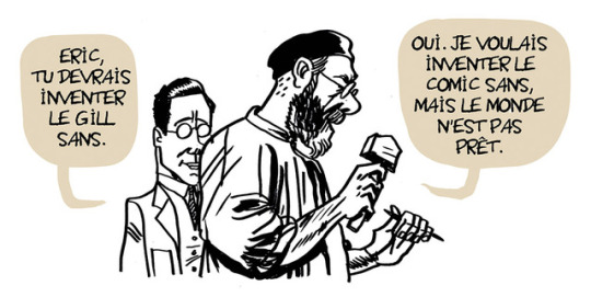


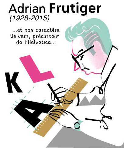

Quelques images de la bande dessinée ABCD de la typographie, dont j’ai signé le scénario, qui paraîtra chez Gallimard BD le 18 octobre prochain, avec des dessins de Aseyn, Singeon, Libon, Seyhan Argun, Delphine Panique, Olivier Deloye, Hervé Bourhis, Alexandre Clérisse, Anne Simon, Jake Raynal et François Ayroles ; maquette de Jean-Christophe Menu.
A few drawings from the graphic novel ABCD de la typographie, which I wrote. The book, which will be published by Gallimard BD in France on October 18th, is drawn by artists Aseyn, Singeon, Libon, Seyhan Argun, Delphine Panique, Olivier Deloye, Hervé Bourhis, Alexandre Clérisse, Anne Simon, Jake Raynal and François Ayroles ; book design by Jean-Christophe Menu.
2 notes
·
View notes
Text

Une critique de ABC of Typography sur le site de The Herts Advertiser.
A review of ABC of Typography on the website of The Herts Advertiser.
>>>>>>>
Graphic Novel Review: ABC of Typography
PUBLISHED: 10:29 22 November 2019 | UPDATED: 10:29 22 November 2019
Matt Adams
Did you know that changes in the direction we write resulted in the letters B, E and P being permanently flipped by Greek scribes?
Or that the carving at the bottom of a Roman column resulted in a font with a class and majesty that resulted in it being used on countless posters for Hollywood blockbusters?
Have you ever wondered why the "&" symbol represents "and"?
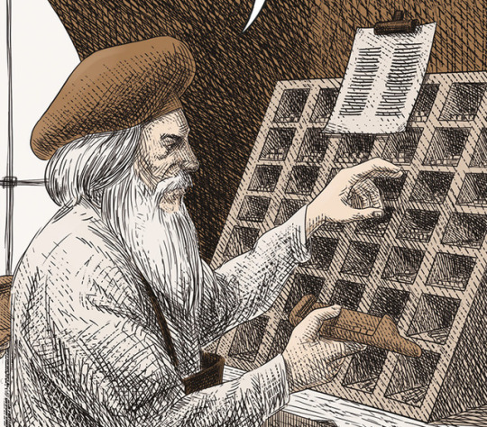
Would it surprise you to know that metal letters used in the earliest form of printing press were stored in a type case divided into upper-case on the higher shelves with lower-case letters below them?
This fascinating book charts the origins of humanity's written language through 3,500 years, including the development of the alphabet through printing and publishing, and the origins of fonts such as Gothic, Garamond, Futura and Times New Roman.
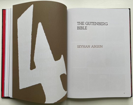
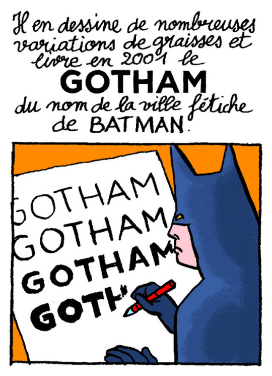
Find out how modern writing survived during the Dark Ages, the laborious process behind printing the Guttenberg Bible, and why different publications choose particular fonts for their logos. Meet the creators of history's most famous fonts, including Eric Gill, the man who gave the London Underground its graphic identity, and how Tobias Frere-Jones preserved the distinctive signage of Manhattan in his Gotham typeface.
Author David Rault, himself a graphic designer, has brought together a team of 12 European artists of various styles to reflect the different periods, including Seyhan Argun, Francois Ayroles, Hervé Bourhis, Olivier Deloye, Delphine Panique and Jake Raynal, to create the first-ever graphic history of Latin type.
A remarkable study of the impact of typography on society, through wars, revolutions and cultural epochs, offering candid explanations as to why particular fonts resonate in a certain way. Who would have thought letters could be so interesting?
0 notes
Last Seen Blogs

chrismcguireart
Chris McGuire

sexhotpk
无标题

machine-headed
Machine-Headed

bloodykillers89
Untitled

elfchat
Welcome, mortal!