#I mean the opacity thing is kind of weird to work with but im not *hating* it... at least on colour stuff
Text

kinda wish I'd been recording the process of this because it'd make it VERY obvious I don't work smartly at all, and that's why all my rough 'shading' layers are so messed up because I made alterations as I went lol
anyway, another WIP - this time of my OC, Beck (who I have not posted about in ages lmao) from the Android AU
Been having Thoughts(tm) about this bastard character of mine and how I could make him even worse than he already is 8) hehe
#delete later#wip#oc#original character#myart#do not mind all the weird lines - this is still not 'finalized' and all the lines are on like 3 different layers I forget about#tfw u label ur layers but still get confused#anyway he REALLY ended up looking like a Dio (specifically how I used to draw one variant before I retconned his look) but uhhh#that was unintentional lmao I WAS USING A REF FOR HIM AND EVERYTHING and somehow still failed his likeness#but this is fine - I'm hoping the colours will make it less like that but we'll seeeee#god even the perspective on his top is strange......... I gotta fix so much still aaaaaa#BUT IT'S 5AM i need to sleep I can fix things tomorrow when I look at this with fresh eyes again#I just wanted to do something vaguely 'fashion-y' ...made funnier by the fact his *girlfriend* is a literal model in this AU#BUT Beck is a vain POS who stresses about his (physical) self-image so I mean..... I think it works out#I've been using this one airbrush I downloaded for CSP for the shading on this and other WIPs and I'm... honestly liking it???#I mean the opacity thing is kind of weird to work with but im not *hating* it... at least on colour stuff#BUT YES OKAY ANYWAY i need to sleep gn folks#also btw the shading doesn't fit very well on his legs cuz that was the shading on just his body lines... which got mostly erased#I was gonna just redo them when I finalized them anyway so I'm trying not to care about how odd it probably looks hahaha
2 notes
·
View notes
Text
color icon tutorial
ok i’m not super great at making icons but an anon requested a tutorial for my icons so i will post my process! it’s good for beginners i think (even tho i have been making these icons this way since 2016 lol)
you’ll need:
Photoshop CS5 or higher (I have CS5 which is quite old, I know, but I pirated it many years ago oops)
relatively hq pics to make icons out of
a psd (if you need some, tumblr.com/tagged/psd is what i periodically check for some).
an action (preferably sharpening action, since that is what i use)
a texture if you want
you, yourself, and you, and i guess this tutorial
i’m going to be making this as a beginner’s tutorial so it’s gonna go about as in-depth as one can be! it’s gonna include a lot so feel free to skip a lot of it if you are already pretty well-versed in photoshop or icon-making.
ITS SO LONG IM SO SORRY IT IS SO VERY IN-DEPTH I’VE EXPLAINED EVERY POSSIBLE THING I COULD’VE
but also if you have any questions at all, please let me know. i love teaching people stuff.
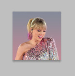
example of the icons that i make:

Hi hello welcome
Ok, so first open up Photoshop. I am using CS5.
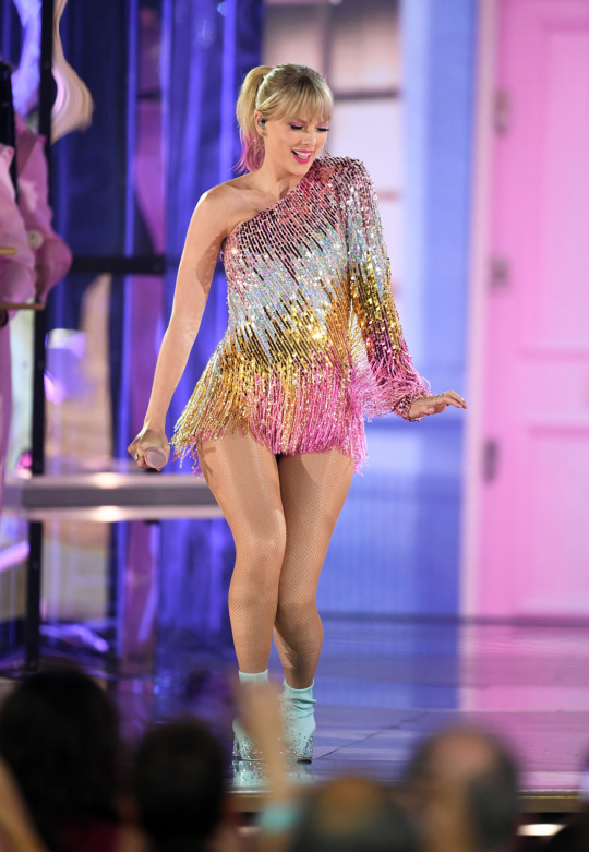
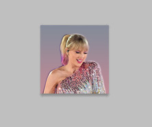
You will need hq pics of whatever you plan to icon. I do 99% Taylor Swift, so I use taylorpictures.net for all my icon needs. Make sure they are of semi-decent quality, they don’t have to be amazing since we will be shrinking them down to a very small size so much of the quality is gonna disappear anyway but like, make sure you can at least tell the subject from the background distinctly (you’ll see why later).
This is the picture I am using for this tutorial (and will post icons separately):
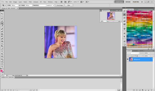
Open this in ps (File > Open > the picture)
Ok so now it’s the actual tutorial lol
1. Crop the image
We are not going to crop it to 100x100! Select the Crop tool and set the dimensions to 300 px x 300 px--MAKE SURE THAT YOU TYPE IN PX AFTER YOU TYPE IN 300, OR ELSE IT WILL CONVERT TO CM AND THAT WILL NOT WORK FOR THIS!
Next, crop the picture you want as much as you want--as long as you get what you want in the icon. For these kinds of icons, you just want to focus on one item--like Taylor, for example--instead of multiple (not Taylor and her backup dancers since this isn’t what my icons look like and you won’t be able to do that very well on a beginner level). Crop that to a 300x300 px size and click the check mark on the top bar to finalize it.

If your pic is hq enough--meaning a larger picture--it will probably look super small. That’s ok, it’s just proportional to the old picture. Go to the right side bar and select the Navigation tool.
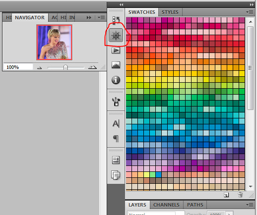
If that tool isn’t there, you will just have to go to Window and select Navigator, and it will bring that up for you.
See where it says 100% in the picture right there? It will likely say something like 25% or whatever if you just cropped it, so change it to 100% which will bring it to full size.
Cool! now it should look like this:
2. Use the Quick Selection Tool

Go to the left sidebar on Photoshop. Depending on which PS you have, it might look different. This is what mine looks like. Regardless, the icon should look relatively the same I believe across all Photoshop versions. If it’s not there, you might want to left click and hold down on some of the icons and see if it is an alternative option (it should be there already--but it is grouped with the Magic Wand Tool just in case).
This tool has three options in the top bar: free select, add, and subtract. Start with the middle option: add.

This will allow you to choose which parts of the picture you want to select to cut out for your icon. You can change the selection brush size, but I always keep it at 3px because it keeps it really precise.
Drag your mouse over the area of the image that you want included in your icon. This tool will automatically choose parts of the image that are similar--for example, Taylor’s blonde hair will like all be selected around the same time, but the pink/blue background will not be, since it can tell that those are starkly different colors and thus two different objects in the picture. It should have a crawling ants moving line around the areas of the picture you want to select. If you go outside of what you want included in your icon, that’s ok! That’s why the subtract option is there. Just select that--to the right of the Add option--and go over what you do NOT want in your icon to get rid of it using the Subtract tool. You might have to go back and forth between those tools in order to get exactly what you want in the final product.
I can’t show you my final outline for Quick Selection since it goes away when I screenshot, but after you’re sure you got what you want in your moving ants line, it’s time to finalize it.
Remember, this tool effectively cuts out the selected portion of the picture from its background.
3. Refine Edge
On the top bar, click the big rectangle button that says Refine Edge. It will bring up a window that looks sort of like this, but I have settings adjusted the way I like:
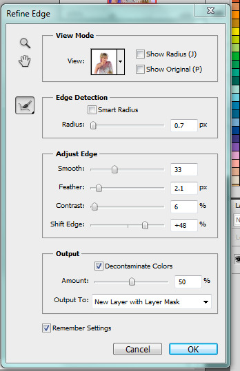
You can change these settings any way you’d like, but I generally stick with this. It’s also okay to mess around with them and see how you feel. If you don’t want to do that, you can just use my settings and edit anything you don’t like later.
Click OK to cut.

This has pretty much removed the background from the picture and only left what we cut out and a transparent background (hence the checkered background--that is space that doesn’t actually exist). You can also see some shadow from the background around her arms and hair, which we can delete out later very easily. That is a result of the settings from Refine Edge, which is why some people choose to lower the Feather bar so that it doesn’t include as much shadow--which is good for many pictures since a lot of these are straight cuts, but this can occasionally cut out part of the icon you want to keep or make it look weird since you want just a little space to mess up when it comes to the Quick Selection Tool.
Bonus step if you want a selective colored icon:
Some people like really vibrant icons that include re-coloring. I’m not very good at it, but what I do (and it sometimes turns out well--this is typically the way people do it, though they are less sloppy than I am) is select a color from the Swatches at the right that is similar to the one that they want to paint over. For example, if I wanted to make Taylor’s hair more yellow/gold and vibrant, I will choose a yellow. Select the Paintbrush tool. On the top bar, the Opacity will likely be set to 100%, which will basically color right over the picture and look weird. Set the opacity to something very light--mine is 20%--and paint over the part that you want to color. Make sure you do this in one stroke--if you paint over her hair with 20% opacity once, let go of the mouse, then go over it again, it’s gonna start building up and becoming more opaque!
You can also completely recolor a picture this way, like if you wanted Taylor to have entirely pink hair, you can use this same method but choose the pink you want instead of a similar yellow. This can be very difficult and tedious, so I don’t typically selective color my icons, though occasionally I do because I love those icons with obnoxiously vibrant colors.
4. Open texture/create new background.
Ok, so I do both of these things depending on the background I want. I have some textures saved such as this that I use for icons:

I didn’t make it--it’s pre-made by another artist on tumblr from whom I downloaded their texture pack. You can make backgrounds like these too, but I’m not very good at them.
SO you can either File > Open one of these pre-made backgrounds/textures, or you can make your own.
In order to do that, you can do File > New and change the settings to width: 100 pixels and height: 100 pixels. Under Background Contents, choose White. That’s very important! You don’t want transparent, it doesn’t help us. That brings up a new window on Photoshop next to the picture we’ve just cut out, just a small white square. You can paint that whatever color you’d like. Use the Paint Bucket tool and choose a color from the Swatches section on the right. This will make the background completely one color. However, if you want a gradient, you can do this several ways, but I do it like this:

Click that, go to Gradient, and mess around with the Gradient options and see how you like the background. Here’s one I made, for example:

Boom! Background for icon. I will use this since I made it for this tutorial so yeah it might not look amazing but here we are.
IF YOU USED THE TEXTURE I JUST POSTED OR YOU KNOW THE TEXTURE YOU ARE USING IS NOT 100x100--THE ONE I POSTED BUT DID NOT MAKE IS 200x200--THEN YOU NEED TO RESIZE IT TO 100x100.
You can do this by going to Image > Image Size and changing the 200 pixels x 200 pixels (or whatever is there) to 100 x 100.
5. Duplicate layer
Now it is time to combine these two images we’ve created. Go back to the original picture we worked on--mine is Taylor at the BBMAs--and go to the right sidebar. You should have two copies of this image now: Background and Background Copy. Background Copy is the cut out picture we are using for the icon. Right click on Background Copy and select Duplicate Layer...
This will bring up a window that asks what you wanna do with this layer.

Select the dropdown under Destination. Currently, the Document selected is the image we are already on (my Taylor pic was saved under 056.jpg) but we want to click the dropdown and select the pic that we are using for the background. In my case, it’s titled Untitled-1 since I didn’t change the name. Yours probably is too. Select whatever your background image is saved as and click OK.
Now go to the background image or texture that you just selected--your cutout should be there, but you can probably juuuust barely see it! That’s because your picture is about 3 times bigger than your background.
6. Resize layer
Use the Select tool--the very top icon on the left sidebar--and make sure Show Transform Controls is selected on the top bar. If it’s not, you’ll know--because you won’t be able to resize the image.

The square you are seeing (that isn’t the picture) is the layer we just duplicated onto the background, aka the icon. You’ll want to hold Shift and select the bottom right part of the image to resize to whatever you would like visible in the icon--it could be the entirety of the picture we cut out, or just part of it, if you realize you like how only part of it looks. Either way, you need to hold Shift while you do this, or else the image will NOT stay proportional, and it’ll look all wonky. Hold Shift the entire time you are resizing. This is what mine looks like:
You can see I both resized it and moved it a little to the right--you can use the Select tool to move it, but that might move it way too much since it does it incrementally, you can just use the arrows on your keyboard and move it by pixels which takes longer but is way more precise.
You can still see the shadows from the background on the icon, so select the Eraser tool (if the shadows bother you or you don’t like how it looks) and zoom waaay in. You want to be careful with the Eraser tool! (Also make sure Background Copy is still selected so you don’t accidentally erase the background. If you just have Background Copy selected while you erase, it will only erase whatever is part of that layer, it won’t bother the background).
While zoomed in, erase the pixels that are obviously discolored from the rest of the image. You can zoom in and out to check how you like it as it progresses.
Here is mine after I used the eraser tool on any parts of the image I thought were bad! It should lay on the background naturally.
Now that we’ve figured that out...
7. Sharpen/action
Now is the time to apply an action! Please sharpen your icons. You want them to look good on your blog or others blogs, and in order to do that, you need to sharpen them.
If you already have actions uploaded, cool! If you don’t know how, well, I sure am going very in-depth here so you’re in luck.
Download an action from any photoshop resource (or tumblr.com/tagged/photoshop-action is where I look occasionally). You will have to load them onto your Photoshop now. Click the button that looks like a movie Play icon on the right sidebar. This will bring up the Action list. Photoshop likely has pre-made actions for you, but we don’t use those because I never taught myself how to use those so maybe you can use them, I don’t know. I just use ones I download from Tumblr.
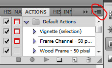
Click that little dropdown menu and click Load Actions...
This should bring up a file opener and you can select the action that you downloaded for this icon. It will download it into Photoshop and will now always be there--you don’t have to load actions every single time you want to use them. If you load them once, they should be there for the rest of forever.
Scroll down to find that action and select it. Now, make sure you still have Background Copy selected. I don’t care about applying an action to the background, just the copy, which is still our image that we cut out. Click the Play button on the Action list--pictured above on the very bottom of the screenshot, next to the Circle and the Folder icon. This will apply the action to the background copy. (Hint: if the Play button isn’t available, it’s probably because your action is in a folder. Click the dropdown of the folder and click the first thing under it--that should be the action and it will apply it).

There it is with the action applied! It’s muuuuch sharper--perhaps a little too sharp, but that’s ok, it won’t look bad on people’s blogs.
8. Add a PSD
To apply a PSD, File > Open and choose the PSD you want to use. I listed above where I find most of my PSDs, just download one you like. You can choose 100 different ones and try it out if you want. I use the same one for everything, by @toxicpsds (I believe it’s #6). This should open a third window with the PSD over a sample image (thanks to the artist!). You just have to select the PSD layer--not the image with it--and Duplicate Layer and put it on the image that we have produced thus far. It is the same process as when we took our cutout and put it on the background. (The PSD is probably under a group--mine says Group 1--so just select the group in its entirety--shift-click it if you need to).

You can tell the background is also lighter. If you don’t want the color of the background affected by the PSD, select Background Copy and the PSD together, right click on one of them, and select Merge Layers. This will put the cutout and the PSD in the same layer, which should take the PSD off of the background and revert it back to the color we had before. However, I really like what the PSD did to the background, so I will keep it this way.
I am finished now with my icon!
9. Save it for Web
To save the icon to be able to post on Tumblr, go to File > Save for Web & Devices, which will bring up a window like this. It might look a little different since I have my settings a certain way, but whatever.
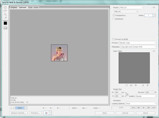
(Sorry this looks weird here, it’s just what happens when I screenshot. I’m not a tech wizard).
Your pre-saved things might look different, but make sure you are saving a a PNG-24 for the best quality. Just make your settings look like this, basically, then click Save.
There she is! All done!
If you have any questions, let me know! I tried to be really specific, but I’m not sure what level people are on Photoshop (probably better than I am) so just ask if I need to clarify anything!
60 notes
·
View notes
Text
i have too many thoughts bouncing around in my head so uhhhh im gonna talk abt shit
welcome 2 episode 43647 of my shitty slice-of-life text post series
school tomorrow i dont wanna go!!!!! !!!!!!!!!! depressions been hitting me tf up like some kind of MotherFucker n im so tired i h8 both of my classes i just want 2 lie down & turn into the floor -______________-
read 12 chapters of fma yesterday its good............. i dont love it yet but im definitely entertained so far & looking forward to getting further into it
also started reading silver spoon & it turns out the things i hated in the 1st ep of the anime didnt even happen in the manga who fuckin knew (im sorry i doubted u arakawa) so im actually enjoying the series a lot more this second time around! though that’s probably partly because i got rly attached to the protag halfway through s2 & now i get to dig out all the little signs of his low sense of self-worth on the reread so like. im having fun lol (watching him react to being told about livestock being offed for under-performing just the smallest bit again is..... so good.......)
watched all of aggretsuko today, like the original 100 shorts & the new series, it was p good! i honestly never planned to watch it bc like. i hate death metal / screaming bc it gives me anxiety & i knew this show would aggravate that but idk i heard good things about it from literally everywhere so i was like w/e im in the mood today i’ll just try it out & i blasted through it and enjoyed it v much
i think i like the shorts better than the show but that might be bc i watched the shorts first & got used to their rhythm? but at the same time i feel like the concept generally works better as little 1-minute tidbits. the show is a bit awkward sometimes in comparison but it’s a v good adaption regardless. it was interesting to see the concept executed 2 different ways at least. v fun show!
mmmmm still working on my silan portrait kind of!! i took a break for 2 days because 1. depression and 2. i was a fucking fool and played a Lot of piano on thursday so that put me out of physical commission for 2 days (honestly i was still feeling it today but i rly wanted to get back to work before it started to fade into yet another unfinished project). so yeah i got back to work on it today, and made some decent progress i think!
i mentioned in my other post that im working in clip studio paint, a program im not used to painting in, and i’ve definitely been struggling trying to get used to all these weird brushes but i think im slowly coming to an understanding and finding a technique that works for me? there’s an “oil paint” brush that’s good for blending & previously i was trying to use only that, since in photoshop i never switched to other brushes, i only used the one (hard round). the oil paint brush being a blending brush though, it’s basically impossible to lay down any new color on top of the old ones because the new color automatically blends with the old ones instead of coming out pure, so as a result all of my shading was coming out super soft and light which is not the effect i’m going for
so i found that using a different brush to lay down color first and then going in with the oil to blend made a huge difference & i was finally able to get in the darker shadows i wanted, but there was still the problem of details because like. the oil brush blends rly soft and it makes everything look kind of fuzzy, and it’s especially hard to deal with small areas for details
so today i started experimenting with a “watercolor” brush, which is basically just a normal brush with low opacity, and i’ve found it’s a good kind of middle ground between blending and carving in details, so that gave me a lot more control and is probably the closest i’ve gotten to my old painting style when i was working in photoshop
this whole process has just been rly confusing & im sure there are easier ways to go about this but i know i’ll get the hang of it eventually & get some good use out of this program, & it’s good to experiment with new tools i guess so?? it’s all good?? i’ll be honest im getting tired & this topic is kind of getting away from me uhhhh in conclusion im still working on the thing & i dont know when i’ll be done but i’m gonna fuckin. Keep at it
back to aggretsuko for a sec, something i rly noticed was the ost is?? really good????? i wanted to listen to it while i drew but i couldnt find it on yt & that’s like the extent of my music search capabilities on the internet so im p sad abt that bc that was like my fave part of the show rip
instead i listened to houseki no kuni’s ost which is fuckin beautiful ugh i finished that show a few weeks ago & it was very very gorgeous, like. weird and disjointed and a little tangential but fuck if it’s not put together in such an artful way that i can forgive all of that like what a way to create an atmosphere what a way to adapt a fuckin manga?? i tried reading the manga a bit bc lets be honest that anime ending was super unsatisfying but it just?? wasnt the same??? theres something abt the show being a 3d show and having the music to accompany its visuals & the way they did the lunarians especially holy fuck, it’s a completely different experience watching the show vs reading the manga & now im sad bc i want a s2 rly rly bad,,,;;;
anyway i didnt mean to talk abt hnk so much lol uh. i ended up listening to the op a thousand times bc god when i say the music for this show is rly good i mean it, both the op & ed are fuckin great (speaking of the ed that gorgeous animation holy shit,) along with its super atmospheric bgm just. god
as a reward for anyone who read through all this shit lmao here listen to hnk’s op it’s super good i promise
also watch the ed lmfao trust me it was a gift benevolently bestowed upon my eyeballs and now so too shall it be upon thine
anyway im fuckin tired & i think that’s all i wanted to say so like. peace
#retag later#my last post like this i think the read more didnt work on mobile so if that happens again i am. sorry#(if it happens again and tungle mobile disappears these tags then double whoops)#talkin bout stuff#today posts#ss blogging
1 note
·
View note
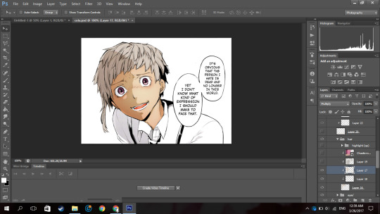
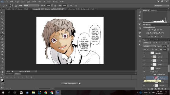
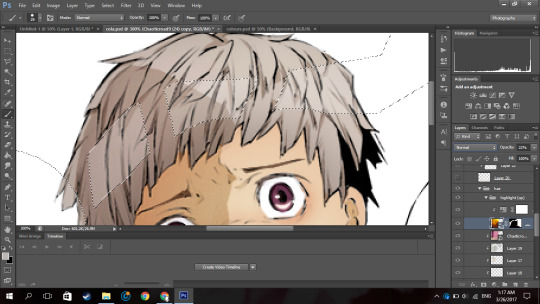
Photo
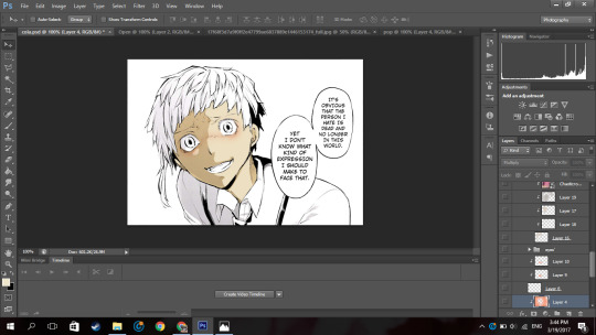
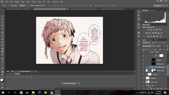
So because I have no life and because I offered to help an anon, I’m making this manga colouring tutorial.
Now first off I’d like to apologise because I personally suck at explaining things. I really do and I’m sorry if this confuses you.
I used Photoshop CS6
(its pretty easy to get it off the internet and I can’t remember where I got mine google is your best friend. But you can see if this masterlist by itsphotoshop still has working links)
But, I’m sure other versions of photoshop like CS5 and CC can do this as well.
If this actually helped you please give it a little, like/reblog!
Now on with the tutorial!
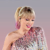
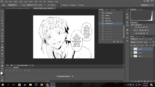
Ok so I’m going to use a mangacap from bungou stray dogs and I’m gonna be colouring something I coloured before (here), my depressed home boy Atsushi
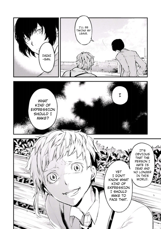
(scan courtesy dazaiscans)
When you open it in photoshop please ensure that your image mode is RGB and not Index (this is common with scans from mangastream). To change it go to Image>Mode>RGB
Crop out the area you’re gonna colour. And resize to desired size (I chose 540px) because I wanted to upload it to tumblr)
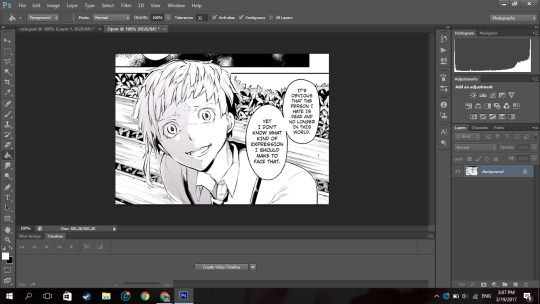
Now we’re gonna clean it. I have no idea how other people clean theirs, this is just how I do it.
First double click on your background layer and click ok on the box that comes up so it will not be locked.
Now click channels

And then click the dotted circle at the bottom. After, click delete on your keyboard.
The image will show up something click this:
Now go to Layer(on the topbar)>New Fill Layer>Solid Colour and you set the colour to pure white). Move that layer below your mangacap.
Now it’ll look like that. Then I merged those layers together.
Because I don’t want the background with the bus andbench and the panel above Atsushi, I’m going to create a new blank layer (so if I make any mistakes I can fix it), take the polygon lasso tool

(if you dont see it right click on the area where you see the normal lasso tool/magnetic lasso tool and then click polygon lasso tool)
and then I select the areas around Atsushi.
Then on the new layer I created, I use the paint bucket tool and fill in the selected area with the colour i wanted which is white.
now it looks like that.
Then on a new layer, I take a black solid brush and I change the size to something small (like around 2-3px) and I just fill in the black areas which look at little weird. For example, I thought Atsushi’s pupils looked a little weird so I filled them in.
So now it’s time to colour. Now go google a random animecap/coloured pic (preferably official art) of your character. Then open it in photoshop.
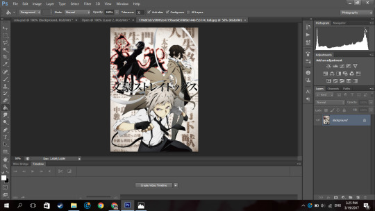
I used this pic so yeah.
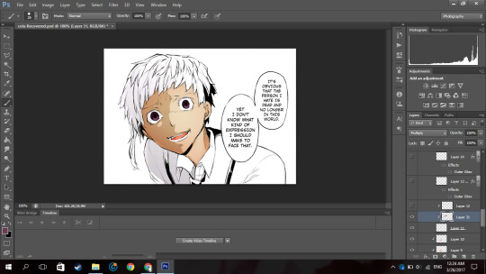
Now using the colour picker tool, pick their skin colour. Ok now go back to your mangacap, create a new layer, and select all the areas where your character’s skin is with the polygon lasso tool.
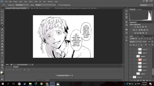
Then use a solid brush (basically one of the first default brushes from photoshop you see here), adjust the size to suit, then colour in with the characters skin colour. Set the layer to multiply.
Now, create a new layer and clip it to the layer you coloured their skin on. (clip a layer by right clicking on the layer and click clip layer and the layer will clip onto the layer below it). Set the layer to multiply
Then you select the areas where you see a shadow on the character’s skin.
If there is none, what you can do is google some lighting references and choose shadows on faces that are at a similar angles as your character (does that make sense??). Or you can just not put it in.
Now using the same colour you used to colour the skin. Colour the selected areas.

If you decide that other areas need a deeper shadow, you can create another layer, set it to multiply, clip it to the layer below, select the areas you want to be darker and just fill in the selection. I did this for the frown lines on Atsushi’s face.
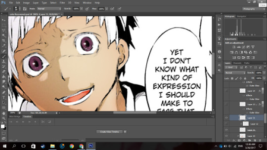
Now because Atsushi looks as if hes about to cry, using a pink colour (like the one below),

I make a new layer, set it to multiply I clip it to the skin layer and using a soft brush I brush over under his eyes and a horizontally across his nose.
Now to get some soft shadows (?) around his face and like the areas of skin below his hair, using the same pinky colour, and a huge soft brush (i used 288px) brush the area around his face but not directly near like this:
(the gif is shitty and rushed im sorry)
Using a soft brush eraser you can just fix it up from the inside of his face. I’m sorry if that sentence made no sense.
Now on a new layer (set to multiply), using the same colour I used for the soft shading, I select the area where inside his mouth is supposed to be and using a hard brush I fill that in.
And then you know the drill, I create a layer, clip it to the layer before, set it to multiply and just put in where I think the shadow would be.
And then going in with a soft brush on another clipped layer and just put in some soft shadows around.

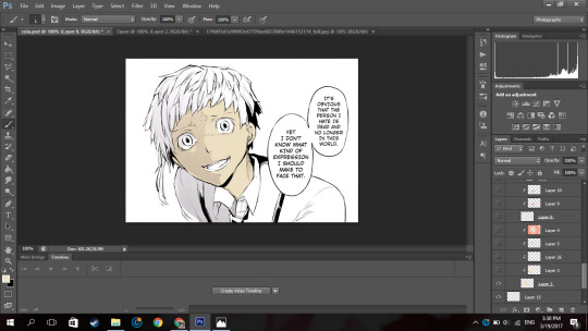
Now I’m going into his eyes. Now I do practically the same thing I do for his skin here: I pick the colour of the eye from the art with the colour picker tool, make a new layer, set it to multiply, colour it in.
Now it, really depends on how I feel to do the shadow on the eye.
Sometimes I do something like this where I shade the top half of the eye, like in the image above.
Or I simply outline the eye and the edges alone are made darker. Like this:

In this case I chose to go with the latter because I felt like it.
NOW. Normally eyes have that ‘shine’ to them right. I normally don’t do the eye like this, I just put a normal circle kinda by the pupil like this or follow whatever highlight the mangaka drew like this:

But since I thought Atsushi’s eyes looked bland like this, I highlighted it more. Now this is optional, I thought it looked better this way because following the highlight it originally had was bland for me so I did it. You by no means have to do it, it just depends on your preference.
So on a new layer, on the eye I selected a kind of a crescent shaped like so:
Up close and personal with my depressed son. Then using the colour white, I colour it in with a hard brush.

So now at the bottom of the last panel on the right, you’d see a button that says “fx,”

Click that and click outerglow. And a tiny window will show up.
Now choose a colour a little lighter that your eye but make sure its around the same tone(?) (a warm colour or a cool colour; red under tones, blue undertones, etc.). In my case I chose a pinky colour.
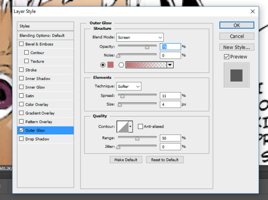
As you can see I set the blend mode to screen now this part is a must, but the opacity and the spread and size are all up to you, again its all based on your preference.
Now your eye will look something like this:
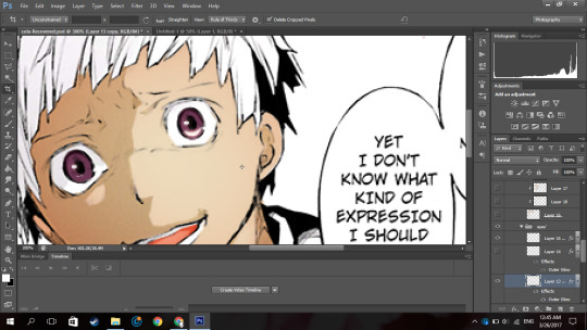
Now just duplicate that layer and move it to the next eye and rotate it by clicking ‘ctrl+T’ if necessary
now boom you got your eye. I put it in a group so it’ll be a little organised.
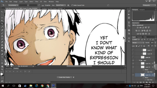
Now onto his hair oh the pain.
Now you know what to do, make a new layer, set it to multiply, pick the hair colour off your reference image, select the areas with the hair (this includes eyebrows and lashes if they’re there), colour it in.

I hid the layer where I put the redness of his eye and only realised just now so I unhid the layer sorry.
Now Atsushi’s hair on his head has a lot of layers (?) so I had to select the areas where I saw the shadows going (?) (I’m sorry if that doesn’t make sense). If your character has shadows in their hair to go along with by all means follow it but in my case his hair sort of didn’t.
So as you can see, I selected the areas where I deemed fit to have harsh shadows, I really did not put much but you can tell I did something. It all depends on where you want to put it though, I’m no expert in shadow theory so I probably suck at it but eh.
Now if you notice there’s kind of a shadow over his hair and it’s cast over his face to. So I just followed what I saw, and on a new clipped layer I selected the area and using the same colour I used for his hair and just did a shadow for that area like so:
Now normally I put soft shadows and you can see I used a pinky shade for that when I did the skin and his mouth,
but since the colour didn’t look like it had any pink undertones (did I say that right), It kind of looked weird with a pink shading. So for the soft shading I used a greyish colour:

and I just did the normal thing where I brushed around the hair with a soft brush.

NOW this part I’m about to do is completely not necessary, I barely do it but I did it in this colouring so yeah.
Using the texture above, I clip it to the hair, set it to screen, change the opacity to 50% and the fill to 28%.
Its bare noticeable but it gave his hair a slight purplish look so I liked it.
Now this part is something I barely do as well but I did it here so I’ll show you how.
Using this texture, I set it the opacity to 22%. I then select where I want the line of the highlight to be (you know how anime characters especially have this line of shine across their hair). Like this:
And then add that to a layer mask by clicking the button next to the “fx,” button. (I did it before I’m sorry I didn’t take a screenshot before I added the layer mask I’m really sorry).
Then you set the layer to soft light and boom.

You have a highlight looking thing.
Now for the shirt I basically did what I did for the skin, hair and other areas: make a new layer, set it to multiply, pick the hair colour off your reference image, select the areas needed, colour it in.
Now advice, I don’t know if you want to do it or not but, I personally think that if your character has a white shirt do not leave it pure white. Colour it with an off white colour like a light grey. Like this:

It makes it easier for me at least to put in the shadows and stuff as you have a layer to clip it to and its easier to just use the same colour and click multiply.
Then again this all depends on your preference.

For the soft shadows I used the same colour I used for his hair soft shadow.
As you can see, he has a tie and suspenders which are both black.
Now again advice and it’s my opinion I am by no means an expert but I think one should never use a pure black colour to colour it in unless it’s what you’re stylistically going for it. I’ve seen a lot of artists on tumblr say this and they use a somewhat dark blush-ish grey colour and I 100% agree with it.
However again, everyone has their own preferences.
Now the colour I typically use for black areas leans more to the gray side rather than the blue.

Now again what I’m about to do is not what I normally do but I did it in this colouring so I will show you but it is not necessary you do it.
Using the same texture I used for his hair, I clip it to the various black pieces of clothing he has, moving it around until I think it looks nice and changed the opacity as I saw fit. I did not change the blending mode from normal to soft light but you can if you want to.
To do each part individually, Using a layer mask and a pure black soft brush, I removed the parts affecting the other parts. And I unlinked the layer mask to the original layer
(double click the chain link that’s between in the layer and the layer mask)
so I can move it if I wanted to without moving the layer mask.
For example his suspender which appears to be at your left, I place the texture over that, moved it around, changed the opacity as I saw fit, removed the parts affecting his tie and other suspender. And was left with this:

Now just do that for the other parts.

Now I forgot to colour his teeth and white of his eye and only realised now so I just used the off white colour and coloured it in real quick (I put in the harsh shadows as well)

Now by all means you can leave it like this but I like to put in highlights to the skin but you can leave it like this. I have not put highlights to the skin before in some of my other colourings like this one of haiba alisa from haikyuu.
Now what you’re gonna do on a new layer set to normal is select a fine line around areas like, the perimeter of the lower half of the face, frown lines (if you want), the outer perimeter of the ear, the bridge of the nose, a little circle by the lip (if you want) and if the character has sweat or water on their face, select the outline.
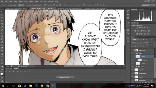
It’ll be something like this. Now with a hard white brush fill in selected area.
BOOM NOW YOUR PRACTICALLY FINISHED CLAP THE STRUGGLE IS OVER.
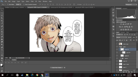
Now you don’t have to do this part it’s your personal preference. I have a photoshop plugin Topaz Clean 3 which is really easy to get off google so if you want you can go get it. Now I copy every layer and merge it. Now using Topaz clean with these settings:

I apply it to the layer and set the layer to 50% opacity (i literally wrote 50% free the 1st time im trash)
Now to add a little more oomph to my colouring because I can.
I used the same texture I used on his hair, set it to screen, I added a layer mask and erased the areas it affected besides the text so they text looked coloured.
Then you apply your psd. Now the psd I’m using is psd 01 from this psd pack but its really heavily modified and I removed a lot of the layers. Then I used 2 textures
with blending mode soft light and opacity 37%
and
with blending mode screen, opacity 51% and a black and white gradient layer clipped to it.
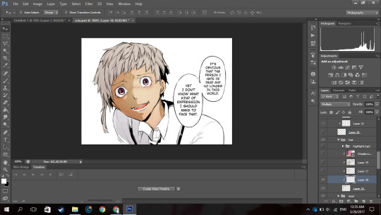
and boom you’re done!

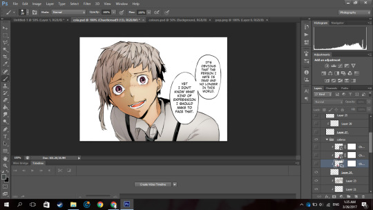
And that is the end result! I hope you enjoyed and that it wasn’t too confusing!
#itsphotoshop#yeahps#tutorial#photoshop tutorial#*mine:tutorial#*mine#photoshop#manga colouring#manga coloring
326 notes
·
View notes
Last Seen Blogs
putrirahpa
PUTRI RAHAYU PAGILARAN that's my name
storyofarts
Not About Farts

regressangel
⋆ ˚。🎀.*
thirstyassblog
GRAB HER BY HER PUSSY LIPS, THEY LOOSE!

phonographica
P H O N O G R ▲ P H I C ▲