#Founders Grotesk
Text
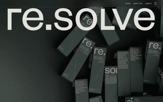
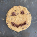
Re.solve
#Re.solve#skincare#cosmetics#modern man#shop#quiz#active ingredients#grey#type#typeface#font#Founders Grotesk#2023#Week 40#website#web design#inspire#inspiration#happywebdesign
23 notes
·
View notes
Text

0 notes

Text
10 Most Popular Fonts of 2022


I 10 fonts più popolari del 2022, secondo Typewolf.
#collezione#fonte: typewolf#top: year#gt alpina#founders grotesk#neue haas grotesk#self modern#suisse intl#inter#pp migra#dp reckless#gt super#graphik#2022
0 notes
Photo
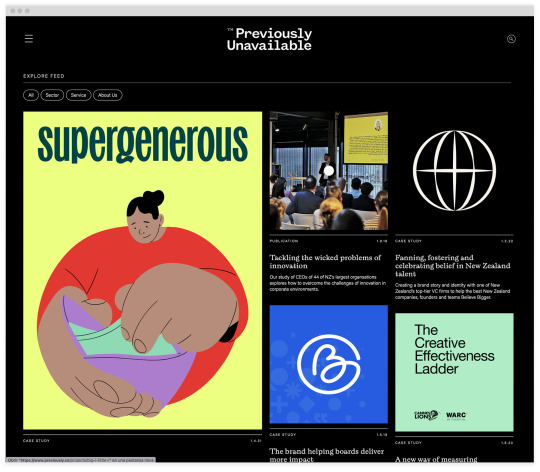
#2122 https://www.previously.co
23 notes
·
View notes
Text
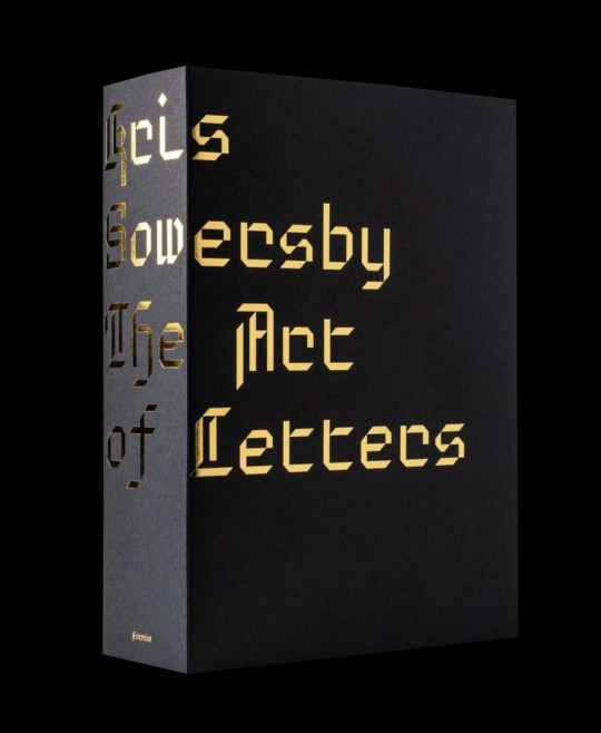
Kris Sowersby: The Art of Letters is a visual feast of letterforms celebrating one of the world’s leading type designers. The 800 page publication examines Sowersby’s letter drawing practice while considering the characters as independent works of art, exploring their interconnections of function and style. It champions the absurd beauty involved in creating multiple expressions of predetermined alphabets through nuance and theory.
While a typeface is a well considered set of many elements, if one removes the context of language systems and alphabets, each character may be viewed as a singular abstract drawing, as art in their own right. As presented in this book, it allows us to re-see, or to see for the first time, their individual form and function.
As Sowersby expresses, “There is no definitive form of the alphabet. The alphabet is a concept made concrete through countless written and designed letterforms; the alphabet is not defined by a single typeface but expressed through all of them. There’s sets of rules, largely unwritten rules, of how a typeface is put together, about relationships between letterforms and between styles”.
Printed one per page in black on cream paper, the publication features over 750 large character illustrations selected from Klim typefaces including Calibre, Domaine, Founders Grotesk, Heldane, National, Signifier, Söhne and Untitled.
The volume features an essay—"What We Read When We See"—by graphic designer, writer and educator Paul McNeil and a foreword by Formist publisher and designer Mark Gowing.
Kris Sowersby: The Art of Letters is finished with black-edged pages and the dust jacket features gold foil-stamped custom typography. Sowersby and Gowing collaborated on a custom typeface used to typeset the book. Inspired by the rich history of rotunda typefaces, its use is exclusive to the publication.
Edited by Mark Gowing and Dave Foster
Designed by Formist
Published by Formist Editions, 2021
Paperback, 800 pages, b&w and color images, 6 × 7.9 inches
ISBN: 978-0-64-859634-9
10 notes
·
View notes
Text
The Vessel → Site of the Day for July 4, 2023
Fonts: Migra, Founders Grotesk
5 notes
·
View notes
Text
HELVETICA film: Review
Founders of Helvetica: Eduard Hoffman, Max Miedinger (Designer)
Original type specimen of Helvetica: Haas Neue Grotesk
Before the evolution of Helvetica in the early 1900s to 1950s, Typeface was very expressive when it came to spreading information, some say it lacked structure. There was a variety of typefaces in a singular design, different variations of typefaces with different fonts at every page turn in a newspaper. It was almost as if there was more complexity to the typeface than to what the text was trying to communicate. However,the invention of Helvetica was the breakthrough in modernism and simplicity. Helvetica became a symbol for reconstruction and renewal. This new type of design quickly adapted to society and appealed to companies due to its efficient and neutral design, therefore they would be seen as a company who is accountable, transparent and accessible.
It was said in the film that the design of Helvetica was all about the interrelationship of the negative space, the figure ground relationship, the spaces between characters and within characters.
Would I use Helvetica?
I don’t think I would personally use Helvetica due to its simplicity which is something that does not appeal to me.

0 notes
Text
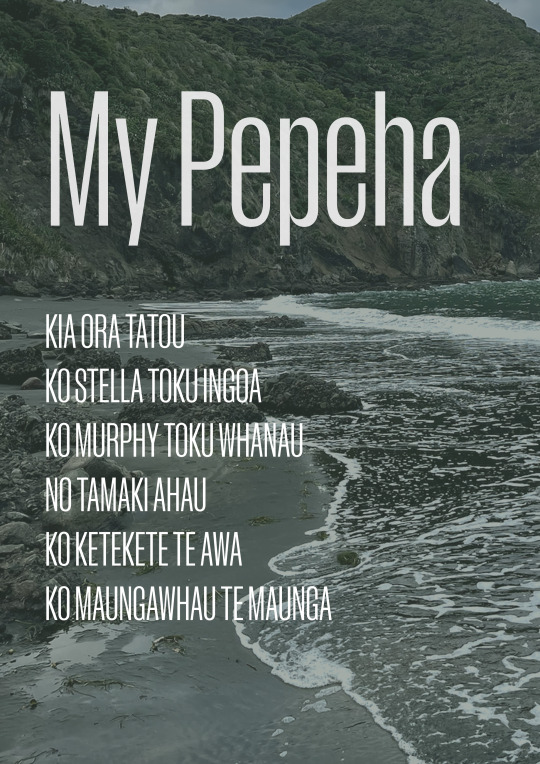

My Pepeha and Mood Board
I presented my Pepeha on an image I took at at Karekare beach.
As for my visualised Pepeha - I paired this with my chosen font for the project. Manuka by Klim. This font represents me, it's bold and characterful, with potential. I have't used this font before, but I often use Founders Grotesk, also by Klim. So I am familiar with their fonts. Manuka in particular is a beautiful font with many weights - perfect for any design project. Lowercase and uppercase have a different look which I prefer as it allows there to be contrast in a project where only one font is being utilised.
As for my images I carefully chose images with texture and character to really depict not only me, my pepeha but the font and look and feel I want for this project. Included are aspects of my own heritage - Samoa, Italy and where I was born New Zealand. Naturally forest green will be apart of this project. Accompanying beautiful golds and brown tones. I believe that this mood board encompasses not only my Pepeha, but the look and feel of the font and project. They flow so seamlessly.
1 note
·
View note
Text


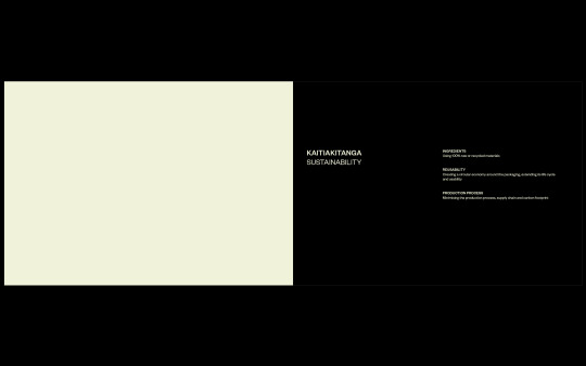

transferring the leave-behind document over to indesign , as our group collaborated on it at the same time on google slides to make things easier for us to communicate
replaced the helvetica with Founder Grotesk from Klim Type Foundry , an NZ made typeface to better align with Whitiki's values
instead of the #ffffff white , swapped it with our brand's colour palette's cream for a more unified booklet
establishing paragraph styles for consistency throughout the spreads
0 notes
Text
Adiem Law
#Adiem Law#law#employment#administrative#litigation#Aasish Ponna#one page#typographic#typography#type#typeface#font#Founders Grotesk#2023#Week 52#website#web design#inspire#inspiration#happywebdesign
9 notes
·
View notes
Text
WK7 Typeface Exploration
Geometric Typefaces
I looked at geometric typefaces which are the most legible, taking into account that the riso inking can be quirky. To consider the style, size and weight of the typeface to ensure good legibility and easier reading for the viewer.
https://www.printpeppermint.com/the-most-easily-readable-fonts-for-web-and-print/
Open Sans

“was designed to increase legibility. There is more space between characters, good for both digital publications and print” Print Peppermint, (2022). - https://www.printpeppermint.com/the-most-easily-readable-fonts-for-web-and-print/
Klim Type Foundry Test Typefaces
I also looked at Klim Type Foundry and explored some of the tests which they let users use for free. The first one being The Future and the second being Founders Grotesk Test and Founders Mono and Untitled Sans.
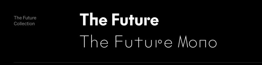
The future is a geometric typeface, however in the test the interesting features of the r is missing.
https://klim.co.nz/retail-fonts/the-future/
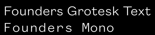
Theses two typefaces are legible, and geomettic. There is a large kerning between each of the letters.
https://klim.co.nz/retail-fonts/founders-grotesk-text/
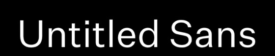
Untitled sans is a contemporary font. It os geometric, clean and legible. These typefaces come from large font families, which is also important to consider when making design decisions in the typefaces used for the publication.
https://klim.co.nz/retail-fonts/
Plastic Typeface
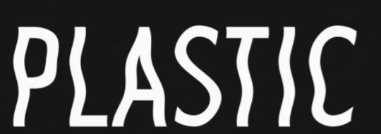
https://klim.co.nz/retail-fonts/
https://befonts.com/plastic-sans-font.html
I am aware this font is not adobe, or google. It would primarily only be used for display typeface if selected. However I was searching up plastic inspired typefaces and this was one that came up. However I am aware that it may not have been done to industry standard like other type foundries.
0 notes
Text
10 Most Popular Fonts of 2021


I 10 fonts più popolari del 2021, secondo Typewolf.
#collezione#fonte: typewolf#top: year#pp editorial new#neue haas grotesk#founders grotesk#favorit#self modern#sohne#maison neue#neue haas unica#gt alpina#signifier#2021
0 notes
Text
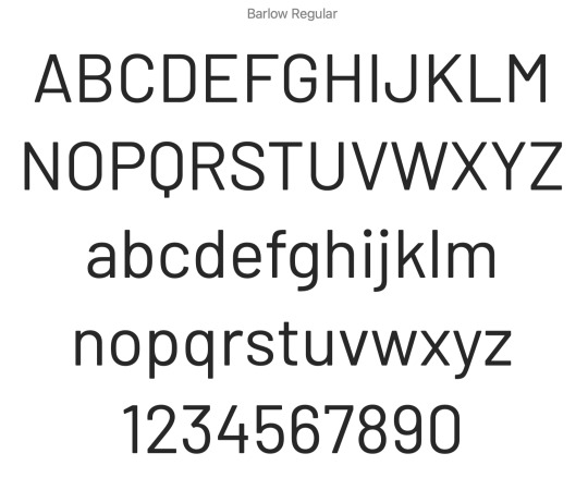
RESEARCH OF BARLOW INFOS
Barlow is a slightly rounded, low-contrast, grotesk type family designed by Jeremy Tribby . Drawing from the visual style of the California public, Barlow shares qualities with the state’s car plates, highway signs, busses, and trains. The family includes 54 manually-hinted styles in three widths and nine weights, as well as obliques, suitable for large and small digital and print use. Customizable weights and widths are available via the included variable font (GX) file.
Barlow is named after internet pioneer, EFF co-founder, songwriter, and activist John Perry Barlow.
REFERENCE
(https://www.fontsquirrel.com/fonts/barlow)
0 notes
Text
Week 1 - Brief, Allocated font and Research
For our first class back for the second semester, we began our class by going through the brief for our projects. In materials and media this semester we are to complete two different projects, which are going to take 6 weeks to complete each. For our first project this semester, we are working with typography to illustrate it in a way that it can be viewed as both text and image. This final product for this project will be produced as a static booklet with 16-24 pages which explores the typography we are randomly allocated.
Once we had gone through the brief, we were allocated our font. This font is what we will be using for the rest of the semester for both of our projects. The font that I was allocated was Barlow.
The Barlow project is led by Jeremy Tribby, A designer based in San Fransico, USA. Barlow is a slightly rounded, low-contrast, Grotesk-type family. drawing from the visual style of the California public, drawing inspiration from the state’s car plates, highways signs, busses and trains. It is part of the Normal family, which is a part of the superfamily, along with Semi Condensed and Condensed, each with 9 weights in Roman and Italic.
The font was named after EFF(Electronic Frontier Foundation) co-founder, John Perry Barlow, who was an activist, songwriter and cattle rancher. It was a tribute to his lasting impact on the information superhighway. After a meeting with Barlow and John Gilmore, Jeremy Tribby (creator of the font) witnesses these two discuss the legal implications of producing a font, Tribby was left with a font name and a very memorable experience. From this meeting, he was inspired to integrate the California Landscape into the design. Barlow is free software, released under the SIL Open Font License. It can be used for products and projects - digital or print, commercial or otherwise.
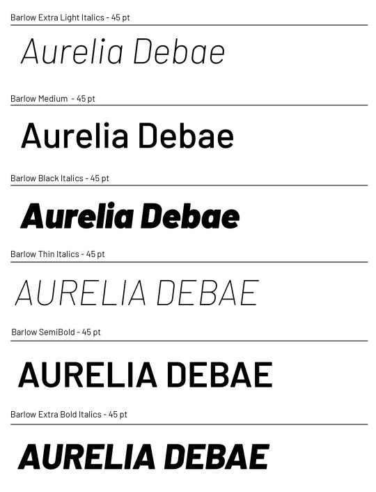
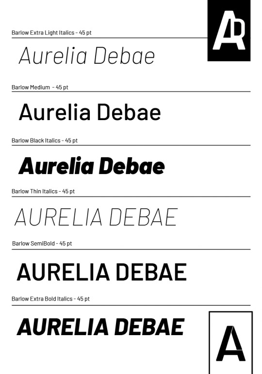
For the next part of the class, we were asked to display our font to show the different styles, weights and upper and lower case. There are examples of my progress on this below, I wanted to ensure that I covered all 9 styles of Barlow. Looking at the typeface, I like how it has curved edges and it has a clean and simplistic aesthetic. I find it easy to read and I admire how in each different weight, the typography can portray a different message. For example, the bold italics of Barlow make the type seem as if it's being blown or pushed away. Whereas the thin weight portrays a delicate and dainty characteristic.
While completing this, we were also asked to produce a monogram of our initials within our allocated font. As I was running out of time in class, I decided to make a simplistic monogram of an 'A' with 'D' part of its structure. I thought this was an interesting play around with combing the two letters together. I'm looking forward to using this typography throughout my work this semester and being able to pull it apart while also displaying its unique character and features.

1 note
·
View note
Last Seen Blogs
figgldygrak
Hello!
xicyhotah
mi🇵🇸

mabatakii
Seiyuu's Photobook

classstage7
Unbetitelt
milkytheholy1
I'm back baby!