
Last Seen Blogs

sagaciousfchuzzle
Cheerful and Stupid
red-headed-batman
Friendly Neighborhood Oracle

fluffyclouds8
Untitled

artofatlas
Art by Atlas.

2021chillinamsterdamlolnotdutch
Naamloos
Text
References
Bold Fonts. (n.d.). Retrieved from Barlow Font Free download: https://boldfonts.com/barlow-font/
CDN Fonts. (2020). Retrieved from CND Fonts: https://www.cdnfonts.com/barlow.font
Google Fonts. (n.d.). Retrieved from Barlow: https://fonts.google.com/specimen/Barlow
lifestyle, E. C. (2022). California through my lens. Retrieved from Famous roads for great drives in California: https://californiathroughmylens.com/famous-roads-for-great-drives-in-california/
Masters, N. (2015, October 27). KCET. Retrieved from What Does California's State Highway Shield Symbolize?: https://www.kcet.org/shows/lost-la/what-does-californias-state-highway-shield-symbolize
Rhinocarhire. (n.d.). Retrieved from US Road signs: https://www.rhinocarhire.com/Drive-Smart-Blog/Drive-Smart-USA/United-States-Road-Signs.aspx
Tribby, J. (n.d.). Tribby. Retrieved from Barlow: https://tribby.com/fonts/barlow/
9 notes
·
View notes
Text
Rationale and Reflection


These are my final rationale and reflection for M&M.
An extra reflection for this one is that I found creating the frame-by-frame animations more efficient and easier for me to execute the ideas I had. I found this was easier for me as I had developed a strong understanding of how to use the frame-by-frame so I had more control over how long each frame would appear on the screen. I found the video animation a little more difficult to control the timing and transitions as it was difficult to gauge with a smaller sliding bar and having to check through each layer to see where the transitions took place. I would have liked to have given myself some more time to understand properly how to animate using the video timeline. I would say that I am proud and satisfied with my frame-by-frame animations but more content with my video timeline animations. I am still proud I was able to produce my vision within a short period of time.
1 note
·
View note
Text
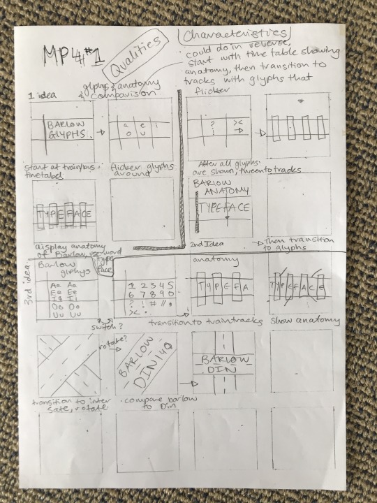
Final MP4 1
Things I would have differently
I think I could have made the glyph table more interesting and quicker so that they aren't shown for so long. If I had more time I would have liked to include flickering glyphs to attract attention.
I could have tightened up the transitions with the MP4 so it is more connected to each other.
I also would have liked to figure out how to export properly so I could have the MP4 fit the whole screen. I did export it as 1080 x 1080 but couldn't figure out why it wasn't filling the screen.
1 note
·
View note
Text
Final MP4 2
Things I would have done differently:
include a delay/pause for when the languages move across the screen. This would have allowed the viewer to take in the different languages easier and may no have to watch it multiple times to catch the different ways of saying exit.
I think it would have been better to alternate the ways the time comes on to the screen. Creating a bit of difference within the MP4
Same as my other MP4, I wish I could have exported it correctly do it fills up the whole screen
1 note
·
View note
Text
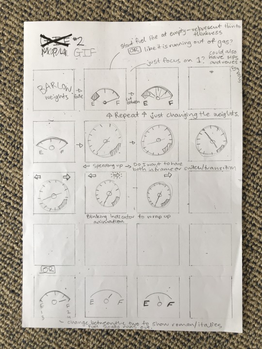
Final GIF 2 Weights

Things I have changed since my previous design:
Chang the beginning transition so that the type doesn't run onto the screen, it's more that they are quickly passing by a sign.
Made the transition quicker between the weights, not as slow so not boring
Things I would have like to have done differently:
I would have liked to communicate the story behind the design in a more structured sense. I feel that you are only able to understand the story if it was explained to you. I would have liked to be able to portray it more efficiently in a visual manner.
I am still proud of my second final GIF animation and believe I achieved what I was aiming to. I really enjoyed the process of frame-by-frame and would be happy to animate using the photoshop software again.
1 note
·
View note
Text
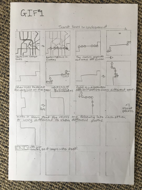
Final train map GIF 1

I am rather satisfied with how this animation has come together. The only thing that I would have liked to incorporate would be a sign to explain some of the different descriptive words, such as grotesque.
1 note
·
View note
Text
Week 12 - MP4 2 Iterations
focusing on the tracks and how I will display the type on them
1 note
·
View note
Text
Week 12 - MP4 2 Iteration #2
playing around with the directional arrows
1 note
·
View note
Text
Week 12- MP4 2
This is the beginning work of my second MP4 design. I am working on how the type appears on the screen with for the beginning sequence. I wanted them to slide on the screen to give the idea of moving along a road or interstate. I am thinking of incorporating arrow signs to show the direction of movement.
0 notes
Text
Week 11- First MP4
This is a video of my first attempt at putting together my MP4. I began by creating a small intro scene that then moves on to showcasing Barlow's Glyphs. I wanted to include this as a sample piece from my type specimen book. I also liked the idea that the table looks like one for a train or bus timetable. I thought this could help iterate the idea of where Barlow is seen within California.
I want to create a smoother transition between each table so it looks like its flipping between the different time/routes.
0 notes
Text
Week 11 - MP4 1 Iterations
For the second half of the video, I wanted to showcase where Barlow was used, such as on trains and interstates. I thought I could incorporate this idea by using illustrations that portray highways and train tracks. I am still playing around with how I want to transition between these two different transit options.
0 notes
Text
Gas Weights Gif 2

I have moved forwards with my weight illustration to try and create something more visually appealing. After some extra research, I have conducted, I thought it would be interesting to include the unique shape of California's road signs shapes. They are in the shape of a shovel as a representation of the gold mining days. This is why I have changed the beginning of my animation to this sign.
Through this new animation, I feel that I have been able to tell a more compelling story. The idea was a road trip or driver through California, displaying the road sign. Then it noticed that they are almost out of gas, so as they are filling up it shows the weights of Barlow as they gradually get more full (like gas meter). I found this design a lot more interesting than my previous one and is able to communicate a story within it.
There are still some little touch-ups I need to change such as how the type appears on the sign and the transitions between each weight. It is currently 0.7 seconds change between each weight transition, thought I would tighten this up to make it a bit quicker, changed to 0.5 seconds
0 notes
Text
Train map GIF 1 - Last iterations

This is my first GIF, based around train routes that are showcasing the description of Barlow as a type. After our formative feedback session, I was advised to push the transit line out to the edge of the screen. I was also told that I should change the way the type appears on the screen, which I was already wanting to do for my animations. Karol suggested that I display each word along a different transit line so it creates differences and interest in the design.
I am rather happy with how this Gif is coming along, I feel that I have been able to execute the idea how I wanted to. There are some small changes I still need to make until I feel like this is ready to submit.
0 notes
Text
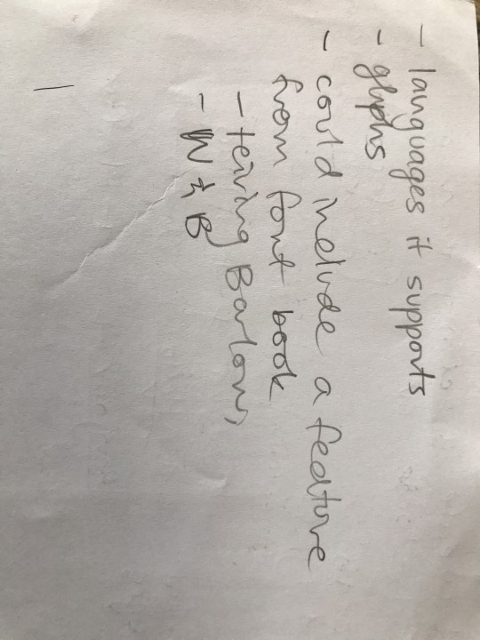
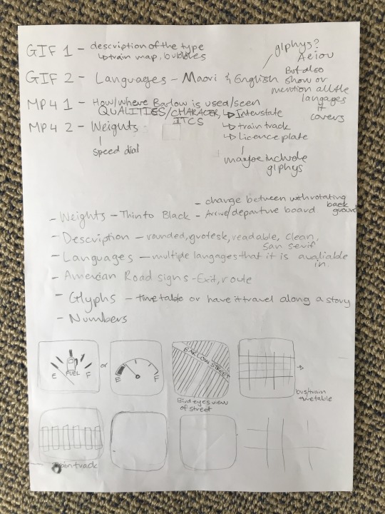
Week 11 - Extra planning
After our feedback session, I decide to replan my animations so I can get a better understanding of how I will implement the design. I have also been stuck on what I want to focus on for my MP4 videos. I have found that creating brainstorming and storyboarding has helped me to visualise my ideas so then it is easier to implement them later.


0 notes
Text
American Road signs
As I wanted to expand my vocabulary for my GIF of different types I can include, I decided to look at the different type of road signs within the USA. I thought this would be strong to include in my work as there aren't many descriptive words about my type so this will expand the number of words I can work with. It is also on brand with the theme I want to use for my GIF, highlighting Barlow's design purpose which was for transit within California.
Below are images that I have found of road signs within America. I am thinking of pulling words from these signs to use within my videos/ GIFs to use as vocabulary. I have also thought about using interstate signs and the vocabulary from that. Such as North, South, East and West as well as the number and location that they are travelling to. I think this would be a strong element to include in my design as it resembles the purpose that the typeface was designed for.


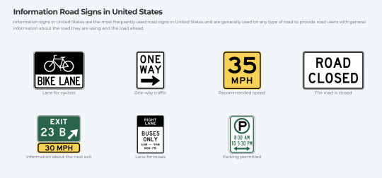
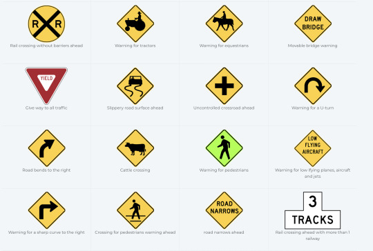
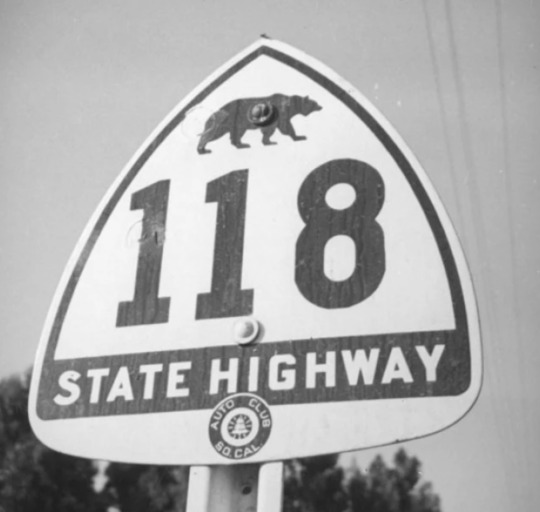
Through my research, I found that there are differences in interstate signs within America. California interstate signs are shaped like spades to symbolise the forty-niners who would go into the foothills and dig for gold. The miner's spade emblem was adapted to the state highways in 1934. From 1934 to 1957, they adopted a silhouette of a grizzly bear onto the state highway signs. This was a symbol of the Forty-Niners and their descendants who had hunted the grizzly bears to extinction in 1922. Today, California is the only non-rectangular state highway shield, making it a unique feature to add to my GIF/ MP4.

0 notes