2023-512stellamurphy
Stella Murphy
Making and Media Student Workbook
33 posts
Don't wanna be here? Send us removal request.
Last Seen Blogs
heyfuckthatguy
Fuck that Guy

lightvoxx-blog
Untitled

penjualbukuislamsurabaya-blog
Untitled

guuui
제목 없음
emkvipblog-blog
EMK Institute Share Space
Text
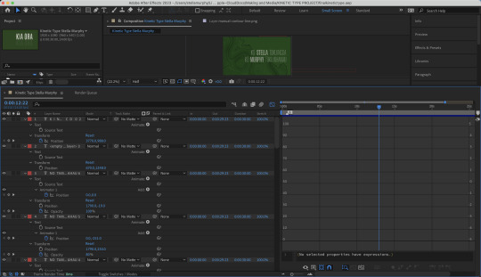
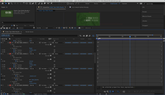
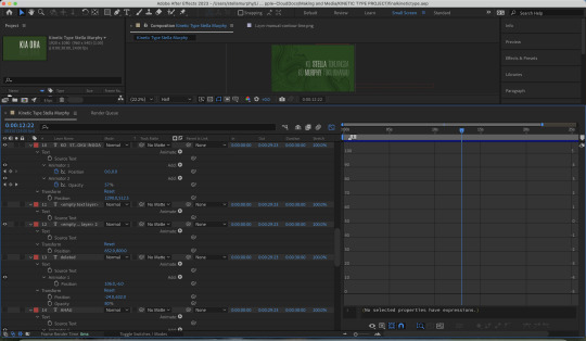
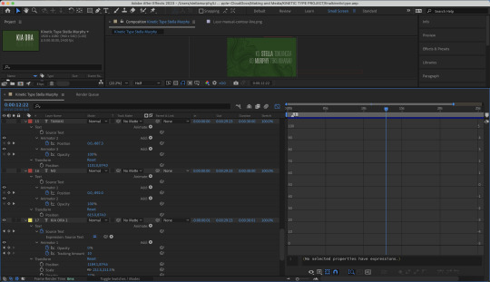
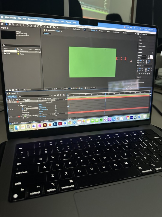
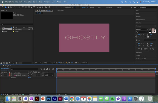
Lastly in addition to the kinetic type project here are some screenshots of my Ae layers. Though quite messy you are able to see the process and progress with lots of pre-compositions etc.
0 notes
Text
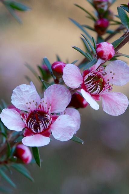
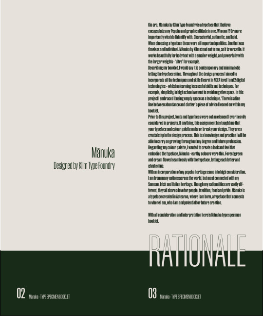
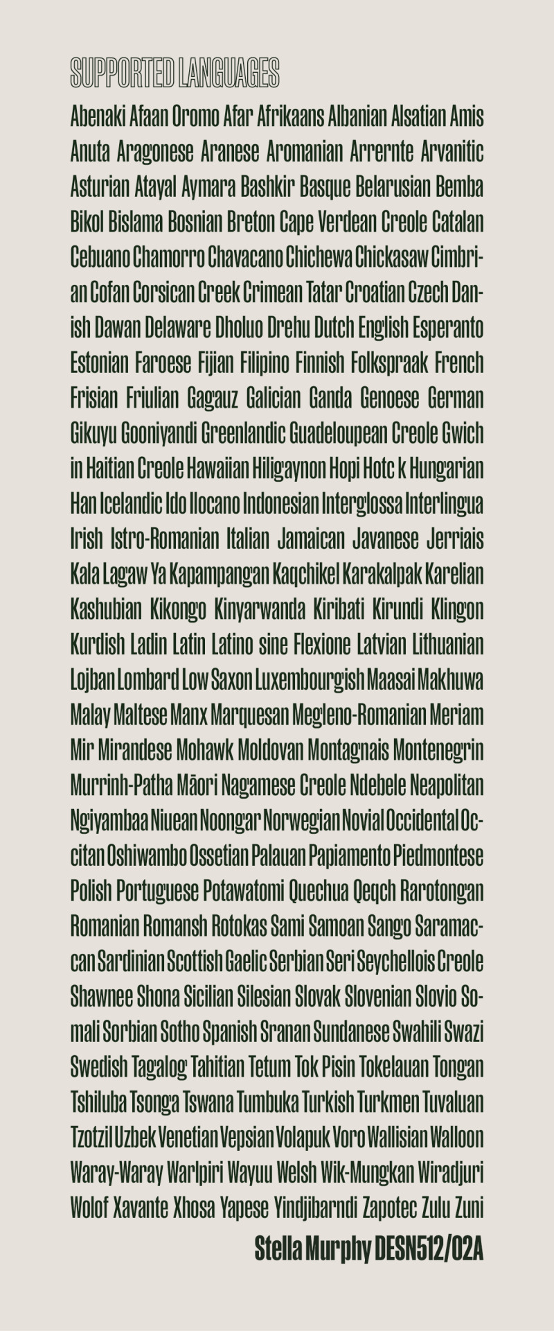
IMAGE CREDIT
I found the Manuka flower on Pinterest, however there was no credit to a photographer and the upload was anonymous. (Source unknown).
I grey scaled the image before using it, here is the image and source explanation.
0 notes
Text
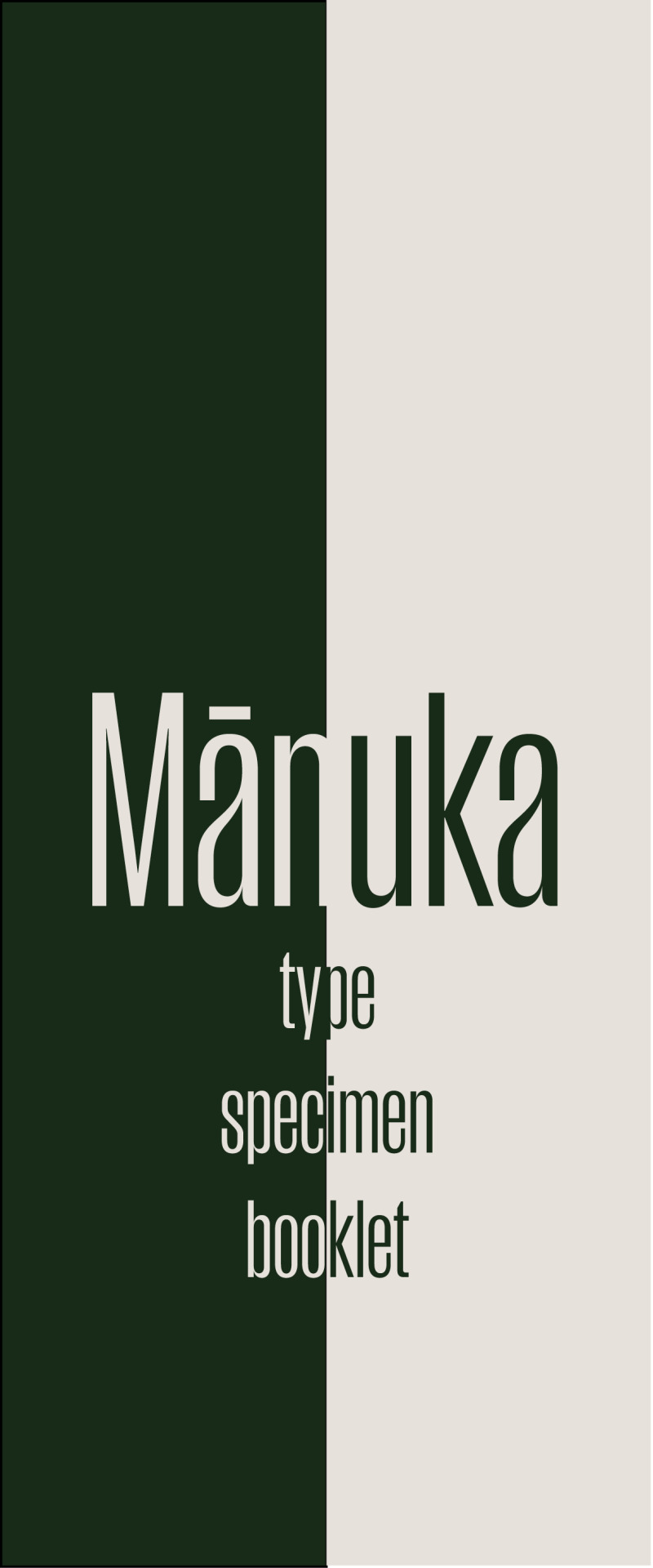

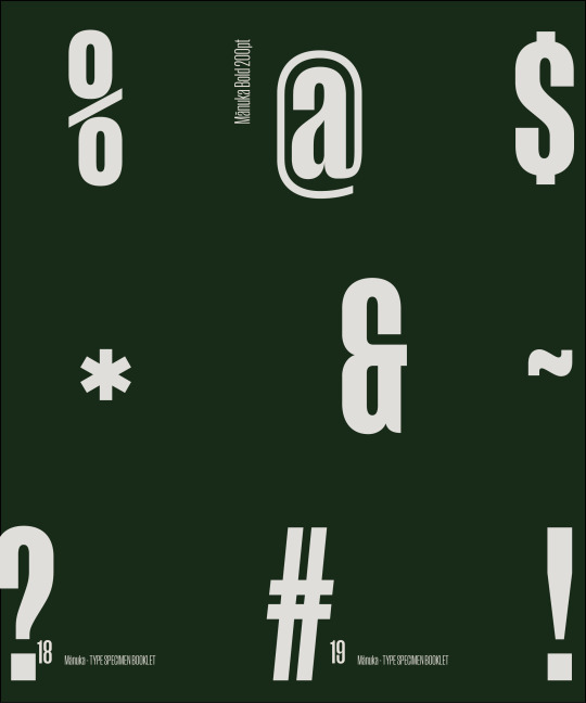
MY FINAL TYPE SPECIMEN BOOKLET
For my final type specimen booklet I only made a few alterations as on the whole I was happy with its quality.
The adjustments I made were, changing out the honey image, as it detracted from the booklets look and feel, sticking out rather then telling the same story. It also looks more like poured metal than honey, which left too many questions. I instead changed it for a Manuka flower, as this brings everything home and ties it together.
My other adjustments where all around spacing and grids, making sure that glyphs were not obscuring the page numbers etc. Just that final edit with fresh eyes.
Otherwise I am happy and confident to hand-in. And I will do my final upload to canvas now.
0 notes
Text
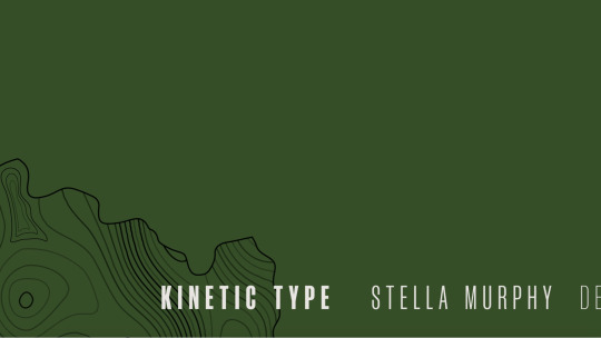
MY FINAL KINETIC TYPE
My final kinetic type animation. I am happy and proud with my work over this semester, I spent most of this half of the sem, sick so doing it mostly remotely was a challenge. Thanks to YouTube tutorials it all worked out as I taught myself by trial and error. At the start my after effects skills were similar to a stop motion picture array. Overtime and with research I understood more of the after effects tools and was able to program much better.
I think my animation tells a beautiful story and brings all design aspects together. It is all centred around my pepeha, while using Manuka by Klim to bring it to life. The two projects for CD beautifully complement each other, and are a lovely beginning to my design degree portfolio.
Stella Murphy
0 notes
Text
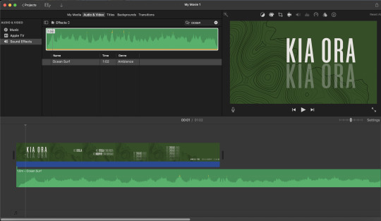
LAST STEP AUDIO
Lastly I imported my MP4 into iMovie to add audio as I find this super easy. I decided on ocean waves as they add a layer of lyrical song into the landscape of this project. The waves fade in and out, like the text and work together throughout the animation.
0 notes
Text
HERE IS MY LAST DRAFT
As you can see it is missing some of the final edits. It also has a different song - footsteps in the dark by SIR. However, after some perspective and thought I realised that while I might connect with the song, it does not add nor emphasise the project. So, I am now looking for a final song or audio to bring the whole kinetic type project together.
0 notes
Text
For the credits animation I’ve used two swipes (position tool) to move the contour map off the page to emphases and close with the credit. The font is smaller and like a ticker tape across the bottom as a sign off. The closing image is of the plain green background (like the title slide) and credits in 3 font weights to differentiate each part of the sentence.
The soundscape for the animation had to reflect the fade and movement of the animation.
0 notes
Text

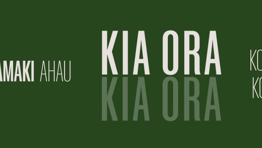
To fill the screen with detail (to contrast effects with previous animations), I created 5 rows of the same sentence (NO TĀMAKI AHAU) that drop in from above to fill the page for emphasis. I've brought the fade / opacity effects into this animation to echo the opening title and that sense of place with the face in and out of landscape mist. The bottom row is 20% opacity, then it layers up 20% at a time until the top row is at 100%. There are many ways of interpreting this image – some people might see a metaphor for the depth of water or the depth of time.
At this point I also added a traced contour of Pt Chevalier peninsula (SEEN BELOW) (where I have always lived) to the whole project for context and texture for the empty space. To the five lines of text have graphic impact. They fade out all at once before the final credits.
0 notes
Text

My first design for the ‘place’ sentence (Tāmaki) used 3 layers and then I animated each one to drop into position. It was a bit bare, so I looked to fill the screen with more details.
0 notes
Text

I’ve used changing font weights to emphasise the keyword in each sentence. Medium Mānuka for my name, Thin Mānuka for the body copy.
I’ve timed the first two sentences to come in one at a time as you would read (or speak) them.
When I right-aligned the two sentences in this clip I made an error in positioning the second sentence so that there was a delay in the positioning. It created some subtlety which I actually liked so I kept it.
0 notes
Text
The changing opacity of the text (the pepeha) within the deep forest green background is like speech that fades in and out of ear shot or sound coming in and out of a mist. The mist idea links back to the landscape. Where I live in Pt Chevalier on the Waitematā Harbour, there is always sea mist that lifts as the sun heats the air.
0 notes
Text

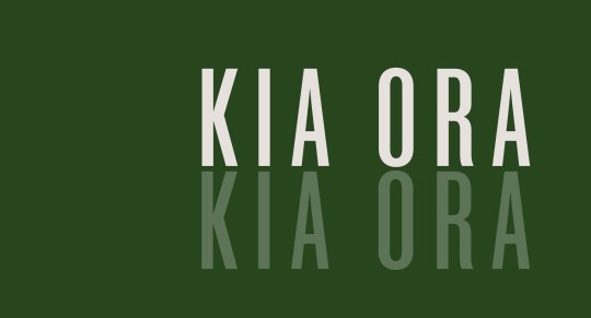
My animation techniques focus on text ‘swipes’ (using the position tool) and ‘fades’ (using the opacity tool). The swipes create movement across a landscape / Tāmaki - ideas from the pepeha. The fades are a metaphor for speech - a pepeha is always spoken - they represent the way sound dissipates from loud to soft, so they face to nothing. Similar to the tracking / expansion of KIA ORA at the title opening - like sound waves moving through space, or the way sound is represented on sound or speaker icons on apps.
0 notes
Text

Transparent PNG of Point Chevalier peninsular.
For my previous project in Design Studio I created a contour map of Point Chevalier to use in grounding my project. It looks very lyrical and the soft lines look beautiful around text. It came to me half way through designing this project that it would add another graphical dimension layered behind the text, and add to the sense of place which is my Pepeha.
0 notes
Text
Starting with the plain green background, I started bringing the text in from the sides. I also duplicated ‘KIA ORA’ for an ‘echo’ to play on the voice / speech idea. The opacity of the second line also resembles a reflection of the letters (not mirrored) which talks to the landscape my pepeha is about.
At this stage I started to get more inspiration as I figured out how to use adobe after effects a bit better. Getting it to flow rather then look like top motion was progress. It was my first time using this software so it took a lot of youtube tutorials.
0 notes
Text


Beginning my design
First of all I decided upon my colour palette, I went for the same a my booklet sticking to the Manuka theme. However, I slightly altered the colours to make it more fresh and vibrant. My font selection was Manuka by Klim Type Foundry font family. The only downside is that I haven't been able to use Te Reo macrons as I was only using the test fonts. As to purchase all the fonts would have cost upwards of $200 NZD.
First up I used the tracking tool for my title animation. Starting with the greeting ‘KIA ORA’ and expanding it for emphasis, the way it animates feels like a speech animation, as if someone has voiced it.
0 notes
Text


Doing some extra research I wanted to look into colour palettes beginning to visualise the colours I would like to implement into my kinetic type. However, I do need to firm up my concept beside colour before confirming which colour is most appropriate and provides concept to the text. Letting it shine while complementing the design.
0 notes
Text
In the same week 8 lesson we did a crash course on Adobe After Effects. I found it very challenging trying to consume and comprehend all the information and technical steps. But it was very useful and we went over many steps to making an animation. We started by learning how to pull text across a screen and then we went on to upgrade this - typeface etc. I will go home and learn more about after effects hoping to use it in my kinetic type assignment. It is such a great tool and can be used in so many ways and instances.
0 notes