#DONT draw crowds. i suffered. i cannot explain. i didnt even detail that many crowd ppl but i was fighting for my life the whole time
Text
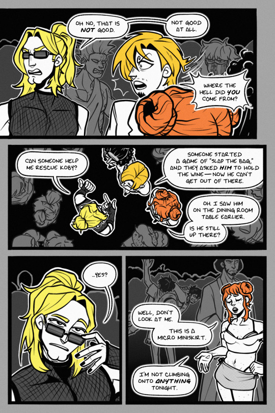
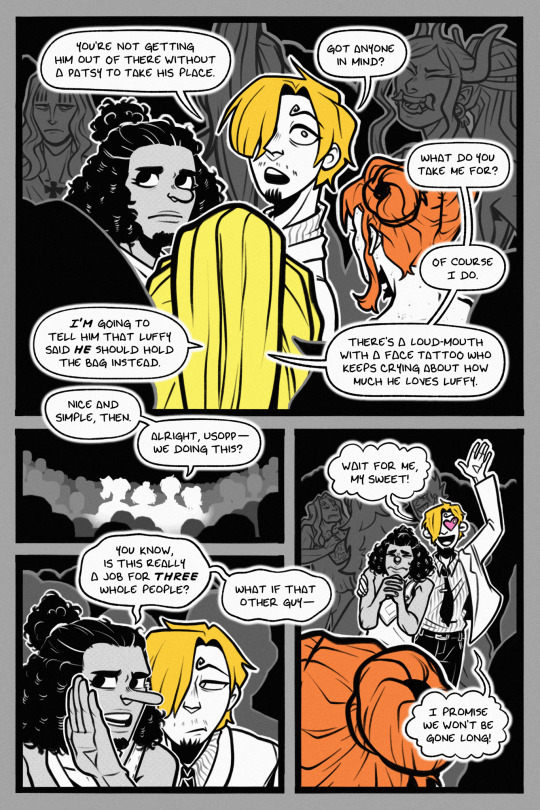
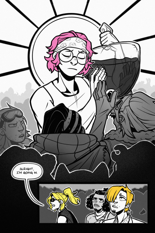
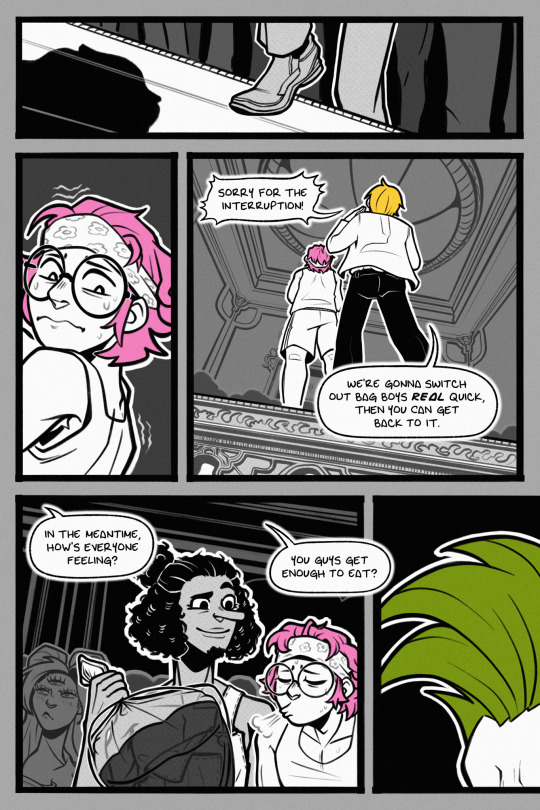
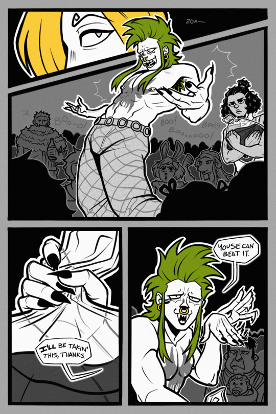
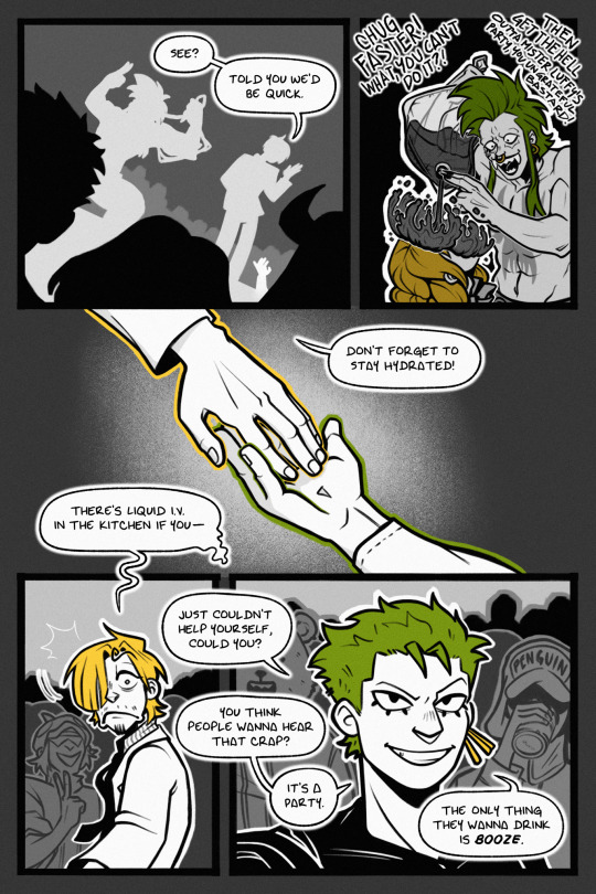
launching a rescue mission!
from utilities included, ch. 8
masterpost
#one piece#sanji#zoro#zosan#nami#usopp#helmeppo#koby#bartolomeo#other ppl but theyre just cameos#utilities included#DONT draw crowds. i suffered. i cannot explain. i didnt even detail that many crowd ppl but i was fighting for my life the whole time#blood sweat and tears. ill be complaining about this one for a while#BUT. IM SO HAPPY WITH IT?!#shoutout to emmie for helping me with the barto pose#and shoutout to bege for bringing a whole infant to a rager. my favorite detail that i added to please myself#anyway i learned i love drawing koby and barto
902 notes
·
View notes
Photo

Hi everyone! Last week our models battled to the death with the primals. Our intrepid Warriors of Light risked life and limb for some of the best battle shots we’ve seen in the history of the competition.
The ever present threat against Eorzea, primals are our primary foe. How are you keeping Eorzea (or Doma or Yanxia) safe from these menaces?
However, even though everyone did a great job this week (and gave the judges and the community absolute fits - the rankings were all over the place), only one model emerged from the pile of corpses with the best overall score by a mere third of a point:
Rymmrael Bhaldraelwyn
Congratulations! Not even Ramuh’s beard can stand up to your fierce display of paladin strength. Time for a shave and a haircut, primal!
The next round of ENTM Tumblr Cycle 10 will hopefully be posted sometime before midnight EST on Friday, October 12th - assuming Michael stays far, far away.
Please check below for feedback from our judges.
A note from Kat: Models, please know that if you have any questions or want clarification from a judge on a critique, you are welcome to DM them from the Discord channel. Often when the round is this excellent the decisions come down to tiny nit picks, so a suggestion for how a shot could have been improved is not always the same thing as a low vote in the ranks. You could be a judge’s favorite that week and they’ll still have something to say that could have made it even more amazing.
Judge Kusuh
Hey all! Just as a note: these critiques are being written on the road due to a major life move! These may be a bit shorter, but as always, feel free to reach out me with any clarifications!
Ni’ko: Colored marker is an *amazing* color choice for this picture! Everything about this picture adds to it in an amazing way: the dark sun in the back center drawing the shot together, the line connecting you and Ifrit, the ice shards adding sharp edges to the frame of the shot; everything adds something! Here’s my caution though: this picture walks that very thin line between enough and *too much*. While everything in a shot can have a purpose, there is such a thing as overloading a frame, even if you believe it’s all necessary! I want you to keep an eye on that in the coming weeks, making sure to really keep an editorial eye on what you do.
Cowbot: The deadly slice of Odin gives me some maaajor flashbacks to the DPS checks of that fight when it came out, so I’m glad you were able to catch it in a much more showy and epic light! I believe the cinema frame here was a good choice, it’s like the climax of a movie! Now, here’s something I’ve noticed in a few of your shots, including this one: you are a lalafell, and therefore you are shorter then most of your fellow models. This is going to produce unique challenges, mostly in terms of visibility. In this shot, while the look and effect is great, I’m having a hard time seeing you! For the future, I want you to try zooming in a lot more! See what you can get from a different perspective.
Ysildor: I very much appreciate the choice of color and use of the tools available to you in gpose, you’ve clearly put a lot of thought into what you need to do to make the shots as aesthetically pleasing as possible. Here’s what I’m noticing this week: the shot feels a little crowded to me. This mostly comes from the fact that while you are clearly engaged in combat with Odin, the fact that you two overlap on different planes makes me wonder exactly where you are looking and aiming your attacks. Whereas I commonly ask others to zoom in, I’d like to see what you can do with a wider shot in the weeks to come! Let’s see how you do with much more room to work with.
Judge Vederah
Azalea: Stylistically there's some pretty neat things happening here. I love how you put some thought into the glamour you wore for this particular shoot- helps your character fit in with the shot and helps with the narrative. I also like how both you and the primal are super imposed over one another. His might may be looming over you, but the ferocity in the characters expression shows where the true power lies. However, the picture is so over saturated with blue and green hues that you lose a large portion of the primal's shape and a lot of the details on the floor for that mechanic. Perhaps a different filter, or less direct lighting would've helped.
Lily: I love how crisp and clear this image is- like almost to the point where it looks like a screenshot from a cut scene. How your character is positioned in relation to the primal makes it feel like they're actively engaged in battle. I also really like the contrast between your character's blue hued armor against the warmer toned backdrop and Ifrit. It's a really well composed shot- and the only thing I could point out as maybe something to change would be to scoot the shot a touch more to the left so it's more centered.
Rymm: I love the pink and deep blue tones of this shot- and how you matched your glamour to it. It's always important that your character fits into the settings. I also really like the angle of the shot and how it directs the eye over to Ramuh who is just being completely surrounded by that amazing lightning graphic. I think the only con to this image is that it's a little dark around the edges. So much so that it almost makes the image as a whole too muted. If the lighting was a touch brighter, those amazing colors would've popped even more- making this image mindblowingly good.
Judge M’Telihgo
Wren: I want to start by saying how much I absolutely adored your picture from last week. You were front and center and in the irrefutable focus of your picture. That picture was you and everyone knew it. Why? Partly you are in the center part of your picture, we always start there when looking at an image. You are the only thing that is blue. We can see your beautiful face, you should show it to us much more often, you are very pretty! I’m sorry Wren, I cannot say the same things for this week. It helps that you are the only thing in white, it really does so +1 for you. I’m kinda sad that I cannot see your face this week. I also have pink hair and thanks to a request by my bf, I am using the same hairstyle right now. I would love to see how your face looks with it too. A slightly different camera angle to focus on you a little more and show your face could be just what you need! Shiva commands much more of the area of this picture than you do. Neither one of you are facing the camera and that would help your image too. I can tell you are trying, and you do get credit from me. This next round is for a close up, please, let me see how awesome you look in that!!
Ona: Your picture also suffers from your face being obscured. Taken from the opposite side, much more of your face would be visible since the hairstyle is asymmetrical. I like the effect, it does look like you are fighting Garuda, you lined it up well. Unfortunately, it leaves you in a weird pose that I feel detracts from your image. I do think a different outfit may have helped you some too. You skin tone doesn’t pop against the blue background, it makes you blend a little bit and since your armor is light and has a low coverage it takes some focus away from you. I like the lighting on Garuda, it makes her look like she has some depth to her and that is also something that you lack because of the pose the action left you in. Again, it’s a nice pose and it works well for the action part, just not so much for the you part. Keep at it, I know you will get there.
Judge Rongi
Adam: This week you really used contrasting colors to your advantage. I love the colors in this shot! This pencil filter was a genius choice because not only does it make the background look fantastic, it also made you look like youre straight out of a comic book. You look amazing in this shot, but one of the hard things about taking screenshots with mobs is getting them to also look good. Garuda has a lot of appendages, and as such, if she isnt in the right position, she can become a confusing mess. If Garuda had looked like she does in Ona's shot in your shot, I think this picture would have been much stronger.
James: Normally I do not like these portrait style shots, but both you and Haila really pulled out some great shots with it. While you both pulled it off very well here, I think where you faltered in comparison is by not doing a back shot. In the shot you submitted it looks like you are summoning the Pheonix yourself, a lot like Azalea did as well, but I think it would have been stronger if you had been facing the Phoenix. Many models this week are facing away from the primals, but the way they are positioned makes them still seem engaged with them in battle. The Pheonix's wings are also cut off at the tips, which I dont think a horizontal shot would have fixed because then we couldn't have seen you either. I didnt rank you low, but I wanted to explain why I didn't rank you super high.
Nadede: Wow! This shot is amazing. I love the color contrast, the pose of both of you, the way you fit like a puzzle piece into the silhouette of Leviathan, everything. I feel like you went for something less flashy, and it totally paid off. I wish we could see more of a weapon, where your hand is being cut off at a strange place, but not focusing on that, only looking between you and Leviathan, i think this shot is great. Wonderful job.
Judge Kai
Chee: Good job with the setup of this image. I love that you’re dominant, and I can see you clearly! Also, you were very smart to wear lighter clothes, seeing that the ground and sky are much darker. It makes you pop without needing to force it. The lighting is also lovely, and I love how dramatic it looks on your face. Concept wise, I see what you were going for but it seems more like you’re getting ready to flee than actually face this menace. Also, the outfit you chose to wear, while great color-wise, is a bit off where it pops out with the knee. Unfortunately, SE didn’t map these outfits to fall naturally when turning and having such a pose, so it ends up just popping straight out and leaves my eye wondering what exactly your body is doing. Overall, love the lighting and I see what you were going for but I don’t think it quite got there. As for the outfit, kudos on picking a color that makes you stand out, but from the waist down it’s just not working for me.
Haila: First off I will say this… that is a beautiful shot, and I love that you made it a long shot and not a wide. It really gives you the height to show how massive this creature really is! That said, concept-wise I’m not sure if it comes off as facing a foe. It seems more like you’re summoning it, and you’re the for about to lay waste to a bunch of innocent people (which hey, I’m not against this because it’s awesome looking). Nice job on the lighting, and on picking an outfit that makes you pop. As for the back to the camera, I’ve always said I'm not fond of it unless it really adds something to the image, and I’m not sure if this really adds to it. Overall it’s an awesome picture, you pop and have nice lighting. Seeing Levi fly out of the water like that is amazing… but I’m just not sure it really follows the concept, as well as some of the others, did.
Lantis: This looks like a battle shot, and I love how you have yourself leaping into the air to meet your foe head-on. Concept wise, I’ll say you hit it pretty much dead on. I’ll also say that it was smart for you to use the glowing weapons and that arc of light under you to attract the eye. If you didn’t have those bright color to pull the eye to you, I don’t think this would have worked as well as it does. The image does come off very dark, and your clothes almost blend into the background without the help of the light around you. If you’d somehow made this image a bit lighter, or have worn something that popped a bit more I think it would have helped your character become more dominant in the image. Overall I think this is a great setup, and the concept is spot on, but the darkness of the image leaves you dependent on bright pops of color to attract the eye instead of your character.
3 notes
·
View notes