#ALSO. seeing red was rated so much higher than i thought yall. it's not even near btm 10. :l
Text

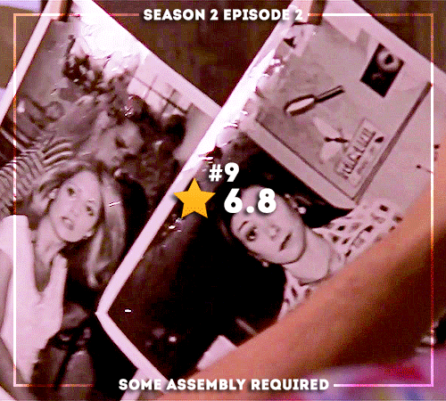

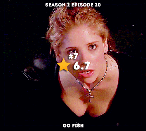


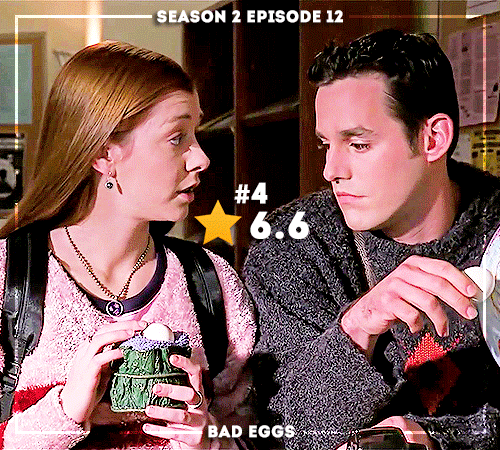


The Worst of the Worst: IMDB’s 10 Worst Ranked Episodes of Buffy the Vampire Slayer (insp.)
#btvsedit#buffythevampireslayeredit#btvs#buffy the vampire slayer#creations#buffy summers#willow rosenberg#xander harris#rupert giles#riley finn#dailybtvs#buffysource#top10bottom10#things this list says to me is#1) buffy episodes are a serve because i love most of these#2) imdb ratings are once again whack because a lot of these episodes should not be bottom 10. just say you hate camp and go#go fish? camp. doublemeat palace? camp. i robot? camp.#beer bad is ironically camp but deservedly no. 1 on the bad list for being propoganda#tbh i think wtwta is the only episode on this list i actually don't like#ALSO. seeing red was rated so much higher than i thought yall. it's not even near btm 10. :l#and how is not a single s7 ep here. my bottom 10 would be all s7
224 notes
·
View notes
Text
rating mankai company based on character design
Note: I will take into account hair, color scheme, sprite poses, mostly outfits that are not from plays or scouts, and memorability. This is half an objective view and half my personal opinion.
Disclaimer: I curse a lot for comedic effort. I am mean because I am funny. No, you cannot disagree.
Spring 🌸
sakuya: you get what you see. a literal spring babey. his hair and color scheme’s a little generic, but he’s mankai’s poster boy, so that’s understandable. speaking of generic, his main pose is just this emoji 🧍♂️ his outfits tend to be kinda basic, but any outfit with a mostly pink top gets him bonus points. 6/10
masumi: okay his hair is elite. probably one of the most memorable character design aspects among the cast. his mole and eyes also make him very pretty. love my boy’s dark color scheme. unfortunately, points must be docked for baiting us with the emo fit, then as the story progresses, he starts dressing like the trust fund kid he is smh. 9/10
tsuzuru: i love you tsuzu but. my mans is so basic. if he didn’t have such a great personality, he’d be as bland as untoasted white bread. the saya of a3. his best design aspect is the fact that he doesn’t dye his roots. his outfits look comfy, but not necessarily eye-catching. 4/10
itaru: everyone who starts a3! with no knowledge of these characters has one (1) thought about itaru. sec sea man. so obviously there’s something appealing/good about his character design. i think part of the appeal is his fuck-all demeanor. obviously, his eyes and hairstyle are attractive, but the way the artists draw him gives him an air of not caring, which is also attractive in a way. his dyed tips are also nice. he looks kinda lame when he dresses professionally, but his casual outfits hit. especially the ones with light pink. 8/10
citron: although i’m not a big fan of the “character is foreign and therefore must talk and dress different and be funny” trope in these types of media, his fashion does make him stand out from the other characters who tend to have more basic clothes. citron’s summer, travel, and autumn outfits SLAP and anyone who says otherwise has bad taste. his hair and eyes are interesting, but his overall color scheme can be a bit repetitive. 7/10
chikage: i hate this guy’s fucking bowlcut. fucking salad bowl lookin ass. every outfit is the same turtleneck and sneakers in two alternate colors. his outfits are so plain. only thing i like is his casual outfit glasses. HOWEVER. that’s the point. he’s supposed to look boring and blend in because he’s a spy. it’s a smart design, i just don’t like it so im docking points. stay mad about it. 5/10
Summer ☀️
tenma: im yawning. you think tsuzu was boring? this guy has orange hair and i still find his design boring. that’s how you know he’s basic. he’s got generic messy shounen protag hair. he could be from any property. if i drew fanart of him, people would ask where he’s from. he either dresses like your slightly homophobic frat boy classmate or a grandfather who gets his shit stolen by the asshole kids next door. 2/10
yuki: he has the r a n g e. all of yuki’s casual outfits hit. they’re all different, but cute in their own way. to no one’s surprise, one of the best styled characters. though i like his general color scheme, i’m personally not the biggest fan of his hairstyle. it’s okay, but a little plain at times. but i think it suits him well. 7/10
muku: i love him. muku’s design is what i love about this game. you see him, and you immediately know what his character archtype is supposed to be. he’s the soft, cute boy. and if this was a mediocre series, that’d be all muku is. but since this is a3, he’s so much more than that. he’s smart, passionate, sensitive to others’ feelings, and protective. a3 does a great job designing characters that look exactly like their archtype, but having a much more developed personality than that. getting back to the actual subject at hand, i love his hairstyle and color, as well as his outfits. you can never go wrong with light pink hair. i may be biased but fuck you. 10/10
misumi: another great memorable design. his eye shape and hair style are really unique. his outfits also elevate his design. street fashion is always a plus for me. though sumi’s design is special in the world of a3! where most of the characters are just. guys. regular lookin dudes. i think that outside of the game, his design would not be as unique. 8/10
kazunari: personally, im a fan. maybe it’s cause i have an affinity for blonde anime boys. but his hairstyle is pretty unique and his trendy looks set him apart from most characters, even outside this game. and he has a pretty lovable expression in his sprites. his fatal flaw is that his fits are either a hit or miss. they’re either really cute or wtf. at least he’s memorable. 8/10
kumon: i love that he reminds me of an owl. his hair and eyes are very cute and his color scheme is great. and i think they did a great job making him look related to juza, but still very much his own character. but he dresses like your classmate from middle school that looks like a nike-sponsored highlighter. yeah, he’s the sporty one, and i like the windbreakers but... i cannot excuse his summer fit. also, i find his design a little tame compared to some of the other characters in the game. 6/10
Autumn 🍂
banri: i hate his hair. i hate it so much. i know in canon it’s nice and he takes good care of it, but it looks so fucking greasy. the style makes him look so greasy and it makes me mad. he looks like an asshole. i mean, he is, so it fits. if this dumb bitch changed his hair more often, i’d like his design so much more. you saw this coming; his love for cheetah print is fucking repulsive. BUT, maybe unpopular opinion, minus the animal print, his sense of fashion is not bad. why do yall clown on it. if the fit is fresh, the fit is fresh. anyway, he looks like an ass, but objectively his design is kinda eh. 5/10
juza: im sorry im DEADLY fucking biased when it comes to juza, but he’s so handsome. his hair is a such a rich, pretty shade of purple and his eyes are so mesmerizing. his hairstyle is so attractive. his face is so pretty. yeah his design isn’t crazy unique, but the simplicity just works. im so sorry im this man’s whore i didn’t choose this life... but i can stop being a simp for one second to say that he has a boring fashion sense. i mean it’s kinda hot how simple his outfits are but his travel fit is good-- wait a minute i just remembered the fucking sandals. docking one point. 9/10
taichi: okay shut the fuck up i LOVE taichi’s design. so eye-catching and fun. as i’ve said i love street fashion, and taichi’s lil e-boy fits are right up my alley. that shade of bright red goes so well with his fashion sense, making a really cohesive design. with his main outfit, you can tell he purposely dresses like that to be trendy and it’s so smart. 10/10
omi: im sorry omi stans but his design is kinda,, boring. i legit had such a hard time identifying him when i first got into this game. the scar saves it a bit. but... only a bit. he’s just got. hair. and a dad outfit. i mean his tits are huge, but i don’t think i can call that a character design aspect. kinda forgettable design. i don’t dislike it though, so he ranks higher than tenma did. 3/10
sakyo: im not sure why but i really like sakyo’s design?? the contrast of his light hair and his dark clothes is nice. also, megane rights. even when i thought he was an npc during my first playthrough, i really dug his design and thought he was memorable. i actually cannot pinpoint a reason why. i wish i had more constructive things to say... but upon thinking about it, he has a karen haircut, which kinda dampers my thoughts on his design. i like his moles, but i honestly did not notice them until the game pointed them out. 7/10
azami: azami has a damn good design. i don’t think anyone can deny that. the long hair, the contrast of black hair and bright blue eyes, his eye shape. all very eye-catching design aspects. and the street fashion style strikes again. the color scheme matches well with everything. this review is lame, but there’s really only good things i can say about his design so. 10/10
Winter ❄️
tsumugi: it’s so late and im so tired of looking at these sprites. anyway, tsumugi’s design is okay. i think his color scheme’s a bit limited and his outfits are a bit meh. he has a more respectable bowlcut than chikage, but it’s still a bowlcut and it’s still boring. i think the best part of his design is his eyes, they’re very soft and kind. but other than that, tsumugi looks pretty basic. 5/10
tasuku: tbh, i didn’t even realize that the godza member tasuku was the same character as the winter troupe guy in the game’s opening until the middle of episode 3... yeah. im slow. ooooooor... tasuku has the worst fucking design in the game. yeah i said it. come at me, but tasuku’s design fucking sucks. i literally thought he was a minor character until they forced me to realize he wasn’t. his fashion sense is... questionable at best. i look at that man’s hair and think he doesn’t shampoo. he looks so bland i could dry up from looking at him. im sorry but his tits do not make up for the sheer fucking snorefest of his character design. he’s so boring i won’t elaborate anymore. 1/10
hisoka: ya get what ya see part 2. i like that i can tell he’s the sleepy and mysterious character just by his design, but honestly, that’s a character trope im generally not a big fan of. so i wasn’t thrilled by hisoka’s design at first. but it’s effective. i like the hairstyle with the white hair, but i’m not too fond of his color scheme. his outfits look comfy and soft though. it makes sense, but it’s nothing too memorable if you compare him to characters outside the game. 5/10.
homare: ah, now this is a memorable character design. his hairstyle annoyed me in the beginning, but now i love it. it’s so unique and fun. and i like the purple. i also like his outfits. very classy. but honestly, most of his charisma lies in his face. i think that the pure eccentricity of the hairstyle is enough to put him in the top tier without considering any other element. you really could not find this design in any other media. fuck it. i don’t need to consider anything else. 9/10
azuma: i’ll be honest. im not a fan of long-haired anime men. especially the pretty, flirty types. i don’t know, i just don’t vibe with them. originally, i didn’t like azuma’s design, but now i do. i don’t know how, but i think it’s because azuma is just that powerful. his ponytail makes it more bearable for me and i like the way his bangs frame his face. he just has pretty eyes and face. unfortunately his color scheme is a little too repetitive for me and his casual outfits are a little boring. 6/10
guy: maybe it’s because he looks dead inside, but i love him. i don’t even know this character that well yet, but i think his deadass expression is great. the darker under-eyeline sets him apart from the other characters and i love how he dresses. i think his hair is kinda eh. i personally like it, but objectively, it’s meh. it’s a solid design, but ngl it’s nothing special when i really think about it. 6/10
#for legal reasons this is a joke#this entire post should be underlined with a /lh#i love them all very much im sorry for being mean#except for chikage he deserves it#long post#a3!#a3! act! addict! actors!#A3! Actor Training Game#mod tsuzu talks
63 notes
·
View notes
Last Seen Blogs

brankaridicki
Branka Ridicki

blackmusclecake
BLACK MUSCLE CAKE
sam-racc
Heya!
alyshiba
Alyshiba
hmm2812
...