
riftp
Read It For The Pictures Podcast
A comic book podcast by Dave Clarke (daveclarkeart.com) and Neil Kapit (wyrecats.com)
38 posts
Don't wanna be here? Send us removal request.
Last Seen Blogs

buns-ttte-fixation
I'm Vult. Not Buns. Trying to fix that bare with me

jamesjongazenga
Sggirls Leaks


lambofregress
LambOfRegress

fashionsfromhistory
Fashions From History
Text
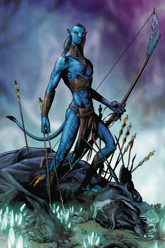
Read It For the Pictures 38: Avatar: Tsu’Tey’s Path by Duursema, Smith, Dzobia, and Parson
NK: Welcome to Read It For the Pictures, the comic book blog where we read it for the pictures! So, Dave Clarke, may I ask you what you were up to in 2009?
DC: I was at home watching television, so no I don't have any witnesses who can confirm that. And on that television I was seeing ads for James Cameron's Avatar. I didn't see it in a cinema, though; it would take another year or so for me to watch a DVD copy on the crappy little tv in my dorm.
NK: I.e. not in 3D, its big selling point
DC: Yeah, I didn't really get the appeal when I watched it. But in the spirit of the looking back 10 years and comparing the exciting, brimming with potential world of 2009 to the bloated and depressed pointlessness of 2019, we're reviewing an Avatar comic that came out this week.
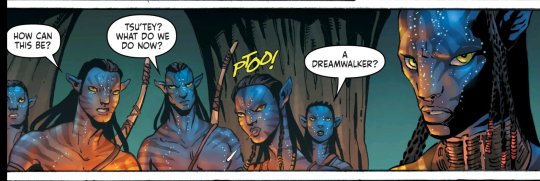
NK: Avatar: Tsu'tey's Path #1 is a prequel comic written by Sherri L. Smith and illustrated by Jan Duursema with inks by Dan Parson and coloring by Wez Dzioba. It tells the story of Tsu'tey, the native heroine's betrothed who, following the "Pocahontas in Space" script, is just there to get cucked and get killed, so it's not like he's a complex and memorable character whose rich backstory we're worried about contradicting.
( Also, while I hate the regressive misogynist types who use the word, I really like saying "Cuck" because it's a funny sound. Cuck cuck cuck cuck cuck )
DC: Yes, Ive been hounded all week by Neil wanting to review the cuck comic. The year of the orc is over, long live the year of the cuck
NK: I was skeptical about this because the only other comic I've read drawn by artist Jan Duursema was a Wolverine "Prestige Format" one-shot in a fantasy AU Fortunately she's done a lot more than just ridiculously jacked grumpypusses in her long career.

DC: And how do you think this held up.
NK: About as well as it could've in a dimly lit forest with entirely half-naked blue cat people. So definitely points for accuracy.

DC: Yeah folks, not much to talk about in this one were you wondering what the blue aliens were doing prior to humans showing up? Pretty much just hunting and stuff
NK: Did you have trouble telling the characters apart?
DC: One was a woman
Pictured: a distinct and memorable cast of characters
NK: There was some impressive facial work in this comic in the scenes where characters got to emote beyond being stoic. It is worth noting that Avatar's Pandora is a beautifully designed world with some extremely impressive creatures. The trees are impressively organic and create a nice environment
DC: Neil was always a better diplomat than I. The biggest hint, to me at least, that this wasn’t a passion project was that even the action scenes seem to have no attempt at foreshortening. (foreshortening is when you draw a long object, like an arm or leg, distorted in such a way to look like it's coming towards the viewer, creating the illusion of depth)

NK: A lot of these are fairly stock superheroey poses too.

DC: The mighty marvel method allowed Jack Kirby to infuse page with a dynamic and spontaneous energy and also allowed people to easily crank out tie-in comics to 10 year old movies no one cares about. A few action poses, a few meaningful looks in a conversation scene, fit the words around them
NK: Computer coloring only goes so far to enhance this, comics haven't benefitted from technology to compensate for flat story as well as movies or games
DC: Come to think of it this probably went through several layers of approval from the IP owners. I wonder who has the job of making sure that the clothing the na'vi wear across multimedia is consistent.
NK: I would've preferred they gone with a radically stylized look to showcase the Na'vi's movements being far more fluid and flexible than humans'. For example, a Ted McKeever Avatar
DC: Michael Fiffe's Bloodstrike: Brutalists which we reviewed a while back is the good version of this decade out of date revival done right.
NK: Yes, that is a much better way to revitalize a long dead franchise the world's long since forgotten
DC: I wonder if any of the kids who saw avatar at a formative age are old enough to be nostalgic for it while the Na'vi go through a Shrek style ironic revival?
NK: In theory I like the idea of telling the story of the Na'vi, a mash-up of indigenous cultures through the lens of a rich white guy's philanthropy, from the perspective of the actual natives
DC: Weirdly this comic, by mostly just being the natives fucking around doing their own thing, has less weird politics than the film, where the white outsider was the hero in a story about pushing back the colonizers
NK: Avatar is really a form of colonialism that, having exhausted the natural resources and human labor it brutally stole from the rest of the world, shows it sympathy it can sell in the form of a #NotAllWhities adventure.. The bar is so low for larger sociocultural consciousness in Hollywood films that it almost seems woke compared to, say, the Transformers movies At least this comic gives Tsu'tey another note or two to his personality beyond "Cranky Cuck".
DC: What note was that? I mean, I know what it was, I’m asking for the readers. Obviously.
NK: That he's still mourning the death of his true beloved, Ney'tiri's sister, and he's stepping up to roles set before him.
DC: Let this be an PSA to fellow content producers: reviewing an Avatar comic in 2019 is not the easy comedy goldmine it may seem at first glance. That said, are you excited for Avatar 2: the search for Na'vi's gold?
NK: If you'll excuse me, I gotta go fast to catch a ship that sailed years ago.
DC: At least spending $4 on a comic for ironic nostalgia is cheaper than spending $20 on a movie ticket. Anyway, happy new year everyone, we promise* to have more regular reviews this year
*not legally binding
11 notes
·
View notes
Text
Read It For The Pictures 36: Prodigy #1 by Mark Millar and Rafael Albuquerque

NK: Hi, I’m welcome to Read It For The Pictures, the comic book BLOG where we read it… for the pictures. I’m Neil Kapit and with me as always is the Firestarter, Twisted Firestarter, Dave Clarke!
DC: While I’m grateful for the warm intro I just want to make it clear I’m not admitting to any connection to the recent Queensland bushfires. Anyway, speaking of natural disasters... today we're talking about Prodigy #1
NK: Prodigy, written by Mark Millar and drawn by Rafael Albuquerque, is the latest spec script for a Netflix series. The back of the physical comic LITERALLY has the company logo on it.
DC: Also, bafflingly, there’s an ad for the Netflix Daredevil series in the digital version. Very odd to see in an image book.
NK: To be fair, Netflix, like the rest of big media, doesn't care about comics except as a source of IP for other shit, and Millarworld exists for that reason. At least Mark Millar picks good artists to illustrate his brazenly cynical gaming of this system.
DC: It’s a good thing we have this Netflix situation to talk about because the comic (including the art) doesn’t have that much of interest in it.
NK: Albuquerque does some really good action scenes, which is good because the impossibly perfect star of this book, Professor Edison Crane, is basically Batman minus the fursona and personality.
DC: You talking about that Bruce Lee fight at the beginning?
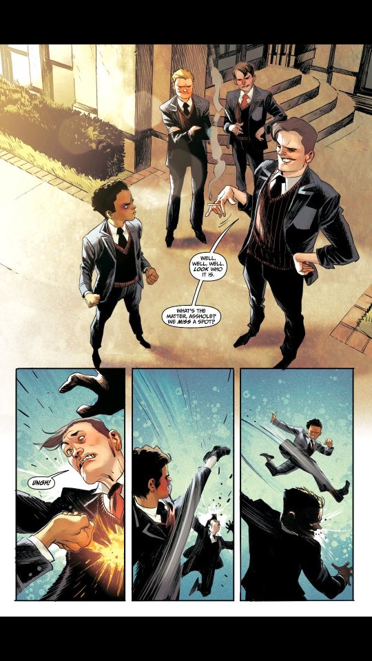
NK: Yes, where eleven-year-old Edison, upon being beaten up by his high school polo teammates for outshining them in the game, learns martial arts by watching kung fu movies and proceeding to beat them all up without breaking a sweat. The sense of motion conveyed is really effective, and Edison's anatomy is just exaggerated enough to make it believable that an eleven year old could beat up three seventeen year olds with skill alone.
DC: This page is basically all the action though.
NK: What about the scene where adult Edison jumps the Grand Canyon on his motorcycle while on fire and ditching his motorcycle to plummet the second half of the distance without a parachute? I mean, if you're going to have a story about a one-dimensional Mary Sue who does nothing but these try-hard exercises in power fantasy, you at least want someone who can draw it convincingly.
DC: The art is fine, you can totally picture it being handed to a film crew and them making a passable tv series out of it. There's even an Akira homage. But other than that I can't find much else notable about it. Actually that's not true there's an Escher homage too.
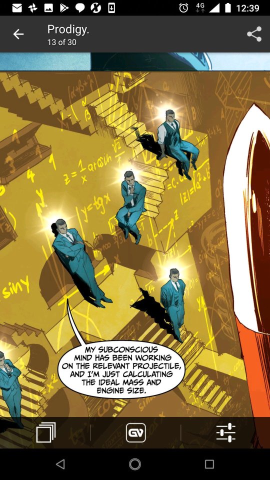
NK: That's a clever visual depiction of how Edison seems to be able to solve every single problem thrown his way without hesitation. There are very few comics where I read them and I feel embarrassed for everyone involved having to salvage the premise. This is one of them.Here's hoping Edison demonstrates something resembling a character flaw or at least a quirk by the next issue.
DC: Or if it just became Axe Cop.
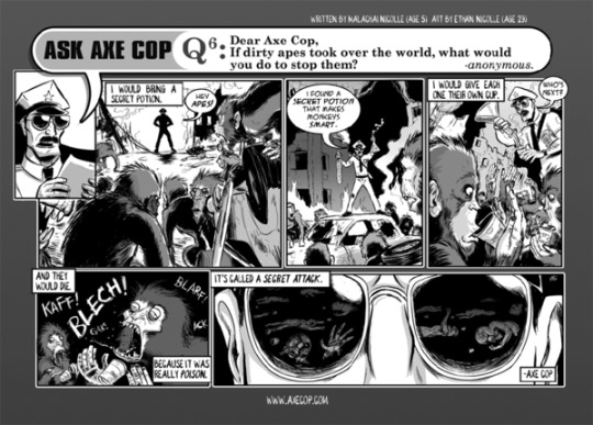
NK: Axe Cop was fun because it had strong art to illustrate a child's stream of consciousness fantasies. That appeal doesn't hold in Mark Millar's writing, unless he's going full booby-trapped womb mode of outlandish vulgarity. Otherwise you're just seeing a comic story meticulously constructed so that every character beat is obvious at showing off how awesome the character is while never veering from a simple plot structure that resolves itself without question in six issues.Then again, perhaps "writing for the trade" has influenced the glacial pacing of many Netflix shows released in full season, but we're reading this as single issues of little consequence each.
DC: Honestly you have to admire Millar for essentially selling Netflix a more boring version of the premise of Limitless, when they already have a Limitless series on their service.
NK: Perhaps having sold the "Game of Thrones meets Sopranos" series Magic Order without a hitch, he wanted to see what else they might buy, and this time he didn't even need to include a fetus magically escaping its own abortion. NOT MAKING THAT UP
DC” Ok, so now that we're starting to move in circles on this comic, let's pivot to 'read it for the business analysis' …. What your take on Netflix moving into comics
NK: Largely indifferent because for now they're just paying Mark Millar to do the shit he was doing already except with them getting the inevitable adaptations.
DC: You should worry, just in general, not sure if you should worry about this though. What’s weird is that I was able to get this on comixology. I didn't have to go through the Netflix app…
NK: Think they'll end up pulling it to stick it to Amazon?
DC: I imagine that going through Image means it has to be on Comixology, but that raises the question why are image involved at all? It can't be for publicity, Netflix could put an ad on their homepage for free and get a bunch more eyeballs.
NK: Because Image has been publishing comics for decades and Netflix, like the rest of mass media, only cares about comics in so far as it has material they can adapt later.
DC: I suppose handling physical printing is something Netflix don't want to deal with. And they need physical copies out in the world in order to say it based on a comic? And that enough of a driver of sales for a tv show that it's worth doing?
NK: Unlike the content of Mark Millar's comics, Netflix isn't into aborting things before they gestate into product for them.
DC: Please send your complaints to Neil and not me, I didn't make the abortion joke.
NK: I imagine it'll be easier to make a show if there's an illustrated spec script for it, a lot of the shots Rafael Albuquerque drew could just be given to a cameraman or a set designer . They may end up deviating from the source material but it saves the initial time actually having to come up with it.There's still a place for cartoonists like us who are a one-man-band of visual production
DC: I still feel it'd be easier to just hire him as a storyboard artist?

NK: Probably, since that’s basically the entire comic
DC: Yeah pretty much.
NK: So in conclusion, will you get the next issue?
DC: Absolutely not. Feels weird watching Netflix expand from slowly ruining the film industry to dipping it's toes into comics.
NK: Unless there's the kind of groin-related wizardry I expect from Mark Millar comics, I'll admit that I'll not bother, the art is good but there's nothing meaningful here to illustrate.
DC: Check out American vampire, that’s Albuquerque right? That's a pretty book.
NK: Also his earlier work on the Jaime Reyes Blue Beetle.
DC: To end on a happy note: he'll probably get a bunch of royalties out of this project so that's good I guess.
NK: And now I don't have to cry myself to sleep every night, the stock Millar dialogue for saying a character is unhappy
#neil kapit#dave clarke#read it for the pictures#prodigy#mark millar#Rafael Albuquerque#netflix#millarworld#struggle session
0 notes
Text
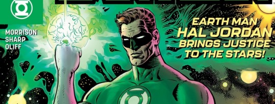
Read It For the Pictures 36: The Green Lantern by Liam Sharp, Grant Morrison, and Steve Oliff

NK :Hi, welcome to Read It For the Pictures, the comic book blog where we read it for the pictures! I'm Neil Kapit, and today I ask....what's up Dave Clarke's butt?
DC: That’s the other article series we do, this is the comic book one.
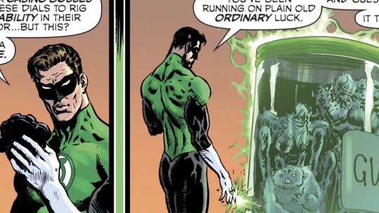
NK: They intersect, because you apparently had problems with The Green Lantern #1, drawn by Liam Sharp and colored by Steve Oliff, with a script by Our Lord Grant Morrison?
DC: Yeah, you were all giddy for me to read this so we could do a review and when i actually got around to reading the dang thing... well perhaps you should elaborate on your positive reaction to it.
NK: Well, Grant Morrison is one of the only writers who I have enough goodwill towards that I'd read them doing a book on Hal Jordan, a character more square than any PS1 3D model.
DC: Hold your horse their bud, Hal Jordan isn’t square anymore, he fucks.

NK: He's always slept around, but this time it's not accompanied with a Geoff Johnsian internal monologue about his dead dad.
But that's an impressively framed sequence, with the off-panel sex being implied by the meteor shower, with the gutters creating a subtle sensation of time passing (because apparently Hal is no Flash in the bedroom).
DC: Yeah, real subtle. In all honestly I liked the down to earth Hal scenes the most
NK: subtle enough that I missed it the first time, because my mind isn't in the gutter
* that gutter, at least
DC: When the comic is about Hal, the random dude wandering around the mid west it actually has negative space to juxtapose all that texture and detailing.
When it’s in space however....
NK: I'm sorry, you went into this Green Lantern comic about an interstellar police force of aliens with rings that basically make anything, and you wanted understatement? Make this a teachable moment
DC: Lol, if any of our readers are patient with us enough to listen to our episode on Frank quietly’s Jupiter’s :Legacy they know I love bold detail. But there needs to be a balance.

NK: When we reviewed Shaolin Cowboy in the dark age of the Podcast, we observed that Geof Darrow put a tremendous amount of detail into his backgrounds but left the figures relatively simple. That's one of the things that comes to mind here, especially since Hal's costume is basically body paint that whisks his genitals into the space where Optimus Prime keeps his truck trailer in robot mode. A fairly simple guy in a ludicrously dense, sprawling, and active cosmos.
DC: I’m too young and youthful to get that reference
NK: OK, then it's where Pewdiepie keeps his Fidget Spinner when he's playing the FortNite.
DC: : Thank you for relating to me, a millennial. At all times we are made aware Hal is shredded af and his neck thick.
NK: Liam Sharp got his start in the 1990s, the peak of superhero swoleness, and worked on the Hulk, the thiccest one there is.
DC: There’s a certain charming griminess to some of his 2000ad work.
NK: However, I'd say that while his Hal has a heroic build, it's still simplified and flattened enough to make him distinct from his surroundings. He's definitely a whitebread heteronormative super, but he's in a context here where he's the only one
DC: Yeah, I’m not sure I’m seeing that.
NK: Which helps sell the kind of man out of time angle being played here, as Hal's estranged from Earth but still very much not like the aliens of space.
DC: Oh shit yeah we have to talk about the plot. One last thing about the art, maybe it would work before for me if the colourist was willing to muddle with how dark the inks are. Maybe not every blade of grass miles away needs to cast a pure black shadow. But I suppose that’s one of the restrictions of working with ink
NK: Possibly, and the deep black inks seem an artifact of working in a time before widespread computer coloring
DC: Hey, remember when we talked about Diediedie?
NK: I seem to remember a comic that came out without any announcement that ended up disappointing me, yes
DC: About how it communicated the visual noise of the forest without being overwhelming on the page. I remember gushing about the forest scene. This panel specifically
Anyway, Liam Sharp’s work on the grimy 2000ad stuff seems cool but in green lantern where the protagonist isn’t suppose to be covered in grease a cocaine residue, well it works better for some than others I guess.
NL: It isn't? This is specifically a police procedural in space, with specifically urban developments as settings. Also, if one of the Green Lanterns is a sentient bacteria that can trigger bowel movements, why not a Green Lantern who's a sapient drug?
DC: It’s Hal mfing Jordan, even his edgy sex scene is just doing missionary.
NK: Again, that helps sell him as an outsider, the inherently contradictory figure of the Good Cop
DC: Ehhh, he seems equally greasy in the art to me, but I’m glad you liked it.
NK: Greasy enough not to break page unity but not nearly as greasy as a lot of the other alien figures and environments. Similarly, he reintroduces himself as Green Lantern with a simple green energy hand swat, instead of the more complex creations of other Lanterns.

DC: But yeah, the scenes with negative space where things are readable, i liked them. The scenes where every single wacky morrison ideas elbows each other to fit in the frame, I didn’t like.
NK: So would you read another issue?
DC: Well let/s talk about the story first before sentencing this issue. It’s about space cops
chasing some baddies
and they catch them
but then they get out
but then Hal catches them again
and somewhere in there has time to bone his hot wife
NK:: Someone else's hot wife, Hal takes on the noble burden of cucking red state patriarch voters.
DC: Yeah, this book about space isn’t exactly something that screams "from the writer of the invisibles". Though, maybe i shouldn’t judge, Morrison is like 57 or something now.

NK: Give it time, this is a first issue of a self-contained series that has to establish its tone, since it's meant to be distinct from previous Green Lantern books.
DC: You say that, but the end page twist didn’t really make sense to me and i just assumed it was building off previous continuity.
NK: I think an evil cyborg Anti-Matter Hal is explanatory enough, especially since this seems to be implying that the book of OA was wrong, and the Green Lantern Corps is systemically flawed
DC: I don’t have to know that Green Arrow made a clone of Hal cos he was lonely cos Hal was battling the Cyan Lanterns?.
NK: Sure, why not.
#dave clarke#neil kapit#wyrecats#green lantern#hal jordan#grant morrison#liam sharp#dc comics#how to draw
0 notes
Text
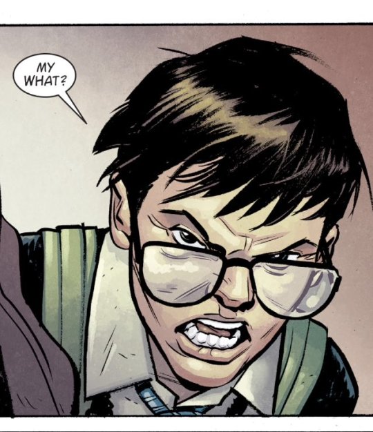
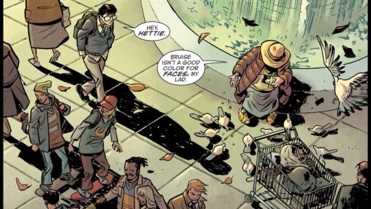
Read It For the Pictures 35: Books of Magic by Tom Fowler and Kat Howard
NK: Welcome to Read it For The Pictures, the comic book Blog where we read it for the Politics! I mean, pictures. What did I say?
DC: Happy Halloween everyone! In the spirit of the holiday we’ll try to avoid talking about the slow corruption of our world by ghouls and goblins like we usually do.
NK: In the spirit of the holiday we’ve got something tangentially supernatural to review: the recent Books of Magic relaunch, written by Kat Howard, with art by Tom Fowler and colors by Jordan Boyd!
DC: Before we dive in, what was your costume this year?

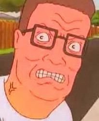
NK: I dressed as Hank Hill from King of the Hill, mainly because it was cheap, but also because I wanted to take a strong and principled stance against Charcoal.
DC: Whuaah?
NK: Are you on the marijuana? Why would anyone do drugs when they could just mow a lawn?
DC: My costume this year was going as the David Clarke who’s a sheriff. (And yes, I’m Australian, so of course I did the blackface ).
NK: I’m sorry your name is common enough for that coincidence
*disclaimer: Dave did not actually do blackface *
But before we get lost in Gribbleposting, why did you suggest we do this book?
DC: Very few number ones this week, fewer still anything that could be said to be Halloweeny. It largely got in on default, but thankfully it’s a Good Comic ™.
NK: Well I was wondering why you picked a relaunch of a 1990s sequel to a graphic novel by Neil Gaiman about a boy wizard .
Tired: DC American Superhero Franchises
Wired: DC European Vertigo Fantasy Franchises
DC: Yeah, apparently this is one of the 40 million Sandman spinoffs. Do you have any deeper familiarity with the series.
NK: Not really. It’s the story of Tim Hunter, a high school boy with glasses and a destiny to be the greatest wizard of all. That’s where the similarities to Harry Potter ends because A.) Tim goes to an ordinary school and interacts with the ordinary world, and B.) its creator hasn’t told us Tim had a genderfluid Mongolian cousin we’ll never hear about again.
DC: Harry …Potter? I’ve not read that comic
NK: At least tell me you’ve seen the movies and the recent resurgence of shit being milked from a perfectly decent ending.
DC: Movies?
NK: They’re like comics with infinite panels that flash before your eyes. they also have sound and an actual audience
DC: Sounds exhausting. Unlike this comic, which had very nice art :)
NK: Fortunately, this comic recaps everything you need to know about the Books of Magic in a short and inventive sequence.
DC: Yeah, there a neat trick at the beginning where they overlay a bunch of different illustration styles. I imagine it’s a very cool allusion to the previous series but it mostly went over my head.
NK: Unless I’m wrong that’s all Fowler doing different styles for the different artists of the Books of Magic series, which I always love to see. Very few artists can master their own style, let alone several others. JH Williams is the only other one to come to mind at the moment in comics.
DC: Every time I can’t get a face consistent from panel to panel it’s me adopting different styles deliberately. More seriously though… this book handles lighting in a super interesting way. The first thing that sticks out about the art, to me at least, is how it has super bold black brushstrokes.
NK: Surprisingly few masses of spot blacks though, beyond hair and cast shadows
DC: It looks nice, but it presents its own challenges, namely that the solid blacks look weird if not clearly separated from the color. This book manages to work within that restriction but still has a constant motif of the sun setting and time passing.
A solid black shadow is being cast which would suggest that the front of his body’s should be almost completely covered in black too. It’s quite a deft touch evoking enough of a shadow without actually having to go that black
(Like mine was at the Halloween party)
NK: Got dang it Dave I’m gonna kick your ass if you make another blackface reference, I tell you what.
DC: I imagine a less talented artist would have opted for safer, more flat lighting.
NK: Color is used effectively throughout by colorist Jordan Boyd; not just to create sense of place and time, but also mood The one page with Tim’s depressed dad whiling away on the couch following Tim’s mom’s disappearance is well done in its melancholic haze.

DC: Also, it sometimes distorts color for emotional effect. I especially liked that sequence because of how it creates a separation between the outside, the hallway and the lounge room through color. The way this all work so well I imagine at least the inlet and colourist have to be working fairly close together
NK: A lot of these shifts are just subtle enough to be seamless in the narrative if you aren’t actually looking for them. This is an introductory issue where Tim is out of the magic game and can’t get spells to work and yes, is having problems with his wand.
DC: Yeah, I suppose we have to talk about the plot in this one too. Let’s just say the coloring does a lot to make people talking in rooms dynamic.
NK: There’s the origin recap and the opening narrative problem, like in the first 1/12th of a movie, so it’s good that the art has enough depth to make these subtler emotions sing. There isn’t enough plot so far for me to judge where it’s going but I expect that Tim will be able to cast spells again at some point.
DC: I fully expect there to be magic, books and some relationship between those two concepts. Man we were spoiled with the 60+ pages of “the new world”
NK: “ I don’t want consequences. I want magic. ”
DC: If I had heard of a book series about a boy wizard I might say that this, despite being a reboot, manages to feel fresher than it is.
NK: It very much reads like the first chapter in a longer story but it’s extremely effective at that. Would you want to read more of it?
DC: If it had the same art team I’d read a trade or two of this. As much as this is just people in rooms having feelings the opening with the cross cutting art styles is a bit of a promise this will get my dynamic
The DC new titles needed to have a completely random cut to a random future action scene for that. Good on books of magic for having it actually connect to the narrative of this issues.
NK: Next time we’ll be going back to our old rabbit hole with Grant Morrison and Liam Sharp’s debut on Green Lantern So we’re back from wired to tired, sorry.
DC: Yeah, hope you got your fill of politics free comic talk Next week we’re tackling an icon of the underground punk scenes return from pure creator owned stuff to a big 2 book about cops Also I may find a way to be bitter about how happy! Got to be a Netflix series but we still don’t have a we3 movie
NK: STTTIINNNNK
DC: We’ve had a lot of fun here tonight, but what’s not fun is blackface
1 note
·
View note
Text
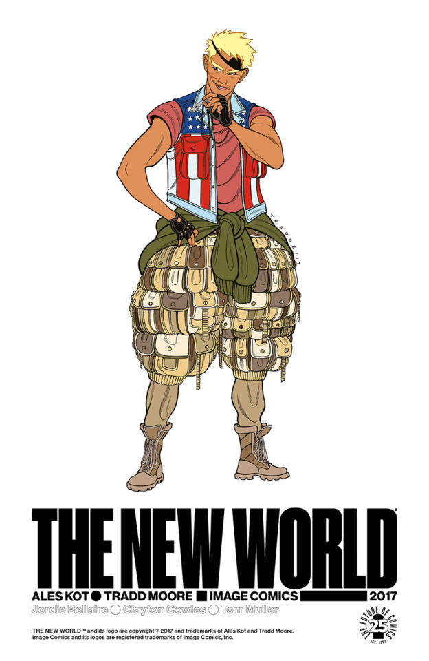
Read It For The Pictures 33: The New World by Ales Kot and Tradd Moore
NK: Hello and welcome to Read It For The Pictures, the comic book Blog where we Read It For The Pictures! I'm Neil Kapit, and with me as always is the virgin formalist to my chad animist, Dave Clarke! How you doin' Dave?
DC: *grumble* You know I’ve had sex a few times, which weirdly works as a segue into this week’s book: The New World #1
NK: Yes: the New World #1 written by Ales Kot and drawn by Tradd Moore with colors by Heather Moore. It is a thing of beauty.

DC: Thing of beauty hey, now who’s the one not getting any?
NK: The premise of the book: in the post-apocalyptic remnants of the United States (specifically, the "New California", Hunger Games-style media-centered fascism has taken over. The boy Kirby is an anarchist, the girl Stella is a cop (albeit a good one). Neither of them knew that about the other until AFTER they spend the night together. It's a pretty straightforward first issue but does a great job establishing everything about this New World.
DC: (I was going to clarify that this was just a book about fucking, but also the comixology version of this is 69 pages long Hehe, nice.)
DC: *cough* anyway yeah, this issue was kinda great
NK: Tradd Moore is definitely a comic artist's comic artist, and his style is something that plays up the unique strengths of the medium He draws figures and movements that have the kind of sense of motion and fluidity you could only capture with a still frame of a drawn figure.
DC: Also I love how he does expressions.

NK: In an inversion of how we usually see comic art, he does comparatively simple figures against meticulously detailed and dense backgrounds
DC: Yeah, it’s very impressive how he manages to use detail without being overwhelming. Though, he does a scene in the dark without that detail and that doesn’t work as well.

NK: Possibly a deliberate design choice; Stella lives in a huge luxury penthouse provided by her bosses that is mostly big empty space, except for the clutter in her one little area of the apartment. By contrast, Kirby resides in his father's house in the city, which is extremely cluttered and lived-in but cozy.
DC: Every other scene, even the meeting with the father that you’d expect to be sterile is similarly busy. There’s an weird layout trick, the opening exposition is done in landscape spreads across 2 pages (or Wyrecats style) and when we zoom in on the characters it’s all normal single comics pages that are loaded with more panels than normal The extra panels kinda work like an additional level of crazy detail.

NK: It certainly avoids the repetitive banality of usual comics conversation scenes…
DC: Hehe are you going to explain that reference as well as the case of King fever you’ve come down with? ( Before Neil starts melting down, the new world is great, and this is the first single issue I’m eager to follow for the rest of its run. )
NK: Tom King, CIA officer turned comic writer best known for the aborted Batman/Catwoman wedding, has a very particular style of scripts that are incredibly fascinating structurally and often horribly shallow and tedious in terms of actual content. People will rightly point to his Vision and Omega Men stories or his creator-owned Sheriff of Babylon as examples of his talents, and I don't dispute that or deny some of the great work he’s done, which is why the bizarre writer's workshop exercises he turns in as Batman scripts befuddle me.

This is from a Batman comic where Booster Gold fucks up the timeline by saving Bruce Wayne's parents and thus turning Gotham into a hellhole, and this is a whole page of him mugging to the "camera" and explaining why he did it. And this was a three issue arc with a lot of pages, as usual, spent on narratively superfluous banter and formalist self-congratulation (with all these repeating nine panel grids, Because Watchmen).
I bring this up because the 69 (tee hee) page New World comic had relatively little story beyond establishing world, character, and conflict, but Kot's script and Moore's art made every page feel like it was useful and important. E a splash page like the iconic standing fuck page feels like it has a lot of depth in terms of setting up the characters and their movements and how they feel for each other
And when extra pages are used like the two-page spread of the satellite, it's genuinely visually novel and compelling and deliberate to set up a sense of scope. Even in these post-apocalyptic “Divided States of Hysteria”, mass media controls everything and nowhere is free from surveillance.
DC: If we’re talking wider trends, what’s the deal with streaming stories? We’ve seen four of them recently.
NK: Which were all of them for our two readers' reference?
DC: Sideways, bonehead, VS and this
NL: It's the zeitgeist of an era where everything is broadcast constantly.
DC: ( Can’t be that much of a zeitgeist seeing as I got no viewers when I streamed myself playing “the shrouded isle” last night…)
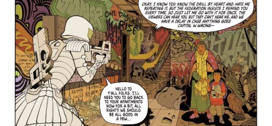
NK: For example, in this comic Stella isn't just a cop, she's a cop on a reality show where the audience is given the chance to vote whether or not she spares or kills criminals. Even when the vote is for killing, she still lets a perp go to have a second chance, upsetting her masters by going "off script". Stella is the all-too-infrequent (in reality) trope known as the good cop, but it works because she's totally aware that her job is unjust on a systemic level, as opposed to just seeing bad cops as a few bad apples.
DC: Also with have a main character saying ACAB in this (all cops are bastards)
NK: That panel is the perfect "this is the future liberals want" image that I share with completely unironic support. Also note that the vast majority of coloring in this comic is flat but bold colors. and the sky there is a basic gradient effect, but the sheer density of content on the landscape makes it feel 3D
DC: Yeah, it’s a very groovy looking book
NK: Oh, and if we’re checking off clichés of our reviews, I’ll get us to bingo
I badly want Tradd Moore to do a Metal Gear adaptation now.
DC: I thought you thought Ashley wood was the perfect MGS artist, Tradd moore is kinda the opposite to that style. Sadly Death Stranding doesn’t similarly groovy... and now we’ve lost the thread of this review all together..
NK: No, we're doing an elaborate formalist experiment!
DC: I’d be interested to revisit this when we’ve got the first 5 or so issues, curious how much of its appeal is from having an extended first issue to establish things
NK: I just hope Stella's cat Godzilla appears frequently

DC: Bingo!
(Also: Checkout http://twitch.tv/daveclarke10 , Sometimes I stream stuff come say hi)
NK: Also, if you love military-industrial paranoia with your cats, http://wyrecats.com is here as always

DC: Maybe we’ll find something, maybe we’ll do one of the good Tom king books…
#dave clarke#neil kapit#read it for the pictures#the new world#ales kot#tradd moore#metal gear#image comics#cats#comic books#art#drawing#how to draw#tom king#nine panel grid
0 notes
Text
Read It (alone) for the Pictures
Hey folks, Dave here. Just me this time, giving some quick reviews of a bunch of Image first issues I read
Bonehead #1
by Bryan Edward Hill, Rhoald Marcellius and Sakti Yuwono
Short version of my impressions here is that this is a well drawn book that falls in that first issue trap of not having enough of a hook to keep someone coming back. It does a lot with simplified colours to make figures running through a busy futuristic city read clearly. It’s also about streaming… I guess, not really sure what its going for but im sure future issues will deepen whatever its trying to say so it doesn’t just seem like its desperately trying to stay relevant. Unrelatedly, check out my twitch stream twitch.tv/daveclarke10, I think ive worked out how to make the streaming software work now.
Dead Hand, The #1
by Kyle Higgins, Stephen Mooney and Jordie Bellaire
This feels a little like a novel, being mostly told through captions but the art is evocative enough to give extra texture. Its more heavily photo referenced than most other stuff we review, but its oddly a good fit for this style of storytelling. Almost like a documentary that uses a lot of archival footage and photos.
Another thing that makes it read like a novel is how it keeps a lot of secrets as it goes along and ends with a large twist. Very much a first chapter, or maybe the first episode of something like Lost. But who knows maybe this wont fall apart into nonsense. Also Im sure Neil’s going to be on this book cos of its similarity to MGS3.

Dissonance #1
by Melita Curphy, Singgh Nugroho, Ryan Cady, Sami Basri and Sakti Yuwono
I’ve heard a bunch of aspiring comics creators pitch ideas for grand space operas that have intricate lore but almost nothing in the way of character and it’s weird to see that kinda thing made into a comic. This makes me appreciate the Red Hand even more cos its similarly exposition heavy but manages to ground it enough by focusing on real human experiences. The designs are neat but the story is mostly impenetrable pretentious garbage.

Proxima centurai#1
by Farel Dalrymple
This comics is so weird and different I can’t help but be charmed by it. It seems uninterested in having consistent time and space but also evoking familiar teenage angst and worry which makes it feel like a dream. It uses a lot of white space which gives it a sense of being ethereal and drawn really quickly, as well as a tonne of strange designs and layouts that make it feel like the product of a jumbled mind.
Rose #1
by Meredith Finch, Ig Guara and Cardinal Rae
A remarkably efficient fantasy story. There are several beats I’m surprised arnt lingered on, but ultimately it more important to introduce all the elements so a reader wants to come back for more. Art is delightful, very strong figure work. Not much more to say really.

VS #1
by Ivan Brandon, Esad Ribic and Nic Klein
This is almost the opposite of Rose. Sci-fi rather than fantasy, violent male hero rather than a passive female one. Drawn out and lingering rather than punchy. Very European, I’m reminded of moebius desert landscapes and those junkyard bits in the incal (sounds like a fancy reference but it’s really entry level European comics). I think going for a painted style allows for mood and tone that isn’t possible with traditional ink. Because of the sparse writing I don’t think it stands above proxima centurai, dead hand or rose but it the one I’m most eager to see more of cos it is exploring my closest passion; gaming.
0 notes
Text
Read It For The Pictures 32: DIEDIEDIE! #1 by Robert Kirkman and Chris Burnham
NK: Hello, and welcome to Read It For the Pictures, the comic book Blog where we read it for the Pictures! I'm Neil Kapit, and with me as always is the rare species homo australis, Dave Clarke! How you doin' Dave?
DC: I’m excited cos we actually have a book suited for this review format. Not a random issue of an 50+ year old franchise, not a bold new IP launch featuring an artist who’ll be gone in 3 issues, but something by a unique artists getting to flex their muscles.
NK: Yes, we're reviewing DIEDIEDIE! by Robert Kirkman and Chris Burnham, with colors by Nathan Fairbairn and co-plotting by Scott M. Gimple. This comic was announced last Tuesday and released last Wednesday as a surprise, due to writer and Image COO Kirkman wanting exciting new material to get people to set foot in comic stores….In theory.
DC: Yeah... that I don't get. Don’t get me wrong I think this is a pretty enjoyable issue but I don’t get why this would get randos any more excited than any other random Image book. Maybe we should go over what the actual plot is if only to give some context to pointing out cool stuff in the art.
NK: POLITICS WARNING POLITICS WARNING
DC: This more of a code yellow politics warning than a code red (heh). So the book's about a secret society of assassins within the US government who're working outside the system to kill evil people.

Truly mind bending sci-fi.
NK: I really do think Chris Burnham is a great artist and would be a great choice to launch a kind of killer app for comic stores that this was clearly positioned as. Too bad the script doesn't allow him to really flex those artistic muscles. For example it's hard to make a three page info dump about a past operation assassinating a pedophile politician compelling reading.
DC: So our story follow's Paul, an assassin who’s working for a US senator on a needlessly complicated scheme to take out a bad guy when he’s captured (presumably by unrelated bad guys). The end of first issue twist is that the senator brings in Paul's two brothers to help rescue him.
NK: Because that's what makes for a compelling hook in an action story, showing your badass hitman hero get the shit kicked out of him by more competent assassins after successfully killing a middle-aged out-of-shape kiddie fiddler.

DC: You say that but these are pretty cool action scenes.
NK: They are, but they're only a fraction of the issue. Burnham does give some impressive fight choreography in pages 2-5, that help sell Paul as a deadly and resourceful fighter. A lot of the rest talking heads in deep shadow speaking in overstuffed word balloons of exposition and banter.

DC: I actually wanted to talk about what I thought was an interesting decision for the shadow scenes. There’s a scene that takes place in a dark office that is punctuated by someone opening the door and letting light in. After which he immediately closes the door.
NK: (And yes, Connie has a random naked man lying on her couch, amidst her documents and hard drugs. The thing feels like kind of a half measure in terms of dark comedy.)
DC: The approach to the dark scenes reminded me of dramatic lighting in prestige tv shows.
NK: A bit harder to pull off in comics where there's a lot of spot blacks. Burnham shades it accurately, and the lack of drama is mostly just because there isn't much reason to care about Connie drunkenly talking to her photo of Barack Obama about how her assassination business hasn't gone as planned.
DC: Well yeah the story’s bad but as you know from my multiple hours explaining power ranger plots you know that’s never stopped me needing out. Quite a cool trick I thought :/
NK: But the coloring isn't complex enough to make it more than just deep blacks and dull blues. I admit to my shame that, for a blog about the pictures, I'm particularly hung up on the words at the moment. Because all these neat tricks of comics choreography just go to waste, when the script is such that the parts where the artist could show off are a small part of the book, and there's only so much you can do to make a compelling scene of marathon talking heads. In the page where we see the Assassin Nate go to his armory, that's less than a third of the page, and the majority is just him walking out of his car through his mansion. In the print version, that's about a 2 inch by 8 inch frame to show off all his guns, and most of it is blocked by the figure of Nate in the foreground.
DC: *takes a long draw on my cigarette* but that’s what life is, a sequence of talking heads until we all die.
…and coming from the most vocal defender of Metal Gear Solid 4's cutscenes thats a pretty severe criticism.
NK: ...this isn’t the time or place for that. But would you say that each page should do something to advance the story and reveal character?
DC: I would also say the issue as a whole fails that test. But I went in with basically no expectations of the writing.

Come on, look how Burnham is able to use the visual noise of the trees here in a way that doesn’t dominate the page or change the bright midday lighting.
NK: I had higher expectations for this because it got this sudden surprise release with that editorial on how people should have reasons to be excited about going to the comic store. Certainly the script looks like it was written on meth compared to the likes of Brian Bendis or Tom King, but we need higher standards than those for writers filling in bi-weekly pages on 80 year old characters.
DC: (Also I promise I’m not just picking every panel with the f word.)
NK: The opening page with the greyhound track is really impressively composed and does a great job creating an illusion of motion that only comics can create. It also has nothing to do with any of the narrative content of the book. It's the setup for the punchline of Paul "accidentally" giving a random old man a winning ticket, which I guess is supposed to show that he's a hitman with a Heart.
DC: I don’t blame you for not following the convoluted plan, but giving him the money was just part of the Rube Goldberg machine the senator set up.
NK: Convolution to create an appearance of depth. But still, I like this utopian fantasy of politicians who are competent and do things for a greater good Since we have Captain Planet villains running every branch of American government, sinister puppetmasters seem nominally better. But then, compare the first page of this with the first page of Burnham’s Nameless comic with Grant Morrison
NK: And you can see which writer's getting the most out of their artist.
DC: Before you bait me into more politics chat I’ll just say that doing the shadow with colouring in this panel was a clever choice.

NK: These are good techniques for you to point out because they're the kind that'd likely go unnoticed unless they were done badly
DC: It seems that forest scene was doing a lot to control visual noise. That’s the annoying thing about visual art, when it’s done well a lot of it just goes unnoticed At least that my excuse for all my projects taking so long. That and I’ve recently become addicted to playing Cities: Skylines
NK:: So the best teaching is to study the techniques of great artists working off of limp scripts?
DC: I think this script does enough to give Burnham room to work, it gives a variety of locations, different moods and pacing and an extended action sequence. I recently read a comic that very definitively doesn’t do that, but that’s for another article. But yeah, it don’t expect it to tap into the zeitgeist like walking dead. Somehow the elite deploying super assassins for the benefit of the people doesn’t quite seem as modern as the complete collapse of civilization.
NK: We’re all the walking dead.
#diediedie#skybound#walking dead#invincible#image comics#dave clarke#neil kapit#read it for the pictures#blog#comic books#Robert kirkman#chris burnham
1 note
·
View note
Text
Read It For the Pictures 31: Astonishing X-Men

NK: Welcome to Read It For The Pictures, The Comic Book Blog where we read it for the pictures! I’m Neil Kapit, and with me as always is the Tennessee Williams of Crash Bandicoot/Dr. Cortex erotica, Dave Clarke! How you doin’ Dave?
DC: Doing good, finally got that last kid out of the cave so I can put my feet up and read some comics. Also don’t yell at us for being delayed with this review.
NK: We were gonna do the Unexpected, the last book in DC's "artist-driven" New Age of Heroes, but if said artists are leaving to the point where some don't even finish a full issue, why should we complete a full review of the line?
DC: Also we did a review of Captain America #1 but even the shadow Russian agents who fund this operation thought we were being too transparent.
NK: Hey, I resent the implication that us Americans aren't capable of ruining our own democracy! Anyway, this week we got the latest iteration of Astonishing X-Men, written by Matt Rosenberg and drawn by Greg Land, with inks by Jay Leisten and colors by Frank D'Armata.
….And I’ve been waiting to do a Greg Land review for a while
DC: Sadly this probably isn’t going to be the rage filled Greg Land review you want because Astonishing X-men 13 was actually fairly alright.
NK: I was actually pleasantly surprised by the art here. Greg Land gets a lot of shit for plastic-looking figures, recycled poses and faces (even by superhero comics standards), and objectified women. Which he's brought on himself, but he does have some genuine skill with visual storytelling and the bad habits aren't nearly as obvious here as they've been elsewhere.
…I didn't recognize the guest appearance of Tony Stark in this comic without his sex offender grin.
DC: In many ways Greg Land is like me. I said mildly insightful things in the first three episodes of the podcast we did and I’ve been coasting ever since.
My favourite individual drawing in the issue is this one. But I think the strength of the issue is with the pacing.
NK: Context: The story of this issue involves Havok, the X-Man best known as Cyclops' brother who joined the Avengers and gave that "Don't say the M-Word" speech about tolerance through pretending people aren't different, is back from being magically evil and wants to rejoin an X-Men team, but nobody wants him around and he's not making his case very well.
DC: Normally I’d try to embarrass Neil by getting him to tell more X-Men lore he’s memorized but this issue seems to not only not require that but also kinda gently mock superhero comics as a whole. There’s a part where the avengers show up to seemingly help Havok fight a baddy but actually he was screwing up some of their plans. (Incidentally this panel is fairly notorious Land-ish)
Kinda pokes wholes in the whole concept of NY being full of supers. And the rest of the book is him trying to put an X-Men team together for some reason and everyone treating him like a weird dork with no direction for it

I also like this one, even if it slightly too photoreffed.
NK: Havok in his civilian identity as the Unabomber?
DC: Hmmmm, that’d be a direction to go with the X-Men...
NK: (Hilariously, Cyclops' jet pack that allowed Land to recycle that flying pose actually stuck around and appeared a few times)
DC: I see what you’re doing Neil. You’re trying to trick my contrarian impulse into defending land figure reusing as subversive
NK: Hardly, I read through the X-Men far longer than I should've when Land was on it, and there was more art recycling than a Ctrl Alt Delete comic.
DC:. That’s a bit rough.
NK: Truly a miscarriage of talent.

DC: Could someone make an argument that his reuse of figures work as a commentary of the limited range of storytelling required in superhero comics... maybe?
NK: But there were some scenes I actually liked here, and the one T&A bit with "Miss Sinister" actually worked in context. And the fact that there's a Miss Sinister is evidence for that argument.
DC: The fact that Land is shaking things up on this book vaguely critical of formula in superhero comics may suggest that he’s been subversive the whole time.
NK: Also, the scenes with the cybernetic Reavers towards the end were pretty well done, in large part because these monstrous man-machines can't be so easily referenced.
DC: That feel when you trick yourself into thinking Greg land is a secret genius.

NK: Glob Herman there works well for that reason also. But are we gonna have the Starship Troopers argument again, where you hold up lazy clichés as metatextual satire?
DC: I’m not sure I’ve fully convinced myself, but I am curious to see where the rest of this book goes. If it does become a long story of Havok trying to find people to team up with him that could be kinda funny.
NK: Do you think the coloring helps to make this look less plastic than Greg Land usually is? The opacity of the linework seems lower than other colorists, and the colors themselves more saturated
DC: The colouring seems fairly standard to me, outside of this splash.
I’ve seen colouring be way way more plastic than this though. Also, weird thing, but this uses white backgrounds throughout the whole thing
I noticed cos there are two pages fairly close together that do the “drop the background in the last panel to look dramatic” thing.
NK: I prefer white panel borders for complex coloring myself, it creates a sharper contrast. But in lieu of backgrounds it's just lazy
DC: I think a blue page background would have worked in the lecture hall scenes to better recreate the dull lighting of that environment but maybe that’s just me. Like I said folks, just coasting at this point.
NK: Shall we reveal what we’re doing next week?
DC: Yeah, we have a plan so we don’t just disappear for a month :)
NK: Next time we’ll be reviewing DIEDIEDIE by Robert Kirkman and Chris Burnham, the surprise release from Image….though I just blew the surprise.
DC: I’ve bitched about invincible on here before haven’t I? In any event I’m a bigger fan of Burnham than I am an enemy of Kirkman
NK: You have not, so save your hot takes.
0 notes
Text
Read It For the Pictures 30: Challengers of the Unknown by Andy Kubert, Klaus Janson, Scott Snyder

NK: Welcome to Read It For The Pictures, the comic book blog where we read it…for the pictures! I’m Neil Kapit, and with me as always is my something something Australian stereotype, Dave Clarke! How you doin’ Dave?
DC: Doing alright except… you remember when I apologized for making you read that Power rangers annual? Well I’m taking that apology back after this weeks assigned reading.
NK: Yes, today we’re going back to the New Age of Heroes at DC with the technically new Challengers of the Unknown #1, illustrated by Andy Kubert with inks by Klaus Janson and colors by Brad Anderson, and written by Scott Snyder and Aaron Gillespie! This is the second time we’ve done an Andy Kubert comic; back in the dark days of the RIFTP podcast, two of you may recall we did Dark Knight 3: Master Race #9.
DC: Oh yeah, this is a Kubert book. I remember thinking that a lot of this looked very similar to stuff from the kubert school illustration course stuff .I guess when you’re an artist drawing in a similar style to your dad who opened a comic school it’s hard to escape looking kinda generic.
NK: I love the entire Kubert family but Andy stands out especially, because he was drawing X-Men when I got into comics as a boy. Mmmmm… Boneless Buffalo Wolverine….* drools *

DC: I guess that and DK3 escape being generic by being so damn wacky. This comic less so.
NK: I thought that, while very much in a house superhero style, this was inventively designed and laid out, even if I myself didn’t really follow the script. A lot of panels per page and in interesting arrangements.
DC: There’s a tonne of bleed panels with insets over the top.
NK: And you gotta love Krunch’s melty face. Yes, this comic has a hero named “Krunch”
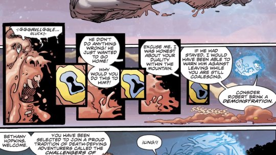
DC: Does it, I mean, isn’t he a suicide squad style extra who’s killed early to establish the stakes.
NK: Was he? His face melted as a reminder that he’s precariously placed between life and death, but he’s back to being whole and shows up for the cliffhanger with the others. Then they have to fight what looks like a giant lobster, a being of pure Jordan Petersonian evil.DC: Between fighting a giant lobster and proving that the earth is flat this is a very online comic. Looking forward to one of the members being chased down a street for being racist Also who cares if this review is filled with incomprehensible injokes.

NK: So, you got roped into reading a D-List superhero comic tying into a mega-crossover.

DC: Oh yes, this connects to that metal series in some way Wanna have a crack at explaining it to me.
NK: While Gotham is being destroyed by interdimensional forces in Metal, four randos are pulled from imminent death by a mysterious figure, inhabiting a place called Challengers Mountain, and are tasked with saving the world in a way the supers can’t. A lot of this is thankfully framed from the Challengers’ perspectives, so they’re just as confused as the readers. That said, we get a better sense of who most of these guys are in this introductory issue, particularly Dr. Trina Alvarez.
DC: Honestly Trina’s life before she becomes a ghost superhero seems more interesting. And all of these new DC books have started with 2 splash pages of things to come down the line. The difference with this book is that in addition to that cold open there’s another cold open with the helicopter in the storm. Yo dawg, I heard you like cold opens…

NK: Hence, we resort to memes to try and understand this.
DC: (Ok I’m done with the dumb meme shit now). So having a template for opening a comic isn’t necessarily a bad thing, Kirby did it all the time by opening on a splash and then a double splash.
NK: We’re not done with the memes. Andy Kubert will be done soon with this comic though, since like the other big name artists on these New Age of Heroes books, he’s only here for the beginning. And DC neglected to make this clear.
And now we’re done with the dumb memes.
DC: Any artist big enough to launch a new property is too big to stay on a mid tier DC book. Real catch 22 there. So my understanding is that the original challengers weren’t ghosts. This new premise feels very tv, which given how many shows DC is rolling out is probably intentional.
NK: Yeah, they were just normal humans on epic science journeys, like the Fantastic Four without powers Still, the bifurcated panel layouts help keep the interest in scenes that are just people in regular clothes wondering to each other where the hell they are. Plus, all the characters here wear actual clothes with mass and folds, instead of skintight spandex. The way the clothing moves with the figures is pretty well done and I know that’s a bitch to draw.

DC: Yeah I will give it that, that kubert boy knows how to do fabric good
NK: All the artists on these New Age of Heroes books are superhero genre veterans, and most of them haven’t drawn much else professionally, so I like seeing their work in other contexts even if in baby steps away from supers.
DC: Just realizing that the book is probably so confusing to live up to the name of ‘challengers of the UNKNOWN’ Cute, I guess, but I KNOW I won’t be continuing with this *buh dum tish
NK: You don’t care that it ends with the same giant not-Galactus corpse that we saw in the Terrifics?
DC: Oh shit yeah it does Also the coordinator is evil, maybe? Sigh, kind of impressive to capture the feeling of pointless meandering from Lost in a single issue I’m sure there’s a polar bear hidden in one of these panels
NK: That was my experience of Metal in a nutshell. Perhaps it’s easier for writers to write like this when they’re working on characters everyone knows, as opposed to ones who are….unknown I got one in too!
DC: Speaking of unknowns, what are you subjecting me to next week?
NK: I’ll pass the baton to you so we get something that’s in Sentai Hell rather than DCU Hell.
DC: I’ll find something without spandex
NK: Let’s leave on an unsatisfying incomplete note, just like this comic
DC: Maybe I’ll find it in time for Neil to put it in this article, maybe I won’t. That’s just the kind of adventure into mystery you can expect from us.
1 note
·
View note
Text
Read It For The Pictures 29: Medieval Spawn/Witchblade #1 by Brian Haberlin
Medieval Spawn Witchblade

NK: Hello, and welcome to Read It For The Pictures, the comic book Blog where we read it…for the Pictures! I’m Neil Kapit and with me as always is the Dark Souls of Australians, Dave Clarke! How you doin’ Dave?
DC: Living up to my reputation by being hard and being slightly unlikable. Anyway, this week where reading a crossover(?) of two properties neither of us know too much about.
NK: Yes, this week we have Medieval Spawn/Witchblade #1, written and illustrated by Brian Haberlin, with story collaboration by Brian Holguin, colors by Geirrod Van Dyke, and programing by David Pentz with others helping out with 3D Assists. You may recall how computer generated comics used to look, back in 1992

DC: Kind of an unfair comparison? The art in this is surprisingly solid.
NK: I’d be curious how Haberlin did it, because the art definitely looks like you could believe it was done analog, but if you know what to look for you can’t unsee the digital aspects. There seems to be a kind of rotoscoping effect to give hard shadows and ragged edges to the 3D figure models and it allows them to avoid the Uncanny Valley.
DC: Yes, oddly enough this is going to be an installment where we actually talk mostly about the art. The story is weird in that it’s actually a story, expected something a little sillier from something with Medieval Spawn and Witchblade on the cover.

NK: Well, neither of us knows much about Spawn, and I only started reading Witchblade after Ron Marz took over and it pretty much stopped being a titty book, which meant it was no longer for the 90’s Image crowd.
DC: Read spawn 200 and was completely baffled by it, think I may have read the first issue of Witchblade at some point.
NK: Fortunately, both series deal with legacies spanning millenia before their main characters. Any woman who inherits gets the Witchblade is Witchblade, and any undead person with a demon goo armor that gives them power in exchange for eventually dragging them down to Hell is a Spawn In any case, we’re doing horror fantasy in the Medieval Age, and because I review media, I am contractually obligated to tell you that this reminds me of Dark Souls
DC: This is gonna sound more damning than I mean it to be, but this comic does visually look a bunch like Dark Souls, specifically the undead burg.

NK: I think I got past that part, but my tolerance for Dark Souls’ difficulty was far lower than yours
DC: Don’t worry reader I’ll be punishing him for not fully appreciating Dark Souls’ genius immediately after this. The biggest thing that makes this stand out from most other comics is how it uses texture, specific texture achieved using 3D software

NK: The video game comparisons are especially apt because all the characters appear to be 3D models. This allows them to have a lot more detail than you usually see on comic characters, and in the case of this comic, really highlights the clunky and ragged metal armor that the protagonist wears. Since I always love poring over complex armor textures, I really love the designs here, and would rather he keep the helmet on even if his face weren’t rotting flesh.
DC: The texture on the armour was clearly done by creating the armour in 3D software and adjusting a lightsource until they got what they wanted for the shot. But I don’t think all the figures are 3d models. This is straight up just a drawing.
(Also dropping the background in some spots is a nice way to not over do it with the textures)
This shot he struck me as weirdly stiff so their maybe be some models being used
NK: The background atmosphere and coloring is done really well here too. Since most of it is outside during the winter, it uses a lot of dull blue hues to create a sense that everyone is cold and miserable. And it doesn’t look as murky and dreary as modern “realistic” games have become (Dark Souls, ironically, being an exception)
DC: It looks a little murky, but it’s clearly intentional
NK: Not illegibly so, a problem that computer coloring in comics often creates.
DC: Returning to this panel, there are also a bunch of textures you can see clearly applied with a brush (wind, snow, skin)
Mostly I lost tract of the story trying to reverse engineer how the art was done for most of this, but I imagine most normal people won’t have that problem
NK: It’s clear that the artist did a lot of work painting over the 3D models to ensure that they wouldn’t look sterile
DC: But then I guess early image was known for pushing digital colouring, kinda nice to see that interest in new technological approaches continued
NK: Before we forget, there’s a story here about a good king back from the dead to take back his kingdom from evil, with his quest for justice seemingly going at odds with the women who control the Witchblade. Note that if you didn’t know that the Witchblade can take the form of jewelry, you’d think there was no Witchblade whatsoever in this comic because it only appears at the end as an earring.
DC: Women, amiright?
NL: Yeah, always getting up in your business when you sell your soul for a necroplasmic suit of armor to get revenge.
DC: I find the art in this fascinating, but it not really my thing. THIS is my thing
NK: And this is my thing.

NK: Well, a lot of times we find the stuff we talk about more interesting conceptually than entertaining personally . No fault to this comic, because it is still a Medieval Spawn/Witchblade crossover that kind of repels the chance of being truly great by its very nature
DC: There’s a grimy grittiness to every in this which makes it feel like a real lived in world, but it also has an effect of also making things feel mundane
NK: It’s definitely got a unified aesthetic and characters don’t break from that. I think there was some good character acting and emoting though.
DC: Something somewhat anticlimactic about getting a grounded effective story when you’re expected a McFarlane demon superhero to fight a titty comic hero.
NK: I was overall impressed by this. There’s been a trend in comics of people doing brilliant and bizarre things with established properties that aren’t quite as big and controlled as Marvel and DC, such as Power Rangers, Transformers, Flintstones, etc. This isn’t quite on the level of Snagglepuss as a gay Southern playwright during the height of McCarthyism, but I really did enjoy it. It should stand as a lesson to IP holders that your IPs are only as good or bad as the people writing and illustrating them.
DC: Yeah, I might not be continuing with this but I’m kinda curious about what other weird stuff is happening at Top Cow.
NK: And next time, we’re likely descending back into superhero comics banality with the New Age of Heroes’ Challengers of the Unknown reboot. I hope I’m wrong
DC: Huzzah, love to challenge the unknown.
NK: Maybe I’ll be wrong and it’ll be the Dark Souls of D-List superhero franchise relaunches
DC: Here’s hoping we won’t need to consult the wiki or call in someone more experienced
~JI�|_~�
1 note
·
View note
Text
Read It For The Pictures 28: Mighty Morphin’ Power Rangers Annual 2018, by a Buttload of Creators

NK: Hello and welcome to Read it For The Pictures, the comic book Blog where we read it for the pictures! I’m Neil Kapit, and with me as always is the man voted Spiciest Shrimp on the Barbie in the Mr. Australia competition ten years running, Dave Clarke! How you doin’ Dave?
DC: Doing good cos we’ve got a special one on his week. We’re talking about special anthology issue for a long running beloved property
NK:You mean Action Comics 1000?
DC: Of course not that may actually bring in some readers. I’m talking about power rangers annual 2018
NK: This comic by Boom Studios was drawn by Artists: Marcus To, Patrick Mulholland, Dylan Burnett, Hyeonjin Kim, Simone Di Meo Writers: Kyle Higgins, Caleb Goellner, Anthony Burch, Adam Cesare, Becka Barnes, and Alwyn Dale. Though I haven’t been reading the new Power Rangers comics, I dunno, there’s a lot to compete with in Action Comics 1000. I mean, we learn the origin of the car on the cover of Action Comics 1 back in 1938. THE CAR!

DC: Sadly this book doesn’t have anything quite so needlessly banal, though it is chock full of confusing continuity.
NK: I thought that was the sole providence of Marvel and DC. Explain.
DC: The reason I thought to pick this is I picked up the 2017 annual on a sale a few weeks ago. It was a bunch of one of stories with weird artists and was pretty great. This however seems to not only setting up an event in the main title, but also building off lore in main title and is involving characters from 5 different unrelated seasons of the show.
NK: So I only ever saw the first Mighty Morphin’ Power Rangers as a kid, then matured to real adult comics like X-Force and Bloodstrike, and thus only understood who the characters were in the first chapter by Higgins and To. And for the rest, I had no idea who all these colorful yet ultimately indistinguishable characters were running around and fighting. For one solemn moment I learned what it was like to be you, listening to me.
DC: Yes folks, this is the episode I’ve been threatening to do for ages where I nerd out about Power Rangers Thank god they don’t make Metal Gear comics.
NK: I am pleased to note that even though there’s six different artists here, there isn’t nearly as much tonal whiplash as I’d expect. Since this is a collection of short stories that all tie together to set up the “Shattered Grid” crossover, it’s important that they maintain cohesion, even across different eras and universe. Aside from inevitable questions like “who the fuck is the guy with the dog’s head”, I wasn’t lost in terms of basic narrative flow
DC: That’s one of the stranger things about it, to my eyes at least, is how conventional each of the artists are. At least compared to this in last years annual: So how much did you get of the “plot”, such as it were.
NK: TLDR: Drakkon, the Green Ranger Tommy’s evil parallel universe counterpart, is going across different worlds stealing different artifacts of power from different sets of teenagers with attitude. And other than the Power Rangers SPD sequence, they all end with “To Be Continued In Shattered Grid”, because that totally makes me feels as though this $8.00 comic was a justified purchase,
DC: Yeah I didn’t look at the price tag before picking this one.
NK: Well I’ve got you paying for a lot of shittier comics over the course of this project, so this is karmic payback to me.

DC: Seeing as I’m now firmly in the having to defend this position I think the cartooning in the RPM section is pretty solid. Ninja Steel section also does some very nice environment shots.

NK: It did break the common problem with licensed comic artists doing painfully obvious photo references of the actors and actresses. Not many of these actors are big-time celebrities, notwithstanding my shrine to Johnny Yong Bosch (which is much more for his anime dubbing work), so I can see why they’d do it from scratch. Still, if I knew who any of these guys were, I guess I’d feel their personalities were captured?
DC: I guess the reason this annuals exists is that whatever interdimensional epic they have planned for the main title doesn’t give enough attention to characters outside the core cast and this is a way to do that. That being said I still think they should just do an RPM title and not tease us like this
NK: And your other pick for this week was “Hunt for Wolverine”, another extra-priced special that was a prologue for a larger story and did even less to advance its own plot ( flashback to Wolverine’s funeral, then fight scene over Wolverine’s grave, then the X-Men finding out Wolverine’s not actually dead). So…bullet dodged?
DC: What can I say, I have expensive terrible taste :P I did actually start reading the Power Rangers B-title and it’s really good, so chances are I will eventually be catching up with this story. Can’t imagine I’ll have much luck in getting you to join me.
NK: I feel like this isn’t entirely fair to the multiple artists and writers, because there wasn’t anything notably bad in this comic, each one did the impressive task of setting up their respective Rangers’ unique world, and they managed to synchronize with each other surprisingly well. Other than Marcus To (the first artist, who’s done work for the Big Two) I didn’t recognize any of the names, perhaps owing to Boom Studios having less pull to get star artists, even for small part of a book this pricey
DC: Weirdly I thought the first part was the weakest art wise, though it was the most just friends hanging out and chatting. Besides this panel.

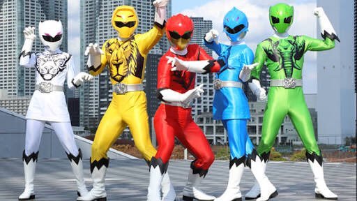
NK: It does capture the dynamism and meticulous choreography of the low-budget Sentai footage that they imported from Japan to fill out half of the Power Rangers show.
DC: I have this theory that the Power Rangers, like the Justice League, are very hard to make look good because they’re all different bright colours. The exception being the original mmpr team because black is more flexible a colour than green.

NK: Pistols at dawn, sir. They also have white as a unifying color though.
DC: You use a tonne of neutral colours to break up the brighter primaries though.

(Art from Go Go Power Rangers #2, art by Dan Mora and Raul Angelo)
NK: OK, I’ve got a lot of love for Dan Mora after he worked with Grant Morrison on Klaus, so I may have to check this out
DC: Ohh.. and as great as the cover art for this annual was it features Super Samurai Red, Time Force Pink and Dino Charge Blue, who don’t appear in this issue. That’s what it needed: more teenagers with attitude.
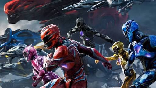
NK: They could’ve brought in the 2016 movie Rangers, for the three of us that loved it.
DC: This shattered grid event isn’t over yet.
NK: Fingers crossed for autistic Billy.
DC: One final thought on this annual and Power Rangers in general: Power Rangers is everything that grant Morrison wanted the DCU to be. Constant variation on a few archetypes (see the three Batman arc, Batman inc, superman 1,000,000), always doing completely new things with the formula while also being reverent to the legacy of the franchise, never stopped being primarily for kids and completely impenetrable to newcomers. Whether you take that as a compliment to Power Rangers or an insult to Grant Morrison is up to you
NK: Also yes.
9 notes
·
View notes
Text
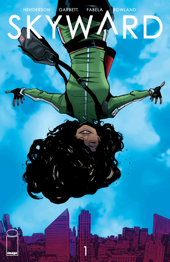
Read It For The Pictures 27: Skyward by Lee Garbett and Joe Henderson
NK: Hello and welcome to Read It For The Pictures, the comic book Blog where we read it for the pictures! I’m Neil Kapit, and with me as always is my preferred cane toad dealer, Dave Clarke! How you doin’ Dave?
DC: I’m doing good, it’s a brand new day, the sun is shining and I didn’t have to read a DC book this week
NK: Yes, in a welcome change of pace we're not doing one of those New Age of Heroes books, and instead are doing Skyward #1, written by Joe Henderson with art by Lee Garbett and coloring by Antonio Fabella
DC: There are so many assumptions in superhero books that skyward throws off. For one, the world is the star of this book, not some brand new hero. And this feels like it has an ending it mind. Maybe after 6 or 12 issues. Why don’t you tell the reader what the premise is and if you agree with that reading? Why don’t you tell the reader what the premise is and if you agree with that reading?
NK: I think corporate owned superhero comics are in such a uniquely stunted and atavistic place that things we think would be Storytelling 101 seem like radical departures there. I hope that our discussion of this comic doesn’t devolve into us complimenting it only as a way to backhand DC.
DC: 50/50 chance it will, but let’s try to stay focused.
NK: Anyway, Skyward is a story of a world where Earth's gravity dramatically decreased one awful day 20 years ago. The protagonist is Willa, a young courier in a Chicago literally tied together by cables that people grab onto so they don't fling into the stratosphere. Her mother died from this when she was a baby and her father has understandably been protective of her, urging Willa not to venture outside their city. Willa, of course, isn't deterred.

DC: Yeah, I think it’s more of a zero gravity than low gravity scenario but I was able to keep my pedantry in check. The biggest thing that stands out about this is how the low (or no) g environment is communicated in static images.
NK: Willa's long, bushy hair is used effectively to indicate not only her own motion, but the upwards direction towards which everyone is falling. Everyone is consistently rendered in context of this almost zero gravity, but Willa's design stands out in a way that comics can uniquely display.
DC: It’s the same logic as Superman’s cape which is used to show the direction he’s travelled in. And yes, I will be lashing myself in penance for bringing up DC again.

NK: As one of the five people who played the Playstation Vita game Gravity Rush, I've seen this used in an animated medium, but it works better here because the eye can linger on it, as opposed to just being a welcome but minor detail amidst all the anime shenanigans
DC: There’s also a few examples of liquids in zero g, which I’m not sure makes a lot of practical sense for the world but it’s a cool visual so I’ll let it slide.

NK: Lee Garbett has mostly done superhero and 2000 AD books before this, but has proven himself an exceptional storyteller. This script, which takes place in a fully three dimensional perspective beyond what we encounter in most of our daily life, presents a unique challenge but he rises to it.
DC: Can’t help but think that mirrors edge had some influence on how this world was conceived.
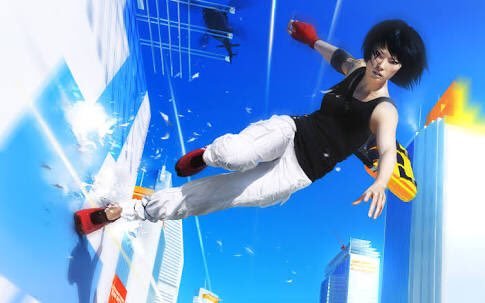
NK: I've not played the console Mirror's Edge but Willa's life seems a lot happier. She's definitely a cheerful character who, having known nothing but this low-g world, is able to appreciate it better than those who remember being safely stuck on the ground. Her reactions help make this world interesting, not just horrifying.
DC: Yeah, it’s interesting how they paint this zero g world as having both positive and negatives, more positives really if I think about it .
NK: Edison, the co-worker Willa has a (badly concealed) crush on, is missing his legs, so he certainly has reason to appreciate the lack of gravity
DC: It almost seems like this is just going to be a slice of life comic in a weird world, but a sci-fi plot rears it’s head in the final pages. Not sure how I feel about that, maybe would have just been fun to have vignettes of how society adapted to no gravity (agriculture comes to mind). But I’m sure we’ll get a few more clever ideas like that, Garbett. is good at filling out a world in the background while still telling a clear effective story.
NK: Also note that everyone is covered with cables and tethers, which are almost always rendered in spot blacks. It's a conceit of this world that they have to literally tether themselves to something heavy, and I think it serves to ground the reader's viewpoint as well because we're spoiled with our sheltered two-dimensional movement planes
Also, the final page twist is that Willa's father Nate, a scientist who seems to have known about what caused the gravity breakdown, also has an idea on how to fix it. But since Willa's mother died it's implied that he's completely shut down, becoming a recluse who needs Willa to financially support him Well, the final page twist is that Willa's father Nate, a scientist who seems to have known about what caused the gravity breakdown, also has an idea on how to fix it. But since Willa's mother died it's implied that he's completely shut down, becoming a recluse who needs Willa to financially support him. And we can assume that Willa isn't 100% on board with the idea, much less what will be needed to get the gravity fixed
DC: He’s also doing muscle train exercises, a weird neat little touch cos no gravity would atrify your muscles and he’s planning to live in a world with gravity again. Writer must have a lot of trust in the artist to communicate so much of the world wordlessly.
NK: Given how the characters zip across the city in all directions, their bodies withering upon adjusting to the lowered gravity doesn't seem to be a major concern for anyone else. But I get my knowledge from the scientific journal of Super Mario Galaxy, where fire can be thrown underwater
DC: As much as I think this is a well realized world with lots interesting stuff to explore and built in conflict told in an elegant way I feel a should at least say one negative thing. This is an awkward shot.

NK: Not enough to make too much of a difference. The fact that this world takes place considering directions most of us don't bother with makes occasional perspective gaffes like her rather large head negligible when it's already stretched beyond most artists' conceptions of 3-D space
DC: This character is maybe too cartoony for the rest of the comic. But maybe I’m nitpicking now
NK: When I subject you to the Challengers of the Unknown reboot next time you'll be begging to go back to this, tethering yourself to the floating fat woman as you're adrift in DC Universe nonsense.
DC: Oh dear, and just when I was trying to find the dark horse catalogue to get in first with our next comic.
NK: You can no more rely on that than these characters can rely on their gravity, when cast adrift in a world of characterless IP whose own histories spin off into the aether at a moment's notice.
DC: Who’s the one viewing this book too much through the lens of DC now. Anyway, I heartily recommend skyward
NK: Petard, meet hoist. Basically one of the main appeals of comics is their limitless nature, bound only by the imagination and ability of the artist. Superheroes thrive in such a medium but are not limited to it, anymore than comics are limited to superheroes. Drawing supers probably helped Garbett develop the exact skills needed for this comic, so I do have to acknowledge and respect that.

DC: Catch you next week, when we do the anniversary of a legendary franchise with quite a lot of Power
0 notes
Text
Read It For The Pictures 26: Immortal Men by Jim Lee, Ryan Benjamin, and James Tynion IV

NK:Hello and welcome to Read it For the Pictures, the comic book Blog for read it for the Pictures! I’m Neil Kapit and with me as always is the man who’s been stealing my Vegemite, Dave Clarke! How you doin’ Dave?
DC: I’m doing alright, but let’s not pretend you’ve ever eaten vegemite :P Anyway, today we have Immortal Men #1, a comic that dares to ask the question “if a pictures worth a thousand words than what is a picture next to a thousand words worth?”

NK: You'd figure that a comic from an Artist-Driven imprint, especially one done by the company's Co-Publisher and most famous artist, would be able to keep unnecessary text to a minimum. That’s just one thing wrong with this.
DC: He asked, musing over this confusing issue with his cohost. The intentions of the creators alluded him, vexed him with their contradictions. It would take more investigation to get to the bottom of this mystery.

NK: Jim Lee’s style may not be to everyone’s taste, but nobody can deny his influence on the way people draw superheroes. And unlike, say, Rob Liefeld, he’s got the technical foundations behind his flashy excesses. Though he also is infamous for not meeting deadlines due to the detail of his work, which is why some of the pages of this first issue are fill-ins by Ryan Benjamin. Specifically, the scenes with protagonist Caden Park in his day to day life.
DC: Oh yeah, funnily enough they didn’t stick out to me as being done by a different artist. The expressions are a little weird, but my instinct was to chalk that up to a script that changed after they were drawn.
NK: Note how Jim Lee gets to draw all the big action scenes while the boring stuff like characterization and conversation (that's not just monologuing) is outsourced. Ryan Benjamin was an artist at WildStorm in its early days, so as someone from the school of early Image, he seemed a good fit if you had to get a fill in on the first issue of a book that's been delayed by four months from its originally solicited date.
(And I checked out some of Benjamin's original work on his own comics and as an artist on video games, and it's definitely worth seeing. Because I felt bad just writing him off as a poor man's Jim Lee, so I'll put the link to his site here.): https://ryanbenjamin.com/
DC: Calling the characterization scenes boring is unfair, the secret world of rejected wildC.A.T.S designs is also boring.
NK: But yeah, this is basically WildCATS all over again, which itself was X-Men all over again, all of them sticking to a Mad Libs about outlaw superhero team stories. At least time none of the women are in a thong. Well, I guess Stray (the furry one) is referred to as a "good girl" is wearing just a vest, but she doesn't count because her skin is fully covered. We find this out in the only two pages that the Immortal Men themselves get characterization.

DC: I’ve got one take that I was able to squeeze out of this comic, and that is that it’s Harry Potter if Rowling was interested in Bloodstrike rather than European folklore. Down to a main character being pulled into a secret hidden world by a large bearded man by way of a train.
NK: I was able to discern a little bit about Caden and his parents from the art and dialogue alone, but nothing to get them out of the very tight boxes that are their narrative roles. And you’d think that taking place in the DC Universe, the parents would be a little less skeptical about their son’s weird super dreams.
DC: There’s an offhand reference to “there’s no secret heroes out there” by the Batman Who Laughs which raises all sorts of questions.
NK: In addition to the wordiness, we also have three villains with three different fonts and word balloon styles, plotting in the shadows. One of whom is The Batman who Laughs from DC: Metal, an alternate Batman turned into the Joker at his most Satanically tedious.
DC: Rather than being distinct it just blurs together, using the same 90s gradients for the text boxes didn’t help.
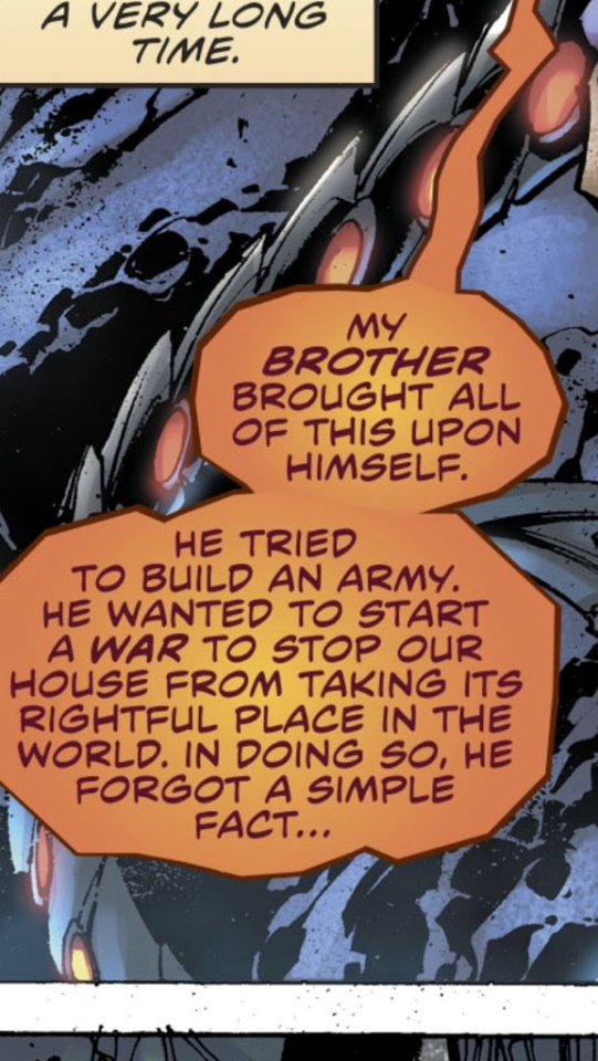
NK: And the weird Joker clone’s design looks understated next to the two Jim Lee-designed villains, The Infinite Woman and The Hunt.
DC: Rather than go around in circles on the plot of this (and risk revealing that I’m not actually good at reading comprehension) let discuss what this book means in context of the other new DC books.
NK: So in the shadow of all the other weirdness in the DC Universe, there's this one family House of Immortals that's been hunted almost to extinction by another family House of Immortals, and the surviving Immortal Men are looking for the boy who I guess is the Chosen One who can turn the tide. At least there aren’t any guest-stars shoe-horned in here like in Damage, thus indicating some confidence in the book’s ability to stand freely. The Batman Who Laughs seems here to give it a connection to the larger DCU, though he doesn't seem to have any reason for helping The Infinite Woman beyond getting to kill for lulz.
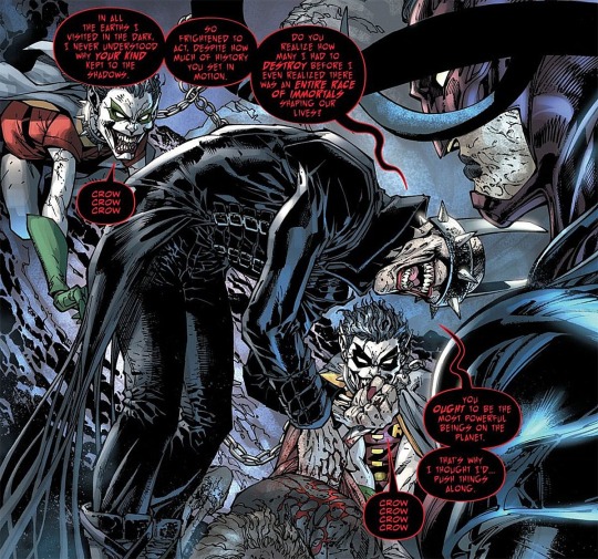
DC: I meant more in a meta sense, each of the other new boos felt like a contained pitch, twitch steamer hero, a mother whos’ a hero, the hulk by way of MGS military paranoia, a poor hero… nd now... this incomprehensible nonsense
NK: It's comprehensible, there's just not much to comprehend from this issue alone. We have little to no idea who these characters are beyond their roles from a plot perspective. It's not enough just to name a character "Ghostfist". Perhaps all the dialogue is the writer's attempt to take these page layouts and give them some character, but the only parts where he can do that are on the tiny tiny panels in the two page "obligatory team introduction" sequence.
DC: Immortal men #1 - I’m not a fan, thanks for tuning in folks
NK: You're not getting off that easy, we still have a lot of designs to laugh at. For example, the Campus. "You got your Great Pyramid of Giza in my Hall of Justice! You got your Hall of Justice in my Great Pyramid of Giza! "
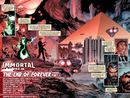
DC: I suppose the pyramid is more of an Illuminati connection than an Egypt or Inca connection.
NK: It still looks like two radically different buildings dumped on each other rather than a single structure with a unified design. The Hunt, the baddie with a goldfish scale shirt, pitch black metal boots, and fur collar, at least has the excuse that they might all be trophies from previous conquests he did for Conquest. Oh yeah, and the bad guys’ House is literally named Conquest.

DC: Oh, you mean kraven the hunter?
NK: How can one comic have so many words and still read so fast?
DC: Perhaps this is just for a different audience, maybe much younger versions of Dave and Neil would have picked through this novella with a few pictures for clues on what’s coming up.
NK: Rule #1 for doing a superhero team book called the Immortal Men; on your first issue, actually have it focus on the Immortal Men. My money may well be better spent on other things, but I'll be reading the next issue because I'm already a demon and heaven's not my kind of place anyway. Put another one in the jar, it's like the Philosopher's Legacy at this point. Make that two.
DC: I’m wresting control back next week and we’re not doing a DC book :D
NK: Hopefully it'll actually have a brighter color palette, all the sections drawn by Jim Lee needed a lamp. Also, I don't know what the Immortal Man Reload's ( the Moon Knight looking guy) deal is, but I assume that he can reload his guns after firing a single bullet without wasting the entire clip, like a video game character
DC: Honestly I’m forgetting chunks of this comic with each passing minute.
NK: “ I can feel my mind going, Neil. “ “ I’m afraid I can’t allow you to do that, Dave. “
DC: <insert picture of HAL in an accubra hat here>
NK: You and your crazy culture. Now if you'll excuse me, I've got Tide Pods to eat.
Tabl
0 notes
Text
Read It For The Pictures 25: Curse of the Brimstone #1 by Philip Tan and Justin Jordan
NK: Hello and welcome to Read It For The Pictures, The Comic Book Blog where we read it for the pictures! I'm Neil Kapit, and with me as always is the actor who played Kangaroo Jack in the background of Ready Player one, Dave Clarke! How you doin' Dave?
DC: I’m doing good. Oddly enough ready player one is an interesting counterpoint to today’s comic: the Curse of Brimstone #1.
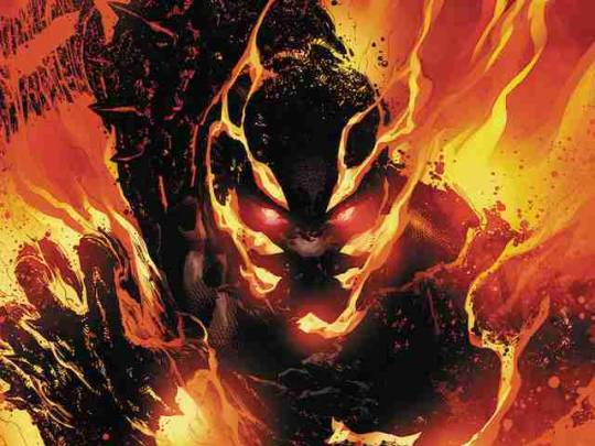
NK: The Curse of Brimstone #1, illustrated by Phillip Tan and written by Justin Jordan with colors by Rain Beredo, is likely a better story, right?
DC: It is better written that’s for sure, at no point does the protagonist call his step dad “a n00b” before being punched in the face. As much as I just want to talk about Ready Player One more than this comic (seriously that is a weird movie) I did have a point to make in the comparison
NK: We should probably establish what this comic is about first, and sound the POLITICS WARNING alarm.

NK: That still looks nicer than the book’s town of York Hills. Props to the artist for giving us a convincingly bleak atmosphere for this rural ghetto.
DC: The comic is less political than you’re expecting, it’s us who’re about to get political.
The basic concept is that the hero Joe Chamberlain, a boy from the kind of dirt-poor economically-stagnant Midwestern town that unchained capitalism gets us. He encounters a man in a fine suit who gives him a vague offer to save the town, and in return turns him into the monster known as Brimstone.
DC: Yeah, most of this issue is spent setting up that “poverty exists and it sucks”. Without the magic powers at the end it’s just a slice of life comic
NK: I credit the art for making that slice of life convincing, and I'm almost disappointed it becomes a super-power book. Props to the artist for giving us a convincingly bleak atmosphere for this rural ghetto. The designs for the characters themselves may come from stock tropes, but they're convincing and don't fall into stereotype
DC: ahhh yes... Philip Tan…I will say I think this book is better written than it is drawn
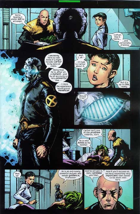
NK: I know Phillip Tan didn’t exactly start when he was “ready for Prime Time” given the work he did on 2003 Uncanny X-Men, but he's developed enough skill over his many years in the industry that the face above can be chalked up to stylistic exaggeration and not sloppy facial construction.
DC: There’s not much in the way of establishing shots, but what we do see of the town is evocative enough. I think he was more brought in to do expressionist fire monsters than arguments over kitchen tables though.
DC: For those of you readers wondering “is Dave gonna deduct points from every artist who doesn’t draw like frank quietly?” The answer is yes. More seriously though, I feel like Tan’s interests and strengths lie more in subject matter that will be more in future issues.
NK: Phillip Tan gave us the uniquely American hero Larfleeze the Orange Lantern, who is fueled by the emotion of Greed. For that alone he deserves some respect.

NK: I really love the spot black effects in this comic, especially on the establishing shots; gives the decaying town a convincing texture. The splatter effects don’t at all resemble realistic lighting and values but they create a visually interesting effect. And I like how the tiles on the floor aren't an even, orderly grid.
DC: I feel the coloring is doing a lot to make a pretty ropey panel passable here.
NK: Colorist is Rain Beredo, who's done a lot of work with Mike Deodato Jr. (another superhero artist who's way into spot blacks). As odd as it sounds, this reminds me of Sam Kieth’s work on Sandman, everything through a jagged, blotchy, uncomfortable lens. Perfectly suited to a horror title, even if a superheroic one. Can you imagine Tony Daniel drawing this?

DC: Odd comparison but I see it. I imagine he’d be even more bored with this issue. There’s this weird blurring effect going on with some foreground elements throughout this. Not a big fan of that.
NK: You don't think it helps give a sense of depth by making the stuff in the extreme foreground out of focus?
DC: It’s true that objects closer to the eye/camera that the distance being focused on are blurry, but it only draws attention to some of the conventions of comics we overlook the absurdity off. Like, a pitch black shirt is not a thing you see. They don’t make shirts out of material that absorbs light that strongly, black shirts always appear as some kind of grey. And the crosshatching. But maybe I’m being a pedant.
NK: You're condemning the use of spot blacks into a comic where the titular character literally turns into a man of brimstone. Albeit at the end, because this one of those comics that gives us the premise exactly at the end of the first chapter
DC: I’m condemning the use of digital blurring in a comic with heavy ink work. Stylization isn’t bad (in fact you could say, it’s good) but if it’s not consistent it can be jarring
NK: OK, That’s Fair. Still, there are some impressive shots in this, like introducing Joe's disabled, strung-out father.
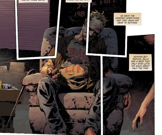
DC: This is a good shot, I’m surprised the colorist thought to go that dark with the shadow. Usually colorists try to maintain the separation in tones done by the ink but this was a bold move that really worked.
NK: So what’s your conclusion about this comic?
DC: It’s refreshing to have a superhero comic actually engage with real world problems, but don’t get too excited just yet. This comic only points out that poverty exists, depending on the readers inclinations they could read that poverty as being caused by capitalism, environmentalists (it was a coal town) or ELITES. This aside muddies the waters. Also, it is a bummer to read about poverty even if it’s done well.
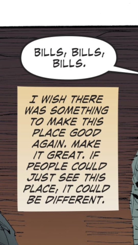
NK: The point of this, as the writer explains in an interview, is that Joe turning into Brimstone represents the kind of desperate grab for anything that led people to vote for Trump, despite him being an obvious conman and Orange Lantern.
DC: Somehow viewing politics through the lens of Green Lantern feels even sadder than seeing it through the lens of Harry Potter. But maybe Philip Tan does have a deeper connection to the material now that you mention it.
NK: The Orange Lantern Corps is just one psychopathic man-child with an army of subservient orange puppets. That is the perfect metaphor for the kind of cabinet Donald's trying to build. And the fact that Joe's transformation to Brimstone literally involves blowing up his home town seems uncomfortably close to the kind of disaster capitalism that such poor places are given as "relief".

DC: We all know that the only work of fiction that explains the state of the world is Metal Gear Solid.
NK: Must. Not. Reference. Must. Not. Reference.
DC: Before you readers complain, we did open with a warning
NK: And next week we have the crown jewel of whatever kind of crown this New Age of Heroes is: The Immortal Men #1, by Jim Lee and James Tynion III! I'll be going back to Curse of Brimstone, and I'm cautiously optimistic about The Immortal Men.
DC: Ahh yes, I can see the light at the end of this new DC properties tunnel! Catch ya then readers.
priority49
#neil kapit#dave clarke#dc comics#Justin jordan#Philip tan#rain beredo#new age of heroes#curse of the brimstone#art#illustration#manga#how to draw#sandman#larfleeze#politics warning
0 notes
Text
Read It For The Pictures 24: Dry Country by Rich Tomasso
NK: Welcome to Read It for the Pictures, the comic book Blog where we read it for the pictures! I’m Neil Kapit, and with me as always is the man who taught me how to properly eat a meat pie, Dave Clarke! How you doin’ Dave?
DC: Doing good Neil, enjoying a bright sunny early March day, riding my kangaroo around town, eating a vegemite sandwich, fosters, shrimp on the barbie, etc.
NK: So this week we’re taking a break from DC’s air quotes “new” hero line and doing something you picked, want to give some background on this?
DC: Yes, this time it was my pic and I wanted to get away from DC superheroes as much as possible so I picked Dry County #1 by Rich Tommaso. Initially just cos it was an image #1 but it seemed to be the perfect pic for what I was going for.
NK: And what you were going for was?
DC: The opposite of a DC superhero book. This is an autobiographical(??) slice of life story that seems to approach storytelling completely differently than Damage ™ did. At least that was my read on it, how did you find the book?
NK: Let’s hope we can discuss this book’s merits on its own terms and not damn it with the faint praise of being a better story than the Terrifics, because I thought it was an exceptional piece of cartooning. It made me want to read other Rich Tommaso books like Spy Seal, which was described to me as “Tintin Noir”.
DC: That is a very Tintin cover, but his art reminds me most of newspaper cartoons (which this protagonist of this story makes. That’s why I think it may be autobiographical not cos I did research or anything).
NK: The protagonist Lou Rossi lives in late 1980s miami, and while the time period isn’t explicitly stated, the art leaves a lot of subtle cues to indicate the period. They include rotary phones, T-shirts for Nine Inch Nails and Social Distortion, and the fact that Lou is paying his bills as a newspaper cartoonist.
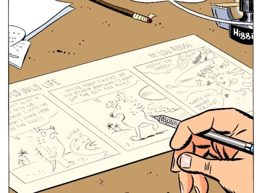
DC: A dip into the past where America was doing the bop and print wasn’t dead.
NK: Ahh the 1990s, a golden age when a little more than 1% of the population was contented and innocent, but I digress….
DC: One thing that’s going to limit our discussion is being unable to read this as a broad analogy of global politics. And also our limited experience with women. (Don’t act surprised folks were writing about comics on the internet).
NK: The plot is pretty simple, boy meets girl, boy wants to get with girl, girl is stuck in abusive relationship, boy keeps pursuing girl, and not sure where it goes next issue. The storytelling and page layouts really sell this as a unique work.
DC: Yeah, have you ever read ‘Understanding Comics’ by Scott McCloud?

NK: Well, duh. Everyone who hasn’t should seriously read it, if only to understand the kind of image juxtaposition that is used so effectively here in Dry Country.
DC: Hehe, of course, well for our readers who haven’t in that book he outlines the different types of transitions that can exist between panels. Most superhero comics focus on action to action shots, which makes sense if you’re story is about super people punching each other. This book most does scene to scene transitions, which allow the writing to do most of the heavy lifting for conveying meaning
NK: I thought most superhero comics were now about gaudily dressed men having long maudlin talking heads sequences with the occasional two-page spread of violence. Anyway, Worth noting that Tomasso focuses on single objects a lot to reinforce the mood, like the fan in the foreground of the miserably hot apartment. Inanimate objects go a long way towards creating a sense of place and mood.

DC: Yeah, while simplified they are nicely composed panels. In a way the illustration style echos the storytelling style, there’s just enough there to convey the idea without getting bogged down in details. The same way you don’t need every sentence of his conversation with the woman (sorry I forgot her name I will try to be better) you also don’t need to get obsessive about the shadows cast from the bars in the above panel to get the feelings of the scene
NK: (Ironically, a book called Dry Country has a protagonist who’s getting drunk most every time he has a moment free). Which gives everything in the book that’s there in the panels a sense of deliberation and importance. And also serves to illustrate how effective those choices are, particularly with setting and character design. Within one panel of seeing, say, Lou’s loudmouth friend, I got a great sense of who he was without feeling like he was a one-dimensional trope.
DC: Also there’s something to the heavy use of scene to scene transitions that makes it more personal, maybe with the sketch pad background to all the captions makes you feel the hand of the creator more. Kinda like an hourly comic. I wonder if the same technique could be used to, say, make Hal Jordan seem more like a real person or would that just be nakedly artificial.

NK: The yellow legal paper captions do help us get deeper and deeper into Lou’s head, but they’d pierce right through Hal’s skull because his broke-ass ring can’t do shit against yellow. It’d be interesting to compare this with Geoff Johns and Ivan Reis’ Green Lantern: Secret Origin, based on that criteria. But this is a noir story, not a superhero one. A bright, mostly sunny noir story
DC: Is it a noir? Like, the packaging suggests that it’s going to have a crime thriller twist in future issues but this issue is just a slice of life story
NK: The creeping sense of fatalism, the hero’s far-less-than-pure motives, and the extralegal confrontation with the abusive asshole boyfriend suggest that it’s getting into that genre. Which works in its favor, because it looks no more like a crime story than an average Batman comic, except there are thousands of Batman stories and only a few Rich Tomasso stories.
DC: Yeah, this is more Harvey Pekar than Maltese Falcon, but it’s possible that the juxtaposition could work to make the comic more unique and memorable. (Please forgive my weird references, I need to make a certain number each week or my family will starve).
NK: Those are appropriate references. This is a simple, inviting art style that would fit a Harvey Pekar story, but will be extremely disarming and unsettling if it gets into Dashiell Hammet territory. The virgin Phillip Marlowe and the chad Lou Rossi, now that’s an inappropriate reference.
DC: That being said, while there’s a lot of craft on display here it’s not my cup of tea. Can’t relate to people who don’t solve their problems with violence
NK: Don’t you think violence will occur in future issues? Lou is sexually frustrated, borderline alcoholic, and has the perfect complete bastard to take out all his aggression on.
DC: Possibly, but it could just as easily happen off-panel and we could be treated to an, admittedly effective, few paragraphs of our protagonist talking about how it made him feel. If you’re interested in making comics this is worth seeking out cos it shows an approach to doing talk-y scenes interestingly that goes deeper than the wally woods 22 panels that always work.

NK: If you’re turned off by us giving you some culture this week then you can tune back in on April 4 when we have Curse of the Brimstone by Phillip Tan and Justin Jordan from DC’s New Age of Heroes.
DC: Neil thinks he can just announce this stuff in the chat without consulting me, and it works every time!
NK: Consider me Jigsaw and this your torture chamber.

1 note
·
View note
Text
Read It For The Pictures 21: The Terrifics by Ivan Reis
NK: Welcome to Read It For The Pictures, the comic book Blog where we read it for the pictures! I’m Neil Kapit, and with me as always is the man exchanging my US savings to the Australian dollarydoo, Dave Clarke! How you doin’ Dave?
DC: The Australian dollar, you wouldn’t think it given out history of drunken wrestling wildlife but it’s somehow more stable than bitcoin too.
NK: Anyway, I hope you’re ready for mouth-watering Terrifics!
DC: I thought you said we were having fantastic fours?
NK: That’s what I call Fantastic Four, the Terrifics! It’s a DCU expression.
DC: Well I’ve been reading Batman comics for years and I’ve never heard of that property.
NK: It’s from the Justice League family of books. But seriously, this week we’ve got another New Age of Heroes book: The Terrifics , drawn by Ivan Reis, written by Jeff Lemire, with inking by Joe Prado and coloring by Marcelo Maiolo.
DC: Yes, the Terrifics is in the weird place of being a mildly cute joke that takes far too much effort to explain to anyone not obsessive enough to be writing about comics on the internet, in order to be worth the payoff.
NK: Being obsessive enough, I’ll explain; unlike other New Age of Heroes books, The Terrifics is entirely existing characters pulled together to create a DC version of the Fantastic Four, that Marvel comic that nobody cared about for years until Marvel stopped publishing it partly due to the FOX movie rights dispute (but mostly due to the fact that nobody cared about it). So we’ve got a super-genius leader (Mr. Terrific), a withdrawn doe-eyed female (Phantom Girl of the Legion of Superheroes), a wacky prankster (Plastic Man), and a lovably gruff rock monster (Metamorpho) as a team of explorer heroes. Except where the Fantastic Four ended up just as a Jack Kirby cover band with occasional all-too-brief flashes of inspiration, this explorer team might actually, y’know, explore new shit.
DC: Yes, DC really thumbing their nose at the competition by saying “you can’t publish a superhero team idea that’s 50 years past its prime that No one cares about? Well we can. “
NK: The good news is that the storyteller/artist for this obscure and petulant in-joke is Ivan Reis, one of the definitive DC superhero artists of the past fifteen years. Most people will see this as an impressive spread encapsulating the amount of depth and grandeur Reis put into the Green Lantern mythos. I see his rendition of Dex-Starr the Red Lantern cat and think that doesn’t look at all like a cat from the neck down. I’m not most people.

DC: Ivan Reis is a good drawer, and this book is getting some positive buzz, but I’m afraid this instalment is going to be mostly Neil trying to sell me on it cos I just don’t get it .
NK: Well, we're reading it for the pictures. There isn't much of a story here so far beyond the team getting together, but there doesn't have to be. Besides, better that Reis be drawing images of cool things like the Terrifics fighting the giant maggots of a giant corpse's bowels than something like this...

DC: Personally I think Aquaman in a Hungry Jack’s is a cooler/funnier thing to draw than most of the heroic posturing in the Terrifics. I will agree that he is better suited here.
NK: Reis became so popular for a reason; he was able to capture the cinematic photo-“realism” that superhero comics gravitated towards while maintaining an expressive and organic element unique to comics. He uses a lot of spot blacks in his art, even in this age of complex computer coloring. It doesn’t really resemble realistic lighting but it gives his figures a lot more weight.
DC: Realism should be in quotation marks when it comes Ivan Reis.
NK: Realism in art is ALWAYS in quotation marks Especially when half the cast doesn’t resemble real humans in the slightest.
DC: He’s much more true to life than, say Jack Kirby But it’s not like he’s even remotely interested in realism like say John singer Sargent Talking about superhero comics all the time can have an effect of flattening our what you think is possible with visual art.

DC: It’s been fun talking about these DC books (and that yacht I bought with the Warner bros money for only reviewing DC books is also nice) but when we were discussing slice of life and kids comics I think we broadened our palette a bit. Reis is a capital S super H hero artist, and looking at his work through that lens is much nicer than thinking about him as being realistic.
NK: Reis is realistic enough to have a greater sense of depth and detail than most other superhero artists, but he does stop short, and in doing so he avoids the Uncanny Valley from whence artists like Greg Land came. And that's the thing; throughout this book I kept wondering what Reis could do with material beyond DC superheroes. As far as I know he's just done DC, Marvel, and a few properties licensed to Dark Horse.

NK: It's a well framed letterbox panel there. Metamorpho, apparently gone mad from the Dark Multiverse's influence, lunges powerfully from the middle plane causing Mr. Terrific to fly like a rag doll into the foreground. Metamorpho's girlfriend is in the back watching helplessly, while the Kirby Dot pattern's coloring causes her linework to fade a bit.
DC: I guess the man knows what he likes Or he’s been type cast Or there’s just not that many jobs going for a reliable slice of life comic artist Sorry if it feels like I’m getting a bit to meta on the nature of comics here...
NK: Lol, wut? You thought we weren't going to do an insufferably meta discussion here? FOHHHHH
DC: But there’s also not really a story.., so it didn’t jump out to me as much as when I picked on the blue beetle comic. Also these panels also show a wider problem if there not really being backgrounds or environments in this comic .
NK: There's a stronger sense of place when the portal to the Dark Multiverse isn't pouring over our world, with scenes like Simon Stagg's mansion and laboratory, or dead not-Galactus' craggy innards style.
DC: You say that, but the breezes through all of those places so quickly they didn’t really leave an impression. There a bunch of fun plastic man poses though. Plastic man is a dumb character that I hate, he in a boom where everyone is heroically posing he stands out as a highlight.

DC: Why don’t you try summarizing the story for the cheap freeloaders in our audience who didn’t do the homework.
NK: So the issue starts with Mr. Terrific (JSA version, Michael Holt) going to rescue Metamorpho, who's being used for twisted multiverse experiments by his evil father-in-law(?) Simon Stagg. As twisted multiverse experiments usually go, it goes wrong, so Mr. Terrific pulls out the newly returned and Dark-immune Plastic Man from his egg-shaped slumber. They get sucked into the void, and banter a bit until they discover they're in the stomach cavity of a dead giant that looks more than a little like Galactus. There they fight some maggots and meet Phantom Girl, and get a distress call from (and this is where it gets insufferably atavistic): Tom Strong, from Alan Moore’s America’s Best Comics!

DC: A pastiche of square jawed heroes in a mashup semi-parody of the fantastic four. How many layers of pointless meta commentary are you on?
NK: Because Tom Strong is created by Alan Moore, we have to worship him and work him into the DC Universe at every point possible and use him in a context completely divorced from the original version. I love the Tom Strong comics, in large part because they actually DO capture the inventive spirit of those older comics, but in a context with some ironic distance that subtly implies the fascism inherent in superheroes.

NK: Maybe as the series progress we'll get to see the Terrifics joined by Tom and his family as they explore more creative and wondrous realms, and Ivan Reis will draw different and more exciting backgrounds. Except that Reis is leaving the book with issue 3, with Chris Sprouse doing issue 4 while Reis does Brian Michael Bendis' version of the Superman origin. So much for artist driven (no disrespect to Sprouse) .
DC: You don’t know that the Terrifics isn’t going to turn into a nuanced but fun critque of modern culture in the next issue, after starting as a dull as dirt opening.
NK: You weren't nearly this down on the other three new Age of heroes books.
DC: Well, yeah, I imagine with some distance I’ll see them all as being vaguely similar in value but Sideways was actively engaging with social media culture, Silencer was using the perspective of a working mother to inform an action story, and Damage is the character find of 2018. Terrific so the other hand is existing characters being forced into the mild of other long existing characters with the twist of meeting another existing character who’s whole shtick is being a commentary on older existing characters.
NK: And there are some impressive set-ups, like the first page with Mr. Terrifics' monologue about the unknown, set to the unfrozen caveman bodyguard Java crushing a butterfly. Yes, Java doesn't like new and different things, he likes being a wage slave to oppressive 1%er Simon Stagg fffffffffffffff
DC: Man, as much as my insufferable commie heart loves to hear people do class conscious readings of garbage culture that feels like a stretch even to me. Maybe in future issues this comic will have a clear point other than being a funny solicitation but until we know what the point of this is I have no idea what changes I’d make to it to achieve that purpose better.
NK: I usually love meta, but this is meta in a very TV Tropes way, like they're just going through a catalog and connecting things that are nominally similar.
DC: And I’m guessing the fans of plastic man and Metamorpho don’t have a tonne of overlap with fans of Reis. Didn’t everyone prefer the direction they went with the Wednesday Comics Metamorpho?
NK: Wednesday Comics was a stand-alone creator-driven experiment without any connection to shared universe continuity, drawing on creators veteran and new from outside DC's usual talent pool. Neil Gaiman and Mike Allred did the Metamorpho series. It was the exact thing that's up our alley and might appeal to people outside the direct market crowd. Which, of course, means it fails with the base audience.
DC: The direct market fans are mostly idiots though (he said, wondering why he doesn’t get more readers).
NK: You don't have the kind of built-in audience these decades-old characters have, which allows you to do these kinds of diminishing returns meta projects long enough to make some money off of it at least. That said, you may want to read the epic Wyrecats/Ruby Nation crossover coming soon (and by soon I mean never).
DC: What are you talking about? I’ve got tones of mass market appeal with an intellectual edge!
DC: Anyway, I’m sure you can alert our adoring fan(s?) about what our next pick is when I find it.
NK: Ummmm...it’s Aurora Borealis #1, written by Seymour Skinner and drawn by Agnes Skinner!
DC: Simpsons shitposting is pure and should be spared the broken world of comics.
NK: Egads! My reference is ruined!

#read it for the pictures#dave clarke#neil kapit#terrifics#tom strong#ivan reis#jeff lemire#dc comics#steamed hams#simpsons#metamorpho#plastic man#dark nights: metal#comic books#art#illustration#how to draw
0 notes
Text
Read It For the Pictures 22: Sideways #1 by Kenneth Rocafort
NK: Hello and welcome to Read It For the Pictures, the comic book BLOG where we read it for the pictures! I’m Neil Kapit and with me as always is my most trusted Emu Wrangler, Dave Clarke! How you doin’ Dave?
DC: Things are good in the terrifying flightless bird business
And on top of that this week we read Sideways, the third dc new titles we’ve touched
We talked about damage but that’s a secret lost episode folks)
NK: Sideways #1, created and illustrated by Kenneth Rocafort, with script by Dan Didio and Justin Jordan and coloring by Daniel Brown. no relation to the Paul Giamatti film, so don't worry, we won't subject you to any Fucking Merlot
Going into this, I saw a lithe young man in a zentai, and thought, is this going to be a Spider-Man rip-off?
Answer: Probably not! This was pretty good.
DC: As far as rip offs of existing concepts go I think this is one of the more unique ones. Yeah sure it’s a young male hero with a skin tight costume, but it got more original aspects than Damage
NK: Imagine my trepidation, when the artist and creative force behind the book had done stuff like this. Fortunately, there aren't any giant hooters for Kenneth Rocafort to draw in this comic.
DC: Not in issue 1 at least.
NK: Unfortunately,, there aren't displays of elaborate machinery for him to draw in this issue, either, which is the other thing he's become known for But anyway, even though Kenneth Rocafort is only 33 (unlike the older veteran artists in this New Age of Heroes line), he's got a very 90's Image aesthetic. And this is mostly just an issue at a normal high school
DC: He still finds plenty of excuses to squeeze lots of detail in, as well as give representation to a underserved minority; Gamers.
NK: Derek/Sideways' friend "Ernie" (short for Ernestine) is amazingly weeaboo. A lot of effort was put into her room and all the anime stuff she has, which seems to tick off every single anime stereotype (including what appears to be a Cloud Strife body pillow), but creates a nice shorthand and impressive setting. It's also a nice touch that she's a cosplayer who already knew how to make a costume for Derek, which is a pretty good design as far as spandex costumes go
DC: Replicating our dynamic of the weeaboo who does the hard work and the idiot who says stupid things on social media for attention. But you’re telling me you can’t take a picture of your desk covered in iron man figurines as we speak?
NK: I don't have a desk per se, I have an end table that has different action figures brought in and out based on what I need to inspire my drawing. Anyway, Rocafort clearly did put effort into creating distinct "normal" supporting cast members
DC: Yeah, this is almost a slice of life comic. In fact I wish it was more of a slice of life comic focusing on his weird live stream. Like a supernatural Logan Paul but not as racist. Picture it now: Sideways goes to the suicide forest
NK: We'll see how it goes, he doesn't actually fight anyone this issue, he just teleports around the globe shooting footage of different locales (when he teleports he creates a boomerang-shaped Portal into which he goes "Sideways"). I like the idea of powered characters who don't use their powers to be heroes or villains.
DC: I do think this is the best illustrated comic we’ve looked at in this new DC launch. Panels like this show real thought going into the characters, at least to me…
…even if it is balanced out with a few panels like this…
No background, there are a few panels without backgrounds where it’s done for better composition, but also a chunk where it looks like the deadlines were encroaching. Not that it’s a deal breaker…
NK: There are some where the backgrounds have pornographic levels of detail to them as seen above, so it's not like it's an inability of Rocafort's.
DC: You have more experience with Rocafort than me, is this thing on the sides of the page normal for him?
NK: I don't have a lot of experience with Rocafort because he made his name on comics by Sexual Harrasser And Comics' Most Successful D Student, Scott Lobdell. That said, panels floating freely across extant layouts are something that's his thing. He’s not one to be bound by grids.
DC: It’s not that dissimilar to those concept layout pages he does, has a knack for laying out a bunch of random elements.

NK: I honestly like it better on the concept art pages, I generally prefer stronger defined borders for comic storytelling It can take away from the impact when you're trying to decipher what's going on inside the panels and which panel comes first, though Rocafort's kept the layouts coherent here.
DC: Gonna be real with you, I preferred silencer to this.
NK: In terms of storytelling, John Romita JR definitely has an edge, since he's almost twice as old as Rocafort and has spent his entire adult life drawing comics But I wasn't thrown out of the story by anything the way I was seeing giant biker androids. Even Ernie wearing a rainbow fursuit felt appropriate in context
DC: I guess I just think the Talia scene from silencer has enough of a payoff to be satisfying on its own where this is feels like a pitch for a series.
NK: That, and Derek's origin story is literally "fell into giant plot hole from DC Metal crossover, got powers from it" But there’s a lot going for this once you get past the crossover nod. Derek himself is quiet and weird in his civilian life, even before he fell in the Plot-Hole. He's also adopted, clear from how his skin color is significantly darker than his parents', which may add to his sense of alienation
DC: There’s a bunch to work with here, most of the interaction between the hero and Ernie is through text messages, the hero does a stream to fans he can’t see, and he’s able to be everywhere at once. There’s a tonne to mine on the topic of disconnected and parasocial relationships. Maybe they’ll dig into it hard in issue 7 after they’re done with this cosmic judge arc, assuming it isn’t cancelled.
NK: Sideways vs. YouTube Copyright Lawyers....IN SPACE! That's a way to get this back to being about a vlogger rather than just another crimefighter. The bots taking down stuff that’s offensive, but literal.
DC: Also sideways is a whole privacy conundrum in himself, her appears in Ernie’s bathroom unannounced at the start. More and more I think this is going to be held back by having to be a New DC Hero (tm). Him being a bit of a shit could lead to more interesting explorations of modern technology
NK: To be fair, I assume he's just known Ernie since they were little kids and in his excitement it didn't occur to him that it was a problem
DC: Well yeah, but it could lay the seeds of a story of fame going to his head and corrupting him
NK: DC's probably not going to have a New DC Hero use his powers to get upskirt photos, but you're right, there's a lot more that could be done that probably won't be so he can keep the hero protagonist spot. Then again, superhero comics with outright supervillain protagonists are still in vogue
DC: Harley Quinn is the comic for the Instagram using reader, Sideways is the one for the twitch viewer. We need a hero for Weird Twitter now.
NK: I propose The Shitposter, who forcibly swaps peoples' faces with ones more Memeworthy.
DC: The Dril
NK: So do you think you'll be going back to this one?
DC: I see a bunch of potential in this but I’m skeptical about it being realized. For a comic about The Youths it manages to have convincing voices and is engaging with new technology rather than writing it all off as you might expect an established DC writer to do. But I don’t want to read about a cosmic judge. Rockafort is good, exploring youth culture is interesting and the specter of compromise with a large multinational hangs over as always
NK: I'll give it another few issues like I am with Silencer (though Damage gets only one more issue with me based on its dreadful debut.) Also, here's hoping that Rocafort keeps showing his range at things not machines or breasts
DC: Lol he should do a metal gear comic
NK: So our next review will be; the Terrifics #1 on 2/28/2018, by Ivan Reis and Jeff Lemire
DC: I never agreed to that :P
NK: Hey, we commit to the bit, try each of these books. You'll save money if we never end up actually seeing Jim Lee's Immortal Men anyway
DC: Alright, but when we’re done with DC books I’ll be finding some picks to punish you.
NK: You can suggest any picks as you want, but I've already endured Tarot. Do your worst.
DC: By the time we’re done with these DC books we’ll finally have that Mark Millar adaptation of Das Kapital.
#neil kapit#dave clarke#dan didio#Justin jordan#Kenneth rocafort#sideways#dc#comics#new age of heroes#art#illustration#how to draw
0 notes