lauralutz12-blog
Laura Lutz
Graphic Communication L5 BCU
14 posts
Don't wanna be here? Send us removal request.
Last Seen Blogs

annysir
Untitled

lumaleelop
And when the story ends
It becomes a part of me

drawhishaw
EverythingCanBeCrazy
hellcheerful
all too well

gayger
Taintedblossomofwar
Photo


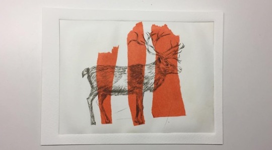


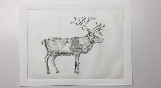
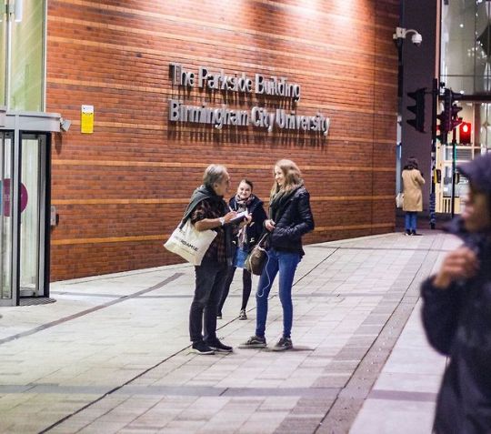
On 12th of December Silvana and I went to a Drypoint Workshop in the Printroom at Parkside Building of BCU.
Drypoint is an intaglio printing technique in which an image is incised into a plate (or "matrix") with a needle. In this workshop we were using acrylic glass. After incising the image you add ink all over the plate and press it into the image. When this is done you wipe away the rest of the ink on your plate using a tartan cloth and print onto a slightly watered watercolor paper.
By adding colour you get more variety in your results. I really like this technique as the results can be very detailed.
0 notes
Photo
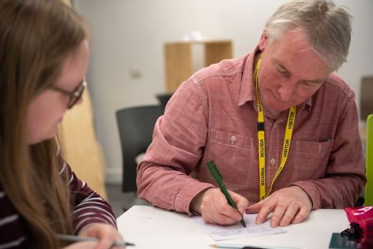


On 15th of November I joined a Calligraphy Workshop with Nick Caulkin who is a Freelance calligrapher and handwriting consultant from Birmingham.
His clients are various well known companies and societies such as NatWest Bank, MacDonald’s, the Royal College of Surgeons, the City of Birmingham, Vauxhall Cars, Land Rover, Barclays Bank, South Birmingham Health Authority and The Royal Society of Arts.
He tought us the first steps how to start with Italic Handwriting such as getting a rhythm in drawing lines to get a balanced typeface. Then he showed us all the letters in this typeface and let us write some example words.
I really appreciated learning from a calligrapher with that much experience.
0 notes
Photo


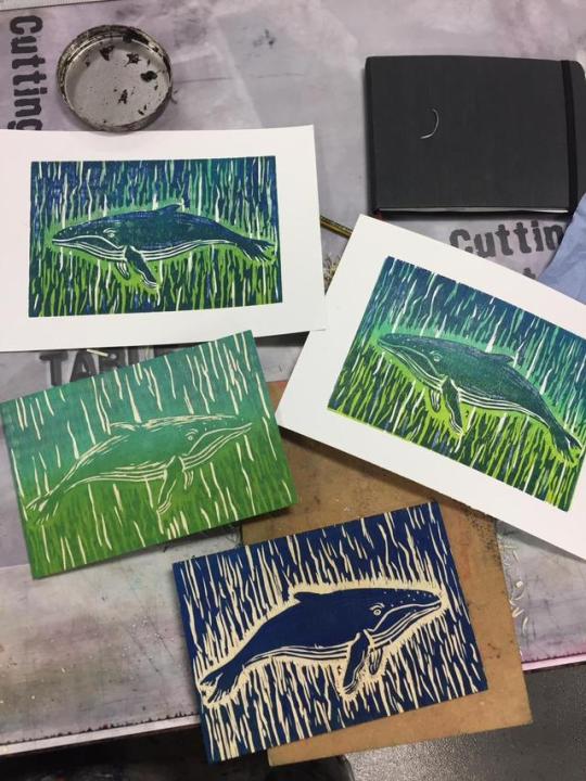
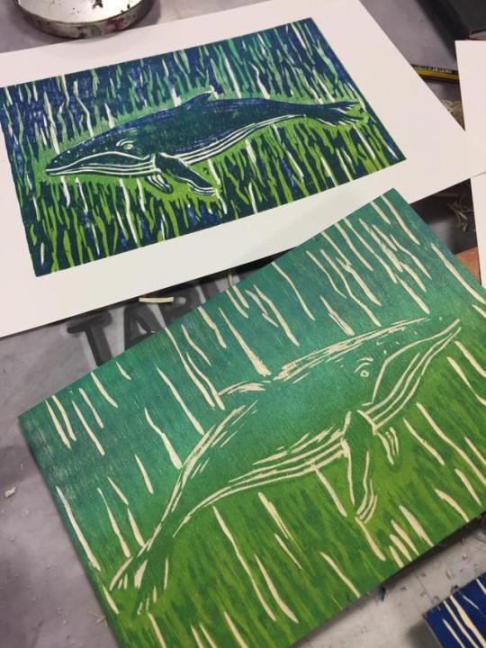
On 19th of December I attended to a workshop about Woodcuts in the Printroom at Parkside Building in BCU.
Woodcut is a relief printing technique that comes from China in antiquity as a method of printing on textiles and later on paper. The earliest woodblock prints are silk printed with flowers in three colours from the Han dynasty (before 220). This technique was transmitted to Europe in the 13th century.
First you have to carve an image into the surface of a block of wood leaving the printing parts level with the surface while removing the non-printing parts.
To get a second layer you can print your first print onto another wood keying the paper to a frame around the woodblock and carve the parts you want to print in another colour. For the first print it could be an option to print an outline of your object first and for the second wood could be the filling. These multiple layers can be combined in different colours to get unique results at printing.
I really like this technique as you get the wooden structure in your image. But carving into wood is much more work than Lino.
0 notes
Photo

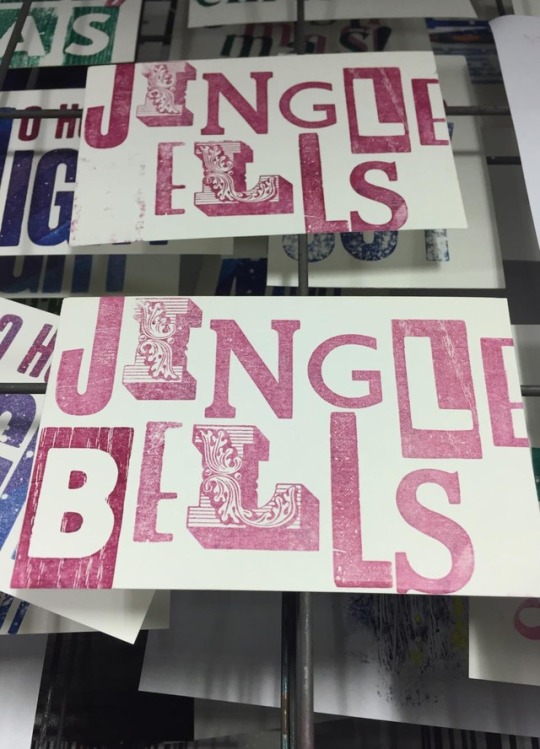
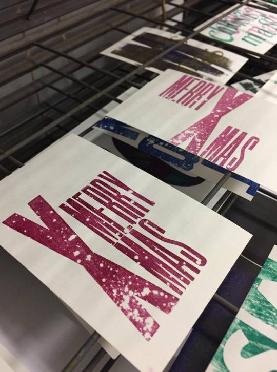


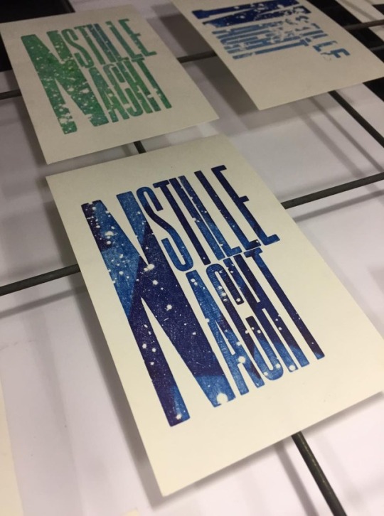

Yesterday I joined a Christmas Cards Letterpress Workshop organized by the TypeSociety which took part in the Print Room in Parkside Building.
Naomi tought us how to create stunning effects like snow on our letters and how to apply multiple layers onto our designs. I really enjoyed it to play with different fonts and sizes and tried to combine big and small letters.
1 note
·
View note
Photo
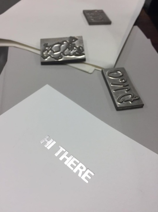
The Birmingham City University offers Foil Blocking as a technique to visually enhance your design. This can be used for small objects like business cards for example. There are 3 Typefaces available but you can also print your own designs by ordering prints made out of brass at the company Metallic Elephant.
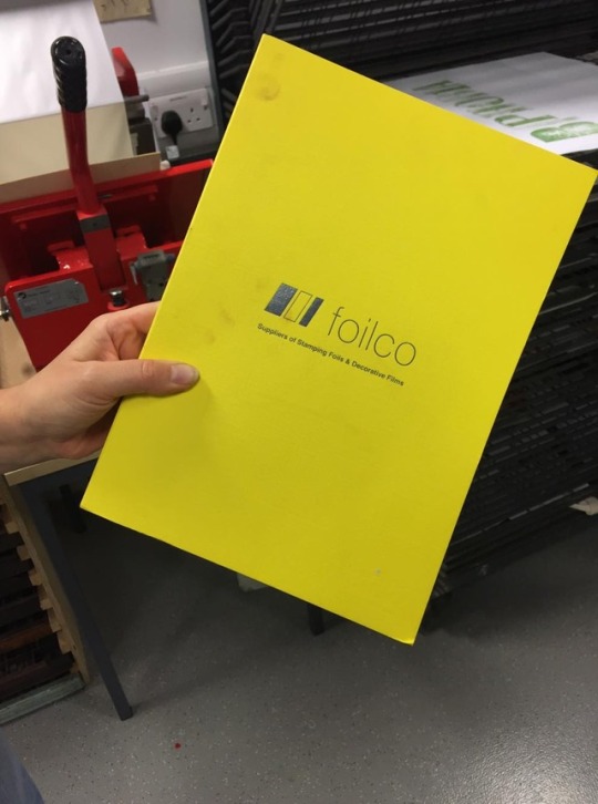
In addition foilco has a lot of options for different foils which you can order.
0 notes
Video

This is an animation I created in After Effects for my final assessment of the Live Project in L5. I chose the briefing of the agency RBH which was about creating a christmas campaign for a christmas beer.
One of my ideas is about Christmas presents: all the ones you get that you don’t want (socks, sweaters, snowglobes...) and the ones people really wish to get (in this case: beer). The name of the beer comes from the bitter taste and “refund” means you can give the presents back. The logo is made in letterpress to show the handcrafted character of the beer and the slogan “Make Christmas Great Again” relates to Trump’s Quote “Make America Great Again” which points out an actual political topic and brings discussion. The animation can be used to grab people’s attention on social media.
0 notes
Photo
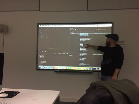
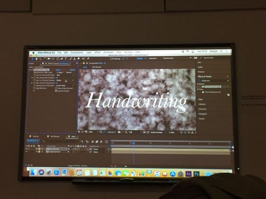

Today I went to an after effects workshop of L6 with Korey. I already knew the basics of the programme from my home university but I thought a refreshment would be good so I joined. I also learned new things like how to do a text reveal using masks and how to use the tool “easy ease” to make movements in an animation look more fluid.
0 notes
Photo

On 6th of November I went to a Careers + Event about “What can I do with my Arts, Design & Media Degree?”. The talk was about knowing what you are good at and what you enjoy, personal skills (soft&hard), networking on LinkedIn and a test of personalities that helps to get to know yourself better and what you are good at.
On 7th of November we went to the graduation + fair which unfortunately didn’t offer anything for graphic design. Most of the companies were for engineering and finance students
0 notes
Photo


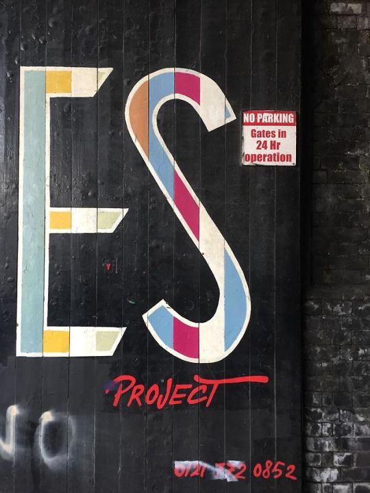

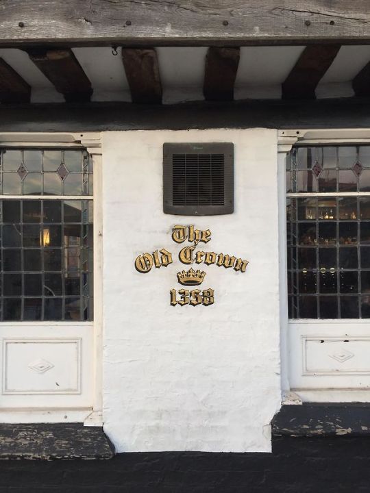


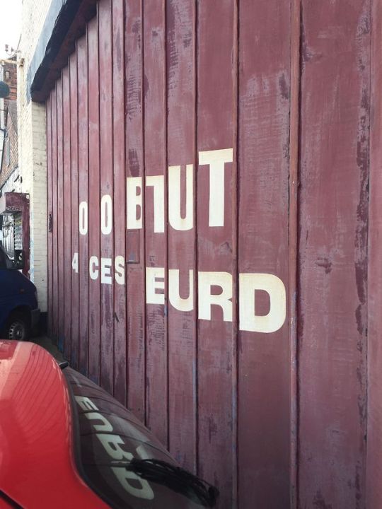
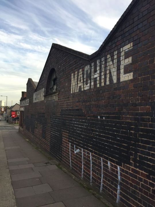
On 17th of October we went to a Typewalk in Digbeth with Geraldine Marshall. She is a collector/ rambler of urban lettering - documenting the city graphic DNA. She showed us some different types of old urban lettering and ghost signs as well as the type on the oldest pub in Birmingham “The Old Crown”.
0 notes
Photo
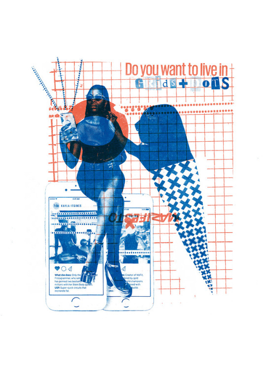
Working on some risoprint during Print Club session for my competition brief about our lost generation in the digital age. Nowadays we are surrounded by our phones all the time. We want to look best on social media and try to hide our real self behind a mask. But do we really want a life like this?
1 note
·
View note
Photo


On 26th of October we attended an inspiring talk of David Carson at BCU.
David Carson is a well known graphic designer from the US. He worked for many big companies such as Burton Snowboards, Nike, Pepsi, Levi’s and and Coca Cola for example and was the art director of the magazine “Ray Gun”, which shows his innovative typography. His style is very experimental and he always tries to break with conventional design rules such as grids and legibility.
He was talking about his work and showed us how he reaches to get an individual and unique design for each client. An important thing he said about his working method was that the design either has to be simple or powerful and that people will never remember something that is something in the middle. Also you get better solutions working in an open way – the process is important. As well as integrating something personal in the design – even if it’s just the spacing between letters. In addition he underlined that it’s always good to go back to analog working methods as every designer uses the same programmes.
For me it was really amazing to meet such an incredible and sympathetic Designer.
0 notes
Photo
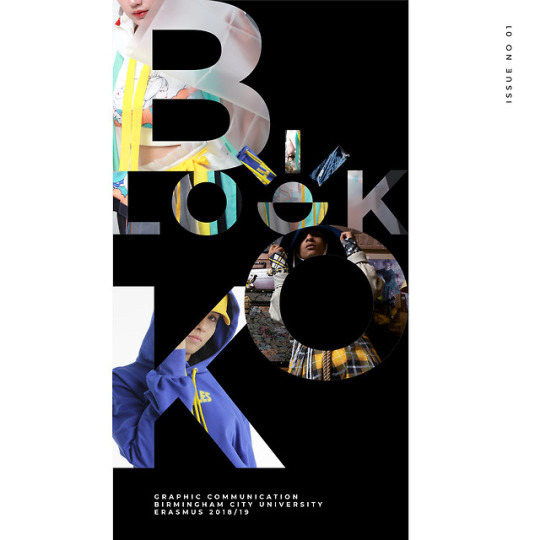
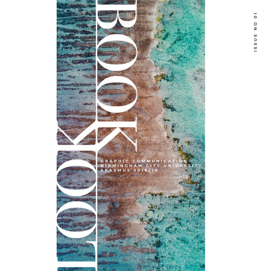


These are different cover ideas for the fashion-lookbook I’m currently working on. I tried to use different typefaces to create an unique look but I think the Serif-Typeface doesn't match all the collections in the lookbook so I might stick to something neutral. I really like to play with big letters and creating new shapes out of them which is why i combined one of the “o”s of “Look” and “Book”.
0 notes
Link
For the context module I decided to pick the ISTD Brief about the theme “Lost”. I’m thinking about our ‘lost generation’ that is grown up with a lot of technology and social media. This topic affects me because I’m a very digital person and I would like to create a typographic work that confronts people with the reality they want to hide.
0 notes
Link
About today’s competition brief for Survival International
1 note
·
View note