k00292537
𝔏𝔢𝔞𝔥 𝔅𝔯𝔢𝔢𝔫
𝕷𝖘𝖆𝖉 1𝖘𝖙 𝖞𝖊𝖆𝖗 𝖆𝖗𝖙 𝖘𝖙𝖚𝖉𝖊𝖓𝖙| Painting |My concept for portrait details how my style can inform another person’s perception of me, and the importance of how I present myself to the world through the things which I can alter about myself.
73 posts
Don't wanna be here? Send us removal request.
Last Seen Blogs
karenfordonte
Caring For Donte
kbakba-station
KBA-KBA station
karenfordonte
Caring For Donte
dx23xx
Anime
baseballlibertarian
Baseball Libertarian
Text
Project : Portrait
Week : 22nd April - 26th April
Bookmaking
Below is a video of my completed book from the previous post, bound together by wire.
I really enjoyed making the book, as it’s something I never really tried before. I like how it functions at an autobiography of my physical appearance in relation to how I dress. I think bookmaking is definitely a technique I’ll use in the future to produce work.
What I find interesting about my book is it’s elements of sculpture and fashion. Due to the thick pages and heavy duty materials, it almost looks like a sculpture piece. I like how even in the painting discipline, I can still delve into other areas of art to inform my paintings.
8 notes
·
View notes
Text
Project : Portrait
Week : 22nd April - 26th April
Bookmaking
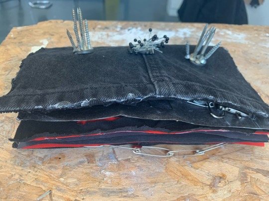
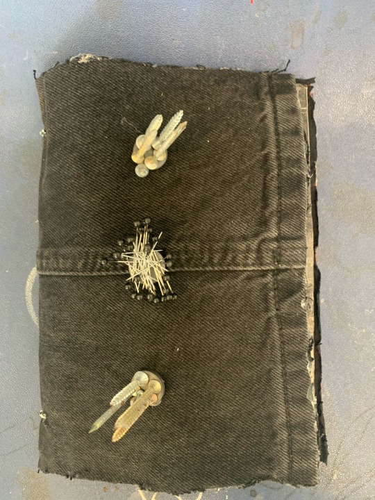
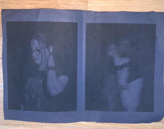
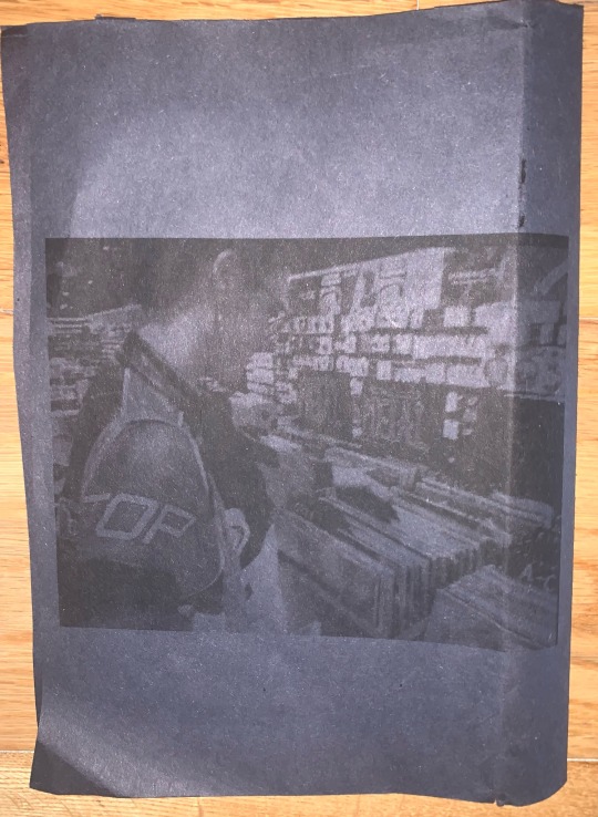
After making a glue-bound book, I was motivated to make another book - but with more edge. I wanted to make the pages more bold, by combined more fashion samples and sculptural elements that hint at my personal style.
Below are the pages, which I laid out in order to decide my composition of the book.
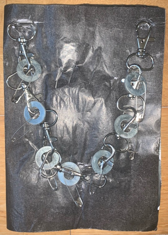
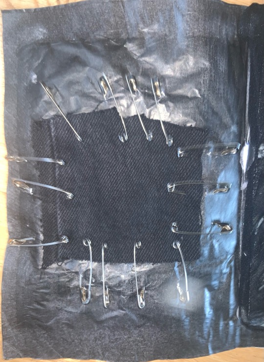
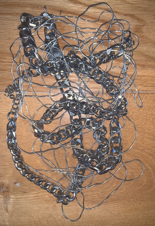
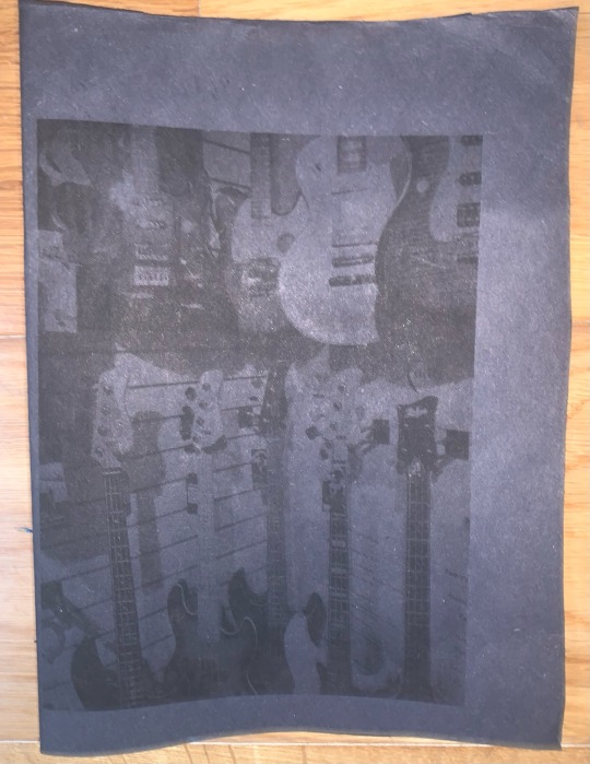
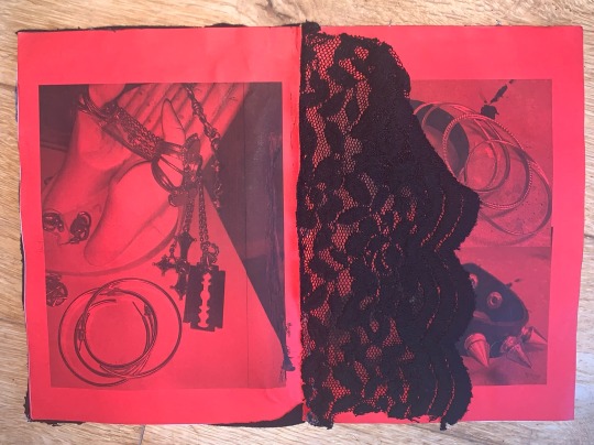
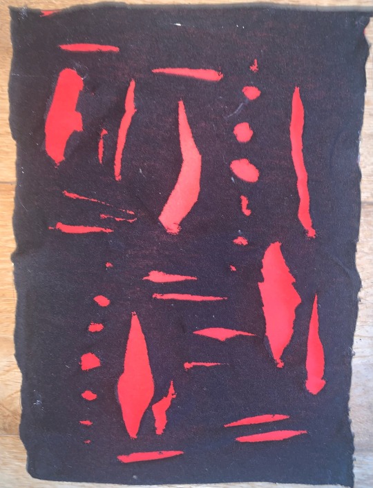
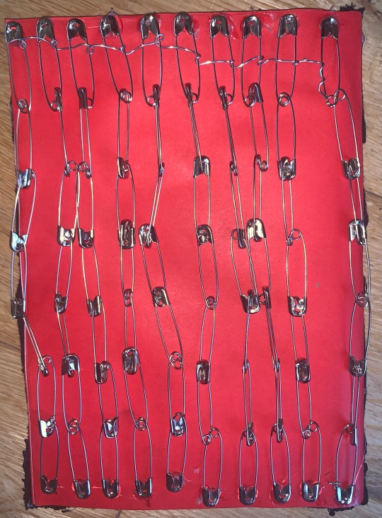
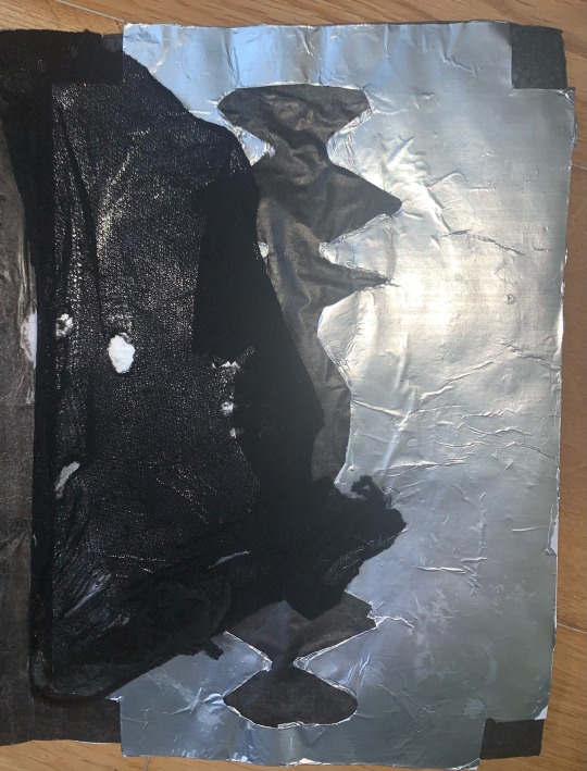
I used different metal items, such as pins, bolts, chains, wire and nails to reflect the predominantly silver jewellery items I wear. I incorporated fabrics such as denim, lace and tights to give samples of garments that I wear.
I printed some images of myself, places that inspire me and my accessories onto black and red paper in black ink (my two favourite colours).
12 notes
·
View notes
Text
Project : Portrait
Week : 22nd April - 26th April
Artist Research : Barbara Kruger
Barbara Kruger is an American graphic designer, known for her style of using black and white imagery, with brief phrases in red and white fonts in Futura Bold Oblique, or Helvetica Ultra Condensed.

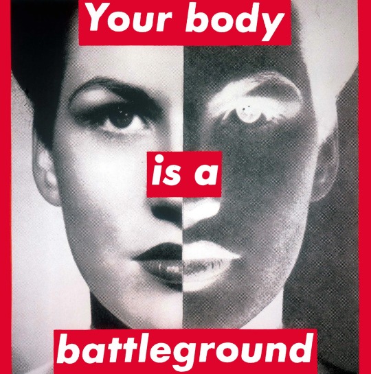
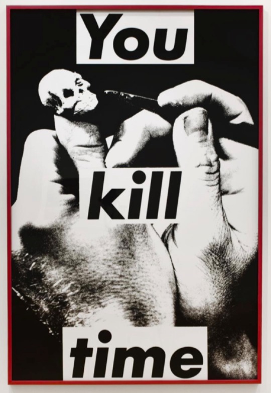
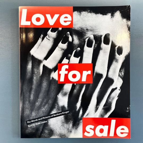
Within her work, she challenged societal issues and conventions. Her dark imagery is undercut by the short sayings that accompany it. It allows the viewer to reflect on the image, but also analyse the meaning of the text in relation to the image.
I’m influenced by Kruger, as the colour palette of black, red and white run through all of my pieces. In particular, the book that I made from my previous post is influenced by her, as I’ve combined quick phrases, with black and white images of myself, in a simplistic form.
3 notes
·
View notes
Text
Project : Portrait
Week : 15th April - 20th April
Bookmaking
With Eoin, I created a book of quick sketches/collages to visual some ideas to relate to my theme for ‘Portrait’
In the book, I’ve shown a mix of images of things and places that influence my style and physical samples of my fashion tastes.
4 notes
·
View notes
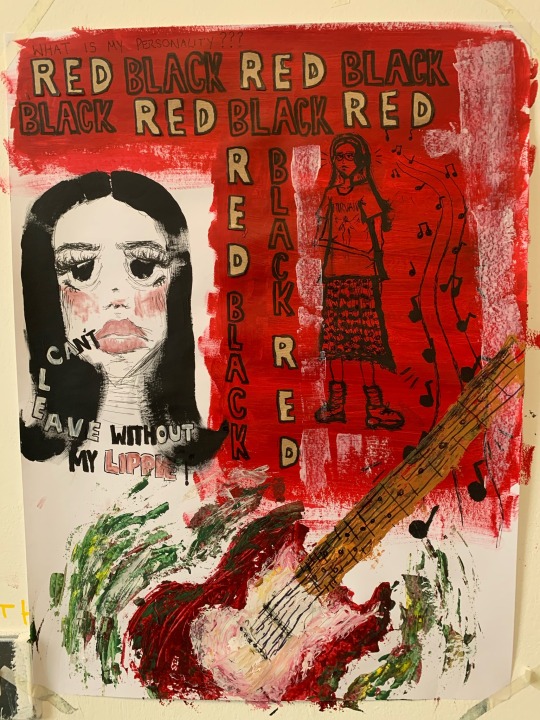
Text
Project : Portrait
Week : 15th April - 19th April
Process Painting
As a continuation of an animated style and process painting, I created another painting/collage.
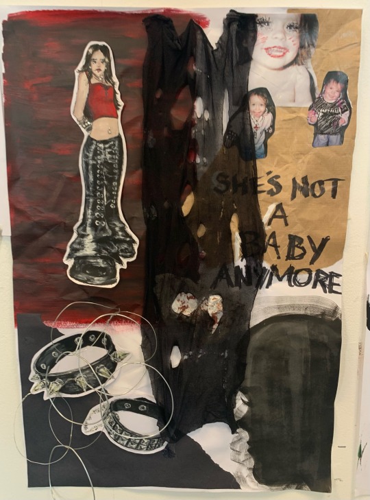
For this piece, I decided to include more texture/sculpture elements - with relief paintings, fabric and wire.

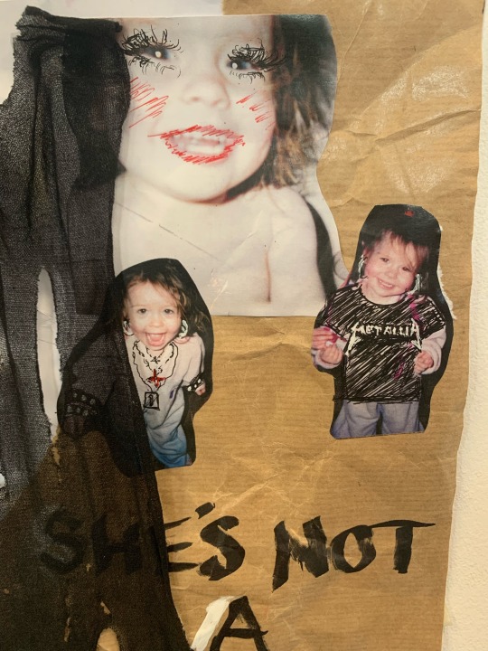
I painted myself in an animated style, using my favourite tv shows as inspiration. I included paintings of my jewellery, also using wire to make replicas of my accessories. Using collage, I stuck pictures of my childhood self, drawing my current fashion over top. I used my own ripped tights for collage also, to showcase a physical piece of what I wear.
1 note
·
View note
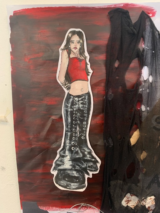
Text
Project : Portrait
Week : 15th April - 19th April
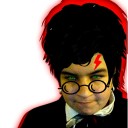
Artist Research : Chris Prynoski
Chris Prynoski is an animator and director, particularly known for designing the characters for MTV show ‘Downtown’.
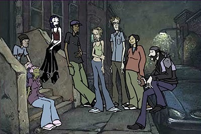
The way the figures look really influenced my approach to attempt to work in a less realistic style. I like their urban appearance, and the 90s style of fashion.
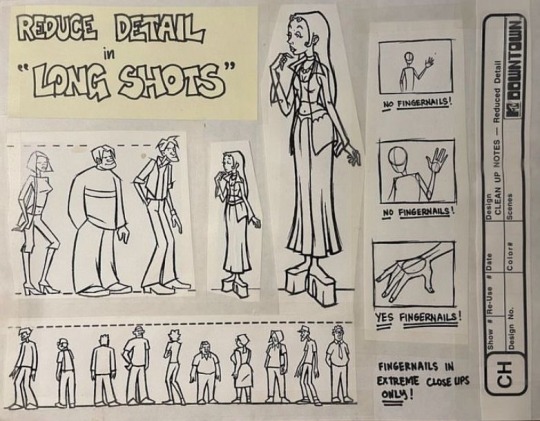
The TV show is my favourite animated show, which I think will suit the theme of ‘portrait’ well. As I’m displaying my interests within the style of my painting.
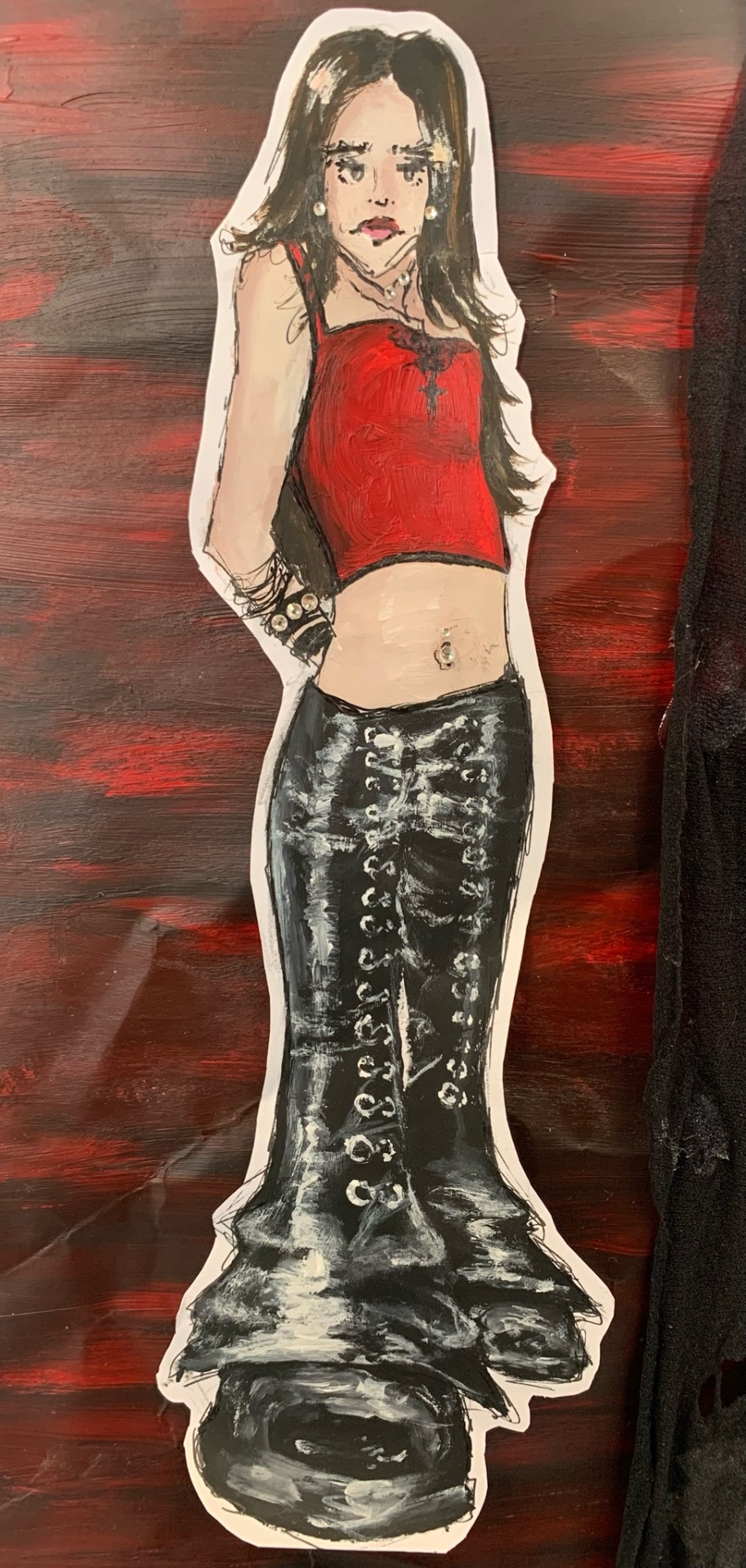
Above is a painting of myself inspired by the character design of ‘Downtown’.
5 notes
·
View notes
Text
Project : Portrait
Week : 8th April - 10th April
Process painting
The week I felt like experimenting. I had the idea of presenting myself in a more animated style, to break out of my cycle of structural realism. Rather than going in with a precise idea, I wanted to take on the method of process painting, working out how it will look visually in the moment.
To portray myself, I included imagery which suggested my hobbies, favourite colours and my personal style.
I used a mix of paint and collage.
Although this way of painting is very foreign to me, I enjoyed the productivity in creating something faster. I think process painting could be a positive thing to become familiar with.
8 notes
·
View notes
Text
Project : Portrait
Week : 8th April - 10th April
Life Drawing
Below are some drawings I did in the life drawing workshop. I used a mix of pen and charcoal to create these.
The 20 minute posed drawings are helping me to increase my pace, and also learn what materials work best for quick sketching.
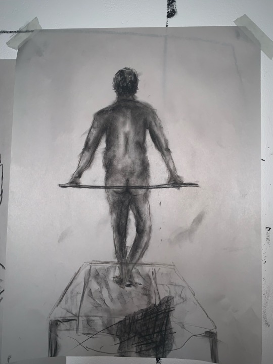
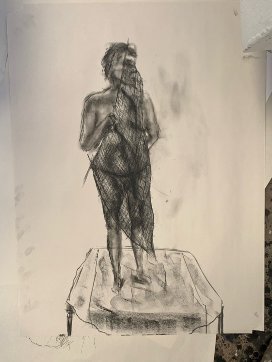
I attempted to focus in on certain body parts, to produce more sketches and understand anatomy in gesture drawing.
1 note
·
View note
Text
Project : Portrait
Week : 8th April - 10th April
Mood board
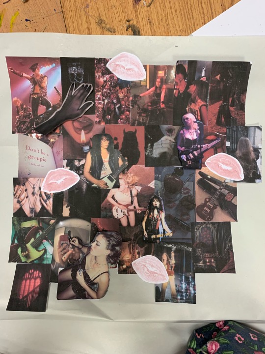
I asked some friends to send pre-existing pictures online to describe how I appear and present myself. I then collaged a mood board of the pictures.
1 note
·
View note
Text
Project : Portrait
Week : 19th March - 22nd March
Self - Portrait
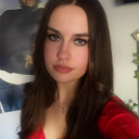
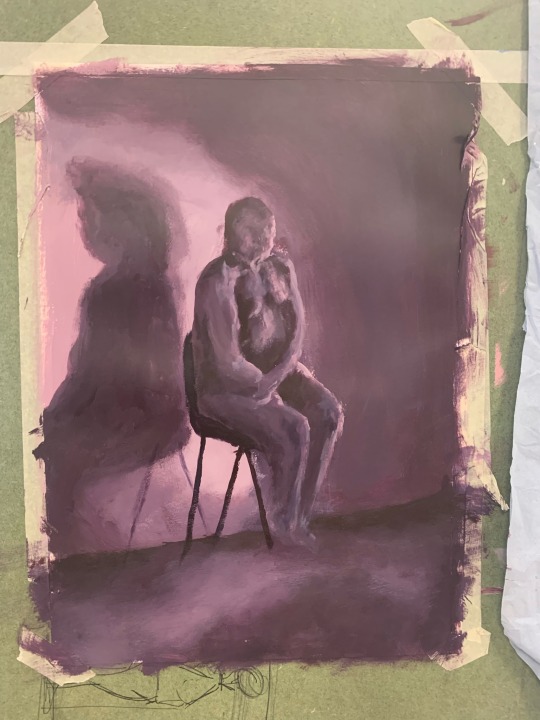
I painted a back-facing portrait of myself using acrylic paints.
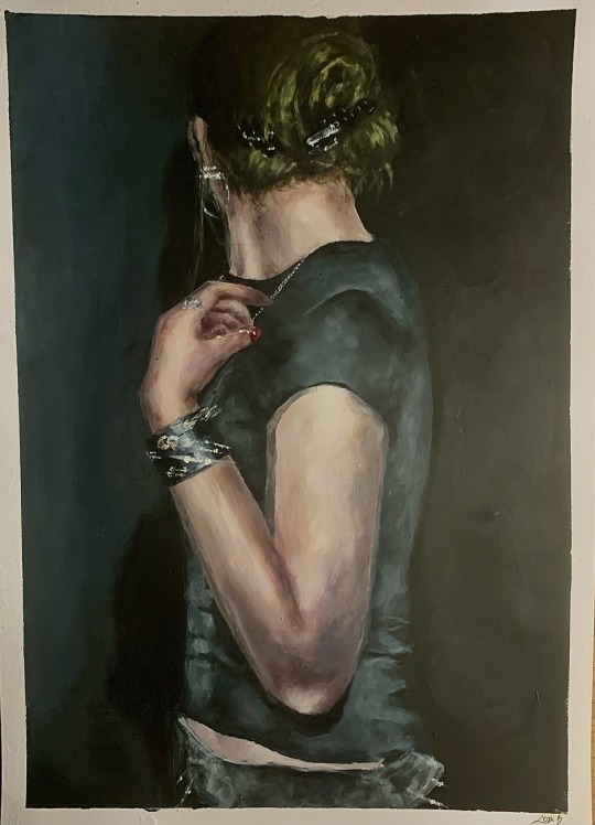
I used a neutral colour palette for this painting, with black, white, yellow, brown and blue tones. I made the background black to illuminate my pale figure, and to emphasise the shine on the accessories.
Below is my photograph reference.

To take the photo I used a flash, to capture my shadow on the wall and to highlight the silver jewellery. There was also motion to the camera, creating a blurred effect.
For the image, I wanted to document myself for my clothes and accessories. Showing how the way I dress can inform personality and identity, rather than my facial features and body.
#art student#lsad#artwork#portraiture#self portrait#acrylic painting#figure painting#painting#clothing#accessories#gothic
11 notes
·
View notes
Text
Project : Portrait
Week : 19th March - 22nd March
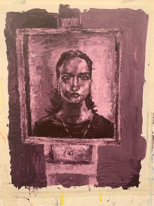
Artist Research : Michael Borremans
Michael Borremans is a Belgian painter and film-maker, who is influenced by the techniques of impressionist painters such as Degas, Manet, and Goya. But also mirrors the psychological, enigmatic subject matter of surrealism. His melancholic, staged portraits are what captured my attention, particularly the faceless paintings.


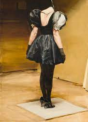

Due to the lack of identity that these figures have, they are almost objectified. They feel very lonely and claustrophobic, as they stare aimlessly at the wall, in which they are stood right up against. Almost as if they've been punished and are facing guilt.
I'm influenced by Borremans' range of back paintings, as they allow the viewer to only perceive the body. We can't make out the expression or feelings of the girls. We can only judge based off of their stance, the neutral colour palette and the composition. I'm looking at a similar idea for my concept for 'portrait', by focusing on how what I put on my body can shape a perception of me, allowing for pre-judgement.


Another appealing aspect to Borremans' work is his ability to transform his painting into film.


Based on a series of paintings and sketches from 2002-2005, he produced a film - 'Weight', in 2006. His absurdity in his subject matter translates from paper to camera with ease.
7 notes
·
View notes
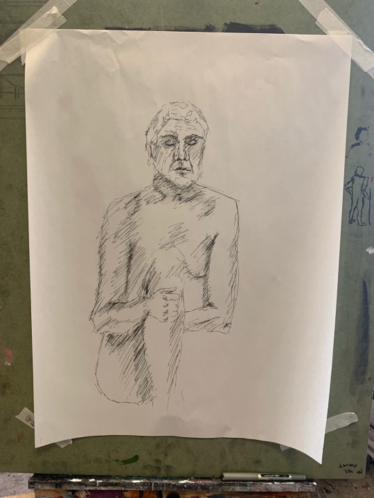
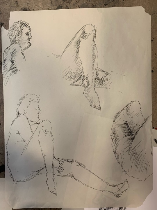
Text
Project : Portrait
Week : 19th March - 22nd March
Painting - Life Drawing
I went back to do some more figure drawing, but using Indian ink this time rather than paint. From my previous post, I found that Indian ink helps me work faster and to not focus too heavily on detail.
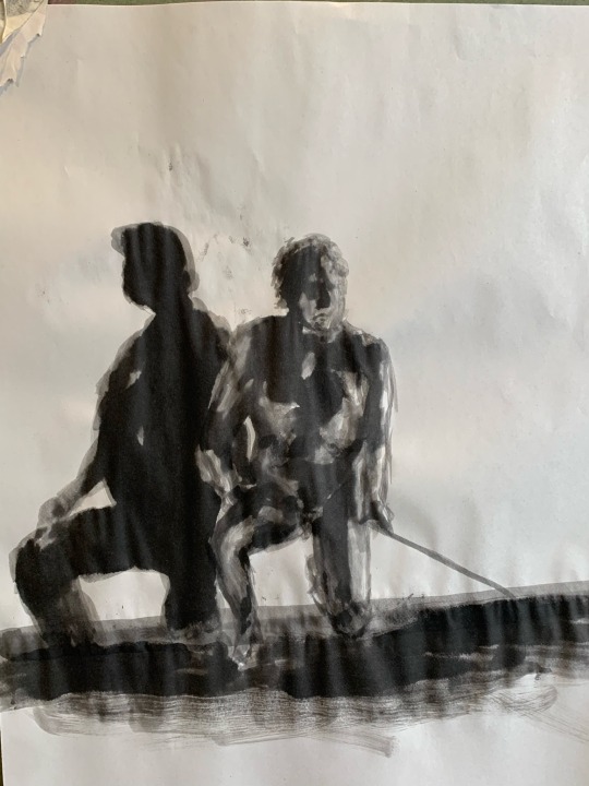
We were given 20 minutes to capture each pose.
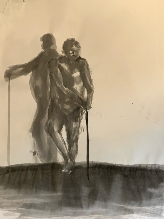
I found that the shadow for each pose was just as interesting to document as the pose itself. It’s almost like a second figure. The freedom of Indian ink helped me to note the depth of this shadow.
7 notes
·
View notes
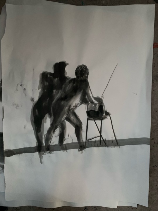
Text
Project : Portrait
Week : 19th March - 22nd March
Painting (Visual Brainstorm)
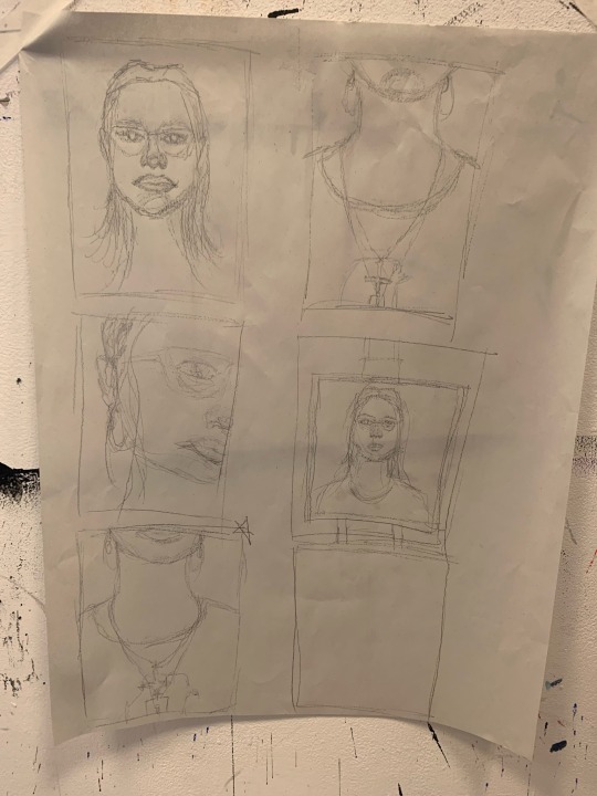
To start off the week we were advised to work large scale and face paced, both of which are out of my comfort zone, to brainstorm our concepts for ‘portrait’.
Working in this way made me learn that detail isn’t required when trying to conjure up ideas. It’s about focusing on the context rather than the finished product.
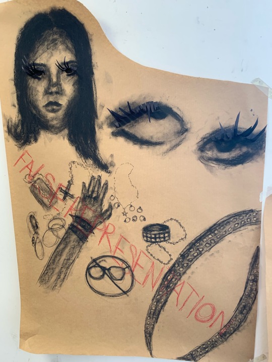
I began by visualising my concept of how my style can inform another person’s perception of me. How my accessories and image can contrast with my personality and the importance of self expression.
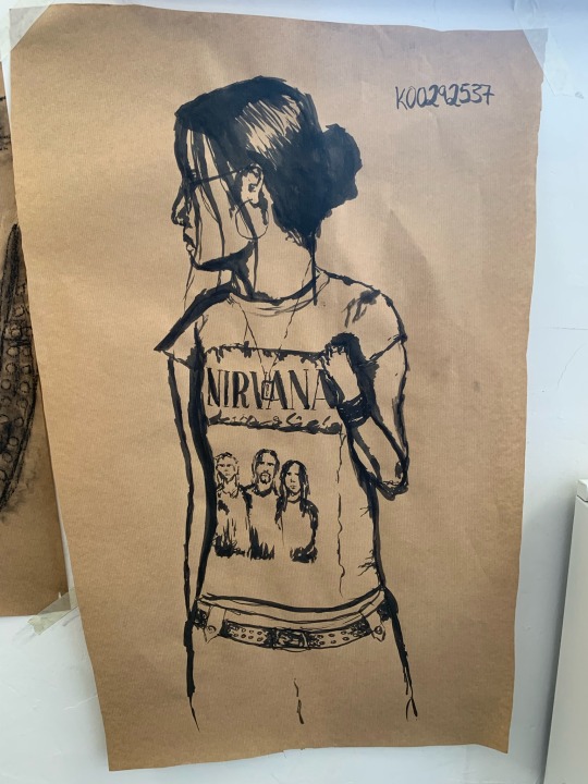
I then used Indian ink to paint a self portrait. I think using the Indian ink helps me work faster, as the application is so bold. As my face is turning away in the picture, it helps to focus on my clothing and jewellery.
In the end, I actually enjoyed working fast paced as I felt fulfilled in the amount of work that I produced.
3 notes
·
View notes
Text
Project : Portrait
Painting (Brainstorm)
Week : 11th March - 15th March
After getting the brief on Monday, I thought it would be a good idea to flesh out some ideas I have for this project in the first week.
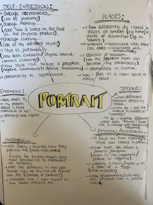
I made a quick mindmap to explore some concepts. in relation to portrait, I quite like the idea of looking into my fashion and accessories, the objects that I carry and use on a daily basis, and perceptions of others of myself vs. my own perception.
2 notes
·
View notes
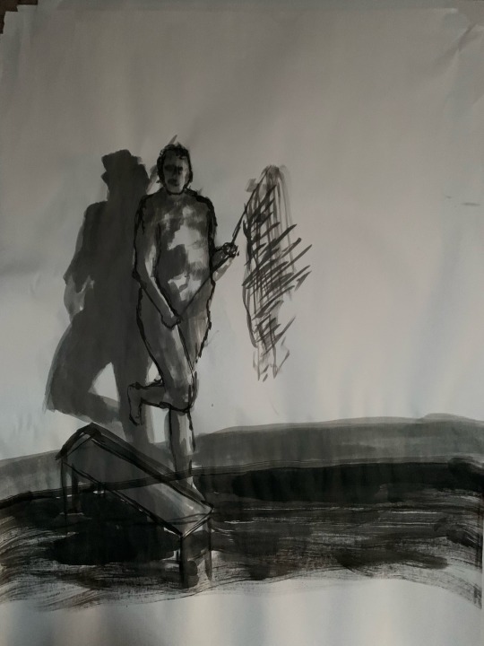
Text
Project : Portrait
Self Portraiture
Week : 11th March - 15th March
As a continuation of our previous activity of looking at the live figure, we did self portraits. The difference was that we could only use a pallette knife to paint our portraits.
We started by sketching out multiple thumbnails to decide what our composition would be. With the aid of a viewfinder, we were able to focus on different areas of our eyeline. I chose one that would include myself in the mirror, with the easel in the foreground.
For the painting, we mixed 3 tones - similar to the life painting in my previous post. I started by painting in the background, then the foreground. At first I found using only a pallette knife quite a challenge, as I doesn’t achieve great detail which I usually like. However once I got to the face, I got the hang of using it.
I quite like the impasto look of the finished painting. I find that it adds texture, which can add greater detail. I think this won’t be my last time painting with a pallette knife, as I like the finished product.
11 notes
·
View notes
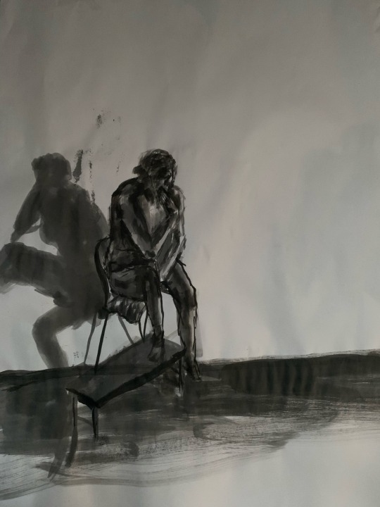
Text
Project : Portrait
Life Painting
Week : 11th March - 15th March
To start off this project in painting I did Sylvia’s workshop, where we did figure painting with a live nude model.
For our colour palette we mixed three tones - a light, medium, and dark tone. We began painting in the background first, then looking at where the shadow would be placed, and how the light would compliment it. We painted the live model last, as I’ve learned what you paint last is what stands out on the page.
I think that the angle at which I was painting at was quite unique. The shadow was very emphasised, which almost appeared as if there was a second figure in the painting.
At first, I found the live model painting hard as it is quite fast paced, which is out of my comfort zone. However I learned to not focus too much on detail when gesture painting.
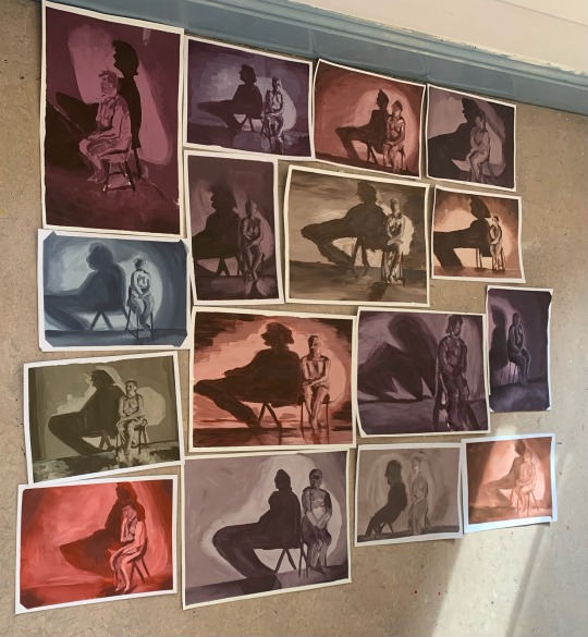
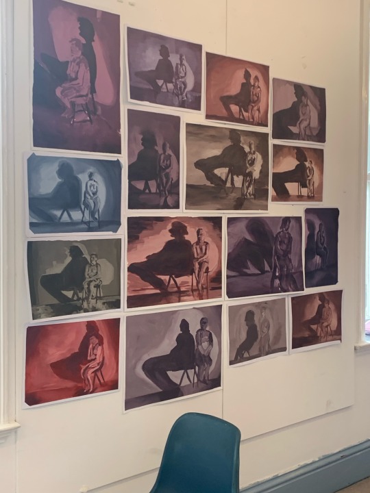
Later on, we combined the classes paintings, and arranged a composition to be hung on the wall. We arranged them on the floor first so we could play around with the layout, then hung them up.
#art student#lsad#artwork#portrait#portraiture#acrylic painting#live painting#live model#gesture drawing#figure painting
4 notes
·
View notes
Text
Project : Movement
Week : 26th Feb - 1st Mar
Artist Research : Chloe Tersigni
Chloe Tersigni is both an illustrator and musician, known for making the album artwork for singer Melanie Martinez’s album ‘Crybaby’. Tersigni was originally a fan of Melanie Martinez, who often made fan art. Melanie Martinez would later discover Tersigni, and was such a fan of her drawings that she asked Tersigni to illustrate the story book for her album.
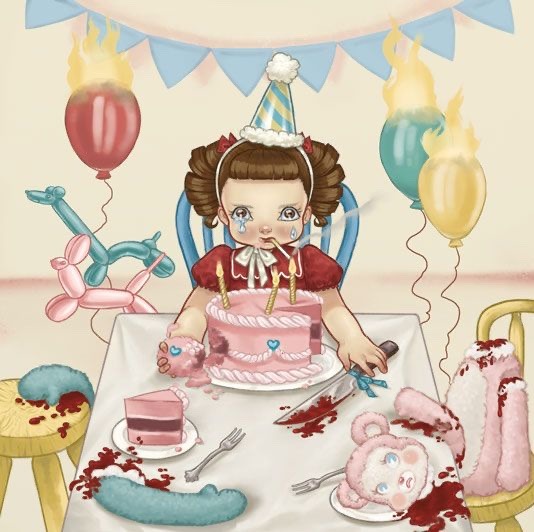
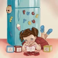
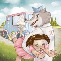
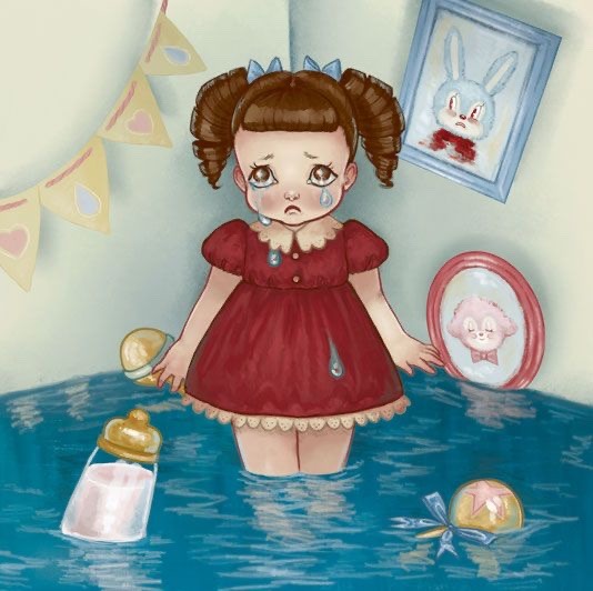
Tersigni’s visuals support each song on the album. They’re drawn in a childlike way, with light pastel colours and simple character design. But the details of images suggest dark themes ranging from loneliness and insecurity, to kidnapping and murder.
Above is a video of me flipping through the entire storybook, that’s found in the booklet of the cd. There’s an image to accompany the meaning behind each song, including a couple of lines of explanation, which reads like a poem.
Both the illustrations and songs from the album influence my theme itself for ‘movement’. Based on appearance and first listen, it seems to be quite playful and childish, but the details in the music and images inform nightmarish ideas.
Also, this album is very personal to me, as I loved it as a child and I still love it to this day. Although Melanie Martinez and Tersigni attracted some controversy with the potential danger of mixing childish imagery with non-family friendly ideas, I think their ambition to pursue their concept is admirable.
5 notes
·
View notes