k00203017
Bara-Bara
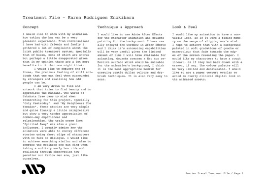
Karen Rodrigues Enokibara
Animation Student
112 posts
Don't wanna be here? Send us removal request.
Last Seen Blogs

hannislut
willing victim of a cannibal
lerutea
Look Around You

vernyvarelamusic
Verny Varela Music

tavernlords
Kerwin beats Greg up ™
freak-n-ready
We all are Freaks!
Text
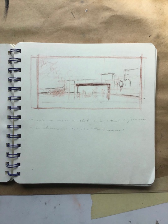
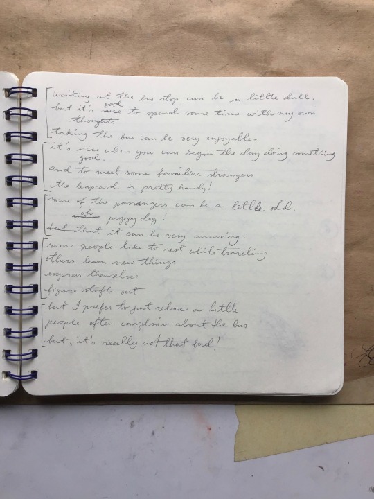
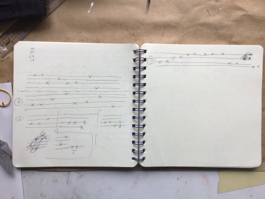
Background sketches, narration draft and some ukulele finger picking notes
0 notes
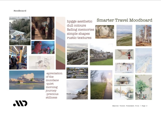
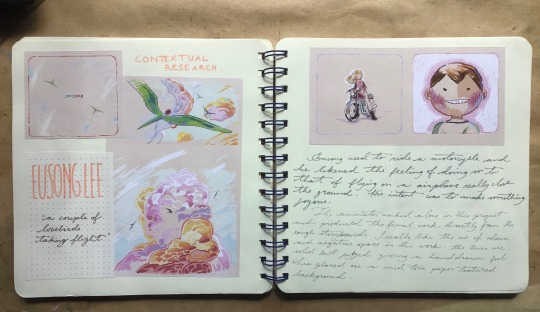
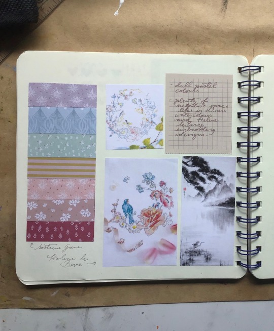
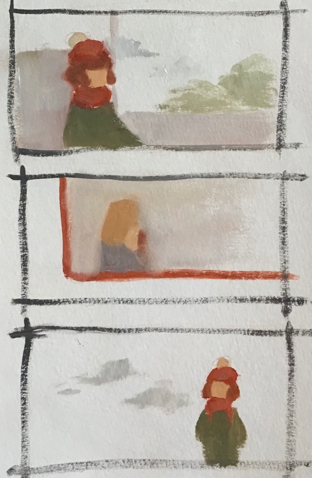
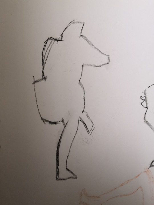
Text

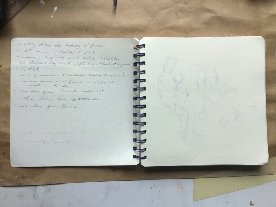
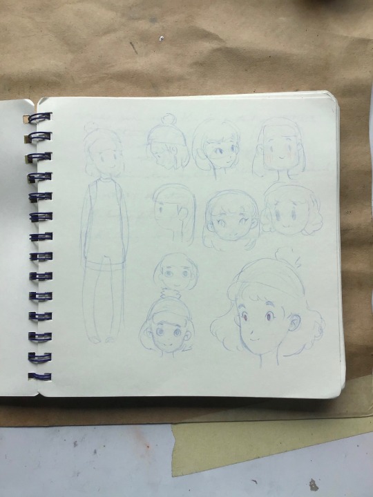
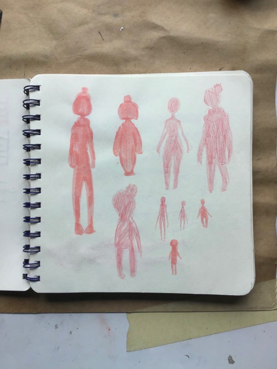
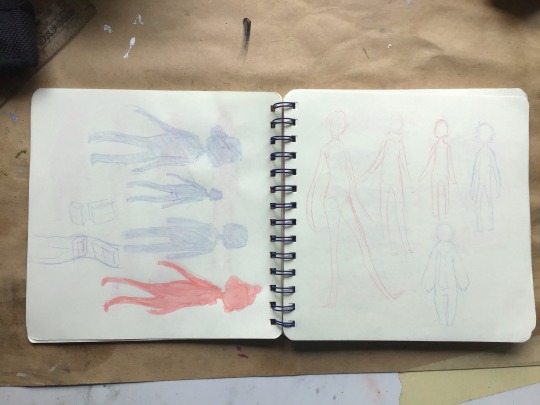
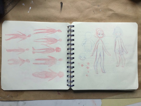
Preliminary work for the smarter travel project
1 note
·
View note
Text

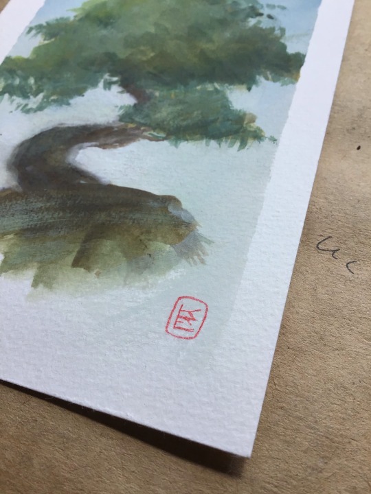
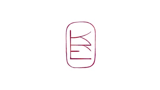
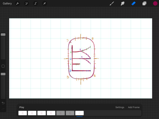
https://vimeo.com/415505327
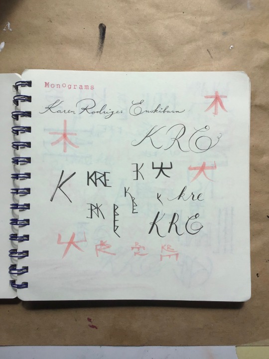
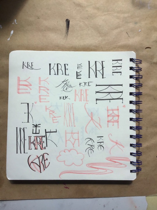
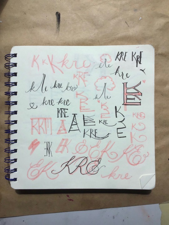
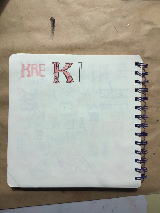
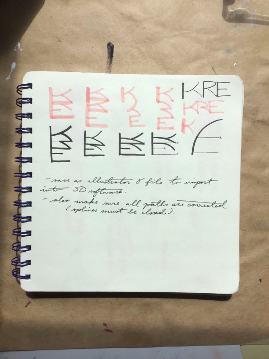
I was inspired by Albrecht Durer’s Monogram and Japanese name seals designs. I wanted to convey my love for my family roots and traditional craftsmanship. The first finished design I made felt a little too modern so I reworked it by making the lines more delicate and textured with a little colour variation, that way I could also use it as a signature for my illustrations.
vimeo
6 notes
·
View notes
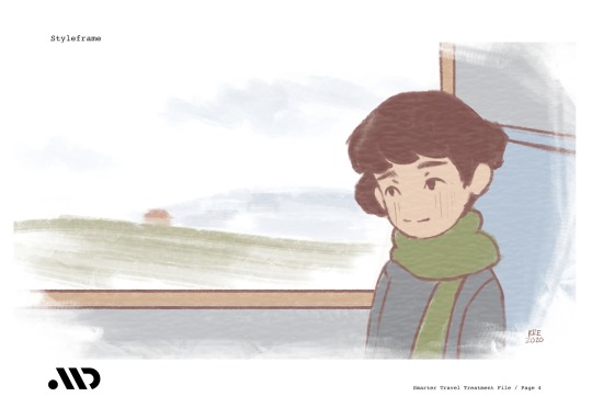
Text
Smarter Travel Project Update
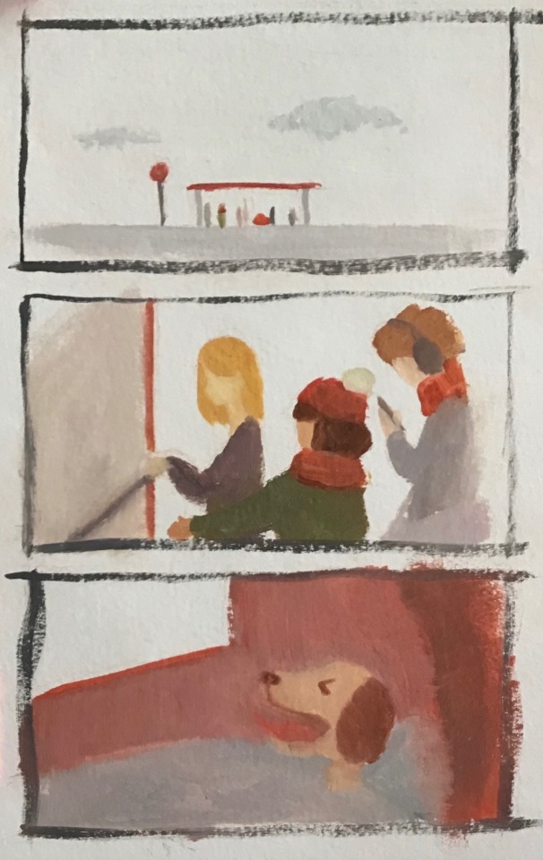
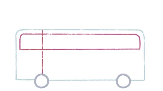
I made some colour storyboards in order to decide the arrangement of colours throughout the animation.
I painted a few backgrounds in oils and then abandoned the idea as the quarantine period extended and i would have no means to digitize them at home. Those were then painted digitally and i experiment with some colour-changing brushes. I liked how more saturated and happier the colours have become, as well as the chalky textures I was able to achieve with these new brushes. (although when i look at it now, it looks more like a health services advertisement then a transportation one.)
As I began to attempt animating in procreate I realized that in order for the canvas to be of an acceptable resolution I would only be able to have 20 layers (frames) per file. So I attempted to animate in segments of 1 -1.5 seconds. I removed the line work to make selecting and moving parts of the characters easier. Then I ran into what i assume to be a hardware deficiency, the IPad overheats to the point of being uncomfortable to use.
I am currently researching alternative methods to animate. My laptop is being shared with my younger siblings as they need to do their homework online now with the current circumstances, it is also very slow and runs the creative cloud apps very poorly.
I am thinking of perhaps animating traditionally, I have an a4 light pad that although quite small, i think will do the job with some layout paper. The pages could be scanned with my home printer and animated with a simpler software. I must purchase or improvise some registration pegs.
6 notes
·
View notes
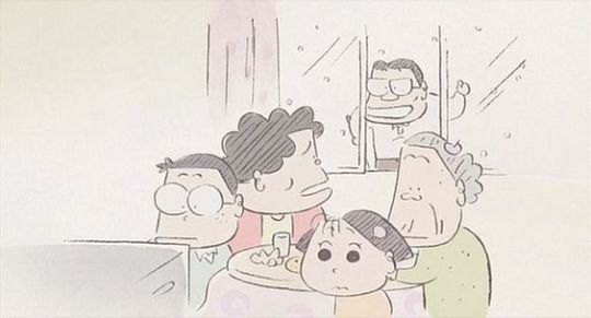
Video
vimeo
Final Animatic
3 notes
·
View notes
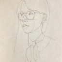
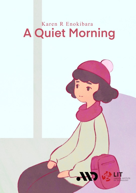
Photo
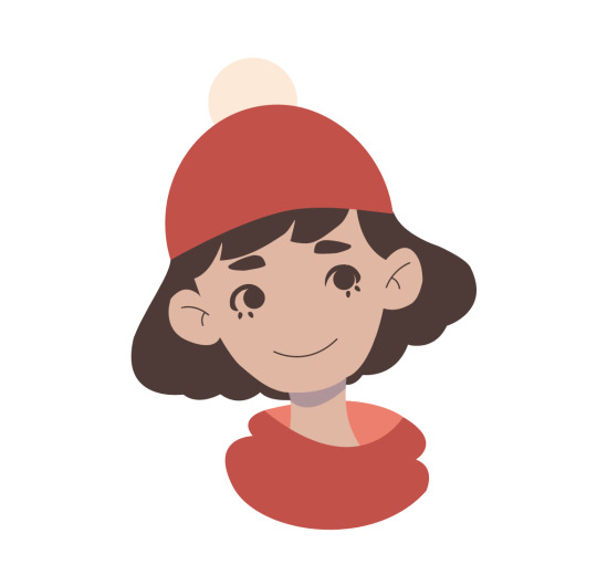
I made a portrait of my character from the smart travel animation project using the illustrator techniques I learned yesterday :3
5 notes
·
View notes
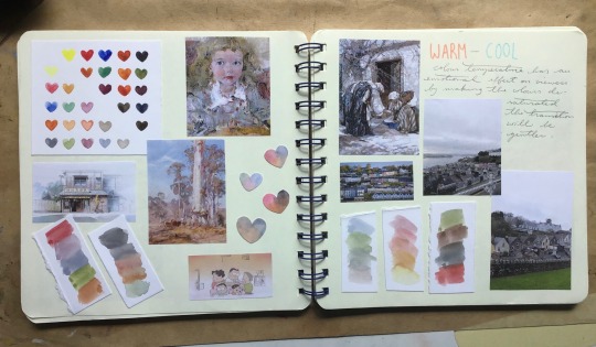
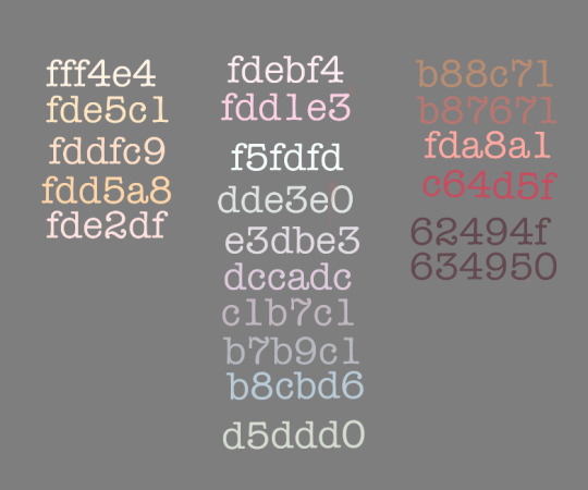
Photo
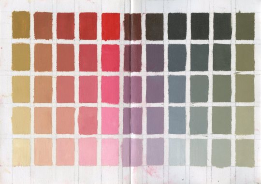
I made an oil colour chart for Drawing Awards with the Zorn colour palette. Zorn was a 19th century Swedish figurative painter who was well known for using only 4 pigments in his palette, a white, ochre, red and black. This limitation resulted in very harmonious paintings and did not impede him from achieve very naturalistic results. Although it is mostly used in portraiture I think it would work very well for my animation as the temperature range is quite wide and chroma very low, making it very comfortable to look at.
2 notes
·
View notes
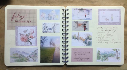
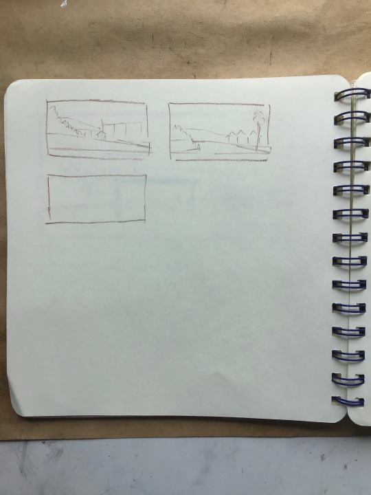
Photo
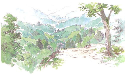
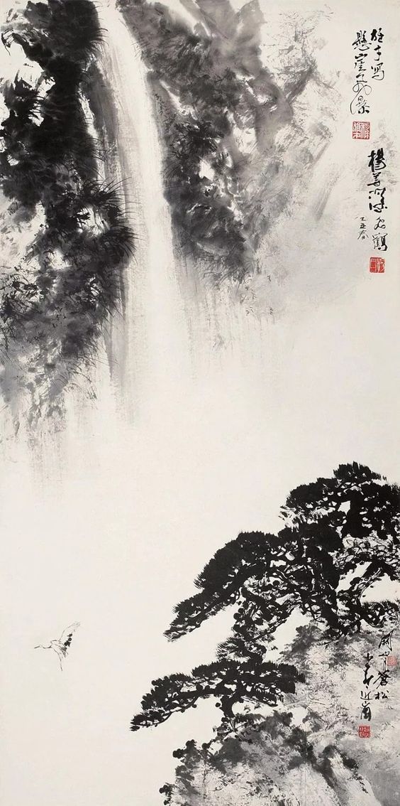
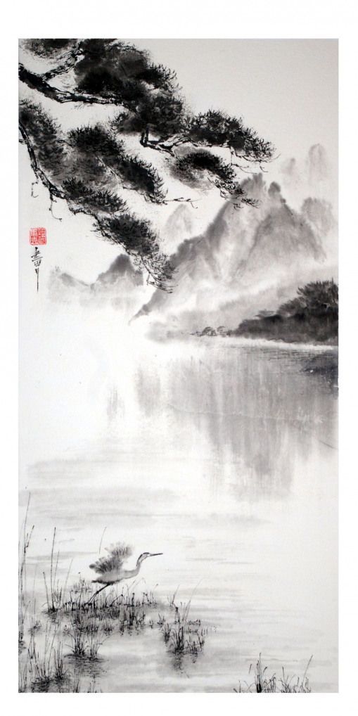
As I was drafting the layout for my animation I began to struggle with the background. There was far too much detail and it became very distracting so I went back to my moodboard and looked at the works that inspired me at the beginning of the project.
I’d like to try and strip back as much of the background information as possible and focus more on the character interactions, referencing the backgrounds of Isao Takahata’s works and Chinese landscape paintings.
1 note
·
View note
Photo
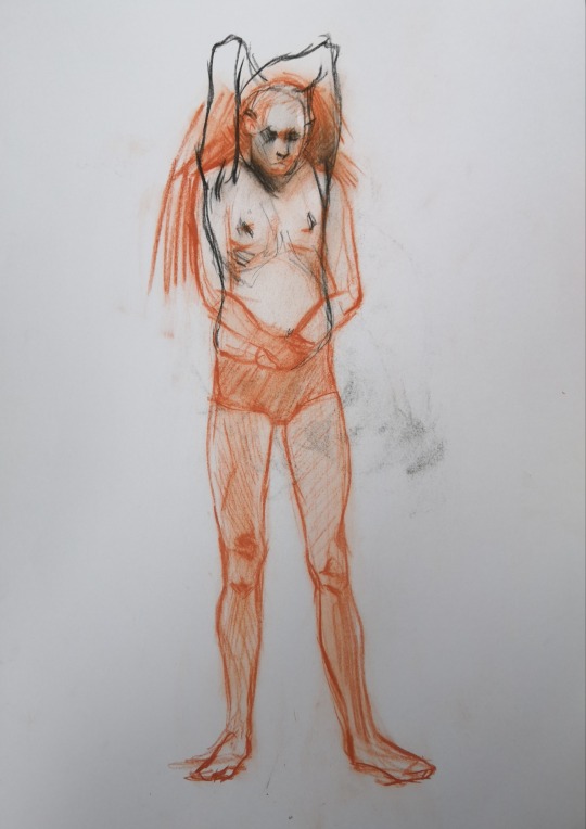
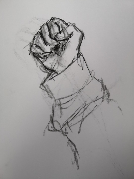
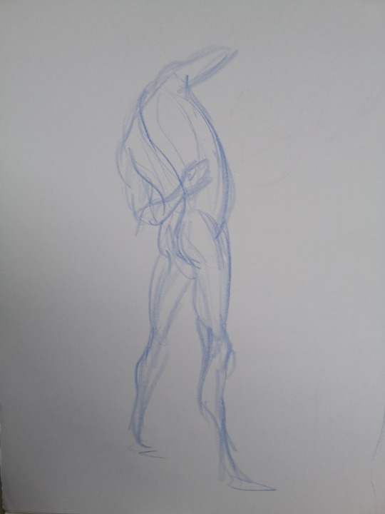
Life drawing efforts from a while ago
4 notes
·
View notes
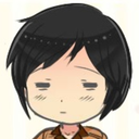
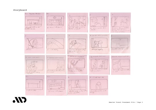
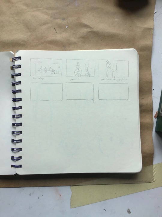
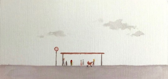
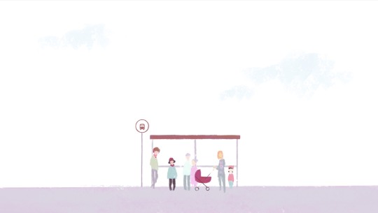
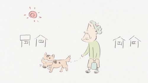
Photo
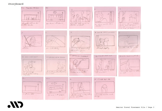
Smarter Travel Campus storyboard. I sketched them in post-its so I could move the scenes around and choose a sequence with ease then stuck them to a sheet of paper and scanned them.
6 notes
·
View notes
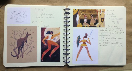
Photo
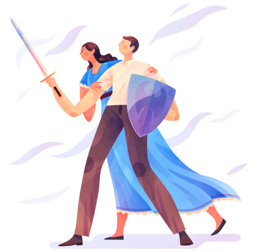
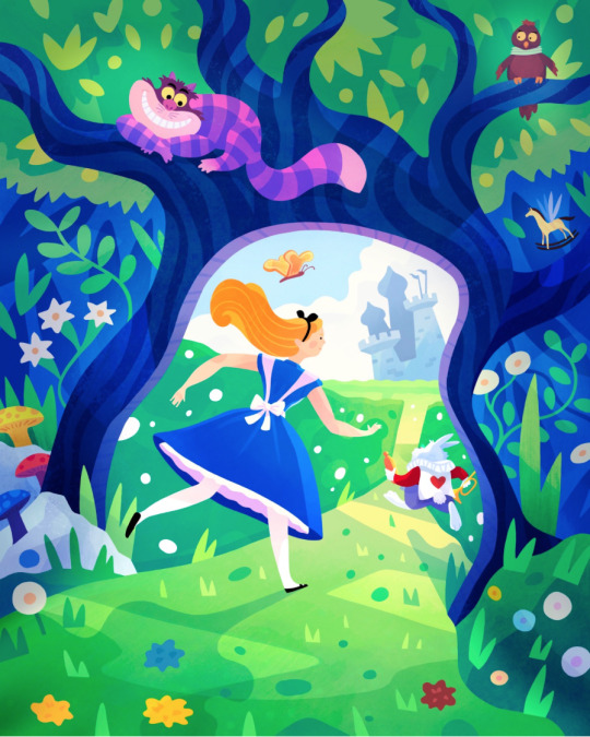
I came across Jarom Vogel when researching procreate a while ago. I really enjoy the simplicity of his character illustrations and the gesture of their poses. I’d like to achieve something similar in my smarter travel project.
2 notes
·
View notes
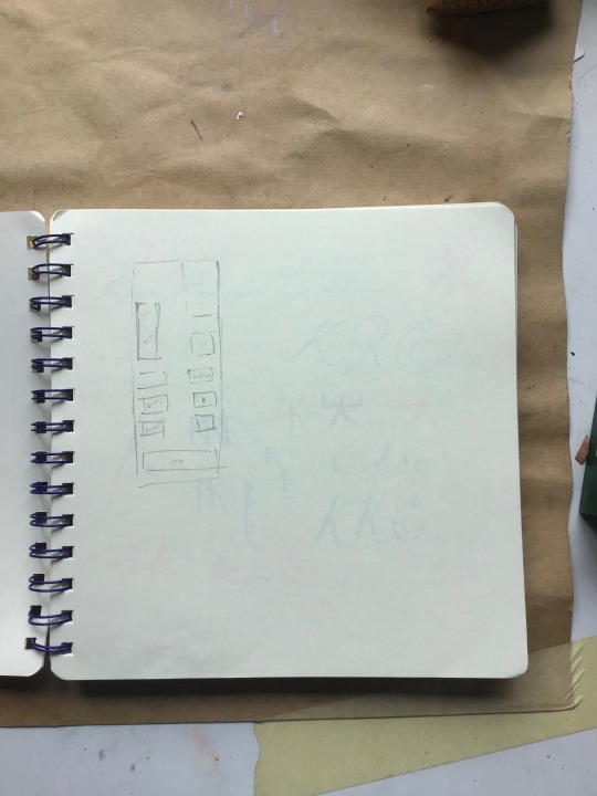
Text
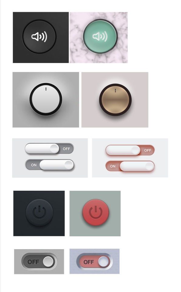
Photoshop exercise where we were asked to copy the interface buttons as best as possible. I played around with different layer modes to make them pretty.
4 notes
·
View notes
Photo
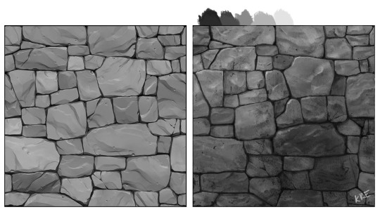
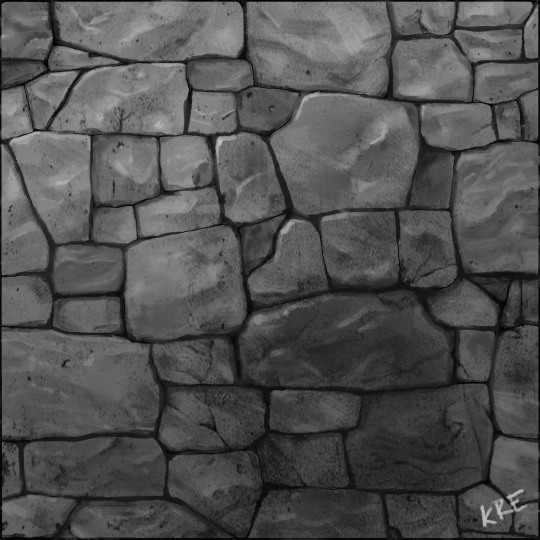
Last weeks digital painting exercise. Did some simple rendering then overlayed some textures in various layer modes, the dark splotch came in one of the textures and I thought it’d be fun to adapt it into the final painting.
3 notes
·
View notes