
Last Seen Blogs

athena-85
Bread & Roses

reylokylo
Wishadamwasmine
onokunibelly
Hugebelly Lovers

with-love-from-hell
You are not lost

doyceandclennam
Doyce&Clennam
Text
Week 15 - Final Thoughts
Our world has been quickly switching to a more online society. Especially with the current pandemic and a lot of people being forced to adapt to online work and socialization, I see an even larger potential shift to online. I think making the online world feel more and more like the real world will the next big steps designers will face. I think augmented reality will be a forerunner in that type of technology. Just based off the science fiction movies I have seen, I can imagine work meetings or parties where no one is physically there but you can still see them in 3D and not just on a 2D screen. Similar to Augmented reality, I definitely see a future for virtual reality as well. One of my favorite books is one that is centered around virtual reality called “Ready Play One,” and the dystopian world in that story is not too far off from today’s reality. Future designers will need to design all the small details in basically everything to make the virtual world feel real. It sounds like a very daunting task but it is one that is very plausible. According to an article on ZDNet by Steve Ranger, AR and VR technologies are very similar to where cinema and television were in the 1930s. We just need to do with VR what we did with television and figure out how to make the new technology something everyone needs. We have the technology now but it is not to the level where it can be practical for day to day use. If we do see this rise in popularity of an online virtual world, the real world will need to become just as extravagant in order to get people out of their houses. This is how I can see computational architecture becoming more mainstream. The trends right now are emphasizing minimalism and simplistic designs, but computational design is almost the opposite of it. I believe that once people begin to see what designers are capable of, by utilizing computers and engineering to create complex and visually appealing structures, that that will become the new normal. But in the end, all these new design and architectural forms are limited by the technology we have available to us. It is impossible to predict the future, but I’m excited to see what it has in store for us.
Thanks for a great semester! This was my first design class and I really enjoyed learning more about the history of what I’m so interested in!
-Jack Lehtinen
https://www.zdnet.com/article/a-look-into-the-future-of-ar-and-vr-for-business-and-pleasure-from-tentacles-and-time-travellers-to-smart-soldiers-and-digital-doctors/
0 notes
Text
Week 14 - Your Choice
This semester has introduced me to a lot of new information within the world of design. I really like that I can finally place names to design styles that I have always been drawn towards. I have discussed in previous journals about my interest in the Art Deco design style. Once I’m making real adult money I am for sure going to use it as inspiration for my interior design. But Art Deco is not the thing that I wish to discuss this week. Ever since learning about the term Planned Obsolescence I have had it in the back of my head whenever I am buying anything new. For example, I recently had to buy a new phone after only having my old one for about 2 years. I keep excellent care of my technology (especially when it costs a few hundred dollars) but it seemed that my device just started acting up more and more after that 2 year mark. The battery could barely hold a charge, it would randomly shut down a handful of times every day, along with a handful of other issues. It made me wonder if the phone was even designed to be used for a long stretch of time? Thinking back to planned obsolescence, it probably wasn’t. I experienced another example of this after my semi new desk lap broke. I got this lamp right before leaving for college, so I had it for about three years. When I mentioned the lamp breaking to my father, he told me that I can have the one he used in college. I am currently typing this journal next to a completely functional lamp that is over 30 years old. I am confident when I say “completely functional” because the light turns on while my 3 year old lamp is sitting in the trash (where it belongs). You would think that 30 years of lamp design could create a product that could withstand anything... But unfortunately planned obsolescence might have gotten in the way. This then made me wonder whether or not planned obsolescence have helped or hurt the world of industrial design? Has updating and “improving” products year after year encouraged advancement? Or has the thought of designing items with a short lifespan hindered designers from creating quality products? I have no idea what the answer is, but it is definitely an interesting thought experiment.
0 notes
Text
Week 13 - New Media
When comparing the technological advancement of the human race from any other period in time to today, our current speed of creation exceeds any other time. We continue to update and invent new technology to better our quality of life. I was born in the year 2000, and in my own 20 years on this planet, I have probably seen more progression than all my ancestors combined. This is due to the invention and mass expansion of the internet. We have learned a lot about the history of design in this class, and one thing that design has had in common no matter what century you look at is that it is always limited by the technology at that time. Before the printing press, print media was expensive and difficult to produce. They simply did not have the means to improve that field until the printing press was invented. Similarly, in the 1990s, just as the world wide web was gaining popularity, the web designers were limited to what they could and could not do. They did not have the technology to add more than the website necessities. In other words, they couldn’t afford to make websites look pretty. With what we are used to today, the digital aesthetic during this time was not too impressive. But it did not take long for the technology to advance to the level we know it today. The invention of the Flash player allowed for a more interactive experience and the use of motion graphics expanded what web designers could do. One very interesting website that you may be familiar with is archive.org. Through this website you can type in almost any URL and see what the website looked like in different eras of its life. I was curious to see what google.com was like in 1998, and if you try this you can see first hand just how far we’ve come in such a short time. I spent about 20 min just clicking through the years to see how Google got to where it is today. I highly recommend trying this if you haven't already. So overall, the digital aesthetic has changed a lot since the invention of the internet and it will continue to evolve just as every other design form has.
0 notes
Text
Week 12 - New Media
This week's topic of discussion, along with the next weeks, is very interesting to me as I have never known a world without this “New Media.” I was born January of 2000, making me 20 right now, and some of my earliest memories are playing computer games with my sister that we would rent from the library. I have been surrounded by interactive design for so long I’ve become unaware of its existence. Similar to the saying, “you do not know the worth of something until it is taken away,” this week’s lesson didn’t necessarily “take interactive design away” but it allowed me to take a step back and become aware of how expansive interactive design is in our media. In my opinion, the field that has had the most influence on this spread of interactive design is the internet. An argument can easily be made about any other field like smartphone or computer design, but without the internet, it would be impossible to be as interconnected as we are today. With the coronavirus pandemic currently impacting the lives of nearly everyone, many of us are staying locked in our homes, but because of the internet, we can still stay connected to the world around us, even though we are not able to experience it. In order to ensure that the internet is easily accessible for everyone, interactive designers have designed everything from your mobile devices to websites that are simple to use. According to an article on hostingtribunal.com, there are about 2 billion website with roughly 400 million of those websites still currently active. And each one of those websites will have incorporated some form of interactive design into them. As time passes, and technology continues to improve more and more, the internet will always be the backbone of the design. We are seeing a shift in today’s technology as common everyday appliances and objects are becoming more interactive. Even refrigerators today can connect to the internet! The technology of our world is advancing faster than it ever has in human history. I believe that without the internet, that would not have been the case.
0 notes
Text
Week 11 - Graphic Design
From what I’ve gathered in this weeks readings, a citizen designer is a designer who focuses their energy towards improving our way of life.One quote from Graphic Design a New History, captures the ideals of Citizen Design perfectly. The quote goes as follows, “Call for designers to see themselves as public intellectuals with profound responsibilities to shape society” (p429). The “Citizen Designer” movement attempts to influence those with a career in design to focus not only on corporate assigned projects, but also stretch their designer legs a bit and improve the world around them. The increased popularity of DIY in the past few decades expanded the reach of design to the general public. In today’s day and age, everyone is encouraged to be a designer in order to express their individualism, it is no longer exclusive to those who have been professionally trained. This extended reach of design also applies to the ideas behind citizen design. Because citizen design is not tied to any large corporation or advertisement scheme, anyone can dip their toe into improving the world through design. Over the past few centuries, as technology advanced and life improved we no longer have to worry about essentials like finding food or staying alive. America and other first world countries have the privilege to put effort into social change and solving equality related problems. This added time and reduced stress allowed us to find ways to further improve our way of life. Citizen Design was born out of our constant need for advancement and betterment in everyone's lives. In my opinion, I enjoy the optimistic ideals that built the premise behind this movement, because it put the future in the hands of everyone. With the fast sharing of information of the internet, no longer do we need to rely on other people or large businesses to role out new products. If someone has an idea, they have the ability to express that idea to the world, designing a better life for the future.
0 notes
Text
Week 10 - Graphic Design
Throughout this course, I’ve learned about many different design styles that I have seen in the past but did not know any of the details, or the history behind them. One of the eras of design that I fell in love with was Art Deco. Before even learning about typefaces, the Art Deco era of furniture and architectural design caught my eye. I believe that it is the symmetry, geometric shapes, and hard lines that really catch my eye. From all the images in the assigned readings this week, fig 4.34 was the one that incorporates everything I love about the Art Deco design style. Designed by Morris Fuller Benton, this specific typeface is called Broadway, as quoted in Graphic Design A New History this typeface is, “Essentially a revival of the early nineteenth-century fat faces fused with a sleek geometric sense of form.” The poster this type was used in (fig. 4.34) was for American Type Founders Company and seems to incorporates the geometric lines used in the initial spacing of the text in the final design. Even though the text was not designed for widespread public use because of its low level of readability, the typeface achieved its intended goal of drawing immediate attention to itself. This 1928 design has kept its relevance as it is still used in many Nightclubs and Restaurants that wish to project the sophistication that comes with the typeface. While writing this I am having a hard time putting into words the positive feelings I have towards this poster. It might just be my obsession with order and cleanliness in my real life but when I look at the poster I feel a sense of relaxation. I could also describe it as the opposite of how I feel when I see a Dada poster. I’m not knocking Dada but it’s intended look in many posters is not the same as this one. In Benton’s design, the subtle clean lines that form the spacing for the rest of the material is my favorite aspect. What could have been empty space, is now something that unites all parts of the poster.
0 notes
Text
Week 9 - Industrial Design
Brooks Stevens, as we know, was born and raised in Milwaukee Wisconsin. According to the Milwaukee Art Museum website (mam.org), he was born on June 7, 1911, and ever since he was a child he was interested and encouraged to pursue design. Even when he developed polio at age 8 his father always pushed him to continue sketching and crafting. In his college years, Stevens attended Cornell University for architecture only to drop out before his graduation. With no college degree, Steven returned to Milwaukee to do some small design jobs which will eventually lead to him to open his first design office a few years later in 1935. Even though he knew large cities like New York already had an established design community, Stevens decided to stay in Milwaukee because as he stated Milwaukee was, “where the business was” (mam.org). His timing could not have been better, by 1939 his office has grown to five people. As discussed in previous weeks the end of the great depression marked one of the most influential times in design, specifically industrial design. According to the video, American Industrial Design: Design in a Nutshell, to combat this decline and to get the public spending money again ... Industrial Designers began introducing products with sleek and futuristic designs. These new products got the public buying again. Stevens became Milwaukee’s epicenter of design. He assisted in the design needs of local businesses and manufacturers while still working on larger design projects like his automobile designs. His influence on our city gained him much popularity in the design world, but the one thing he was most known for was his unintentional coined phrase “planned obsolescence.” Stevens defined it as “ instilling in the buyer the desire to own something a little newer, a little better, a little sooner than is necessary” (mam.org). This philosophy continues to be controversial even to today which further emphasizes the impact a Milwaukee native had on the field of industrial design.
0 notes
Text
Week 8 - Industrial Design
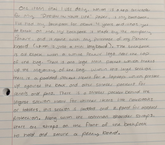
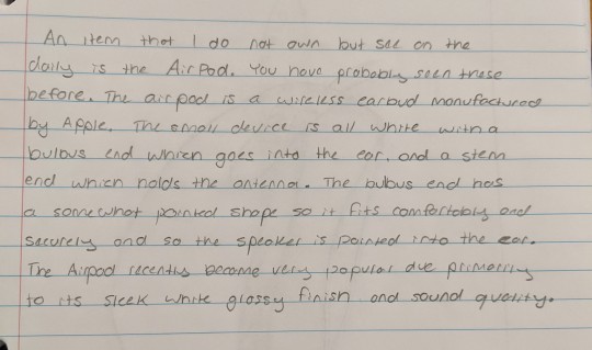
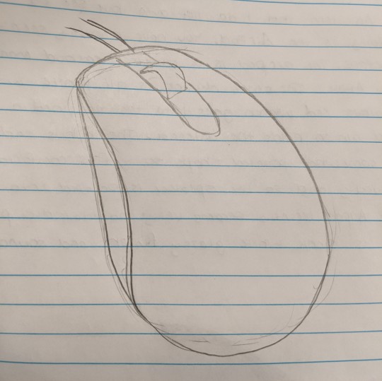
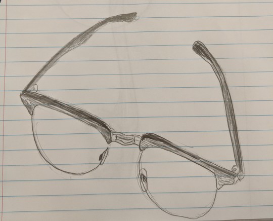
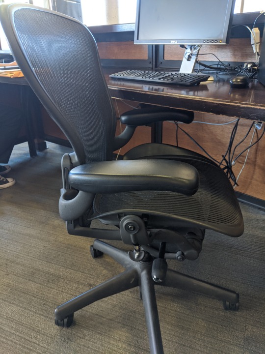
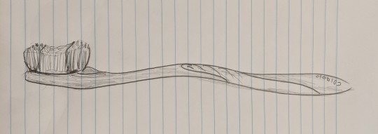
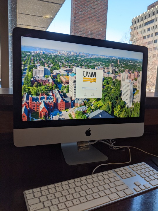
Starting after the great depression, designers and manufacturers were in a rut because the public was less likely to spend their money. According to the video, American Industrial Design: Design in a Nutshell, to combat this decline and to get the public spending money again, manufacturers introduced items with new materials because the use of molds became increasingly more popular. The materials included chrome, plywood, and vinyl. These new items sparked an interest in the consumer. Industrial Designers began introducing products with sleek and futuristic designs. Americans found as the video stated, “great positivity in these futuristic forms... American industrial designers realize that by making objects look great, people simply wanted them more.” This was the spark that leads to the emphasis on aesthetics and function in everyday products. Included are 10 pictures, descriptions, and drawings of industrial design I see every day. All these products are similar in the fact that they are all composed of overlapping design elements. This type of modern sleek design, as previously stated, began after the great depression and has stuck around since. Even objects as mundane as a toothbrush and a water bottle have no hard edges within its design. Both items have no need to be visually appealing yet are. The stainless steel finish of the toaster and automatic can opener is a more modern version of the chrome products also seen after the depression. Even the things we accessorize with reflect the evolution of industrial design. From the examples I gave, the glasses and Airpods are both simplistic in their design, almost as if they wish to go unnoticed but still remain stylish. The technology we use every day is another example of modern design. I included a picture of an IMac, but all devices nowadays stress aesthetics almost as much, if not more than function. As consumers we want our devices to look beautiful, meaning minimal visible edges, elegant colors (greyscale, darker colors), and little to no complexity. I included the chair in my examples because even though it has complex functions like adjustable heights and armrests, the overall design still has no noticeable hard edges and is still sleek regardless. These staples in industrial design have stuck around for nearly 80 years, although some things have evolved over time it's interesting to see the many aspects have remained constant.


0 notes
Text
Week 7 - Architecture
According to the website, universaldesign.ie, there are 7 key principles to universal design. These include Equitable Use, Flexibility in Use, Simple and Intuitive Use, Perceptible Information, Tolerance for Error, Low Physical Effort, and Size and Space for Approach and Use. The main purpose of Universal Design is to make buildings, products, and environments accessible for all people. The importance of universal design was especially prevalent in the 1990′s after the enactment of the ADA or Americans with Disabilities Act. This law, according to adat.org, “is a civil rights law that prohibits discrimination against individuals with disabilities in all areas of public life, including jobs, schools, transportation, and all public and private places that are open to the general public. ...It guarantees equal opportunity for individuals with disabilities in public accommodations.” Pre-existing buildings and new architecture needed to ensure that someone with a disability (ex. wheelchair-bound) will be able to use the facility as someone without the disability. I will be focusing on the principles of Low Physical Effort and Simple and Intuitive Use, specifically on how those principles relate to handicap doors seen in all public buildings and crosswalks seen in our environment. If a door is not already fully automatic for any person there is almost always a button that could open the door instead. Regarding the simple and intuitive use, this handicap button is always labeled so the user knows who and what the button is used for (common handicap logo). The door that the button controls are labeled as well with the same logo. This button is always around waist height or lower for those of us that are able to walk. At first glance, this may seem out of place, but the button is perfectly placed for those of us who are in wheelchairs. This references the low physical effort principle, as the wheelchair-bound does not need to reach far for it. These two principles are seen everywhere if you pay attention. In our crosswalks, the placement of them are always in high traffic areas (low physical effort) and most either have road signs to alert cars to slow down or actual signals when or when not to walk (simple and intuitive use). There is a reason this avenue of design is called “universal” design because if you know what you’re looking for you can see it everywhere.
http://universaldesign.ie/What-is-Universal-Design/The-7-Principles/
https://adata.org/learn-about-ada
0 notes
Text
Week 6 - Architecture
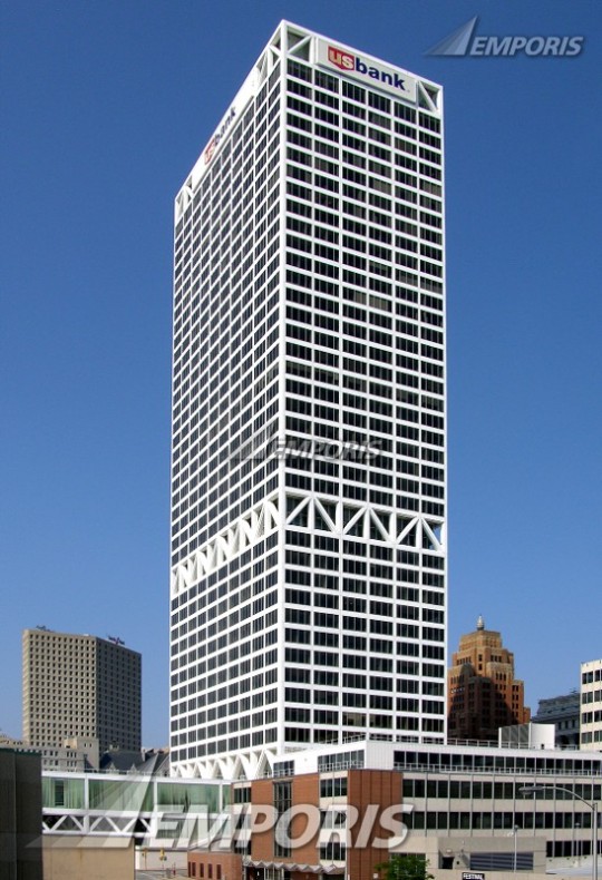
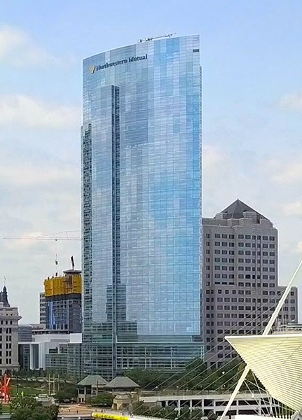
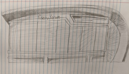
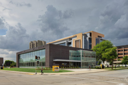
While walking through downtown Milwaukee this week a few things caught my eye when focusing on the architecture and how it has evolved over time. One of the most obvious architectural aspects that I took note of was the difference between old and modern architecture. In order to understand the evolution of Milwaukee’s architecture, I did some research on the history. According to A Brief History of Milwaukee, Milwaukee experienced its largest boom in population between the years of 1835 and 1854. This influx came from fur traders and later German immigrants. The first skyscraper was The Pabst building, built in 1891. This building seems to have a Neo-Gothic style of architecture and drew on some German influences in its Design. The Pabst building was demolished in the early 1980s but in its place, the 100 East Wisconsin building or “The Fashion building” was erected with a similar German Neo-Gothic style. The other lesser buildings built in the late 1890s and early 1900s, many of which still stand today, were built with similar designs in mind. Those buildings are easy to pick out as they obviously do not have the modern architectural aspects we see in newer buildings. A few decades later came the Modernist era of architecture. It is evident when looking at The US Bank building which was built in 1971. This is a good example of The International Style because of its clean lines, use of white, greys, and blacks, and easy geometric shapes. Some of the Newest additions to Milwaukee and it’s skyline is the Northwestern Mutual Building and the Fiser Forum. These buildings I would classify as post post modernism as the interesting curves incorporated in the design do not match modernism or post modernism architecture (as seen in this week’s lecture). Unlike the US Bank building, the Northwestern Mutual building is not a simple geometric shape. It is a combination of complex angles on one side then one continuous curve on the other. The complete glass exterior further solidifies the design as a departure from modernism and post modernism. The Fiser Forum, similar to the Northwestern Mutual, has large curves in the design, basically forming one side and the roof of the building. It will be interesting to see the evolution of architecture evolves in my time. I will also like to see how modern architecture will be classified under, or if it will continue to be grouped with Modernism.
0 notes
Text
Week 5 - History of Design
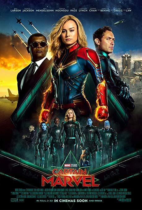
Throughout our reading and lectures of the history of design, the biggest influences on the field have been countries that you might expect, for example, France, England, America, etc. It was surprising to learn that both Russia and Germany had some of the largest contributions to design that we still see in modern design today. The first parallel I noticed was the similarities between movie posters today and those done in the 1920s by Alexander Rodchenko. As stated in Graphic Design A New History, for the 1924 film Kino Glaz, “Rodchenko created a poster advertising the film that makes use of his favored triangular composition” (198). This same triangular strategy of poster design is used today, most obviously in the posters made for Marvel movies. I included a picture of an advertisement for the 2019 movie Captain Marvel. It is easy to see how the triangular composition of this poster draws the eyes from the bottom of the poster to the top where the focal point of the design is. The eye is the emphasis in Rodchenko’s design (fig. 5.26) and Captain Marvel is the emphasis in this one.
The next big parallel I saw was the Bauhaus, specifically the architecture and furniture design. The Wassily Chair is what stood out to me (fig. 6.17). If you showed 100 people a picture of this chair and asked: “what year was this chair designed in?” I guarantee that a large portion of those people are not going to say a year anywhere close to 1928 (the actual year the chair was made). The designer, Wassily Kandinsky, designed the chair with a few things in mind “beauty resting in proportions and the balance of simple forms” (226). The design of the chair doesn’t need to be complex to be beautiful, which is a mindset seen in furniture design today. I included a picture of a chair uwm library. Although this chair is not as visually pleasing, like the Wassily chair, it has a simple metal frame with a fabric seat and backrest. It follows the Bauhaus idea of “less is more.”

The final example also relates to Bauhaus, specifically the Dessau Bauhaus architecture. When I first saw the image on the Bauhaus building in Dessau (fig. 6.16) I instantly thought of the UWM Welcome Center and the new Kenwood building. The Bauhaus building is described as “geometric shapes interacting in a dynamic fashion… constructed of the most modern materials-- steel, reinforced concrete, and glass” (225). That building was constructed in 1926 yet it looks like something that would be constructed on our campus. The quote I included could almost perfectly describe the Welcome Center. These design principles were created nearly 100 years ago yet we still use them in our modern designs. This just proves how influential the Bauhaus was and still is today.
Eskilson, Stephen. Graphic Design: a New History. Yale University Press, 2019.
0 notes
Text
Week 4 - Found Object
Ever since beginning the semester I've been trying to pay more attention to the design of the things around me. Asking questions like "why?" or "could this be better?” While making my commute and a short walk to campus I need to safely cross the street at a few intersections. In order to do this, I always press the sensor or button that supposedly (with the knowledge I had at the time) tells the stoplight that I want to cross. When it is safe to walk the button apparatus makes a loud, alarm like clanging noise and vibrates. The sound can only be described as a woodpecker trying to peck its way out of a metal box. At first, I was confused about why the sensor had to make such an ear-piercing sound, but after thinking on it I realized that it was designed for the blind population that cannot see visually when it is safe to cross. And a quick Google search confirms this hypothesis. According to Brian Valencia in the article "Crosswalk buttons don’t do what you think, instead help people with disabilities," the vibrating clanging noise is in fact intended to help the seeing impaired. He also included a quote from Mike Hicks, a spokesman with the Tucson Department of Transportation who states, “Once the signal gets done with its timing it will [activate the walk signal]. That’s all it does... It doesn’t shorten a signal phase, it doesn’t extend a signal phase.” I always suspected that pressing that button doesn't actually do anything for me, however, knowing myself, it is probably not going to stop me from pressing that button every single time. This also makes me question everything I know about the "door close" button in an elevator, does that thing do anything either?! This design aspect does, in fact, pop up in other places as well. Using the elevator example, most make a ding noise before the door opens, which I can only assume is intended to help the visually impaired as well. But now every time I hear that clanging noise on my commute I'll understand and appreciate the purpose behind it. So instead of walking away from it confused and with a headache, I'll just have a headache.
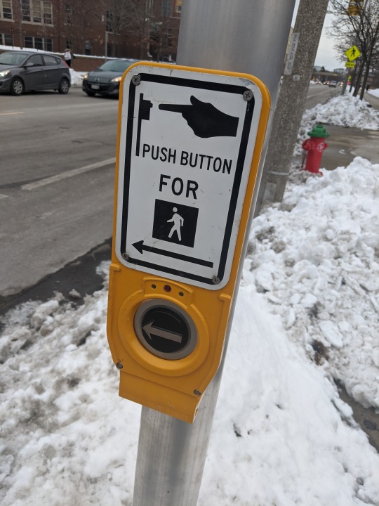
Valencia, Brian, and Arizona Sonora News. “Crosswalk Buttons Don't Do What You Think, Instead Help People with Disabilities.” Arizona Sonora News , 12 Nov. 2014, arizonasonoranewsservice.com/crosswalk-buttons-dont-think-instead-help-people-disabilities/.
0 notes
Text
Week 3 - History of Design
There are many aspects of design that nowadays are so easily accessible that we overlook the fact that they at one point did not exist. The modern design elements that we are accustomed to today has had a long history and continues to evolve with the times.
*The chosen examples are influenced by multiple historical elements, but are grouped as they are to highlight the one I find most prominent*


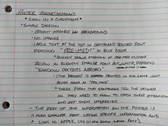
The one thing that stood out to me the most, as I never really considered its history, was fonts and how they have evolved over time. The font that has stuck around the longest and still influences graphic design today is sans serif. As stated in Graphic Design, A New History, “The first commercial sans serif was released in 1816 by William Caslow IV”(46). This page also stated that the sans serif font used geometric structures and was much bolder than other fonts in its time. The energy that this font brought to advertising made the portrayed message very evident to any passerby. In an era where it was believed that “more is more” when it comes to design (45), sans serif brought a level of simplicity that had not been seen before. And for this reason is why today we still use this font, or fonts similar. I included a few examples of William Caslow’s advertising and design strategy in action over 200 years later, specifically the Ikea logo, the notes on a poster I saw in a classroom, and the woman’s bathroom sign. These three examples all used a font similar to sans serif in order for the viewer to notice it, then understand what it is with little to no thought needed. I took the notes on that poster before reading the assigned sections of the textbook, and without even knowing the history of the font type I had an understanding of why it was used because it has been so prevalent in design for centuries.
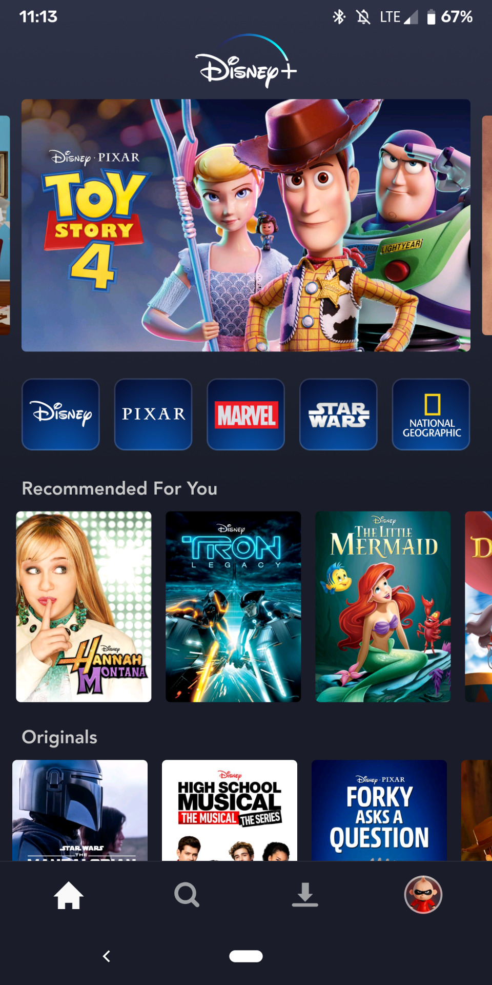
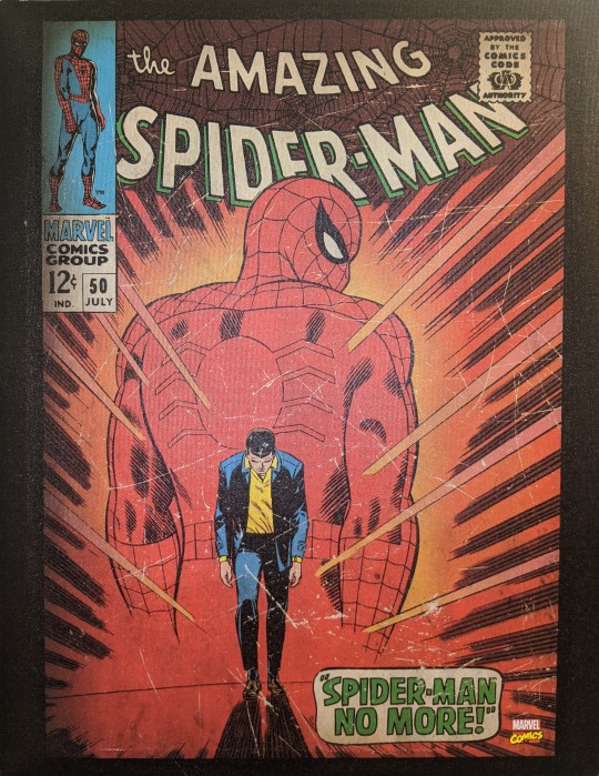
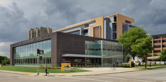
The next few examples I wanted to reference was the Disney+ screenshot, The Spider-Man comic, and the UWM Welcome Center. In a post-Victorian perspective, It was believed that “more is more” when it comes to design (45). Figure 1.19 titled Demorest’s Illustrated Monthly is a perfect example of this “more is more” mindset. This chaotic poster with corner to corner design is an example of horror vacui or the fear of emptiness (45). The three examples I provided show the opposite of horror vacui, they learned from history and had an understanding of what works and doesn’t. The Dinsey+ mobile home screen is very simple as the background is a solid dark grey. The fonts and colors are chosen (shout out to William Caslow) because they stand out from the dark background. Any icons as well are prominent because the overall design is very simple. The Spider-Man comic also shares this level of simplicity and contrast between the background and foreground. And like the Disney+, the chosen fonts and colors of that text draws the eye to them and is easy to read. Most comics covers (seen from any quick “comic book cover” google search) are cluttered with bright colors and numerous characters. This cover is different, the chosen colors are much more mute and the art style reminds me of the Japanese inspired French Art Nouveau (59-69) from the late 1800s, due to the dark lines and simple yet realistic human forms. The third example was the UWM Welcome Center. I included this in this section because even architecture in the 19th century had a “more is more” mindset. Modern architecture (which I will know much more about in a few weeks) is simplistic, with hard lines and clean colors. If buildings were fonts, the UWM Welcome Center would be sans serif for sure.
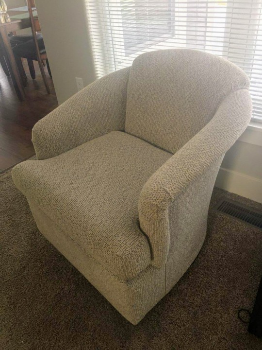
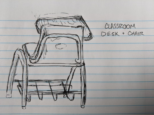
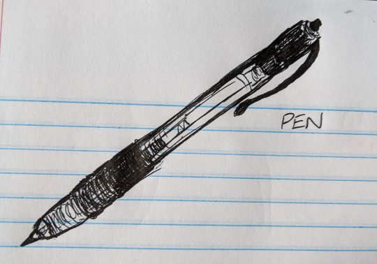
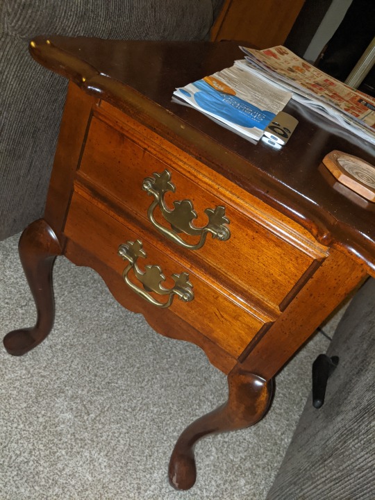
The last few examples I included to reference the “Arts and Crafts Movement” started by William Morris in the mid to late 1800s. “Morris decried the loli state of design arts and contended that the urban environments need not be filled with such downright ugly objects" (50). The Arts and Crafts Movement's main purpose was to bring beauty back to a world filled with industry. I included the sketch of the desk and chair because I feel it is an example of a functional design that Morris would not have liked. The desk serves its intended purpose but it does not look visually appealing. However, the other three examples I included have a functional purpose and are also visually appealing. The plush chair's color and fabric are simple yet beautiful, the end tables rounded features provide a level of uniqueness, and the pen has a clear outer layer which exposes the inner mechanisms. All these details are for visual aspects only and do not affect the function of the object. Although the implementation of Morris's design ideas were too expensive in his era, I believe that him along with many other designers in his time would be proud of how far design has come.
Eskilson, Stephen. Graphic Design: a New History. Yale University Press.
0 notes
Text
Week 2 - Design Thinking
After reading “Design Thinking” My definition of design would go as follows, “a creative process done with the goal of improving quality of life.” Design is much more than the aesthetics of a product, its the functionality of an item, task, space, etc and working to optimize that specific project to work more efficiently than it did before. It can (and probably should) be applied to every aspect of our lives. Before this reading, I had an understanding of what design was but I did not understand how far-reaching of a concept it truly is.
Choosing example products to describe design thinking is difficult because we are literally surrounded by design thinking. So I decided to choose something that we are constantly surrounded by, and that’s Disney. Specifically, I want to talk about theme parks. There is a very interesting docu-series on Disney+ called “The Imagineering Story.” The series goes into great detail about the process behind many of the things we see at the Disney Theme parks. While reading “Design Thinking” I noticed many parallels behind the Imagineering process and design thinking. The author of “Design Thinking”, Tim Brown, described the process of design thinking as “metaphorically a system of spaces rather than a predefined series of orderly steps” and “chaotic to experiencing it for the first time.” Those same descriptions were given when describing Imagineering. Every detail regarding a ride, environment, or building within the Disney park grounds has been thought over in order to enhance the consumer’s experience. Even the Disney+ app itself is designed in a way that even a child can navigate it. The Disney parks were most successful when the designers were given the freedom and support to create what they wanted. Disney is one of the most successful companies at the moment and I believe design thinking is the key to their success.
The video “The Deep Dive” also visually showed exactly what “Design Thinking” was describing. I found it very interesting that a workplace can be most efficient when the workers are given the freedom to design their own workplace. After watching this video and having an understanding of the success of design thinking it’s confusing to me why all companies haven’t implemented these concepts. Even mundane tasks could become more efficient if done in an environment that promotes individuality and comfort. Overall, I took a lot away from this week’s readings, I’m going to try my best to use the concepts behind design thinking in my day to day life.
0 notes
Text
Week 1 - About me
I’m Jack Lehtinen, I’m majoring in Kinesiology and recently declared a minor in art and design studio. At the moment I wish to pursue a career in Physical Therapy. So that brings up why I’m choosing to minor in the arts. I don’t have a better reason other than the fact that I’ve always loved it and right now is when I should be exploring all of my interests. This interest of mine didn’t come out of nowhere, for as long as I’ve been alive (20 years) my father has been working as a graphic designer for Readers Digest. He has always encouraged me to be creative and has been a big inspiration in that part of my life. I also draw inspiration from many of the comedians I frequently watch. They tend to live their lives very carefree and basically have fun and laugh for a career. I hope to one day reach that level of enjoyment both in a career and in my free time. But in order to do this, I need to explore and find what it is in life that makes me happy. In regards to where I recently had design in mind when buying a product was when I bought the coffee mug that I am currently drinking coffee out of while writing this. I wanted something that was easy to carry around and kept my coffee warm for an extended period of time. There were multiple choices but I ended up purchasing one that met those needs and was still a reasonable price. Overall I’m looking forward to continuing in this class and learning more about all avenues of design.
1 note
·
View note