frostbite-the-bat
‼️ GUZMA, THE ULTIMATE SWAGBEAST ‼️
* Welcome to my BLOG! I am Guzma (They/It/He). I'm 19.💙♠️💙♠️💙♠️💙♠️💙♠️💙♠️💙♠️💙♠️ * Or, alternatively... you can call me by my TOTALLY real name: Doctor Guzma Cathal Spades Spamtongender the Spade Catboy/God/Cog of Chaos, the ultimate SWAGBEAST. Or just Guzma Spades. I am a CREATURE and I BITE!!! 💌☎️ I pledge my alliance to the Spamton swag!! ☎️💌 My blorbos/faves are what keeps me alive!!! Despite my Deltarune theme, it's not all I post about, and I have many interests! Check out my pinned for info and my side-blogs. I do art, make characters, post random shitposts, reblog a million things a day... All that jazz! Stay swag, but remember, you will never be as swag as the lord of swag themselves (me). 💙♠️💙♠️💙♠️💙♠️💙♠️💙♠️💙♠️💙♠️ * Members of the Guzma's blorbo brain house are (but not all the characters I am Silly™ about) : Cathal Ray Toby Bravecog, Spamton G. Spamton, Shepherd (ENA), Sweet, Cap'n, K_K and Gary the Gadget Guy. | EXTREMELY normal about High Roller. Did you know we're canon it's true gay love is real 🎲 HIGH ROLLER HIGH ROLLAAAUURGHHHHHH
37628 posts
Last active 60 minutes ago
Don't wanna be here? Send us removal request.
Last Seen Blogs

yfukuoka
明日もカレーを食べます

kaylorisreal-png
I'm a mess but I'm the mess that you wanted
sistinas
Aleatorivm

trill-uminazi
207
unfourtunatelove
dani
Text
that fucking guide took me 3+ hours and I WANTED TO PLAY TOONTOWN AHHHHHHHHHHHHH my back hurt!!!!!!!
yall better APPRECIATE IT
0 notes
Note
Hi! I'm kinda shy but I love your vintage finish on your work. Would you consider offering pointers for how to achieve that vibe?
oh, absolutely!! i love that sort of style and i think more people should be able to achieve it if they want!! shouldn't gatekeep art stuff ^^ i don't really do vintage style stuff a lot, and i take more comic book/print/retro inspo than anything. but, these go hand in hand!! please know i am still learning, too! this is just how i do it.
also, there's a lot of guides for this online and tools... that you have to purchase. i can assure you everything listed here is free! (including my pirated SAI2 copy!) some things have donations available towards the artists that made them, so you can do that if you want to support an artist :D
i'll go over basically everything i know, so this WILL get long! i also spent hours going over several days searching for resources, so i'll list everything so you don't have to ^^
(PART 1/2 BECAUSE OF IMAGE LIMITATIONS!!! PART 2 SHOULD BE WRITTEN SOON AFTER THIS ONE!! reblog THAT once it's done!)
-------------------------------------------------------------
THE ART ITSELF / INSPIRATIONS:
for the ARTSTYLE and WHAT you draw: you can just draw whatever!! really, do your own thing! twist this style in your own way, it doesn't have to be a 100% accurate!! i literally used these same vintage look effects in a drawing drawn in my usual style of high roller. you can draw anything you want and you don't need to copy comicbook styles or all that!!

or - you CAN take inspo from vintage comic books / artwork or other printed comics! (for me tom and jerry comes to mind as something with a toony style, since it's what i read as a kid. also donald duck comics! no need to follow this but if you wanna be extra you can! ^^ looking at inspo is good.)
however you will need to look at examples aside from just the Artstyle, to achieve the actual Look!!
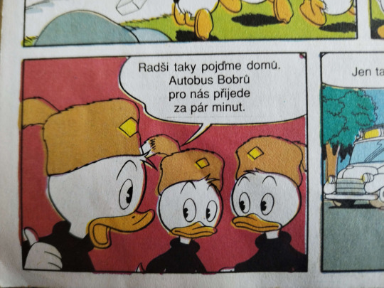
here's some examples pics i took of some comics i own laying around in a shelf. these are mixed ages, the asterix and ducktales comics being older and the tom and jerry comic being newer. i have some oldies since i got them passed down! czech text + asterix jumpscare, sorry.
to move on from the artstyle talk fully and more to the general style/look part - notice how the tom and jerry has brighter colors, less dirt, and an overall better quality!!
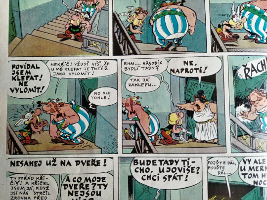
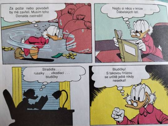

one thing i want you to note, in older prints there's obvious color misprinting and imperfections! you may chose to do this, or don't! depends what kind of era or printing you wanna reference. of course, also keep in mind the veeery limited CYMK colors they had Back In The Day. also note the dirt!!! how some parts are lighter and more chipped and how it isn't a full block of color!!


a lot of this does parrot posessedpasm's own guide, which i HIGHLY recommend! it's where i got a jump-start on things. there's other things listed on their post, which you should give a read! goes over history of some things that will let you have a better understanding of stuff.
speaking of inspo and on the topic of posessedpasm, before we move on - they're one of my biggest inspirations for this! their art is incredible and i think it's important to look at other artists' take on these styles. go out there and look at other artists who draw in a similar style achieving the same retro look!!! (no but genuinely i could look at posessedpasm's art forever... i love just looking at it and studying it!! i want what they have... but i'm not gonna gush now!)
-----------------------------------------------------------------
ACTUAL TECHNICALITIES / HOW THE FUCK DO I DO IT ???:
FIRST, LINEART!!: i choose a brush that's somewhat fluttery and resembles ink at least a little bit, instead of a basic round brush. here's the brush i used, for any sai2 users. i'll show my krita faves after!!

(note brush size, gets fuzzier the bigger it is)
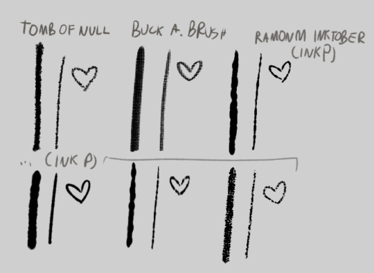
and the krita alternatives! i don't do inking / lineart in krita in 99.9% of my art unless i'm experimenting. but there's some great brushes you can find online to use! here's links to the ones on screen
tomb of null
buck a. brush
ramonm inktober (he just presents it but since it's his post i named it that) (download link is on the video!)
that alone already gets the lineart look just a bit. but it's not all! krita is especially useful for this, as sai doesn't have this function. (but i find my way around it


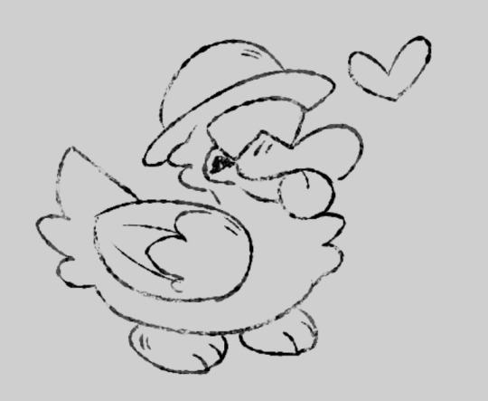
here's a WIP screenshot i took while drawing that piece VS the final piece!
you may notice the lineart is "chipped" away in some spots. printing always wasn't perfect and created some imperfections, that may smudge and chip away as time goes on.
HERE'S A GUIDE FOR IMITATING THAT!!!!
what i do, is simply create a clipping layer on the lineart. (typically i do the lineart, then color, THEN do lineart effects, but this is just for show) (i also usually have a set, typically orange/yellow background color picked already, but i haven't done that here for Whatever Reason)
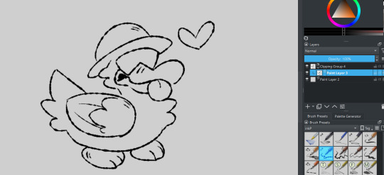
set it to "erase" layer mode... (and click the little "a" to actually clip it to the layer. you could also just make a quick clipping group that does it for you!)

and draw over the lineart! (preferably with a highly textured "dirty" brush!) the erase clipping layer will only erase the lineart, and nothing underneath it. you can change the opacity up and down to adjust the erasing... you can add more erase layers to play with the effect a little!

what i then do (sometimes), i ctrl+e the lineart group to one layer. i copy it. i ctrl+z to go back to keep the group if needed. i paste the copied lineart underneath it. i add a blur filter, shift it to be slightly off from the lineart by a few pixels, and set it to "burn". i may change the color to be a very dark orange-ish brownish color. gives an effect of the lineart bleeding a little!


COLORING!!:
color: okay so for this part i just kinda bullshit it and either pick whatever colors i want, or i color pick them from this image below then slightly alter if i need a different color. i do not have the patience to do my own cymk layer management digitally, just adding my effects can take OVER an hour and i have a way that looks nice Without It. i either fake my color misprints later or i just don't do it. still stuff to consider!
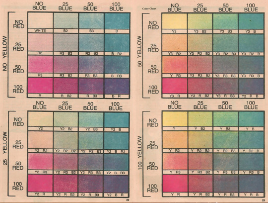
(taken from posessedpasm's guide! this is how i colored my sticky lou drawing. usually i will just pick my own colors and yellow them/dim them slightly.)
how do i do it: i color in sai using my usual brush or the one i showed previously. if i color on krita i use a different fuzzy kind of brush...
some colors i do on different layers and i move them slightly to make the misprinted effect. then i may erase small bits of it to make it look a bit better if i want.


if you really want the funky color mixing that may not be Extra Accurate anyway - draw using different colors on different layers. the layer overlapping with the bottom layer... set it to "multiply" and eyedrop the color where the two colors overlap. set the layer effect back to "normal". lock your opacity so you draw only on the Already Colored Parts and color the overlapping area using the eyedropped color! neato !

ONE THING TO NOTE!!! if something is white, you should leave it uncolored/transparent. unless you stylize it to be a different color entirely, if so... go ahead! but if it's WHITE white - just don't color it at all!!!
and now, to my Favorite part - the halftone overlay effect!!! here's where things can get fairly convincing already - plus, i use this effect / similar even in my normal art!
before ANYTHING!! at least, for krita - to achieve the best look i use the newspaper plugin!
newspaper plugin for krita
FIRST, i merge the color layer into one layer and then add it into a clipping group. i then copy the color layer and paste it OUTSIDE the clipping group.
then, select your PASTED color layer (named on the screenshot so u know what i mean) and go to tools>scripts>newspaper (once you install the plugin!)
i then play with the settings a bit. i typically don't touch everything - i just change the mode to Four color (CMY+K Pictures) or Four color (CMYK - Pictures) (this one usually looks better imo)
i also change the size to be smaller, usually around 4.00px.

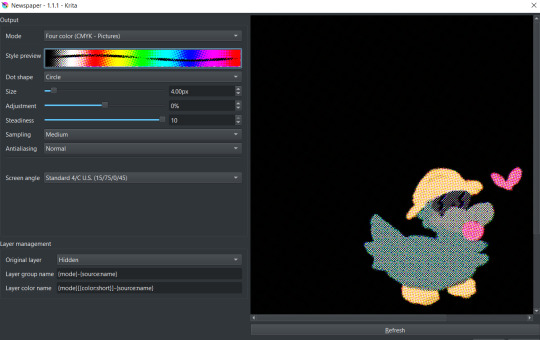
click OK! it'll generate cymk halftone layers IN a clipping group! don't worry about the black, you can rid of it easily ;]

just close the group and move it to be inside of your color group below! clip the whole cmyk group over the color layer... and BOOM!
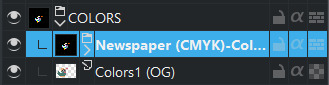

but that's not it! set the newspaper group's layer effect to luminosity (or whatever you find works best...!) adjust the opacity to around 50%-30% and BOOM!!

though, that's not all! do the same things we did to erase up the lineart earlier to the coloring, too. same steps! in the same clipping group! just make sure it's above the cmyk newspaper group.
you can then group both lineart groups and color groups into ANOTHER group that will contain them both. with that you can then make an erase layer over them both so they both get affected by it and make it look like both got chipped away, and not like they're separate entities. ^^
you can then use this for backgrounds... text... other things!
one important thing is also getting those papery, dirty effects... which i'll cover in a reblog! (image limit :,]) alongside that, i'll list all my resources for download there!!!
#srb#guz art#long post#tutorial#art tutorial#art guide#art ref#I NEED ALL THESE TAGS BC#THE TAGGING SYSTEM ON THIS SITE SUCKS#AND I COULDNT EVEN FIND MY OWN GUIDE!!!!!!!!!§
5 notes
·
View notes
Text
someone on twitter found the vector asset for this one dot image and we can now see what her outfit looks like without the jacket .. i love you 2010 dot but you have the most extra outfit ever


22 notes
·
View notes
Text
I hate waiting for things to stop being popular so i can enjoy them
29K notes
·
View notes
Text
Asexual flag color picked from the celibacy gif

24K notes
·
View notes
Text
I think people gotta realize and remember most trans guys can't access hrt/surgery or don't desire it and they are very much real boys as others who do have access to those resources. the reason why I draw most of my boys as "non passing" cuz they look like me and others.
I saw someone bring that up as a sort of "criticism" a few days ago which is valid but also like, it's how I express and rep boys like me.
3K notes
·
View notes

Text
learned about this Bermuda Cahow Cam twt account today and i cannot get over this ball of lint babything...


this beast
20 notes
·
View notes
Note
MY PARENTS ARE TAKING ME TO DASHCON AS MY CHRISTMAS PRESENT! AHHH
*loudly sings it’s beginning to look a lot like Christmas*
8K notes
·
View notes
Photo
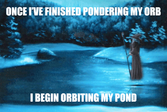
Once I’ve finished pondering my orb
I begin orbiting my pond
122K notes
·
View notes
Text
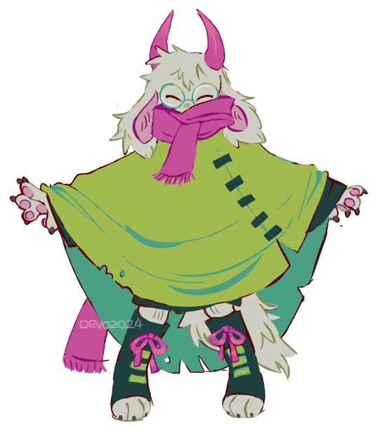
what cogs should i draw chat
24 notes
·
View notes