deostyx
Odd.com
Danie I like clowns21 • she/he • Butch[art tag: #danie art] I mostly draw OCs and promote friends art • pfp by me :3 and banner by thevideospecial
7313 posts
Don't wanna be here? Send us removal request.
Last Seen Blogs
hannashi44
Fighting Dreamers Only
hhhh-snakes
iz 🦖 she/her
yourclanessa
Icons clanessa
yourclanessa
Icons clanessa

hitekpals
HiTekPals Tech News and Discussion
Text

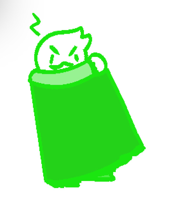
cape cape cape cape CAPE CAPE CAPE
#danie art#this was something quick please excuse the mess-#sanders sides#remus sanders#ts remus#remus sanders fanart#duke sanders#ts duke#sanders sides fanart
34 notes
·
View notes
Text

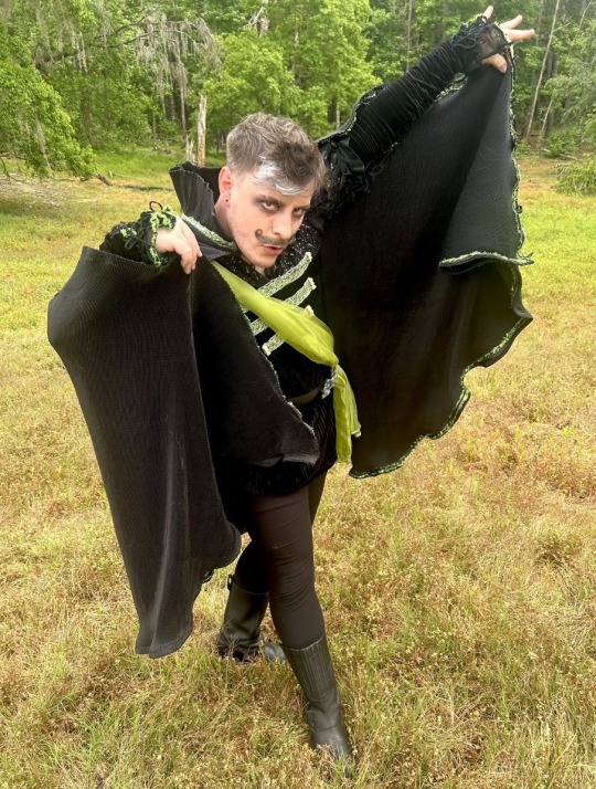
REMUS WAS SUPPOSED TO HAVE A CAPE WHAT!?!!?!?!?!?!?!?
51 notes
·
View notes
Note
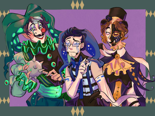
I’m a different anon I swear /gen and totally get it if not but could we get the other 3 sides as clowns? :> I just think it’d be neat
yes you can get the others :D
even more clown activities
385 notes
·
View notes
Text
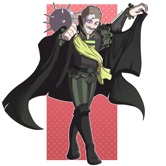
Mantle man!
I did see the pics lol.
PLEASE, DO NOT USE OR REPOST MY ART WITHOUT PERMISSION.
MY ART IS NOT FREE TO USE!
152 notes
·
View notes
Text


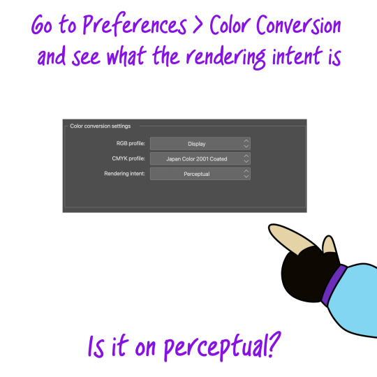


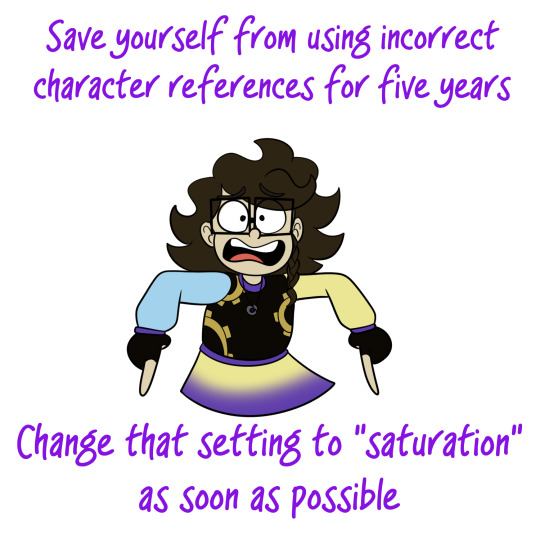
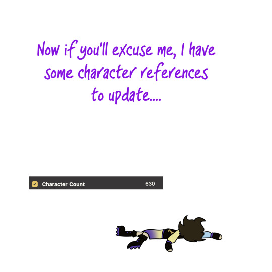
Just to make a point, every time I finished a panel of this I would export it as a PNG on the perceptual setting and use it as a color reference for the next panel
IT'S BAD
PLEASE CHECK YOUR COLOR SETTINGS
EDIT: If you're still having problems, it might help to switch from "Save/Save as" to "Export (as a) Single Layer". Just. Make SURE the box labeled "Expression Color" is set to RGB. I've been messing with this all day, and it looks like this combination of settings will allow exported PNGs to maintain their colors perfectly. To you. So far both Discord and Toyhouse still only display desaturated images and I cannot for the life of me figure out why
#I NEVER REBLOGED THIS#long post#csp#thank you a million times#ive had SUCH a problem with this#also good to know I should Not be send finished art to myself through discord anymore
51K notes
·
View notes
Text
Just curious…
To my mutuals/followers/anyone who sees this, what is your favourite sanders sides ship? Tell me in the replies or in a reblog!
#currently intruality and loceit#they show up the most in my thoughts when im trying to make ship content#!!! i enjoy them so much
160 notes
·
View notes
Note
I LOVE THEM I LOVE THESE COLORS WHAAA
draw Roman, Patton and Virgil dressed up as clowns
just a silly trio
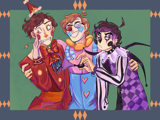
#sanders sides#ANDBJFJFNFBDNDNFNRN#sorry im. normal about clowns#and the sides as clowns. very normal
1K notes
·
View notes
Text

janus as a chihuahua bc he likes having big ears (mostly bc snakes have no ears and he feels left out bc all his friends have fur-)
21 notes
·
View notes
Text
this is so roman core
14 notes
·
View notes
Text

some chibi practice with my babies!


25 notes
·
View notes
Text
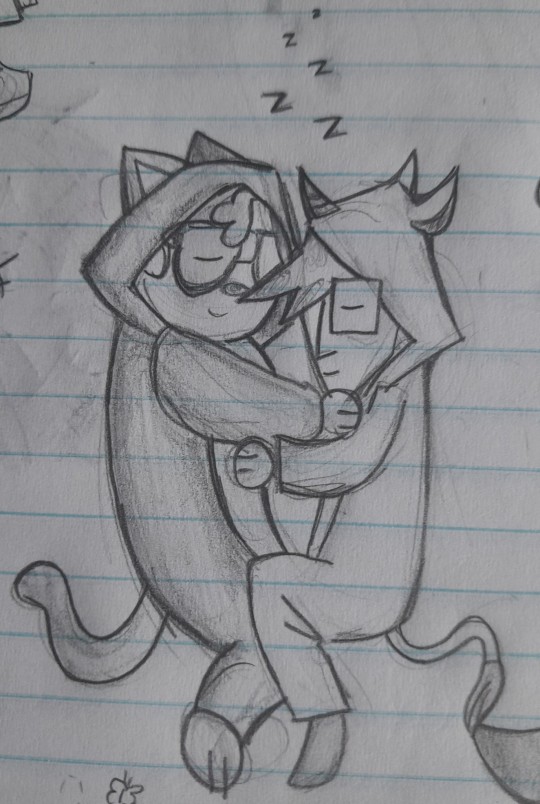
@giddleford YOU. you understand
Hey intruality is a great ship! Me and the 5 other people who ship it think so at least
108 notes
·
View notes
Text
Hey intruality is a great ship! Me and the 5 other people who ship it think so at least
108 notes
·
View notes
Text
I still can't get over the fact that Remus' spot where he stands is in between Virgil and Roman, therefore removing that sense of comfort of being able to look over and see someone who was becoming their best friend and instead having to see for Roman "everything he doesn't want to be" and for Virgil an old friend who he was really scared of and is now probably just annoyed by
Idk it's just something I think about a lot
342 notes
·
View notes
Text
this is so SO late bc i have had this drawn for months and simply forgor to post it but anyway i thought it’d be fun to mix @thegoldenduckie’s starry analogical designs with how i draw them <3
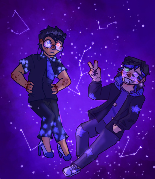
93 notes
·
View notes
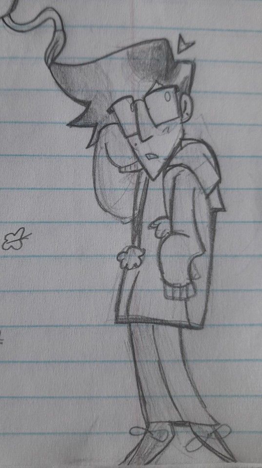
Note
Can you draw Virgil with glasses? :D
Thanks for the reqqq
Here he is + Ro :] + stickers lol
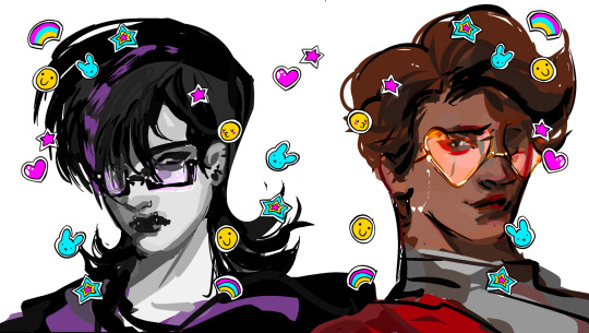
69 notes
·
View notes
Text
i bring a sort of "sanders sides poses some genuinely interesting questions about identity and how we define and seperate parts of ourselves" vibe to the club that nobody likes.
#hi i read all that#i fucking love your perspective#the fact that they have histories with eachother before thomas even met them being an analogy for self discovery and#self identification is so freaking cool#They are such a great narrative device and they are so distinct and unique
339 notes
·
View notes
Text
oh, he could not break surface tension
he looked in the wrong place for redemption
#accidentally rbed on wrong blog#anyway#loganloganlogankdnsakjnsbfnsb#poor little meow meow#sanders sides
356 notes
·
View notes