caitlindesignux-blog
Caitlin Warner
UX/UI DESIGN WORKBOOK
16 posts
Don't wanna be here? Send us removal request.
Last Seen Blogs

fransantos73-blog
Sem título

yelo
Yelo

walkingwiththefire
I made peace with the light

bounsweet-days
it's me, mark

bhangrahits-blog
Hit Hindi Punjabi Video/Audio Songs, Music
Text
Reflecting...
To think that a whole semester has already passed is very overwhelming. Time really just slipped by. Reflecting back on the whole semester, there have been a whole lot of ups and downs. I definitely feel like I’ve learnt a lot, technically and in relation to life.
Teamwork... Theres a lot of things that can be said for this part of the semester, but I won’t ramble. To be frank, I think there is a lot of work that could have been done on both sides to improve teamwork. In a group of three it has been shown that it is easy to be excluded if you don't really push for results. I fully admit that I lacked communication with my tutors and should’ve made more of an effort to push past my personal issues and come to class or try harder for answers from my team mates. At the start of the semester everything seemed new and exciting and I felt as though I was ready to put my 100% into it, but things change, obstacles come into play and suddenly I had so many other things on my mind. This really took a toll on the teamwork aspect of my learning as my team mates felt like I was leaving all the work for them to do, which really sucked to say the least. Communicating with them felt hard, as the time went on it seemed as though I had been completely isolated and there was no response to my questions or messages. I felt as though one moment it was clear and the next they were doing something completely different and I struggled to keep up.
It’s hard to really say what goals were achieved as I had little to do with the final product, but from what I did get to see it seemed like the initial idea was how it was intended. There were a few technical obstacles along the way, like Sketch not having certain features that were needed for a couple aspects of the app. As this tool was chosen without me, I had no input in which tool was the right one for the app.
I think there is a lot of things to take away from this course. I've learnt about what things are most important in life. I’ve learnt more about teamwork and different ways of communication. I’ve learnt what not to do in certain situations. I’ve learnt more about Adobe programmes and different prototyping tools. I’ve learnt about the more in depth things about app and web design and not just what it looks like.
0 notes
Text
Promo Video
https://vimeo.com/273424338
The video is the same as the other girls, but I had already added my own music to it.
0 notes
Text
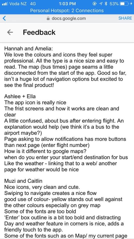
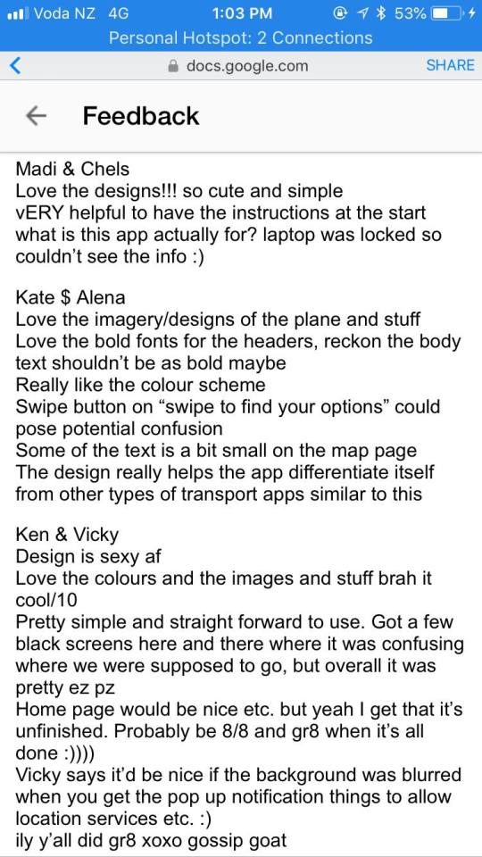
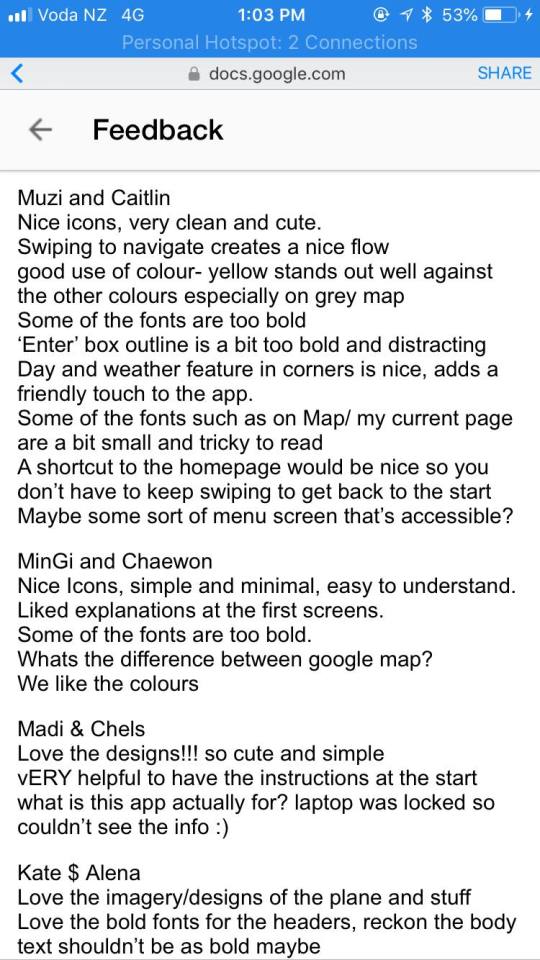
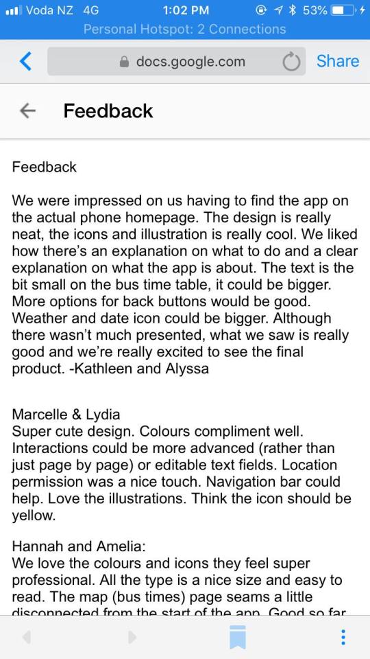
Progression Session
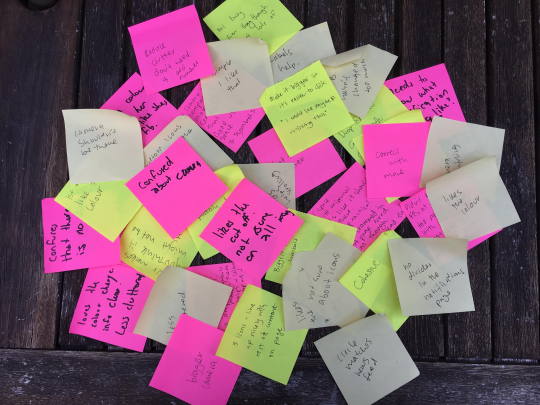
The feedback we got from our high fidelity prototype was really good and informative! There was definitely a lot of things that could be used to change the app and make it so much better!
There were a few comments that were completely opposite to others which made some parts harder to decide as it seemed as though some people understood it and others didn't. This is something that needs to be taken into account for further designing.
0 notes
Text
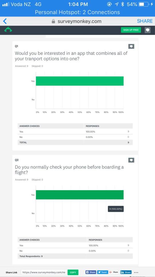
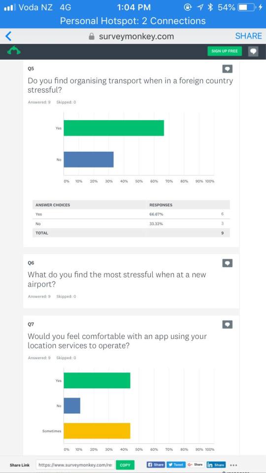
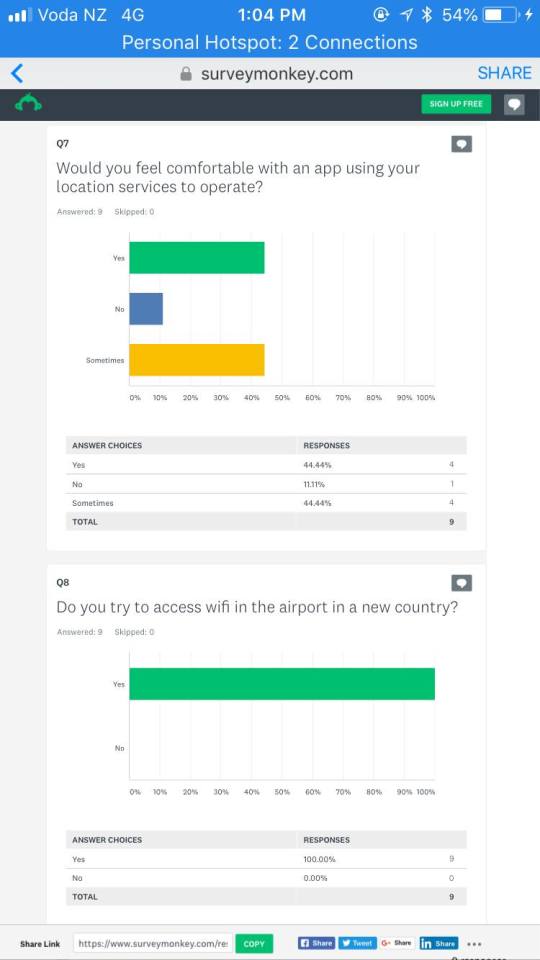
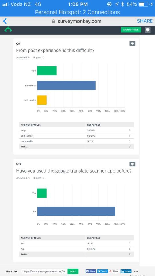
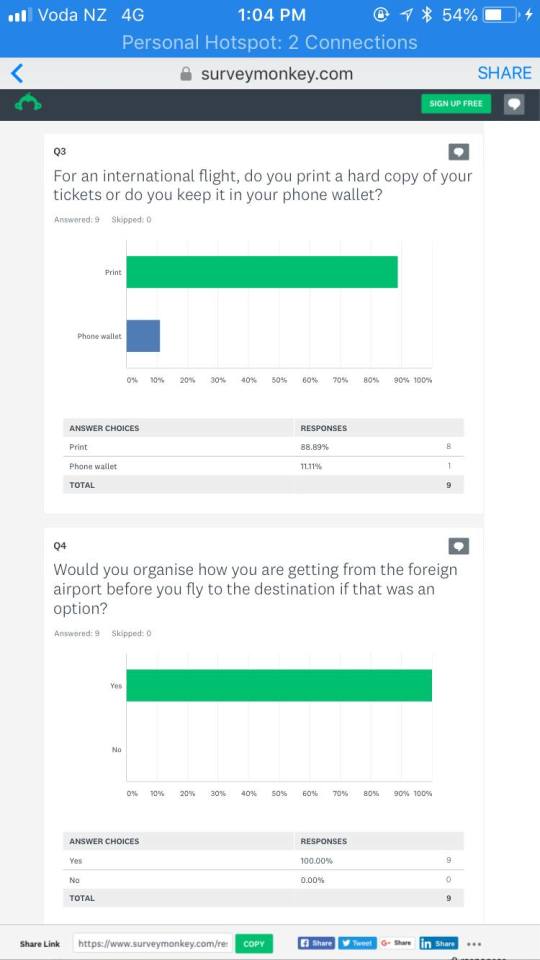
Survey
A survey was made to get some questions answered from potential users of the app. I think we got back some really informative answers and things that could be used in the final app.
0 notes
Text
Week 8
Storyboards
This is a basic storyboard of how our chosen persona was going to use the app. Drawing up the storyboard helped to clarify certain aspects that had been forgotten or not thought about. Things like airport wifi and language barriers became so much more apparent.
0 notes
Text
Information Architecture
"Information architecture is the practice of deciding how to arrange the parts of something to be understandable.” - The Information Architecture Institute
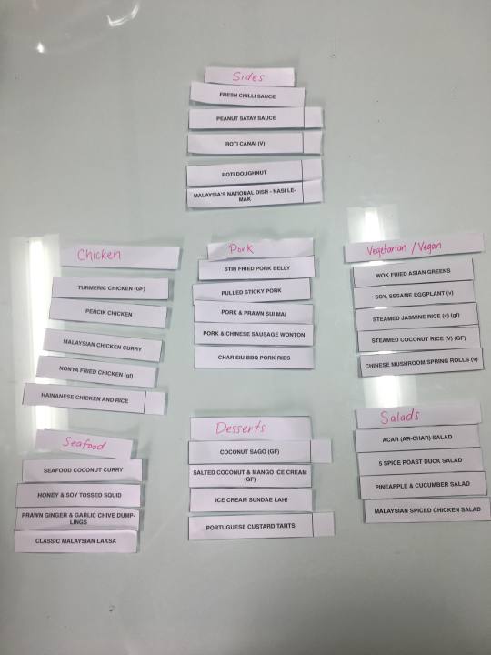
In this lesson we learnt a little bit about Information Architecture. Kevyn chose to teach us this by sorting out menu items into different categories based on what we think is easiest to understand. It took a couple tries but eventually I settled on the options shown in the image below. This made the most sense as this was for Madam Woo and personally when going to a restaurant like that I like to choose my dishes based on the meat. I also wanted to make it clear what the sides were and the vegetarian/vegan options. In this day and age Veganism is increasingly popular so having this option so clear was an important step in including that particular group.
After this lesson, I decided to do a little more research into the concept. Information Architecture is in all of our surroundings, without even realising it. Its all about organising your content to make sure most people understand it and find things easy to navigate. It can be used in books, websites, menus etc etc...
0 notes
Text
Week 7
Design Sprint
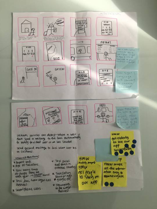
I found that this was one of the most interesting and crucial stages of the app. This was where all the ideas we’d spoken about finally got put onto paper. Its quite funny, I didn't realise how valuable this would be until we had it all laid out and were crossing things off and adding things in between steps that we had only just thought of.
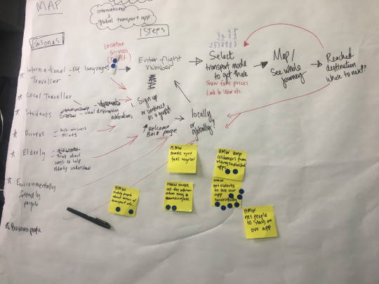
The yellow sticky notes are our “How Might We’s” and the blue dots are what the classmates thought were valuable and important things that should be considered.
0 notes
Video
My First Prototype!
We were asked for this lesson to test out some prototyping tools as practice for our final app. As a general consensus it seemed as though InVision was the easiest option for a first prototype. I already had experience with this tool from High School so was advised to try something new! After looking through a list of different options, I chose the website ‘Marvel’ it seemed like a very user friendly way to prototype. It was a pretty decent tool though some issues included only being able to upload jpeg files and only being able to use basic functions. There were very few options but I made it work with what I had as for a home screen and login page I didn't need too much.
0 notes
Text
Infographics...?
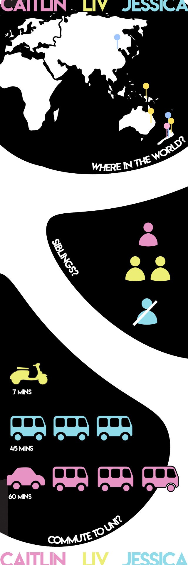
To be quite honest, infographics was something that took a little while to get my head around. The questions felt slightly pointless, though i did enjoy getting to be a little creative with icons and colours. My group chose to focus on simple facts about each other so the first one was where in the world have we lived? Followed by siblings and the oh so interesting question of how and how long does it take to get to uni?
0 notes
Text
New and Improved NY Times!
Week Four
The amount of questions that ran through my head when trying to decide how I was going to start my re-design of The New York Times was ridiculous. I didn't want to take away the important information, I wanted to organise it a little more. As a group, we decided on colour we would like to use. There was a couple stages we went through till we came to the Blue. The blue felt mature yet also modern and contrasted nicely with white and the photographs. It is purely coincidence that it matches Donald Trumps tie. We decided to keep the Logo font, it was something that didn't feel necessary to take away and was really what made The New York Times recognisable. The other fonts felt more necessary to change to give the cleaner appearance we were looking for.
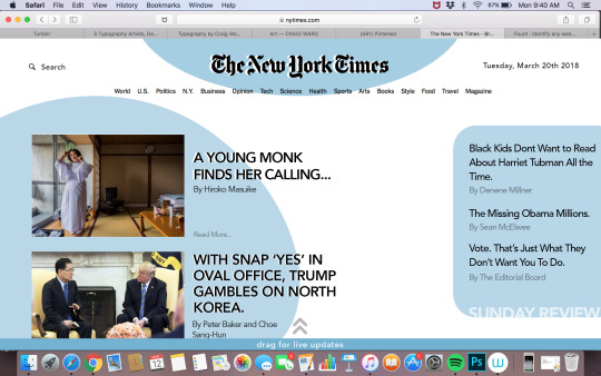
As this is the Home page I wanted to keep the main stories and make them easier to decipher which was most important. I felt that live updates was something that should be on the home page as an option, which is why that tab was created at the bottom of the screen. In regards to the stories, I decided to take away the massive paragraphs and only have the headings and the authors names, this eliminated some of the clutter.
0 notes
Text
Discovering The New York Times
Week Three
Cloning the NY Times was hard work. There were so many different elements that I hadn't fully realised were there until I looked closely at it. I think my biggest struggle re creating this was matching and figuring out all the different fonts as most of them are only slightly different. Luckily, Keryn had shown us the tool ‘Fount’ which helped to identify the fonts and there pt sizes.

Personally, some of the things I really dislike about this design are the proximity of the columns, I get that it is meant to resemble an actual newspaper but print and web have different readability and shouldn't have the same layout. I also am not a fan of the amount of bold text, it is hard to tell what the main story is and what the most important features are. For my re design i hope to make it a lot more easier to read and a bit more fun!
0 notes
Text
User Testing
Facebook Re-Design Testing
For our first lesson of user testing, we went round and tested our classmates designs and they tested ours. Unfortunately, we only managed to get feedback from two different people; one male, one female. We got a few good comments but having only two people meant there were a few contradictory statements.
Both testers said they liked the colour change and that the design was less cluttered. They also both said that they liked the drop shadow on the icons at the top as it made them more inclined to click them.
One tester said they didn't like that there were no dividers between the notifications and the lack of the little icons indicating what the notification was about seemed to make it harder to figure out. The other tester contradicted this and said they didn't even notice those two things and that they preferred to not have the icons as they looked tacky and just took up space.
My partner and I decided not to show the comparison of the old and new version until after they’d said most of their comments, as we wanted to see how important some aspects really were to the functionality of the app.
For next time, we would like to get a couple more opinions.
0 notes
Text
Facebook 2.0
Week Two
Redesigning the Facebook app
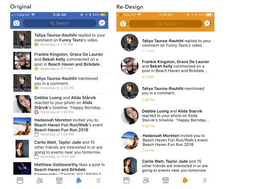
As the initial decisions are made by me, I was thinking about how I would like to see the Facebook app. To me, the app is way too cluttered. This may be the mindset of a millennial in this generation, but I think if you can get your point across with a smaller amount of information it is a success.
I did some brainstorming on who would necessarily be using the app and after speaking to a couple other people we decided that it would be more of the younger generation to the middle aged people. Personally, my Grandparents only use Facebook on their computers so the app would not be catered to them.
While discussing options with my partner, we decided that this orange (Pantone 7564C) was youthful and fun but it wasn't too ‘in your face’. We chose to make the profile pictures in a circle format as a lot of the icons and other accessories of the app are more curved rather that square or straight edged. I also decided to space the notifications out more and get rid of the colourful icons next to each time stamp. Another decluttering decision was to minimise the amount of bold text used within each notification and I thought the main information you wanted to know when receiving a notification was who it was from.
2 notes
·
View notes
Text
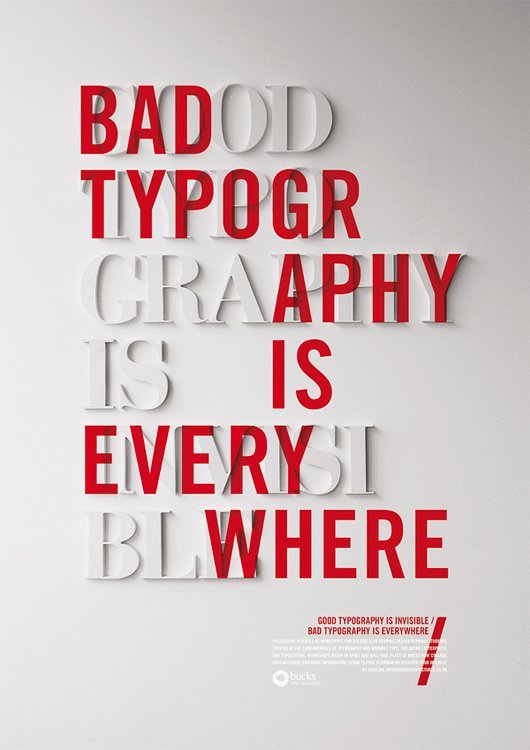
Craig Ward
The Man Behind The Type
Craig Ward is currently one of the most influential typographers of this generation. One of his most popular pieces is his ‘Good Typography is invisible, Bad Typography is Everywhere’ piece. He made the second quote bold and red as that is what your eye is drawn to and also disguises the good type behind it. This is a pretty bold and controversial statement in my opinion. We are taught that good typography should be easy to read and should be obvious as to where you want the reader to start.
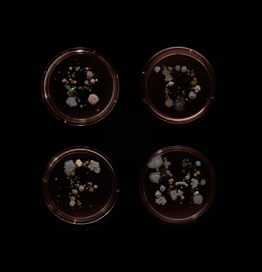
A series that I found on his personal website really intrigued me and showed that you can make letters out of the most random things. The series is called “Subvisual Subway” and he cut out sterilized sponges to form certain letterforms and he collected bacterial samples from subway lines. The letters are very gross but you can't help but admire the detail of the shapes.
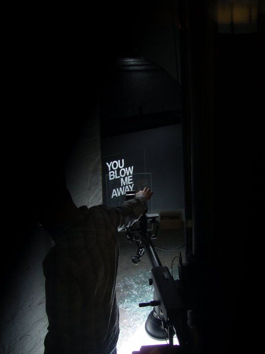
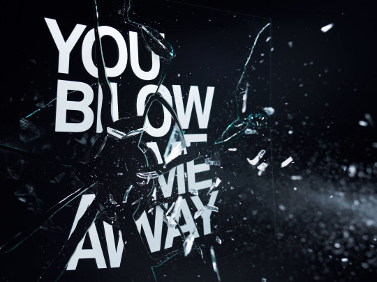
This next series is definitely one of my favourites! It’s so simple yet eye-catching at the same time. The series titled ‘You Blow Me Away’ was done by screen printing the type onto sheets of glass and were then destructed. Highly recommend checking out the ‘art’ tab on Craig’s website!!
0 notes
Text
Facebook Doppelgänger
Week One:
Re-create a page from the Facebook app.
I chose to re-create the notifications page from my app as I felt it was one of the most viewed pages, especially for myself. The design looks fairly simple and straightforward, while re-doing the app from scratch I discovered it wasn't as simple as I had thought.
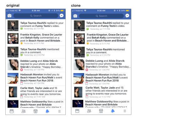
During the design, I found that each little icon Facebook created was slightly different than I thought. For example, the messenger icon in the top right corner is not a perfect circle but is actually slightly warped.
It’s quite funny coming to realisations of things you didn't even really notice until you take a closer look. The colour of the text, while it may look black is actually a more charcoal grey/ dark blue colour, this sticks with Facebook’s blue and white scheme and is also much less harsh than a solid black would be. I also found that the kerning and tracking of the text was very odd and difficult to duplicate without adjusting every individual letter.
xo
0 notes