
andrealacyart
Andrea Lacy
Welcome to my art blog!
378 posts
Don't wanna be here? Send us removal request.
Last Seen Blogs
aulepenna
Sr. Campo
young-ghost
Living Dead

fsyaxx
LikeSharer Club
fashabala-blog
99% hot gas

scltwaterroom-blog
⌜ i am bigger than these bones ⌟
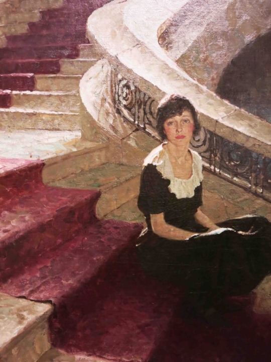
Photo
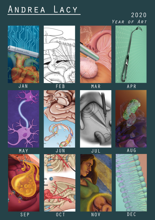
Hello tumblr, very long time no see, but its a personal tradition to share my yearly art review:
Despite everything that happened this year that resulted in lots of undesirable firsts, I also must look back fondly at 2020 as really my year to surround myself in medical illustration. As you may note all the work in this year’s round up is class work done for my graduate program. I did very little personal work, just sketches here and there but especially with an additional summer semester of classes and six months working alone on projects during quarantine, I was completely immersed in medical illustration this year. And one of the best things about that experience is where last year if felt like I stepped through the threshold into the world of medical illustration, now I feel that I have lived in that room and its hard to see myself doing anything besides this.
Now onto the art. Each row roughly lines up with my semesters which is handy. Highlights this past spring were my first experiences with surgery which were rewarding but also very overwhelming experiences. There’s something very humbling about being in surgery and having the surgeon be concerned about whether or not you’re getting a good view of the action and if all your questions are answered. One surgeon this year even let me sit at the robotic surgery controls to see her work in stereoscopic view (no worries the safety lock was on, so I didn’t bump anything). Something I also did back in spring was start learning my first 3D modelling program: Cinema 4D.
Over the summer I did a lot of work in animation and more 3D modeling with a good dose of surgery illustration work as well. This summer I feel that I switched from being rather scared of surgical illustration to being quite proud and even a bit comfortable with the process which is something that undergrad me would be shocked to hear. I also submitted work to the AMI for the first time with my pieces from June and July as my example of my skills. In August I did my first bit of 3D animation; a neutrophil engulfing some bacteria.
And finally, in Fall I was back to in-person classes and busier than I had ever been. I worked on a large-scale poster in September which was very rewarding, struggled so hard to achieve the look of ‘med-legal’ in October, and managed to squeeze in my love for tarot card/ art deco symbolism in a mock journal cover. And I also created a fully 3D animation on the cell membrane. And that is only part of the work I did but some of the other work in kind of under NDA for the moment.
Thank you all kindly for reading and being curious about this little journey of mine. I hope your holidays are pleasant and safe this year, and make sure to take some time for yourself to reward yourself for all the hard work this year.
2 notes
·
View notes
Note
Hi, I love your artwork! I was especially struck by your self portraits, that one from 2017 reminded me of Prudence Heward (one of my all-time fave artists!) and the colour temperature oil painting is really rad too!
Thank you so much!, self portraits are so fun and interesting to experiment with, and thanks that temperature painting was crazy haha, throw a colored light bulb on an object and everything you think you know about color is challenged haha.
Also I feel that I must say that I’m not using my tumblr much anymore, I’m most active on Instagram (same name) and I’m expanding into twitter right now, also I’m currently in school for medical illustration, if thats an interest to you, of course I’ll still continue illustration work in general.
And thank you again for the kind words!
7 notes
·
View notes
Photo
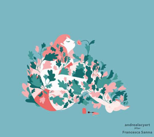
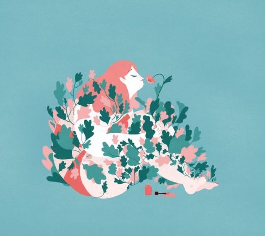
A study of a panel from “Her Hair” by Francesca Sanna: Her Instagram
-
This is my last post for my History of American illustration, it was really satisfying to go through this whole process and actually experience all these new techniques and styles. -
-
When we covered Francesca’s work we discussed her book ‘The Journey’ which tells the true life tale of immigrants that she interviewed herself. I wanted to try my hand at her line-less, curvy shaped style. As someone who really likes flow in their work, I resonated with the feel of her illustrations. I really enjoyed the pattern work with the leaves as well.
#art#my art#artwork#master study#american illustration#history of american illustration#illustration#digital illustration
3 notes
·
View notes
Photo
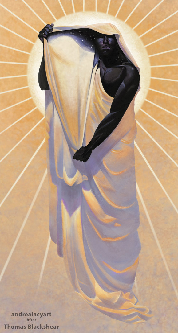
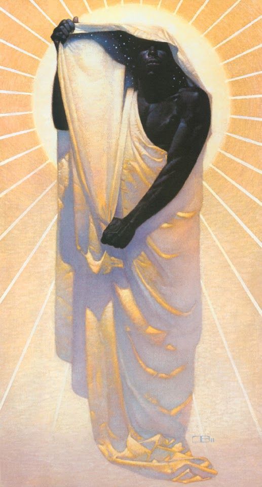
Study of “Night in Day” by Thomas Blackshear. -
-
-
I really wanted to do a study on this particular piece after my professor had shown us this picture in my first illustration class. I love the dynamic lighting and the nouveau inspired composition. And as I was working on it I was particularly interested in the method to which he rendered the folds in the cloak, the colors and shadow shapes were so different than what I would have typically chosen. I also have to say that I’m particularly happy with that right hand.
#thomas blackshear#my art#art#master study#illustration#American Illustration#History of American Illustration#digital art#digital painting#Digital Illustration#illustrator
125 notes
·
View notes
Photo
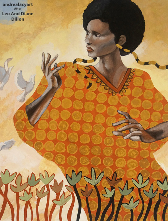
Study of Leo and Diane Dillon in 1990 from the children’s book Aida. -
-
-
Leo and Dianne were not friends when they first met, they were actually in fierce competition with each other for the first three years of their college education. It wasn’t until their senior year when they concluded they actually caused each other to be better artists and if they worked together instead of against each other, they realized the strength of collaboration. They became a great working duo and worked together on each illustration. I really liked their combination of geometric shapes and fully rendered elements.
#art#my art#illustration#master study#American Illustration#History of American Illustration#casein#casein painting#painting#illustrator#vintage illustration#Aida book#leo and diane dillon
11 notes
·
View notes
Photo
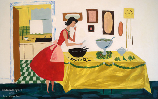

Study of a magazine illustration in 1955 by Lorraine Fox.
-
-
Learning about Lorraine Fox, I admired her commitment to her own style throughout her life, but she also constantly strived towards redefining what that meant visually. Her work was unique to the industry when she was starting her career, emphasizing design and had cues of folk art, but as she got more popular she felt she needed to branch out because she started to feel cornered into a style by publishers. This piece was really fun to replicate, so different from my own. I really enjoyed the color pallet and working with all these bold shapes.
#my art#art#artwork#lorraine fox#master study#American Illustration#History of American Illustration#painting#casein painting#illustration#vintage illustration#magazine illustration#vintage magazine art
1 note
·
View note
Photo
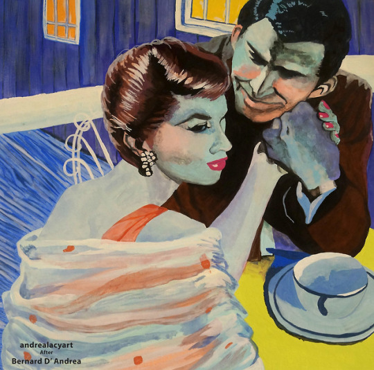
Study of an illustration for the story “For Kiss Under the Moon.” Illustrated by Bernard D’ Andrea in 1956. -
-
Back to my illustration studies. Bernard D’ Andrea studied through Pratt through a Scholastic Magazine full scholarship, but got interrupted by WWII, he still finished his degree but during the draft he got in contact with Cooper studios where he got his start in illustration. He was part of a movement of magazine illustratiors nicknamed “boy-meets-girl illustrators.” These pieces were overly positive and romanticized depictions. He also did some Sci-Fi illustrations and was good friends with Issac Asimov. He lately got into abstract expressionism and in the 80’s became a plein air painter where he stated he felt like Van Gogh, who was a childhood inspiration. I chose to recreate this piece simply because of those bright vibrant colors. I also enjoying recreating the textural qualities from flat washes to blended colors. I really focused on picking those color hues.
#my art#bernard d' andrea#master study#American Illustration#History of American Illustration#vintage magazine art#vintage illustration#illustration#casein#casein painting#painting
2 notes
·
View notes
Photo
DTIYS for Nate Hilyer over on Instagram: Nate’s Instagram & My Instagram
#my art#art#draw this in your style#dtiys#drawing challenge#instagram art challenge#digital art#digital painting#illustration#digital illustration
0 notes
Photo
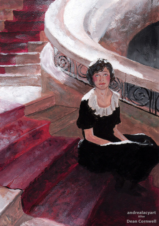
Study of “Waiting” by Dean Cornwell in 1921.
-
-
I wanted to try my hand at Dean Cornwell’s ‘bold, light drenched style’ where I focused on all the textures I could made with a brush and how I can push those lights and shadows like Cornwell did. Although he became a well known illustrator, his family struggled with money so he was often overworked and at one point picked up illustration jobs only to make ends meet. He struggled with the lack of legacy that is often associated with illustration and sought out other pursuits like being a muralist, which was a somewhat common side pursuit of other illustrators at the time. He later became the president of the National Society if Mural Painters.
#my art#art#dean cornwell#master study#History of American Illustration#american illustration#illustration#casein painting#painting
46 notes
·
View notes
Photo
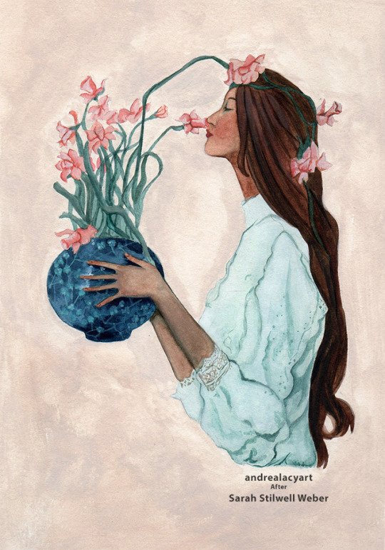
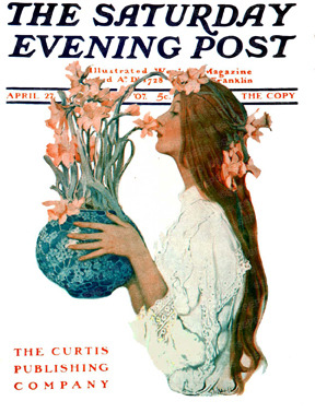
Study of “Lady Smelling Daffodils” from Sarah Stilwell Weber for the Saturday Evening Post in 1907.
-
-
More studies from a student of Howard Pyle, Sarah Stilwell Weber was also a very prolific illustrator. She never cared for deadlines so she preferred and requested her contracts to be nonscheduled work. I personally admired many of her pieces for their composition, and I particularly noted how she used negative space when designing magazine covers. I was drawn to recreating this piece because it felt like the kind of work I also enjoy making. I enjoyed seeing how she used the color pallet of this piece, adding bits of each individual color all over the illustration, unifying the whole.
#art#my art#artwork#master study#history of american illustration#illustration#sarah stilwell weber#painting#painting study#watercolor#watercolor painting#the saturday evening post
1 note
·
View note
Photo
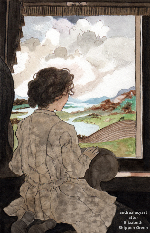
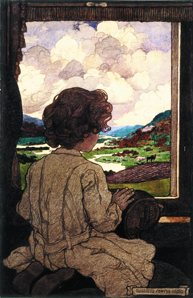
Study of “The Journey” by Elizabeth Shippen Green in 1903 for Harper’s Magazine. -
-
My class spent quite a bit of time talking about Howard Pyle and his many students, and for good reason. If you know nothing about American illustration, I really suggest just looking up his wiki page. He’s an important person to know in the heritage of illustration. He taught a group of students that became known as ‘the red rose girls’: Violet Oakley, Jessie Willcox Smith, and Elizabeth Shippen Green. They lived and worked together and all became prolific illustrators. The sense of friendship and community was heartwarming to hear, especially when artistry is far more associated with solitude, it’s important to note these relationships between artists that enhance their life and skills. I specifically chose to do a piece by Elizabeth because of her use of mix media, she loved changing up her media as well as her style. I also think in these examples she has an interesting use of line-art. -
#my art#master study#history of american illustration#american illustration#elizabeth shippen green#painting study#mixed media#illustration#traditional art
2 notes
·
View notes
Photo
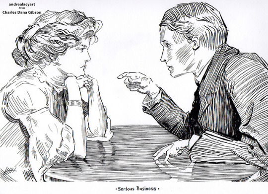
Study of “Serious Business” by Charles Dana Gibson 1906.
-
-
Continuation of my studies from American illustration. Before the class I was aware of the ‘gibson girl’ and her influence on Edwardian culture and fashion but I didn’t know much about the artist that brought her to be. It’s interesting to note that before Gibson produced his dip pen work he got interested in art by making paper silhouettes as a child and then apprenticed with a sculptor in his teens. This knowledge of form and silhouette he learned early is so evident in his pen and ink work. I also appreciated that although the Gibson girl was poised and elegant, she was also confident and adversely to the time a dominant figure in the images. That’s one reason why I chose to replicate this piece, showing how he depicted male/female relationships. On the technical side of things, replicating his work with a dip pen was both relaxing and terrifying. There’s a looseness to his strokes, but they are purposeful, indicating forms, textures and lighting. I always tried to follow the patches of cross hatching to understand their purpose before I went in scratching at the paper myself. Those parts were fun, doing the lines on the faces however…, my hands were shaking and I’m pretty sure I stopped breathing for all of it.
#my art#art#artwork#dip pen#dip pen art#pen and ink#charles dana gibson#gibson girl#master study#art study#pen and ink study#american illustration#history of american illustration#drawing
23 notes
·
View notes
Photo
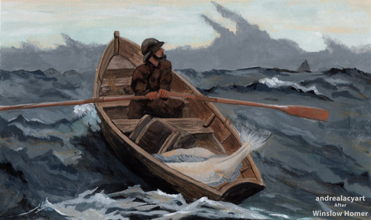
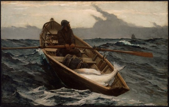
Homer’s “Fog Warning” made in 1885.
-
-
Now that it’s getting closer for me to head back to school to get my masters, I’m taking a look back at the work I made my senior year of college. First I’m sharing the work I did during History of American Illustration. It was really wonderful choosing a new artist every week to learn from not just from books but by doing, recreating one of their pieces. -
-
I first chose Winslow Homer. I admired his paintings of the ocean with his expressive brushwork as well as his color pallets. He started out as a lithographer during the civil war but then became a plein air painter mostly working in Main. He was a solitary man who loved observing the ocean and the local men and women working the shores. He even lived in a lighthouse at one point! -
-
Hope you liked this little bio on a well admired illustrator. I’ll be sharing more of my studies soon!
#my art#winslowhomer#winslow homer#paint#painting#paintingstudy#master study#american illustration#history of american illustration#illustration#traditional illustration#traditional art
0 notes
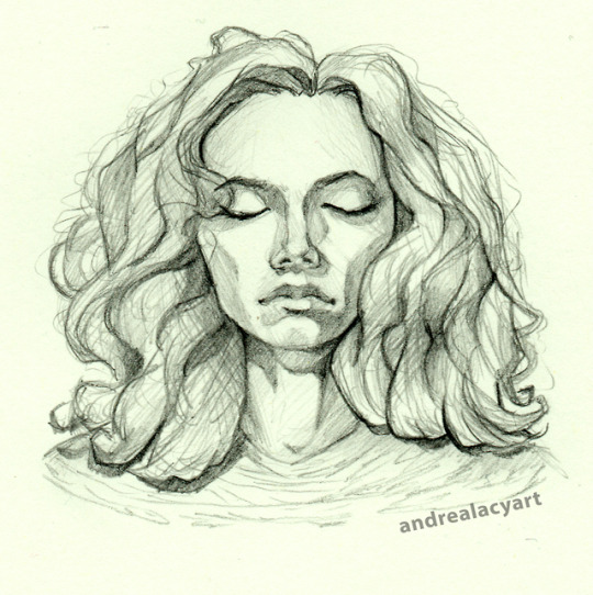
Photo
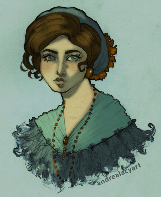
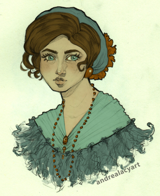
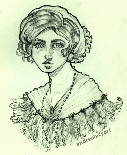
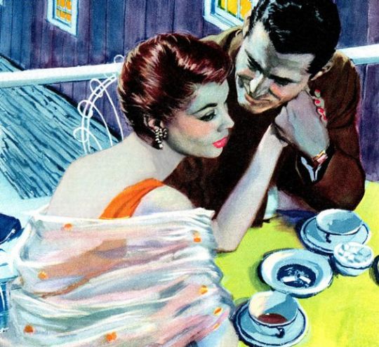
Some pencil experiments with line and quick color and lighting. I referenced lots of old greeting cards of some beautiful watercolor women. -
#art#artwork#drawing#illustration#digital illustration#mixed media#digital art#my art#andrealacyart#illo#digital painting#painting#portrait#vintage#vintage fashion#vintage illustration
4 notes
·
View notes
Photo
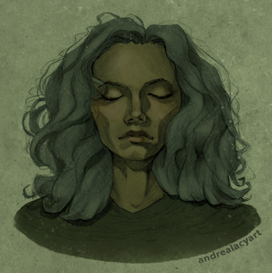
colored a moody sketch
#art#artwork#my art#sketch#digital art#Digital Illustration#digital painting#photoshop#portrait#portrait drawing#portrait painting
2 notes
·
View notes
Photo
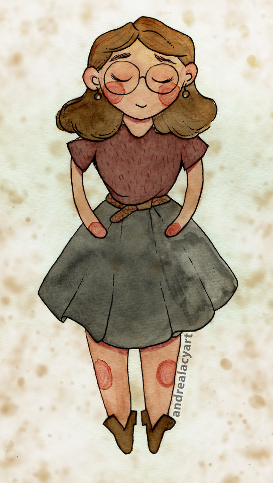
A simple ootd watercolor doodle
#ootdart#ootd#outfit of the day#watercolor#watercolor painting#my art#art#artwork#doodle#sketch#watercolor sketch#van gogh watercolors#watercolors#andrealacyart
4 notes
·
View notes
Photo
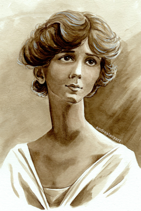
I really love painting vintage styled portraits and there’s something very relaxing working only in sepia tone values. Did this painting while I got sick last week. It really helped me to cheer up.
#art#artwork#myart#watercolor#watercolors#vangoghwatercolor#vintage portrait#van gogh watercolors#sepia portrait#vintage#vintage inspired#illustration#traditional art#painting#watercolor painting
2 notes
·
View notes