Text
Irish Avant-garde designer

Recently I was visiting the National Museum of Ireland when I came across a permanent exhibition by an Irish architect and designer, Eilleen Gray. I confess that I didn't know her until then and I was quite surprised because I thought they were recent pieces from a few years ago due to the modern and current aesthetic. However, I discovered that they are works developed in the first decades of the 20th century.
Doing a bit of research, I discovered that Eillen Gray was one of the leaders of the modern design movement. Renowned in France, she was an avant-garde artist who worked with elements such as chrome and aluminium, tubular steel and cork in her designs. And their furniture manages to mix functionality, comfort and sensitivity. The alternation between textures, colours and formats shows Gray's ability to combine elements and innovate, in a way that inspires people to this day.

Its chairs and armchairs draw attention to this mix between chrome and leather. Mixing the rustic with the modern and industrial. The shapes vary between rounded corners that help with comfort and straight and rigid metals. For this reason, they seem to be very current pieces that represent this innovation in the aesthetics of the early 20th century. In fact, Eilleen Gray's work draws a lot of attention for its elegance and proves how she left her legacy in the history of interior design.
0 notes
Text
Photos + Typography

I was doing my research for my desktop publishing project and I noticed this very interesting style for cover magazines. A currently widely used trend in which photography interacts and blends with the text and design elements of the page. I, particularly, really like this trend for being super modern and dynamic. It gives us a sense of movement, versatility and especially 3D, as the limbs and specific parts of some photos are cropped and placed on different layers of the font or canvas design.

This way, it looks like part of the photo is coming off the page. It's a simple type of effect, without much of a secret, but which completely changes the intention of the image. When we have part of the photo, the person or the object interacting with the elements of the page, the feeling is of something more dynamic, changeable and modern.
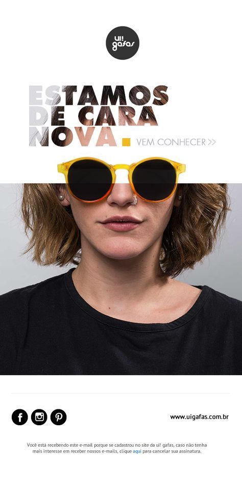
I really like the use of the negative too. Where the font fill becomes the background image. It is as if the text were cut out in the design and gave space to the image in the background, serving as texture and filling. Very beautiful, bold and elegant when mixed with a few colour combinations to make it easy to read. This brings a lot of personality to the design of the page and makes a beautiful photograph stand out a lot. Definitely the types of styles I mix, photography and typography that I intend to carry forward in my design projects.
0 notes
Text
Back to the pass!
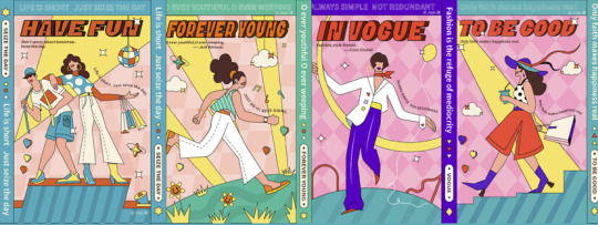
I was researching a design trend for 2023 and there was one in particular that caught my eye: The retro style of the 70s. in layouts and in logos. We can analyse that the trend in art is always this, right? One seems that both in fashion and in graphic design, however much there is an evolution and change in trends, at a certain point, this cycle returns to the initial or previous stages. Retro comes into focus from time to time. And I think that's a very beneficial thing. Because in times of digital revolution, every 10 years we have a new generation that interacts with digital media in different ways. With that, we have changes in language and styles very quickly, with little time to absorb or appreciate a certain stage of this artistic evolution. Retro, that return to appreciating the past, gives us the opportunity to reassess and give due prestige to a stage.
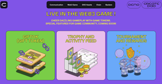
We can currently see this trend off vibrant, daring flat designs inspired by the 70s art movement. These design compositions put bright, saturated colours on the pedestal. Along with this We can see the use of borders in almost all elements and the use of more rounded typography and often with depth, in a way that jumps to the eye. May or may not have a 3D look. However, well-defined uses of solid and strong colours, always accompanied by borders. Almost in a more primitive form of drawing and layout.

Some compositions can even follow a colour gradient, but the border around the elements, most of the time, 2D is always present. As a result, we have sometimes simplified forms that sound like a throwback, but stand out precisely for taking a step back and reintroducing this aesthetic.
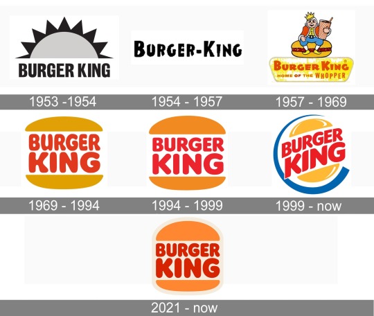
We even have the Burger King logo as an example, which recently returned to what it used to be. Losing brightness and colour details that left the element in 3D for fully 2D shapes, with more contiguous and less flashy borders and colours. Now we can only see how much more we can see of this retro design mix in the coming years.
0 notes
Text
Memphis style and Maisa Show
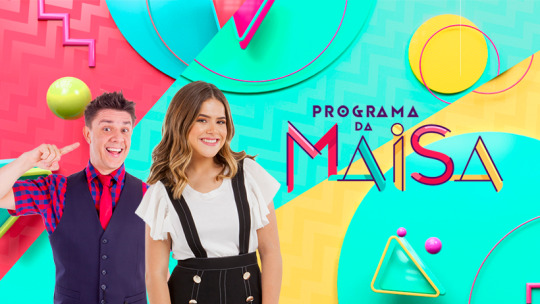
I have a very personal attachment to design that I want to talk about today. This is the Memphis style aesthetic. This logo is about a TV show in Brazil, called “Programa da Maisa”. A talk show by a 16-year-old girl, at the beginning of the project, who grew up in front of the cameras, since she was 3 years old. On social media she has more than 45 million followers, being a real success from a very young age. This was the first TV show of her own, conducting interviews in a humorous and joking way, aimed at a young audience. I closely followed this program because I was assistant director of this project and although I didn't design the scenery and art for the program, I supervised the entire creation process.
The Memphis style aesthetic was chosen from the program's logo to its setting for bringing this versatility to the project. In addition to being very versatile and expressing exactly what this presenter represents. Something light, fun and relaxed. Bringing a younger audience closer to the program.
Memphis style originated from a group of designers in the 1980s who came together to create a collective style. After 3 months working on this idea individually, they put all the ideas together thus creating the Memphis style. A combination of patterns, shapes and colours that at first do not match, but when applied on a large scale manage to create an identity of styles, even if it is the absence of connection between the pieces.

Memphis style has been a trend in recent years and that's why we brought it to Maisa's Program. It expresses fun and versatility by containing different elements in contrast to each other and between colours. We can see from the scenery how different textures make up the floor of the environment, geometric shapes on the wall with the use of spheres, lines, points and different colours and contrasts. Even the logo, which is nothing more than the presenter's name, is composed of an authorial font with different sizes that do not line up perfectly and with unfinished finishes, with each letter being in a different colour. From the logo, the whole Memphis style was applied to the program's scenario and graphic package, with geometric shapes, patterns being alternated with pop art images such as rubber ducks, pineapple and frequent elements in conversations of generation z. I am very proud to have been part of this project on Brazilian TV. However, in addition to being able to work with a young star in my country, I was able to follow the implementation of a different graphic project within a conservative TV station, but which had a very positive public response and exactly as expected.
1 note
·
View note
Text
Delivering the message
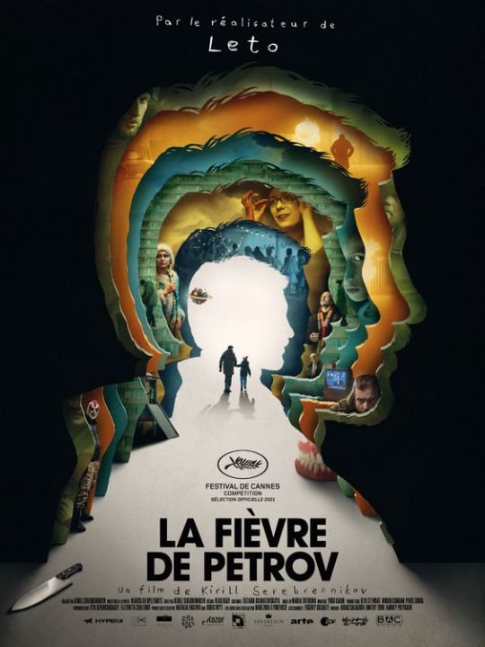
In my research for my film design poster I came across this one. It is a Russian film by Kirill Serebrennikov and the translation would be Petrov's fever. In the plot, we can follow a comic book artist and his family in post-Soviet Russia. While suffering from the flu, Petrov is carried by his friend Igor on a long walk, drifting in and out of fantasy and reality.
And I found this poster very interesting for several reasons. Just by the darker aesthetics we can already understand that it is a drama or even terror. However, there are no horror elements, for that reason, I imagined it to be a drama. The silhouette is something I want to bring in my poster, because it is also something that aborts the character's psychology. And this drawing that shows each of the character's profile in a perspective that ends what would be a light at the end of the tunnel. A light that, at the same time, conveys mystery to us, because we never know what lies beyond that light. It could be death, total madness, sanity. We just have the impression that we are getting to the bottom of the character's psyche and head.
In addition, we have the physical elements of the character being guided by someone right in the centre and beginning of that light, which would then be within his own mind. It's great how each layer of your profile has enough information that brings back memories or madness, something that, until then, just by analysing the poster, there was no way to know. However, it instigates curiosity and the desire to know more about it. Small elements scattered between the layers give us hints of what may come and make room for different interpretations. Like the knife in the lower left corner of the screen, the dentures more in the middle of the layout. They are curious and important elements to bring us this dramatic, frightening and mysterious tone.
Therefore, this poster fulfils its function. Since it transmits the drama to us, the genre to which the film is about, it gives us a briefing of the main conflict of this character and opens up the possibility of interpreting from this plot what we want most about the plot until then, people watch it. It generates curiosity and interest in those who observe the images and gives us the initial information necessary for a production like this.
0 notes
Text
Nature and luxury in harmony

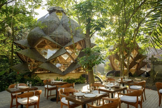
Leaving the fashion subject, a little, because I don't consider myself an expert. I wanted to pay attention to this architectural project of a luxury resort in Bali. Obviously, I will never be able to see something like that up close. However, it is one of the most beautiful things I have ever seen in terms of architecture. It looks like a dream. It's like you're in a science fiction movie. Because at the same time that the wooden composition gives an almost rustic and primitive air to a resort totally immersed in the middle of a forest, you have extremely modern and elegant shapes and lighting.
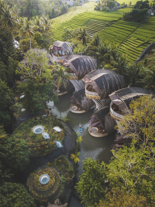
It's like I'm in a James Cameron movie, like Avatar. However, I always thought that something like this was only possible in 3d graphic creation. The mix of modern and rustic is what most calls my attention. It is as if the entire composition was taken from the natural resources of the forest. The spherical geometry of the rooms and different environments does not give it a futuristic, almost spaceship-like appearance. The lighting that at the same time manages to make the most of the natural light mixed with artificial lighting is a show in itself. Really, the result of all this is almost like being immersed in a big dream.
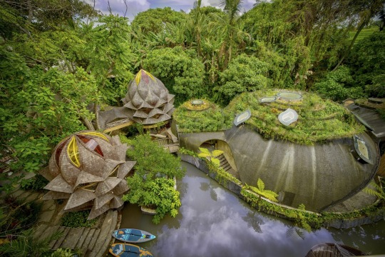
I think the highlight of this work is its integration with the space. The architectural communication with the local vegetation gives an impression of being a hidden indigenous town or city. However, perfectly designed and very studied for the environment. The format reminiscent of hollows and that bring fluidity and naturalness to the environment. The textures and colours that blend with nature. It is a perfect harmony that, without disturbing the environment, only brings a lot of sophistication and luxury.
0 notes
Text
Balenciaga over sized and over limits
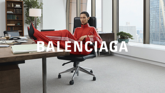
Again, I'm not a fashion person. However, as someone who observes and consumes a lot of social networks, such as Instagram and TikTok, this subject is always on the rise in the profiles that are part of my feed. Although I don't practice fashion, I follow many influencers whose main content is fashion. Because of this, I always admire and analyse fashion from an aesthetic and design point of view.
Currently, we can see a constant need to shock through fashion. Big influencers with partnerships with big brands like to call people's attention to the unusual, the strangeness, and the discomfort. In this scenario, we can identify two sides: the conservatives and the moderns. Just like in almost every kind of artistic manifestation. Fashion is also part of it all.
Personally, I'm between one and the other. I like the visual shock, that kind of image and design that causes discomfort because I believe that this is the only way that innovations emerge and give way to a more democratic fashion. However, I think it's important to keep old styles and designs so that fashion continues to speak to as many people as possible. However, separating beauty from fashion is an important step that I think is valid and I agree.
That said, I realize that there is a very famous brand that stands out in this segment. We are talking about Balenciaga. This brand, specifically, I never liked, not because of the appeal to what is different from them, which are always clashing with their collections that mix the dirty, the old and the new, for example. But it bothers me how they tend to take something that seems very undervalued and attach too much value to it. We can see influencers paying thousands of dollars on sneakers with the aesthetics all dirty and destroyed. The message that Demna Gvasalia, artistic director of the brand, wants to pass on in relation to sustainability and reuse is valid, however, you see an overvaluation of money in items that we can already find on the market with exorbitantly lower values, but not valued because they do not have the seal Balenciaga. It sounds hypocritical to me on the part of this loyal and very famous public that the brand tends to support, such as North American influencer and model Kim Kardashian.
But all this introduction is to talk about something recent that shocked everyone and maybe it's a little important to understand the limits of a brand in wanting to surprise people. Recently, in its new collection, Balenciaga presented an essay in which children held teddy bears wearing accessories from the BDSM universe. Something totally inappropriate for children. I am not even attaching the images here in respect of the kids. Even because, Balenciaga has deleted from all his platform the photoshoot now. if that weren't enough, small hidden messages like easter eggs were captured by the most attentive eyes, with small intentions of supporting Satanism. On the wall of the environment where these children are, there are children's drawings of demons, and an adhesive tape with the Balenciaga brand with the pronunciation mistake, instead of Balenciaga, we see baalenciaga with emphasis on the word Baal, which refers to a middle eastern demon.
We can say that all this was an isolated joke in bad taste or just a conspiracy theory. However, after this great controversy, in previous collections, such as the one he made in partnership with Adidas, internet researchers again found easter eggs, this time more discreet, but which already hinted at where Balenciaga was going. In this shoot, we have several models with sports suits in a formal office environment. So far, so good, the contrast of the environment with the stripped clothes of Balenciaga feat Adidas is very interesting and fulfills the role of attracting attention in a positive way. However, in several photos, it is possible to find some disturbing elements linked to pedophilia. A 2008 document, from the Supreme Court of the United States, in which its content defended the legalization of child pornography in animation format.
In this same image, a book was also found with the paintings of the Belgian artist Michaël Borremans, known for portraying scenes of cannibalism and child abuse. In another photo, in this same campaign, other Internet users pointed to a painting with the name of John Philip Fisher, a criminal convicted of raping his own granddaughter, from 6 to 16 years old.
After these controversies of trials of different collections came to light, some influencers, notably Kim Kardashian, took a stand against the brand, not agreeing with any type of content linked to child pedophilia and child abuse. Balenciaga then went public apologizing saying that despite always wanting to shock, they do not condone any cause linked to child exploitation and that they would hold those responsible for the campaigns responsible. However, it is very difficult to believe that there were two mistakes with the same themes that happened without the intention or artistic supervision of the brand. In my opinion, this just proves that the need to draw attention, even if in a negative way, can end up with fashion, or cause this innovation movement to have a big setback. Since, the conventional and conservative, at least, was in a safe zone and without polemics. This constant need to attract all the spotlight, even in a negative way, may be going too far by losing the limit of boldness. In my opinion, Balenciaga was already a little too much, and now they've proven they can go further. From its oversized clothes to its over-moral limits.
0 notes
Text
Fashion in Pixels
I don't consider myself a very fashionable person. My style is always casual, or casual sport. In my closet, you will always find basic clothes: jeans, black and white t-shirts, and a few colours variations without much information. Let's say I don't like to stand out for my outfit. I even feel like it, but I don't believe I have the personality that involves such an action. That said, I'm not someone who researches or understands a lot of what's new in the fashion world. However, it is the type of subject that the algorithm of my feed tends to bring me because I dedicate a few minutes and likes it since it appears on my timeline.
I like to follow the news from fashion weeks around the world. But it is much more about the people and celebrities who were there than the shows themselves. But recently, at Paris Fashion Week in October, I was stunned by images from a show that undoubtedly made me stop to make sure I was seeing it right.
The Spanish brand Loewe presented a collection called IRL, inspired by the 3d and pixelated design of the Minecraft universe. In a completely surprising and unusual way, even people less interested in fashion caught the attention of a show that leaves us doubting what we are really seeing. The set of pants with jumpers and hoodie used by the models generates a pixelated visual effect, with paintings made with cubes. Big, wide cubes give the pixel feel. The outline of the pieces is finished in black, giving the illusion of an outline to the design. In addition to the rigidity effect that a 2D perspective in the real world causes us.

This feat by artistic director, north Irish Jonathan Anderson is totally unusual, surprising, fun, and arouses a lot of curiosity. We are in a moment where we observe the opposite. Many brands began toying with the possibility of using the metaverse for their collections. Nothing too impressive so far. But the natural movement of the vast majority is to migrate their designs to the virtual universe and Loewe innovated with the opposite movement: bringing a reference and elements of the virtual and using a fabric that appears rigid, colours and shapes, managed to bring a visual 2D to a 3D reality.
This type of trendy design is very interesting because it reaches a much larger audience than the eventual one. In addition to awakening a real sense of purchase. Many people on the internet have started to show real interest in getting these parts. We know that design pieces used in designer fashion shows will not necessarily be for sale, but serve to express the artistic intent of the brand. In this case, Loewe not only managed to pass on its modern and innovative message but also managed to awaken this purchase and desire stimulus.
In fact, I didn't even know Loewe before and his artistic director Jonathan Anderson, but I'll be following his next releases because it's amazing to see how some details in shape, material, and colours can interfere with the way our eyes observe the reality.
0 notes
Video

In the past few classes we have been talking a lot about colours scoop, the mix of colours, contrasts and different combinations. Thinking of that, I came across today with something that definitely couched my attention: the Argentinian - Spanish artist Felipe Pantone, well known for the use of bold colours, geometrical patterns and op art elements. Op art is the style of visual art that uses optical illusions.
It's a bit ironic and, at first, I thought his name was a reference to the Pantone colours, once that's his marks on his arts. But, in a funny way, his name just matches with Pantone company, used as an international colour pattern. Felipe was born in Argentina in 1986 and he started doing graffiti arts, now we can see a huge variety of works, such as exhibitions, internal design, architecture and his configurable arts.
I found his project on a video on Tik Tok, about people buying his configurable arts. Basically, it’s his business where he sells different types of arts that you can interact in a way. Always working with his main colourful and abstract, geometrical characteristic.
The most recent release is called subtractive variability, and its, basically, a combination of CMY colour in an interactive way. He displayed 3 layers of a type of transparent acrylic, one with cyan, one in magenta and the last one with yellow. Then, when you spin each layer, in a different order you can create amazing range of colours. It’s a stunning piece of art and it can be placed anywhere that is going to give you a modern, hypnotic and warming feeling.
Felipe has been featuring with many brands in marketing. We can see some contribution to watch brands, shoes, furniture. So, we can, definitely, see a good business behind his art. I believe I might not being seem in a good way for some other artists. I, personally, don’t see much problem on it. I guess leaving your art, and being able to get a good profit from that shouldn’t be a huge problem. And we can see that all products realised as partnership with Pantone, is very well designed and elaborated to make sure his ideas and message is being given according to his concepts. I was looking for Felipe’s pictures and face, but I failed. All his pictures, even on his personal social media, he is covering half of his face. He always hides is always in way. And I guess I see his point. Pantone wants to be known by his arts features, not for himself. And now, for me, its very clear, its impossible not to look at a piece of colourful range spectrum and not thinking of him.
After being amazed by his art and the subtractive variability, he just completed his last work, recently, making a big graffiti art design on a building in Sao Paulo, Brazil. Simply, my home town. Pantone made a mural of 300.000 Km/s with a nice spectrum of colour, mixing contrast and effects. Basically, I felt a mix of feelings, in one hand, I was so happy by this coincidence of finding this amazing artist when he just contributed with his art in my home city, but in the other hand, I’m far away from there and I won’t be able to see that in person. Although, in my next visit, I will have more than my family to check it out. LOL
#felipepantone#pantone#colour#design#graffiti#graffittiart#configurableart#subtractivevariability#artist#art#saopaulo
0 notes
Text
Bowie and Pop Art

Inspired by the suggestion, in class, to watch the movie “Moonage daydream”, I put here this image of this visionary, unique and avant-garde artist who was and will always be David Bowie.
This design is from the digital gallery www.BigFatArts.net, and shows one of many arts inspired by this musician, dancer, singer, painter, stylist who was David Bowie. We can see the strong influence of POP art that David, early on, introduced in the late 60's, the Glam Rock. Bowie, ahead of his time, introduced colours, shapes, art to rock, always with his peculiar and unique way, as well as his eyes with anisocoria (a condition that made each eye have a different pupil). He was a completed artist and he anticipated the audacity, the new, the different, as we see in POP artists of the last decades. Long before Lady Gaga, with her extravagant clothes, accessories, makeup, David Bowie had been doing the same for 50 years. One of the first artists to reveal and work with his androgyny and break the supremacy of the male image. He brought colours and design with his eccentric hair and makeup, shapes and ideas with his iconic thunderbolt drawn to his face, he innovated in clothes, with shines, textures and causing discomfort to the public, always knowing how to dictate new fashion trends. Bowie changed from time to time, and in addition to evolving musically, as a musician and singer, he always surprisingly fulfilled his role in fashion, dance and the arts as a whole. The movie “Moonage Daydream” shows us all this artistic package of this music icon, his inspirations, works, and the eccentricity that every good artist has. This image also makes it very clear that remarkable people such as David Bowie can be recognized by symbols, by their influence and contribution to artistic manifestations. We don't even need to see David Bowie's features in the image, his lightning, his colours, the flag and POP ART will always make it clear who we're talking about. An artist like few others who should appear on earth in 100 to 100 years. It is an immense pleasure to have shared the same period of time and life with someone like David Bowie.
0 notes
Photo


Viscom - Worksheet 2
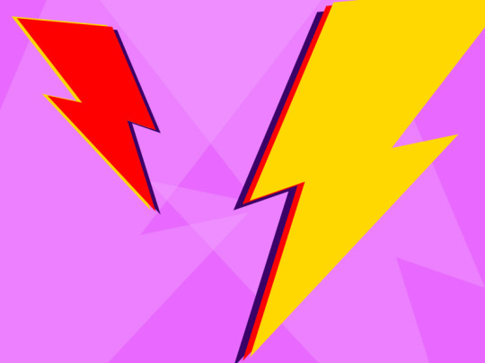
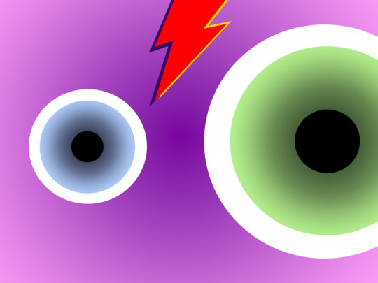
The idea of this exercise to be able to show the types of contrasts, both colours and sizes. Still inspired by the geometric shapes of the previous exercise, I tried to bring right triangles and a lot of elements with different sizes, different planes and that entered into contrasts in a way that I could bring something interesting to my canvas. I used abstract composition and also some more specific ones like rays. Even though it was a mixture of random drawings, I tried to translate what the exercise asked for, which was to work with contrasts of all shapes and types.
0 notes
Photo
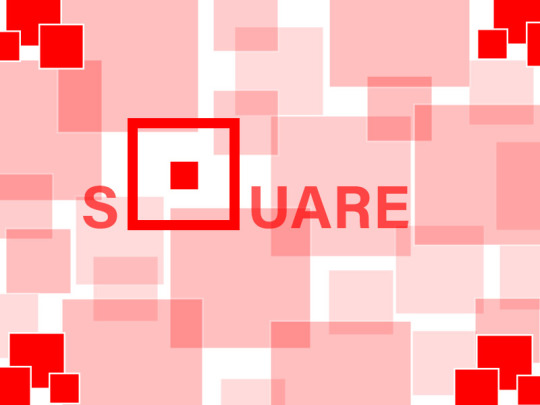
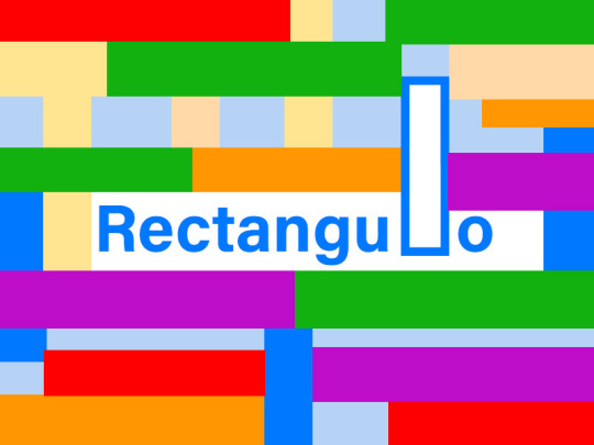


Visual Communication - Worksheet - exercise 1.
For this exercise I wanted to use the literal form of each word around the entire design. Using different sizes to generate contrast and also different colours, I wanted to simply integrate the word of each geometric shape within each screen. Just like in “triangle” we have a triangle in T, in C we have a circle and in Q we have a square. Only in the rectangle was it a little more difficult to see this possibility, but I managed to use one of the last letters: the L as a rectangle. I compose around the main word, more elements of this geometric shape that differ in size and transparency. However, always maintaining a unit of color. That they would just be different within the set of shapes. Again, just for the rectangle I decided to mix the colors giving a contrast not only of sizes but also of colours.
1 note
·
View note