#we have ?? 30 something pages of diagrams and drawings? 8 teams so the book is probably 250ish pages long atm
Text
.
#would like to finish my fucking fic but i need to just rant about how insane architecture school is#there are 50 people in my year and we're making this book thing together#have to present the book thing today#theres 8 groups and each person made a handful of pages#each group handles 1 topic#and then theres a formatting team which is a representative from each team#so that we can all coordinate on the formatting and hten go back to our groups to tell them like what fonts to use and give them layouts#shit like that#i am on that team#which means i have to nitpick my team and make sure their pages look the same as the other people's pages and compile them#we have ?? 30 something pages of diagrams and drawings? 8 teams so the book is probably 250ish pages long atm#thats due today and after were done presenting were getting a second study to do which is due on monday (same length)#we have to present that one too#and then we have an essay due tuesday (3 pages) a site analysis due thursday (that ones short#another due next tuesday (again 3 pages for theory (gag))#and were getting our studio assignment after mondays presentation#where we have to design a building and we have a few months to do it#and this weekend i have a networking event and a site visit so i have like 1 day to work and 1 day to do those things#oh and we have readings in the midst of all this#not sure the word count on that but we have usually 4 a week and theyre usually each 20 ish pages long which isnt that bad but you know#oh shit i also have to go to mr theory mans office hours on monday bcause i NEED that 4.0 man i need it#anyway if i am not writing i promise you i PROMISE you i am thinking about how much i want to and what i will do next#there is just ?????? so much shit to do#also my structures class is during the quali today so im just gonna. watch it in there. multitask. priorities#tldr dont study architecture#all these f1 drivers who wanted to be architects? would they have survived is my question. the answer may shock you#td
2 notes
·
View notes
Text
Design Integration
Developing a new campaign created the opportunity to review previous processes and further explore new capabilities. The new campaign started from a proposal for a Tiny Homes campground that needed a name, logo, and stationery. The new logo explored seventeen different sketches from which four were selected and developed into roughs. One rough was then selected and further developed into six variations. These variations produced a final logo for the Coastal Oaks Tiny Village. To further explore the branding process a business card, letterhead, envelope, advertisement, rack card and invitation were designed.
The next step is to create a moodboard, wire diagram and web page that will tie all the branding elements together. This final creative media plan will introduce the innovative Coastal Oaks Tiny Village campground to the public, announce the grand opening and help to fill the reservations for the first season.
**NEW** Campaign Project Tiny Homes Campground
This campaign is for a tiny homes campground that affords consumers the opportunity to experience the tiny home movement. Through temporary tiny home vacation rentals individuals/couples can find out if this simplified lifestyle is something that they would like to permanently consider. The campground will have eight unique isolated community campsites each with eight tiny homes. These small pocket communities are distinctive campsites with individual themes which makes up the larger village.
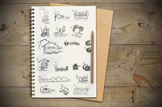
Sketches:
The first sketches were free flowing ideas that would quickly identify tiny homes to an audience. “It’s vital to keep an open mind and not limit yourself when sketching. Even if your ideas seem too far-fetched, it’s best to make a visual note of every thought that crosses your mind” (Airey, 2015, chapter 7). Sketches 3, 4, 6 and 8 were selected for further examination and development.
Airey, D. (2015). Logo Design Love, Keep it simple. Retrieved May 07, 2017, from http://ce.safaribooksonline.com/9780133812589/
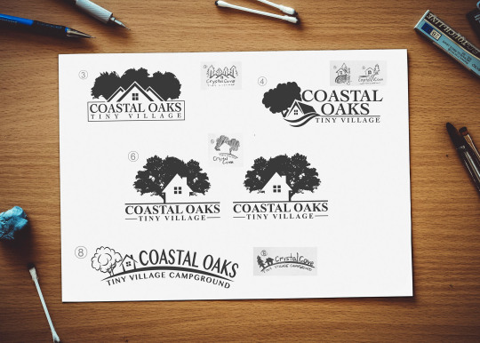
Roughs:
Originally the name was Coastal Cove, as the refined logos began to be developed the name was changed to Coastal Oaks. Many of the original sketches contained indigenous loblolly pines. These pines are weak and seasonal hurricanes decimate these trees. To strengthen the brand identity a strong tree was selected, the oak. To identify the logo with the local area and eastern North Carolina region the word “coastal” was selected. “The right name has the potential to become a self- propelling publicity campaign, motivating word of mouth, reputation, recommendations, and press coverage” (Wheeler, 2012, p. 23).
As logo number 4 was being refined, some ideas from logo 5 was incorporated with the way the text was handled. Logo number 6 had a polished classy business look that shows the strength of the oaks with the negative space of the tiny home which helps to frame the house and make it stand out. Logo number 8 was created for a playful look but does not add to the professional brand identity.
Wheeler, Alina. Designing Brand Identity: An Essential Guide for the Whole Branding Team, 4th Edition. John Wiley & Sons P&T, 10/22/12. VitalBook file.
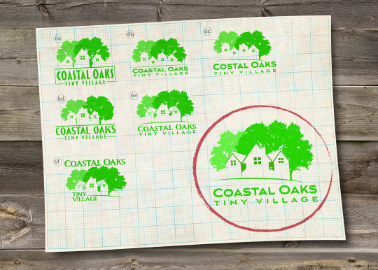
Comps:
The Coastal Oaks Tiny Village logo is in the final stages of completion. Logo number six was chosen for further exploration. Here, some fine tuning with a different font choice gave the logo a tone and feel of a fashionable and professional tiny home campground. “Typefaces have great influence over people’s decisions, helping to further emphasize the message of a brand. The typefaces that you choose can effect whether the right message is being communicated to the viewer” (Hardy, 2011, Part II, Chapter 8). Additionally, it was suggested to add more than one home to the logo so that it would represent more of a village. “There’s always room for more creativity, refinement, and experimentation. Don’t be afraid to create variations of your original idea: Remove elements, add elements, and play with the proportions and the weight of the drawing” (Hardy, 2011, Part II, Chapter 7). This revision contained six new variations; 6a through 6f of the logo. The oak trees and negative space are similar to the original version number 6 while the changes show different home and text combinations. The final logo is circled in red.
Hardy, G. (2011). Smashing Logo Design: The Art of Creating Visual Identities. Retrieved May 10, 2017, from http://ce.safaribooksonline.com/book/graphic-design/9781119993568/
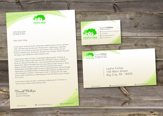
Stationery:
To elevate the campaign to a higher level and improve work, one of the areas revisited explored how to build a strong brand using print media. Print media such as stationery, brochures, signage and mailers assist in building a strong brand. To build a successful, long lasting and memorable brand there must be a consistent use in the logo, color, typography and images. The image must be distinctive and stand out from other brands. This brand must connect with the customer and become synonymous with trust and value. “Your personal reputation, like a company’s brand, lies outside your control. It’s not what YOU say it is—it’s what THEY say it is. The best you can do is influence it” (Neumeier, 2007, p. 19). Print media allows the aesthetic qualities of the font, colors and images along with the physical texture bring the print to life and establishes brand recognition.
The business card is an example of how the logo would look at is smallest size. According to Gareth Hardy “a simple logo design improves how the logo performs at smaller sizes—a complex logo may look fine on a billboard, but on a business card or letterhead, all that detail will be lost” (2011, Chapter 3: The Key to Success).
Hardy, G. (2011). Smashing Logo Design: The Art of Creating Visual Identities. Retrieved May 14, 2017, from http://ce.safaribooksonline.com/book/graphic-design/9781119993568/
Neumeier, M. (2007). ZAG: The Number-One Strategy of High-Performance Brands. Retrieved May 17, 2017, from http://ce.safaribooksonline.com/book/branding/0321426770
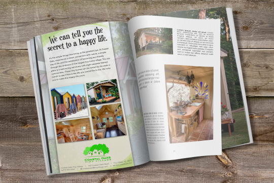
Advertisement:
To add to the stationery and branding media an advertisement was created. The advertisement speaks to the audience about a simple lifestyle and invites them to try and experience the tiny house life. The headline that was created for the ad bridges the gap between the audience and the Coastal Oaks Tiny Village brand. The question peaks the interest of the viewer by stating “We can tell you the secret for a happy life” this in turn creates curiosity and engages the viewer to read the body text to find the secret. “The essential rule is to always understand that your job is to create a bridge between the brand or the company you’re talking about and the people you’re trying to talk to. And that bridge better be rewarding. It better be likable, engaging, entertaining, charming, interesting, funny, fun. . . . You’ve got to create a bridge that, one, doesn’t allow them to ignore it and, two, makes them feel good for the 30 or 60 seconds they’ve spent with that company or brand” (Felton, 2013, p. 197).
Felton, George. Advertising: Concept and Copy (Third Edition), 3rd Edition. W. W. Norton & Company, 20130805. VitalBook file.
0 notes
Last Seen Blogs
carpornpowerwomen
CARPORNPOWER WOMEN

whatgayswant69
What We Want

alkanhukukburosu-blog
Alkan Hukuk Bürosu

karlabanana
KarlaBanana

fuckyeahhorrorpunk-blog
Fuck Yeah Horror Punk