#ui mobile
Text
All I'm saying is that as someone whose first console was a Mattel Intellivision, the sorts of control schemes that mobile developers would have us believe are reasonable ways of playing an action game on your phone are starting to feel eerily familiar.
924 notes
·
View notes
Text
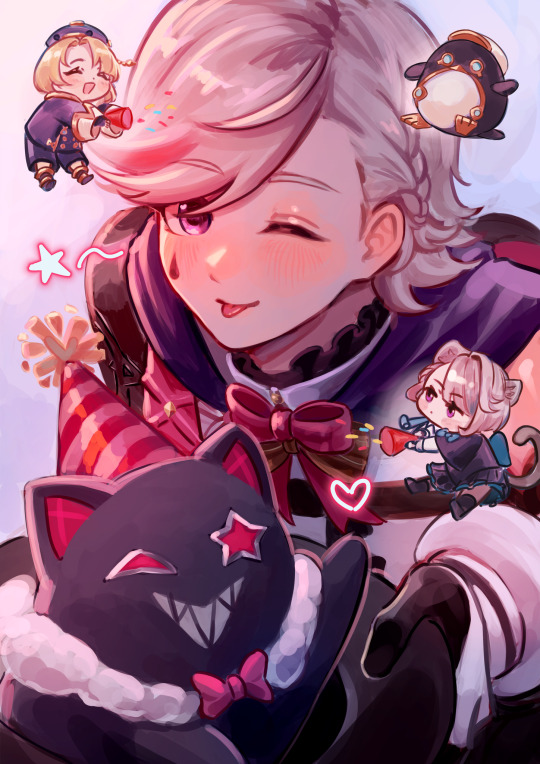
Birthday gift for a friend!
#genshin impact#genshin impact lyney#lyney#freminet#lynette#tumblr keeps changing their mobile ui#i got confused for a sec where the make post button is 😭
556 notes
·
View notes
Text

Nuevo.Tokyo™ / Japanese Gradient [For UI] / Gradient / 2024
Download
#nuevo.tokyo#Japanese gradient [for ui]#gradient#2024#device#digital#mobile phone#shopsystem#typography
303 notes
·
View notes
Text
who let discord cook on this new ui i want the old one back this one messes with my muscle memory so bad and it is actively less convenient like
the member list is way out of the way instead of being a simple swipe to the right, now swiping to the right triggers a reply on the message you swiped over instead
search tool is missing several results and no longer lets you go through pages you have to scroll down which makes finding stuff harder especially if it’s not recent
why is the invite members button right below the search that makes me anxious abt accidentally inviting someone to a server that’s supposed to be private or something
something something DM list and server list didn’t need to be in separate tabs
okay two good things uhh I like how voice calls look and being able to search for members is handy
but oh my god everything else is so much less convenient and it wasn’t needed
298 notes
·
View notes
Text
This is what I wrote in the feedback section for the new discord update:
I absolutely hate that the messages like group chats and DMs are in a different tab than servers now. there was absolutely nothing broken about the way that it was laid out and displayed before, so there's no reason to "fix" it!! I also am sorely missing the ability to swipe left to look at all members of a server, the having to click on the top feels clunky and visually unpleasant. I hate being taken to an entirely different screen just to see who's online! it's an entirely unnecessary extra step that helps no one. the idea of "prioritizing messaging" by putting private messages and group chats in a tab seperate from servers is completely asinine when discord as a whole is a messaging service in and of itself! also, it's a small aesthetic change but rounding the corners of the servers when swiping to look at the servers at the side is unnecessary and unwelcome and overall incredibly displeasing to look at. speaking of swiping, making it so swiping left creates a reply to a message is the most unnecessary, confusing, and almost MALICIOUS feeling change yet, especially when swiping left had an entirely different function before. please listen to your user base and stop making so many changes that absolutely NO ONE is actually asking for and actively make the user experience worse. you have a good app, it is not broken, stop trying to fix things that don't need to be changed because you've continually only made things worse.
#im having a very normal and neurotypical time#so do you think discord just hates autistic people or like. what. because what was the reason#discord you do not need your mobile app to look like a fucking social media platform YOU ARE A MESSAGING APP#WHY WOULD YOU PUT DMS IN A SEPERATE TAB TO FOCUS ON MESSAGING. ITS ALREADY A MESSAGING APP!!!!#what is actually wrong with them#i hope everyone involved in this UI change dies in 7 days#discord#discord app#discord update#discord server#discord changes
193 notes
·
View notes
Text
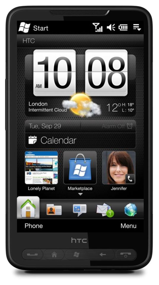
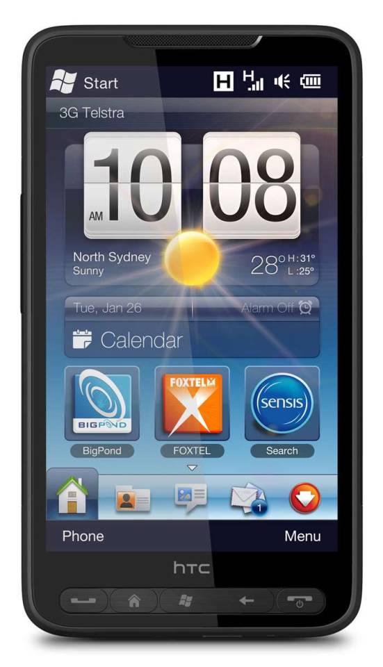

#art#cellphones#design#frutiger aero#graphic design#graphics#htc#icons#mobile#phones#smartphones#tech#technology#touchscreen#user interface#ui
234 notes
·
View notes
Text
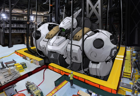
factory
#mech#mecha#mech design#concept art#mecha design#i mostly use mobile and the ui is very annoying so i accidentally followed some people i'm very sorry
391 notes
·
View notes
Text
friendly reminder that u can reverse tumblr updates on mobile by downloading an old app apk
step 1: go to your app/play store, turn off tumblr auto-update
step 2: delete tumblr
step 3: google 'tumblr old versions' and find the either ios, android, or whatever other system you have
step 4: scroll back a couple versions and click install on one you want
step 4.5: you may need to give your browser permission to install apps
step 5: click on the download, bam now u have old tumblr
step 6 ig?: swipe down on the blue banner in app telling you to update
anyways reblog this or send this to ur local mobile-using autist who wants pretty dms again
#tumblr#updates#changes#tumblr updates#tumblr update#messaging#tumblr messaging#196 migration#196#196 campfire#r/196#twitter#twitter migration#twitter migrants#reddit migration#reddit migrants#tumblr mobile#staff#support#ui Update#ui layout#user interface
230 notes
·
View notes
Text
>new shitty discord mobile ui
>new shitty tumblr mobile ui
>new shitty youtube desktop ui
And none of them have options to go back to the old layouts!
#I had to finally update discord on mobile because forums/threads stopped showing up entirely#and gifs wouldnt load#I had to finally update tumblr mobile because the dash stopped working and each time I visited a blog it said it was empty#and heres to hoping theres an extension that can get youtube on desktop back to normal#ugh!!!!!#all these companies changing layouts at the same time :(#and the tumblr desktop ui update from earlier.....#and *gestures to windows 11#I got a new laptop that came to me windows 11#and I am so happy I was able to reset it back to windows 10
40 notes
·
View notes
Text


Check out the new app icon designs for Praxis — a blend of neo-brutalist color schemes and network concepts
join the praxis discord - praxis github
#open source#praxis#free software#typescript#nodejs#foss#ui design#logo design#design#app design#mobile app design#ux design
71 notes
·
View notes
Text
So Discord decided in all of their genius in their newest mobile update to drop the old, perfectly functional UI in exchange for the universally hated new UI. If you’ve tried it for a second, then you probably know how clunky it is. I haven’t touched it since it was first launched and I’m currently avoiding using it because I highly doubt it improved.
So don’t update Discord if you hate terrible UI design and maybe leave a review or complaint in their support because this just fucking sucks
#discord#mobile discord#how did they think this was a good idea#i haven’t heard a single positive thing about the new ui and they still force you to use it#i hate their change for the sake of change mentality#if it ain’t broke pretend it always was and impliment a worse option and remove the functional one entirely#fuck discord
64 notes
·
View notes
Text

Nuevo.Tokyo™ / Japanese Gradient [For UI] / Gradient / 2024
Download
#nuevo.tokyo#japanese gradient [for ui]#gradient#2024#device#digital#mobile phone#shopsystem#typography
69 notes
·
View notes
Text
my biggest beef with touch pads is that you cannot hover. I love hovering. just put my cursor there for a moment, maybe see where the link goes, some nice hovercard action, maybe get to see a tool tip, woah
#żmija gada#I looooooove the older UI. I love it#I hate mobile apps I hate cookie cutter apple style websites I hate smooth widgets
139 notes
·
View notes
Text
Clear Theme 4 Apex Launcher
#apex launcher#art#blue#cellphone#design#frutiger aero#graphic design#graphics#icons#mobile#phone#screenshot#skeuomorphic#skeuomorphism#smartphone#tech#technology#ui#user interface
162 notes
·
View notes
Text
as primarily a mobile user i feel like i'm watching the world burn around me blissfully ignorant as i refuse to step even an inch near the desktop version any time soon
#rambles#me with my silly little mobile app and silly no ui change#i feel like a bystander watching a group of kids get bullied#im so sorry lovies💔good luck on your desktop journey
61 notes
·
View notes
Last Seen Blogs

revbryanapearson
Holy Crap

larehhh
Minimal talking

askbeannuts
To the Skies...

consumedkings-archive
( A R C H I V E D )

imrankhanyoutuber
ImranKhanYouTuber