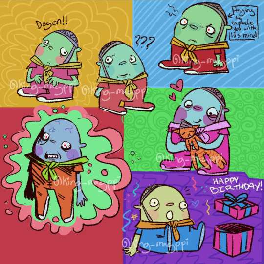
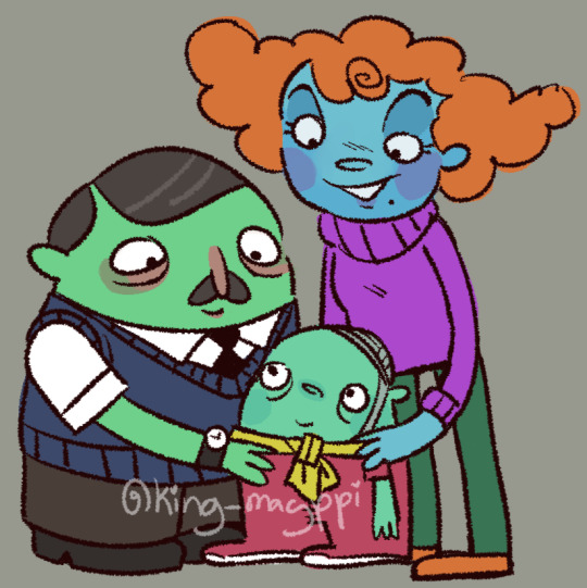
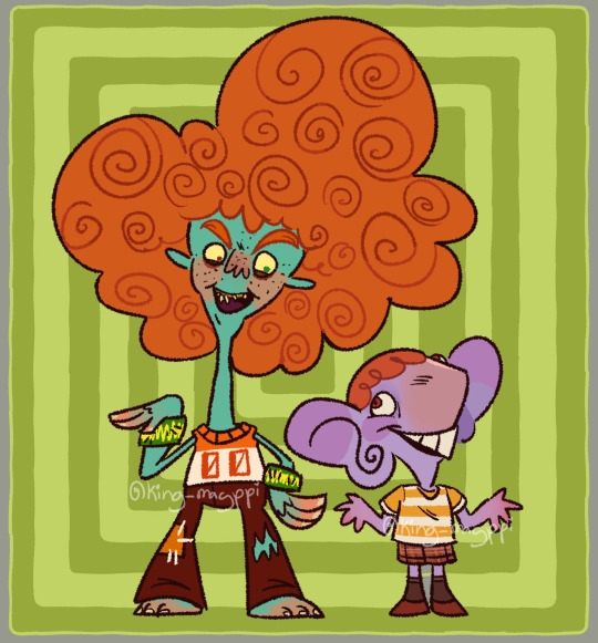
#those people dogen are with in the one picture are designs i made up to be his parents btw!!!
Text
So I started Psychonauts this week and I am in LOVE with this game?? SO many cool characters to look at oh my God.. And the ocassion for today's post is for one special little guy in particular... HAPPY BIRTHDAY DOGEN BOOLE!!! One of MANY characters I really like so far!
!!!!NO SPOILERS IN THE COMMENTS PLEASE I HAVEN'T FINISHED THE GAME YET!!!!
P.P.S: This was meant to be posted earlier in the day but I forgot and now it's tomorrow.😭
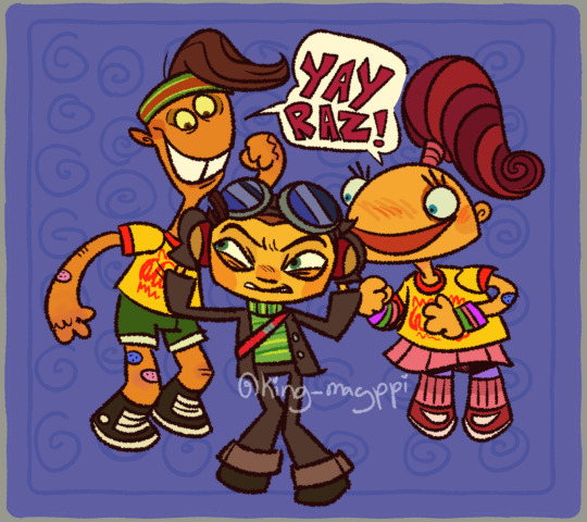
#psychonauts#psychonauts fanart#dogen boole#edgar teglee#maloof canola#mikhail bulgakov#bobby zilch#benny fideleo#razputin aquato#psychonauts razputin#clem foote#crystal flowers snagrash#those people dogen are with in the one picture are designs i made up to be his parents btw!!!
1K notes
·
View notes
Photo
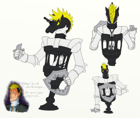

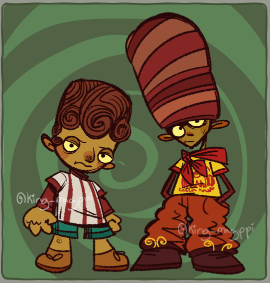
Persona 4-style Shadows of Knightley and Simon! (Because they have a lot of issues, and therefore this was a lot of fun to do. =D)
Some background for people not familiar with this concept from the Persona games: a Shadow is the physical manifestation of a person's suppressed self, the thoughts and feelings that they hate to acknowledge and try to hide from everyone including themselves. They're initially humanoid and look like a yellow-eyed doppelganger of their host, but if the host denies that the Shadow is a part of them, the Shadow grows in strength and transforms into a monstrous berserk form with an appearance that represents its host's issues in a symbolic, abstract way.
(You should totally play Persona 4 if you haven't, by the way. It's great.)
While I adore the concept of Shadows and often think about hypothetical Shadows for non-P4 characters that I like, I don't usually consider berserk forms that much because I'm not very well-versed in the symbolism necessary for it. However, Knightley and Simon just so happen to already have so much rich imagery going on with their designs for me to work with - the horse, chess and knight motifs for Knightley, and the monkey and clown motifs for Simon - that I was actually able to come up with some plausible berserk Shadow forms for them! So here they are, for the small handful of people who care about Simon and Knightley's issues enough to be able to appreciate this.
More detailed commentary on exactly what I had in mind for each of the designs under the cut.
Shadow Knightley
Knightley's suppressed self would revolve around the ideas of failure and inadequacy. He's a failure as a bodyguard compared to Rooke, but more importantly and centrally to everything about who Knightley is as a person, he's a failure as a friend to Simon after having kidnapped him eighteen years ago in the snow, and nothing he does will ever make up for that fact. So, take a wild guess who the king chess piece inside Shadow Knightley is, why he's facing away and why he's in chains. (The king is the most important piece on the board. The entire goal of the game is to protect him.)
The knight's sword and shield are broken, useless for protecting the king, because Knightley couldn't ever really protect Simon at all.
The structure the king is trapped inside is supposed to evoke the sorts of towers that knights have to rescue people from in fairy tales, except how is Knightley supposed to save his king from a prison he himself trapped him in?
This tower also conveniently happens to look like a rook chess piece, linking Knightley's inadequacy compared to Rooke to his inadequacy at helping Simon.
The king's chains are connected to a shackle around Knightley's neck which I based off his neck brace (a symbol of his failure against de Killer) because the fact that he did this to Simon is always holding him back.
The king can sometimes tug on the chains to give a similar effect to pulling on a horse's reins. Simon essentially has control over Knightley, who would do anything Simon wanted him to to try and make up for the past.
The horse helmet with an exaggeration of Knightley's ridiculous hairstyle and his gun for a horn is a representation of Knightley's over-inflated ego - except that this is a mask and not his real face.
Knightley himself and his king are white, but the parts symbolising the things that work against him - the tower, the chains and the helmet - are black, like opposite sides of a chess game.
His shield bears a broken version of his father's insignia - broken and missing the letters because he can't properly remember his father, but still there because he still wore that ring and so he must have still cared about his father in some way.
While I don't usually draw Knightley with his neck brace because unless it's explicitly the three or so days in which he wore that there's no reason to draw him with it, Shadow Knightley's humanoid form has the brace because, again, it's a symbol of his failure.
Getting into hypothetical battle mechanics for a moment, Shadow Knightley would probably use some ice-elemented skills, given what he did to Simon. He'd be vulnerable to piercing attacks, since such attacks can easily hit the king, which is his weak spot.
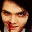
Shadow Simon
Simon's Shadow would embody the fact that beneath all the manipulation and murderous revenge plots, Simon's basically still just a terrified kid who thinks everybody in the world is out to get him. So he's a small, childlike monkey with three pairs of arms to hide his face from all the evil that he thinks is out there.
The bandages all over him are also for the idea that he believes everything is trying to hurt him, as well as how hurt he was by Knightley's betrayal. The knife in the back may have been a bit unsubtle of me, but, shh.
The horse-shaped sweet he's clutching in his tail represents the fact that despite everything he misses his father (who made the best desserts in the world), and he misses having a best friend that he doesn’t hate and want to murder.
Those tears on his face are reminiscent of the ones on his clown make-up, except these are actual tears.
His colour scheme is a sort of sepia-tinted monochrome to reflect the fact that he's stuck in the past and can't move on from what happened to him.
The jester's hat (with bonus Dogen's bells on) symbolises the jester-like mastermind persona he puts on and is in full colour because that part of him is so jarringly separate from the real him beneath it.
His humanoid form doesn't have the silly ponytails which were only ever a part of his facade, but he also doesn't have dyed hair, since that would have been something he did while on the run partly to try and distance himself from the kid he used to be.
Battle mechanics-wise, I imagine he'd be weak to ice for obvious reasons. Not entirely sure what element he'd use himself, though. I can't really picture him fighting much at all, actually - more just cowering in the corner and desperately trying to avoid all attacks that come his way.
#ace attorney#ace attorney investigations 2#aai2 spoilers#horace knightley#simon keyes#shadows#crossover#ace attorney au#persona 4 au#ramble
146 notes
·
View notes
Text
Column #28 - Popkalab Interview
Based between Rotterdam and Rio de Janeiro, experimental project POPKALAB is all about creating unique experiences through the mediums of smart clothing, unique design, interactive installations and tactile interfaces. Spearheaded by founder Ricardo Nascimento, the lab have recently been making waves with a series of wearable sound-based accessories and electronic-embedded sneakers - we caught up with Ricardo to find out more.
The Creator's Project: Tell us a bit about POPKALAB – what's it all about, how did it first get started and what was your initial aim when setting the project up?
Ricardo Nascimento: POPKALAB started as a platform to present my personal work. After some time, I started to receive requests from other artists and companies to develop interactive pieces, so I decided to migrate my personal portfolio and founded POPKALAB as a independent studio focused on the creation of experiences through smart clothing and interactive installations.
MAK Fashion Lab #01 - Shoes Sequenz from MAK Wien on Vimeo.
Walk us through the kinds of intelligent clothing prototypes POPKALAB works on. What are your thoughts on the ongoing relationship between fashion, technology and the body?
We develop pieces that expand our senses and use the body as a vehicle for making statements. We create clothes that make music, light up, react to cell phones and light to extend our body. For us, it's important to hide the technology as much as possible, until it becomes almost invisible – at first glance, the pieces look like ordinary pieces of cloth but when you start to interact with them through wearing them, something extraordinary happens. During the conception of the pieces, we try not to create "gadgets", but instead pieces that can have a poetical approach. We're more interested in making people dream, instead of necessarily making the wearer's life more efficient. Fashion is a way of expression, and technology adds other possibilities for this expression to happen.
We love the sound-based pieces like the Recording Shoes and the Orchestra Scarf you guys recently put together with the BLESSproject. Creating physical pieces that allow the wearer to tailor auditory experience as wearable fashion is a pretty impressive undertaking – what was the inspiration behind those designs?
The idea behind the Orchestra Scarf was to create a bubble of sound around the body, as if it was a perfume. In the morning, you can choose which perfume you are going to wear – we wanted to do the same with the music, to allow people to be able to decide how they would like to sound. You can change the sound by wearing it in different ways.
The Recording Shoes is a piece that plays with our perception; by playing the sound of steps when the person stops walking, we intended to create a sonic confusion.
The last piece was the Melodised Hammock. The idea came from the design that BLESS made using pillows and robes – we wanted to turn the hammock into a instrument that can be played. The piece you've seen is the first prototype. We are now looking for opportunities to create another version, with more precise interaction.
http://ift.tt/2lm5U1l">Untangle me (2012) from http://ift.tt/2lbFv3G">ricardo O'nascimento on https://vimeo.com">Vimeo.
Interactivity is obviously a key concept for you guys too – POPKALAB also works on interactive video installations and walls. Out of those projects, which one/two was a particular favourite/standout and why? How does the art side of your work relate to the more style/fashion-based aspect of things?
Our goal is to create experiences. The sensation triggered by a piece is, for us, more important than the piece itself. Sometimes smart clothing is the best way to create a specific experience – sometimes it might only be a drawing. However, interactivity is a powerful way to engage people.
A good example is the Head Bang Hero piece, which is a game where the interface is a long-haired wig, and you headbang to collect points – the tricky part is that you need to move your head a lot to get a good score, but by doing so you physically damage your neck. This behaviour raises interesting questions that go beyond pure entertainment, making us think about our relation with games. By using humour and fun, we can touch important aspects of contemporary life in a light, efficient way.
I believe the art side and the fashion/style side are actually the same. If you think about a cloth as a wearable sculpture, you open your mind to other shapes and functions.
POPKALAB was commissioned by Timberland last year – what was the deal there? (And if you could work with three other high-profile fashion brands, what would they be?)
Timberland wanted us to create an interactive piece by hacking one of their designs, so we created a shoe that posts pictures of your location on Twitter and Facebook while you walk. It got interesting feedback, especially from people concerned about privacy and geolocation. The shoes recently evolved into another product when we paired up with Opening Ceremony to embed electronics in their collab Adidas shoe design. The result was a piece titled 'Jump!' — sneakers that enable their wearer to leave both a physical and virtual path. One jump allows a post to Twitter, two jumps takes a Google Streetview photo and posts it to Facebook, while three jumps enable the wearer to pin their personal Google map.
I'm very happy that established brands are starting to invest on smart clothing on an experimental level. If I could choose three brands or designers to work with, it'd be Alexander McQueen for their poetical and extravagant design, Adidas for their experimental vision on technology and Philip Treacy – just because I love his hats.
Outfits like yours are obviously at the forefront of the wearable tech field right now – what are your predictions for the medium over the next five, ten years or so? What kinds of developments will we see emerging?
In the past few years, the development of small and flexible electronics has opened up the possibility to create clothing that is both intelligent and fashionable. There are many "smart" pieces out there, but they lack in style. For example, the Google glass is a very interesting device in terms of functionality, but its design does not look so exciting. I believe that new smart clothes won't look like they're from outer space. At POPKALAB, we're looking for warm designs that show a seamless integration with the technology.
In the future, I believe clothes will become more integrated with other electronics devices and that computers will be merged into everyday objects (including clothes) that will communicate with one another. This "Internet of things" is already happening, and will only increase in the near future. Smart clothes are improving the capability of communication with humans and the environment, as well as expanding our senses and modes of expression. However, despite all these exciting discoveries, we shouldn't just use technology because it's available; we need to create meaningful uses instead.
Popkalap is based between both Rotterdam and Rio de Janeiro – as working environments, are there any creative differences between the two?
POPKALAB is based in Rotterdam because I'm based there. In the Netherlands there are many people doing amazing fashion tech pieces – there's a growing scene with names like Anouk Wipprecht, Maartje Dijskstra, Local Androids and Pauline Van Dogen, to name a few. The Rio office allows me to keep a connection with my country, although I work there way less than I'd like. Our clients are spread over the globe and we often work remotely, creating the concept together via video conference and developing the technology in Rotterdam. Working in Brazil is always a pleasure – people are more relaxed and open to new ideas – but the access to technology is more complicated due to the high price and delivery time. In Rotterdam, I have an amazing team of engineers and designers, which makes it easier to develop the custom electronics and 3D print used in our projects – those services are more accessible in Europe than in Brazil.
What kinds of projects has Popkalab got in store for 2014?
Next year will be very exciting. We are working on some projects, but unfortunately I can't tell much due to contracts. I can say that we are developing another interactive shoe related to music, and also working in collaboration with Brazilian fashion brand High- High to create a concept piece for their next collection. We're also planning to branch out into advertisement and promotion.
from creators http://ift.tt/2kuew6j
via IFTTT
0 notes
Last Seen Blogs

mtparis
Sans titre
cowbellasupremeoh
folk lore ** myth ** alien nature
maybeinsomeotheruniverse
if you are reading this

that2pnyoromano
Welcome to the Crazy Life of Lucrezia Vargas
cyberbundy
don't be nice