#this was also my first time using csp so these feel a bit messy but at least I’m ending my Stockholm syndrome with ps
Text


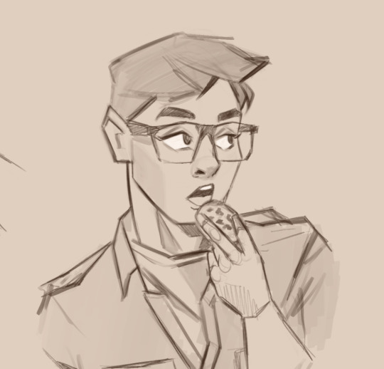
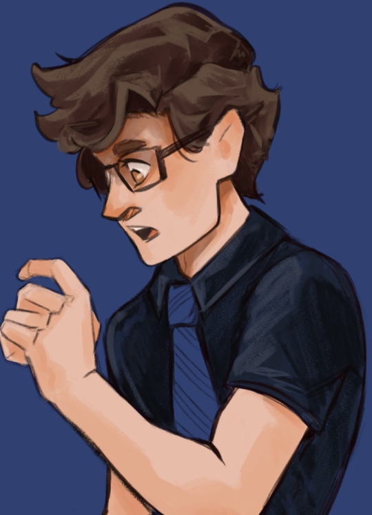
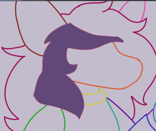
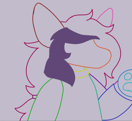
Tarot cards based my Lunadeyis and Aster designs
#I may be the only person in the world who cares about the goddesses#but I love gillions fictional divorced mums#this was also my first time using csp so these feel a bit messy but at least I’m ending my Stockholm syndrome with ps#I also fucking love the theory that Ava was asters champion so that’s in here too#jrwi riptide#jrwi fanart
796 notes
·
View notes
Note
Is it too much to ask what brushes you use for your art? They're just so pretty and blocky and I can't for the life of me find good replicants.
(Love your art, by the way. I've been meaning to study your style for a while now and your colouring pages are perfect for it.)
Of course! All the brushes that I use are free, because I'm cheap and also because I couldn't figure out the payments methods inside of CSP, but I did pay for the program I use (clip studio paint) so this only works for CSP unless the artist released them on some other programs:
For example for this:
I play a lot with the width of the brush so I don't actually use that many, just these 2 that are kinda new for me:
https://assets.clip-studio.com/es-es/detail?id=1702961
https://assets.clip-studio.com/es-es/detail?id=1702959

The first one is really dense so I like to set it really small to use as liner for small but dark details
The second one it's a funny one because it's actually really sensitive to pressure, you can go from really faint to really strong color and that can feel weird however with a bit of care you can get a constant pressure, but I really like it because of that!!! You can get some really neat translucent efects because it overlaps and it's really sharp! I also used them for Remys birthday drawing,
For stuff like this however:
I really like these three, which I actually think are default brushes on CSP, in case they are not I can share the brush file and it's really easy to install but I'm pretty sure they are, names might be different tho because mine is in spanish but there are simply "tempera paint", "fine brush" and "oil"

I really like the "tempera" because it has so much texture!!! but also can look really smooth depending on how much pressure you use and also it's easy to mix with other colors (in the right side I'm mixing with another color)
Meanwhile Oil I like it for sketching or for really rough looks (like in logan's lines here)

Basically I use the same 3/4 brushes per piece but I change the width and stuff a couple of times,
My style is actually really messy, so I lean into brushes that have a lot of texture and these are some of my current favorites, I also reached the limit of 10 pictures on a single post so I might continue on a reblog with the pencil ones that I like.....which are also mainly default brushes (ノ◕ヮ◕)ノ*.✧
I'm not only cheap but I'm also kind of lazy about looking for new brushes, only when I see an art style that really looks like it's using a very specific brush that I don't have, but it's really fun when I download new brushes, it feels like buying new art materials, just plain fun!!!
Also I really like using brushes for things that they arent meant for lmao
28 notes
·
View notes
Photo
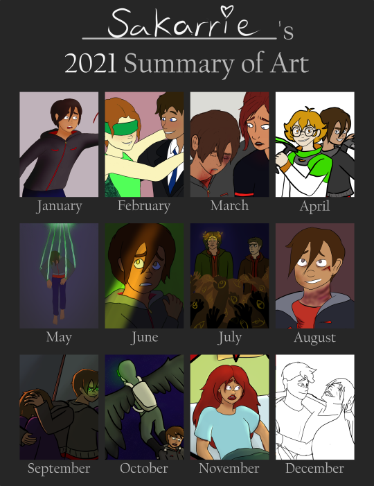

Heyo!!! I know I’m a bit far into the new year, but with this being my first year of digital art, I really wanted to make sure I got this so I can start my build up to compare future years to! This also includes a fair few pieces of art I haven’t posted so take that as reward for actually looking haha. You can find the blank template here!
A few end of year questions cause I love self-reflection way too much!
What was your biggest challenge this year?
Man it really depends on the project! In the beginning, it definitely was anatomy and perspective. I had so much stuff that I wanted to draw but just didn’t feel like I had the ability or knowledge to pull it off. That being said, after I found position references and 3D models, that was way less of a stress, and positioning the individual joints I feel taught me a lot on it’s own just about how different body positions look. After that, it moved into the steep learning curves of animation and lighting. I have an animatic project that I want to see come to life so bad, but I’ve had had to realise it’s going to take a lot of practice with other random animatics/animations to feel like I can full that off. I also have just had a consistent fear of backgrounds and lighting, neither of which I’ve done anymore than dip my toes in still.
If I had to pick one single challenge for the year though, I’d say it was just the mere vastness of tools and styles at my fingers tips. I had so much I wanted to do and so many tools I wanted to use, but they all took (and are taking) a very long time to get used to. Just as I start to feel comfortable with my toolset, I realise there’s a better way of doing something and start back at the “beginner” stage. All being considered, though, that definitely isn’t too bad of a challenge to have haha.
What was something you were surprised by?
Other than the absolute bottomless pit that is CSP’s features? Okay, but for real. That thing is crAZY. Hmmmm I think maybe how much my style varied? I feel like even through I draw Player and Carmen all the time, they still look different in 80% of my pictures. Other than that... maybe how okay I am with my shading? Like, on basically all of these that I even attempted shading on, I thought it was absolutely terrible and obviously incorrect. Looking back through in putting this together, though. I was definitely surprised to find that I’m actually kinda proud of most of them. I’ve got a lot of work ahead of me in that department, but I don’t think I need to be as intimidated as I’ve felt.
Where do you think you most improved?
Definitely in my sketches. Once I had a basic comfort with anatomy, it really was freeing. They’re messy at best, but not having to look up what an arm looks like from a certain angle every time made it way more of a relaxed environment. 90% of my art this year is in quick sketches, and I find that I actually am okay with them even after the first time or two. The repetition has really given me a lot more confidence and I’m way faster. Now I just gotta work on getting PAST the sketch part lol.
What are you most proud of?
Probably my Whumptober trap door animatic. It took me absolutely forever and it’s not consistent in style at all, but it spanned several minutes, included only one character that I’d drawn before, had some pretty dynamic scenes, and there was even a bit of background work! It’s certainly some of my cleanest lineart I’ve made and, considering how vivid the scene was in my head, it’s not actually crazy different. It proved to myself I could pull it off and gives me a lot of hope for my other animatic aspirations.
Speaking of which, 2022 Goals!!
As you know if you happened to have looked through my writing reflection, this is going to be a pretty heavy year in school so I’m trying to keep actual commitments low. That being said I have lots of things I want to try out more this year stylistically:
-Brushes: There’s so many and I’ve got no idea how or when or why to use them, but I want to try!
-Shading and Lighting: I left a lot of things uncolored because I was scared the shading would ruin them, but I’m not going to improve if I don’t let myself fail a bit first.
-More Dynamic Scenes and Positions: Same as above. They’re terrifying, but I want to be able to do them better
-Experiment With 3D Sets!!!: This last month I’ve discovered that in the same way I can use 3D models, I can use 3D sets as well! I’m once again at the very bottom of the learning curve, but I’m so excited for the potential this could bring to the ambitiousness of my scenes.
-Post More: I’m honestly kind of terrified of posting art for some reason, but I have tons to share. I don’t know if it’s cause tumblr is more intimidating, or cause art is stolen more often than fics, or cause it’s way easier for a small mistake to ruin an overall art piece, or cause it feels less common to be a mostly h/c artist than to be an h/c author. There’s tons of worries and insecurities that probably play into it, but I think it would be nice to feel more comfortable because those of you who do interact with my stuff are really nice and deserve the extra Player content.
Overall, how’d the year go?
Pretty good! I really explored a ton of stuff with my tablet and I’m just beginning to feel like I’m moving out of the experimentation stage and into the doing stage (for some things haha). There’s still so much to learn, but I’m getting to the point where I enjoy my art more often than not and in my opinion, appreciating your work where you’re at, despite the flaws, is a huge step towards becoming a better and more confident artist.
#sakarrie's art#carmen sandiego#supernatural#Voltron: Legendary Defender#cs player#cs carmen#vld pidge#Sam Winchester#dean winchester#vld shiro#vld Matt#owlet (gulfish)#tw blood#end of year#art summery 2021
9 notes
·
View notes
Text

I’m not sure how serious you were but I’d be happy to explain hehe. The brief version is I followed this tutorial, but I made a few adjustments since I use csp. If you don’t use csp, I think you’ll still be able to do it but might have to fiddle around a bit.
I’ll explain more in depth under the cut, just cause I can tend to over explain LOL. I’ll include pictures as well.
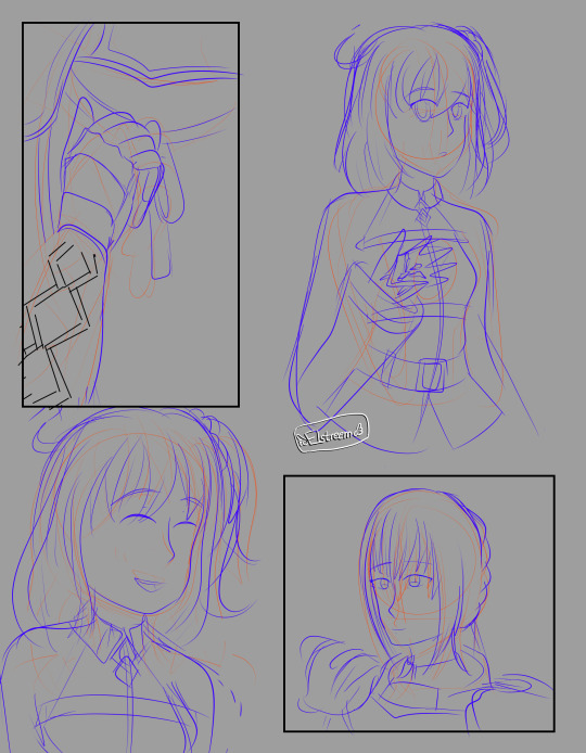
I’m gonna use a drawing I did of my oc Elenor to demonstrate!
1. Like in the tutorial above, the first step is the sketch.

2. Again like in the tutorial, you go over every piece on separate layers. Consider where you want your shadows to be, as they might require an additional piece. For example, she has different sections of her hair, and places where they overlap is where i would want there to be shadows. So, her hair is going to be 2 layers to accomplish that.

While you’re making all these layers, it helps me to think about it as if it’s actual paper. So like, what is going to be lying on top of what to create this effect? For example, Elenor’s sleeve on the left rests on her body, and her body rests on her right sleeve. This helps keep your layers organized (bc you’re gonna have a lot of them).

Here’s a visual example of this. I’ve named the layers w the colors I did the line art in to help make it more clear though i know its confusing. It doesn’t really matter what colors you do the line art in since u can color it later.
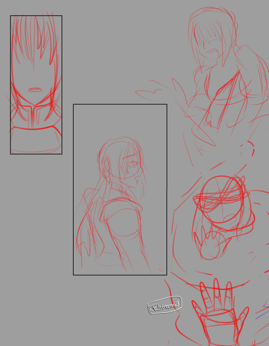
3. Now it’s time to fill in the line art with the colors of your character. (you should turn off the sketch layer for this part!) On the SAME LAYER as your line art, just use a paint bucket tool to fill it in.
Like this! you can see its a bit messy, so just lock transparent pixels (might be called alpha lock on other programs), and color over it so it looks smooth. erase some parts that bled over onto other line art layers
So now it looks like this! and just do this to every layer. yes it will take awhile.

Once you’re done with all of that, it will look like this! Note that everything is still on its individual layers.
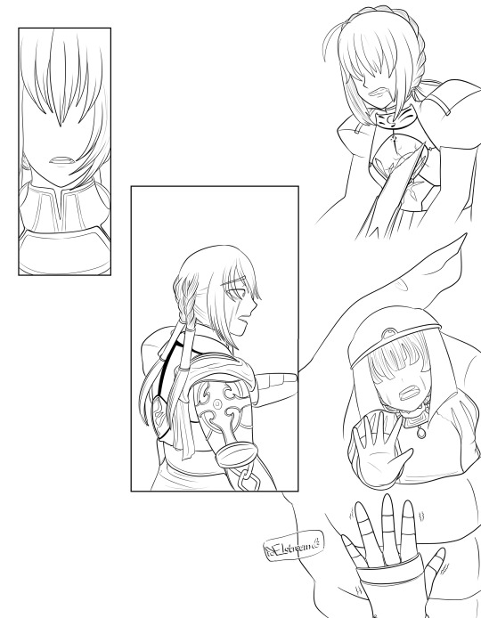
4. Now, like in the other tutorial, you want to duplicate every layer, set it to multiply, and blur the multiply later to create a shadow effect. If your drawing program does not have multiply, just lock transparent pixels and color it a darker color until you get something you like.
This is what that looks like. The multiply layer makes a dark area around the entire layer, but i don’t really want there to be a shadow everywhere. So I’ll just erase the multiply layer in the parts where I don’t want the shadow.
So now we have this! and again, do this for pretty much every layer. There are some that might not need a shadow but p much all of them will. it depends on your preference really.

Now that everything is blended, it looks like this!
5. Now we add in the details, like the lines on her ear and face. I just make a single layer and put it at the very top. BUT it doesn’t really matter.

So now we have this.
6. This is the final step! but it also takes awhile. go onto some free stock images website, such as unsplash or pexels, and search for a paper texture. Copy and paste that into your drawing, and use a clipping layer and put it on top of each of your layers- NOT the multiplied ones tho! I also personally do not have one over the detail lines like the eyes but it doesn’t rly matter.
You COULD merge all your layers and just have one clipping layer, but personally i DON’T do that bc i like to fiddle with the opacity from layer to layer.

This is how it looks while i add all my paper layers. u can fiddle with the opacity as you add them too. The opacity is totally personal preference but to give an idea mine are usually in the 5%-20% range.
And then, once you’ve done all that, you’re done!

I hope this makes sense, I don’t really do tutorials very much but they’re fun to make. Feel free to send any questions you have my way! ^__^
#delta draws#tutorial#i rly like how that elenor game out ill post it l8r tonight or something#oh this is ok to rb also if anyone wants! like if u found it helpful or something hehe
8 notes
·
View notes
Photo
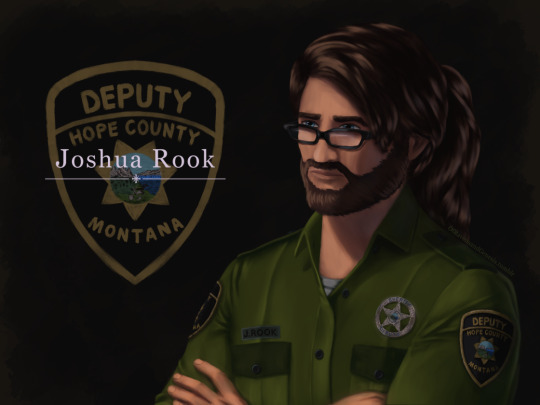
IT IS FINISHED no seriously, this took ages. First couple of days were fine and motoring along with progress, then I was laid out for a week-ish with health problems. Then once I was well enough again I was back to being fixated on finishing this piece of my lad Joshua here for another handful of days, so I’m super glad this is done now.
More talk about the painting, details and process under the cut:
Art Entry 01, Joshua Rook, Junior Deputy of Hope County. Regarding the painting’s execution, stylistic choices, practiced methods, and speculation on further experimentation for skill and stylization.
_____________________________
Honestly I thought that the uniform’s large swatches of green fabric would be more difficult than it actually was. Turns out that was the easier part compared to the shoulder patch and metal badge. x’D The metal badge design is based off of and inspired by a custom-ordered cosplay badge design I found while looking for references, in this post here (link,) from v-i-d-e-n-o-i-r’s blog and Far Cry 5 cosplay. There are some differences in the painting’s rendition above, namely I flattened the middle section and made it all concentric polished metal instead of painted and the great seal rendition in the middle doesn’t have silver lineart either. Those choices are as much for aesthetic reasons of eliminating the blue ring so it was all a fairly simple mono-material-looking surface as it was for simplifying having to forego painting the foreshortening that a spherical dome might entail. Also just because the rest of the metal turned out looking good enough that an additional bit of shiny metal seemed like it’d fit right in for this. That being said, the badge design that inspired this one is rad and awesome looking—and I totally didn’t realize it wasn’t quite like the badges from in-game assets until after I’d painted it. x’D So, I decided to stick with this one since it’s simpler and has cleaner lines, and less engraving to pick out highlights on. Metal is very hit or miss for me to get right, so I’m very pleased with how this one came out! :D I think I did well on that one.
The shoulder patch originally I was looking at real world references and ended up changing the shape once I actually looked at in-game references on Staci and Joey—who I discovered have slightly different details on their uniforms, like the font for their name tags—Staci’s has an old-timey-looking-font with serifs, Joey’s is a non-serif more modern-style font. Some pictures have them having different buttons on their uniforms either in color or shape (the former being exported assets, the latter being in-game gifs/screenies/etc.) This is also how I learned that the little landscape with the shovel, pickaxe and plough/plow are part of the great seal of Montana. I had no flipping idea that was what it was, looking at the patches in-game. The cosplay community does some great work for that, for which I’m grateful. I ended up looking up references of what the state seal’s design was so as to see the smaller details, and to find out what the motto meant ”Oro y Plata,” meant, leading to etymology googling adventures from there, as usual. All important details to paint though I think here, since Joshua’s deputy uniform is symbolically significant to him and will remain so throughout his story as part of his internal conflict for a couple of reasons.
One thing I knew I should’ve done from the start, and reminded myself to do, was the fact that I should paint all skin sections at the same time, so as to ensure they all came out the same shades. I did not do this. x’D I’ll have to actually try to do that next time honestly. Same with the hair sections, while I like how they came out, I do feel the differences between the three major segments in terms of brushwork is not as coherent as I’d like, even if beard hair is not necessarily similar in how it lays to scalp hair, particularly with length and such taken into consideration. Still, not bad. Could’ve used more refs for the backlighting and figuring out how the highlights would fit best on the ponytail, but I think the hair curves turned out nice there in particular. Overall, Joshua’s hair ended up messier than I’d thought with how the locks all end up looping this way and that across his head, but it does actually fit him well as a character for his hairstyle to be messy and loosely held together, but functional. It did end up longer than I’d intended, so we have him likely ending up with a nerdy Jesus hairstyle when it’s down. x’D (Thanks to @undead-gearhead for that mental imagery, I shall take great amusement in that should I get around to drawing Joshua with his hair down.)
Aside from that, I think I’m slowly improving on figuring out how to paint glasses, though I’m thinking in the future I should test more layered reflective light on them or something where the frames are in contact or close to skin, particularly around the glasses’ bridge across the nose and such.
Then there are the other deviation details added—like using dark green instead of the black for the uniform accents. The faded black looks great in-game, but I do think the buttons pop more against dark green instead for this painting. I’m a little bit surprised how well the button-placket section came out, Clip Studio Paint crashed when I painted the first rendition of it, sadly losing all that work. I thought it’d be okay but turns out it didn’t quite get to auto-save that recently enough, but the second go around turned out quite well I think, possibly better. I was originally planning to try to put more textured brushwork across the flat sections of the uniform material, but decided to skip it for speed—I’ll test that elsewhere perhaps, though I think it came out well with the watercolor brushes layered on top of one another like that as is. Among the other smaller details, there’s some tweaks and such for how Joshua’s eye shape, eyebrows, nose shape, hairline etc came out compared to references of Greg Bryk in his role as Joseph Seed. I think Joshua did come out looking like he’s obviously related to the Seeds as I was hoping for, but I’m kind of on the fence that people would look at him and automatically assume it’s Joseph specifically that he’s descended from. I hope so, but either way, that’s how he’s written in-fic. x’D
Overall, I would consider this painting a success, though as usual I do wish it’d been faster to finish. I do think this was good practice for detail work, and metal shading, also: buttons. Still haven’t figured out how to paint lips with more pink or red tones, I don’t like the way they look when painted sadly, unless it’s lipstick. That may end up being a stylistic element perhaps, along with how I paint the lines for fingernails and other such details. Fun fact: I have to leave the shading on the eyes for last, or else my brain goes “The eyes are done! We’re done! Call it a day.” I’m not sure why, but so far, leaving them as flats until the end seems to work a treat for keeping me focused on finishing the rest of the work with less mental dissonance.
Now if only I could figure out why despite knowing I should do all the exposed skin portions at the same time, I don’t follow through on that naturally as far as inclinations go. Maybe it’s a layer organization thing and perception of wanting, say, the cloth to be done first before working “down” to the hands and such in the sense of working from the head down? I’ll have to think on that some more and test things in the next painting. Perhaps color coding the order of layers to paint will help? CSP does have a nice layer-icon-color function that I’ve dabbled with here and there. There are so many brushes, I really do need to test out more of them, I use, what, four or five total, but primarily somewhere around two or three. Hm, but what to do with texture, and how to utilize it so?
Hmmm, as far as personal appeal for methodology goes, I might prefer to use textures in select pieces for more emotional emphasis? If I can figure out how to do that in a messier speed-paint style of things. Rougher textures for conflict, for example. That sounds like an interesting idea to explore, I’ll have to remember that for a later piece. Maybe more heavily textured brushes will also help with the mental itch to refine things to a cleaner-level of refining instead of leaving it in a more organically rough state. Hm, maybe it’s a “mental texture” aversion or something, as far as an interplay between the brush’s texture and the flow of the linework/brushstroke. Perhaps more uneven brushes echo that in a complimentary fashion to better allow less mental discomfort for me personally when trying to paint in a faster, looser fashion?
Honestly, very tempting to go try that out sooner rather than later on some art ideas I have, but I’ve been missing my writing very much of late with two time-demanding paintings back to back. So, ideas for a later time to experiment with.
#Far Cry 5#FC 5#Far Cry 5 AU#FC 5 AU#deputy joshua rook#my art#ofravensandgenesis's art#art talk#chatter#writing about art#writing about fanart#queue
23 notes
·
View notes
Text
Behind the scenes for this comic -
This is preeeetty long, so I'll put it under read more.
So as with all the other comics I have done, the process usually is: lay out panels - lineart - adding special effects (which really is just adding gradients, I haven't really figured out using proper comic tones and stuff -)

Sketches for pages 1 and 2! I often used red pencil for basic outlines, just to figure out what goes into which panel, and then a more polished blue sketch I can draw off.
Initially, dark Bedi (lol) had one eye showing but that just made him look like the angry mango Avenger so I decided to show only the mouth instead.
If I'm feeling confident enough, I go straight off my initial sketch, as was with page 3. Here's the comparison between the sketch and a finished lineart!
And it is not fun drawing the bby so distressed :'''<


Page 3 had a few things going for it, like the fact that it had a gradient background and character outlines were in white - which I kind of blunt-forced my way into doing by clipping another layer on top of my lineart and painting that white. So many layers lol. I had separate panels for the blood drip on Altria's chest because I honestly wasn't sure what I was doing lol.
As for Princess Helena's design (again, she's the princess abducted in the story of the Saint Mont-Michel) there's nothing really deep about it. I don't think Fate will ever show what she looks like so I just thought to draw a princess-y outfit, but I ended up kind of liking it.
And man, the fact that Bedivere still remembers Princess Helena and feels guilty over it after all those years, enough to tell Ritsuka about it in his Interlude. I kind of wanted to explore that really, that he feels a lot of guilt for the people he thinks he failed, and naturally, that fear of losing another person he loves extends to Ritsuka. Which leads to imagined fears on the next page.
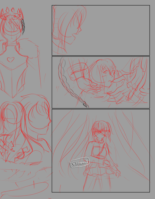

Page 4 is probably the most complicated page, it took me 3 hours working on the line art for this. The hands around Ritsuka are the Foreign God and Goetia...well, I tried, but Beast I has really detailed hands...
It's a bit confusing to me how much of Chapter 6 the summoned Bedivere actually remembers, because Mash says he probably didn't experience it, but he definitely is aware that he's a Bedivere from a different history - the profile even says he swore loyalty to Ritsuka because they helped him fulfill his wish. So...does he actually remember it or not? From some comments on character materials on the wiki, he acknowledges the Camelot allies, and he finds himself upset at seeing Altria Lancer (which she also comments on in her own materials and I realllllly wish we see this interaction in the game.) He also knows she isn't his King, so he seems to know that they were able to let Goddes Rhongomyiad to rest.
On the other hand...Bedivere seems to avoid talking about Camelot in Tristan's Interlude and doesn't seem to acknowledge it in his My Room lines. Which could just be him not wanting to talk about it rather than having forgotten, but couldn't be Fate without some messy lore. Welp. This got long.
Anyway, these four pages are actually the only ones I initially laid out, and the rest is me going rogue and thinking, "Let me add one more page....hm, not concluding enough, one more - and one more -" so the rest of the comic is a bit plain in comparison.
It's a bit of a mind twister figuring out where Ritsuka's side ponytail is every time I draw her. I've drawn Bedi enough times to not be confused where his metal arm is lol.
I also realized midway that it's a little confusing as to what is really happening and half-assed it into Bedivere having his intrusive thoughts while walking with Ritsuka. The first four pages had something going for it which changed in the last six pages, that's me not planning ahead lol.
What else...oh yeah, I initially wrote all dialogue in by hand but my handwriting is atrocious and not really consistent, so I ended up using CSP to insert the text.
If you're ever gonna make a comic, don't be like me who lays out all the visuals with only a vague idea of what the dialogue is gonna be and then end up with longer text than expected in place ^^;
0 notes
Last Seen Blogs

intb-blog1
Int. B. (IB)

zeneez
ZENEEZ

askscientistpopee
ask a filthy scientist

elwrite-s
The Collection
betawoman
Beta