#the markers i used were ohuhu and copics [copics i have just for skin tones]
Text
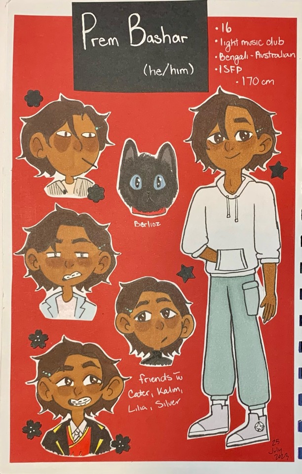
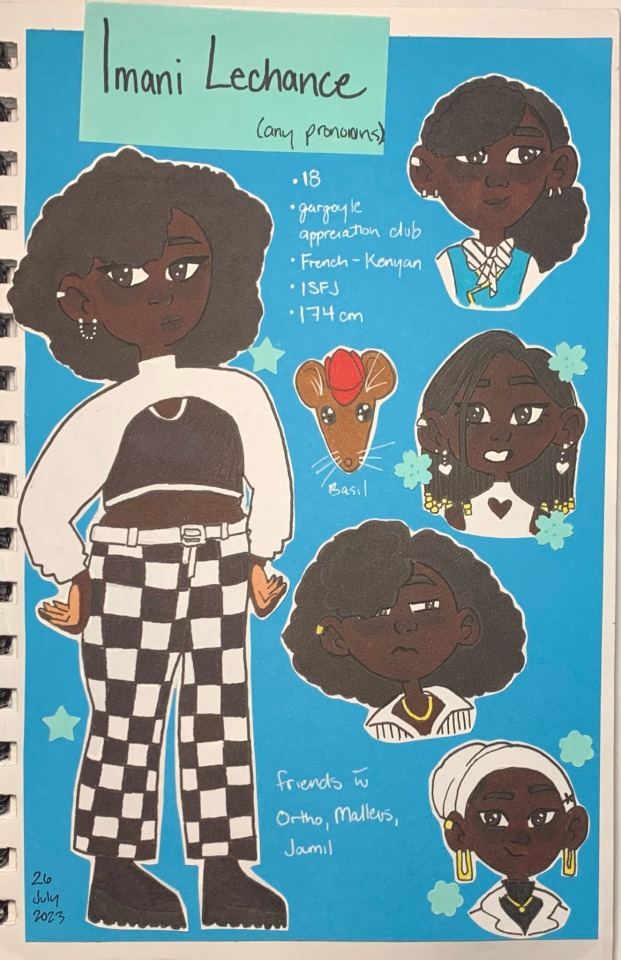
Here, have my character sheets for my TWST OCs
I’m going to fight my camera over photo quality (did Imani so dirty)
Ségdae

Yusra

Prem
Imani (camera, why did you do them so dirty?)
Avis

Seok

Rayen (internet was down so the crutches were done without reference)

Eden (yes, I included body hair, sue me)
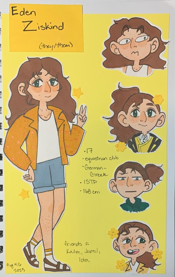
All collage work; I really didn’t feel like drawing a frog and robot, so Rayen and Eden don’t have their companions.
Medium used; alcohol-based markers, pencil crayon, Micron pen, construction paper. I primarily used scissors but switched to an X-acto knife for detail work. The flowers, and stars are made by hole punch designs I have.
#my ocs#i'm not tagging twst as the only people i want to see them are mutuals#camera did imani so fucking dirty and I'm mad about it [copic E37 is his skin tone]#yusra is the only one who looks like her o.g design#everyone else looks a bit or vastly different from their o.g designs#going to put this into my pinned comment so it doesn't get lost#i hate drawing hands and feet#eden gave me the most trouble out of everyone even though they have an “easy” design; idkw they gave me a hard time#finally they are complete#my art#the markers i used were ohuhu and copics [copics i have just for skin tones]#i want to draw prof tonyx more as they give me dopamine#dove's ocs#i only do traditional art so yeah#why am i nervous about posting this?
18 notes
·
View notes
Text
Copic Marker Alternatives and Tests
When I decided I wanted to try alcohol markers I bought a super limited set of Copics. They were demonstrated by the YouTuber Jazza and it was a place to start. The set of 10 Copics were greys for shadow. There were flesh tones which would work to make a relatively dark skin tone to a pale. If I wanted to go really deep and rich dark skin I’d need to add to it, but it was to start me out. Then there were a red, blue, green and colorless blender. It set me back about $65.00.
I also purchased some Spectrum Noir marker sets. They’re similar to Copics but have a bullet tip where Copics have chisel. Both have the brush tip. They normally run about $45 for a set of 12. I got mine on sale through Walmart. I don’t remember how much I paid for them, but it was significantly less.
Then the Ohuhu brand began creeping into the art world. I did some digging, watched a lot of videos and decided to take the plunge. There was a huge difference in price. Over a year I bought their basic set of 120, the Flesh Tones set (which doesn’t just cover Caucasians. The kit will give you the tools for black people, Asians, Latino, the range of white people with tanish to pink, and basically any kind of human skin.) I also just bought the new pastel set.
Total markers: 192
Price: $174.00
For those people who buy art supplies, let that sink in a second. The price is less than $1.00 per marker.
They aren’t cheap trash, either.
Ohuhu has a chisel and brush end like Copic. They’re easy on the hands like Copic. They blend beautifully with each other, Copics, and Spectrum Noir. So far the tips have held up exactly the same as the Copics. I’ve been using both.
The cons:
Ohuhu can’t be bought individually like Copics.
They can’t be refilled
Their line is expanding, but they don’t have as many colors as Copic
Basically you’d have to replace a set or get a Copic in a similar color if you really use one color a lot. It would depend on which colors, but it might be more cost effective to pick up a Copic on sale or it might be better to buy a small set of Ohuhu markers. I haven’t had this problem yet.
Ohuhu’s big set does have colors which are very close to each other, and the Pastels aren’t really as “pastel” as they could be. Most of the colors are really vibrant rather than pale as you’d think of a pastel.
Even so, I’m in love with the line and alcohol markers. I’m doing a fan portrait and it’s coming out unbelievably well for my first try.
Now, about those Spectrum Noir... They’re cheaper than Copics and blend a little better on basic paper. I’m using a very high quality paper with a slick texture which is specifically designed for alcohol based markers. Other people use sketch books or Bristol but I blend the holy heck out of these markers. I don’t know what I’m doing, really, and treat them like oil paints.
The Spectrum Noir are a little better on non specialty paper.
The tips on my Spectrum Noir markers are worn out already and have barely been used. The brush nibs have no “snap” like the other 2 and are frayed so they lay down only a thick line. In their defense, these could have been on sale because they were really old stock. I seem to remember the company addressing an issue like this a couple of years ago and making better nibs.
They have a bullet tip instead of a chisel which can be really nice.
What I don’t like about them is that the barrels are really thick and octagon shaped. They’re uncomfortable to handle (for me. Others prefer the shape.) They blend beautifully and work fine with other brands, but I doubt I’d buy any more of them. Once the ink runs out, I won’t replace them.
#alcohol markers#copic markers#ohuhu markers#spectrum noir markers#art tools#art supply review#whuffie does art
2 notes
·
View notes
Photo
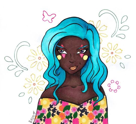
Covered in All the Colored Lights
Well, this looks wild and different coming from me, doesn't it?
If you've been a Sparkler long enough, you may remember this character of mine from ages ago when I made This Is Where You Wanna Be, which featured her. Her name is Windith, and she's a performer who likes mixing old-time circus elements with more contemporary stuff.
(She was originally just a circus performer but that felt too limiting for me, and I'm thinking it might be a little too passive for her personality. I don't have a set story for her, so her character will perpetually be in development )
This drawing was also me testing out some new paper and the new Skin Tone marker set from Ohuhu. Which I simply had to get because it meant more colors of their brush tip markers that I've tested out in the past. (Ohuhu Brush Marker Review and Sweet Ohuhu Snail)
I'll cut to the chase for those that aren't interested in the longer version: I kinda hate this paper and it, unfortunately, was not the best choice for what was supposed to be a mostly-marker illustration. But I like the markers! The markers themselves are nice as always, and I like the addition of the new colors, but the one thing I have to point out is that Ohuhu is still lacking in good colors for super pale skin that doesn't have a strong pink or gray undertone. They're doing really good with peachy tones, mid-tone, warm browns, and the new colors add some really nice darker/cooler browns, though.
In fact, the new marker colors are what primarily inspired me to bring Winidth back into the fold in the first place; some of the colors looked like they would work really well for her skin tone in particular, and I've avoided drawing her traditionally in the past because I wasn't sure I could capture it accurately with the supplies I had.
And...that's really all I have to say about the markers, actually. As brush markers, virtually nothing has changed from the last two rounds of testing I did with the Ohuhus, and thus the only thing I can really comment on is the colors. I really appreciate having more to pick from, especially because some of the colors in the set really do stand apart from the rest of my alcohol marker collection, but a lot of the "light skin tone" options are either too orange/pink or too yellow or just generally too dark for a light/pale skin tone. So, my final commentary is the same as always: More colors, please!
Now, as for that paper...
I picked up a new sketchbook from my local Ross, which I've known for a while now as having a surprisingly good (maybe not the best, but surprisingly good) art supply section. This paper is by a brand called Craft Smith, which as far as I can tell seems to be very into making scrapbook/craft paper and doesn't appear to be actively selling/promoting sketchbooks currently. (At least not anywhere I could find online.) It also claims to be "Mixed Media Paper 120 lb (180 gsm)."
I actually have some 120 lb mixed media paper that I use semi-frequently in the form of a sketchbook by Denik. And funnily enough, that's the same paper I used on my other two Ohuhu marker pieces. So we have both a baseline for comparison in terms of performance and in terms of feel.
Now, I'm not an idiot. I did inspect the paper before I actually bought the sketchbook, and it's alarming how deceptive this paper is. It definitely has the right weight/thickness to it, even compared to the 120 lb. paper I already had once I got it home. The only truly notable differences are 1. This paper is a brighter white (the Denik paper is almost on the blue/purple side) and 2. This paper feels smoother. And the second point was actually one of the reasons I bought it, as I thought it was make for a really nice marker paper. (Smoother paper tends to be a better option for brush markers so you don't wear out the nibs as quickly)
Oh boy, how wrong would I be!
So, let me explain just by going through my process for the art, since that and discovering the atrocities of this paper go pretty hand-in-hand.
Trying desperately to get used to my current tablet situation, I started by doing the lines for the illustration digitally, having been inspired for a pose/facial expression by some Ball Jointed Dolls over on Instagram. The lines didn't turn out perfectly, but they were good enough that I felt comfortable printing them out and re-inking them traditionally as I did for Fairy Enchanting, the artwork featured on my Commission Sheet.
In that process, I would end up with a 1/2 of the drawing that didn't print correctly, the proper print out I used to do the inking, and also similarly to Fairy Enchanting, a first attempt at tracing my lines that was not turning out how I wanted that got scrapped. So, essentially, I had 1.5 test pages just for colors/color placement (as they were on regular printer paper), and 1 to see how this paper would actually handle my supplies. And while normally I'd be scolding myself for wasting paper and ink, in this case, it's actually a very good thing that happened.
My second attempt at inking on this paper went a lot smoother (I think I just needed to loosen up the inking part of my brain), and I was actually pretty happy with how the lines turned out. So much so that once I discovered major problems with the paper, I actually scanned the inked version in to preserve it, just in case. And I even inked it a third time on to the Denik paper I mentioned earlier, extra-just in case so I could even do a side-by-side comparison of the two papers to show "this paper is crap, this other paper is not." (Fortunately, I don't think I'll be needing that third inking despite the tale I'm about to tell.)
I started out by using the different test pages to make sure I had the right tones/colors I wanted for the skin. The swatches looked okay, so I went ahead and tried coloring the skin to test some blush and shading. Right away I noticed that 1. The ink feathers/bleeds across the page (outside of lines) way more than it should for a paper this thick, and 2. once the ink settles into the paper, it's kind of patchy/spotty. And 3. If you trying layering a light color over a darker color with alcohol markers, it makes the patchy/spotty-ness more apparent.
Obviously, these things combined make layering and blending tricky without the end result looking strange and uncomfortable.
Just in case there was something this paper didn't like about the Ohuhu markers, in particular (and also because I wasn't super happy with my color choices for Ohuhu for this particular hair color), I did try a test blend for the hair with some Copic markers. Nope, still feathering badly and doing the weird spotty thing. Still not layering very well without re-working the entire area.
Briefly, I panicked.
The whole idea for this paper was to be for markers, and I had largely intended for this illustration to be pretty markers-only. But this paper, quite apparently, hates markers.
Okay, okay. I tried one more blending/coloring test, this time just seeing if I could do the skin and get it to look decent on this paper inside my lines, and while not super ideal, I did manage to get something I was mostly happy with. Likewise, my next step was to do that again on the final piece. At least then I'd have the most important part--the skin--for this piece done and then I could proceed with whatever seemed like the best option for the rest of it.
So the skin actually turned out okay in the end because I was being exceptionally careful to work with the issues I'd already discovered. By nature, it's not the best (as in it would look better on better paper), but it works.
I still had at least a small problem on my hands though.
To be fair, even before I printed the lines off I was thinking I might try washi tape for her clothes/shawl/whatever, so the paper not liking markers really just re-enforced that idea.
The problem was I still had the hair to do.
I tried a couple more blending/coloring tests, trying desperately to make the markers work for that, but it just wasn't happening. The way I blend hair just requires too many layers for this paper.
So my next solution was to try some tests with colored pencils.
For smooth, flat color, this paper is actually pretty nice for colored pencils. For layering and blending, however, (just as I suspected before I even tried it) it's too smooth. Blending works pretty okay if you're just doing 1-2 layers, but anything beyond that is just slippery and unsatisfying, to say the least. That was my two main mediums thrown out the window. Now what do I do?
Because I was largely at my wit's end, I got a little crazy and tried some tests using some Faber Castell gelatos to see what they would do. And I have to say, putting the gelatos to this paper does feel exceptionally good, as the smoothness of the paper suits the creamy texture of the gelatos. Although the gelatos don't blend out super well when you add water to them on this paper, so that limits what you can do with them by a fair amount.
Not really knowing what else to do, I broke out some actual watercolors and tried those.
Fortunately, while the paper does warp fairly easily (that's to be expected with any paper less than 140 lb.), the paint lays down and blends fairly smoothly and nicely.
And so I finally had something to work with.
There's a reason when I work with watercolors I usually don't go for a hard illustration like this, but I think I managed fairly well to get the paint to do what I wanted. I knew going in it wouldn't have the same look or dimension as my markers or pencils, so I made my peace with that ahead of time. The main thing I wanted was at least the suggestion of shading and relatively smooth coverage. There are some small areas where the paint just did what it wanted anyway, but it's little enough I don't think it ruins the whole thing. I'm sure I could've worked with the hair more to get arguably better results, but by this point, I was so relieved the paint was working that I decided not to push my luck. (I did end up having to digitally tweak it because it shows up as a little more blue on the scan than it actual is, but that's not really the paper's fault.)
Since I wasn't sure what exactly I wanted to do with the face/makeup at this point, I moved on to dealing with the washi tape.
Fortunately, this ended up working out fairly easily. I actually put the tape down on my inking-gone-wrong (as the areas where I needed to cut it turned out well enough it would work for this) and used an Exacto knife to carefully cut the top of tape away to make the neckline and keep the tape from covering up the little bit of hair that reaches down that far, the hair being the tricker part to cut. Even so, I had a less challenging time than I thought and I only minimally dented/cut into the very top layer of the paper underneath. (Which was why I wanted to cut the tape on not-the-final-piece in the first place; I knew indentions were going to be made from the knife no matter what I did, but it's hard to predict how bad it'll be until it's usually too late.) Once that was done, I could simply peel the pre-cut tape off of my test page and re-apply it to the final one.
Naturally, the cut wasn't 100% accurate, but it was close enough that the little bit that wasn't quite right was easily disguised but going back over my lines again and filling any gaps.
I went back to the face once that was taken care of, and I ended up relying on the heavy feathering this paper does to get Windith's eyes right.
Originally when I drew her, I tried to give her "oil slick" eyes. As in, her eyes are black but have a rainbow sheen to them, like how if you ever see oil in a parking lot, it's black but has that really pretty rainbow shine to it. I never had to consider before how this might translate into a traditional drawing though since that drawing was done digitally and at a time where I thought digital art was going to be my primary medium going forward. (My oh my, how the tables have turned indeed...)
After a couple of failed tests (failed due to personal preference and actually not the paper this time) I ended up going with a dark selection of alcohol markers in very teeny tiny dots to make a pseudo-rainbow. It's not a perfect translation of what her eyes are supposed to look like, but it's close enough to suit me.
Then came the makeup.
Originally, I was going to just make her lips a more natural color and largely call it done, but I didn't want them to blend in too much with her skin and even when I tried a less natural berry color I just couldn't get the blending right in such a small space on this paper.
And I was also thinking it would be nice to give her eye shadow and bring the colors from her shawl-thing up into the face area a little bit. But I'd already discovered colored pencils weren't the way to go and I had a feeling I wasn't going to like how this paper handled pastels either, so I just skipped testing that altogether.
After some thought, since I originally thought of Windith as a circus performer, I deiced to do some testing with gel pens (which I figured would handle just fine on this paper, given the nature of gel pens in general) and this simple kind of clown makeup. (I'm sure there's a more proper name for it out there somewhere but I haven't the foggiest idea what that said name is.)
I ended up really liking that, especially with how the bright colors pop against her dark skin tone, and in that, I thought a bright color would work well for her lips, too. I tested my orange gel pen, but it was a little too bright and just a little too imprecise for my taste, so I opted for a little fluorescent orange watercolor instead.
I know the makeup probably looks kind of silly to most, but I really like it and how it ties the colors together better. And besides, I think it says a lot of about Windith's character that she can wear makeup like that but still looks as confident and determined as she does here.
But I wasn't done quite yet.
I wanted to do something to fill the empty space in the background, but as I mentioned earlier I really was not keen on finding out how this paper would handle pastels after the struggles I'd already been through. And also I didn't really think any of my pastel colors would work all that well with the other colors going on here.
It's not too much, but I ended up defaulting to some of my dollar-store stencils to add some florals and a little butterfly back there. I figured that would tie in nicely with the floral washi tape, add a bit of color, yet not totally overpower everything. I also ended up with some artsy white dots because I somehow got some random ink dots/smudges around a few edges and once I covered those up I added some more dots so it would look like an intentional part of the look. Unfortunately, said white dots did not show up on the scan.
The final piece is definitely far from perfect and this paper is not good for a lot of things I was hoping it would be (I can report it seems to work pretty good for regular sketching, though, so it won't go to waste!). However, I still managed to get something pretty decent out of the equation, I think. Small victories?
I may not be looking forward to making more finished pieces with this paper, but I am looking forward to playing with the Ohuhu Skin tone markers more, that's for sure. I've got a few sketches that I'm thinking about turned into a mini-series illustrating a few different skin tones with them, but I haven't decided 100% on that just yet. I do have a couple of other projects definitely coming down the pipeline though, so stayed tuned.
P.S. The title is a reference to The Greatest Show, the opening them from "The Greatest Showman," the same song that largely inspired the first time I drew Windith. It's just kinda her thing now.
____
Artwork © me, MysticSparkleWings
____
Where to find me & my artwork:
My Website | Commission Info + Prices | Ko-Fi | dA Print Shop | RedBubble | Twitter | Tumblr | Instagram
1 note
·
View note
Photo

Ohuhu Brush Marker Review
Ta-da! A surprise addition to the supply test storm: Ohuhu Brush Markers!
Ohuhu as a brand made waves (pun intended ) over the past couple years for having alcohol-based markers of pretty decent quality at exception prices; often working out to $0.50 or so per marker in the sets. However, I didn't cave in to the buzz and nice price tag for one reason: No brush tips, only a chisel and bullet tip, and I have a rule about not buying alcohol-based markers without brush tips unless the deal is so good that I can't possibly resist. The brush tip just means that much to me.
And you know what? After hearing about them for so long I almost reconsidered. Almost. Then I heard through one of my favorite art Youtubers that Ohuhu was planning on bringing out brush-tip markers this year (2019) and I instantly went and followed Ohuhu wherever I could to make sure I got the official announcement as soon as it came out.
Which ended up being a nice prank on myself because even as the announcements and initial launch rolled out, I still managed to miss the first US launch for the 48 set in June and had to wait until the restock in July before I could order them off Amazon. Like, the listing was completely gone after they sold out the first time. But I knew from all the reviews already flooding in on Youtube that the price was going to be as good as I was hoping: $34.99 for the 48 set, roughly $0.73 a marker, which is practically unheard of for brush tip alcohol markers that are still decent quality in terms of construction, ink, and the brush tips/nibs themselves.
And then the irony depended because Ohuhu went on Instagram and surprised everyone by restocking a day early, on July 19th instead of 20th as originally planned. And by the time I went to order mine on the 21st, they were already back-ordered by a couple of days. But it's okay because we went on vacation and they were waiting patiently in the mailbox for me when I came back, so the extra waiting didn't totally kill me. (I can't let myself watch the toaster or printer while waiting for whatever it is to come out; anticipation just drives me crazy sometimes.)
The set does come in a pretty nice and sturdy-feeling canvas zipper bag, which looks like the same bag a LOT of brandless Copic rip-off markers come in, at least from afar as I've seen some instances where in-person those bags are more of less sturdy nylon, cheapy fabric. And while I do like the bag, for the most part, my one issue is that there isn't really any way to contain the markers so that you can organize them a certain way and they'll stay in that order. And maybe that's not an issue for some people, but it is for me. I actually had to swatch these twice because I messed up a couple of swatches the first time because I got confused about which marker I was grabbing because of this issue.
The set also comes with a plastic sheet curled around the inside of the case that's meant to be put under the page you're coloring on so the ink doesn't bleed through to the paper underneath, which I thought was a nice touch, but after being in the bag like that it will take some serious time to flatten it out to be usable. And lurking towards the bottom of the back is also a pre-made chart, which isn't super accurate for the colors, but I appreciated as it gave me an "official" order to put the markers in for swatching. (And if I end up putting them in a different storage system then that's the order I'll put them in there too.)
Naturally, I did get to swatching straight away after opening them. And like some others that have way beaten me to the punch in talking about these markers, I agree that the set is lacking some really pale/pastel colors and some really dark/muted colors, but more so on the pastels. And for me personally it's also lacking some yellows (which is an unusual thing for me to say because I feel like a lot of art supply sets often give you too many yellows) as well as I could do with some more peachy/lighter skin tone colors and the browns in the set are all leaning a little on the warm side for me. Also, a colorless blender would be nice to have, but that can be supplemented with a plethora of choices from other brands, so I'm gonna let that slide. And, I mean, it feels fair to me since Ohuhu has like 120 colors in their non-brush tip markers, which I'm unsure if that includes a blender or not, but my point is that I'm almost positive this is just the first 48 colors and there will be more, and likely a "full" set to come, and a lot of other marker brands don't include the colorless blender unless you get the full set and you have to buy it separately anyway.
Actually, thanks to a now much more watchful eye on their Instagram, I do know they plan to launch a 72 set in September with more colors, so that's a step towards my theory being correct. And for the record I haven't decided if I'm going to dive right into that set like I did this one or not, so I do already have 48 colors out of it, but it'll probably depend on how much the set costs (overall and per marker) and how soon it feels like (or if there's hard evidence of) when they're going to launch the next set size up, which will probably be 80 or 100 (but I'm betting more solidly on 100).
But that has little bearing on the here and now, so back to the set I actually have on-hand.
I ended up drawing this funky crab after not really know what to draw to put these to the test--as I haven't yet perfected making galaxies with my alcohol markers (and I also don't usually find that fair since you need a lot of transition shades in markers to make that work, and when I test markers more often than not I'm working with a smaller set that doesn't have a ton of colors to pick from for that), and the drawings for my marker tests really only have the requirements of there having to be some layering and blending involved to get a feel for how the markers handle that--and so as I usually do when lacking inspiration, I went to the internet. I was just scrolling through Twitter and happened upon this picture of a purple crab that I just really liked for some reason, and thus I decided to draw it.
He was fun colors and just looked so cool and somewhat cute for a crustation that I couldn't resist! Plus, his colors worked for the assortment I had to work with and would give me plenty of opportunities to test blending and shading, as well as a little bit of texture work.
My little underwater friend here doesn't look exactly like the reference photo, but I wasn't going for a 1:1, I was really going for the general idea/structure and some heavy stylization. Although I definitely could've stylized it even more, I like where this hits between realistic and stylized a lot.
And originally I wasn't really sure what to do with the background and I changed my mind several times even while working on, but I like how it ended up turning out, even though I probably could've done a bit more to give it some more depth and dimension. But the crab does pop really well and stand out from the background very nicely this way~. (I also used a few tri-tone colored pencils in the darkest part of the seaweed/grass and on the bigger rocks and to cover the sky for a little more interest since as I mentioned I felt like I was lacking certain colors and I did want to do some fun things with the background without the crab blending in or the background taking over.)
I have in the past used stippling/pointillism/dotted shading to ease the transition where I was having trouble before, and while the back-most of legs and gradient colors on the claws of the crab I started blending regularly and switched over for that reason, the rest of him wasn't giving me much trouble in trying to blend the colors and the stippling (or whatever you want to call it) was really more for the scaly/crab shell texture from the reference photo. I'm not really sure it translates into that texture properly, but at the very least it does look pretty cool in the final product. And I like the mostly unintentional juxtaposition of the dots on the crab next to the dots/texture for the sand/rocks he's standing on.
And I have to say that, though I did kind of except thing since the brush tip makes my life with markers in these departments infinitely easier, they did blend and layer quite well.
While I was pretty happy with the selection of purples in the set, I was a little concerned about getting the right tones that I wanted, especially how some areas on the crab are a very vibrant purple with a blue-ish undertone. But lightly layering one of the light blues over the purples worked that out better than I was expected it to. I've had some minor issues in the past with marker layers looking very obvious--like you can see the two or three colors trying to separate out on top of each other--but these don't seem to have that issue, which is great! And when the colors are in the right range/family, they do blend very easily into a smooth transition, which is also good news; the key is just having the right colors.
The only thing I'm really worried about with these markers is the brush nibs, surprisingly. They're pretty similar in feel to a Copic marker, but I noticed they do have a bit more of a spongey/foam texture, which is not a bad thing by itself. The problem is that I've heard tell of a few people heavily using their markers (and keep in mind the markers have only been out for roughly two months at this point) and the nibs have already started to collapse/fray on them. I didn't have any issues while I was working on this drawing or swatching, but my markers are brand-new and I haven't used them much yet. Plus, I'd heard about these issues before getting mine, so I was intentionally gentle and careful so I won't be speeding up the degradation process.
To be fair, even Copic and other high-quality alcohol marker brush nibs can and will degrade after so long and so much use, but one of the reasons you don't hear good things about the Artist Loft markers from Michael's and other cheap Copic knock-offs like them is because the nibs often just don't hold up for very long at all. I've barely touched the 6 set of those that I have and most of the brush nibs are already collapsing.
Ohuhu has made this potential burden a little bit easier by making their nibs dual-sided; meaning if the exposed brush tip starts to fray or collapse, as long as you catch it before it's too far gone, you can pull the nib out, flip it around and stick it back in and you have a fresh one. I can't say I've ever seen a feature like that before in markers, and it's honestly a really cool idea to me, as it saves you having to buy a new replacement nib--or new marker of replacement nibs aren't available--at least once.
The other downside is though that Ohuhu, at least right now, doesn't sell replacement nibs for when both sides of your existing one are gone. Granted, depending on how much you use them and how careful you are, this may not be a huge issue as the nib may only end up lasting about as long as the ink inside the marker and you'd need to buy a new marker anyway because they're not refillable. (Yet).
Except the catch there is the markers aren't available individually/open-stock. Yet!
Here's the thing, again like with the colors, I'm hesitant to put the nibs and the refill inks and the open-stock things as nails in Ohuhu's coffin just yet because this is just the first set of the brush markers they've released. And even more so, they built up the colors available for the original markers over time and, at least seemingly, made the brush tip versions after everyone kept saying that's what would make the markers better, that that was what they wanted. People asked Ohuhu for brush tips, and it did take some time, but they made them. (And I honestly have no way of telling if they made the markers by popular demand or if they were planning on making them anyway and just hadn't gotten around to it until now, but I'd like to assume better of Ohuhu as a company and say it was by popular demand.)
And thus my theory is that if enough people mention and ask about things like replacement nibs, refill inks, and being able to buy the markers open-stock, then give them enough time and they very well might deliver on that like with the brush tips in the first place. We just don't know enough to say for certain if those will be a thing or not right now. At least in my opinion.
So overall, I'd say the Ohuhu markers are definitely worth the price and especially if you're new to alcohol markers and want brush tips, I'd give them a try. I really wish these had been around a couple of years ago when I was first dipping my toes into this medium because they're not as ludicrously expensive as other options but are still good quality. They may have their shortcomings right now, but those things could very easily change and in that case, they'll be an even better value for the price.
Honestly, I really am happy to have these in my collection and I'm looking forward to using them more. And with that, I shall leave you and the crab whatever your thoughts might be on the Ohuhu markers
____
Artwork © me, MysticSparkleWings
____
Where to find me & my artwork:
My Website | Commission Info + Prices | Ko-Fi | dA Print Shop | RedBubble | Twitter | Tumblr | Instagram
0 notes
Last Seen Blogs
livingthewritelife-things
Angsty (ideas) on Main
quenotte
Universe
livingthewritelife-things
Angsty (ideas) on Main

ssbbwmature
Mature SSBBW Beautiful
kilnkin
chickenscratch