#specifically maintaining character likeness while angling the face and obscuring some facial features
Text
I need to practice drawing people kissing again
#specifically maintaining character likeness while angling the face and obscuring some facial features#al chatters
20 notes
·
View notes
Photo


@techmomma upon request for critique and advice. This is basically just me going into troubleshooter info-dump mode, so please pardon any abruptness in tone or phrasing.
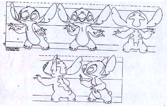
So when drawing for animation, simplification of design and silhouette is key because you’re not only going to be doing the same overall drawing SO MANY TIMES in a row, but also need to ensure that the visual remains instantly recognizable to the viewer’s passing glance. Consistency in silhouette is a big thing to work into the overall design of any character.
I’ve put up some solid examples above from Bruce Timm’s Batman, Disney’s Kim Possible, and Disney’s Lilo & Stitch. The highlights accent how a character’s overall outline - or even just key elements that are most prominently used in gesture and expression - and form remains basically the same no matter what angle they’re viewed from. Notice how the shape and position of the various angles remain in basically the same spot regardless of the angle. Notice how even when features are different in anatomy - such as an ear versus a cheekbone - they still tend to occupy the same general shape and position in the turnaround. There’s also cases like Ron Stoppable where his hair is essentially always in the same shape, angle, and direction relative to which way he is facing no matter what angle he’s viewed from. If he’s looking left, his hair shape is always left.
Another concept to always hold in mind with design is subtraction. One of my teachers - Art Leonardi - gave the advice that “a lazy animator is a good animator”. This isn’t to say that you should be sloppy, but that you should be efficient. Every line you put down once is a line you’ll have to put down a million more times, so figure out exactly what needs to be on the page to convey shape, expression, and meaning, and REMOVE EVERYTHING ELSE. If a character’s clothing or hair shape can be fudged so that a portion of its shape that would logically be visible in the real world isn’t there on the drawn version, and doing so doesn’t disrupt the presentation of the character? Then don’t draw it. Look at Harley Quinn’s design where her headpiece, collar, and ankles are in play. We should logically always see both her “horns” even when she’s in profile, her collar should logically have more volume and thus appear lifted away from her body with a visible ridge, and we’d logically see the pointed flares at the back of her ankles more often. But those are more details for the animators to draw, so they’re shuffled out. Whichever “horn” is furthest from the viewer remains exactly the same position and angle in a 3/4th’s view as it is in head-on or from behind, while in profile it’s removed entirely. Her collar is flush with her shoulder line in all positions and extra detail only appears when she’s in a total profile, which is actually rare in the cartoon itself since characters are infrequently shown fully from the side like that when a 3/4th’s angle would better serve the scene. If we don’t need to see her ankle flares, we don’t see them. If we do, they’re identical in profile as from behind, same as her “horns”.
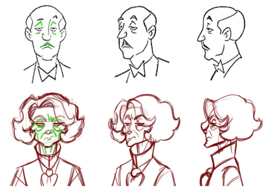
Moving onto TB’s specific design here, this all leads into some fundamentals that can be applied to make the figure easier to animate. TB’s age gives him plenty of wrinkles and lines, but too many causes clutter for the viewer and tons of extra work on the animator. Compare Alfred to TB - both are wizened (albeit to different degrees, admittedly), but Alfred’s deforming facial details (lines above and below his eyes, and his mustache) are limited to a total of six lines that remain fairly parallel with each other. TB, on the other hand, has twice as many in order to convey his age, expression, and depth of his facial structure. Those can be reduced a lot in order to simplify the design. TB’s signature elements would be his cheekbones, smile lines, and heavy-lidded eyes. Things like the extra brow wrinkles and the wither lines on his neck aren’t necessarily as important to convey.
I marked a handful of points that I felt needed attention or removal. The arrows indicate parallax errors; places where exterior lines meet in a way that makes their shape confusing. You want to generally avoid that on the silhouette - it can be okay on interior elements, but you want to keep your overall outline as clean and easily readable as possible. In the basic outline - and especially with the parallax errors in play - we don’t really get a sense of how skinny TB’s neck is because the outline of his high collar and fluffy hair all come together, appearing much bulkier than he actually is. Some easy ways around this would either be to tighten the collar flush along the neck (like Harley’s, as per my previous example) or to lower it away from the jaw and hair line to make the thin neck visible while keeping the sharp angles of the collar itself.
In the profile image, I marked a spot at the neck with an arrow. That’s because you changed the shape of TB’s neckline where it meets the underside of his jaw. In all other angles his neck goes straight up, but in the profile it now has a subtle slope. That’s one extra line and one change in silhouette you don’t need. Similarly, we don’t need to see the fluff of TB’s hair that’s furthest from the viewer in that same profile, as it obscures the shape of his nose and face. It can be removed, thus freeing him up for more expression in profile while speaking or emoting.
The X marks I placed are elements that simply don’t need to be there. Things like shoulder creases or the fluff of his hair from behind are nice in illustrations, but superfluous in animation. Same goes for being able to see TB’s chin at a 3/4th’s rear view, which clashes with the fluffy curve of his hair. Again, more lines and more work. That sort of volume can very easily be done via shading or with far more simpler incidental lines. You don’t need to draw three or four dips to show the volume of his hair when two would suffice.
The final image I placed is a general breakdown of TB’s anatomical structure and outline. In this case I mirrored the general silhouette of his hair, collar, and shoulders, while also mirroring the interior detail of his jawline and neck. Your knack for making good illustrations can work against you when drawing for animation, as every element that differs from its opposite side (such as TB’s hair having slightly different heights and slopes on its right or left sides) makes it that much harder to maintain their relative volume in movement. It’s better to simplify the shapes, mirror them, and match their placement relative to one another. You’ve got a solid hold on anatomy already, so it’s clear TB’s general physical features line up properly as drawn, but when animation is in play you want to anchor features to one another. I picked the base of his collar line as a radial point and drew outward - his physical elements should follow those general lines in order to make for a design that’s easier to replicate consistently. So the same line that starts at the primary dimple in TB’s hair should always go straight down through his eye, along the edge of his nose, along the edge of his mouth, down the shape of his jaw, to that collar base. The center-line of his shirt should go straight up through the center of his jaw, the center of his nose, and the center of the space between his eyes. You should be able to draw a line straight from the point of his lower-most hair curls directly down the outline of his collar, as that makes it easier to maintain their volume and position as well as keeps his overall shape easy to read at a glance.
15 notes
·
View notes
Last Seen Blogs

theditwicks
The Ditwicks
xx-all-purpose-nerd-xx
Super Nerd
voxswifihotspot
fuckalastor33

starsermon
⭐️💫🌟✨💛⭐️💫🌟✨💛⭐️💫🌟✨💛
pumakaji64
The moon exists, I licked It.