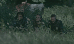
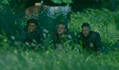
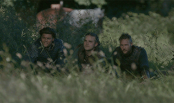
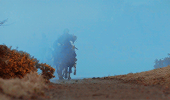
#since the original scene was super dark and cyan/green
Photo

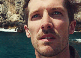

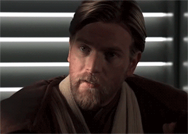
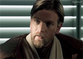

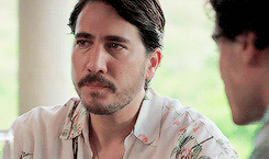
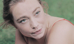
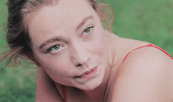
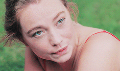
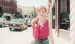
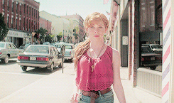
@s-k-y-w-a-l-k-e-r tagged me in this gif meme thank you! These gifs don’t show quite as much difference as some of the other gif memes I’ve seen but I try to avoid any super dark footage. 😅I have a gif tutorial here if anyone wants to check out the steps below in detail.
Acquiring footage
I always screen record footage I use, regardless of where it came from, because Photoshop (in my instance) plays nice with Quicktime videos, but not necessarily with other file types. Screen recording is easier to me than downloading files, so I use Quicktime to record whatever I want to gif, then trim it down to the essentials or (if it’s a long recording) splice it in sections for ease of use. I then save it and open up the video file in Photoshop.
From there I use an action I made to process the video to do all the work of flattening frames into layers, changing frame speed, creating the timeline, etc. In the end this process spits out a ready to use set of frames at 0.04 speed, resized to 540px width by default. I usually do full width gifs so that’s all there is to that.
Coloring
My coloring process is not super involved - it’s really only four steps. These are all done using adjustment layers above all of the layers in the document. I don’t use any .psds, so this is done manually for each gif. If gifs are from the same scene or set I will generally copy the same adjustment layers over, then simply tweak them if needed.
First, curves. This is essential to making the image pop. Usually images are too dark, so simply pulling the curve line in a gentle arch to the left does it (see the tutorial linked above for visuals). Images that need deeper blacks can have the lower left value adjusted, while ones that need brighter whites can have the upper left value adjusted. There are some default options too but I always adjust manually for each gif. There are little guides that show up when you drag the curve - if you use these to make a little square shape between where you drag the guides to and the sort of x and y axis on the curve view background, the effect tends to brighten the image without blowing out any values.
Second, vibrance. I dunno if other people do this, but I find that it makes the colors look more appealing without giving the fakey look that increasing saturation does. I always bump vibrance up by +14, which is an arbitrary number but it’s the one that I like. Vibrance adds a subtle something to the look of the gif that there isn’t a substitute for.
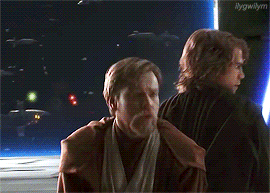
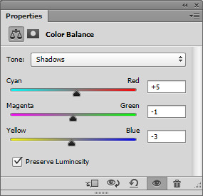
Third, color balance. This is where the fun begins (insert Anakin gif here). Color balance is what makes the gif look truly different from the original material. When I do this adjustment, I always start with the shadows, then do the highlights, then the midtones. After that initial coloring is done, if I’m not happy with the look I tweak each value a little, going higher or lower on it until I find the point where I’m happy with it. This part is really all up to your eyes/color perception. I generally aim for something realistic, without blatant color casts, but I try to give it some tonality that suits the material.
For instance, the first colored gif above has a summery sunshine feel, while the last one is more chocolatey and warm. I usually deepen shadows (often with blues and magentas) and lighten highlights (with cyans and greens/yellows depending) and then the midtones I adjust to generally make the image look “right”. This means no color cast on white in the image, and a person’s skintone should look normal for them (within reason, lighting can change appearance but they shouldn’t look like they are not themselves). If there is ever an overly strong color cast on an image, I will sometimes add a plain fill layer of that color and set it to subtract and tweak the opacity until it appears to be eliminated.
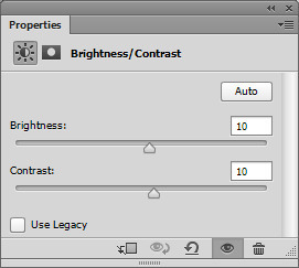
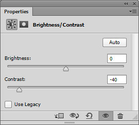
Last, contrast/brightness. This is the finishing step of coloring. While curves do handle most of the light/dark balance adjustments, sometimes a little extra pop of brightness is needed. Doing that can make the image start to get washed out sometimes, however, so I always tweak the contrast to suit as well. The image should look believable to your eyes as a real scene, so if it gets too lightened it will lose that realism. Also brightening too much can lead to lots of little gross pixely effects.
Sharpening
This is the final step before adding any text or watermarks. Once I have the adjustment layers done for the coloring, I chop down the gif to a suitable length (if it isn’t already), which tends to be around 50-70 frames depending on how much contrast, color variation, and movement are present in the material. I convert to timeline, delete any unused layers, then merge the rest of the gif frame layers into a smart object. I then applying smart sharpening to this, at the usual 0.3 radius, 500%, and remove Gaussian blur settings, with the more accurate box checked. This always does the job, to my mind, then all that’s left is saving. Adding text (if needed) and the watermark is something I also do. But it’s not too exciting. When I do put text on an image I give it a 2px border so it’s easy to read, and my watermark is usually white with a lowered opacity.
Saving
When I save gifs I always use the Save for Web & Devices option. I then use a save setting I created, which is actually a ditherless gif. I think I created it based off of a default ditherless gif setting - having no dither is convenient because it results in a smaller file size than say having 100% dither. I always make sure the gif will be under 3mb when saved, since I don’t care for tumblr’s built-in compression, then I make sure to select loop forever, then save and viola! All done.
That’s all there is to it, really. I’ve done some more complicated stuff like combining gifs together or making “3D” gifs but those are a more complicated process and I have to keep some secrets. 😉 Overall if you use good quality footage, adjust brightness with curves, remove obvious color cast, and apply some smart sharpening, you’ll already be on track to making something great.
I would tag somebody but everyone I can think of to tag has already done this/been tagged already!
9 notes
·
View notes
Photo


COMPLETERESOURCES — Pastel Gifs
Pastel gifs can be a bit tricky, especially if you don’t really know you’re way around adjustment layers. In this tutorial, I will show you how I get these pastel gifs, and some tricks and tips for beginners.
I’m using CS6 extended but it will work in all other versions
You’ll need basic knowledge of photoshop and adjustment layers
Please Like / Reblog if you find this useful.
A few notes before we begin:
Pastel gifs are almost always grainy, don’t mistake these with “pale” gifs, which are usually super smooth. Brightening and adding saturation mess with gif a lot, so if you don’t like grain, this tutorial isn’t for you.
Don’t mistake “pastel” with “pale”, there’s a difference in how you make them, the look and the overall grain of the gif as well.
These gifs are a thousand times easier when the original gif is naturally brighter. You can make pastel gifs with darker colors (and scenes like nighttime), but these will be super super grainy and over-sharp due to the amount of black selective coloring you’ll have to use.
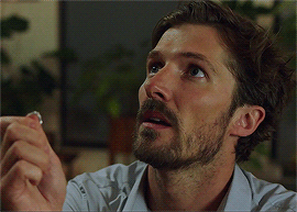
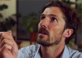
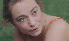
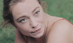
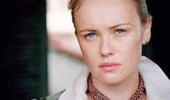
Okay, on to the tutorial. This is the gif I’ll be using, there’s no edits at all, only sharpening:
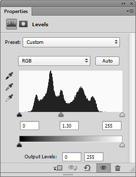
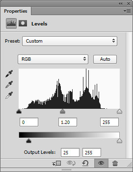
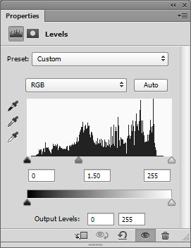
The first thing you want to do is add a “levels” layer. The settings will vary, but you want to gradually add to the gif, don’t go overboard. Here’s my settings for this gif:
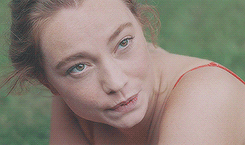
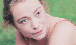
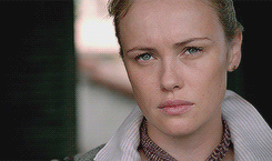
and here’s the gif:
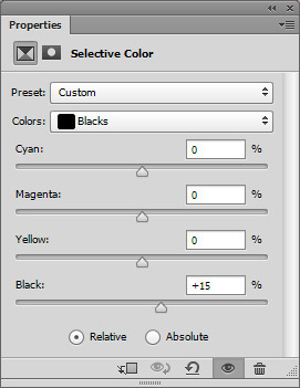
The levels really washed out the gif (this will especially happen if you’re working with POC, but we’ll fix that later), so you’ll want to add a selective color and edit the blacks. This will differ gif to gif, but generally, all my gifs have the same settings up until the actual coloring part. Here’s my settings:
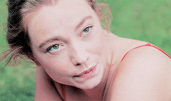
And the gif now:
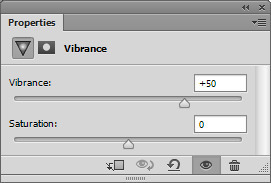
Then you need to add a vibrance layer. Again, these are pastel, not pale, so we do want colorful gifs, just “muted” colors, so here’s my settings:
Then, another levels layer because like I mentioned before, you want to gradually “pastel-ify” your gifs. I set this layer to 53% opacity, but you can change this according to your gif. Here’s my settings:
You’ll also want to add another black selecitive coloring layer. I just duplicate the one from before, drag it to the top of the layers and turn the opacity down to 80%. Here’s the gif now:
Now to color the gif more. Add a selective coloring layer. This will vary, but I do use pretty extreme settings.
Reds: -60, +40, +10, 0
Yellows: -40, +10, +20, 0
Greens: +100, 0, +100, 0
Cyans: +100, 0, +100, 0
Blues: +100, 0, +100, 0
Magentas: -100, +40, +100, 0
no changes to whites, neutrals, blacks
Here’s my gif now:
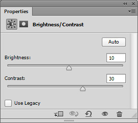
Okay, so my gif is pretty dull and lackluster so I want to add a “brightness/contrast” layer with these settings:
And with that, I duplicate the previous “vibrance” layer, drag it to the top of my layers and turn the opacity down if needed. Here’s the gif:
The gif actually looks pretty good, you can stop here, but I want a more “pastel” look. Add another levels layer with these settings:
Now my gif looks pretty good, a bit washed out, but pretty “pastel”:
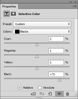
The last step is to tweak the colors a last time using a “selective color” layer. These are my settings for this gif, every gif will be different. You really want to boost all the colors of your gif. This specific gif has a lot of reds, yellows and greens, so I really focus on those. You’ll also want to add more black to darken the darker parts of the your gif. Here’s my black setting:
And here’s the final gif:
TROUBLESHOOTING:
Pastel gifs come with their issues, no doubt about that. Here’s some tips on how to fix some stuff.
Too much brightness/contrast. This gif is pastel-ish, but it’s too bright and looks too harsh:
To fix that, an easy way is to add a “brightness/contrast” layer and turn the contrast down. Here’s the settings I used:
I also added another “selective color” layer and darkened the blacks. Here’s the fixed gif:
Another thing you might come across is “white-washing”. Now let me just say this, there’s a difference between white-washing and pale/pastel gifs. Since these gifs aren’t “pale”, there’s really no reason why a POC should be washed out .
Here’s my gif that I want to fix:
To add more dimension to the skin-tones, I want to add a “selecitive color” layer:
Reds: -50, +20, +15, +100
Yellows: -60, +40, +40, +100
Whites: 0, 0, 0, +35
Blacks: 0, 0, 0, +5
You can turn the opacity down to suit your gif. I’ll explain the reasoning behind these settings. Since the tones I want to “darken” are the reds and yellows, I set the black settings to +100 for both. This darkens the shade, but not the tones so the color is muddy. To fix that, you want to add more (the -50 is “removing” -50 from cyan to “add” red). I also add magenta and yellow to the red option to deepen the color. The same for the yellow. You want the shade to be darker ie a red to dark red, but you want to add some tone depth like adding a bit of purple to the red.
Anyways, you can also add a “brightness/contrast” layer too. Here’s my settings (set to 50% opacity):
And here’s the gif:
Hope this tutorial helps!
638 notes
·
View notes
Photo


TUT 06: Vibrancy
Photoshop
Timeline or Frame Animation
Lots and lots of selective color
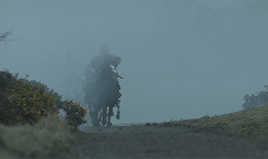
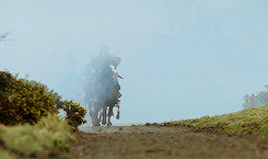
In this tutorial, I'm going to show you how I make my vibrant gifs. Now I know these aren't the most vibrant (color porn-ish) gifs ever, but compared to the originals, there's a huge difference.
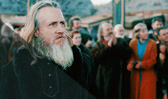
The majority of these gifs will be from the show, Vikings, but this technique will work with any gifs. I'm mostly using Vikings because the scenes are always dull grays, greens and blues, so this will show you the 180* change!
To start off I use a .psd I made, the download and tutorial on how to use it is here. Like I mention on that post, I use that on 99% if not all of my gifs. So Here are a few before gifs, with no other editing besides sharpening:

And here's the afters with the mentioned .psd and edits made with the .psd tutorial:

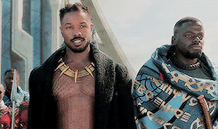
So, if you use that to start off, you can hop into the tutorial after the basic editing. I'm going to basically re-create the .psd so all you lazies don't have to download anything (I'm a fellow lazy so I gotcha). So to start off, I'll use this gif. It has one main color (green) plus their clothing and skin colors so that's the easiest:
I'll start with a curves layer, a brightness/contrast layer:

And a levels layer set to 50% opacity:

Here's my gif now:

It's pretty washed out, so I want to add a selective color layer, adjusting only the blacks:

And the gif:

Now is the funner part. So, I mean, you could just add a vibrance layer set to 100, but that will add a lot of tiny pixels of colors you don't really need (ie random magenta 1x1 pixels in the trees), which would be this:
And you don't really get individual colors, you just get a mess of one overall hue, so in my opinion, it's better to add color gradually. So to do that, you'll want to start by balancing the overall color. Since my gif is mostly green, changes are there's too much green, almost to the point where it bleeds into all the other colors. So for this specific gif, here are my color balance settings:

And my gif now:

Now that there's more of a separation of the colors, I can add a selective color layer to tweak individual colors. Here are my settings for this gif, but every gif will be different:

Now I know some of my settings are extreme, but since there's barely any of those specific colors (cyan, blue, magenta) showing, I wanted to really bring them out. My gif:
Now to brighten the gif up so we can really edit the colors and make a vibrant gif. I use a same vibrance, levels and brightness/contrast layer with varying opacity's based on the gif. Here are my settings for this gif:

The vibrance was set to 100%, the levels was 50% and the brightness/contrast layer was set to 55%. Here's my gif now:

Now to make the colors more saturated. Basically I just use a selective color layer and make the specific color setting 100 to get the purest color, then duplicate that layer until I'm happy (still remembering gradually add onto colors). Here's my settings for the greens, since that's my main color:

Now, add more brightness if you're gif needs it. I'll add another brightness/contrast layer, so here's my gif now:

Now to fine tweak. I want to start with the blacks since they're washed out and starting to turn a noticeable color. Which the blacks here are more towards the green side, I want to add magenta with a selective color layer. I also want to darken them. I want to do it before I start messing with the colors because the black can get muddied and be harder to isolate layer on. Here's my settings:
And here's my gif, the before is on the left, and the after is on the right. You can see a pretty big difference with such a small edit:

Now to fine tweak my colors. This will vary gif to gif, but here are my settings for this gif, really focusing on skin colors. I'm going to get pretty dramatic, cos I can play with the opacity, but here are my settings:

And my gif:
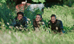
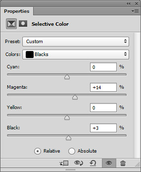
Pretty good, eh? There's a few little issues I want to fix, and you might have the same issues if your gif has more than one person or a lot of colors. So the guy on the far left has a bit of a darker skintone then the two on the right, so he came out more orange that I would like. To fix that, I just add a selective coloring layer and remove some red and yellow. It will mess up the entire gif, but I'll utilize the layer masks next to fix that. Settings:
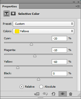
And the “messed up” gif:

Now, when you add an edit layer, it automatically adds a layer mask like this:
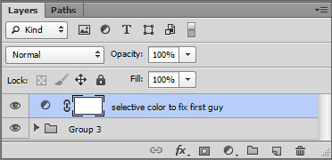
If it's white, that means the opacity is 100% over the whole canvas. Black means it's at a 0% transparency. By default, they're all always white. I only want this selective color layer to be over the first guy's face, so I use the fill tool (paint bucket) to fill the layer in black with the alpha slider by clicking on the mask on the layers:

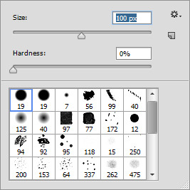
Now the layer is basically hidden, but still enabled. So now, using one of the default soft brushes (hardness set to 0), I want to use the white to paint over just his face.
Here's where I colored for example, but I did this while the alpha mask was clicked:
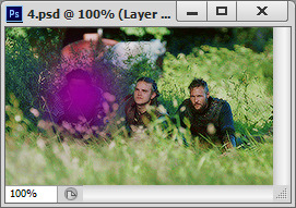
Now the rest of my gif is back to the original, but his skin is more balanced out! You can do this for all the bits you want to adjust. For example, in this gif, I can make the outfits more blue, the cart in the background more red, and even the greens more green by "coloring in" the trees.
Now the final steps would be more brightening if you need it, and another low opacity vibrance layer. I follow the same rule every time, for every +10 vibrance I make the saturation -1. So if the vibrance is 60%, the saturation is -6. That just keeps a balance while still saturating the gif. Here's my before gif:

And the after:
And keeping in tradition of my other tutorials, I will show you again, but a quick tutorial. So here is the before of the next gif:

Now here's the gif with the same editing as above, levels, brightness/contrast and a color balance with these settings:

Here's my gif now:

This gif is super dull, but the colors are pretty separate already unlike the last gif, so I really want to edit the foggy mist and the plants. I'm going to go right in with a selective color layer with the cyan and blue settings as these:
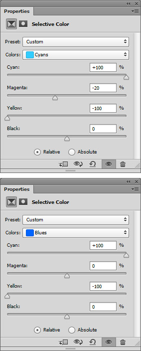
Then I'm going to duplicate that layer a few times until the blues are super saturated. Here's my gif now:
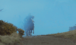
Now I want to fix the blacks. Adding so much blue made the darker colors have a blue tint, so to fix that, I want to remove the blues from the black like this:
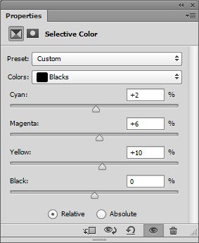
Here's my gif now:

Now to fix the overall colors of the red and yellows (plants and skin tones mostly). Here are my settings of a selective color layer:
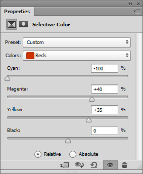
Now here's my gif:
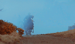
The blacks washed out again, so I fix that with a selective color layer removing reds from the black. Here's my gif after that:
So, like before, I want to use the layer masks on the edit layers to isolate edits to where I want. Here's how I painted them (with the colors I edited) for tutorial purposes. All these were painted on the layer mask using a selective color layer:

And here's my gif:

Now the colors are pretty isolated, but it's still pretty dark, so I added another brightness/contrast layer. Here's my gif after that:

Now the last steps would be a vibrance layer (if you need it) and one final selective color layer to fine tweak the colors. Here's the before gif:

And the after:

And for one more quick tut using a non-Vikings gif. The show is "Black Sails" and most of the time they're on a sunny beach, on the bright blue ocean or in a tropical vibrant landscape, so this is for gifs that are already 1000 steps ahead of the Vikings or Game of Thrones scenes!
Here's the before:

And after the brightness/contrast, levels and curves layer. I didn't mention this before cos there's no POC on this tutorial, but if after you do this step on a gif featuring a POC (even lighter POC shades), you might wash them out. The easiest way to avoid the "white wash", is to add a selective color layer and on the white color settings, turn the white slider all the way to -100. It will look crazy! Just play with the opacity until you balance the color out. Anyways, here's my gif now:

Now, add a color balance layer if you need it. I don't really need it here, so I'll go into the main selective color layer. I want to boost all the colors like I did in the very first gif on this tutorial. Since the color is pretty balance already, I also added more blacks to the black color option right away. Here's my gif after that:

Now to make the gif super vibrant, add a vibrance layer (remembering the -1 saturation for every +10 vibrancy rule I mention in all my tuts). You might also need to add another brightness/contrast layer. Here's my gif now:

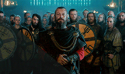
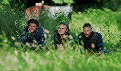
Now you can use the layer masks with selective coloring layers to really isolate certain colors. For all of my Vikings gifs with characters with brighter blue eyes (Bjorn, Ubbe, Ragnar, Floki, Harald for you fellow fans) I literally add like 10 duplicates of +100 cyan/blue selective color layers over the eyes so they really pop. In this gif, Eleanor (Hannah) has greenish blue eyes, so I'll do the same. I'll also go over her lips and skin with a masked selective color layer as well. Here's my gif:
Now the final vibrance and brightness/contrast layers IF you need them. Some gifs will, some won't. Here's the before gif:
And after:

Sorry for such a long tutorial, but I really wanted to get thorough with three common gifs (mostly one color you want to bring out from dull scenes, an overall colorful gif from dull scenes, and a brighter scene you want to color). Hope this helps!
391 notes
·
View notes
Last Seen Blogs

albertopozo
Alberto Pozo
underworld-duo
𝚄𝚗𝚍𝚎𝚛𝚠𝚘𝚛𝚕𝚍 𝙳𝚞𝚘

gabodray
Sans titre
diyabelle
Explore with Me
notweirdbutunique
Palindrome