#like we talk about the starving artist sometimes as like the pinnacle of artistic creation
Photo

in my world airplane cuts his own hair with safety scissors but last time he fucked it up so badly that he’s scared to cut it again and thats why its grown out enough to be pulled into a ponytail
#he makes me so sad#just#like#as an artist#i was talking about this w rippedorigami earlier but like!!!!!!!! Fuck!!!!!!!!!!#he wanted to write the stories he was passionate about but then no one wanted to read them!#and then when he did get recognition it was only because he'd scrapped his plan to please his audience#like we talk about the starving artist sometimes as like the pinnacle of artistic creation#but like fuck that i'd like to live please and thanks?#i can't remember this 100% but i feel like there's a bit at the end of svsss where he's talking to sqq and sqq is like#youre a shit author#and sqh is like#bestie if you hated pidw so much why was it the only one of my books you read???#anyways when sqh said all artistic books are written about gay people i felt that#svsss#svsss shitpost#sqh#shang qinghua#mbj#mobei jun#scum villain's self saving system#scum villain#scumbag system#ren zha fanpai zijiu xitong#shitposts <3#my art <3#posts <3#no transmigration au <3
231 notes
·
View notes
Note
Have you noticed the latest edition of Charlie Bowater can only draw one (1) face? She did The Princess Will Save You and Cast In Firelight both YA Fantasy set to be released this year. And they are how you say... the same fucking cover
Ah yes so you saw the same tweet I did
I know I literally just posted that we cannot outlaw book covers from looking like each other, but ! Oof!
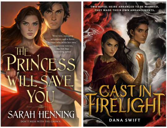
The only thing that softens the blow here is that Charlie has improved at representing nonwhite features such that characters look like POC rather than tan white people, although,, that bar was low. Anybody remember the ACOTAR coloring book.
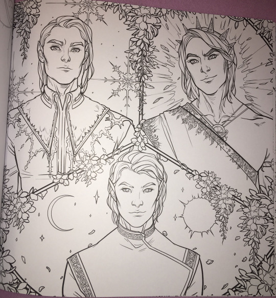
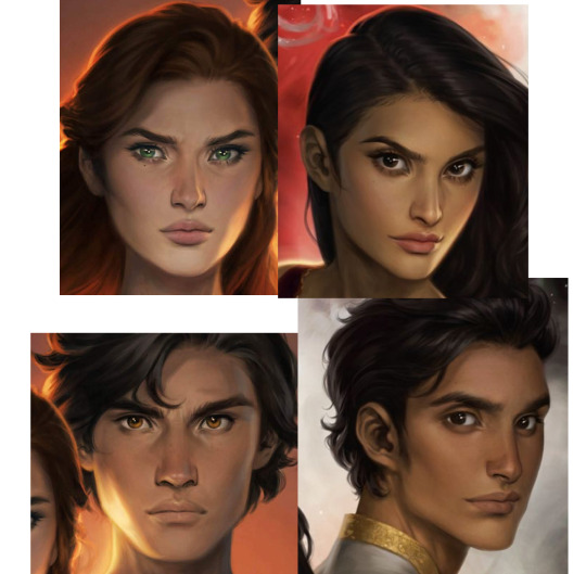
(Would you have guessed that 2/3 of these people are nonwhite? Or even that they’re supposed to be three different men? I guess all the men in Prythian have the same haircut?)
But that minor victory is mostly lost in the quagmires of the fact that Charlie’s style is to give everyone instagram face:
I wouldn’t even call this “Sameface” necessarily: that implies limitation, that an artist is only capable of drawing a single facial structure competently. Bowater is incredibly technically talented, she just chooses to give everyone catlike fae eyes and the cheekbones of a starving nymph. (My previous post on this here.)
But I don’t really blame her for that, or for these hilariously identical, nearly devoid of personality covers. Artists are allowed to do whatever they want. Artists who make art for covers are being art directed by designers and marketing teams who bear responsibility for how the finished pieces turn out.
No, this is our fault, as a community and an industry and..... society, kind of, for valuing character portraits that are “pretty” (“pretty” being an extremely loaded, culturally subjective concept) over art that actually Says Something About The Story. Bowater’s style happens to dovetail perfectly with what we currently collectively find pretty, and so we’ve put her art on a pedestal at the cost of everything else art can or should do for our stories.
And this is understandable: in contemporary western culture, pretty is a value unto itself. Seeing our characters portrayed as pretty denotes them as special, as smart, as powerful. It’s almost impossible to de-program ourselves from that reaction. There are approximately five kajillion studies on how beautiful people are at personal and professional advantages; how they’re perceived to be happier, healthier, more successful, and how those perceptions can translate into realities. (Nevermind how thinness and whiteness enter that equation, see above note about “pretty”.) I would love to see more “average” or weird- looking characters abound (and be accurately visually represented) in the YA/ Genre lit sphere, but for now... everyone is pretty.
Which sometimes means everyone is pretty boring.
But that’s just the specific, "What’s the deal with Bowater’s success in book circles and her style and all the sameiness” part of this equation. What if we backed up and asked: why character art at all? Beyond a question of “pretty”-ness (and general obvious Artistic Quality), why do we gravitate towards it, what's the purpose of it, how does it fall flat in a general sense, and how can it be utilized more effectively?
This is something I think about all the time. I follow writers on social media (because..... I am a writer on social media, regrettably), and we have an enormous collective boner for character art. “Getting fanart [of the characters]” is one of the achievement pinnacles constantly cited when people get or want to get published. Commissioning character art is something we reward ourselves with, or save up for (WHICH IS GOOD AND CORRECT. FREE ART IS GREAT BUT DO NOT SOLICIT IT. PAY YOUR ARTISTS). And like???? Same????? We love our stories because we’re invested in our characters. Most humans, even prose writers, are visual creatures to some extent, and no matter how happy we are with our text-based art, it’s exciting to see our creations exist in that form. So we turn that art into promo material and we advocate for it on our covers-- because it’s so meaningful to us! It goes with the story perfectly!! Look at my dumb beautiful children!!!!!
But on an emotional level, it’s hard to grasp that it only means something to us. Particularly when you take into account the aforementioned vast landscape of beautiful visual blandness of many characters (in the YA/ genre lit sphere, that’s pretty much all I’m ever talking about), character art can be like baby photos. If you know the baby, if that baby is your new niece or your friend’s kid, if you’ve held them and their parent texts you updates when they do cute shit, you’re probably excited to see that baby photo. But unless it’s exceptionally cute, a random stranger’s baby photo isn’t likely to invoke an emotional reaction other than “this is why I don’t get on facebook.”
Seeing art of characters they don’t know might intrigue a reader, but especially if the characters or art are unremarkable-looking, it’s doing a hell of a lot more for the people who already have an emotional attachment to that character than anybody else. And that’s fine. Art for a small, invested audience is incredibly rewarding. But like the parent who cannot see why you don’t think their baby is THE MOST BEAUTIFUL BABY IN THE WORLD???? I think we have trouble divesting our emotional reaction to character art from its actual marketing value, which.... is often pretty minimal. This is my hill to die on #143:
Character portraits, even beautiful ones, are meaningless as a marketing tool without additional context or imagery.
I love character art! I’m not saying it should not exist or that it’s worthless! Even art that appeals to only the one single person who made it has value and the right to exist. And part of this conversation is how important for POC to see themselves on covers, whether illustrations or stock imagery, particularly in YA/kidlit. I’m not saying character portrait covers are “bad”.
I am saying that I have seen dozens and dozens of sets of character art for characters who look interchangeable, and it has never driven me to preorder a book. (Also one character portrait for a high-profile 2019 debut that was clearly just a painting of Amanda Seyfriend. You know the one. There’s nothing wrong with faceclaims but lmfao, girl,,,,)
I’m sure that’s not true for everyone! I am incredibly picky about art. It’s my job. There’s nothing wrong with your card deck of cell-shaded boys of ambiguous age and ethnicity who all have the same button nose and smirk if it Sparks Joy for you.
But if your goal is not only to delight yourself, but to sell books, it’s in your best interest to remember that art, like writing, is a form of communication. The publishing industry runs on pitches: querys, blurbs, proposals, self-promo tweets. What if we applied that logic to our visuals? How can we utilize our character design and art to communicate as much about our stories as possible, in the most enticing way?
Social media has already driven the embrace of this concept in a very general sense. Authors are now supposed to have ~ aesthetics. “Picspams” or graphics, modular collages that function as mini moodboards, are commonplace. But the labor intensity and relative scarcity of character art visible in bookish circles, even on covers, means that application of marketing sensibility to it is less intuitive than throwing together a pinterest board.
Since we were talking about it earlier, WICKED SAINTS, as a case study of a recent “successful” fantasy YA debut, arguably owed a lot of its early social media momentum to fanart.
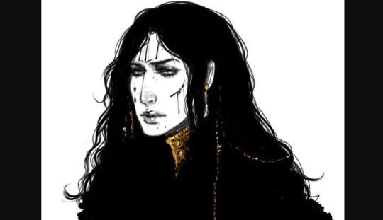
(Early fanart by @warickaart)
The most frequently drawn character, Malachiasz, has long hair, claws, and distinctive face tattoos. WS has a strong aesthetic in general, but those features clearly marked his fanart as him in a way even someone unfamiliar with the book could clearly track across different styles. Different interpretations of his tattoos from different artists even became a point of interest.
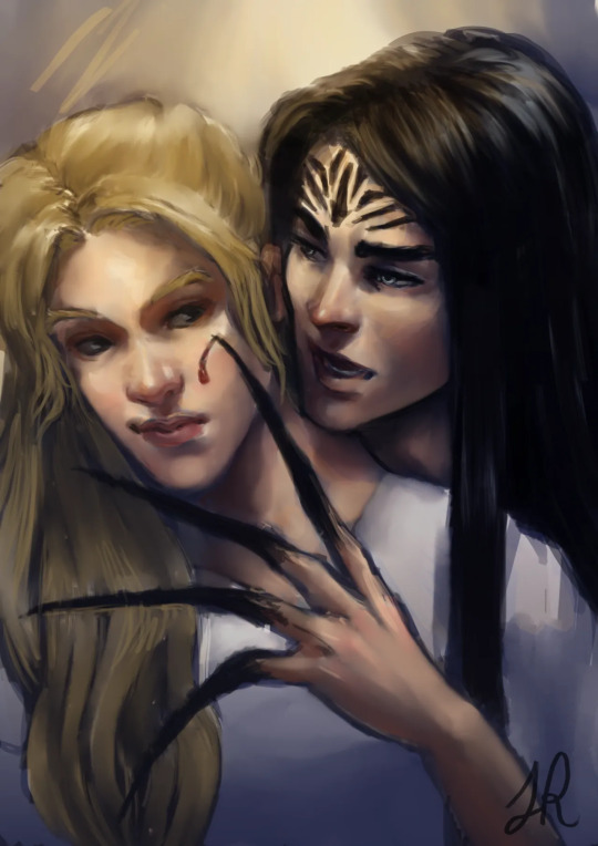
(Art by Jaria Rambaran, also super early days of WS Being A Thing)
Aside from distinctiveness, it's a clear visual representation of his history as a cult member, his monstrous powers, and the story’s dark, medieval tone. The above image is also a great example of character interaction, something missing from straightforward portraits, that communicates a dynamic. Character dynamics draw people into stories: enemies-to-lovers, friends-to-lovers, childhood rivals, platonic life partners, love triangles, devoted siblings, exes who still carry the flame-- there’s a reason we codify these into tropes, and integrate that language and shared knowledge into our marketing. For another example in that vein, I really love this art by @MabyMin, commissioned by Gina Chen:
The wrist grip! The fancy outfits! These are two nobles who hate each other and want to bone and I am sold.
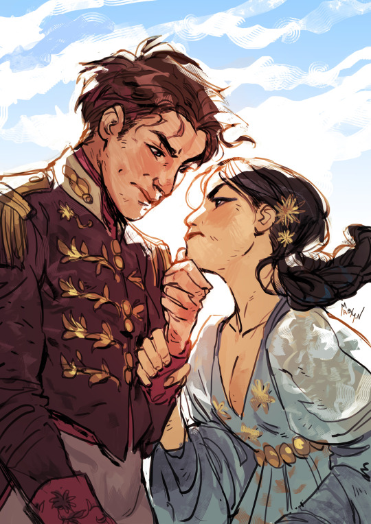
In terms of true portraits, the best recent example I can think of is the set @NicoleDeal did for Roshani Chokshi’s GILDED WOLVES (I believe as a preorder incentive of some kind?):
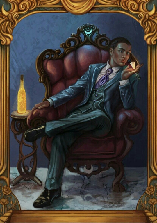
They showcase settings, props, and poses that all communicate the characters’ interests, skills, and personality, as well as the glamorous, elaborate aesthetic of the overall story. Even elements in the gold borders change, alluding to other plot points and symbology.
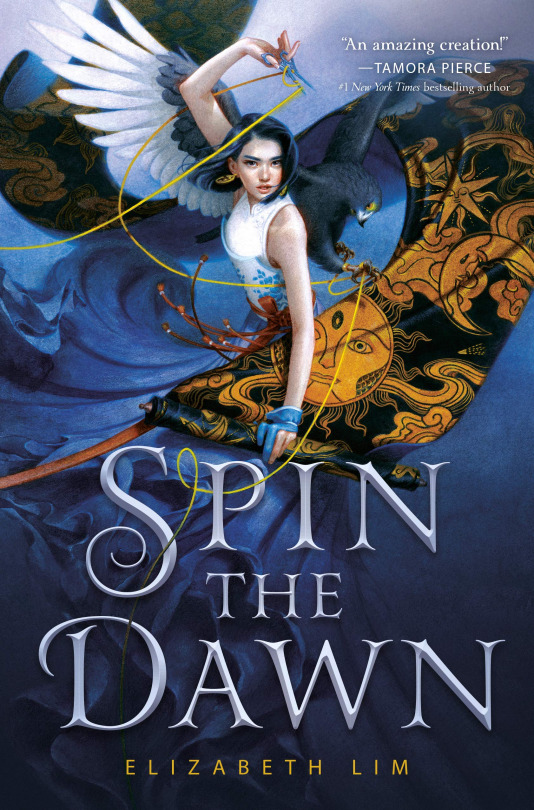
For painterly accuracy in character portraits on covers, I love SPIN THE DAWN. The heroine looks like a beautiful badass, yes, but the thoughtful, detailed rendering of every element, soft textures, and dynamic, fluid composition form a really cohesive, stunning illustration that presents an intriguing collection of story elements.
The devil isn’t always in the details, though: stark, moody, highly stylized or graphic art with an emphasis on textural contrast and bold color and shape rather than representational accuracy can communicate a lot (emotionally and tonally) while pretty much foregoing realism.
The new Lunar Chronicles covers are actually the best examples I found of this (Trying to stay within the realm of existing bookish art rather than branch into All Art Of Human Figures Forever):
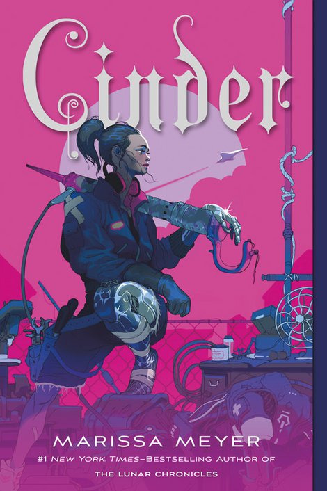
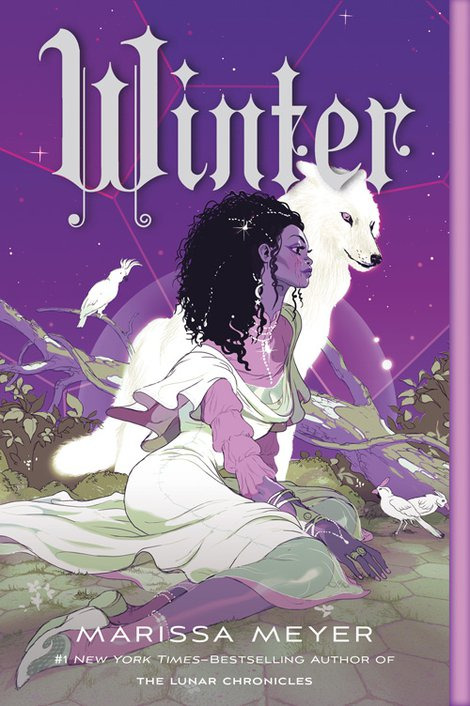
Taking cues from styles more typical of the comics and video game industries. (Games and comics, as visual mediums, are sources of incredible character art and I highly recommend following artists in those industries if you want to See More Cool Art On Your Timeline.)
TL;DR: Character art and design, as a marketing tool (even an incidental one) should be as unique to your story and your characters as possible, and tell us about the story in ways that make us want to read it. I tried to give examples because there are so many ways to do this, and so many different kinds of art, and I could give many more! But I’m bored now. So to circle all the way back:
These are not just bad because they look like each other, although that is embarrassing and illuminating. These are bad covers (although,,,,, PRINCESS is the far worse offender, at least FIRELIGHT suggests a thoughtful cultural analogue) because a desire for Pretty Character Art overrode the basic cover function to tell us about the story. We get no sense of who these people are, what their relationships are, what these books are about beyond the most general genre, or why we might care. The expressions are vague, the characters generic-looking, the compositions uninteresting and the colors failing to be indicative of anything in particular.
They’re somebody else’s baby pictures.
(And yes, that’s the CRUEL PRINCE font on PRINCESS. I better not have to do a roundup post but it’s on thin fucking ice.)
325 notes
·
View notes
Last Seen Blogs

poetalegalis
Poeta Legalis

terminalboutique-blog
The Fashion Blog

mio-imada
今田 美桜

annikasummer
Annika Summer

partnerwithapro
PRO Engineering / Manufacturing Inc.