#isabelnaegele
Photo

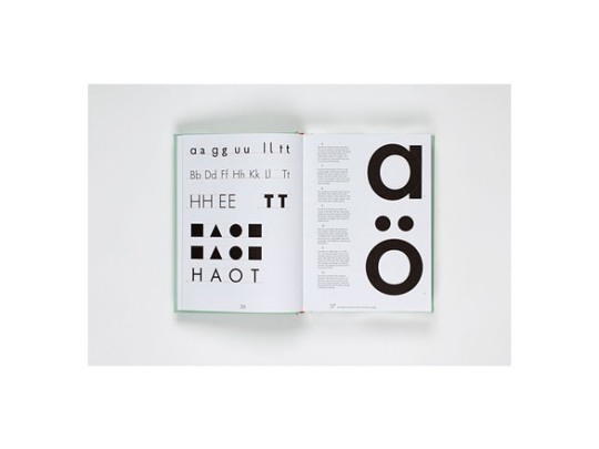
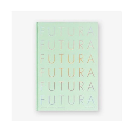
Futura Looks Bright Celebrating its 90th anniversary this year, the life and times of Futura is a fascinating one. Charting its Bauhaus origins to its use as the first font on the moon in 1969 ‘Futura: The Typeface’ is a new book that tells the story of how the typeface went from representing radicalism in design to dependability. It celebrates and rediscovers this timeless font through archive illustrations and informative essays, revealing fascinating facts like ... did you know Futura was Stanley Kubrick's favourite typeface? It was used on the film poster for ‘2001: A Space Odyssey’ … or that ‘Vanity Fair’ used Futura as an experiment for five issues in 1929, defining their progressive design style, and pin-pointing Futura as "a face representing the New Typography of the European avant-garde”. Expect insight and observations from renowned design writers such as Steven Heller, Erik Spiekermann and Christopher Burke. Edited by Petra Eisele, ‘Professor of Design History and Design Theory’ at the ‘University of Mainz’; Dr Annette Ludwig, ‘Director of the Gutenberg Museum’ and Isabel Naegele, ‘Professor of Typography’ at the ‘University of Mainz’. 'Futura: The Typeface’ published by ‘Laurence King Publishing’ is a stunning examination of one of the most popular typefaces ever created. #neonurchin #neonurchinblog #dedicatedtothethingswelove #suzyurchin #ollyurchin #art #music #photography #fashion #film #words #pictures #neon #urchin #newtypography #europeanavantgarde #paulrenner #typographicspecialist #bauertypefoundry #germany #petreisele #annetteludwig #isabelnaegele #futura #furturathetypeface #book #laurencekingpublishing https://www.instagram.com/p/B_MgBb1A0vx/?igshid=13b9bgeanmdnq
#neonurchin#neonurchinblog#dedicatedtothethingswelove#suzyurchin#ollyurchin#art#music#photography#fashion#film#words#pictures#neon#urchin#newtypography#europeanavantgarde#paulrenner#typographicspecialist#bauertypefoundry#germany#petreisele#annetteludwig#isabelnaegele#futura#furturathetypeface#book#laurencekingpublishing
0 notes
Photo

Futura Looks Bright A favourite of Stanley Kubrick and NASA, the typeface Futura is turning 90 this year. The authors of a new book on Futura’s history and influence explain the development of its design by Paul Renner. Renner designed his typeface Futura in 1927, and his reputation began to grow; he went on to become one of the best-known type designers of his time. As a leading member of the ‘Deutscher Werkbund’ (a German association of architects, artists, designers and industrialists) and head of the ‘Meisterschule für Deutschlands Buchdrucker’ (‘Trade School for Book Printers of Germany’) in Munich, he was at the centre of a new media and advertising industry — a position that he also used to criticise the propagandist strategies of the ‘National Socialists’. Unlike many avant-garde designers, who saw their experiments with type as manifestations of a new way of thinking, Renner operated as a typographic specialist. His extensive experience with typefaces made it clear to him that a typeface could be successful only if the upper - and lower-case letters gave rise to a formal aesthetic whole. On the basis of this observation, he derived the structures of his lower-case letters systematically from the geometrical principles of Roman uppercase Antiqua. With this reference to antiquity, Renner managed to design a truly ‘modern’ geometrical typeface, which both met the requirements of the New Typography and suited the tastes of more conservative designers. From a historical point of view, therefore, Futura was a true typographic design innovation that anticipated the future while being rooted in its own time. ‘Futura: The Typeface’ by Petra Eisele (editor), Annette Ludwig (editor), Isabel Naegele (editor) published by ‘Laurence King Publishing’. #neonurchin #neonurchinblog #dedicatedtothethingswelove #suzyurchin #ollyurchin #art #music #photography #fashion #film #words #pictures #neon #urchin #newtypography #europeanavantgarde #paulrenner #typographicspecialist #bauertypefoundry #germany #petreisele #annetteludwig #isabelnaegele #futura #furturathetypeface #book #laurencekingpublishing https://www.instagram.com/p/B_Mf8aegZlQ/?igshid=l0qsncj8h23h
#neonurchin#neonurchinblog#dedicatedtothethingswelove#suzyurchin#ollyurchin#art#music#photography#fashion#film#words#pictures#neon#urchin#newtypography#europeanavantgarde#paulrenner#typographicspecialist#bauertypefoundry#germany#petreisele#annetteludwig#isabelnaegele#futura#furturathetypeface#book#laurencekingpublishing
0 notes
Photo

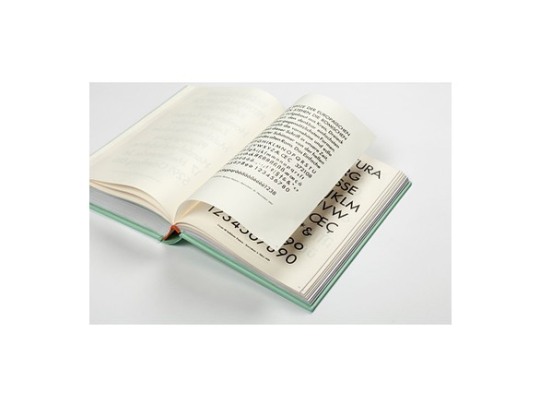
Futura Looks Bright This is a stunning examination of one of the most popular typefaces ever created, Futura. Celebrating its 90th anniversary this year, the story of Futura is a fascinating one. Charting its Bauhaus origins to its use as the first font on the moon in 1969, this book tells the story of how the typeface went from representing radicalism in design to dependability. It is durable and timeless, and is worthy of being rediscovered and celebrated. The enormous success of Futura was owed to the risks taken by Georg Hartmann at the ‘Bauer Type Foundry’ in Frankfurt, as well as the professional care given to the typeface by Heinrich Jost, and the marketing of the typeface through the foundry. Fritz Wichert’s idea to name the new typeface Futura – the future – was certainly also ingenious. It is no coincidence that this name was devised in the context of the ‘New Frankfurt’ project, since, at this time, the city was turning into a hotspot of innovative design. Another contributor to the typeface’s rapid success in Germany was the economic prosperity being experienced the country, which led to a booming advertising scene that quickly became professional. With its elegant, modern and classic appearance, Futura seemed destined to become the typeface of the ‘modern’ look. ‘Futura: The Typeface’ by Petra Eisele (editor), Annette Ludwig (editor), Isabel Naegele (editor) published by ‘Laurence King Publishing’. #neonurchin #neonurchinblog #dedicatedtothethingswelove #suzyurchin #ollyurchin #art #music #photography #fashion #film #words #pictures #neon #urchin #newtypography #europeanavantgarde #paulrenner #typographicspecialist #bauertypefoundry #germany #petreisele #annetteludwig #isabelnaegele #futura #furturathetypeface #book #laurencekingpublishing https://www.instagram.com/p/B_Mf3RqgESV/?igshid=tfu2c5pf6uya
#neonurchin#neonurchinblog#dedicatedtothethingswelove#suzyurchin#ollyurchin#art#music#photography#fashion#film#words#pictures#neon#urchin#newtypography#europeanavantgarde#paulrenner#typographicspecialist#bauertypefoundry#germany#petreisele#annetteludwig#isabelnaegele#futura#furturathetypeface#book#laurencekingpublishing
0 notes