#is this actual colored pencils or just a perfect digital representation of colored pencils?
Text
Making of Ashes to Ashley
Recently I posted my comic Ashes to Ashley, and got such a tremendously kind and loving response that I felt like sharing a little bit more about where it came from.
The story is about a transgender awakening, where the quiet and somber Ash explodes out of the closet as the loud and colorful Ashley. This was always the plan, however the details changed along the way. Quite quickly I realized that I was writing about myself and my own trans journey. I never played in a band and I don't imagine I'll ever grow bunny ears (sadly), but still Ashley is undoubtedly a reflection of myself. I just allowed life to become a stage and gender performance a rock concert.
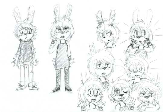
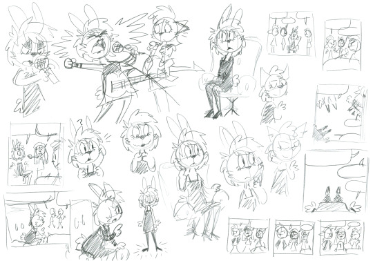
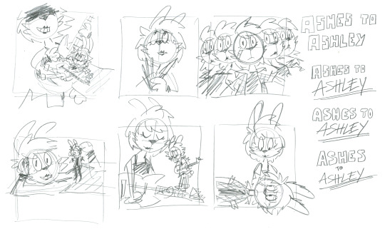
Above are the first idea doodles I drew late at night in early April. I quite enjoyed giving Ashley lipstick and prominent eye shadow, since I hadn't ever done a character like that before. The idea was a bit of exaggerated femininity that accidentally becomes raw punk expression. One or two people have pointed out the Um Jammer Lammy similarities, and they are absolutely not coincidental. Initially I imagined Ashley would've been more reluctant about her transformation, which is why she looks a bit more annoyed in some of my sketches, but the story became more bright and funny if it was made immediately clear that this all happens off of her own volition.
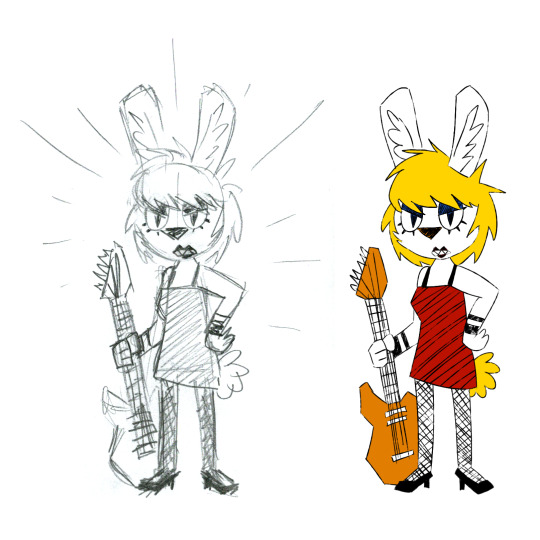
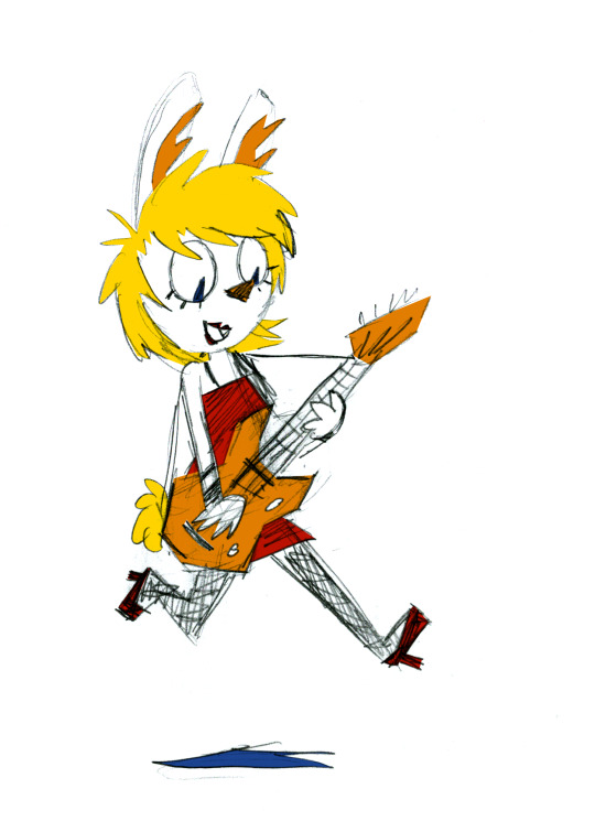

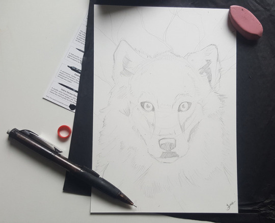
Some method and color tests. My girlfriend suggested I instead go a lot more raw with it, which is why I ended up adamantly using an ugly sponge brush built into Photoshop. Sapphic Disaster are some form of punk-shoegaze band, so combining rough pencil linework with crunchy texture coloring felt like a fitting visual representation of them. This also side-stepped the biggest problems I've always had with drawing comics – dealing with inking is a boring waste of time, and working digitally always makes me fixate on perfection. By just using pencil on paper I had to stick with whatever errors couldn't be saved by a regular eraser, in fact I dedicated myself to only using an old worn down Bic mechanical pencil and embraced the idea that the comic would consistently look a bit off and amateurish. Of course I allowed myself the luxury of cleaning up my drawings digitally before coloring, but that can only take you so far. This way of working helped me make fast progress and kept each step engaging, I've never had as much fun drawing a comic as I had with Ashes to Ashley.
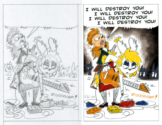
Here's a before and after from initial scan to finished panel. I often only tidy up around focal points like faces or hands, and allow the rest to remain as it is, usually parts like the legs or Ashley's ears.
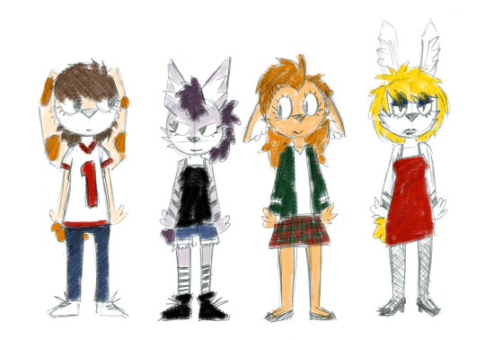
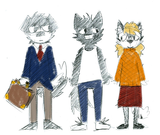
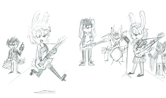
Character references and my initial color picks, they went through small changes as I went along. I liked giving all the band members different sorts of rabbit ears to make them all look distinct from each other.
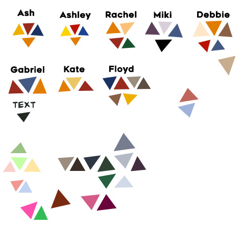
Here's some ideas for the Sapphic Disaster band logo and the comic's color palette, notice how Ashley is more vibrant than Ash.
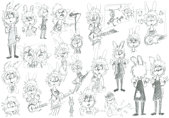
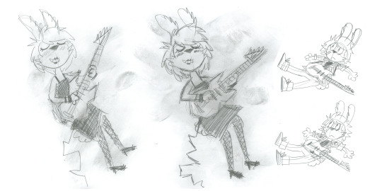
While working I filled up numerous papers with doodles trying to workshop panels and layouts. It's too much to show all of them here, so I composed a few collages of my favorites.
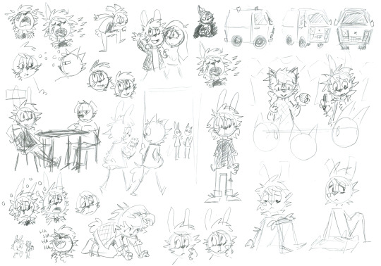
It was pivotal for me that Ash would always look painfully cute. The sketch of the table scene with Floyd shows a rare out-of-character confident and laid-back Ash. In the presence of Floyd?! Never!
I was very concerned about the reader recognizing the old Ash when first seeing Ashley. She may be all excited about being a girl, but her nervous cluelessness remains. I ended up going back and redrawing two panels in Ashley's introduction to strengthen this impression.
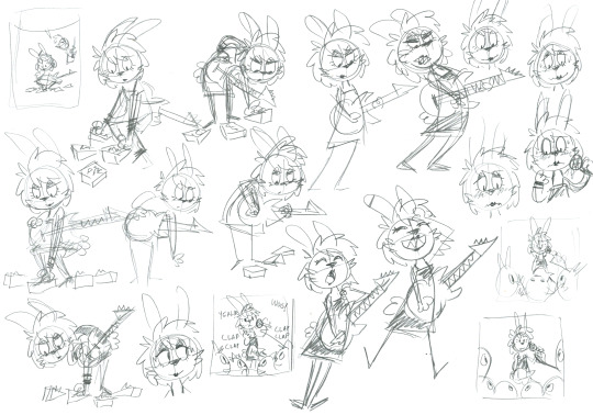
For those not in the know, shoegaze is a rock subgenre that centers around noisey guitar textures, typically achieved through heavy use of effect pedals at the musicians feet; hence the name. When Ashley plays her guitar she produces a cacophony of strange sounds, the reader will have to imagine what they actually sound like, but I always imagined their opening number "I Wanna Be a Girl" to sound like a couple of amateurs trying to recreate Lush's Blackout.
The page where the band go around looking for Ashley while she's receiving her makeover was shoehorned in at a later stage for pacing purposes. That's why Gabriel is suddenly back to pulling cords after previously claiming they're all set, oops!
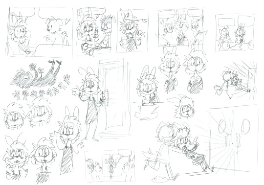
One of the core rules to this story is that everyone is always overly supportive of Ashley's transition no matter what. This is what makes the otherwise stern and serious Floyd especially funny, my girlfriend was pivotal in sprucing up his dialogue, adding bits like "have you seen the health care waiting lists?, "I know an endocrinologist who owes me a favor or two" and "give me 35% more danger"
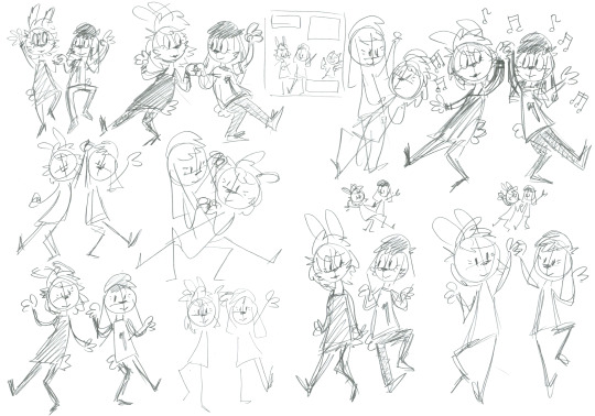
Towards the end I discovered that Ashley and Debbie dancing was apparently the most important panel in the entire comic, judging by how much I tried to perfect it. (For the record, my favorite panel is when Ashley screams into the microphone that she wants to be a girl.) Maybe Ashley and Debbie dancing should've replaced the final full-page panel? Well, we got a lot of cute doodles out of it regardless. Just kiss already!
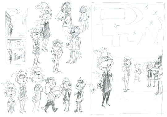
Initially I imagined Ashley to be standing alone in the "could this be the real me" final panel, but I realized her odd family of friends was equally a part of the real her. She was always right where she needed to be, she just needed to find herself within that place. (I ended up giving Ashley a cigarette because otherwise it looked like she was praying.)
Here are some ideas for the cover illustration, of course in 1:1 format to look like an album cover. Up until last minute I planned for the comic to have You Made Me Realize as its subtitle to distinguish it from eventual follow-ups, which is why the You Made Me Realize EP cover art is paraphrased in the top-middle. I ended up just going with Ashes to Ashley to keep it clean and simple. The title Ashes to Ashley was blurted out immediately by my girlfriend when I first showed her my concepts for the story. It's perfect, she's perfect.
I drew two Ashes and two Ashleys for the cover art and let my fingers smudge all over the latter. While most obviously riffing on the cover for My Bloody Valentine's Loveless, it's equally taking from the Ecstasy of Saint Theresa's Pigment.
And there you have it.
However I never intended this to be the full extent of Ashley's story, just a satisfying and complete end of a chapter. I've already finished writing the next story, Today Forever, and I hope I can get it out to you all soon enough. Your love for Ashley keeps me going.
/Kiki
30 notes
·
View notes
Photo
It’s time to write about the September 2018 #Scrawlrbox – not a sponsored post, just me trying different traditional things after basically years of being 95% digital :3
Yet again while I was working on this I got charged for the next box, so there will be another one next month
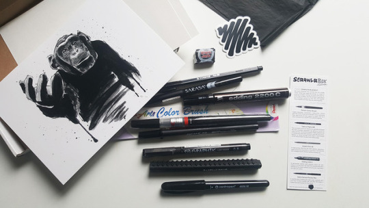
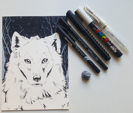
Fittingly enough for this month, the ‘theme’ of the box was the color black, and so everything provided was a type of pen (both brush and felt tips). The print is by damian.er on Instagram if you would like to check out their work!
Ink is one of those things that really intimidates and historically frustrates me, because it takes a lot of patience and planning to do well, and I tend to work much more impulsively. As the box provided two pieces of card stock, I set one aside and used the other to test.
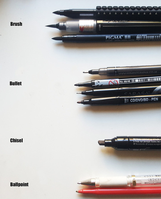
The type of tip the pen uses really influences what you can do with it, so here’s a look at the variety of shapes I had to work with, plus two ballpoint pens I had on hand for comparison
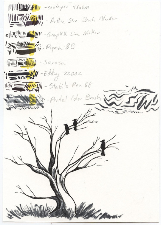
I was not smart enough to put any rational order to the initial testing pfffff
Centropen 4606M (Bullet) – a bit of bleeding on the card stock, gave ‘fuzzy’ lines. When I took the photo of its tip I noticed it said on the side it’s for writing on Cds/DVDs with >:/
Artline Stix Brush Marker (Brush) – actually worked rather well on the paper, but had a but of transparency to it so true black takes more than one layer.
Graphik Line Maker (Bullet) – also a pretty solid choice, but as it was a 0.8 rounded felt nib there isn’t a lot of diversity to the mark making
Pigma BB (Brush) – this is one I ended up really liking. It’s a brush pen so it has a lot of different possibilities, it was really satisfying to use, the color was nice and solid, and there was little issue using it on the card stock
Sarasa (Bullet)– Nice fine lines, will probably see use as I make myself do more traditional stuff
Edding 2200C – honestly is the perfect representation of what you think of when someone says ‘permanent marker’. It stinks, its heavy, it bleeds, its hard to control, and has a chisel tip, nty.
Stabilo Pen 68 (Bullet) – just a basic felt tip pen, had a little more possibility for variety than the Graphik but overall didn’t excite me.
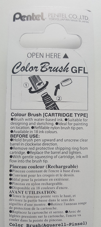
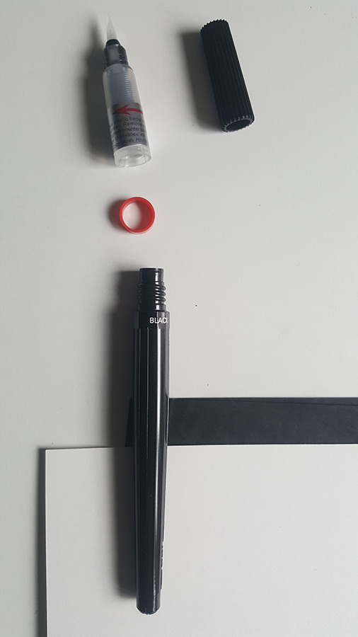
Pentel Color Brush (Brush) – This one I’m a bit baffled with because I’m not sure I was using it right. It came with assembly instructions! In the end I could see use for it but only for a certain type of markmaking (you can see me fooling around with it a lot on the test sheet). The color was very transparent, and the nylon bristle tip gave very uneven results. It would only give me a mark that looked like I was scrubbing the paper with a dry marker.
As I started on this before Inktober was in full swing, I was considering using some of these in my drawings, but, as I knew I wanted a bit of color, had the foresight to test how they held up to a copic marker going over them, after giving them about an hour to dry. I used yellow to get the most visibility of muddiness. In the end, the Stabilo, Pigma, and Graphik pens showed the most resilience, but I chose to stick to the Microns.
At this point I decided to pick out a few of the favorites and try a drawing using the second piece of card stock given. As I said, I know my problems with ink can be traced back to planning and patience, so I started with a light pencil drawing that I absolutely used reference images for. I tried to pick subject matter that worked well with stark contrast of white and black, and in the end the features of a wolf’s face seemed to stand out very well against the fur surrounding it (which tends to be much lighter).
This drawing sat unfinished for several weeks, partially because inktober took over my time, partially because of the fear of messing up a decent sketch. In the end, I finally sat down with three of the pens that bled the least in the test, (the Sarasa for the fine lines, the Pigma for the larger strokes, and the Artline for the large areas), and allowed myself the ‘cheat’ of white pens to fix things.
From here this turns into ‘Emily goes off the rails’ again, but overall I like the effects I got. My complaints with the image are all things that I did, while the pens I picked out did their job to my satisfaction – though it did take a bit of searching through the materials given.
The yellow of the cardstock is playing interestingly with the blue/white of the Posca marker interacting with the ArtStix ink. I’m going to make some changes in photoshop to get some effects I want, but overall this gave me a pretty solid foundation
4 notes
·
View notes
Text
youtube
Watch the American Climate Leadership Awards 2024 now: https://youtu.be/bWiW4Rp8vF0?feature=shared
The American Climate Leadership Awards 2024 broadcast recording is now available on ecoAmerica's YouTube channel for viewers to be inspired by active climate leaders. Watch to find out which finalist received the $50,000 grand prize! Hosted by Vanessa Hauc and featuring Bill McKibben and Katharine Hayhoe!
#ACLA24#ACLA24Leaders#youtube#youtube video#climate leaders#climate solutions#climate action#climate and environment#climate#climate change#climate and health#climate blog#climate justice#climate news#weather and climate#environmental news#environment#environmental awareness#environment and health#environmental#environmental issues#environmental justice#environment protection#environmental health#Youtube
17K notes
·
View notes
Photo
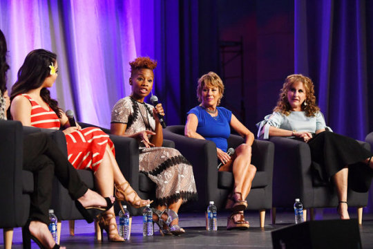
Photo Credit: Disney/Image Group LA
Anika Noni Rose, voice of Princess Tiana, at 2017 D23 Expo’s The Power of The Princess
Details below the cut.
ABOUT BEING CASTED
Anika was performing in “Caroline, or Change” in 2004 at the Ahmanson Theatre in Los Angeles when she was asked by Disney to possibly voice. She wasn't thinking of voicing a princess and told Disney she could voice a Flea or Tick. That she knew the bite would sound like "Nyah!" That interaction with Disney was 2 years before the auditions for Tiana. Anika was filming Dreamgirls when the Tiana auditions were called. She went to 3 auditions that were far apart and was told she got the part while traveling to Australia.
ON RON & JOHN
Ron Clements and John Musker are each other's Yin and Yang says Anika. Ron is real quiet but when he's on, he's on. And John's going to interrupt anyway. Like they're aggressively going to the same point, they are a megamind organism. She called them masters of surprise, Anika said she spent a lot of time weeping. She explains by recalling a moment in Paris where they were at a toy reveal press event. They showed a clip of Tiana animated in color for the first time to Anika, she was crying and wasn't aware of how much Tiana would look like her.
MISUNDERSTANDING CALL OUT
There was discussion on processes of films, in which Jodi Benson was remembering The Little Mermaid as the "the last hand drawn" but Jodi's full thought was meant as "last hand painted on cels." Anika interjects with "Excuse me? Yeah, there were some hands on my film." Jodi then completes the thought with "to use hand painted cel" which is a correct fact. Hosts and WDAS Animators Kira Lehtomaki and Amy Smeed confirm that The Princess and The Frog was hand drawn, but colored digitally.
MARK HENN
Mark Henn was sitting in the audience, the Hosts ask for him to stand. Mark brought never before seen pencil tests to show the audience. One of the first animations of Tiana was as a frog. I actually did not write down what this scene was, but I'm remembering it as the "There is no way I'm kissing a frog and eating a bug in the same day." dialogue. He then shows us a test that was never in the movie, he believes the audio was pulled from an audition tape of Anika and that the test was to see how the voice and visuals worked together as a whole. Tiana says something along the lines of "I'm not kissing a frog." Sorry I don't have detailed notes of these, watching the pencil lines on screen were too much of a treat.
ON MUSIC
Randy Newman was described as great and funny by Anika. It took a long time for Anika to be casted as Tiana. She was at the Oscars for Dreamgirls and Randy was there. She came up to him during a rehearsal and said "Hi, Randy. I auditioned for Tiana..." but no casting secrets were revealed that night. She calls Randy fantastic, interesting but an introvert. He wouldn't look at you. He's all about a feeling, and connecting on a feeling. Randy was a perfect fit as he felt the city and lived there. There were many other songs created for the movie, but they were darker, bluesy, and sexy. Too sexy actually.
ON WHAT ALMOST THERE MEANS
Anika felt like all of the movie was much like her life. In the first drafts, Tiana was named Maddy, short for Madeline. Anika grew up in a small town where her guidance counselor in school told her she should learn a trade. But she was lucky to have a supportive family. Almost There is about being somewhere. Anika knew Tiana's journey and her path. Find joy in the journey and the steps you have taken. You can be Almost There and take a couple more steps.
WRECK-IT RALPH 2: RALPH BREAKS THE INTERNET
A clip that was previously shown in the Animation Hall D23 Presentation was shown the audience of The Power of the Princess. Ralph and Vanellope venture into the internet and discover a website called Oh My Disney. The Princesses are mobbed by fans while they walk backstage, their door is guarded by a Storm Trooper. Vanellope glitches into their dressing room to which the princesses act in defense, Cinderella breaks her glass slipper to be a weapon. Each Princess then goes around finding ways to qualify Vanellope as a Princess. Tiana's line asks if she's ever been "Cursed?" The Princesses find Vanellope's casual wear to be delightful, they then create their own versions of Disneybounds. Tiana wears a yellow shirt that says NOLA, pants, and sneakers. She is holding a starbucks cup and her natural hair is down and rendered in CG. Tiana says to Vanellope "It would be boring if we were all the same."
ON REPRESENTATION
Anika has all kinds of photos of children dressed as Tiana "An Asian Tiana" She talks about how Tiana shows brown kids and their friends that "They too, are regal." Anika would wear a yellow towel on her head as a child, but now kids can be as regal, as phenomenal as they are. We reach children on a level which they speak. It isn't until adults reach in and put the boundary. A man in New York approached Anika, thanking her that he can buy a princess doll that looks like his daughter.
FINALE
Before closing the panel, each voice was asked for their favorite quote and/or sing. Anika did not choose a quote, but sang Down in New Orleans. Anika said she had to catch a flight after but took a selfie with the audience.
BETTER NOTES FROM PRESS REPORTERS
High School Los Angeles Times - Cassandra Hsiao
Rose thought Disney was considering her for a much smaller part than the voice of Tiana, the lead princess. “I was not at all thinking of a princess,” Rose said, describing the meeting that took place between her and Disney. “I was like, listen, I’ve been working on some things, if by chance you need a flea or a tick I know what that might sounds like.”
For Rose, she was in Paris when the directors of “The Princess and The Frog” John Musker and Ron Clements showed her a clip without a preface. “They showed me myself for the first time in color,” said Rose. “I had never seen her fully animated and I had no idea she was going to look so much like me. I was weeping in Paris backstage.”
Rose explained that Tiana as the first African-American princess not only showed brown children that they are regal but also show their friends that they too are regal. The movie also encompassed ideas of perseverance and tenaciousness– something that struck very close to Rose’s heart. “I felt like when I read the script, I knew this girl. I grew up in a small town without anybody doing the thing I wanted to do. I grew up in a small town where a guidance counselor told me maybe I should learn a trade. So I understood being somewhere where nobody else understood what I wanted to do. So I felt like the journey I was going on as Tiana, though I was not a young girl in the South in the Jazz Age, was my journey. I knew her voice. I knew her path. I constantly felt and still feel that I am ‘almost there…’ There is a joy in the journey of your dream. And sometimes you’re not quite touching it there. But the fact that you’ve gotten to the point where you’re almost there means you only have a couple more steps to go.”
Rotoscopers - Kajsa Rain Forden
Anika Noni Rose’s journey to Disney had a lengthier path. First, she was invited simply for open discussion, a meeting with Disney to see the possibilities; Rose was ecstatic: “I would love to come in for Disney because I’ve got voices.” Rose specifically remembers offering her voice for a flea or tick, having developed a particularly humorous biting noise. It would be another couple of years before Princess Tiana, or Maddie as she was originally named, became part of her life.
Rose thought of the team as “each other’s yin and yang,” also calling them masters of surprise. Rose remembers the poignant moment when Ron and John surprised her with a first look at Tiana, fully animated and in color – causing her to cry while backstage in Paris.
Consistently impassioned, Rose had much to say about Princess Tiana’s power, including how she finally showed “little brown children” that they are regal, that they can be princesses or princes. Tiana also promotes a sense of autonomy, the idea that you can work for your dreams on your own abilities and on your own terms.
For Rose, Tiana opens up the field of imagination for children who hadn’t yet seen princesses that looked like them and that could be included in a pantheon with other diverse characters. “It is not until adults reach in and ruin [imagination] that [children] put up boundaries.”
Oh My Disney - Sean Reed
“I was weeping in Paris backstage. I didn’t realize how much she’d look like me.” –Anika, remembering the very first time she saw animation of her character Tiana, from The Princess and the Frog.
“You can be almost there and be sad about it, or you can be almost there and find the joy in the journey, and how far you have gone.” –Anika, commenting on what makes Tiana’s story so inspiring. RE: WEEPING.
“That was like a master class in conquering your fears.” –Paige speaking for all of us after Anika’s incredible advice.
“We reach children on the level that they speak. We reach them in their hearts.” –Anika just doling out another gold soundbite like it’s her job.
#tiana#princess tiana#anika noni rose#disney princess#princess and the frog#d23 expo: 2017#event: d23 expo#photo#cast: anika noni rose#text#commentary#mod: adamos
22 notes
·
View notes
Text
[Carnival of Kindness] A Kindness of Ravens
[Original fiction, 4500 words. PM me for content notes if you need them.]
The worst part is, you know this is your own fault.
You’d known for years that you have to read the whole spell to make sure that there aren’t ingredients that aren’t mentioned in the list at the top, but you always made the same mistake, and sometimes it came back to bite you in the ass. This time, you didn’t notice that in order to summon a raven--or any corvid--you needed an actual raven feather.
But where on earth would you get a raven feather at 9pm on a Friday? You did a half-hearted Google search, and then an even more half-hearted (quarter-hearted?) search of the birding websites to see if there was a place where everyone knew that ravens flocked and, well, nah. And was it worth traipsing around in the dark, in a park, on a lark, with a spark--you shake your head--looking for a black feather and hoping that it was the right kind of black feather?
No, you decide, but you already knew it just wasn’t. There are places online where you can order raven feathers, obviously, and you might be able to go to the zoo or something, but it’s not going to happen tonight, if you need a raven feather.
Your hands start trembling at that, because you’d planned on summoning a raven tonight, under the full moon at midnight, just like the spell says. It’s been on your calendar and you gathered together everything in the list of ingredients. Most of the herbs are dried, and they’ll keep, but it was on your calendar and if you don’t do the spell tonight, you’ll have to delete it off your calendar, and when is the next time that a full moon will happen on a Friday night when you have three days in a row off, and what if the herbs don’t actually keep, because some of them were difficult to get, and…
A spiral, that’s what that was. You shut your eyes and blank your mind forcibly and repeatedly until you start to calm. Sort of. Not as calm as you’d like, but calm enough. You can’t solve the problem of not having a raven feather, which means it goes in a very particular mental box, one you’ve constructed to keep unsolvable problems, even though you know it’ll only hold for so long. You then go down the list: what next? What can you fix? What is something you can do?
You look at your calendar for another full moon on a Friday night. Four months from now, it’s on a Thursday, and you might be able to get a Friday off instead of a Monday, especially if you ask this far in advance. But the Monday after is your boss’s birthday, so probably not. But you can ask. You make a note for yourself to ask, and then you shut your calendar--it’s paper, but you also keep an identical digital version.
What else can you do? If you were cooking, you’d check for a substitute. Spells aren’t entirely unlike cooking, but you’ve never tried to substitute something yet, and what if it goes wrong? The spell is fairly simple, though, and if it goes wrong--what then? Probably you just won’t summon a raven.
You check Google for spell substitutions, but this isn’t the kind of information that would be found through a quick search. You aren’t surprised when you find nothing. You go over to your spellbooks, all three of them, and check the indices. Only two of the books even have indices, and you aren’t sure how accurate they are, but you look anyway. Nothing.
Frustrated, you flip through the third book, looking for a table of contents or some sort of organization. It’s not the book you’re using for this spell, and it’s not a book you use very often as the font is difficult for you to read, but it does have chapter headings. One of them jumps out at you: Basics. Maybe it’ll have something about substitutions in there.
And it does. Magic is largely a result of intent and symbolism, which is why a single hair can represent an entire person, and so on. In theory, the use of a picture or other representation of an item should do as well, although if one cares deeply about the specifics, this method is not recommended.
Do you care about the specifics? You care that it’s a raven and not another type of bird, but that’s why you specify the type of feather. You don’t care specifically which raven you call, since the spell has fuchsia flowers in it to ensure that whichever one is called will be willing. So in theory, a picture or other representation should work.
You have many pictures of ravens and their feathers saved to your computer, but when you try to print them, you discover your printer is out of ink. That can’t be right. You frown, but then you remember you ran out while printing those flyers for a coworker. That was right before you ran out of meds and nothing got done for a few days, and you obviously didn’t remember after that. Which, of course, you think grimly, is one reason you’re even doing this spell in the first place; a familiar can help with things like that. You try printing in color, to see if that cartridge has any dregs left in it, but it’s also empty. Your hands are starting to shake again. You know there are twenty-four-hour stores that carry your printer ink, but the idea of leaving the house to go to one--No.
You don’t have to leave, you reassure yourself. You don’t have to go anywhere. Besides, printing isn’t the only way to make a picture. You can draw one.
You don’t have any black colored pencils, but you have a bunch of Sharpies--or, well, you did, but your therapist made you leave them with her this last week so you could see if you could go a week without drawing on your arms. (There are faint pen marks on the inside of one wrist, but that’s been your only slip.) So you’re down to ballpoint pens, or . . .
You’re searching through the drawer of your desk, and you find something in there that isn’t actually a writing implement. After the initial rush of wrongness, you look at it and realize it’s pencil eyeliner. It’s not a brand you use, so probably your ex left it there the last time she was over. You pull off the cap and draw a line on the back of your hand. It hasn’t dried out, and it’s a good consistency to write with. It’s also got a particular sheen to it that reminds you very much of a bird’s feather.
Could you draw a raven feather with this? You may as well try; if not, all you’ve lost is a few minutes.
Using a photograph on your laptop as reference, you sketch out the basic shape with a pencil on a blank piece of paper and then start filling it in with the eyeliner. This is a raven’s feather. This is a raven’s feather. You know enough about spellcasting to state your intentions clearly in your mind.
The end result is pretty good, you think. You cut it out and set it with the rest of the items for the calling, and wait until midnight.
***
It works. Or, at least, the ingredients disappear the way they’re supposed to when a casting goes correctly, and you feel the “pop” in your ears that usually means that something happened. Nothing happens right away, though, and you sit down with a book to wait.
You want to stay up until something does happen, but you know that’s a bad idea; you’ll regret it for the next week or so and even more when you tell your therapist why. You took your night-time dose of the brain meds a few minutes after midnight, which is when you always take them, but now, a couple hours later, you also take the allergy pills and the sleep aid that you take at bedtime. You hesitate over adding the optional pain pill. Your joints ache, especially your left wrist and your right knee, but you can’t tell if it’s bad enough to keep you from sleeping. However, the pain pill plus the sleep aid would mean you’d be sleeping until about noon tomorrow, so you set the pain-pill bottle down. The sleep aid should keep you asleep regardless.
You fall asleep in your bed, the window coverings drawn, as they usually are. Your sleep is not untroubled, because the sleep aids always give you vivid dreams, but you never remember them when you wake up, just the vague, unsettled feeling that they give you. But there’s a reason you have a routine. You get up, pull on jeans and a t-shirt and some of your jewelry--two rings, one bracelet, one necklace--and then stop in the doorway.
Someone is knocking at your door.
That doesn’t happen, especially at nine in the morning on a Saturday. Should you answer the door?
While your brain is showing you the panoply of scenarios that might occur if you open the door, a thought shoots its way to the top: what if it’s the raven? You dismiss it immediately, because ravens don’t knock on doors, at least not like that, but you can’t entirely shake off the curiosity. You look in the mirror, and while your hair’s a mess and you definitely look like you just woke up, you’re presentable enough to answer the door. If it turns out to be a door-to-door salesperson, you tell yourself, you can just close the door and lock it.
It’s not a door-to-door salesperson. It’s a person with a long braid trailing over one shoulder and wide, bright-green eyes rimmed with artfully-applied eyeliner. You spend a moment appreciating the skill involved, how it turns up at the end in perfect flicks even though it clearly isn’t liquid eyeliner and is smudged perfectly evenly, until you realize that you probably should say something.
“Hi,” you say, your voice still a little scratchy and a lot lower than you wish it was.
“Hi,” the person at the door says. “I’m Raven.”
“Er, what?” you say, which isn’t what you want to say, but you couldn’t really stop yourself from asking.
“Raven. She and her pronouns,” she adds casually, and you’re happy for that.
“Casey, they/them,” you reply, because that’s what you’re supposed to do when someone introduces themself. You’re pretty sure you know why she added the pronouns; you’re nothing if not visibly queer, from undercut to rainbow flag pinned to the hip pocket of your black jeans to the stylized “NB” necklace you’re wearing. “Do we know each other?” It isn’t really what you want to ask, but you know that asking, What are you doing here? is generally rude.
“Not yet,” she says, “but you summoned me.”
“I did?” you say--and then it hits you. Raven. Her name is Raven. You didn’t summon a raven, you summoned a Raven. “I didn’t mean to?” you say.
“Oh,” she says with a couple of blinks.
“I was trying to summon a bird.”
“Oh,” she says again. She droops a little around the edges, but only for a second or so. “I’m sorry to have bothered you, then, especially this early on a weekend. Have a nice day!” She turns and takes one step down off your porch--
--but no further. You can see the muscles in her neck and shoulders, revealed by her hair being swept over her shoulder and her wide-necked tunic, clenching and twitching as if she’s trying to move farther, but she clearly can’t. Finally, after thirty seconds of strain, she turns back around. “It appears I can’t leave,” she says. Her voice is light, the naturally-high pitch made higher by her recent effort, but she keeps her tone even. You envy her control; you don’t even sound the way you want to most days.
But she’s said something, that she can’t leave, and you don’t know how to respond to that. You nod slowly, trying to buy yourself time to think, but this isn’t a situation you have a pattern for, and now you’re off script and you don’t know what to do.
Think, you say to yourself, your mental tone clearly berating, even though you know that your therapist is disappointed any time you engage in negative self-talk when you are in a new situation. If she can’t leave, where does she go?
In. She should come inside. “Would you like to come inside?” you ask, a temporary spike of happiness going through you at knowing what to do. However, it’s almost immediately countered by a spike of anxiety about letting someone, anyone new, into your house, and a second, not-unrelated spike of anxiety about the current state of your living room and kitchen and whether or not you have any food to offer or anything to drink or any clean glasses and whether or not she has any food allergies--or any allergies--that will be affected by your house and--
“I’d love to,” she says, and while the sound of her voice isn’t enough to stop the anxiety, it’s at least enough to cut off the spiral before it gets any worse.
The couch is, at least, mostly free of debris; there’s a blanket crumpled in one corner and the throw pillows aren’t in any sort of order, but that’s it. The end table has an untidy stack of books on it and the floor hasn’t been swept, nor the rug vacuumed, in who knows how long, but it’s not as bad as it could be. Raven doesn’t seem to notice the clutter and dust; she’s distracted by the painting over the fireplace, and then the photograph above the sofa, and then the mural in the dining room visible through the archway.
“Are you an artist?” she asks.
You shake your head no. “I work at a bookstore,” you say, and her gaze slides to the pile of books. It’s not why you have books around, but it’s as good an excuse as any. “My ex-girlfriend Elena was the artist. She did the mural on the wall.”
Was that too much information? You have no idea, but Raven doesn’t appear to be uncomfortable. “It’s gorgeous,” she says. “I love the colors.”
“I do, too,” you say. It’s why you have never considered painting it over, even when you were as mad at Elena as you could be.
She gestures to the couch. “May I sit?”
“Sure,” you say, trying to match her level of casualness. “Would you like something to drink?” You can wash a cup real fast, if you need to.
“Water would be great,” she says.
Water. You have water. You probably don’t have ice, since you don’t tend to put it in drinks due to it just being too cold for your mouth, but you can just not offer her ice. “I can do water.”
You don’t even have to wash a glass; the dishwasher is full and clean. You don’t have a filter pitcher or anything, but the tap water tastes okay here, and you fill the cup with the coldest water that will come out of the tap.
As you’re handing it to her, though, there’s another knock on the door. You’re confused. Should you answer it? Clearly, but you already have a guest, and who on earth could it be?
It’s a new person, short spiky hair, ripped black jeans, eyeliner smudges from yesterday beneath brown eyes. “Hi,” they say. “I’m Raven.”
Raven-the-first comes up behind you, making enough noise that you hear her, and chuckles. “How many Ravens did you summon?” she asks.
You answer her, even though your mind is whirling with a thousand questions. “Only the one,” you say. “At least, that’s what I thought.”
The new Raven eyes you and the first Raven and says, “Well, I’ll just go, then.” They try to leave, and of course it doesn’t work and you end up inviting the second Raven inside.
This Raven uses he and him pronouns, it turns out, and Raven the first is able to engage him in conversation while you go hide in the bathroom for a couple minutes.
Should you call your therapist about this? You have your phone in your hand and your therapist’s name on the screen, but you hesitate. She’s told you that you can call her at any time, and you’ve called her at weird enough times to know that she really means it, but you’d have to explain the situation and that might be worse than trying to power through on your own. If all else fails, your house is two stories, and you can go upstairs.
You count breaths for a few minutes and run your hands under warm water until they don’t feel so cold anymore, and then you go back into the living room.
There are now three people other than you in the living room. “Hi,” says the third one. “I’m Raven.”
You’re still boggling when there’s another knock at the door.
***
By noon, the stream of new people has halted, but there are twenty-five Ravens in your house. That’s about twenty more people than have ever been in your house at one time, and about ten or fifteen more than is actually comfortable for the people here. There are four sitting on the couch, two in the chair; all four chairs from the dining room set have been hauled into the living room, and that still leaves fifteen people sitting on the floor, the coffee table, and the dining room table itself.
You’re sitting on the stairway, which is close enough to the living room that you can pretend you’re being sociable, but there’s still a physical separation. Everyone is speaking, asking questions, wondering why they’re here, and you have no answers for them.
It’s a diverse group of individuals, ranging in age from eighteen or so to somewhat over sixty, as far as you can tell. The group skews about two-thirds female or femme and one-third masculine, but you’ve long since lost track of everyone’s pronouns. You know there are a few people here who aren’t really named Raven, as well; there are a couple people with last names like ‘Ravenel’ and ‘Ravenwood’ and one who is a young man in his early 20s who is a Baltimore Ravens fan, complete with jersey and the remnants of eye black on his face. Overall, though, you seem to have summoned a couple dozen Ravens.
You would laugh if you had it in you to do that.
The first Raven is going around the room, chatting with people; you didn’t ask her to do that and you aren’t sure what she’s saying, but you’re glad that someone is talking to everyone so you don’t have to. She comes over and sits next to you, an appropriate distance away, and says, “Can you tell me what you did to summon all of us?”
You think about trying to speak, but you’re pretty sure it won’t work, so you hold up a hand so she’ll wait. You go upstairs and get the book and bring it downstairs to show her. Her eyes light up, and she takes the book from you carefully. “Ritual magic,” she breathes, and reads through the entire spell. “And this is exactly what you did?”
You nod, and then shake your head. This you can’t explain just by handing her a book, but your throat is still tight, so you pick up your phone, open a text window, and type for a moment.
I didn’t have a raven feather so I substituted a picture of a raven feather.
“A picture? Like a photograph, or something you printed?”
I drew it. You take the phone back after showing her, and add, With eyeliner.
She chuckles. “Good idea. What brand?”
You tell her, and she laughs outright this time. “That’s the brand I’m wearing.”
“What brand?” one of the other Ravens asks, a slender person with long dark hair in a ponytail and a kilt. You can’t remember their pronouns and wish you’d thought to find nametags for everyone, but then again you hope everyone will leave before you need to know that.
“That’s the brand I use!” Raven-in-a-kilt says after being told.
The brand of eyeliner spreads through the room, and it turns out about eight of them use the same brand. It also turns out that all twenty-five of the Ravens are wearing eyeliner in some way, shape, or form. You’d laugh if it wasn’t disturbing your life right at this minute. You used an eyeliner feather to summon a raven, and instead you got twenty-five Ravens wearing eyeliner.
Of course, this doesn’t get you much closer to getting them out of your house. No one can leave, and you’re about to retreat upstairs when the first Raven asks you quietly, “Why did you summon a raven again?”
Ravens are familiars, you type.
“So you needed help?”
You shrug. It isn’t help you wanted, but someone to talk to while you were doing ritual magic. A little help remembering things, perhaps, but not an assistant. Maybe a partner? Putting it into words isn’t going well for you, so you just say, Something like that.
“But you can’t possibly need twenty-five peoples’ worth of help.”
You need zero peoples’ worth of help, so you shake your head no.
“Then . . . maybe tell the magic that?”
It doesn’t work that way, but you nod. The problem is, of course, you can only do ritual magic, and it doesn’t retain any sort of connection to you after the ritual is complete--that’s what the popping really is, the magic becoming independent of you. So you can’t speak to the magic. You’ll have to do a second ritual, although it’ll be one with less power since it can’t possibly be the right time of day and you can’t possibly have the right ingredients.
You go upstairs to the second bedroom, where you keep all your books and whatnot, and sit in the middle of the chalk circle. It’s not even worth looking up a real ritual in a book, but you get out a knife, dull-bladed but meticulously kept, and draw the circle and speak the words for unbinding. They’re not above a whisper, but you manage to force them out.
It doesn’t work. It doesn’t fail because you did anything wrong, but it fails because that’s not how you have to end the spell. You really have no idea why that’s true, but you know it’s true nonetheless. You have to figure out what the first ritual needed to let all the Ravens go.
You go back downstairs, and Raven the First apparently reads it off your face. “Didn’t work, huh?”
You shake your head no. “Needs something else,” you say, barely audible, and pull your phone out in case you need to speak anymore.
“What do you need?” she asks.
You shrug. Peace and quiet, you type.
“That I expected,” she says gently. “Anything else?”
“I, uh, could use a bathroom,” says the Raven in a kilt.
“It’s through the kitchen,” says the football Raven. “Sorry, buddy,” he says to you. “I had to go.”
You shrug--this whole thing is an invasion, but you’ll deal with it.
Kilt-Raven rushes off to the bathroom, and something in your ears pops. Was it that simple? You turn to First Raven, but she’s already nodding. “Does anyone else need anything?” she asks, raising her voice enough to be heard over the crowd noise.
Wise asses say the usual answers: a million dollars, a pony, a hot boyfriend. But one says, “I need a bass player,” and conversation stops.
“A bass player?”
“Yeah. My band’s holding auditions at two pm, and I have to get out of here before then.”
“Are you in the Paperwork Valkyries?” another Raven says. You think that one is the Ravenwood, and you’re a little jealous of their last name.
“Yeah,” says the original speaker.
“I was thinking about auditioning, but I got scared,” Ravenwood says.
“You should come anyway, if we can get out of here.”
Pop! “Oh,” says the Paperwork Valkyrie Raven. “I think we can leave.”
You think they can, too.
By twos and threes and even one memorable group of five, the Ravens find each other. Someone needs a roommate; the football Raven needs a date to his sister’s wedding. Ripped-jeans Raven needs a new car, and the Ravenel needs the five hundred dollars he can get from his old clunker.
The best part of this whole situation is that you don’t even have to do anything. You’re a catalyst; everything is moving faster because of the spell you did, but your part is done.
At the end, everyone’s gone except the first Raven, and she’s looking at you. “What do you need?” you ask her. Every time a person left your house you gained a little of your voice back, and you sound almost normal.
“I think,” she says, “I need you.”
She can’t possibly mean that, and you start to tell her, but she holds up a hand. “I think you need an apprentice, and I need a teacher.”
An apprentice? You’d never thought--but you aren’t--she can’t--
“Someone to talk to while you do rituals, right? Someone to share magic with. I can’t perch on the back of your couch, but I can be here, and you can teach me.”
The idea of teaching someone is terrifying and somehow appealing. You would be able to figure out what to say in advance, which always helps. She has already proven that she’s happy to accommodate you in ways that some of your friends--your actual friends from work and high school and even the people you know over the internet--forget or aren’t willing to do. It would be structure, and you like structure. Some people, and you’ve never really been able to determine if you’re one of those people, for a list of reasons, learn very well by teaching other people.
And, you realize, it wouldn’t be the worst thing in the world to spend more time with her.
“Besides,” she says, and pulls a black feather out of her pocket. A raven feather. She had a raven feather in her pocket this whole time.
Of course she did.
You laugh, and she joins in. “I’ll consider it,” you say, and the spell pops in your ears one final time.
“I guess I’ll be going now,” she says and starts to stand. “Unless--?”
“Come back tomorrow?” you say. You definitely need some time alone now; you’re starting to itch, especially the insides of your wrists. “Maybe lunch?”
Raven smiles, her lipstick and eyeliner still as perfect as they were when you opened the door to see her hours ago. “Sure,” she says.
#carnival of kindness#paperwork valkyries is always the name of my band#original writing#story nurse#story hospital
3 notes
·
View notes
Text
Journal entrys 4-7
"Possibilities For The Adaptation Project"
When we were given the option to present options for our adaptation project, I gave a poem by Rupi Kaur, “Milk and Honey” as an option. It was picked for the list, so I proceeded to choose this. I didn’t really explore any other options because I already had ideas on how I wanted to present this. I chose this poem because it’s an excerpt from one of my favorite books and I felt as if the words in it had very powerful imagery that would be simple to adapt. My idea for this project would be to adapt this poem into a visual representation that reflects my targeted audience. My audience I chose was the same audience that the poet’s audience seemed to be, which would be “Tumblr girls” so to speak. When I first heard of this book, I saw it becoming very popular amongst this demographic and felt I needed to know what the hype was about. A lot of the poems are directed at girls, from their teenage years to their twenties, who can relate to her topics of heartbreak, love, loss, and overcoming obstacles. My vision was to create a collage of images to represent these emotions.
"My Evolving Process"
(1) Write a reflection on your Adaptation Project (once it's finished).
In the past, I created a lot of comics that were basic, one-dimensional, square panels, and hand drawn images that were colored with colored pencils. I decided that since I had time to create this project, I wanted to push the idea of a comic as a medium and create something that had more meaning and interest to myself. My process has changed because instead of hand drawings like I did prior, I created a collage of images, hand drawings, and objects to create pictures that accurately reflect the emotions portrayed in the poem. The brainstorming was less time, considering I kind of had an idea of what I wanted to do, and the overall process took around 6 hours (I stayed up until 4am one night over break making this). I am a very visual person. When I was picking out pictures I wanted to use, I was flipping through magazines and looking at all the pictures until I found one I really enjoyed and thought it would fit. I tended to pick a lot of women, children, and elderly because I personally think when you see one of these people displaying emotions, it becomes more “real.” I think my strategy is unlike what we have learned in class, but am very proud of what I created because its unique and I enjoyed making it.
I personally love being able to implement my creativity in my work but hate having to think for myself. So when a topic is broad, I get overwhelmed. I enjoyed being able to have to pick a topic and then chose the way I wanted to adapt it. I didn’t feel constrained or anything because the topic I chose was something I enjoyed and suggested. I feel like I would rather adapt work because it helps me have a loose guideline to what I want to do, rather than brainstorm and come up with ideas from scratch due to the fact that there is a starting point for me to launch off from.
(2) Read one of the following entries from Comic Tools, a blog dedicated to craft discussions and tutorials for comic creators, and then write a response. How do you compare? What have you learned? What will you implement? If it's a tutorial, try the activity suggested, and post your attempt (along with reflection). Here are some specific articles/ links:
"Erase Your Fucking Pencils (Links to an external site.)"
I agree with this so much. I am somewhat OCD and love to pencil things in before drawing them but I am huge on sketching lightly so I can erase the pencil as soon as I finish outlining the drawing with ink. I will continue to implement me in this in future drawings.
(3) Here are some questions from the first round of journal postings, too. Feel free to revisit any of these ideas that you might not have touched upon:
What type of materials/tools are you using? Pen, pencil, paper?
I am still using the same drawing pad as I have in the past. Very basic, green pad, bought at Publix. I am still using a pencil to sketch and a pen to outline.
Are you using any digital materials or programs?
I have not used any digital materials but would like to learn photoshop sometime soon to see if its any easier/harder.
Are you penciling first, then inking? Are you just inking? Are you sketching or "thumbnailing" first, then drawing the finished product? Have you tried multiple different "drafting" / "outlining" methods? Which works best? What have been the results?
I always, always, always, pencil first then pen. I hate the way it looks if i do not do this first. I don’t trust my drawing abilities enough.
What comes first, the text or the art?
The text, then the art. It gives me a better basis for what I should be trying to create.
How has your process changed (even if only slightly) with each new attempt?
Over the past few comics I would change little aspects such as types of viewpoints and panel sizes. One comic I made a full page, when all my others usually had 3-6 panels. My adaptation project was very different because I used collaging instead of hand drawing.
How does your comic creation process differ from your typical writing process?
I enjoy writing but I feel as if I have more to use when creating comics. I have to focus harder on how I want the audience to perceive the work yet I can create anything, because there’s not many restrictions to what a comic is.
How much time have you spent on each task? Do you think that you're an efficient artist, or does this feel like it's taking a long, long time? (Is efficiency even important?) Do you feel that comic-creation is actually a quicker way to communicate than standard text?
I still believe that written text is easier to communicate than comic form because I am still not too used to the medium. I enjoy making the comics but each task takes me a few hours to create. I don’t think I am an efficient artist but I feel like the time is worth it to have a piece I am satisfied with.
"Things I've Learned/ Things to Steal"
Here are some ideas for your posting(s) for this category.
(1) Take a picture of a single page of a comic that we've read, and write about it.
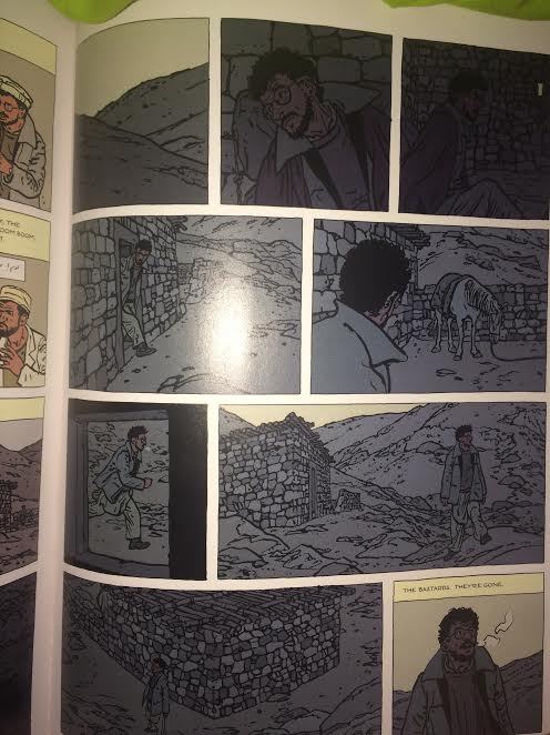
Write a posting in which you discuss the specific strategies you see on display in one of the comics that we’re reading and discussing. This should be super-easy. We're doing this with our reading discussions, after all. Feel free to talk about any aspect of the comics page, but make sure you're actually posting a picture.
I chose this picture from the comic, “The Photographer” because it is a perfect representation of showing vs telling and implements a lot of color usage to show it is night time. The full page has no words describing what is going on until the very last panel. You can tell that the character is attempting to hide. He seems anxious. When the coast is clear, he runs and attempts to find no one there. He then proceeds to say “those bastards,” as if they have tricked him. This is a good representation of showing instead of telling and the closure out minds create when figuring out this action going on, by ourselves.
All of these panels are also shown with dark grey coloration, making it obvious that it is night time, or dusk. The illustrator even creates a dark shadow on the characters face to keep this consistent.
Harmony Blanchies
ENC 3375
1 note
·
View note
Text
XP Pen Note Plus is a Magical Paper Notepad That Scans Everything You Write
Our verdict of the XP Pen Note Plus:
A clever concept that bridges the digital divide and saves your paper scribbles, works with any A5 notepad, and for an entirely reasonable price. But it's seriously let down by a buggy app, and if you want to make changes to previously written notes, the concept starts to fall down flat. 610
Putting pen to paper is so much more satisfying than writing on a screen. But if you need to share your creation, or back it up, your options are to take a bad photo or get a scanner. The XP Pen Note Plus is really quite magical. It’s a paper notepad, but anything you write on it is synced with the accompanying app via Bluetooth. And it costs less than $100.
XP Pen has carved a name for themselves offering digital artist tablets at affordable prices, but for those of us who prefer a pen and paper, can this device bridge the divide?
Yes, It Works With Any Notepad!
You’re probably thinking that this sort of tech needs a special type of paper, or a particular replaceable notepad. The good news is that any slimline A5 notepad will fit, and works just fine.
The back page tucks into the Note Plus folder, and the whole thing weighs less than a pound.
You do however need to use the supplied ballpoint pen. XP Pen sells replacement ballpoint cartridges, but they appear to be standard Ministar refills, so you should be able to find them anywhere.
How Does It Work?
To use the Note Plus, open the stylish folder, turn to your latest artistic creation, and carry on writing. It’s hardly complicated, assuming you have battery power. The device will automatically power on when opened and begin recording your pen strokes.
To start a new page, press the single button on the bottom edge of the folder. A small white LED will flash to indicate you’ve started a new page. If you forget to do this, or it doesn’t register, then your pages become a muddled mess and chaos will reign.
Did I forget to press the button?
Besides this single button, you’ll find a proprietary magnetic charging port. Use the supplied cable with any standard USB charger. A single charge should last around 10 hours of continuous use, with a standby time of a month.
The XP Pen Note Plus has enough internal memory for around 50 pages before they need to be synced or deleted.
But Where to Put That Pen?
The only design flaw in the Note Plus is that there’s nowhere to store the pen. Which, considering it can only be used with that pen and therefore it isn’t really something you’d want to lose, seems like a significant oversight. I’m sure they could have made the folder a bit bulkier and included somewhere to tuck it in.
How to Sync Your Notes?
Open up the accompanying app, and after the initial pairing is complete, it should reconnect over Bluetooth. Pull down from the top and hit sync.
Or at least this is how it should work in theory. In my testing on an iPhone X, I needed to pair every single time I opened the app. This was quite frustrating, but I’m confident it’s a software bug they can fix. I’ve yet to receive a response on my support request, but that’s forgivable given the situation in China at the moment.
Once your notes are synced, you can use the text recognition button to turn them into digital text. Since I’ve had a keyboard close to hand since the age of about three, my writing is barely legible to humans, let alone machine AI. Frankly, the concept of turning your written note into a digitally recognized text seems a little pointless, since you probably would have been a lot faster to just type it out in the first place.
It's pretty cool when it works, though.
Get used to seeing this.
The back button slows down playback, the forward button speeds it up, and the slider isn't interactive. Could this be any more badly designed? No, no it couldn't.
Another seemingly pointless feature is the ability to “playback” your creation. This shows an animated representation of your pen strokes. While I’m sure it’s fascinating to see a true artist at work, this feature doesn’t quite convey the same beauty of the pen stroke. What this feature does allow you to do, however, is fix merged pages by painstakingly watching for the moment you started a new page but forgot to press the new page button, and then hit the split to create two separate pages.
Be very careful though, because if you miss the right spot, you’ll have to start again from the start. For an example of horrible design choices, observe the final UI screenshot above. The skip back button doesn’t, in fact, go back, it just slows down the playback. The forward button doesn’t go forward, it speeds up playback. And the progress slider? You can’t actually drag it. It’s just a visual indicator. After discovering this fact, I hit the main back button to go back and try again at splitting my accidentally merged pages; and then the app crashed.
Can You Edit Previous Notes?
Normally, adding some scribbles to a previous page in a paper notepad would be a relatively simple affair. Turn to the page, and keep writing! But with the Note Plus, it’s not quite as simple, since the only button on the device itself is to start a new page. If you’ve already started a new page, there’s no way to tell it you want to go back again.
However, it is actually possible to make changes to previously synced notes. Just open the app, select the note you want to edit, then select the edit button in the top right. Then tap to confirm. Keep the app open while you write on the page, and the additions will sync live with the app. You can even change the color, though I hope I don’t need to point out that this is only going to be on the digital copy, not your physical original. Yes, it’s weird.
Do You Really Need to Save Your Scribbles?
The XP Pen Note Plus is a unique and fascinating concept that really does manage to bridge the divide between a physical pen and paper, and digital storage. It creates a perfect copy of your creation, recording individual strokes. Assuming you want to use a ballpoint pen that is, not a pencil.
It’s truly magical to see it in action. You couldn’t design a product that’s easier to use, really. Unless you want to edit something you wrote a few pages back, then you’ll need to keep the app open and Bluetooth connected.
For less than $100, you can’t go too wrong. But only if they can fix the Bluetooth pairing bug, which makes every sync a bit of a chore at the moment.
My closest comparison will have to be an iPad or Android tablet. And for most people, the truth is that a tablet will simply be more convenient and a better value device in the long run. If you don’t particularly care where you jot down notes, an iPad will serve you better and do so much more. But just as telling a book lover to buy a kindle isn’t particularly helpful, if you’re the type of person who just can’t abide writing on a digital screen, the Note Plus might be precisely the product you’ve been looking for.
Got that creative bug but not sure if the XP Pen Note Plus is right for you? Check out XP Pen’s full range of great value digital drawing tablets!
Thanks to XP Pen, we have another Note Plus to give away to one lucky reader. Just enter your details below, and be sure to watch the review video to find the bonus code. Good luck!
Enter the Competition!
XP Pen Note Plus Giveaway
Read the full article: XP Pen Note Plus is a Magical Paper Notepad That Scans Everything You Write
XP Pen Note Plus is a Magical Paper Notepad That Scans Everything You Write posted first on grassroutespage.blogspot.com
0 notes
Text
youtube
Watch the 2024 American Climate Leadership Awards for High School Students now: https://youtu.be/5C-bb9PoRLc
The recording is now available on ecoAmerica's YouTube channel for viewers to be inspired by student climate leaders! Join Aishah-Nyeta Brown & Jerome Foster II and be inspired by student climate leaders as we recognize the High School Student finalists. Watch now to find out which student received the $25,000 grand prize and top recognition!
#ACLA24#ACLA24HighSchoolStudents#youtube#youtube video#climate leaders#climate solutions#climate action#climate and environment#climate#climate change#climate and health#climate blog#climate justice#climate news#weather and climate#environmental news#environment#environmental awareness#environment and health#environmental#environmental issues#environmental education#environmental justice#environmental protection#environmental health#high school students#high school#youth#youth of america#school
17K notes
·
View notes
Text
XP Pen Note Plus is a Magical Paper Notepad That Scans Everything You Write
Our verdict of the XP Pen Note Plus:
A clever concept that bridges the digital divide and saves your paper scribbles, works with any A5 notepad, and for an entirely reasonable price. But it's seriously let down by a buggy app, and if you want to make changes to previously written notes, the concept starts to fall down flat. 610
Putting pen to paper is so much more satisfying than writing on a screen. But if you need to share your creation, or back it up, your options are to take a bad photo or get a scanner. The XP Pen Note Plus is really quite magical. It’s a paper notepad, but anything you write on it is synced with the accompanying app via Bluetooth. And it costs less than $100.
XP Pen has carved a name for themselves offering digital artist tablets at affordable prices, but for those of us who prefer a pen and paper, can this device bridge the divide?
Yes, It Works With Any Notepad!
You’re probably thinking that this sort of tech needs a special type of paper, or a particular replaceable notepad. The good news is that any slimline A5 notepad will fit, and works just fine.
The back page tucks into the Note Plus folder, and the whole thing weighs less than a pound.
You do however need to use the supplied ballpoint pen. XP Pen sells replacement ballpoint cartridges, but they appear to be standard Ministar refills, so you should be able to find them anywhere.
How Does It Work?
To use the Note Plus, open the stylish folder, turn to your latest artistic creation, and carry on writing. It’s hardly complicated, assuming you have battery power. The device will automatically power on when opened and begin recording your pen strokes.
To start a new page, press the single button on the bottom edge of the folder. A small white LED will flash to indicate you’ve started a new page. If you forget to do this, or it doesn’t register, then your pages become a muddled mess and chaos will reign.
Did I forget to press the button?
Besides this single button, you’ll find a proprietary magnetic charging port. Use the supplied cable with any standard USB charger. A single charge should last around 10 hours of continuous use, with a standby time of a month.
The XP Pen Note Plus has enough internal memory for around 50 pages before they need to be synced or deleted.
But Where to Put That Pen?
The only design flaw in the Note Plus is that there’s nowhere to store the pen. Which, considering it can only be used with that pen and therefore it isn’t really something you’d want to lose, seems like a significant oversight. I’m sure they could have made the folder a bit bulkier and included somewhere to tuck it in.
How to Sync Your Notes?
Open up the accompanying app, and after the initial pairing is complete, it should reconnect over Bluetooth. Pull down from the top and hit sync.
Or at least this is how it should work in theory. In my testing on an iPhone X, I needed to pair every single time I opened the app. This was quite frustrating, but I’m confident it’s a software bug they can fix. I’ve yet to receive a response on my support request, but that’s forgivable given the situation in China at the moment.
Once your notes are synced, you can use the text recognition button to turn them into digital text. Since I’ve had a keyboard close to hand since the age of about three, my writing is barely legible to humans, let alone machine AI. Frankly, the concept of turning your written note into a digitally recognized text seems a little pointless, since you probably would have been a lot faster to just type it out in the first place.
It's pretty cool when it works, though.
Get used to seeing this.
The back button slows down playback, the forward button speeds it up, and the slider isn't interactive. Could this be any more badly designed? No, no it couldn't.
Another seemingly pointless feature is the ability to “playback” your creation. This shows an animated representation of your pen strokes. While I’m sure it’s fascinating to see a true artist at work, this feature doesn’t quite convey the same beauty of the pen stroke. What this feature does allow you to do, however, is fix merged pages by painstakingly watching for the moment you started a new page but forgot to press the new page button, and then hit the split to create two separate pages.
Be very careful though, because if you miss the right spot, you’ll have to start again from the start. For an example of horrible design choices, observe the final UI screenshot above. The skip back button doesn’t, in fact, go back, it just slows down the playback. The forward button doesn’t go forward, it speeds up playback. And the progress slider? You can’t actually drag it. It’s just a visual indicator. After discovering this fact, I hit the main back button to go back and try again at splitting my accidentally merged pages; and then the app crashed.
Can You Edit Previous Notes?
Normally, adding some scribbles to a previous page in a paper notepad would be a relatively simple affair. Turn to the page, and keep writing! But with the Note Plus, it’s not quite as simple, since the only button on the device itself is to start a new page. If you’ve already started a new page, there’s no way to tell it you want to go back again.
However, it is actually possible to make changes to previously synced notes. Just open the app, select the note you want to edit, then select the edit button in the top right. Then tap to confirm. Keep the app open while you write on the page, and the additions will sync live with the app. You can even change the color, though I hope I don’t need to point out that this is only going to be on the digital copy, not your physical original. Yes, it’s weird.
Do You Really Need to Save Your Scribbles?
The XP Pen Note Plus is a unique and fascinating concept that really does manage to bridge the divide between a physical pen and paper, and digital storage. It creates a perfect copy of your creation, recording individual strokes. Assuming you want to use a ballpoint pen that is, not a pencil.
It’s truly magical to see it in action. You couldn’t design a product that’s easier to use, really. Unless you want to edit something you wrote a few pages back, then you’ll need to keep the app open and Bluetooth connected.
For less than $100, you can’t go too wrong. But only if they can fix the Bluetooth pairing bug, which makes every sync a bit of a chore at the moment.
My closest comparison will have to be an iPad or Android tablet. And for most people, the truth is that a tablet will simply be more convenient and a better value device in the long run. If you don’t particularly care where you jot down notes, an iPad will serve you better and do so much more. But just as telling a book lover to buy a kindle isn’t particularly helpful, if you’re the type of person who just can’t abide writing on a digital screen, the Note Plus might be precisely the product you’ve been looking for.
Got that creative bug but not sure if the XP Pen Note Plus is right for you? Check out XP Pen’s full range of great value digital drawing tablets!
Thanks to XP Pen, we have another Note Plus to give away to one lucky reader. Just enter your details below, and be sure to watch the review video to find the bonus code. Good luck!
Enter the Competition!
XP Pen Note Plus Giveaway
Read the full article: XP Pen Note Plus is a Magical Paper Notepad That Scans Everything You Write
XP Pen Note Plus is a Magical Paper Notepad That Scans Everything You Write published first on http://droneseco.tumblr.com/
0 notes
Text
How to design an app: the ultimate guide
Did you know the average person in the US spends approximately 5 hours glued to their smart devices? Whether it’s messaging, posting photographs or gaming—the current digital age we live in has people constantly using apps.
With massive popularity comes massive competition, and while competition is a good thing (it keeps us on our toes and makes everything that little bit better), entering a world where apps grow on trees can be an intimidating yet rewarding venture.
If you’ve decided to build an app, coming up with something that sets you apart from the competition is integral to your success, and can be the difference between standing out and simply making up the numbers. That something is an amazing app design.
Beautiful interfaces, striking simplicity, and easy navigation are 3 of the most prominent traits in a great app. You want people to tell their friends about your app, understand its purpose, have an easy time navigating through it, and ensure it’s something they keep coming back to.
But how do you create a great app design?
Our ultimate guide to app design is here to help, and we’ll walk you through the process of how to design an app that is sure to be a winner:
Getting started
Set the goal of your app
Make a plan
Research your niche and competitors
Design and development
Create a wireframe
Get your app designed
Options for getting your app designed
What to look out for during the app design process
Collect feedback on your design
Get your app developed
Testing and launch
Test your app with a focus group
Launch a beta version
Launch your app
Getting started
—
1. Set the goal of your app
Design by Googa
Before you run for that keyboard, pen and paper are a good place to start. Try to think about why you are designing an app and what you’re setting out to accomplish.
Put your thinking cap on and jot down the answers to the following questions:
What is the underlying goal of your app? What exactly do you want it to do?
How will you make your app appeal to users?
What are you setting out to do? What’s the problem you want to help people solve with your app?
Why would people want to use your app instead of one of your competitors? How does it set itself apart?
It’s not just app design where goal setting is important, it’s a life lesson! Setting clear goals for your app and writing them down will give you a reference to come back to throughout the entire process. If you ever forget the answer to one of these questions, having them jotted down will be a great reference to keep you on track and on course for app world domination.
2. Make a plan
Wait! Don’t go reaching for the computer just yet, you’re not done with the pencil and paper.
Form a visual representation of the answers to your goal-setting questions and get them down on paper. Image via skillapp.it.
Think about the answers to your questions in the first step. Now take that information and sketch out an outline of your project scope. During this stage you can delve a little deeper into how your app is going to make money (ads, in-app purchases, etc), what you need your app to do and sketch out a path of where you will take your ideas, and how you will get them working within your app.
Think of this stage as drawing a visible road map of your app, what its functions are, who it’s for, and a mini step-by-step guide as to how you can get it there.
3. Research your niche and competitors
Yes, yes, you may put your pen down now and turn to the world wide web.
Research your market to better understand the problems people face and how your app can solve them. Design by FaTiH.
Research is an integral step in the process of app design. It’s important to understand the niche market of your app, and to get an idea of what you’re up against. The app world is an extremely diverse and competitive arena, so you will definitely want to make sure your one of a kind idea is exactly that.
Don’t be intimidated by what you see out there. Just because there are many apps similar to what you’re going for doesn’t mean yours won’t be the one to trump them all. Researching your competitors will show you what’s missing from their apps, and give you better ideas as to what to incorporate into your own.
Try to pay attention to reviews—what do users currently like about the apps already out there? What do they dislike, and how could you solve this problem? During this step you can also refer back to your written and sketched notes, modify what you have down and further get an idea of how to get ahead.
Creating your app
—
4. Create a wireframe for your app
Your wireframe is a draft for your app’s visual architecture. You’ll take your goals and visual sketches one step further and create a basic “blueprint” of how your app is going to look, and how it’s going to function. You can do this very simply on paper first, but digital wireframes make things easier, especially once your wireframes are becoming more complex and detailed.
How do you go about doing this? Your wireframe is the chance to take your vision and put it into the confines of a mobile screen. Don’t worry, you don’t need to make any specific design choices yet. This step is about coming up with the workflows and overall structure of your app.
Your wireframe takes your sketched ideas and gives them a digital makeover—one step closer to having an idea of what your app will look like in the hands of your users. Image via UX/UI Land.
The previous steps helped to give you an idea of what you want your app to do. Your wireframe is a more detailed and specific outline of how things are going to work and what pages and functions are needed.
There’s a plethora of easy to use wireframing tools out there that you can use to create your wireframes. See which one works best for you, and start to bring your app design to life.
Here are a few wireframing tools you can use:
Axure
Pidoco
iPlotz
An example of a wireframe for the Uber app. Image via Sketch App Sources.
Once you have your wireframe laid out, you’ll have a good overview over what pages you’ll need and how your app’s going to work.
To test if your wireframes are solid, you can create a click-through model using a tool like Invision. This will enable you to click through the screens you’ve planned and helps you test if the navigation you’ve set up makes sense.
Show your wireframes to your colleagues and friends and collect their feedback on the structure and navigation of your app. See if your testers find it intuitive and if all the screens and elements make sense to them.
If you find any snags in your navigation or want to rearrange screens and layout, you can simply adjust your wireframes and test again. Keep going back and forth until you’re satisfied with your wireframes.
5. Get your app designed
App design by Nashrulmalik
Now it’s time to think about the actual design of your app and create good-looking, realistic mockups. This is a super important step because it’s what will leave a permanent impression on your users, so don’t rush or skimp when it comes to your app design. A great looking, professional, beautiful design is what can make your app a raging success.
What colors, fonts and design elements you should use is a big decision, so we’ll talk more about this in the design tips section below.
When it comes to deciding how to get your app designed you’ve got several different options. You might consider designing you app yourself, but unless you’re a graphic designer we wouldn’t recommend that. Better to rely on a professional to be sure you’ll get a great result.
Work directly with a designer
If you already have a vision of what your app should look like and you know what you want and need, the easiest way is to work with a designer 1-to-1. You can either hire a local freelancer or—if you don’t have any connections to designers yet—look at different designer portfolios online.
Browsing designers with 99designs’ Designer Search tool
Make sure to look at a designer’s previous work with your vision in mind to find the perfect match in terms of skill and style.
Run an app design contest
Start a contest by filling out a brief and let designers know what you need.
If you are unsure about what look you want for your app and you’re looking for suggestions, a great option is to run an app design contest.
You write a brief and designers from around the world read it and send you their ideas for your app. You can give feedback to refine the designs, and ultimately choose your favorite as the winner.
Use an app builder
Another method of design is to use an app builder. Much like a web builder, app builders allow you to save a bit of money compared to hiring a full designer, but you’ll need to be more hands-on and there will be restraints as to what you can do. Keep in mind if you want complex design and have specific needs, this may be out of depth for a builder.
Hire an agency
Your final choice is the complete package, where you can lean back and let someone else take care of everything: hire an agency to build your app from scratch—including the design. This is a great choice if your project is really complex and needs a lot of expertise in different areas. Make the effort to reach out to some of them and get quotes and ideas to see if they are a good fit for what you want done. This will undoubtedly be your most expensive option, but if you want things done a specific way and have the resources to make it happen, it’s a tough option to beat.
No matter which option you choose, be sure to give feedback and keep an eye on whether the design actually fits your brand and communicates the style and look you where going for from the start. Don’t lose sight of the goals you set in the beginning and reflect on whether the final design really says what you want it to say.
What to look out for during the app design process
Here are some key tips to keep in mind when it comes to designing your app:
Make it easy to navigate:
An amazing app is nothing without easy navigation, so design with this in mind to ensure a seamless and enjoyable experience for your users.
When designing for Android, make the navigation drawer easy to find to provide a seamless experience for your users. Image via Viztek.
Ensure the navigation drawer or tab bar is clearly visible to the user. A user won’t be able to navigate your app if they have no idea how to do so, so keep things visible to ensure they know where to go. Remember to stick with a layout that is familiar to your users, so they’ll know intuitively how to navigate through your app.
Another important tip: Make it finger-friendly. If buttons and links are too small for people to click on with their fingers, they will have a hard time navigating through your app.
Design for simplicity:
Keep things minimal for a modern look and make generous use of whitespace. That allows your users to focus on what matters most. Again, using familiar symbols and phrases can help to keep it simple and easy to use.
Designing for simplicity means designing with the goal of making the user experience as enjoyable and easy as possible. Too much information presented on screen at once or simply too much going on, and your user is likely to become overwhelmed and abandon the app.
Design by Sasha Radojevic.
Pick colors and fonts mindfully:
Color psychology has a huge impact, so don’t underestimate their effect. Similarly, your choice of fonts is going to influence the look and feel of your app. Make sure to think about the hidden meanings these design elements communicate and pick them carefully. Also remember: you don’t want to mix too many different colors and fonts for a consistent and professional look.
If you have brand guidelines with specific color and fonts, be sure to stick with them in your app design, so your app becomes a seamless extension of your brand.
Think about visual hierarchy and weight:
Visual weight is the size and impact of different on-screen elements compared to others. Use visual weight to ensure the most important aspects of your design stand out.
A clear visual hierarchy will help your users with orientation, so make sure that the hierarchy you establish for pages and sub-pages as well as headlines and sub-headlines is always consistent.
Be consistent:
Designing for consistency in your app makes it easily recognizable and keeps it looking sleek. Design by ozonestyle.
Here’s the thing with colors and fonts and all those other design elements: they can only be effective and leave a positive branding effect if you are consistent. This goes for other graphics, navigation and your content as well.
Your app should have visual consistency (design elements such as colors, buttons, and labels), functional consistency (your app should function similarly through all elements), and external consistency (any other outlets such as website, sister apps should look similar to your new app).
Being consistent throughout your app will make you look professional and you’ll better allow your users to develop a relationship with your app and your brand.
6. Collect feedback on your design
Now that you have picture-perfect mockups, it’s time to call in your friends, family, and even enemies (if you have any) and test the design of your app. A rendered click-through model will make this easy and will give your testers a real feel of what the app will be like.
It’s important to note that this is not your finished app, and there will be more testing later. This is essentially a test of the layout, navigation, look and feel, while functionality will come later.
Don’t be afraid to peak over the shoulders of your samplers while they are navigating your app. This lets you see how easily they are navigating your app or where they are being held back. Design by subzero_.
The more people you get to sample your app design, the more feedback you’ll have, and thus a better idea of what’s working well and what needs improvement. Constructive criticism will be your friend here, so don’t be afraid to dig a little deeper with your samplers and find out exactly what they think. Is it too crowded? Too bland? Make note of any comments your testers might have.
If you’ve got a rendered click-through model, have a look over the shoulder of your samplers (but make sure your breath is nice and fresh first). This helps to show you how they are navigating your app and gives you a point of view consumer experience.
Once you’ve got all the feedback you need and have a good understanding of what’s working for you and what requires improvement, you can go back and ask your designer to make the necessary adjustments.
7. Get your app developed
Now it’s time to hand over your design to your developer or development team. They will code the functional side of your app and make sure it actually does what it’s supposed to do. Most likely they will go back and forth with you and your designer to adjust the design to make everything work smoothly and to figure out any issues they run into during the development process.
And voilà, you now have a functional app! Take a look back at the goal of your app you decided upon when it all started. Have you solved a common problem, brought enjoyment to people with a fun creation, or simplified people’s lives in some way? Chances are you probably have, and you’ve really nailed it with your stellar design.
Testing and launch
—
8. Test your app with a focus group
Call in the samplers again! Be open to constructive criticism to allow you to make the final adjustments to your app. Design by Deniel Lalla
Now we have a fully functioning app to put to the test, so you’ll want to make sure it’s exactly that before you set it for release. At this point every aspect of the app needs to be functioning properly and visually appealing.
Remember those happy helpers who helped you test your mockups earlier? Give those guys a call again. Make them your focus group and let them have total freedom with your app.
Try to get all the final feedback you can before deciding on your final outcome. If you’re working with a designer and developer, take the constructive criticism you have and put them to work on making the final adjustments towards the completed product.
9. Launch a beta version
Beta testing means launching a beta version of your app and making it available to early-adopters on a small scale. This way, you can view how your app runs in a live environment and check how users respond to it.
TestFlight is an IOS specific program to control Beta testing of apps. The final feedback you gather here will allow you to apply the finishing touches to your app. Image via Sensor Tower.
Let your users know that you would appreciate their feedback, and use it to adjust things based on what you see and the comments you receive.
Once you’ve got the feedback you need and a clear analysis of how your app looks and functions in a live environment, the finish line will appear and you’re ready to reveal your masterpiece to the world.
10. Launch your app
At last, the light at the end of the tunnel! You’ve planned, tested, designed, and tested some more and your app is ready to hit the shelves.
App design by Ljuba97
Android doesn’t require review before you launch your app. This means you simply have to upload your app file onto the Google Play store (as with your beta) and people can begin instantly downloading your app. IOS is slightly different in that they will review your app before it can go live. Don’t worry though, if you’ve followed our ultimate guide and have done everything correctly, you should have no problem getting the green light.
Now that your app is available to the masses, don’t stop there. Keep improving and updating your app regularly to give your users the best experience.
Also don’t underestimate the importance of the next step—marketing. Marketing your app effectively will help get your app out there and onto the phones of your users. To take a peek at some intuitive ideas on how to market your new mobile app, check out this helpful article.
Are you ready to take the app world by storm?
—
Apps are such a dominant aspect of today’s business world and now you’re ready to create and design an app that can really turn heads.
The app design process may seem complex, but if you follow this guide and break it up into small manageable steps, it will get much easier.
So, what are you waiting for? Put your design hat on and make that awesome app idea of yours a reality.
Looking for a stunning app design?
Here you’ll find app designers that are perfect for your project.
Show me
The post How to design an app: the ultimate guide appeared first on 99designs.
via https://99designs.co.uk/blog/
How to design an app: the ultimate guide syndicated from https://www.lilpackaging.com/
0 notes
Text
How to design an app: the ultimate guide
Did you know the average person in the US spends approximately 5 hours glued to their smart devices? Whether it’s messaging, posting photographs or gaming—the current digital age we live in has people constantly using apps.
With massive popularity comes massive competition, and while competition is a good thing (it keeps us on our toes and makes everything that little bit better), entering a world where apps grow on trees can be an intimidating yet rewarding venture.
If you’ve decided to build an app, coming up with something that sets you apart from the competition is integral to your success, and can be the difference between standing out and simply making up the numbers. That something is an amazing app design.
Beautiful interfaces, striking simplicity, and easy navigation are 3 of the most prominent traits in a great app. You want people to tell their friends about your app, understand its purpose, have an easy time navigating through it, and ensure it’s something they keep coming back to.
But how do you create a great app design?
Our ultimate guide to app design is here to help, and we’ll walk you through the process of how to design an app that is sure to be a winner:
Getting started
Set the goal of your app
Make a plan
Research your niche and competitors
Design and development
Create a wireframe
Get your app designed
Options for getting your app designed
What to look out for during the app design process
Collect feedback on your design
Get your app developed
Testing and launch
Test your app with a focus group
Launch a beta version
Launch your app
Getting started
—
1. Set the goal of your app
Design by Googa
Before you run for that keyboard, pen and paper are a good place to start. Try to think about why you are designing an app and what you’re setting out to accomplish.
Put your thinking cap on and jot down the answers to the following questions:
What is the underlying goal of your app? What exactly do you want it to do?
How will you make your app appeal to users?
What are you setting out to do? What’s the problem you want to help people solve with your app?
Why would people want to use your app instead of one of your competitors? How does it set itself apart?
It’s not just app design where goal setting is important, it’s a life lesson! Setting clear goals for your app and writing them down will give you a reference to come back to throughout the entire process. If you ever forget the answer to one of these questions, having them jotted down will be a great reference to keep you on track and on course for app world domination.
2. Make a plan
Wait! Don’t go reaching for the computer just yet, you’re not done with the pencil and paper.
Form a visual representation of the answers to your goal-setting questions and get them down on paper. Image via skillapp.it.
Think about the answers to your questions in the first step. Now take that information and sketch out an outline of your project scope. During this stage you can delve a little deeper into how your app is going to make money (ads, in-app purchases, etc), what you need your app to do and sketch out a path of where you will take your ideas, and how you will get them working within your app.
Think of this stage as drawing a visible road map of your app, what its functions are, who it’s for, and a mini step-by-step guide as to how you can get it there.
3. Research your niche and competitors
Yes, yes, you may put your pen down now and turn to the world wide web.
Research your market to better understand the problems people face and how your app can solve them. Design by FaTiH.
Research is an integral step in the process of app design. It’s important to understand the niche market of your app, and to get an idea of what you’re up against. The app world is an extremely diverse and competitive arena, so you will definitely want to make sure your one of a kind idea is exactly that.
Don’t be intimidated by what you see out there. Just because there are many apps similar to what you’re going for doesn’t mean yours won’t be the one to trump them all. Researching your competitors will show you what’s missing from their apps, and give you better ideas as to what to incorporate into your own.
Try to pay attention to reviews—what do users currently like about the apps already out there? What do they dislike, and how could you solve this problem? During this step you can also refer back to your written and sketched notes, modify what you have down and further get an idea of how to get ahead.
Creating your app
—
4. Create a wireframe for your app
Your wireframe is a draft for your app’s visual architecture. You’ll take your goals and visual sketches one step further and create a basic “blueprint” of how your app is going to look, and how it’s going to function. You can do this very simply on paper first, but digital wireframes make things easier, especially once your wireframes are becoming more complex and detailed.
How do you go about doing this? Your wireframe is the chance to take your vision and put it into the confines of a mobile screen. Don’t worry, you don’t need to make any specific design choices yet. This step is about coming up with the workflows and overall structure of your app.
Your wireframe takes your sketched ideas and gives them a digital makeover—one step closer to having an idea of what your app will look like in the hands of your users. Image via UX/UI Land.
The previous steps helped to give you an idea of what you want your app to do. Your wireframe is a more detailed and specific outline of how things are going to work and what pages and functions are needed.
There’s a plethora of easy to use wireframing tools out there that you can use to create your wireframes. See which one works best for you, and start to bring your app design to life.
Here are a few wireframing tools you can use:
Axure
Pidoco
iPlotz
An example of a wireframe for the Uber app. Image via Sketch App Sources.
Once you have your wireframe laid out, you’ll have a good overview over what pages you’ll need and how your app’s going to work.
To test if your wireframes are solid, you can create a click-through model using a tool like Invision. This will enable you to click through the screens you’ve planned and helps you test if the navigation you’ve set up makes sense.
Show your wireframes to your colleagues and friends and collect their feedback on the structure and navigation of your app. See if your testers find it intuitive and if all the screens and elements make sense to them.
If you find any snags in your navigation or want to rearrange screens and layout, you can simply adjust your wireframes and test again. Keep going back and forth until you’re satisfied with your wireframes.
5. Get your app designed
App design by Nashrulmalik
Now it’s time to think about the actual design of your app and create good-looking, realistic mockups. This is a super important step because it’s what will leave a permanent impression on your users, so don’t rush or skimp when it comes to your app design. A great looking, professional, beautiful design is what can make your app a raging success.
What colors, fonts and design elements you should use is a big decision, so we’ll talk more about this in the design tips section below.
When it comes to deciding how to get your app designed you’ve got several different options. You might consider designing you app yourself, but unless you’re a graphic designer we wouldn’t recommend that. Better to rely on a professional to be sure you’ll get a great result.
Work directly with a designer
If you already have a vision of what your app should look like and you know what you want and need, the easiest way is to work with a designer 1-to-1. You can either hire a local freelancer or—if you don’t have any connections to designers yet—look at different designer portfolios online.
Browsing designers with 99designs’ Designer Search tool
Make sure to look at a designer’s previous work with your vision in mind to find the perfect match in terms of skill and style.
Run an app design contest
Start a contest by filling out a brief and let designers know what you need.
If you are unsure about what look you want for your app and you’re looking for suggestions, a great option is to run an app design contest.
You write a brief and designers from around the world read it and send you their ideas for your app. You can give feedback to refine the designs, and ultimately choose your favorite as the winner.
Use an app builder
Another method of design is to use an app builder. Much like a web builder, app builders allow you to save a bit of money compared to hiring a full designer, but you’ll need to be more hands-on and there will be restraints as to what you can do. Keep in mind if you want complex design and have specific needs, this may be out of depth for a builder.
Hire an agency
Your final choice is the complete package, where you can lean back and let someone else take care of everything: hire an agency to build your app from scratch—including the design. This is a great choice if your project is really complex and needs a lot of expertise in different areas. Make the effort to reach out to some of them and get quotes and ideas to see if they are a good fit for what you want done. This will undoubtedly be your most expensive option, but if you want things done a specific way and have the resources to make it happen, it’s a tough option to beat.
No matter which option you choose, be sure to give feedback and keep an eye on whether the design actually fits your brand and communicates the style and look you where going for from the start. Don’t lose sight of the goals you set in the beginning and reflect on whether the final design really says what you want it to say.
What to look out for during the app design process
Here are some key tips to keep in mind when it comes to designing your app:
Make it easy to navigate:
An amazing app is nothing without easy navigation, so design with this in mind to ensure a seamless and enjoyable experience for your users.
When designing for Android, make the navigation drawer easy to find to provide a seamless experience for your users. Image via Viztek.
Ensure the navigation drawer or tab bar is clearly visible to the user. A user won’t be able to navigate your app if they have no idea how to do so, so keep things visible to ensure they know where to go. Remember to stick with a layout that is familiar to your users, so they’ll know intuitively how to navigate through your app.
Another important tip: Make it finger-friendly. If buttons and links are too small for people to click on with their fingers, they will have a hard time navigating through your app.
Design for simplicity:
Keep things minimal for a modern look and make generous use of whitespace. That allows your users to focus on what matters most. Again, using familiar symbols and phrases can help to keep it simple and easy to use.
Designing for simplicity means designing with the goal of making the user experience as enjoyable and easy as possible. Too much information presented on screen at once or simply too much going on, and your user is likely to become overwhelmed and abandon the app.
Design by Sasha Radojevic.
Pick colors and fonts mindfully:
Color psychology has a huge impact, so don’t underestimate their effect. Similarly, your choice of fonts is going to influence the look and feel of your app. Make sure to think about the hidden meanings these design elements communicate and pick them carefully. Also remember: you don’t want to mix too many different colors and fonts for a consistent and professional look.
If you have brand guidelines with specific color and fonts, be sure to stick with them in your app design, so your app becomes a seamless extension of your brand.
Think about visual hierarchy and weight:
Visual weight is the size and impact of different on-screen elements compared to others. Use visual weight to ensure the most important aspects of your design stand out.
A clear visual hierarchy will help your users with orientation, so make sure that the hierarchy you establish for pages and sub-pages as well as headlines and sub-headlines is always consistent.
Be consistent:
Designing for consistency in your app makes it easily recognizable and keeps it looking sleek. Design by ozonestyle.
Here’s the thing with colors and fonts and all those other design elements: they can only be effective and leave a positive branding effect if you are consistent. This goes for other graphics, navigation and your content as well.
Your app should have visual consistency (design elements such as colors, buttons, and labels), functional consistency (your app should function similarly through all elements), and external consistency (any other outlets such as website, sister apps should look similar to your new app).
Being consistent throughout your app will make you look professional and you’ll better allow your users to develop a relationship with your app and your brand.
6. Collect feedback on your design
Now that you have picture-perfect mockups, it’s time to call in your friends, family, and even enemies (if you have any) and test the design of your app. A rendered click-through model will make this easy and will give your testers a real feel of what the app will be like.
It’s important to note that this is not your finished app, and there will be more testing later. This is essentially a test of the layout, navigation, look and feel, while functionality will come later.
Don’t be afraid to peak over the shoulders of your samplers while they are navigating your app. This lets you see how easily they are navigating your app or where they are being held back. Design by subzero_.
The more people you get to sample your app design, the more feedback you’ll have, and thus a better idea of what’s working well and what needs improvement. Constructive criticism will be your friend here, so don’t be afraid to dig a little deeper with your samplers and find out exactly what they think. Is it too crowded? Too bland? Make note of any comments your testers might have.
If you’ve got a rendered click-through model, have a look over the shoulder of your samplers (but make sure your breath is nice and fresh first). This helps to show you how they are navigating your app and gives you a point of view consumer experience.
Once you’ve got all the feedback you need and have a good understanding of what’s working for you and what requires improvement, you can go back and ask your designer to make the necessary adjustments.
7. Get your app developed
Now it’s time to hand over your design to your developer or development team. They will code the functional side of your app and make sure it actually does what it’s supposed to do. Most likely they will go back and forth with you and your designer to adjust the design to make everything work smoothly and to figure out any issues they run into during the development process.
And voilà, you now have a functional app! Take a look back at the goal of your app you decided upon when it all started. Have you solved a common problem, brought enjoyment to people with a fun creation, or simplified people’s lives in some way? Chances are you probably have, and you’ve really nailed it with your stellar design.
Testing and launch
—
8. Test your app with a focus group
Call in the samplers again! Be open to constructive criticism to allow you to make the final adjustments to your app. Design by Deniel Lalla
Now we have a fully functioning app to put to the test, so you’ll want to make sure it’s exactly that before you set it for release. At this point every aspect of the app needs to be functioning properly and visually appealing.
Remember those happy helpers who helped you test your mockups earlier? Give those guys a call again. Make them your focus group and let them have total freedom with your app.
Try to get all the final feedback you can before deciding on your final outcome. If you’re working with a designer and developer, take the constructive criticism you have and put them to work on making the final adjustments towards the completed product.
9. Launch a beta version
Beta testing means launching a beta version of your app and making it available to early-adopters on a small scale. This way, you can view how your app runs in a live environment and check how users respond to it.
TestFlight is an IOS specific program to control Beta testing of apps. The final feedback you gather here will allow you to apply the finishing touches to your app. Image via Sensor Tower.
Let your users know that you would appreciate their feedback, and use it to adjust things based on what you see and the comments you receive.
Once you’ve got the feedback you need and a clear analysis of how your app looks and functions in a live environment, the finish line will appear and you’re ready to reveal your masterpiece to the world.
10. Launch your app
At last, the light at the end of the tunnel! You’ve planned, tested, designed, and tested some more and your app is ready to hit the shelves.
App design by Ljuba97
Android doesn’t require review before you launch your app. This means you simply have to upload your app file onto the Google Play store (as with your beta) and people can begin instantly downloading your app. IOS is slightly different in that they will review your app before it can go live. Don’t worry though, if you’ve followed our ultimate guide and have done everything correctly, you should have no problem getting the green light.
Now that your app is available to the masses, don’t stop there. Keep improving and updating your app regularly to give your users the best experience.
Also don’t underestimate the importance of the next step—marketing. Marketing your app effectively will help get your app out there and onto the phones of your users. To take a peek at some intuitive ideas on how to market your new mobile app, check out this helpful article.
Are you ready to take the app world by storm?
—
Apps are such a dominant aspect of today’s business world and now you’re ready to create and design an app that can really turn heads.
The app design process may seem complex, but if you follow this guide and break it up into small manageable steps, it will get much easier.
So, what are you waiting for? Put your design hat on and make that awesome app idea of yours a reality.
Looking for a stunning app design?
Here you’ll find app designers that are perfect for your project.
Show me
The post How to design an app: the ultimate guide appeared first on 99designs.
via https://99designs.co.uk/blog/
0 notes
Text
Book Printing: Tips on Preparing Book Cover Art
A book printing client of mine is about to send a 5.5” x 8.5” perfect-bound book to press. She and her husband, a publishing team for literary books of prose and poetry, have circulated “galley-proofs” (lower production quality versions of the book for editors and reviewers to use for commentary), and the reader suggestions will have been introduced into the final-copy art files shortly.
What this means is that the page count is in flux. And that in turn affects the overall price of the book (and the dollar payment my clients will need to send before the production work begins), plus the width of the spine is also in flux, so the cover designer is in a wait-and-see mode at the moment.
Regarding the last comment above, here’s the rub. The designer will need to create a single file with the back cover on the left, then the spine, then the front cover, all side by side. For this particular print book, there will also be French flaps (3.5” extensions on either side of the back and front cover). When folded in, these French flaps will provide a little interior space to print an author bio, reviewers’ quotes, or marketing blurbs. They will also make the paper-bound book look more like it has a dust jacket (like a hardcover book).
So reading from left to right, the final art for the cover will include a 3.5” French flap followed by a 5.5” x 8.5” back cover followed by a spine (indeterminate size at the moment) followed by a 5.5” x 8.5” front cover followed by a 3.5” front cover French flap. To this the cover designer will add bleeds for this four-color printed product (the interior of the book is simpler: black text throughout, with no bleeds).
All of these components need to be stitched together, but more importantly they must be of the correct measurements, or the spine art will end up wrapping onto the front or back cover and looking just plain ugly.
Fortunately the caliper of the interior text paper is known: 400 ppi. For the ease of the math, that means that if my client’s book winds up being 400 pages, the spine will be one inch. In actuality it will probably be 256 pages (it has ranged from about 264 pages down to 250 pages—for the digitally printed “reader’s galleys”). So the spine will be more than half an inch and less than an inch (.64”), but the exact size cannot be finalized until the page count is firm. That means the Photoshop file (the cover designer likes to work in Photoshop rather than InDesign) will need to be fluid, and the final press-ready PDF cannot be distilled until the text pages have been finalized.
In your own print buying work, there are three take-aways from this case study to consider:
Understand the concept of paper thickness or caliper, and get this information from your book printer once you have chosen a paper stock. To be safe, after you have calculated the spine width, have him confirm your math. It’s better to be safe.
Learn how to stitch together the various pieces of a book cover, making sure the overall size is correct, with or without bleeds, and the pages are in the correct order (back cover, spine, front cover).
Send your book printer both the native Photoshop or InDesign file (to his specifications) and a press-ready PDF (to his specifications).
Don’t be surprised, or upset, if your book printer needs you to make some final technical adjustments and resubmit these files. This is complex work.
Further Thoughts
Here are a few more things that I do when I design a print book cover. You might find them useful.
The Color of the Paper
The clients noted above often print the text blocks of their books on a cream stock. That is, the color of the paper is tinted slightly yellow, in contrast to bright white sheets that are tinted slightly blue. (The blue-white is less noticeable. It just looks like a very bright white.)
When my clients add a 12pt C1S cover to this text block, it is usually blue-white rather than natural, cream, or warm white. Usually, my clients print the inside front and back covers as well as the outer front and back covers and spine. The difference between the bright blue-white of the interior covers and the cream white of the text is not visible to the reader at this point because of the ink on the interior covers (it distracts the reader). However, if my clients choose to print a book on cream stock and they have nothing printed on the interior covers, the difference in paper shade between the blue-white interior covers and the cream white text block will be visible.
In cases like these I have often encouraged them to choose a bright white shade for the text as well as the cover.
As an alternative, could my clients print the covers on a cream-white cover sheet? Presumably. However, printing four-color process imagery on a yellowish tinted paper will change the tone of the inks. Remember, process inks are transparent, so the substrate will affect the perceived color of ink printed on an off-white substrate.
So it’s a trade-off. Depending on the colors, my clients may actually either have a bright white cover and cream white text, and live with the difference, or they might print four-color imagery on cream cover stock—depending on the colors in the images. It’s usually not good to print flesh tones on a cream substrate, since facial coloration can look odd (i.e., jaundiced).
Coated One or Two Sides
On a related note, when my clients do print on the interior covers, I always specify a C2S paper (coated two sides). Many coated cover sheets are specified this way: as 80# cover, for instance, rather than 10pt C1S. It can be assumed that cover stock paper has coating on two sides, since this is not specified, whereas C1S paper specified in points (10pt., 12pt.) is coated on only one side because the notation says it is.
I encourage my clients to do this for the following reason. Ink behaves differently on a coated, vs. uncoated, surface. Ink sits up on the top of a coated surface, but it seeps into the paper fibers if there’s no coating. Because of this, four-color imagery printed on the front of a C1S (coated one side) sheet will have a completely different look than four-color imagery printed on the uncoated interior covers (front and back). Ink on the interior covers in this case would seem dull in comparison. If you want that look (a softer, crunchy granola look), it fine if it’s done throughout a book, but it looks odd if it’s done on the inside front and back covers only.
(On a related note, keep in mind that all of the text blocks of this particular client’s books are printed in black ink only on uncoated paper stock. Everything I’m saying would become far more complicated if my clients were to shift to four-color interior text blocks. In fact, at that point, I’d suggest that they either print both the cover and text on coated stock or print the cover and text on uncoated stock, depending on the effect they were seeking.)
Print Out a Hard Copy
One thing I always suggest for my clients’ book covers is that they print out a hard copy on paper with crop marks and printer’s bars. They may need to tile the pages and then tape them together. But the idea is for them to have a full-size physical representation of the cover, ruled out to show the bleeds. This will make it abundantly clear–in ways that often elude the viewer who only looks at the cover on-screen—as to whether everything is correct.
You can see where the type falls on the spine: whether it is centered vertically, or whether it is too high or low. You can see whether the front or back cover art is centered on the page (exclusive of the bleeds, which can be misleading, because once you draw pencil marks–“rule out the cover”–to connect the trim marks, you can see what the cover will look like after it has been printed and trimmed to size).
All of this is visible on a computer screen, granted. Maybe I’m just “old school.” But I do find it easier to see the flaws when the entire front and back cover and spine are before me in actual size (not enlarged or reduced– zoomed in or out). You can always catch the errors at the physical proof stage (and I would encourage you to request a hard-copy cover proof rather than depending on a virtual proof for a print book cover), but why pay to fix errors you can catch by just printing out and taping together a cover mock-up?
Book Printing: Tips on Preparing Book Cover Art published first on https://getyourprintingcompanies.tumblr.com/
0 notes
Last Seen Blogs

tum-mut
Tatum Chronicle

splicermarket
Fusion
Splicers,Fiber optic splicer Factory Price | Splicermark

mugglenetfanfiction
Mugglenet Fanfiction

vinny-v-68
Colors of life
