#i thought a diagonal comp would be fun ^_^
Text
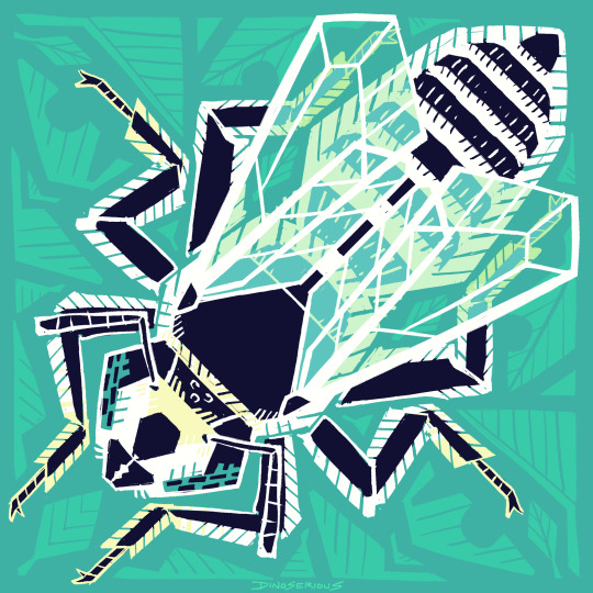
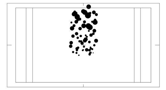
invertober day 2, silvery leafcutter bee!
#invertober#silvery leafcutter bee#bee#insect#bug#symmetry tool time yay#i thought a diagonal comp would be fun ^_^
1K notes
·
View notes
Text
Roald Dahl Motion Graphic
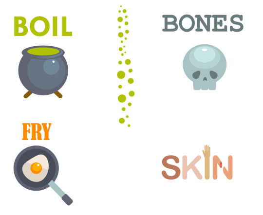
“Boil their bones, fry their skin!”
This was the quote I chose because I thought it could be brought to life in a very visual and graphic-based way. The words that are used are descriptive and almost paint a picture in the readers mind as to what Dahl was trying to convey, not only visually but in the context of sounds and tones that could be used.
Idea generation:
Here is where I began my thought process as to what I would include in my final piece, I have listed the colours, type and graphics I felt worked with the quote and compiled them together in order to create a basic idea.

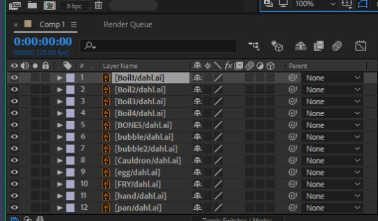
Once my draft was complete, I created these assets in Adobe Illustrator. These will later be imported into an After Effects composition.
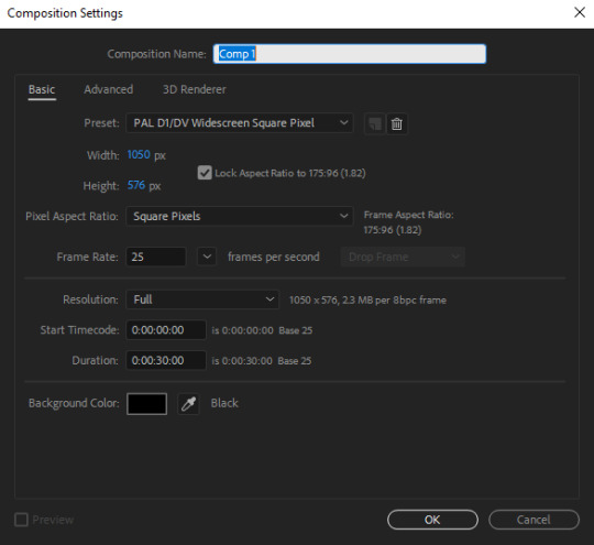
I then went to file > New > New composition and ensured all of the settings were correct.
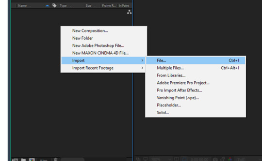
I then right clicked on the composition panel and imported my illustrator assets into After Effects.
I changed the drop down menu at the bottom from Document size to Composition size so that my assets would import at their original scale.
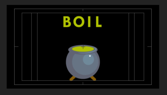
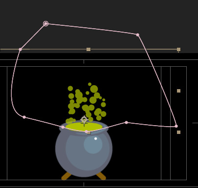
BOIL
This was the first word in my animation and it introduced the entire project. Because of this, I made sure to make it a vibrant and dynamic part of the motion graphic to set the tone and mood for the rest of the video. My cauldron sits on the guidelines that I set by clicking the title / action safe grid option at the bottom of the comp.

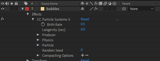
I wanted to achieve something of a convection-type animation as if the heat from the cauldron was lifting the letters up and down, I did have ready made bubbles that I was going to use to accompany this effect, however I decided to use a particle effect instead as it was much more fluid and realistic.

I adjusted the longevity and birth / death rate in order to suit my desired effect. As this was a new technique to me, I will definitely practice with it more frequently in future projects.
A mask was created with the pen tool to keep the bubbles within a selected radius.
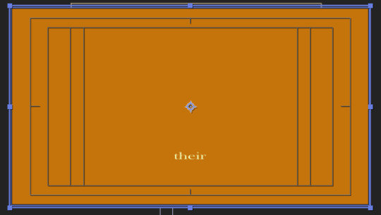
Their: 1
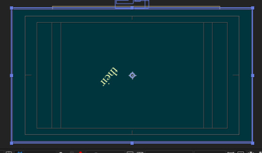
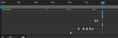
This particular word acts as a transition between the illustrator graphics, I tried to find a way to make it appealing and engaging to look at by using solely the word on its own. By placing the anchor point in the lower left corner, I created a swinging effect as if the word were an object that had come loose on the composition. To make it seem as though the text falls completely, I used the position key frame and dragged it out of the composition.
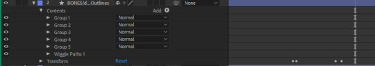
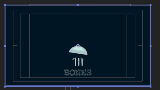
BONES
The third word in my quote was BONES, for this particular word, I had the text and graphic appear into the composition as the previous word left. The background has also changed colour, I did this by creating a new solid colour layer and adjusting the opacity across 1.5 seconds to make a gradual change.
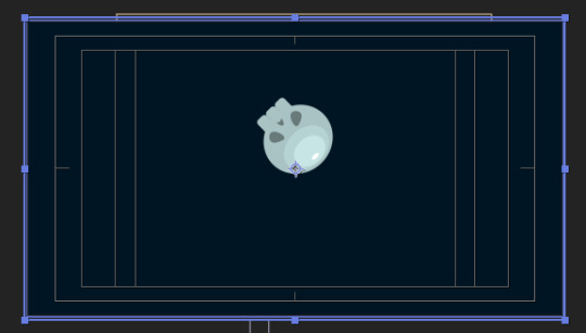
To make the effect of the skull asset falling into place, I positioned it above the composition, put my anchor point in the desired place and created a position key frame, I then moved the skull down to the right level, this automatically placed a second key frame. I repeated the re-positioning process multiple times along with easy ease and rotation adjustments to achieve a bouncing effect.
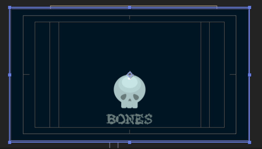
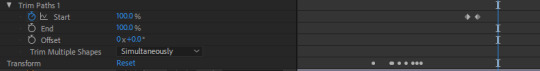
The actual text aspect of the scene is slightly animated using an effect. By right clicking the layer and selecting Create outlines from text I was then able to add an effect from the menu.
I set my values for Wiggle Paths, and was left with a subtle wavy and surreal piece of text. Another effect was used on the skull itself which looked as though the asset had been deconstructed or even broken apart.
FRY
The word FRY was a fun one for me, I thought it would be interesting to contrast the sinister and gritty feel of this quote with a light-hearted graphic depicting a fried egg in a pan. Using the same Wiggle paths effect as the BONES text previously, I made it look like the egg itself had a soft and malleable texture. The egg and frying pan also moved around by implementing some basic diagonal position keyframes and placing one set slightly ahead of the other to make it seem more true to physics.
Note that the background colour has changed once again using the same technique.
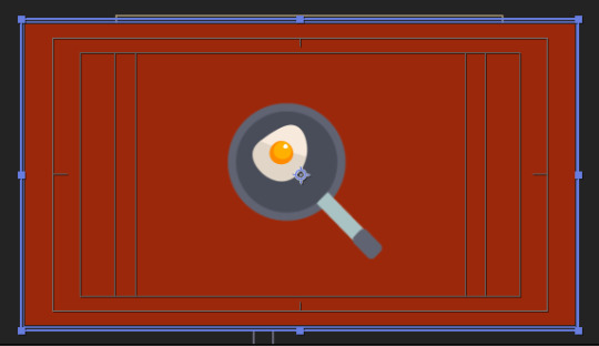

The text for this scene was also made by using the same “Create outlines from text” effect as the one before.

Their: 2
This was the second “Their” transition and rather than repeating the previous version, I made a new one and decided to make it less stiff than last time by giving it a soft and elastic-like bounce as the stretch and squash technique is a very prominent feature to include when conveying the personality or characteristics of an object.
As the word hit the bottom of the screen, I had it flatten slightly to give the impression that it had a rubber-like texture as it sprung back upwards.
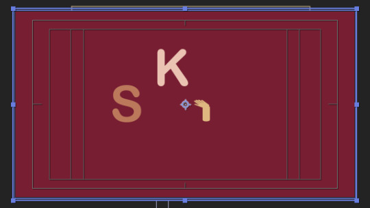
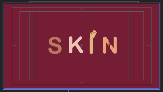
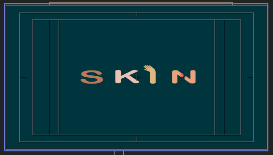
SKIN
I was looking forward to getting to animate this particular word as it involved using the parenting tool, on the third letter, there is a hand graphic that I created in illustrator, each of the four letters are on their own layers so I selected the letter “I” and parented it with the Hand Layer.
By using the same squash and stretch technique as the word previously, I gave each of the letters a bouncy characteristic with a slight delay between each of them to allow them to fall into stage in the direction of which they are read by the viewer. When the letters hit the solid surface of the comp, I left the keyframes as they were, however when they are elevated and on their way back down after a bounce, I made them into easy-ease keyframes to give the impression that gravity was pulling them back down.
Finally, I changed the background colour one final time to match the first scene, I did this so that the animation could loop seamlessly.
Final Animation:
youtube
0 notes
Last Seen Blogs

cor-ben
høyr - ravnegala.
sanskari-ka-jalwa
Shalini Sharma

safedabin
nini

rizse-hardcore-blog
moved to @ulurus

anubisgodofchaos
canoebiz.exe