#i seem to be in an abstract expressionist mood at the moment - it's a very cathartic style
Text

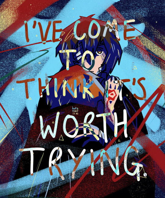
I'VE COME TO THINK IT'S WORTH TRYING.
#i seem to be in an abstract expressionist mood at the moment - it's a very cathartic style#bsd dazai#bsd chuuya#soukoku#bungou stray dogs#bungo stray dogs#bsd#bsd fanart#skk#skk fanart#dazai x chuuya#bungou stray dogs fanart#double black#dazai fanart#chuuya fanart#botanautical#eye strain
2K notes
·
View notes
Text
Art analysis essay
It has taken me a long time to find my art style and find the processes and techniques that really work for me. My art style is very abstract, bold, interpretive, colourful, simple and unrealistic so for me, lino printing is the way for me to showcase my work in the best possible way, as everything can be cut out very simple and geometric. I really like that lino prints can be as simple as one colour as an image, or one colour on a coloured background you have created yourself but can also be done in layers allowing you to add in many colours and create something very interesting. There are always chances to add in more detail to create realistic pieces based on your personal preference, I also like how quickly lino prints can be made and how many you can make in such a short time. Therefore, in this essay I will be talking about lino cut prints and printmakers who use lino cut in their work.
Lino printing is a creative process where you carve or cut and image into a sheet of lino, you then get an ink of your choosing and roll it onto the block the image is carved onto, ready to then place paper on top using pressure, creating an image. After doing some research into the history of lino printing , I’ve learned that lino was first invented around the 1800s and was used by amateur printers as it was much cheaper to get and as it’s a very soft material it was much easier to create an image than in much tougher materials such as wood and metal. Lino prints became much more recognised and used around the 20th century, with German expressionists and Russian constructivist movements. It really took off in the UK when the school of modern art opened in London around 1925, the process was being taught there in classes to inspiring young artists encouraging them to use it in their artwork, the held a lino print exhibition in 1929 (Boarding All Rows, 2020). Lino printing was used massively by Pablo Picasso in the late 1950s, he enjoyed the process as it was good for graphic style posters. It was also known he enjoyed how simple the lino prints could be, with the blocks of colour and shape creating a series of interesting images, he managed to advance the process hugely by printing different layers in different colours (Great North Art Show, 2021)
Pablo Picasso
This is a lino print done by Pablo Picasso in the 1960s, called Portrait de Jacqueline au chapeau de paille (Artnet Auctions, 2020). Upon first looking at this image there is a clear face of a person which makes up the piece, I like this image as it’s not just a simple print of a face. The face is made up of different coloured thick lines, that seem to be quite rounded giving it more of a face like structure but still very distorted. He has left the background as one solid colour which allows very little distraction from the face itself which I think is much better to look at. I feel like there is a strong expression conveyed on the face, it to me looks like an intense stare with also distress. I believe this as one eye on the left side of the face has been made bold, thick and wide open looking intense and almost shocked , whereas the eye on the right hand side of the face has been done half open with curved out lines which to me indicate distress or discomfort. Picasso has also chosen to use an orangey red down the centre of the face and not anywhere else, possibly indicating the face may be split in half. I feel overall this piece has a very strange mood to it, it’s giving off elements of stress with the expression and it looks although the lines are imitating items being stacked up on top of the figure. This shows an element of suspense and although they may fall and ruin the face, which could link to the expression, the tension and chance that the stacked items may fall at any given moment. I generally really like this piece its very abstract and bold, Picasso has given lots of different parts to look at and interpret which I really enjoy when looking at any art.

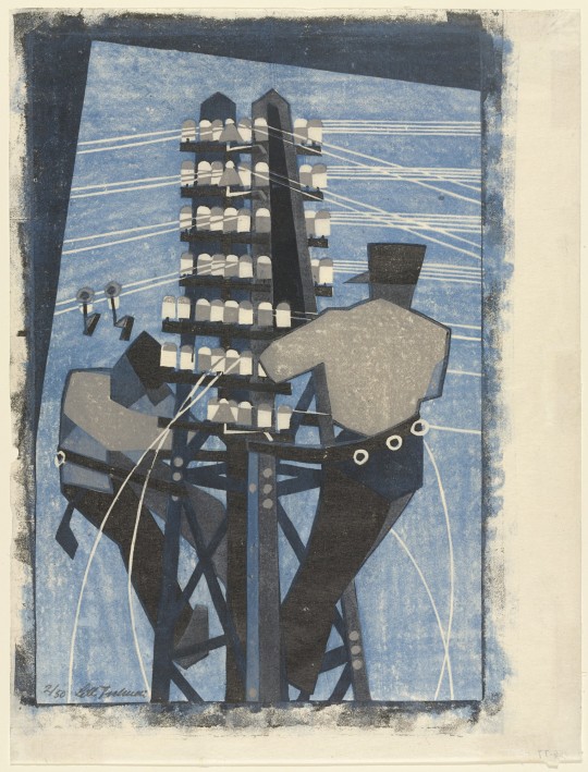
Lil Tschudi.
This is a lino print by Lil Tschudi called fixing the wire, 1932 (The Museum of Modern Art, 2021). In this piece there are two figures, they are very geometric and slightly abstract. Although the figures are a big part of the piece, they are both off to either side whereas the what seems to be an electricity tower is centred, implying that this was the intended focal point. It also stands much taller than both figures, again drawing you towards that before anything else in the piece. I feel although the general tone of the piece is very calm, seems although it’s a bright day with a clear blue sky and if this was real life both figures would be whistling along to a simple tune, getting their work done, with the slight interference from tweeting birds. The colours used are all different variations of blue some dark tones and some lighter tones, with the slight addition of greys. I feel like the colours used are a little boring to look at but do work with the piece and contribute to the all round calm and relaxing mood the piece gives off. Another thing I noticed about this piece is the way it fits the paper. It doesn’t fill the whole page and goes off towards the right-hand side of the page, I feel this adds a little mystery to the image and implies that there are possibly buildings surrounding the figures or other objects. Which could also indicate that there very high up, possibly changing the mood of the piece entirely, as that could imply the blues weren’t used for calm and relaxing and actually changing the blue tones to sadness, depressed, loss and although something bad has happened or may happen.
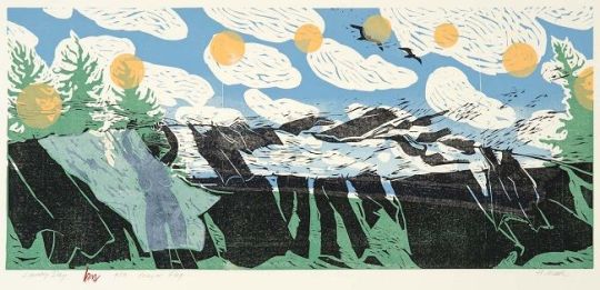
Holly Meade
This is a lino print by Holly Meade called Laundry day prayer flag, 2009 (The Pollock-Krasner Foundation, 2021). I really love this image for many reasons, for one; on first glace I can determine that there isn’t a centred focal point your eyes just dart all over the piece trying to take in all parts of this amazing piece, which isn’t usually what happens in pieces of art. I can see there is a figure off to the left hand side that looks to be putting up the laundry, she has placed the figure under an almost transparent sheet, implying that the figure could possibly be what she intended you to really look at first after looking into it more. The colours used in the print are very simplistic and true to real life, which I feel fits well as the image itself as it’s not very realistic at all, its very flowy and free, giving the all round mood of the piece to be very summery, happy, fresh and almost childlike. All the laundry is also blowing in one direction, towards the right side of the image, implying this was a warm summer day with a strong breeze, another thing that your eyes instantly look at. There are trees placed into the corners of either side which also look although they are blowing int the wind and the lines aren’t realistic and look almost wavy, contributing to the childlike feel. There are yellow circles painted onto the sky also which I think could be the sun, but to keep with her unrealistic block style she has added in multiple, possibly indicating this was the sun rising and setting through the day. Although the figure spent their entire day outside enjoying and taking in their surroundings that is nature, which continues to give a very fresh and free energy to the image.
All the prints I have chosen to write about are all very abstract and unrealistic pieces, that all use bold shapes and are hard to figure out by just looking at them you have to really look and see what is going on and why which I really find interesting about artwork. I feel although their artwork shows lino printing as creative and expressional, allowing it to truly reflect my work and why I love this process over all the other ones to create prints with. I take inspiration from all art I see but some more than others, I enjoy Picassos strong lines and the bold but subdued colours he has used. I love the simplicity of Lil Tschudis piece and still with the geometric and not fully realistic shapes and figures she has created. Finally, I love the childlike feel to Holly Meads work and the freeness it gives you when you look at her images, with the unrealistic and abstract look to it but still real enough to understand her image.
Bibliography
Artnet Auction (2020) Artnet Auctions Presents: This 1960’s Picasso Linocut Played a Key Role in the Artist’s Long History of Printmaking, Online Available at: https://news.artnet.com/partner-content/artnet-auctions-presents-1960s-linocut-pablo-picasso[Accessed: 13/3/21]
Boarding All Rows (2020) The History of Lino Printing and its Artists, Online Available at: https://www.boardingrows.com/history-of-lino-printing-and-famous-linocut-artists[Accessed: 13/3/21]
Great North Art Show (2021) The History and Process of Linocut Print: From Paupers to Picasso, Online Available at: https://greatnorthartshow.co.uk/the-history-and-process-of-linocut-print-from-paupers-to-picasso[Accessed: 14/3/21]
The Museum of Modern Art (2021) Lill Tschudi Swiss, 1911-2004, Online Available at: https://www.moma.org/artists/5954[Accessed: 14/3/21]
The Pollock-Krasner Foundation (2021) Holly Meade, Online Available at: https://www.pkf-imagecollection.org/artist/Holly_Meade/works/7545[Accessed: 14/3/21]
word count: 1503
0 notes
Text
Hyperallergic: A Retrospective of Andrew Wyeth, a Painter Both Loved and Loathed
Andrew Wyeth, “Anna Christina” (1967) tempera on panel, 21 ½ x 23 ½ in. jointly owned by the Brandywine River Museum and the Museum of Fine Arts, Boston, anonymous gifts, 2002 (© 2017 Andrew Wyeth/Artists Rights Society (ARS))
CHADDS FORD, Pa. — Riddle me this: Is the Whitney Biennial a real Whitney Biennial if it goes without protest? In 1960, back when the exhibition was held annually, Edward Hopper urged Andrew Wyeth to sign his letter protesting the near exclusion of realist painting. The artist declined, distancing himself from the New York art world’s socio-political arguments, content with what was in front of him, like Giorgio Morandi with his bottles. Yet, from the late ’60s on, Wyeth would be labeled a reactionary — which is rather like taking issue with a rock for not taking issue with you — and conservative, overlooking John F. Kennedy honoring him in 1963 with a Medal of Freedom for depicting “verities and delights of everyday life” in the “great humanist tradition.” To this day his East Coast critics spend a surprising amount of energy dismissing his relevance.
Jerry Saltz’s 2009 obituary on Wyeth begins by claiming “almost no one in the art world ever thought of or cared much about [him]” thereby slighting Alfred Barr, Elaine de Kooning, and Henri Cartier-Bresson, for starters. More, Robert Hughes did a 180 switch, lauding the painter after his death. “[I]n over three decades in the art world, I have never heard one artist, art student, teacher, critic, collector, or curator mention his name,” Saltz goes on. One wonders whether he missed his wife Roberta Smith’s 1998 New York Times review “New Light on Wyeth’s Outer and Inner Landscapes” on Wyeth’s Whitney Museum show. Was he also completely unaware of photographer Collier Schorr’s obsession with Wyeth’s Helga pictures? “Wyeth was considered so conservative,” Saltz continues, “that even the Metropolitan Museum of Art declined an offer to exhibit his work.” No. The first one-person exhibition the Met ever gave to a living American artist was “Two World’s of Andrew Wyeth: Kuerners and Olsons” curated by director Thomas Hoving in 1976, previewed by Grace Glueck and reviewed by Hilton Kramer in The New York Times, where more argument ensued.
Gwendolyn DuBois Shaw doesn’t ignore art history in her recent piece “Andrew Wyeth’s Black Paintings,” published in the exhibition catalogue for the Brandywine River Museum of Art’s present retrospective on the painter; she rewrites it. It’s not apparent she saw her claimed point of departure: the 2001 “Andrew Wyeth: Close Friends” exhibition of seventy-four works he made of his African-American friends and neighbors over a seventy-year span. But in Shaw’s retelling, Wyeth is a racist oppressor who exploited poor blacks for his own artistic ends. “My issue is more with my field, rather than with the paintings,” Ted Loos cites her as saying, which implies a personal agenda guiding her efforts. It’s helpful to understand this motive, because doing so gives context to the reliably derogatory insinuations and defamatory takes on Wyeth and his art — all free of responsible research.
Andrew Wyeth, “Pentecost” (1989) tempera with pencil on panel, 20 ¾ x 30 5/8 in., private collection (© 2017 Andrew Wyeth/Artists Rights Society (ARS))
Shaw makes much of Wyeth’s lifelong black friend and frequent model David Lawrence’s nickname “Doo-Doo,” (which the Wyeth family spelled “Dodo”) to insinuate Wyeth gave him this disparaging moniker. Unmentioned is who dubbed him this — Dodo’s cousin, mom, the mailman? — and that it was only decades later (in the 1950s) “doo-doo” picked up its scatological connotations. So, for the record, Wyeth did not in fact call his best friend “shit.” But Shaw did substantially misrepresent two people’s lives by getting the etymology of six letters wrong. It may seem trivial to address this, but one must select examples of her speculative trivialities when their accumulation is the whole of her piece.
Shaw holds up Senna Moore as the most artistically violated of his models, especially in “Dryad” (2000/2007), where the painter darkens her skin to envelop her within a tree’s shadow. (Dryads are mythological beings that live inside trees.) The incurious takeaway is, in Wyeth’s paintings, “black bodies could be eliminated entirely.” Despite her simplistic reading, Shaw indicates no knowledge that Senna Moore is actually alive — and perhaps available for an interview (as is a male model). In opting out of this exchange, to quote the writer’s own words, Shaw “eliminated entirely” the very black female voice she arrogated herself to speak on behalf of. Knowing none of Wyeth’s models or the artist, Shaw could, to recall her accusation, “exert a great deal of control over how [s]he imagined them.”
Andrew Wyeth painting “Vivian”; still from Andrew Wyeth: Self-Portrait (Snow Hill), directed by Bo Bartlett
In Chadds Ford, Pennsylvania over 100 works by Andrew Wyeth are on display at the Brandywine for Andrew Wyeth: In Retrospect, a comprehensive exhibition covering works from 1936 to his last in 2008, titled “Goodbye.” An agrarian in an age of war, living “farm to table” in contemporary parlance, his subjects — neighbors, the fields, woods, and streams, dilapidated houses, interiors mixed with still lifes, scandalizing nudes, shorelines, boats, and boots — have potential to inspire and disgust, weary and delight, according to the viewer and often the era’s politics.
Were Wyeth not so beloved by the general public, it’s unlikely the critics — mostly writing in the popular press — would have been so committed to scorning him. The policing of borders separating fine art from illustration was first-order, boring business for critics whose opinions on Wyeth were evidently ignored, if they registered at all with collectors and postcard-buyers alike. Surveys conducted in 1973 and 2006, years bookending Wyeth’s most tarred and feathered moments in the press, evidenced no alteration in the museum-going public’s approval: 86% for “enjoyment” of his paintings, according to exhibition exit polls by Wanda M. Corn and Lynda M. O’Leary. Wyeth sought to make images widely intelligible and by succeeding in that, rendered third-party mediation largely irrelevant, surely a sore spot for professional mouthpieces of taste. This meant authoritative interpretation of his art was his own, exemplified by Thomas Hoving’s choice to interview the artist for the 1976 exhibition catalogue, rather than commission essays.
Wyeth, elsewhere, writes: “I think one’s art goes as far and as deep as one’s love goes. I see no reason for painting but that. If I have anything to offer, it is my emotional contact with the place where I live and the people [I know].
Andrew Wyeth, “Chester County” (1962) dry brush watercolor on paper, 22 ½ x 30 ¾ in., collection of Mr. and Mrs. Frank E. Fowler; (©2017 Andrew Wyeth/Artists Rights Society (ARS))
This quote is slightly revolting in its sentimentality. We rid ourselves of softer emotions in 20th-century art. But “deep love” is not saccharine if we imagine that Wyeth had been a poet, novelist, or essayist. Think of beauty, for example.
“At some point in life the world’s beauty becomes enough. You don’t need to photograph, paint or even remember it. It is enough.”
Okay, that one’s by Toni Morrison. See? It’s nice. It’s a literary attitude, perhaps, that’s needed to enter the world of Andrew Wyeth, which is not to say it’s easy. Francis Weiss, in the academic reader Rethinking Andrew Wyeth, posits Robert Frost as akin to Wyeth in artistic aim. “You and I have something in common,” Frost wrote Wyeth, “that almost makes me one wonder if we hadn’t influenced each other, been brought up in the same family.” They both aimed their art at the common viewer, eschewing urbane tastes, crafting work within a familiar tradition.
Despite the criticism claiming Wyeth’s weathered pastorals were escapist, the works are, like Frost’s poems, a space for darker dreaming and experiencing alienation, isolation, and a distinctly 20th-century form of anxiety. “At its most aesthetically convincing,” Donald Kuspit holds, “Wyeth’s art brings us to consciousness of the body’s existence — bodiliness as such, bodiliness as the essence of existence.” This seems right. All of his works, at least from the late 1940s on, are relentlessly focused at an observational level, almost cruel at times, while suffused with a range of moods, from the austere to the theatrical, as if visual facts were a container for fictions. Or, invoking the novelist Émile Zola’s words: “a corner of creation seen through a temperament.”
Andrew Wyeth “Spring Fed” (1967) tempera on panel, 27 ½ x 39 ½ in. collection of Mr. and Mrs. W. D. Weiss. (© 2017 Andrew Wyeth/Artists Rights Society (ARS))
The Japanese see abstract meanings too. In the new catalogue for the Brandywine exhibition, Shuji Takahashi reveals why Wyeth’s work is collected in Japan more than in any other country but this one, and why Wyeth felt more understood there. His paintings reflect “the Japanese sense of life and death, a belief … that people are part of the great cycle of nature.” The tempera “Thin Ice” (1969) in the show is the most abstract piece, and is exhibited in America for the first time in decades. The orange and brown leaves in a stream under an ice sheet suggest a painter who could’ve been an accomplished abstract artist had he not found the genre dull.
The Japanese never succumbed to the form of western modernity Wyeth’s art rejects, that is, the separation of truth from beauty. Here, what is beautiful cannot be true, and what is true cannot be beautiful. Europe caught this earlier, with the First World War — hence Dadaism — and then this view rose in the United States with WWII. Jackson Pollock and the Abstract Expressionist’s bent toward self-obliteration was incommensurable with a tenacious realism holding forth that humans are inherently dignified. Pop Art then successfully brought back realist imagery, but only by exhausting the meaning of the images’ referents. It’s striking to note Wyeth’s painting of Tom Clark in “Chester County” (1962) was made the same year Warhol introduced his serialized images of Campbell’ Soup. Wyeth was pursuing the human affect in his paintings that Pop Art was laying to rest.
When Robert Rosenblum said in 1977 that Andrew Wyeth was both the most overrated and underrated living American artist, he had it right. The “best” and “worst” artist would’ve been better candidates, but in accounting for collective perceptions, Wyeth did divide. This friction is playing out at the Museum of Modern Art right now. “Christina’s World” (1938), the famous painting of crippled Christina crawling up a hill toward home, was acquired as a work then considered categorically modern, surrealist. But as its popularity grew with the public, the museum’s curatorial thrust instead went toward Abstract-Expressionism, forcing MoMA into its present fix. It keeps the painting at home to do the heavy lifting — it’s their Mona Lisa for ticket sales and merchandising — but rejects displaying it as a great work of art. It’s rarely lent, citing concerns about its condition, a claim contradicted by their relegating it to the heavily trafficked hallway, to be appreciated en route to the toilet. Thus the rub: the museum’s curators let visitors know Wyeth is not a canonical artist, to be put in an legitimate gallery space, while also being substantially reliant on his work for financial support.
Andrew Wyeth, “Coming Storm” (1938) watercolor on paper, 18 x 22 in. private collection (© 2017 Andrew Wyeth/Artists Rights Society (ARS))
The artist’s watercolor landscapes are often considered his best works, or to his dedicated detractors, the least bad — which might in part be due to their purported affinity to Abstract Expressionism. Regardless, they are great works. There are no physical, mental, or material intermediaries between the artist’s spirit and his image. Wyeth’s brush does not represent the subject; it discovers it. The painting is a visual artifact and its process of making are the result of an experiential whole of pointed intention. Mistaking his facility as bravura, which is often done with these works, is like mistaking the beauty in an athlete’s skill — hard won by discipline — for ease.
Given that so much handwringing has been generated about Wyeth for at least the last fifty years, his work is already interesting. The criticisms against him are more rich, varied, and contradictory than any other artist of the 20th century, with him being both lascivious and sexually repressed, impossibly fantastical and boringly descriptive, embarrassingly sentimental and oppressively racist, idyllic and depressed, undeservedly famous and nobody at all. The reasons to like him are less fanciful and few. He was a good guy, made likable pictures, and was a fantastic painter with a rare deftness of touch, able to make innumerable paintings of the same hill and never repeat himself, nail a subject in six seconds or six months, paint from imagination a picture more convincing than a photograph, keep brushes wet for 75 years, and have it in him to paint a “Goodbye” when he knows it’s time to go.
Andrew Wyeth: In Retrospect continues at the Brandywine River Museum of Art (1 Hoffman’s Mill Road, Chadds Ford, PA) through September 17, 2017.
The post A Retrospective of Andrew Wyeth, a Painter Both Loved and Loathed appeared first on Hyperallergic.
from Hyperallergic http://ift.tt/2gIvH33
via IFTTT
2 notes
·
View notes
Text
The Image Reproduced
How many photos in my camera roll? 284
How many were taken in the past week? 0
On average how many a day? 0
What are these photos of? Mostly my coursework, the beach in my hometown and jenga towers. None of people, including me, which people might find weird.
Why did I take them? Evidence, memory, wanted in some way to capture beauty that I saw, possible reference material for artwork.
None of these photos have been shared with others. In fact, this blog is currently my only participation with/contribution to social media. This will probably make my views on modern photographic habits one of an outsider - one who is lacking knowledge and who has no first-hand experience.
In this lecture we heard about the different functions of day-to-day photography and possible reasons behind them. One function is as evidence, to prove/remember that something happened - a more accurate visual representation than that of human memory. By photographing a “moment” or some particular sight which we may not easily be able to photograph again (like a landmark while on holiday) we can revisit it at will. This can act as an external memory; like that of the internet, or become a part of our memories. As Ally mentioned - sometimes we do not know if our early memories are memories of something that actually happened to us or memories of old photographs. This phenomenon means that where our memories would have naturally degraded and disappeared, they can now be reinforced by photographs. By photographing something we could be saying that we don’t want to lose it, that we want others who aren’t there to see it (a shared memory), that it is “worth” photographing or simply as a different way of engaging with it.
When we photograph something we change our perspective of it, we may not simply accept it, but rather scrutinize it - pay attention to the aesthetics, how we could to frame it, how others could perceive it, etc. We capture a slice of reality applying our own perceptions to it (framing, angle, subject matter, filters, manipulation, etc.), and in some way take ownership of it - it might be that we want what we see to become real; we want to have a record of our perception outside of ourselves. This new external perception is much more easily shared with others than the experiences/memories in our heads. Other ways of expressing experiences can be difficult, slow or inaccurate - such as talking, drawing, painting, singing, miming, etc. By taking a photograph of something happening in our lives (or ourselves) we have a very immediate, accurate (possibly) and easy way of expressing ourselves and communicating our perception to others.
This modern form of expression, which can be incredibly accurate (if not manipulated or staged), could be one of the reasons that realism in art has declined. And may have spurred on the expressionistic, surreal and abstract changes that it took, since art; painting in particular, did not need to represent subjects as they actually looked anymore. It was more free to experiment.
Photography as expression could be seen as a physical/digital form of finger-pointing. We point our fingers (cameras) at something we think other people should look at, but those people don’t have to be there with you because you’ve documented and shared it. We say; “I want you to see this”. “Look at this”. “I did this”. “I made this”. “I’m with them”. “Look at me”. “Look at us”. We use this visual communication to tell others about our lives, but we can also use it to change/shape how others perceive us. By choosing what to photograph and how to photograph it we (if only subconsciously) alter other’s perceptions of us. Our photographs are the greatest hits of our days/lives. The most interesting, enjoyable, funny, upsetting, enraging, sexy, cute, moments in our day. It would be difficult to constantly photograph everything, so we have to pick and choose. If we don’t see something we find interesting then normally we pay no attention to it, we glide past it, and since we don’t notice it we don’t photograph it. We do notice ourselves though - most of the time we are aware of ourselves, adept to notice the tiniest changes in mood, circumstance, appearance. It may be hard for us to accept that most other people do not notice these changes in our ourselves. Personality is constantly changing experience. It seems fairly natural that we would want to express these changes in ourselves to others. One way we can do this is in the form of selfies - we can show other people how we have changed, whether it’s because we’re in a different place, we’ve changed the way we look, we’re with somebody else, we’re in a different mood, etc.
We experience life as a constantly updating narrative with us in the centre, and I think that this modern photography reflects that. Although, it seems that we can sometimes get carried away with this form of self-expression. We can centre our lives around it, we can forget to take the time to actually experience something and reflect upon it - we can get into the habit of thinking “that’s done now - I’ve taken a photo of it” and then move on, and in this way we can rob ourselves of in-depth experiences. However, I feel that this photographic expression can largely be positive for people, though I think that we need to remember that social media and smartphones are still very young technologies and we are still learning how to use them and make them better for everyone. Problems can emerge when we think of current trends as the only way, the best way, and the way that it will always be.
Everything changes.
0 notes
Text
Adolf Dehn’s American Journey
Philip Eliasoph, PhD Professor of Art History & Visual Culture Department of Visual & Performing Arts
Fairfield University Art Museum presents the exhibition Adolf Dehn: Midcentury Manhattan, January 27 - April 7, 2017, Bellarmine Hall Galleries. Dr. Philip Eliasoph, the guest curator and a leading expert in the field of American realist art, is the author of a forthcoming book about Dehn’s Manhattan imagery.
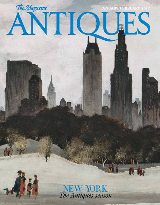
(Fairfield University Art Museum’s exhibition of Adolf Dehn’s midcentury Manhattan works, featured on the cover of The Magazine Antiques January/February 2017 issue.)
Minnesota to Manhattan
“There are no second acts in American life,” F. Scott Fitzgerald drily noted in his unfinished final novel, The Last Tycoon (1).Capturing the disconsolate mood of the author’s untimely death at age 44, it was published posthumously in 1941.
Fellow Minnesotan, artist Adolf Dehn (1895-1968) also emerged out of the heartland, and in the same generation as Fitzgerald. Coincidentally, in the very year of Fitzgerald’s passing, the August 8, 1941, issue of Life touted Dehn. He was enjoying the zenith of his career. The five-page color spread promoted Dehn’s art in America’s most cherished communal print space: words and images converged in the public sphere. This exhibition explores Dehn’s artistic legacy with a focus on his depictions of Manhattan, and proposes that it deserves a reappraisal and “second act.”
Similar to Fitzgerald, Dehn’s career was a rollercoaster: sensational early success, widespread international acclaim, then a fall from grace. Both were outpaced by newer creative voices. Fitzgerald struggled to earn a living as a Hollywood script hack, while Dehn was overtaken by the art world’s full-throttle embrace of modernist idioms and abstraction. Both experienced vacillating popularity and moments of obscurity in their struggles to retain relevancy and favor in the public’s imagination.
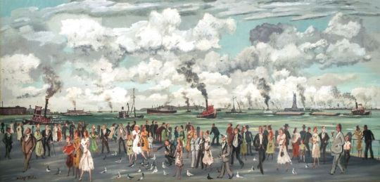
(The Battery, 1953)
Dehn had been interviewed and featured in countless articles in popular magazines and highbrow art journals since arriving on the scene in the 1920s. The answers to new questions about how an artist of such stature could have gone off the radar are surprisingly revealing. That discourse embraces a robust conversation that reimagines and contextualizes the canonical core of American art between the Great Depression and the Cold War.
Unquestionably, Dehn was among the most prominent and critically recognized artists on the American scene during the interwar years and extending nearly into the early 1950s. He enjoyed an enviable exhibition record at the leading art galleries throughout the United States, and his artwork entered the permanent collections of nearly every major museum in the nation. Today, The Metropolitan Museum of Art reproduces a charming Central Park watercolor as its signature Manhattan image on a large array of gift shop items. However, a survey of college textbooks about American art or of recent museum exhibitions yields an unwavering result: Dehn’s visibility is nearly erased. One obvious explanation is that his descriptive Manhattan images share in the precarious fate of all representational painting and printmaking at midcentury.
Much of this reevaluation is predicated on the need to see beyond Clement Greenberg’s dismissal of midcentury Social Realism. Promulgating an anti-realist position in the Trotskyite Partisan Review,Greenberg’s “Avant Garde and Kitsch” essay of 1939 effectively prophesized realism’s demise (2). But the works coming into focus here, unfettered by a politically charged agenda and critical myopia, allow us renewed pleasure from Dehn’s artistry. Now, they reveal a dazzling mastery of a range of media including watercolor, casein and gouache, ink wash, charcoal, pencil, and above all, an unparalleled command of lithography. Contemporary artists have shared with me that they consider him to be the founding “dean” of the school of American lithographers.
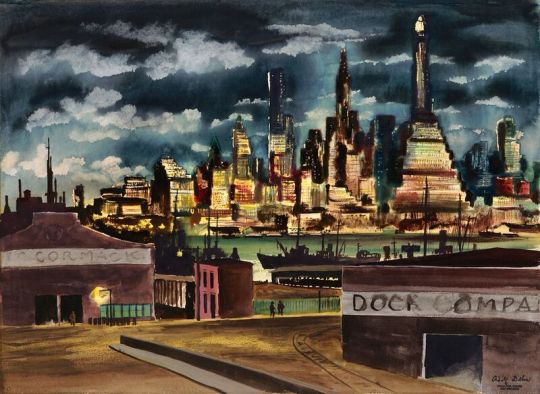
(Manhattan from Docks, 1947)
Dehn’s essential nature as a printmaker taught him how to achieve a rich spectrum of tonalities and textures in the watercolor and casein paintings that blossomed in the second half of his career. Testifying to his graphic supremacy, an early exhibition review from 1929 in The New York Times notes:
In his lithographs Mr. Dehn curiously approaches the aspect of paint. Color weaves most graciously, without recourse to hues other than black, white and delicately harmonized grays. The scope of lithography seems to have become enlarged, thanks to the artist, by many leagues, and there is no telling what fresh expansion of a fascinating domain will manifest itself as times goes on (4).
Contemplating the quality, ingenuity, and spontaneity of these images validates Dehn’s original role among New York’s most beloved and critically respected image-makers.
In Adolf Dehn: Midcentury Manhattan, I argue that stylistic transformations in American art simply left Dehn by the wayside. This pattern is consistently noted in the critical fortunes of a generation of maligned, exiled realists. Spanning over 40 years of sustained research, curating, and authoring catalogs and books, I have explored this cul-de-sac of “left behind” realists: Paul Cadmus, Colleen Browning, Stevan Dohanos, Henry Koerner, and Robert Vickrey. They were all academically trained, figurative, narrative, and literary-based artists. Each suffered from the unorthodoxy of “style heresy:” out of sync with the transition defined by the title of Hilton Kramer’s book: The Age of the Avant-Garde, Dehn fell out of favor (5). Courageously, he never attempted to morph into a late-in-life abstractionist as did many of his peers facing extinction.
Dehn was celebrated in a generously illustrated Life color splash in 1941. It appeared in that last halcyon summer before Pearl Harbor and America’s entry into the inferno of World War II. No savvy art critic of that day could have predicted how Dehn and his closest professional friends − Arnold Blanch, Guy Pene du Bois, and Reginald Marsh – would be surpassed as a tectonic style shift fractured their positions. A generation of Social Realists, including veteran Ashcan School masters and fellow travelers flirting with the Communist Party such as Ben Shahn, the Soyer Brothers, and William Gropper, were usurped with the advent of America’s purely indigenous form of visual jazz: Abstract Expressionism.
The breaking point was the arrival of a powerfully inebriated, violently foul-tempered painter from Wyoming to be featured in Life just eight years later. In the August 11, 1949, issue, a newly crowned Jackson Pollock appears with the headline wondering: “Is he the greatest living painter in the United States?” It augured the explosive arrival and meteoric rise of the Abstract Expressionist generation.
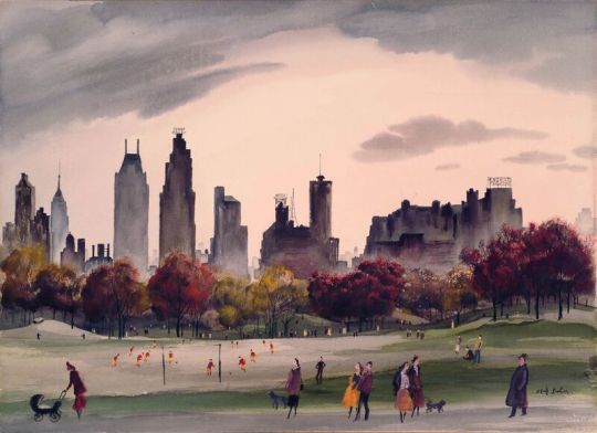
(Autumn in Central Park, 1956)
With many of Dehn’s artistic colleagues consigned to a Stygian netherworld, their contributions lost out to the mythically worshipped, triumphant “New York School.” Instead of the ballyhoo of being cited as a leading American artist, by the early 1950s, Dehn was barely able to earn a living creating illustrations for insurance company calendars, holiday greeting cards, and pharmaceutical ads for middlebrow magazines. However humiliating, he carried on with a persevering dignity. And yet, as late as 1945, the Whitney Museum of American Art’s esteemed director Lloyd Goodrich praised Dehn’s lively watercolors for their “homely poetry ... but with a modern sensitiveness,” noting that in “the beauty of skies with varied cloud shapes, there is a fresh, lyrical response to the poetry of the earth.”(6)
Paris – “Les Crazy Years” to the Harlem Renaissance
Considered a brilliantly gifted young lion out of the Minneapolis Art Institute and the Art Students League of New York, Dehn indulged himself as a cosmopolitan bon vivant “starving artist,” touring Europe’s art capitals during “Les Crazy Years” of the 1920s. Fetchingly attractive women in flapper dresses, silk stockings, and fur boas appear in his sketchbooks, highlighting his self- admitted licentiousness. Dehn indulged a string of boyish dalliances, infatuated relationships, and, occasionally, was lured into financially arranged trysts, frequenting the last remaining brothels of Montparnasse or salons in Berlin’s red-light district (7).
Vagabonding like other literary and artist expatriates of the “Lost Generation,” he sketched Leo Stein at a Parisian café. He was a contributor to society magazines including Vanity Fair, Vogue, and The New Yorker and expressed his defiantly socialist views in his ink and charcoal sketches published frequently in The New Masses. He inked caricatures of his friend Josephine Baker, sketching beneath the footlights during her daringly and savagely risqué La Revue Negre. In 1928, he attended Kurt Weill’s landmark Threepenny Opera, caroused in Berlin’s KitKat Club, and lived la vie boheme on modest monthly payments sent from his New York publishers.
Dehn conversed easily in German with famed Weimar-era social satirist George Grosz, having learned the language from his grandparents. Recognizing his talents for capturing the bestial carnality of brothels and bistros in Berlin and Vienna, Grosz prophetically announced: “You will do things in America which haven’t been done, which only you can do – as far as least as I know America.”(8)
Donning an acerbic point of view, Dehn was humorously motivated to crucify swine-like burghers and Main Street Babbitts back in the States. He launched a blistering satirical attack on bourgeois pomposity. A favorite target: Manhattan’s high society, whose vacuous snobbishness and besotted, double-faced pretensions Dehn exposed. In the spirit of William Hogarth, Honoré Daumier, or Thomas Nast, Dehn came to understand that the satirist’s sting comes from merciless caricature. “Caricature is always Us against Them. The joke is shared; so is the hate.”(9)
It was the Great White Way’s teeming nightlife, its old burlesque houses, and Harlem’s famed jazz salons that most appealed to Dehn’s unquenched tastes for libidinous sensuality. A pacifist war resister from WWI who eventually received an honorable discharge, known for his Communist leanings, Dehn was on the front line of artists devoted to civil rights advocacy. No white artist of his generation was more in tune – and on the spot – with the jitterbugging and musical frenzy of the Harlem Renaissance. But Jim Crow’s shadow even loomed over Harlem’s world famous jazz venues. Jazz meccas like the Savoy Ballroom, Lenox Lounge, and Cotton Club denied African- American patrons seating near the dance floor in black Harlem. In 1938, Dehn was invited by his close friend, Communist party member and civil rights activist Barney Josephson, to paint a mural for Manhattan’s first integrated jazz club: Café Society in Greenwich Village.(10)
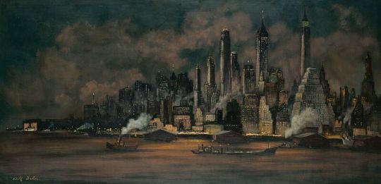
(Lower Manhattan,1956-57)
Manhattan Caput Mundi: “All the Mystery and the Beauty in the World”
Gotham’s rising skyline, which corsets its Edenic garden of Central Park, became Dehn’s visual obsession at midcentury. He repeatedly depicted the rooftop silhouettes of iconic buildings ringing the park. In hundreds of sketches, lithographs, and paintings, the park is ever-changing – a transitory subject akin to Cezanne’s fixation with Mont Sainte-Victoire. Beneath a nuanced wash of billowing clouds pierced by Manhattan Island’s riveting shafts of east/west sunlight, Dehn fused these elements into his signature vision. By midcentury, Manhattan had become the world’s capital city. Dehn’s art explores and captures the frenetic pulse of the Machine Age’s new caput mundi.
Elegant Beaux-Arts landmarks along Central Park’s southern flank including the Plaza, Sherry Netherland, Hampshire House, and Essex House hotels are backdrops of human design intersecting with Olmstead and Vaux’s master plan of controlled nature. Puncturing the Empire City’s skyline, sleek Art Deco wonders such as the Chrysler and Empire State Buildings and Rockefeller Center towers complete Dehn’s urban canvas.
Central Park in Spring, 1941, a watercolor in the collection of The Metropolitan Museum of Art, conveys how the park functions as the heart of the city. A cycle of watercolors in the exhibition surveys the Park’s rambling through the seasons. One wonders if Vivaldi’s strings were playing in Dehn’s mind as he composed lusciously verdant summer greens, deep autumnal reds, and the stark desolation of winter, using spring as his rejuvenating coda. Undeniably, each viewer conjures his or her own synesthesia – experiences of Central Park’s wonders as recollections, memories, and dreams.
Why was Dehn so visually obsessed with Central Park, especially its 22-acre butterfly-shaped artificial lake? It was probably a nostalgic affection, for Lake Tetonka bordered his boyhood home of Waterville, Minnesota. Even after traveling the world and becoming a Manhattan resident in 1929, his fondest memories were linked to backcountry adventures hunting, trapping, and fishing along the lakeside.
While Manhattan’s building façades, rooftops, streets, entertainment venues, and recreational parks were depicted by many urban scene painters such as George Bellows, Edward Hopper, and Reginald Marsh, Dehn set himself apart with a series of wide panoramas of the city seen from either the Brooklyn docks or the deck of the Staten Island Ferry. His impulse to “take it all in” continues the open vistas and deep perspectives of Venetian vedute [views] that artists like Canaletto and Guardi made popular during the 18th century Grand Tour. The Battery, 1953, Lower Manhattan,1956-57, and Manhattan Harbor, 1956, are all breathtakingly depicted with heightened, bird’s-eye points of view. Dehn achieves a visual, emotional gestalt of place and feeling. These images plunge viewers into their vortex. Swallowed by their “all overness,” New York’s infinite harbor becomes Dehn’s Gesamtkunstwerk – a synthesis of being and seeing.
This transcendence is also expressed by Nick Carraway, Fitzgerald’s narrator in The Great Gatsby. An anti-hero, Carraway is the conflicted Minnesotan who loses his innocence while gazing out at the dangerous allure of the shimmering metropolis. In awe, he whispers: “The city seen from the Queensboro Bridge is always the city seen for the first time, in its first wild promise of all the mystery and the beauty in the world.”(11) This swooning rapture is likewise expressed in George Gershwin’s symphonic tribute to the nocturnal city, his Rhapsody in Blue of 1924. Gershwin described his innovative score: “I felt the rhythms of American life [...] to realize the richness of life.”(12) Dehn’s brush puts forth a parallel mood of enchanted ecstasy.
Adolf Dehn’s trajectory was impacted by the shifts from realism to abstraction in the ebb and flow of American art’s tidal changes. His stellar achievement, but paradoxically obscured position, within that landscape echoes the concluding passages from Gatsby. Carraway notes with resignation: “It eluded us [...] So we beat on, boats against the current, borne back ceaselessly into the past.”(13)
An opening reception for Adolf Dehn: Midcentury Manhattan exhibit, free and open to the public, will take place on Thursday, January 26, from 6:00-7:30 pm.
Notes:
F. Scott Fitzgerald, The Last Tycoon, New York: Charles F. Scribner’s Sons, 1941, p. 189.
Clement Greenberg, “Avant Garde and Kitsch,” The Partisan Review, 6:5, 1939.
Edward Alden Jewell, “Dehn and Lemon,” [exhibition review,] The New York Times, March 3, 1929.
Philip Eliasoph, Adolf Dehn: Midcentury Manhattan, New York and North Adams, Mass, The Artist Book Foundation, 2017 [forthcoming].
Hilton Kramer, The Age of the Avant-Garde, An Art Chronicle of 1956-1972, New York: Farrar, Strauss, & Giroux, 1974.
Lloyd Goodrich, American Watercolors and Winslow Homer, Minneapolis: Walker Art Center exhibition catalogue, 1945, published by the American Artists Group, p. 91. [This exhibit continued to the Detroit Art Institute and the Brooklyn Museum].
For this rehearsal of Dehn’s romantic intrigues, I am deeply indebted to Professor Henry Adams, Case Western University. Dr. Adams has generously shared with me his unpublished manuscript covering Dehn’s entire career. With remarkable candor and valued scholarly insights, Adams study, (tentatively titled:) The Sensuous Life of Adolf Dehn: American Master of Watercolor and Printmaking, is anticipated as the definitive monograph.
Carl Zigrosser, The Artist in America: Twenty-four Close-ups of Contemporary Printmakers, New York: Alfred A. Knopf, 1942, p. 15.
William Feaver, Masters of Caricature, New York: Alfred A. Knopf, 1981, p. 9.
Barney Josephson, Terry Trilling-Josephson, Café Society: The Wrong Place for the Right People, Urbana: University of Illinois Press, 2009.
F. Scott Fitzgerald, The Great Gatsby, New York: Charles Scribner’s Sons, 1925, p. 69.
George Gershwin, “Our New National Anthem,” [from Theatre Arts Magazine, August, 1925,] reprinted in Gregory R. Suriano, Gershwin in His Time: A Biographical Scrapbook, 1919-1937, New York: Gramercy Books, 1998, p. 47.
F. Scott Fitzgerald, The Great Gatsby, ibid. p. 182.
#Adolf Dehn#Philip Eliasoph#F. Scott Fitzgerald#Central Park#Nick Carraway#George Bellows#Edward Hopper#Reginald Marsh#Metropolitan Museum of Art#Arnold Blanch#Paul Cadmus#Steven Dohanos#Henry Koerner#Fairfield University Art Museum#Bellarmine Hall Galleries
0 notes
Last Seen Blogs

lebanonescortgirls1-blog
lebanonescortgirls

schermbecker
Sammelthread

hsforever
Mr. Harry Styles
hagora
Booger man's layer

revenant-the-horrid
sasakiluvrfan9000