#hndphotography
Text
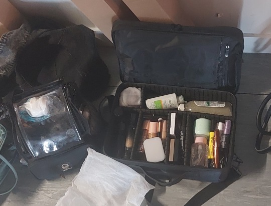
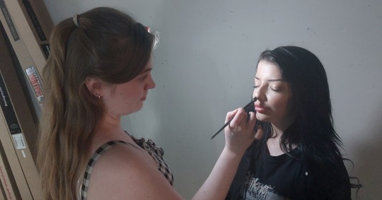
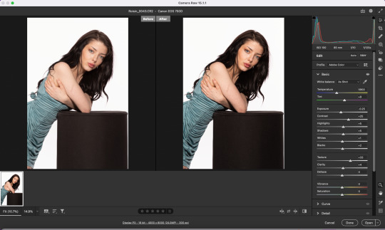
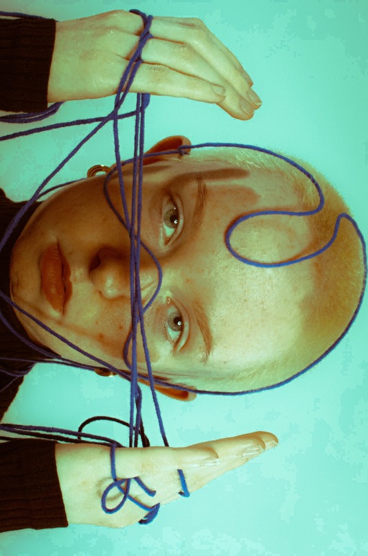
Graded Unit: Portrait IV (Roisin)
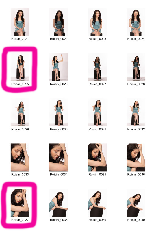
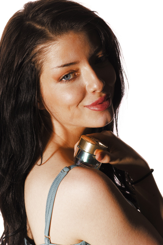
Studio editorial photoshoot with the Clean White technique, shot and conducted in the College photography studio with model Roisin Hodge posing in frame, wearing a teal coloured Shein designer dress, with white Boohoo high heels. MUA Ciara Johnston applied Roisin’s hair and makeup for this shoot. This shoot took place on Monday, May 22nd 2023.
Roisin also posed with small jars of the skin care brand, Estee Lauder, partially turning our photoshoot into an promotional advertising shoot to promote Estee Lauder skin cream.
My final images were optimised, edited retouched and colour corrected via Photoshop. The colour look-up mask layer setting was applied to the images, using the filmstock_50.3 setting with a Saturation blending mode setting applied.
Originally, this shoot was just to help out Ciara for her personal project. But the images and shoot were so successfully shot, I decided to include a few of these images into my own project.
Contact Sheet


Final optimised images


Production


Post production


5 notes
·
View notes
Text
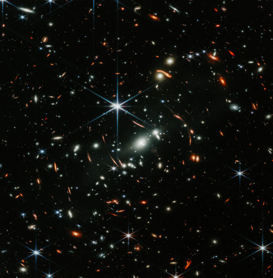

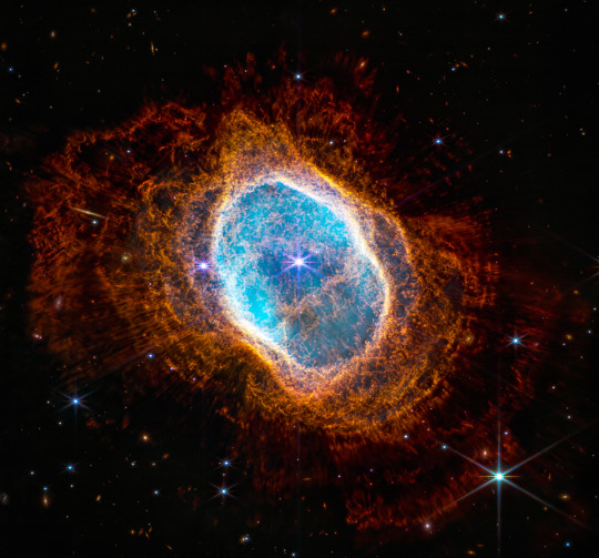
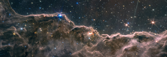
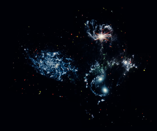

NASA PHOTOS OF THE UNIVERSE, i edited these using some of my own presets I have made and just wanted to share how amazing these photos are and our universe. My mind was blown all of these are stars with plants insane.
Deployment Explorer Webb/NASA link to the photos for everyone to enjoy
#nqphotoblog#photography#learning#student#phootoftheday#astronomy#space#space art#galaxies#nasa#outer space#hndphotography
3 notes
·
View notes
Text
Structure: Final Images


2 notes
·
View notes
Text
RGB Report
HND Image Editing
Colour Management Report
RGB Brief
This report is written by: Katie
HND1C
This project is designed to expand your understanding of professional colour management workflow, including:
• input profiling
• monitor calibration
• printer profiling
• ICC (International Colour Consortium) profiles.
You will be asked to watch a short video and answer the questions relating to this video throughout this document.
You may be required to input diagrams or screenshots as appropriate. This is under open book conditions, meaning that you can use the wider internet to help your research.
The deadline for this brief is Friday 14th May 2021.
Part 1 – Colour Management Basics
Watch this short video on YouTube and answer the questions below.
https://www.youtube.com/watch?v=kP1GgxeY2r0
Q1. What is colour management?
Colour management is a controlled conversion between the colour reprensations of various devices. It can be used with image scanners, digital cameras, monitors etc.
Q2. Why is colour management important for photographers?
Colour management is important as not all programs can reproduce all of the colour range that the human eyes can. The colour space use by each device is designed to produce within given colour space partiecpents
Q3. What colours are the following devices displayed in?
Displays (Screens, monitors, TV etc.): ROYGBIV / Red Orange Yellow Green Blue Indigo Violet
Printers: CMYK / Cyan Magenta Yellow Key
Q4. What does colour space mean?
Colour space is a specific group of colours. This varies on the where the colours are being displayed.
Q5. What are two of the most common colour spaces?
The most commonly used colour spaces are SRGB and adobe RGB.
Q6. Insert a diagram showing the LAB colour space, alongside other common colour spaces and note the differences.
Q7. Explain briefly the difference between ‘colour management’ and ‘colour correct’.
The colour correction process is to make the footage look exactly the way that the human eye sees things.Whereas colour correction changes the aesthetic of the image.
Part 2 – Studio workflow & Input profiling
Watch this short video on YouTube to help answer the questions below.
https://www.youtube.com/watch?v=iAWIYkmuH8Y
Q1. What is the industry standard colour profile for monitors?
The majority of recent high-quality LCDs are around 6500K. Although 6500K is a good starting point, there are times when you should deviate from it. A little lower colour temperature of roughly 5500K, for example, can provide a better screen to print match for your specific work environment.
Q2. Why should you view your images from DSLR computer to print under the same light source?
You should view your images on all devices using the same light source so you can accurately view the colours on each device
Q3. Why should you avoid editing in a room with colourful walls?
You should avoid colours that reflect light such as bright distracting colours. These types of colours end up causing you to see the colours in your images.
Q4. What is the benefit of using a colour checker card in the studio?
Using a colour checker card in the studio is useful to make you can match to the true colour when editing
Q5. What is the benefit of using tethered capture?
Tethered capture is when you take an image on your camera and it gets imported straight into lightroom for example to edit and for you to look at
Q6. What are the three main steps for colour management on set?
1. Image creation
2. Image processing
3. Image reproduction
Part 3 – Post Production (Monitor Calibration)
Watch this short video on YouTube to help answer the questions below.
https://wwww.youtube.com/watch?v=60g0pg0pXFA
Q1. What are the two colour spaces you will most often be working in?
The two-colour spaces most work in are RGB and CMYK.
Q2. If you aren’t going print a lot of your images, what is the recommended colour space?
sRGB as it has a wider colour range. This is fine to use as the printer cannot see the full sRGB range but since we aren’t printing its ok
Q3. If you are printing a lot of your images, what is the recommended colour space and why?
The most recommended colour space is adobe RGB as it has more coour variety compared to other colour spaces like sRGB.
Q4. How regularly should you plan to calibrate your monitor and why?
You should calibrate your monitor once a month or whenever you change lighting conditions. so that you can create prints that accurately represent what you see on your monitor.
Q5. What does a colour meter (for calibration) do? Name three different colourimeter brands and note if they are external or built in.
The colour metre is used to determine the location of a colour on the XYZ axis of non-radioactive materials, in addition to being simple to use and inexpensive. There is densitometers, colour photometers and spectrophotometer.
Q6. What is the industry standard settings for monitor displays?
Gamma: 2.2 for windows, 1.8 for Mac
Luminance: 120 is the recommended for a standard LCD screen
Colour Temperature : If working with video use 6500k, if working with images you plan to print, use 5000k
Part 4 – Post Production (Printer Profiling)
Watch this short video on YouTube to help answer the questions below.
https://www.youtube.com/watch?v=nKI8BZqSuHw
Q1. What colour space should you edit in for print?
Adobe RGB
Q2. What colour space should you export your file in for print and why?
Adobe RGB as this is most compatible with printing as they cant see the full sRGB range
Q3. In terms of colour, why is it sometimes problematic printing on different paper types?
Depending on the paper, the quality of the print may vary. With low quality paper the ink will start too creep away from the text or photograph being printed. Also colour may be different depending on the quality
Q4. Describe what an ICC (International Colour Consortium)
profiles does?
An ICC describes the properties of a colour space, and range of colour it can output
Q5. What is the benefit of checking the ICC available for your image?
Checking the ICC of your image is beneficial to check the colour range your monitor can display or a printer can print
Q6. What does ‘gamut’ mean?
Gamut is the range of colour that a monitor can display or a printer can print
Part 5 – Photoshop Soft Proofing
Watch this short video on YouTube to help answer the questions below.
https://www.youtube.com/watch?v=mWGrfEZjQos
Q1. Why should we use Soft Proofing and what are the benefits?
It allows you to set better expectations and to minimize unexpected results during printing it also gives you more control over colour reproduction in images and overall designs
Q2. What are the main steps to soft proofing in Photoshop?
Open image in photshop
Select ‘view’
Proof setup
Custom
Custom proof condition
Device to simulate- select appropriate printspace
Rendering intent – select appropriate one
Check black point compensation
Tick preview box (on and off)
Click ok
Q3. Once you have soft proofed your image to the desired output result, how should you convert your file to the correct profile?
Select edit
Convert to profile
Use same settings as setting up soft proofing
Rename file
Bibliography:
https://www.loxleycolour.com/help/colour#colourtab2
https://helpx.adobe.com/uk/photoshop/user-guide.html?topic=/uk/en/photoshop/morehelp/color-management.ug.js
https://blog.breathingcolor.com/what-are-color-profiles/
https://www.viewsonic.com/library/photography/color-management-guide/
2 notes
·
View notes
Text
GRADED UNIT SCHEDULE

2 notes
·
View notes
Text
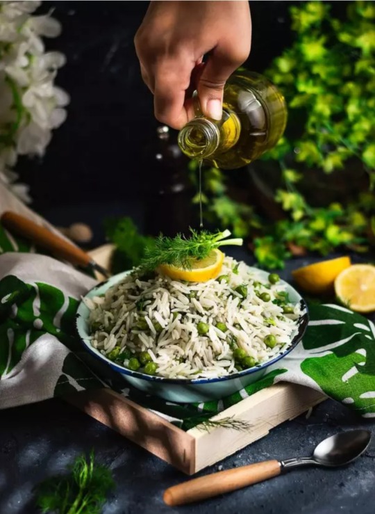
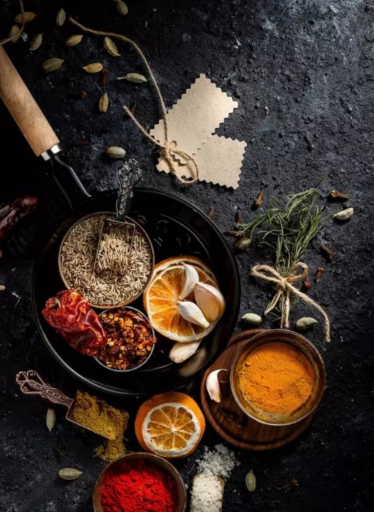
Inspiring images for my personal project


4 notes
·
View notes
Text


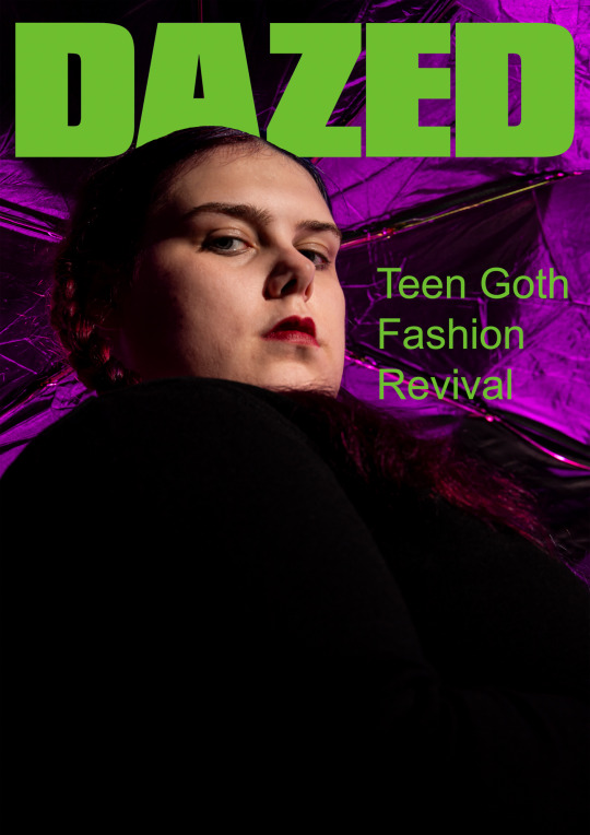
Fashion magazine front cover task for college, how to make a front cover
#photography student#studio#photosafari#portrait#portraiture#portraits#hndphotography#fashion#front cover
0 notes
Text
Photojournalism | News Research
Video Notes
Changing from physical papers to internet/online presence
Decline in newspaper sales
Fewer people are interested in physical newspapers
2.25 million readers lost interest in newspapers
Half a million people stopped buying Sunday papers
Advertising makes up the majority of newspaper pages
Adverts have moved from physical newspapers to online advertising
Local papers have taken the largest hit
Advertisements are the main source of income for newspaper businesses
Journalists, editors, and newspaper staff face job loss
The newspaper has faced revolutions before (radio, TV, etc.)
Modernisation began in the 1980s
Fleet Street was the newspaper 'hub' of the country up until the '80s
"Modernisation" was transferring to computerised offices
The only major British paper not to lose readers in the previous year was The Sun
The Sun won more awards than any other paper
They reduced their price to keep customers (still retaining good profits)
The Sun's main competitor is The Mirror
120-page newspaper, 30,000 copies per hour (40 pages in colour) upgraded to 80,000 copies per hour (all pages in colour)
Investing in new technology and processes
Due to these investments, some papers had to increase prices
Free giveaways are a technique used to boost sales i.e. when The Sun was giving away a free CD copy of McFly's newest album at the time - The Sun gained 300,000 additional readers and the McFly album reached 2.5 million listeners in one weekend
Metro 55% news and 45% advertisements
Robert Murdoch - CEO of News Corporation
The digital revolution is bringing more competition
If readers can't immediately find something on your website - they'll look elsewhere
Videos were being introduced as a form of news outlet on websites/online
Online news is generally free which has an impact on newspaper profitability
Two-thirds of the Guardian's readers are out with the UK
The market is global - no longer physically/geographically restricted
Reader-specific advertising to improve adverts and reader experience
Amazon released the Kindle - subscriptions to newspapers available (as well as books) portable, user-friendly
The younger population tends not to read traditional newspapers
Presentation Questions
Where do you get news?
Television
Radio
Social Media e.g. Twitter
Online newspaper websites
Word of mouth
Four tenets of a newspaper:
Accessible by the public
Published at regular intervals
Information is current
Covers a variety of topics
Why were newspapers so powerful?
The main or only source of news for a long time
Influential
With the inevitable demise of newspapers, what are the implications for photographers today?
Less work
Reduced pay
Stock photos over hiring out
More easily accessible images via the internet
No job security
Paparazzi dominating tabloids
"Citizen" Journalism i.e. newspapers buying images from citizens/pedestrians who happened to take a snap on their phone
Benefits of online news
Larger audience
More exposure
Opportunities for press photographers
Freelance work
Agency work
Can send images to papers rather than working for them
Don't have to wait to be "discovered"
Benefits of working for an agency
Guaranteed work
Additional opportunities
Job security
Benefits
Photo Agencies
Agent France Presse
Reuters
Corbis
Getty
Magnum
Broadsheets
The Times
Sunday Times
The Telegraph
The Guardian
The Observer
The Herald
The Scotsman
The Independent
Tabloids
The Sun
The Mirror
The Daily Mail
The Daily Record
Sunday Mail
Tabloid/Broadsheet Task
What is the photographic style of the paper? Why do you think that is?
Daily Record - Attention-grabbing with various images to keep the reader's attention. The Independent - Takes a more organised/structured approach primarily full of informative articles and fewer images.
How many images are in the paper?
161 images in the independent vs. 189 in The Daily Record.
How many are credited?
Only 18 of the 161 images were credited to The Independent
Comment on the layout of the paper. What proportion text, what proportion images?
In The Independent, there is an even split of images and text, whereas The Daily Record has slightly more images than text.
Freelance or Staff - can you tell?
When looking for credited images, sometimes the same names appear which might indicate these photographers are staff for the paper as their images are used consistently throughout.
Comment on the quality of the image and effectiveness; does it tell the story?
The images with accompanying text work well to help convey the story.
Look for similar stories/events.
An article regarding Russia and Ukraine.
Where is the article?
Page 23 in The Daily Record, page 33 in The Independent.
0 notes
Text
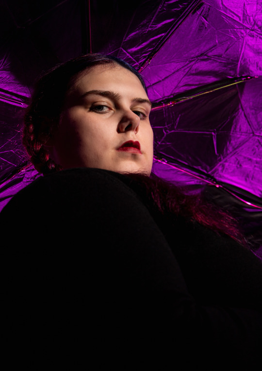
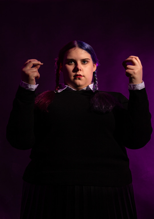
High key/Mid key/Low key
This task was all about recognising high key, mid key and low key images. we then had to pick an inspiration picture for each of them and try to re create them. I created these simple but effective images.


0 notes
Text
3 Hour Landscape
movement

2. close up

3. perspective
2 notes
·
View notes
Text
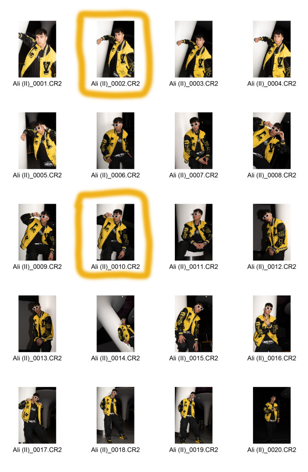
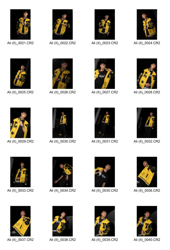
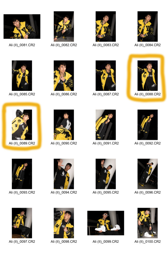
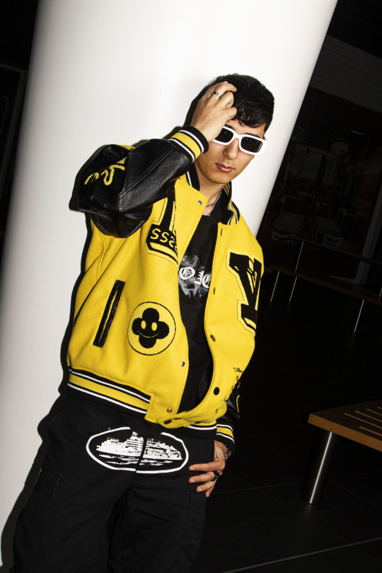
Graded Unit: Portrait III (Ali)
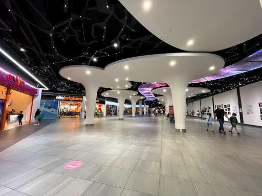
My third shoot for my editorial fashion Graded Unit project and my second collaboration with model Ali. Ali and I shot within the Xscape Amusement Centre, located in Braehead. We did not have a MUA for this shoot, we shot on our own. This shoot took place on Thursday, May 11th.
Ali posed wearing a yellow Louis Vuitton varsity jacket black cargo trousers, with black and yellow shoes and a black designer t-shirt to go with the outfit. We discussed the colours of yellow and black for his outfit weeks before the shoot took place.
Apart from people walking into frame and having to wait for the frame to be free, the shoot went well without any problems occuring.
I was very happy to be shooting inside of the Xscape Centre because I had booked up and requested permission roughly 5 or 6 weeks before I even found a model and a specific date to be shooting on. I selected this location area to shoot in because of the giant white support beams on the centre’s ground floor that really caught my eye, and thought these beams would look super cool in the images’ foreground for atmosphere and design.
The final 7 images were optimised, skin-retouched and colour corrected via both Adobe Bridge and Photoshop. The colour look-up mask layer setting was applied to the images, using the Kodak 5205, Fuji 3510 mask setting with a Soft Light blending mode appliance with a 75% opacity and a 50% fill applied.
Location of area:
Team photo:

Contact Sheet:


Final optimised images:


2 notes
·
View notes
Text
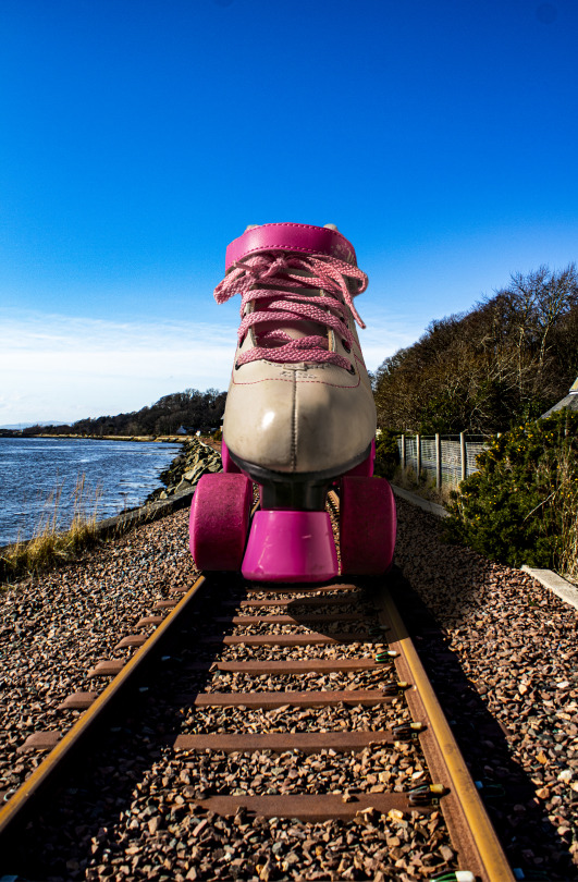
Studio/Location || Photo Sprint
FINAL IMAGE
"Are cycle lanes good or bad for Glasgow"
The reason that I have chosen this image as my final image from the brief is because it shows exactly the point of the brief. This image clearly shows the main story and point of this, are cycle lanes good or bad for Glasgow? It shows that cycle lanes would be good and advantageous for Glasgow as this image shows a cyclist in amongst pedestrians on Buchanan Street. This shows the dangers that are present to pedestrians as there is nowhere for cyclists to go.

1 note
·
View note


Text
Illusion Plan
For the illusion brief i want to bring together two circular objects and try and create something interesting to look at. I decided to choose a vinyl record and the inside of an apple. i feel like the shapes work really well together. this brief takes a lot of editing to make your illusion work. I think taking the record label and sizing it down and then blowing up the apple to a record size then placing the label on top along with some grooves from another record would make the apple look as if it is the actual vinyl record creating a cool illusion.
i have to make sure when taking all my images that everything has the same lighting and same placement. to assure this is achieved i will take notes of all camera and lighting settings. i will also take behind the scenes photos to make sure i have everything in the same place.
things i will need for my final shoots:
apples (more than one)
vinyl record label
white vinyl record for grooves
white background
soft box lights
tripod
light meter
light receiver
camera
different lenses
0 notes
Text
GRADED UNIT PERSONAL PROJECT
STUDIO SESSION 1
25/04/2022
Contact sheet
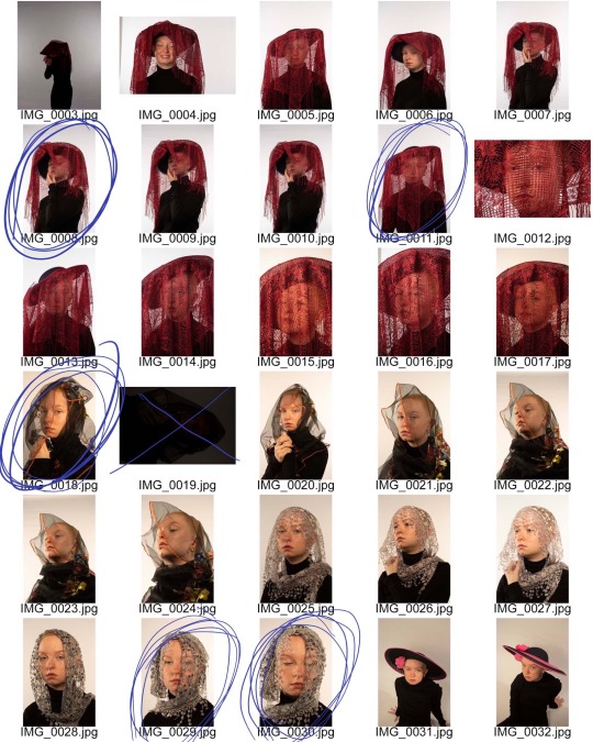


Edited images


6 notes
·
View notes
Text
Lost and Found
Final image
6 notes
·
View notes
Last Seen Blogs

amitghosh24
Untitled

eighteenoheight
Breathe

feracelimucahide
Güle Aşık Bülbül

jimrandyp
Lost in the Æther

the-runed-brush
Painting and model Building