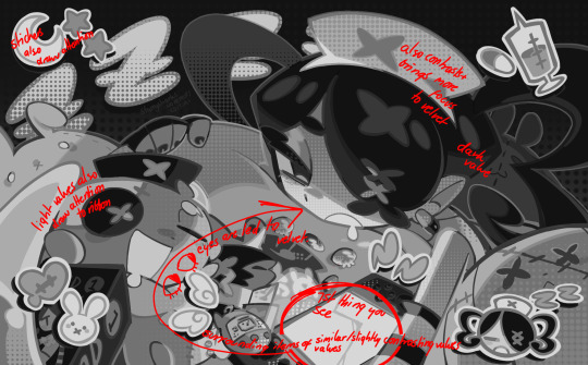
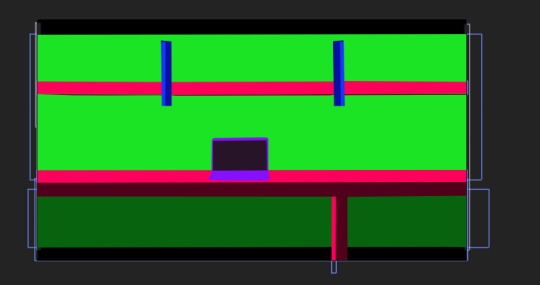
#halftones in sai are... difficult to say the least
Photo
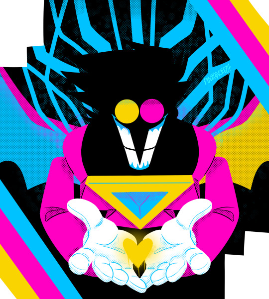
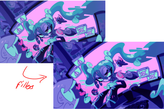
there’s a trend going around on twitter where you draw characters in the cartoon network/cmyk palette and well i gave it a shot with spamton neo!!
#utdr#deltarune#spamton#spamton g spamton#spamton neo#art#fanart#cartoon network color palette#halftones my beloved#halftones are so much easier to do in csp i love it#halftones in sai are... difficult to say the least#sneo
2K notes
·
View notes
Text
alright, here it is: ZENO'S COLOR GUIDE 3.0 !
here, i'll have three "chapters" regarding color:
CH1: how i color in illustrations
CH2: color and character design (in zeno's case)
CH3: how zeno makes his colors cooler
CH1: HOW I COLOR IN ILLUSTRATIONS
it must be noted that, as of lately, i heavily use halftones in my art and the way i use them for gradients effects my color choices. of course you don't need to use halftones if you don't want to, as it's just my personal choice, but anything regarding halftones here could (probably) also apply to regular gradients!
when choosing colors in an illustration, i usually have three things in mind: mood, character, and contrast. we'll be using "gloomy bunny naptime" as an example here.
MOOD: what's the vibe of the piece? for example, here in "gloomy bunny naptime", wanted a mellow, sleepy vibe, so purples and pinks seemed like the best choice. these colors also have a dreamy effect due to being common in real-life early mornings/summer nights - basically, i tend to use associative colors in illustrations.
i usually only use a pallete of 3-7 colors, though of course more characters calls for more colors. for multi-character pieces, i would actually make a "rainbow" of colors based on the mood of the piece - essentially, a bank of colors to use for your colorful casts based on the actual rainbow. you can alter this based on the saturation levels you want! hope that makes sense. i'm not the best at this though, so i would heavily recommend looking for guides from artists who are more skilled in that department.
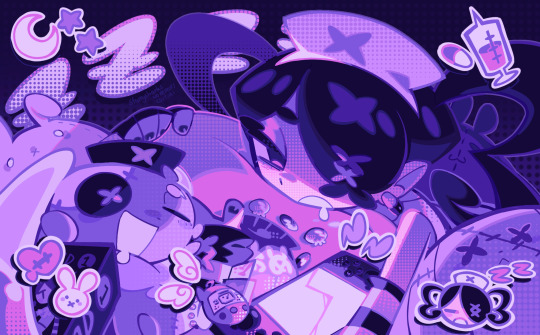
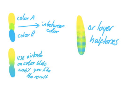
CHARACTER: velvet is the focus of the piece, and as a character her palette is made up of many purples and pinks. of course, it's easier because she and ribbon both have similar designs, but i would still recommend using colors based on/complementary to the focus character's pallete, though this is a rule that can and should be broken if needed. gradients can be used to provide a smooth transition from color-to-color and add depth to the piece, as well as showcase velvet's pallete. when making any gradient, you probably want to have a vibrant middle color. this is difficult to achieve in most art programs, so i'd do it like this:
you can use gradients in lots of cool ways to make stuff pop! (i think this collage shows i use too much purple and pink though.)

CONTRAST: the context of the piece also aids the color through contrast. (that's a lot of Cs!)- we see that velvet is just waking up, and the light from her switch is glowing brightly. i wanted to convey something like her switch suddenly turning on in the middle of the night, waking her up - so the console emits "light" in the form of illuminating the contrasting color of pink against the purples. it might seem specific to this piece, but what i'm trying to say is that contrasting colors can lead the eye to the focal point of the piece, that being velvet herself. because a great deal of the rest of the piece is dark, we look at the contrasting switch screen - the brightest thing in frame - and our eyes move around and up to take in the focal point character. at least that's how i wanted it to be ;w; i guess you could convey it as something like this?
CH2: COLOR AND CHARACTER DESIGN (IN ZENO'S CASE)
this is where i start to get annoying, so stand back! when deciding on colors for a cast of characters, there are many factors: time period, variety, personality, and more that i can't think of.
TIME PERIOD: this one is simple. for example, a futuristic time period (such as that in x-calibur) calls for colder colors, such as greens and blues. for characters involved in futuristic professions such as space exploration, this works incredibly well. for modern time periods, less focus can be on colors and more on the shapes of the clothes, but this is not a shapes tutorial! i don't have any ancient times oc stories, but i'd probably use earthy and warm tones.
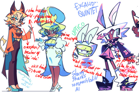
VARIETY: this is also rather simple. i try to be aware of the palletes that i used, and the similarities they might have with other characters. i try to use similar colors for characters who belong to certain organisations or have a uniform, but of course, it's not like catholic school students adhere their entire look to their uniform, so this is a rule that can be broken yet again. art is all about learning things and breaking them, remember that!!!
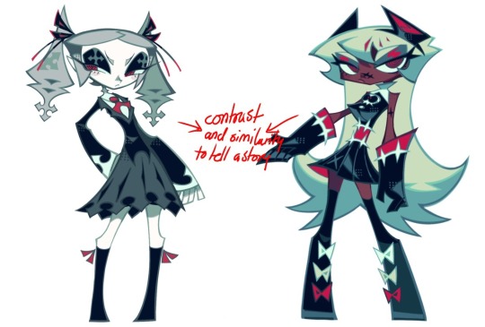
color can also be used for symbolism. my absolute fav example for this is vivica and octavia - the amount of red in their designs is supposed to represent the amount of freedom/passion/anger/confidence they have or are allowed to express under their different circumstances. as vivica belongs to a strict organisation, she has far less red in her design, showing her emotions are stifled - meanwhile octavia has it as her main complementary color because of her freedom to express her emotions, though those emotions may be destructive because of her circumstances.
PERSONALITY: what colors are associated with your character's personality? i actually usually refer to magical girl groups to see what's commonly associated with different colors. here's the main trend:
red: hot-headed, passionate, firey
orange/yellow: bright, happy-go-lucky, sunshine personality
green: wise, mellow, kind
blue: serene, graceful, elegant
purple: magical, regal, fancy
pink: usually the main character (though this because magical girl anime tends to be marketed towards young girls), sweet, relatable, determined
of course these are only stereotypes from one genre of anime, and different colors have tons of different meanings. color theory is the best way to learn this! these colors can also express different moods, which ties into ch1. i myself constantly ignore these rules - v-con, a bombastic hyper DJ, is purple (though he does have yellow accents) for example. basically, i just take them as a general rule and try to have them in mind while drawing.
CH3: HOW ZENO MAKES HIS COLORS COOLER
this might be the most important part of this guide. once again, there are a few things to consider here: filters, hue, overlays, and more!
FILTERS: for ibispaint, you can use an adjustment layer on your whole piece to use a filter. i usually only use brightness/contrast here - upping the brightness (or darkening it based on the mood of the piece) and upping the contrast. this helps to better express values and intensify the colors if that's what you want. i often use it in all my pieces to some extent.
hue/saturation/lightness is also helpful in moderation. you can alter the hue - though it usually only helps if you bring it back or forward by just a few points, or the entire pallete will change. saturation is what it sounds like, and slightly over/desaturating the piece can help with atmosphere. lightness is what it sounds like - lightens the colors in the piece. i don't use it at all.
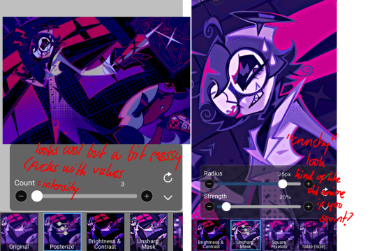
posterize and sharpen mask are some that i've used recently. posterize can add some crazy effects to your art, but i'd probably need to edit it slightly after using it because it can mess with certain colors.
HUE: it's a layer type that can change the overall hue of the piece. i usually use it at a low percentage for atmosphere. kind of like a gradient map but nothing like it? idk
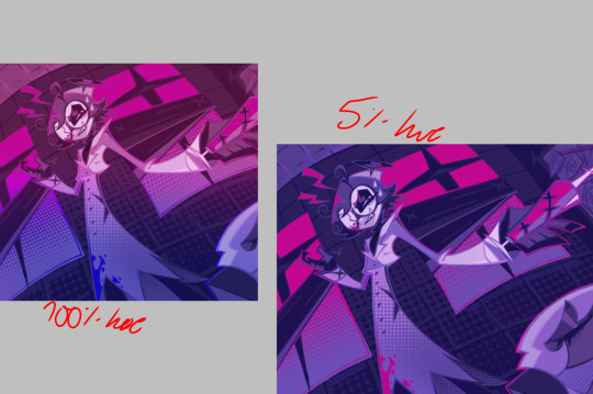
and OVERLAYS: i just use a very saturated blue/purple color over the entire piece at a very low percentage, around 5-10%. it can wash out the piece at too high a percentage.
and that's basically it! sorry it kind of derailed at the end i spent like 2 hours on this and got super tired. goodnight i'm going to sleep please also look at other artists etc etc. bye.
#zeno's art#long post#color tutorial#liar by korn is actually a really catchy song yea the lyrics are weird but its so good tbh#peak drums and bass and guitar and vocals and then the lyrics are hot booty. this is what nu metal's all about people#ask questions if you want#about nu metal or art i dont care
322 notes
·
View notes
Text
Blog Post #4
This week I was able to step out of my comfort zone, aesthetic wise. I was having a hard time trying to pinpoint what type of pop punk/rock "vibe" I wanted my poster and logotype to have. I ended up going with the side I least expected and was way out of my comfort zone. I've been trying to work on learning how to successfully halftone an image, pattern, and color. I can't say that it's been easy, or very successful... but I'm trying my best. I was also challenged to work away from my iPad, what can I say I'm an iPad kid. Procreate has become a very accessible tool for me to use whenever I wanted, and now I'm finding myself having to go against my norm and use my laptop. It's been difficult, but I'm really trying to use all the sources I'm accessible to.
Below is an image of my poster before adding the halftone and working with my color palette!

0 notes
Text
Making
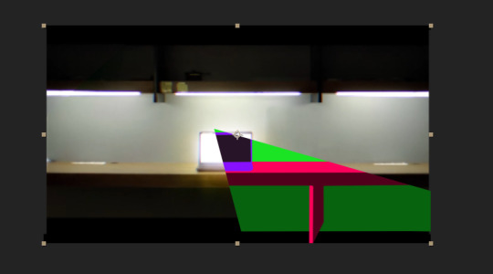
I have screenshotted steps I have taken in my final edit and below I will be explaining them and the thought process behind it.
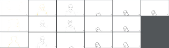
I have decided to add an animation part into my video because I though it could give it a bit different feeling and that it would be a bit unexpected. I have studied animation last year in college so I have used the knoweledge I’ve gained there to help myself with animating this;

It’s nothing difficult but I’m still happy with it as it would be a base for inbetween frames. In total it’s about 16 frames which each of them I’ll post below. I have used similiar style which I used in my storyboard since I’ve liked how it came out there. I took an inspiration from the thought of an online persona and being absorbed into space with nothing in it/not even time/. The transition is made to fit the scene before that which is a light transition.
The idea for light transition I’ve found in this animation clip;
https://www.youtube.com/watch?v=MHrxWKmzQkY
I have been watching this person’s animations previously for a while and I think they’re really pretty. I used their animation as an inspiration for my own idea.
Moving on, I have importent my animation into After Effects where I just edited the lenght and speed of it not adding anything more. I moved then towards making a ‘cartoon-like’ scene using objects and masks which’s process I’ll show below.
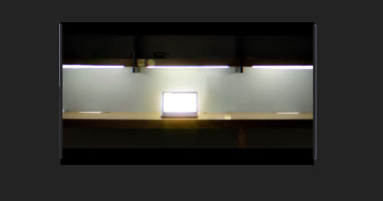
Starting with main scene..
First I created background using object tool which I have then put as hidden so I can continue to pretty much rotoscope or copy the background using the object tool;
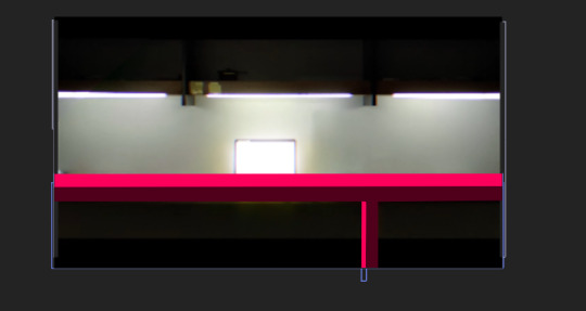
I have created a table with use of shadows adding on top of shelves;
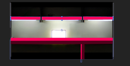
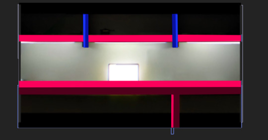
and then I hid all the layers to make the laptop in the middle as an object as well and proceeded to put it all together when it was done. The finished scene looked like this: (I precomposed all layers together so they’re all in one after I finished)
Since there’s a sound effect in my audio that I have used I have taken a masking tool and kind of cut out triangles into the composition and animated it (cutting the layer and setting new mask on each frame). Here’s an example;
I though it created really cool effect and it really looked like it’s from different dimension or world.
(I used effect called ‘Fill’ to change colours more easily of each object for the beat drop changes of coulours)
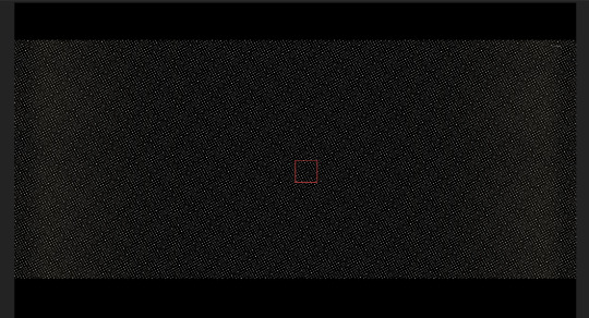
I then moved further to creating ending scene which I quickly created using HalfTone from Sapphire plugin pack with these settings:
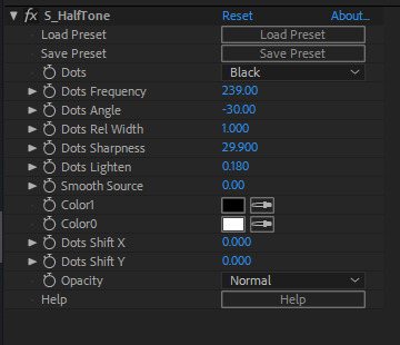
which screated pretty much dots all over the scene (the screenshot is from when quality was set at half in actual video dots are way more visible and it creates really nice and simple background)
and on top of that I again used object tool and I created outline around the whole scene which I then animates to start at the top right corner and connect around.
I don’t have screenshots but after that I created a typography saying ‘Thanks for watching’ for which I used an expression. For information this is the expression used:
freq = 1;
decay = 6;
duration = 0.25;
retard = textIndexthisComp.frameDuration2;
t = time - (inPoint + retard);
startVal = [100,100,100];endVal = [0,0,0];
if (t < duration){ linear(t,0,duration,startVal,endVal);
}else{
amp = (endVal - startVal)/duration;
w = freqMath.PI2;
endVal + amp(Math.sin((t-duration)w)/Math.exp(decay*(t-duration))/w);}
I just ctrl + v this into the animation tab which automatically created smooth bouncy animation. I then adjusted it a little so that I was satisfied enough with it.
For references I have watched these animations to gain some inspiration and ideas;
https://www.youtube.com/watch?v=nE0ElmZm-6c
https://www.youtube.com/watch?v=FQB6HB1SH-U&t=48s
https://www.youtube.com/watch?v=zwXpAR7kTaQ
They have really helped me with deciding on what style and animation I would like to do. I have also watched a video on how to animate in Procreate since the program I’ve used to animate was Procreate and it was my very first time animating in it.
https://www.youtube.com/watch?v=XOELJy6LZJs&t=303s
This is the video I watched which has helped me a lot with understanding what I’m doing in the programme.
I decided to add animation to challenge myself a little since I have been trying to draw or at least sketch a lot and so I though it would be cool to see what I can do and experiment with knowledge I have and if I can learn something more. Which I did, I have learnt more about animating process, frames and I have figured out new drawing/animating software thanks to this experiment. I’m glad I went on and did animation analysis which has really helped me with understanding further animation skills. I’ve been interested in all kinds of creative arts and so I found this to be really helpful and fun to work with as I’ve got to draw, animate and edit footage which has let me to dust off my skills in all of them and improve them step by step little bit further. I have also paid a lot of attention to all the thinking behind it and composition. I have reasearched and looked at bit of character design but I only ended up sketching my character based off of the storyboard.
0 notes
Text
Commercial Printing: Printing Your Driver’s License
I spent three hours in the Maryland Department of Transportation today (mostly waiting) to renew my driver’s license. As a student of commercial printing with time on my hands, I took the opportunity to read the driver’s license replacement brochure to see what I was getting.
Needless to say, when I compared the new design to the one I had had for the past seven years, I was struck by the complexity of the custom printing. The brochure I was reading launched my education into new digital printing methods for drivers’ licenses.
Qualities/Attributes of the Card
First of all, it was clear to me that this could have been any type of card, including a credit card or medical card. The specific custom printing techniques and the substrate of the card itself could ostensibly be useful for all card printing.
Moreover, a few more things were immediately evident.
The card is rigid and durable. I know because I’ve had my current driver’s license for seven years, and everything is still readable. It’s scratched up a bit, but it has lasted. The brochure describes the card as having a “polycarbonate card body” that is “more durable, secure, and tamper resistant” (“Maryland Protected and Proud” brochure).
There was a lot of information encoded in my prior driver’s license, as evidenced by a single two-dimensional code. On both my prior license and the new one there is an “identity barcode” composed not of vertical lines (as with a UPC code or a US Postal barcode) but a pattern of tiny squares (not unlike pixels on a computer screen). These tiny squares link up to create patterns within a rectangle approximately 2” wide by 3/4” high.
This pattern, which I Googled online and found to be a PDF-417 (I believe), reminded me of a QR Code (quick response code).
The key here is that such a code can contain a wealth of information about the individual driver. Presumably this can be used as a repository for information the Maryland Department of Transportation needs for its operations but also as a means for confirming the identity of the card holder.
Based on my understanding of the process, such a code is digitally generated from digital data. And in addition to the identity code, the new drivers’ licenses described in the brochure have an “inventory control number” and accompanying barcode (vertical lines, in contrast to the 2D identity barcode). Again, I assume this is digitally generated, in this case just from the unique control number.
When I compare this card (I actually just found my fiancee’s driver’s license as well, and this matches the brochure image in every detail) to a credit card, it seems to have much more detailed image content. Plus, it has no chip (at least no chip recognizable by the universally accepted “chip logo”).
At the top right of my fiancee’s driver’s license is a small image of my fiancee. When I tilt the card vertically (back and forth), the image changes to her birthdate. So, this means the Maryland Department of Transportation has printed a “lenticular image” (composed of incredibly small plastic lenses that present two images when tilted).
From what I see (and since I know that utilitarian goals trump aesthetics in such a card), the purpose of the lenticular image is to make counterfeiting the driver’s license that much more difficult–as a deterrent to identity theft.
If you run your fingers over my fiancee’s driver’s license, you will notice that some of the lettering is raised. The brochure describes this as “tactile text” or “laser engraving on the card … [that] raises the print making it difficult to tamper or modify” (“Maryland Protected and Proud” brochure).
On the back of the card is a miniature 4-color image of my fiancee (noted in the MDOT brochure as “another barrier against fraud”). There is also a partial 4-color image of what looks like a statehouse (apparently the Annapolis, Maryland, statehouse). The center of the building is in color (a yellow) and the left and right sides of the statehouse are black ink only. There is a gradual shift (like a vignette) from the black to the yellow and back to the black. The brochure refers to this as “rainbow printing.” My assumption is that it is also an anti-counterfeiting measure.
Over the front of my fiancee’s driver’s license seems to be a textured coating. The front of the card is a little glossier than the back, and there is the word “Maryland” and equal-armed crosses from the Maryland flag produced with texture but otherwise invisible (as a laminate or other coating might be).
Goals of These Various Attributes of the Driver’s License
Identity Protection
In its own way, this driver’s license reminds me of some of the new larger-dollar-denomination bills in the US currency, with their holograms, metallic strips, and contrasting-color threads. In both cases, it seems that the goal is to deter fraud. Since there are an increasing number of brilliant but immoral people stealing identities, the state governments need to work harder and harder each year to develop commercial printing techniques to thwart such theft. A close observation of the driver’s license reveals many of these.
Durability
Between the coating on the front of my fiancee’s driver’s license and the thickness and overall strength of the polycarbonate card substrate, it is clear that durability is of paramount importance. The card must be readable in the seventh year of its existence as well as the first. None of the custom printing can be allowed to degrade as the license rubs against other cards in one’s wallet.
Infinitely Variable Data Storage
Unlike most other cards (with the possible exception of a credit card), the driver’s license must contain a wealth of information on only one person. This makes it an ideal candidate for digital commercial printing. No analog process could produce such infinite variability for any reasonable price.
So How Is It Done?
I went online to research the process for printing a driver’s license. I also looked closely at my fiancee’s license with a 12-power printer’s loupe. And I reread the MDOT brochure.
Through a loupe the image appears to contain the minuscule spots of inkjet printing, particularly visible in the color builds of the typescript. The dot pattern in the halftones is not the regular line upon line of halftone dots I see in laser printing. These dots are random, like those of FM screening or stochastic printing. So my educated guess at this point would be that some kind of inkjet printing process was used.
The brochure also mentions laser engraving (as opposed to laser printing) for some of the typescript. So I’m assuming some kind of burning process with a laser was used during printing.
For protection, there seems to be some kind of gloss coating over the polycarbonate card substrate. Given the images I found online of the driver’s license printers, my educated guess would be that they incorporate some sort of heated lamination process following the application of liquid ink (unless it really is a toner-based process, which I doubt).
Since dye sublimation would be the third digital custom printing option, I looked for any indication of changes in color tones not achieved with different sized halftone dots. This is because to the best of my understanding you can actually create different shades of a color with continuous tones using dye sublimation technology. Therefore, I’d assume that this printing process is either inkjet–perhaps UV inkjet (first guess)–or laser printing (second guess).
What You Can Learn From This Case Study
I personally think that card printing not only is a lucrative field currently but that it will only continue to grow. After all, companies and governments have both the desire and the technology required to parse vast amounts of data and to encode it on cards used to identify the holder. This may be for medical reasons (medical cards). It may be for carrying or transferring money (credit and debit cards). Or it may be for identification purposes (drivers’ licenses).
Until all of this information can be biometrically held (fingerprint or retina scan) or held on chips inserted into people (as they are now inserted into rescue animals at the pound), designers and printers will have an increasingly lucrative market in printed plastic cards.
Moreover, this will be a recurring purchase. As the technology improves, people will need new cards. New digital tricks will be invented to foil identity thieves, and this will require replacement cards made with all manner of 2D and 3D commercial printing techniques.
The post Commercial Printing: Printing Your Driver’s License appeared first on Printing Industry Blog.
Commercial Printing: Printing Your Driver’s License published first on https://getyourprintingcompanies.tumblr.com/
1 note
·
View note
Text
#30
- Земля Ноя и Плато Солнца были заняты в первую очередь. Те базы выкуплены за большие деньги. Большие и мимо кассы. Мы слишком бедны для этого. К тому же, кроме базы, на Плато еще и планируют разворачивать административный центр Агентства. Нет, наша база в другом месте, хорошем, красивом месте. За далеким краем туманов.
- Ах, даже так. То есть база 18? Акционерное общество закрытого типа "ITSK", что на нашем родном означает...
- "Идеи, Технологии, Наука, Знания", - хором произнесли все шестеро. Данила чуть менее уверенно, чем остальные. Не успел, так сказать, до конца пропитаться корпоративным духом.
- Ну, так мы считай соседи. У наших две базы, и я как раз на той, что ближе к вам. Думаю, не больше полутора тысяч километров. По прямой.
Василий фыркнул.
- Совсем рядом, да. Будем в гости друг к другу ходить. Пешком, по вечерней зорьке.
- Ну мало ли. Может, и будем когда-нибудь. Дорогу проложим, города построим.
- Чур-чур, - вступил Николай. - Может, мы как-нибудь хоть здесь без городов обойдемся? Тебе на Земле их мало?
- Да мне все равно, в общем то. - Миролюбиво заявил Петя. - Так вы то мне и нужны, ага.
- Нас искал? - уточнил дядя Вася.
- Ну вообще не именно вас, но кого-то типа. Вы лучше всего подходите. Не ангажированы, авантюристичны, с кое-какими возможностями. А у меня слишком много идей, которые эти бюрократы не воспринимают. Можем заработать, очень хорошо заработать.
- Например? - По лицу Грега можно было понять, что он сразу начал терять интерес к беседе. Гость, похоже, просто не понимал, сколько идей они везли с собой. И сколько еще "оставили" на Земле.
- Первую подарю вам бесплатно. Вы с реактором, или как?
- Скорее, с батарейкой. - Ответил Грег. Полутонная электростанция использовала энергию распада, но в постоянном заглушенном режиме, почти что пассивно. Энергоотдача на порядки меньше, но на порядки меньше и цена, и, что сейчас было даже важнее - масса.
- То есть с энергией у вас не то чтобы завались, - резюмировал Петя. - Так вот. Для отопления выводите хладагент куда-нибудь в грунт, при желании, его можно собрать. Тот же аммиак...
Грег кивнул, чуть поколдовал над компьютером, и крутанул экран в сторону Пети:
- Это называется тепловой насос, и мы собирались развернуть его через пару месяцев, пока не к спеху.
- Ага. - Петю сложно было смутить. - Великие умы мыслят одинаково. А с водой вы что придумали? Наши собираются бурить скважину и ждать, пока не появятся талые воды. А ждать может придется и год, и не один. Пока что по усреднению все еще минус двадцать пять. Да и на экваторе средняя чуть ниже точки замерзания. Хоть давление поднялось, и то хорошо, воду теперь хотя бы можно удержать в жидком состоянии, если она появится. Так вот, предлагаю вам пробить шурфы, сколько сможете, и тут же засыпать их камнями. На ночь сверху камни изолировать. Днем они будут прогревать мерзлоту, и вы сможете качать воду, скажем, из скважины посередине. А ночью - за счет теплоизоляции, остывать они будут медленней.
- Прикольно, - сказал дядя Вася. - Дешево и сердито.
- Это что, это бесплатно, пользуйтесь. Вы бы знали, сколько у меня идей по ускорению терраформирования...
- Да ты не понял, Петя, - добавил Василий. - Понимаешь, мы еще ��роще поступили. Мы ледяной пласт нашли. Неглубоко и недалеко. Так что думаю, что мы просто будет напрямик выплавлять воду оттуда. Чистенькую и свеженькую.
- Как нашли? Кто нашел? Вы же еще и не начали...
- Ну, база-то уже восемь лет как... В автоматическом режиме. Успели подготовиться.
- Ага, понятно. Ну а по терраформированию...
- Погоди, Петя, погоди, - остановил его Грег. - Нам тут еще работы кучу до отбоя надо успеть переделать. Мы же спали, долго спали. Я тебе наш адрес дам, как приземлишься, ты пиши. Мы будем смотреть.
- А если что стоящее наклюнется, так мы не обидим, - добавил дядя Вася. - Сам понимаешь, мы не такие. Зачем нам хороших людей обижать. Поделимся по-честному.
- Правда? - с надеждой спросил Петя.
Кивнули сразу трое. Грег, Василий, Лиза.
- Ну тогда до звездопада, да? Адрес давайте.
***
Лишь когда Петя отошел, Лиза шепотом спросила остальных:
- До какого звездопада?
- Я посмотрел, - ответил Данила. - Они собираются сбрасывать капсулы почти все в один виток. На Марсе будет звездопад. Наверное, впервые. Раньше просто не было такой атмосферы, чтобы метеоритам было в чем гореть.
- Наверное, будет красив��, - мечтательно протянула Лиза.
- Я поставлю запись с базы, потом посмотрим, - тут же откликнулся Леонид. Должно быть красиво.
- The land of Noah and the Sun Plateau were occupied in the first place. Those bases are redeemed for a lot of money. Large and past the ticket office. We are too poor for this. In addition, in addition to the base, the Plateau is also planning to deploy the Agency's administrative center. No, our base is in a different place, a good, beautiful place. Behind the far edge of the fog.
"Ah, even so." That is base 18? Closed joint-stock company "ITSK", which on our native means ...
"Ideas, Technologies, Science, Knowledge," all six said in chorus. Danila is a little less confident than the rest. I did not have time, so to speak, to become fully saturated with the corporate spirit.
"Well, that's how we count the neighbors." Our two bases, and I'm just on the one that is closer to you. I think not more than a thousand and a half kilometers. In a straight line.
Vasily snorted.
- Very close, yes. We will visit each other. On foot, on evening dawn.
- Well, you never know. Maybe we will someday. We'll build the road and build the cities.
"Chur-chur," Nicholas entered. - Maybe we'll manage somehow without cities here? You on the Earth are few?
- Yes, I do not care, in general. "Petya declared peacefully. "So you need me, yes."
"Were you looking for us?" - Uncle Vasya specified.
- Well, not exactly you, but someone like that. You are best suited. Not engaged, adventuristic, with some opportunities. And I have too many ideas that these bureaucrats do not perceive. We can earn, very good money.
- For example? "It was clear from Greg's face that he immediately began to lose interest in the conversation." The guest, it seems, just did not understand how many ideas they carried with them. And how much more "left" on Earth.
"I'll give you the first one for free." Are you with the reactor, or what?
- Rather, with a battery. - Answered Greg. The halftone power plant used the energy of decay, but in a constant muted mode, almost passively. Energy recovery by orders of magnitude less, but orders of magnitude less and price, and, what was even more important - the mass.
"That is, with energy, you do not have to fill up," concluded Petya. - So that's it. For heating, take the coolant somewhere into the ground, if desired, it can be collected. The same ammonia ...
Greg nodded, slightly puffed over the computer, and twisted the screen in the direction of Petit:
"This is called a heat pump, and we were going to deploy it in a couple of months, until we were in a hurry."
- Yeah. - Petya was difficult to embarrass. Great minds think alike. And what about water you came up with? Our people are going to drill a well and wait until the melt water appears. And it may take a year and a year to wait. So far, averaging is still minus twenty-five. And at the equator, the average just below the freezing point. Although the pressure has risen, and it is good, water can at least be kept in liquid form if it appears. So, I suggest you punch holes, as much as you can, and immediately fill them with stones. For the night on top of the stones isolate. In the daytime they will warm up the permafrost, and you can pump water, say, from a well in the middle. And at night - due to thermal insulation, they will cool down more slowly.
"It's cool," said Uncle Vasya. "It's cheap and angry."
- It's that, it's free, use it. You would know how many ideas I have for accelerating terraforming ...
"You do not understand, Petya," Vasili added. - You know, we made it even easier. We found an ice sheet. Shallow and not far. So I think that we will just be straightforward to smelt the water from there. Clean and fresh.
- How did you find it? Who found it? You have not started yet ...
- Well, the base is already eight years old ... In automatic mode. Have had time to prepare.
- Yeah, I see. Well, on terraforming ...
"Wait, Petya, wait," Greg stopped him. - We still have a lot of work to do before the lights go out. We slept, slept for a long time. I'll give you our address, as you land, you write. We will watch.
"And if something comes up, we will not offend," added Uncle Vasya. - You understand, we are not like that. Why should we offend good people? Let's share it honestly.
- True? - Petya asked with hope.
Nodded at once three. Greg, Vasily, Lisa.
"Well, then, until the stargazing, right?" Give the address.
***
Only when Petya left, Lisa whispered to the others:
- Up to what starfall?
"I looked," Danila answered. - They are going to drop capsules almost all in one turn. On Mars there will be a starfall. Probably the first time. Before, there simply was not such an atmosphere that meteorites had something to burn.
"It will probably be beautiful," Liza said dreamily.
"I'll put the record down from the base, then we'll see," Leonid immediately responded. It must be beautiful.
0 notes
Last Seen Blogs
edward-twist-blog
Edward Twist

arabmusclegods
Arab Muscle Gods

winchesterskissing-archive-blog
inactive ♥ ♥ ♥

thegirlwhoseesthebeauty
Dolores Brown
acourtofswiftiesandshadowdaddies
gwynriel's daughter